Amazon Discovers That Product Availability And Price Belong Closer Towards Add To Cart
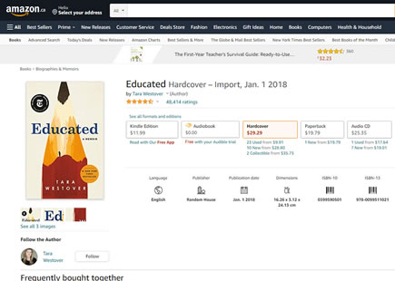
In this little experiment, Amazon shifted the availability information towards the center of its product pages. Instead of showing if and when a product will ship near the right add to cart tile, it was moved towards above the product description. Some weeks later, we discovered that this change was rejected in favor of showing the same information in the top right. The closest pattern I could think of that might be related to this finding is Bulleted Reassurances.
A - Sep 23, 2019 Screenshot
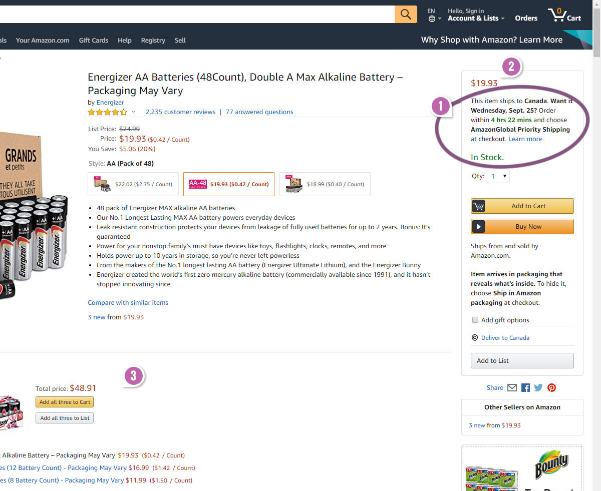
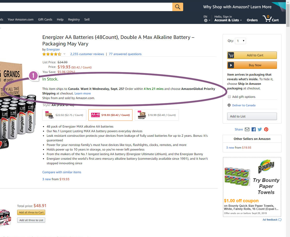
Highlighted UI Changes From This Leak
-
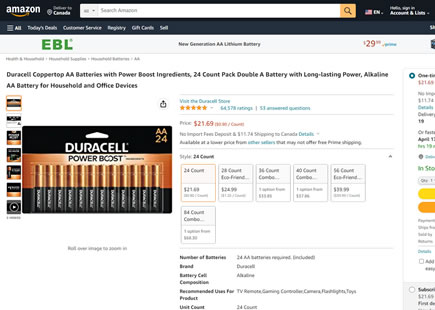
Centered Availability & Deliverability Information
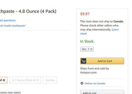
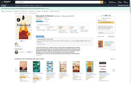
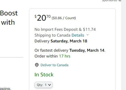
The A version shows the "In Stock" availability information along with whether it will ship to a particular country (and by when) above the add-to-cart button. In the B version this is moved to the center of the screen above the product description.
This is very similar to Pattern #15: Bulleted Reassurances
-
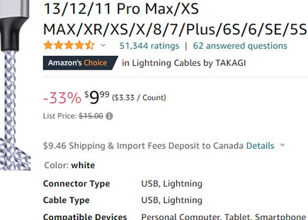
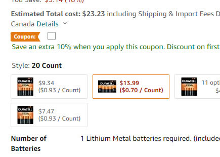
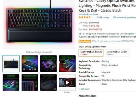
Duplicate Price
The A version also has a duplicate price shown in the top right column, whereas the B version removed it. Could the removal of the duplicate price have contributed to a negative effect? Perhaps it's also good to remind people closer towards the checkout buttons about the cost.
-0.5 Repeatability has been assigned to Pattern #114: Less Or More Visible Prices as evidence that it's getting worse
Repeatability is a net count of evidence for or against a pattern. It’s how we can predict which patterns are better than others. :)
-
More Condensed Screen
As a result of this change, the rest of the screen is either higher (A) or pushed lower (B) - potentially increases the chanced of a false bottom.
Comments