Etsy A/B/C Tests Category Links Vs Breadcrumbs
Etsy A/B/C tested at least 2 variations of their navigation, placing traditional category links against fly-out categories and breadcrumbs. The B variation with both the fly-out categories and breadcrumbs seems to have been rolled out eventually (and further iterated on in 2024).
B - Oct 16, 2023 Screenshot
Highlighted UI Changes From This Leak
-
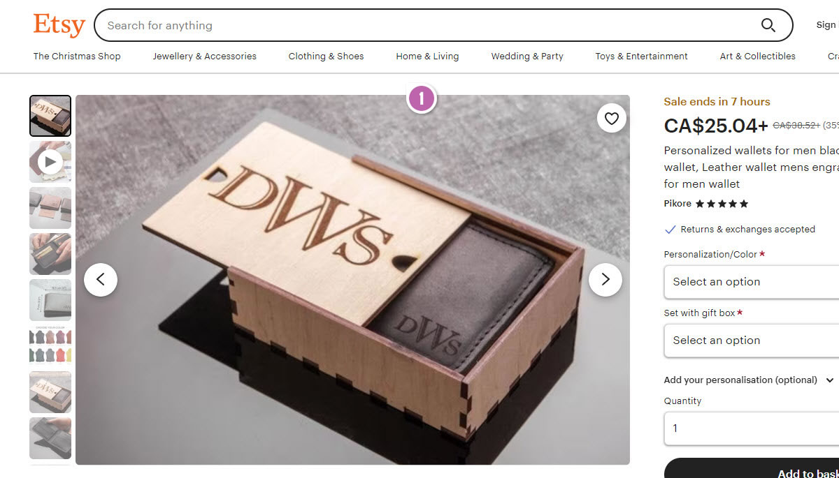
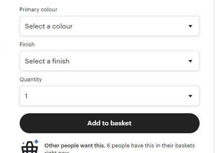
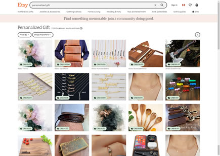
Category Links Only
Here in the control version, we see full width high-level categories right under the search bar. These include things like "The Christmas Shop", "Jewellery & Accessories", etc. Judging by this, they may also be somewhat seasonal.
-
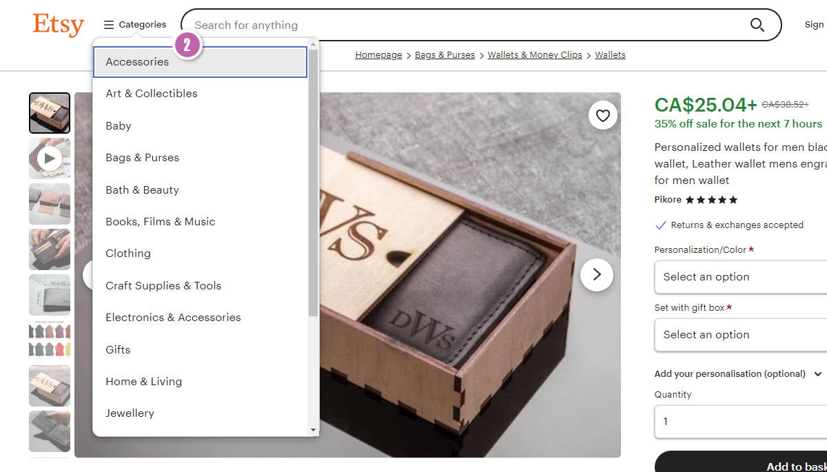
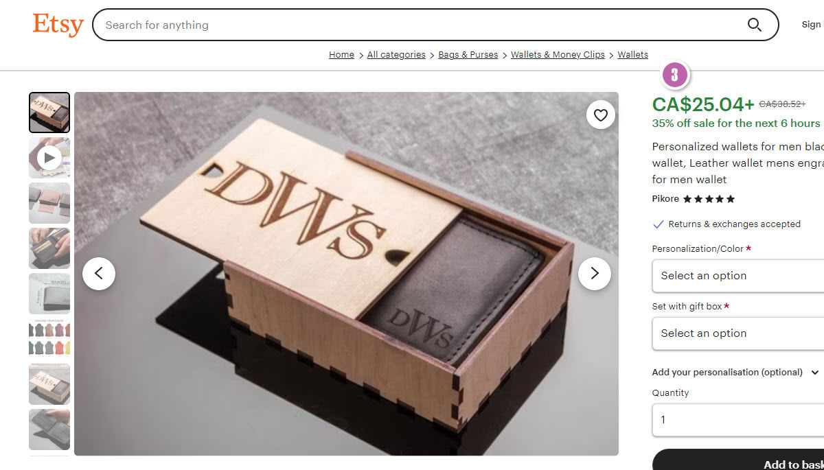
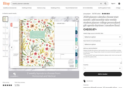
Fly Out Categories + Breadcrums
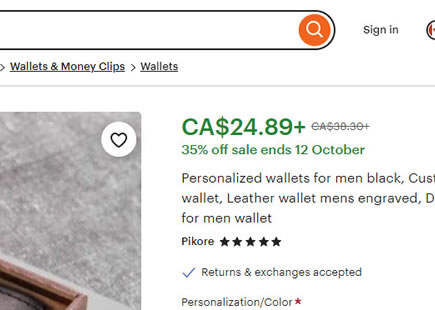
In this variation we can see an expanded fly-out category (the default state was collapsed). And right under the search bar we also see a breadcrumb. As a result of this, the width of the search bar was also slightly shortened.
-
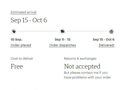
Breadcrumb Only
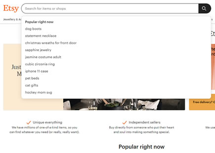
In this variation we see a breadcrum only approach, without any category links.
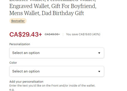
Further Iteration In 2024
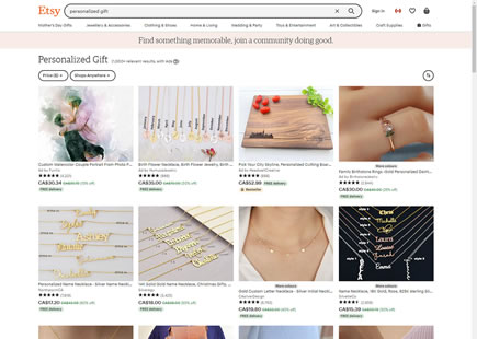
Fast forward into mid 2024 however, we can see that the navigation evolved further. (The original test ran around October 2023). Here we can see that another layer of categories was appended between the search bar and the breadcrumbs. It seems that the more link options, the better.


Comments