Etsy A/B/C Tests The Left Column Vs Overlay Filters On Listing Pages
Etsy ran an interesting filter experiment on their listing pages. The control's exposed filters on the left column were collapsed in two variations and made visible with the use of an overlay. One variation collapsed the filters completely while another added an extra layer of horizontal categories.
I typically see exposing options leading to positive effects while this experiment seems to have challenged this. If the outcome of this experiment has been captured correctly, then it seems that Etsy might have found an interesting exception to this pattern. As the test is wrapping up (with variation A occasionally appearing as a possible hold out group) it's starting to look like variation C is in the lead.


C - Jan 22, 2022 Screenshot

Highlighted UI Changes From This Leak
-
Collapsed & Slide Out Filters
This default-collapsed filter is probably one of the more drastic changes in this experiment. Upon clicking the "All Filters" button in variations B or C, the filters would then slide out as an overlay. Here is how the expanded state looked like:
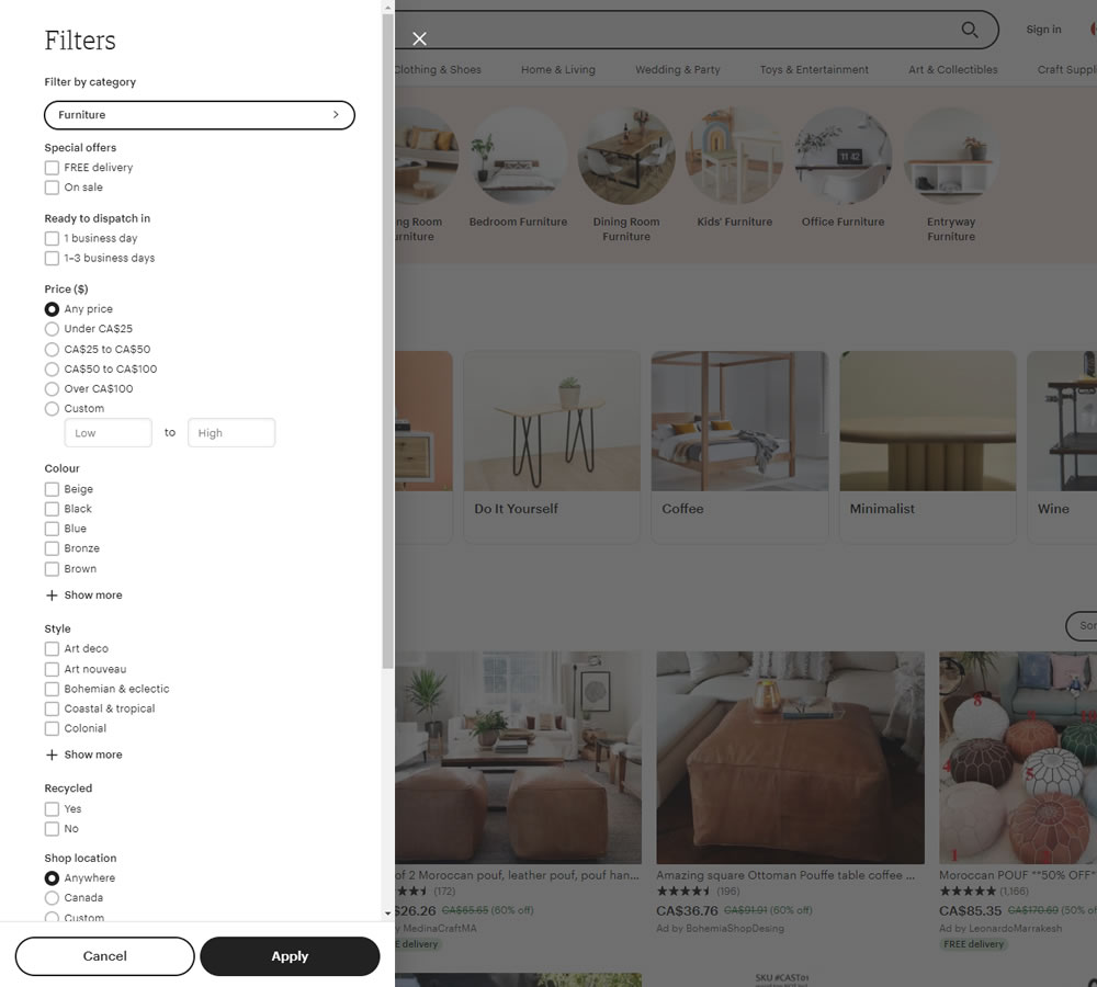
Exposed Filters This is very similar to Pattern #14: Exposed Menu Options
-
Condensed Categories
Variations B and C also include smaller or more condensed top categories (see the top image links as "Living Room Furniture", "Bedroom Furniture", etc.). This has a possibly nice side efffect of raising the actual listings or search results higher up.
-
Larger & Higher Product Tiles
As a result of condensing the above categories, the product tiles have lifted. I'm interested to see that the tiles have also increased in size instead of having been kept the same (and increasing the number of visible tiles per screen real estate as suggested by this little pattern.)
Perhaps this could make a wonderful follow up experiment?
-
More Visible Sorting
There seems to be another silver lining here - that in both variations the "Sort By: Relevancy" gained more visiblity. It gained a border (as it was turned into a ghost button), as well as, was shifter higher. I would easily expect more interactions with sorting from these changes.
As a followup experiment, I'm wondering if the sorting would be more effective exposed as in Bol's experiment.
-
Exposed Shop By Interest
Finally, the C variation also has added a layer of extra search options. These include such search triggers as "Mid Century Modern", "Woodworking", etc.
This is very similar to Pattern #79: Product Highlights

What About Established Conventions?
Comparing this experiment to other leading online retailers it's still a little difficult to believe that the established convention of having exposed filters on the left is somehow inferior. With screenshots of conventional filters from leaders such as Amazon or Best Buy, I can't help but wonder what the results might be if more companies replicated Etsy's approach.


Comments