Etsy A/B Tests A Different Price Style
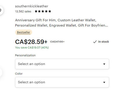
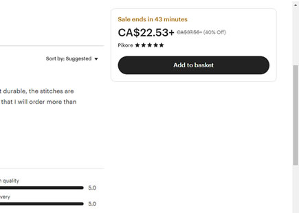
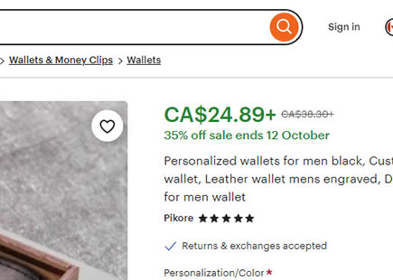
Etsy just ran an a/b test of how prices were displayed on their product pages. The three related changes were detected as a single variation and it now seems like the experiment ended up being rejected - suggesting a loss or insignificant outcome. Although the changes were confounded, based on some positive data related to showing availability, perhaps removing the "In stock" copy was one change too many. Here is what the experiment looked like:
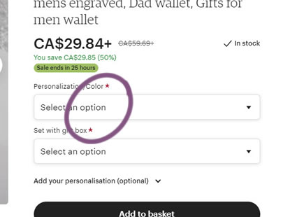
A - Oct 1, 2021 Screenshot
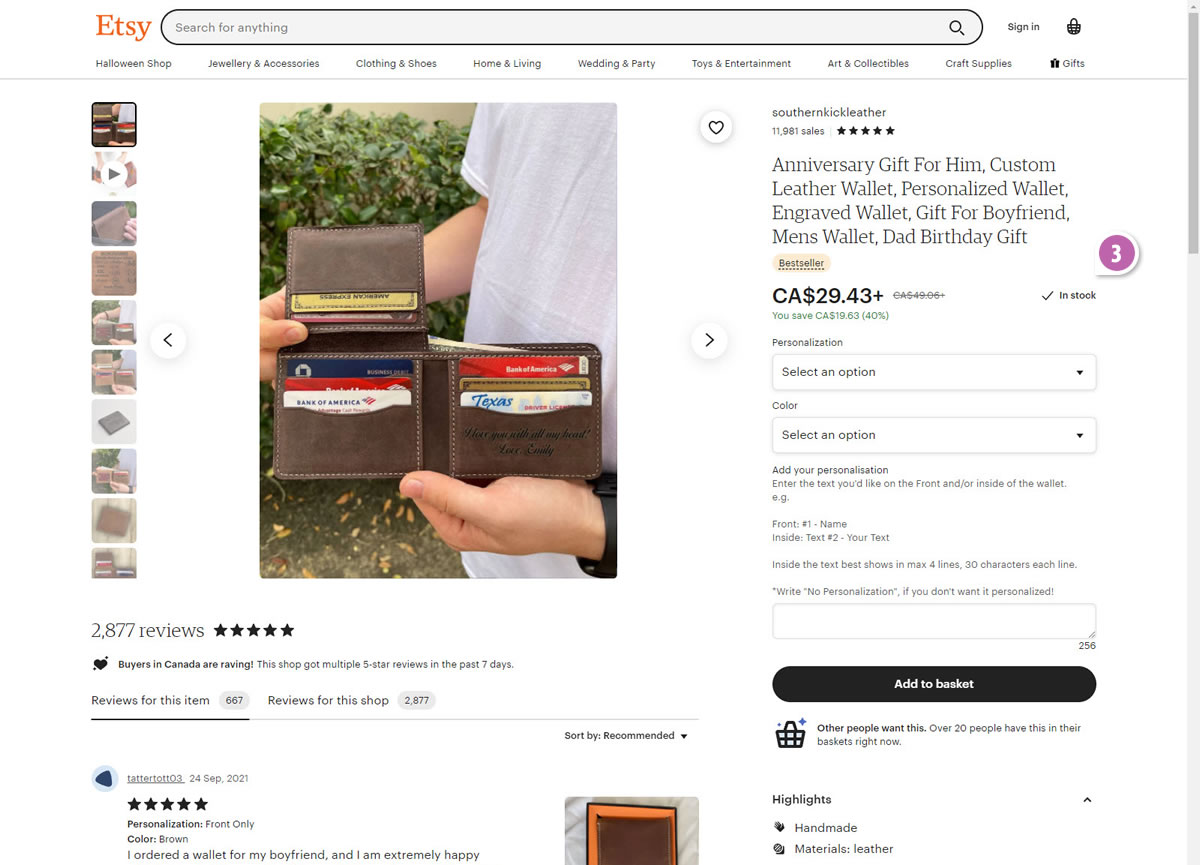
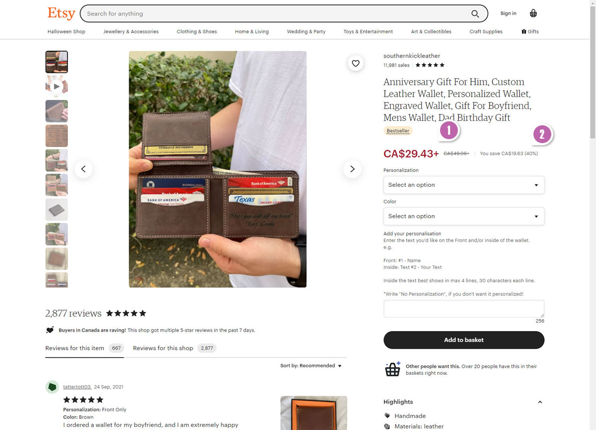
Highlighted UI Changes From This Leak
-
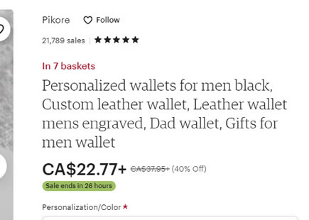
Black Or Red Price
The first change was related to the price color shifting from black to red. Could Etsy have been inspired by other retailers such as Amazon or BestBuy? :) Subtle color changes such as these probably don't carry too much of an effect, but it might have been more interesting if this change was isolated. This way we'd have a clearer signal on just this potential convention.
-
Underneath Or Right Aligned Savings Amount
The second change part was the shifting of the "you save $X" copy from underneath the price towards the right side (in the variation). A green to grey color change also was thrown in the mix.
-
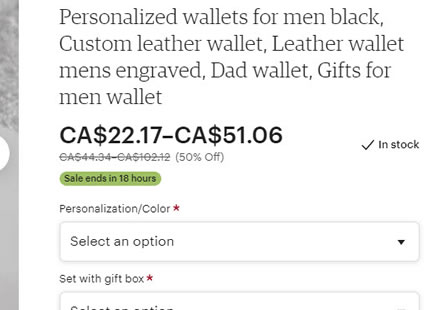
Removed Availability Indicator
Finally, the "In stock" copy was completely removed in the variation. Given that showing availability has lead to good results in the past, I wonder if this change alone brought down the full experiment leading to a rejected outcome. Although most of our experiments so far have been tested in the context of lead-gen, this now makes me want to try the "In Stock" on an ecommerce site. :)
This is very similar to Pattern #24: Visible Availability



Comments