Etsy Fails To Replicate Airbnb's Customer Reviews Banner
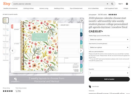
Etsy a/b tested a "customer review banner" on their listing pages - somewhat similar to what Airbnb had rolled out a little earlier in the year. Although I can't say whether this was an intentional replication attempt or simply a co-invention path, Etsy's variation seems to have been rejected. So I tried to highlight a few subtle differences which perhaps may encourage an iteration - worthy of a second chance?
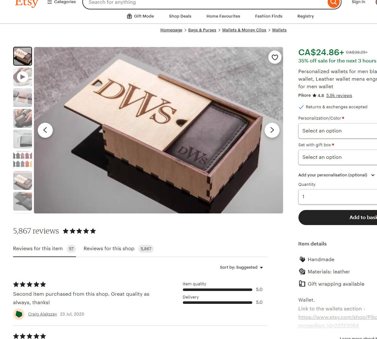
B - Mar 7, 2024 Screenshot
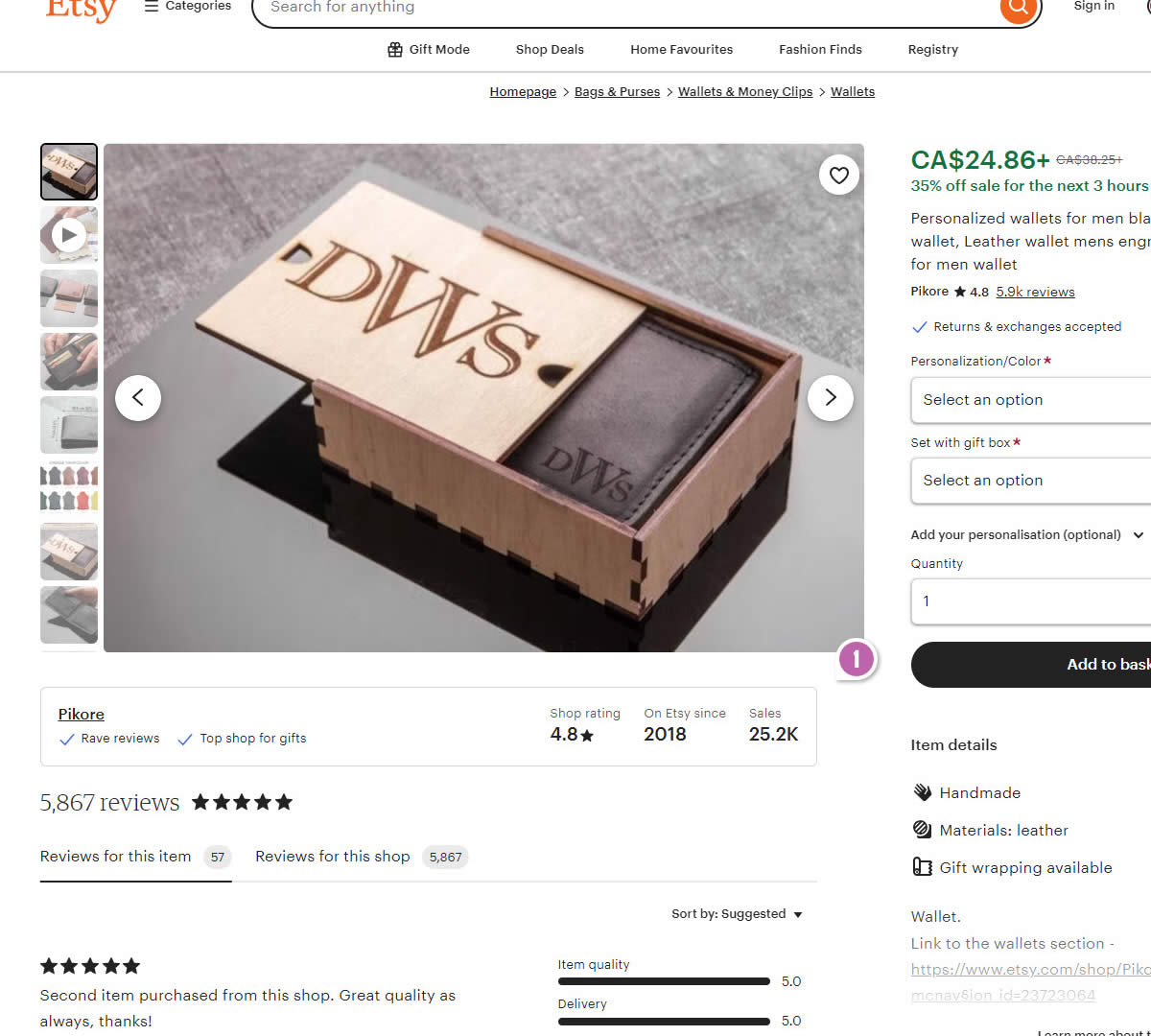
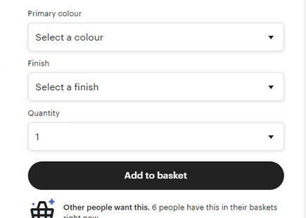
Highlighted UI Changes From This Leak
-
Customer Review Banner
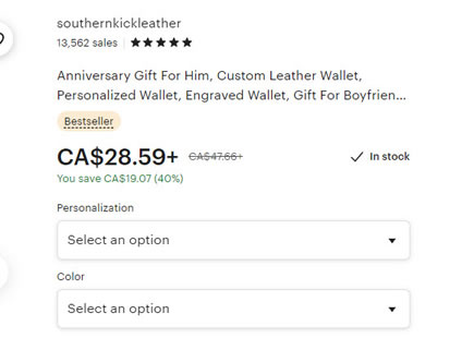
In the variation we can see an injected wide customer review banner. It contained the store name, a few check marked reassurances, the shop rating, the year the store started out on Etsy, starting out on as well as the number of sales.
This is very similar to Pattern #7: Social Counts
A Few Key Differences Between Airbnb And Etsy
If we compare Airbnb's variation (that was likely successful) to Etsy's (likely rejected), we can identify a few key differences which may shed some light as to why Etsy's variant may not have done as well. Perhaps these hold the key to a better effect?
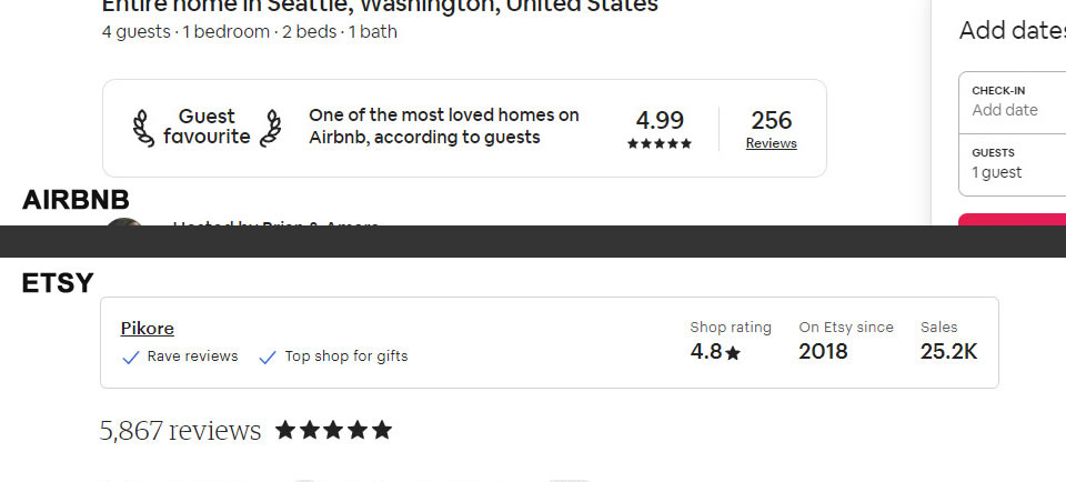
- Airbnb uses a strong and clear subheadline: Guest Favorite
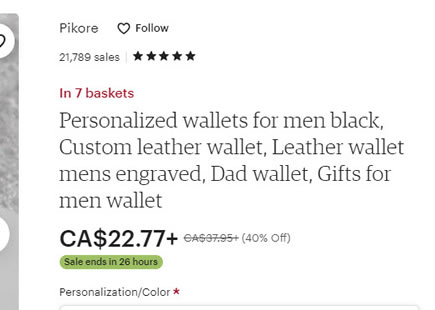
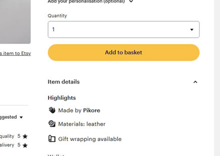
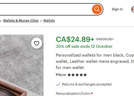
Whereas Airbnb starts off with a very strong headline (Guest Favorite) which then is further clarified with a longer statement, Etsy shows a more ambiguous store name (ex: Pikore in this case). Perhaps these store names may be meaningless in some instances. Etsy's "Rave reviews" reference is also questionable.
- Airbnb uses larger fonts
For the above information and especially the sub titles, Airbnb uses larger fonts.
- Airbnb keeps customers on the page
Whereas Airbnb has a link under the review count that links to a modal and keeps customers on the page; Etsy attached a link to the store name (Pikore) which may have taken customers away to other products.
- Airbnb only shows customer review counts and ratings
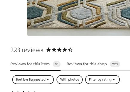
Whereas Airbnb shows customer ratings and rating counts which work together; Etsy also shows the total number of sales - highlighting a potential gap and raising uncertainty of a large number of customers who have not reviewed the product. This may actually be somewhat supported by this more isolated experiment here.
- Airbnb displays reviews conditionally
Whereas Airbnb only shows this banner on some of the higher quality listings with better reviews; perhaps Etsy showed it on a wider set of stores, if not all (this is more of a question as I wasn't actually able to verify this).
Comments