Discover UI Design Decisions Of Leading Companies,
From Leaked Screenshots & A/B Tests.
Showing 112 results
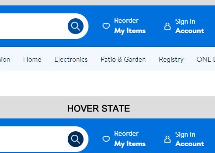
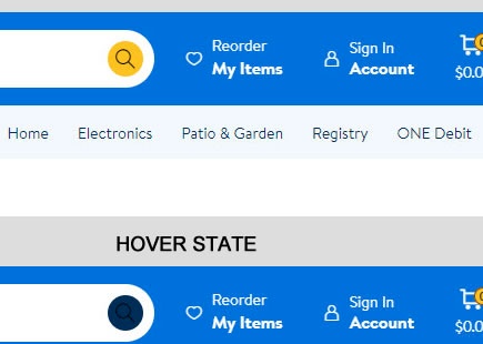
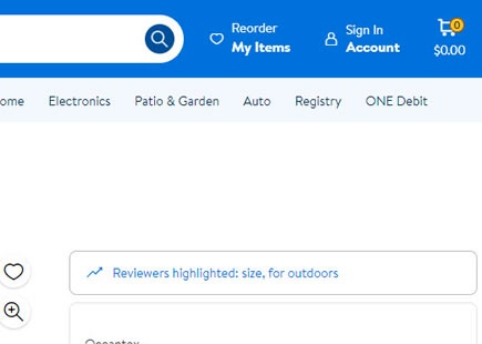
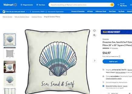
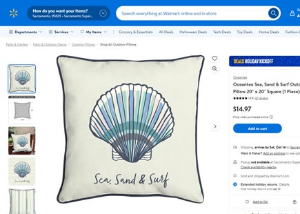
Walmart's 2nd Take On Its Navigation Seems To Have Worked This Time
Walmart hasn't given up on its previously rejected navigation a/b test. In March of this year I noticed a very similar follow up experiment with at least 1 key difference - the "Reorder My Items" menu wasn't changed but kept in its original position. View Leak
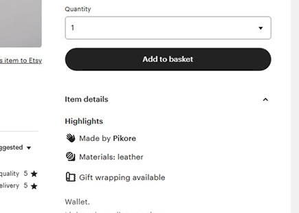
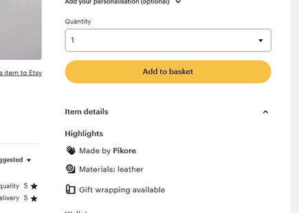
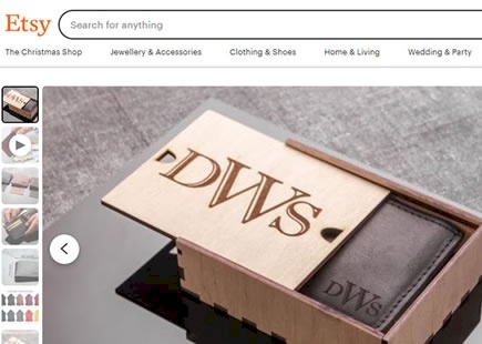
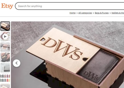
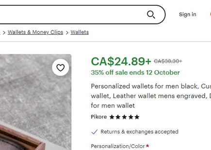
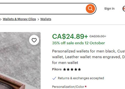
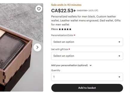
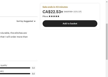
Etsy A/B Tests This High Contrast Button Style
Etsy ran a little A/B test where they probably tried to encourage more searches with the help of a stronger visual cue in their search bar. Instead of using a ghost-like icon only approach for the primary search, they stylized it as a high contrast button. Fast forward a few months and it now looks like the variation was implemented. View Leak
Airbnb A/B Tests Hidden Vs Shown Price Totals
Months ago Airbnb ran this A/B test on their listing pages where they showed price totals for a given date range. This was one step beyond the already visible day rates (in the control). They also used default dates for the total calculation when someone didn't enter a date, or user specified dates when users expressed them. View Leak
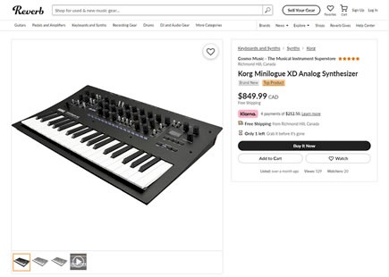
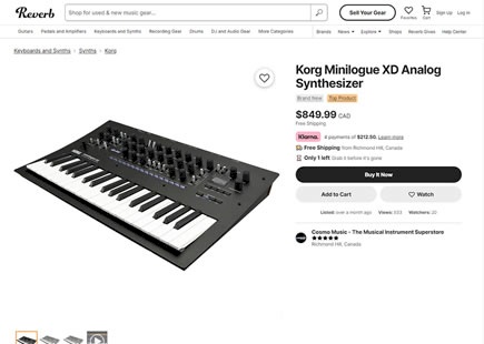
Reverb's UI Redesign Succeeds In This A/B Test
Reverb.com ran this site wide stylistic redesign experiment. It involved a number of rather "soft" UI changes involving button, font, and component styles. Fastforward two months and it now seems like it has been rolled out - suggesting that the variation did not hurt to say the least. View Leak
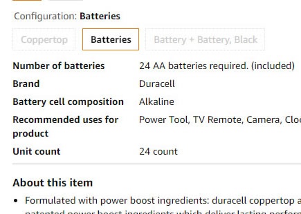
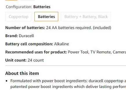
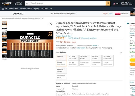
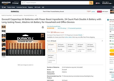
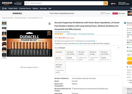
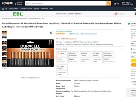
Amazon A/B Tests And Rejects This Product Description Format
Here is a little surprise from Amazon. A few years back, they a/b tested the addition of product details at the top of their product detail pages. Building on this, two months ago someone on their team tried to format these descriptions as inline or flowing text instead of relying on indent alignments (table-like formats). View Leak
Walmart Ran This Big Navigation A/B Test With 8 Confounded UI Changes - Rejecting It
Walmart ran a larger redesign experiment of their navigation. If I observed correctly after triple checking, it was a leap variation with at least 8 changes grouped together. Unfortunately, as of this month it seems that the experiment has stopped with no sight of the variation - hinting at a rejection for whatever reason. In retrospect, I do have some ideas along with my personal and mixed bets on these UI changes. All in all, I suspect a possible confounding situation with some negative changes cancelling out the positive. View Leak
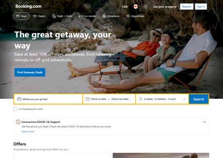
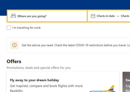
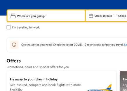
Booking A/B Tests A Highly Prominent Deals Page And Possibly Rejects It
Booking ran a very prominent header experiment on their homepage. In this experiment they directed more traffic towards a dedicated deals page. View Leak
One Possible Reason Why Etsy's Floating Buy Box UI Was Rejected
Etsy recently ran an experiment were they floated their buy box on product detail pages. It's a pattern with a pretty good track record of delivering positive results across past experiments. But as many patterns, it doesn't always win. And in Etsy's case, two months after first detecting their experiment, it also seems that they might have rejected their variation - hinting at a superior control. View Leak
Booking A/B Tests Rounded Corners On Multiple Elements
So this little big Booking experiment finally happened: sharp edges vs softer and rounded ones. View Leak
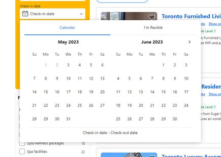
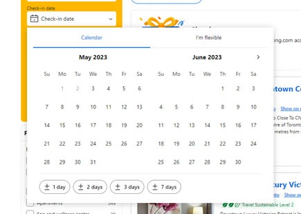
Booking A/B/C/D Tests And Detects A Better Calendar Widget
Booking has been testing at least 3 variations of their calendar widget - a key component that affects availability and prices of rooms. In a nutshell, the variations explored ways of letting users express more flexible date inputs in at least two ways: using day ranges and wider months. The concept looks very similar to what Airbnb has rolled out over a year ago. View Leak
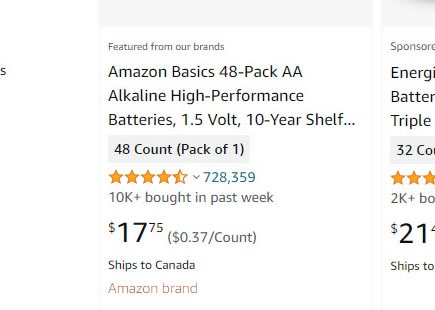
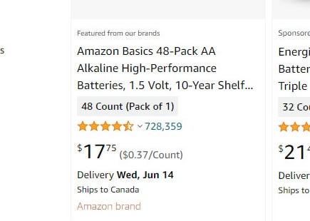
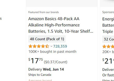
Amazon A/B Tests And Rejects Wider And Smaller Product Titles
Amazon has been noticed a/b testing their product titles styles with at least 3 variants. The first variation stretched the width of the product title. The second variation decreased the font size. While the third variations combined both changes together - possible checking for interaction effects. View Leak
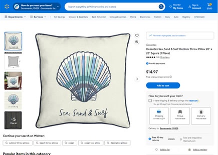
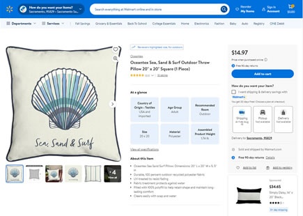
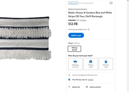
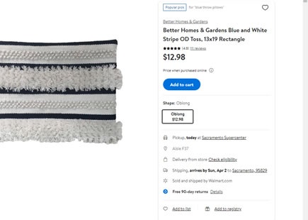
Walmart A/B Tests Shipping Choices Vs Shipping Reassurances
Walmart recently ran an a/b test on their product detail pages that showed shipping information in two different styles. On one hand (here shown as A) shipping options were shown as a button choice. Whereas in the variation, all shipping information was fully expanded and readable bullets. View Leak
