Discover UI Design Decisions Of Leading Companies,
From Leaked Screenshots & A/B Tests.
Showing 112 results
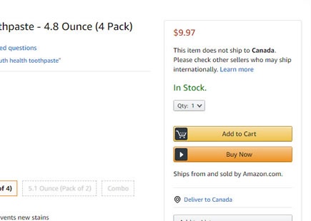
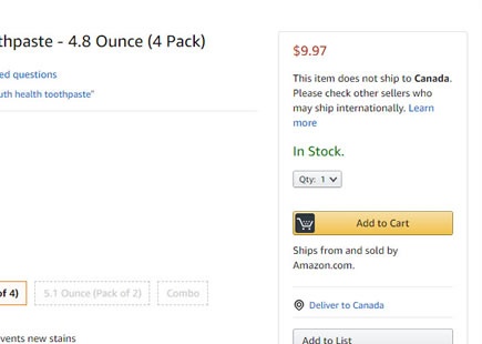
Amazon A/B Tests And Keeps Both Add-To-Cart And Buy Now Buttons
Two months ago I managed to detect that Amazon was actually a/b testing the removal of the second "Buy Now" button on a specific product page. Finally today it looks like the experiment has completed with both buttons still being displayed - like in the old days. View Leak
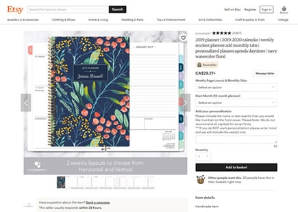
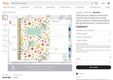
How Etsy's Product Page Design Evolved Between 2019 And 2020
I recently found a 2019 product page screenshot from Etsy's which was just asking for a comparison with the newer 2020 version from today. By doing this little exercise we can see how the screen has evolved with numerous UI changes. View Leak
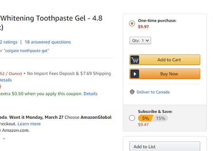
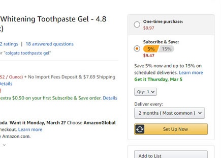
Amazon's One Time Purchase Vs Subscription Experiment
In this experiment captured from a random toothpaste product page, Amazon was testing two separate purchase related defaults. Some visitors would be defaulted to a "One-time purchase" buy box (control version). While others would first see a preselected subscription option, encouraging a recurring product purchase (variation B). View Leak
Netflix A/B Tests 4 Secondary Choices - All Of Which Get Rejected
In this experiment, Netflix displayed secondary buttons in at least 4 different ways. The idea might have been related to something written about by Online Dialogue - what Bart Schutz calls Hobson's +1 Choice Effect. View Leak
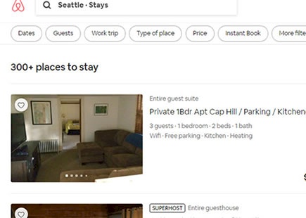
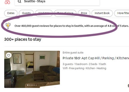
Airbnb A/B Tests And Implements Customer Rating Averages Above Search Results
In this simple experiment, Airbnb tested the display of customer rarings averages on their search results screen. The tested copy was a form of social proof which showed the average rating of the properties for a given city (defined by the search). View Leak
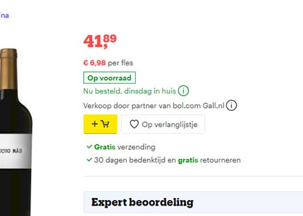
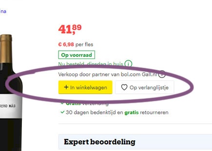
Bol Tests 8 Add-To-Cart Buttons With 1 Winner
Bol, a leading online retailer in the Netherlands, just completed a beautiful experiment with 8 add-to-cart button variations. Two potentially leading variations (C & G) were then retested in a followup A/B test. Today, we have finally detected that the C version ("In winkelwagen" translated to "Add to cart") has been implemented on all product pages. View Leak
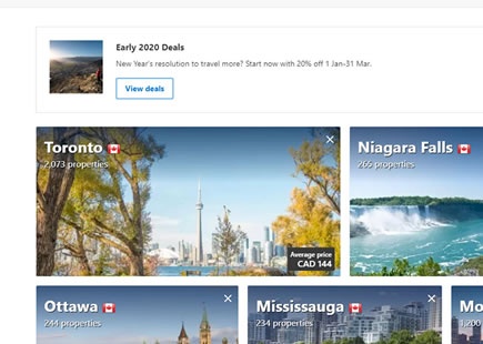
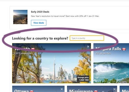
Booking Discovers That Two Search Bars Are Not Better Than One
In this experiment Booking added a second search bar on their homepage. The intention might have been to provide users a way to filter more destinations by country. Could this scenario have created an akward uncertainty about which form field to engage with? Whether this explanation is true or not, I'm not sure. What we do know however that in the end, the control version with the single search bar prevailed. View Leak
Netflix A/B Tests Upfront Email Capture At The Start Of Their Signup Flow And It Succeeds
Once upon a time, Netflix had asked users to enter their email address far down in the signup flow. The email field appeared after a user moved from the hompage, through a series of confirmation steps, and a plan selection - what might officially be counted as the fifth step. All this was challenged with the following experiment where the email field was placed right at the forefront. More so, it also looks like this changed generated some positive impact as it was also rolled out. View Leak
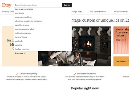
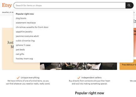
Etsy Discovers A Better, Padded And Wider Search Bar In This A/B/C Test
Etsy just completed a cascade experiment with 3 version of their global search bar. Interestingly the cascaded version with all inherited changes, took the lead. View Leak
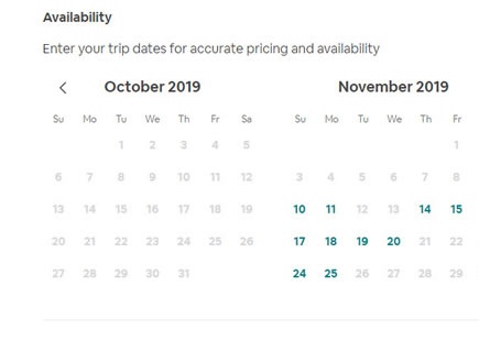
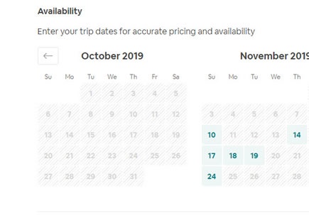
Airbnb Discovers A Better Calendar Picker Component From This UI Experiment
This was a simple calendar picker experiment that Aribnb recently ran and eventually rolled out. The A/B test contains at least 4 simple UI changes which might have contributed to a positive outcome. And so this also shows us what a slightly better UI component looks like. View Leak
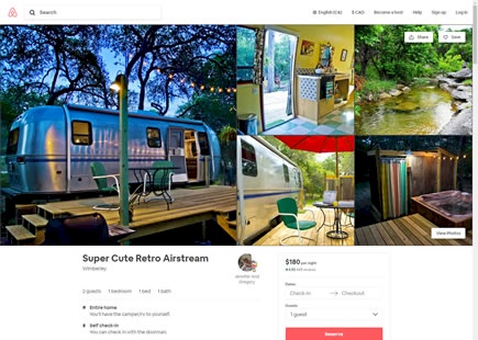
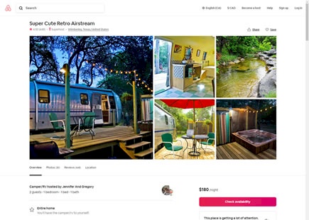
Airbnb Attempts A Big Property Page Redesign But It Is Rejected After This A/B Test
Over two months ago I managed to detect this exciting product/property page redesign on Airbnb with at least 17 UI changes. Unfortunately, as hard as the Airbnb team must have worked on these layout improvements, we now can see that the experiment has ended and the old control version (A) remains the better performer. View Leak
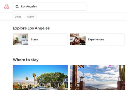
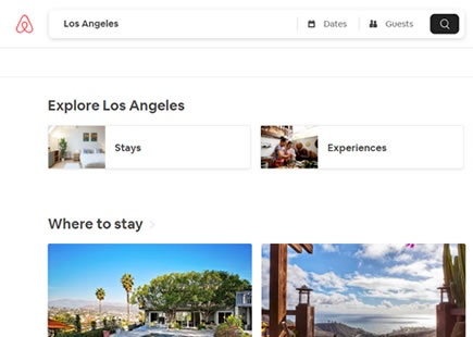
Airbnb A/B Tests Search With Automatic Prompts Which Gets Rejected
In this listing page experiment, Airbnb tried an very similar search interaction that is already present on Booking.com's homepage. Instead of only asking users for their destination, the search interaction was extended to prompt for travel dates and number of guests. View Leak
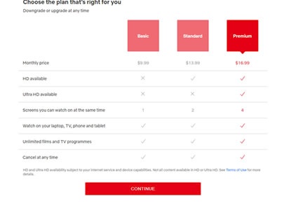
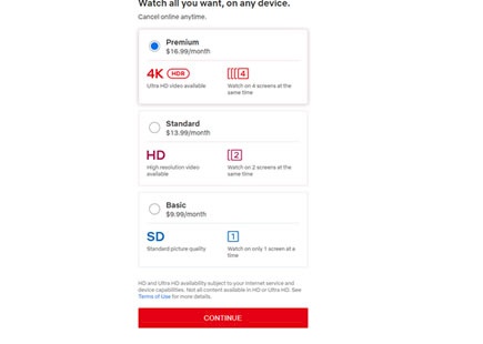
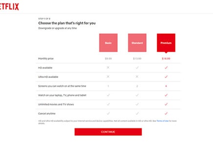
Netflix Keeps Its Older Price Comparison Table And Rejects Their New Layout In This A/B Test
Netflix has been experimenting with the layout of their pricing plans. Challenging the more traditional pricing comparison table, instead they a/b tested three self-contained pricing plan tiles. This newer version however ended up being rejected as we noticed. View Leak
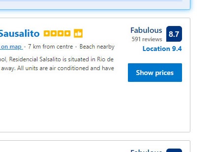
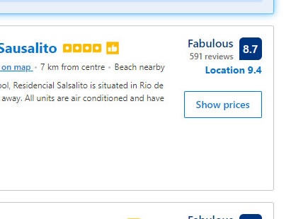
Booking A/B Tests Ghost Buttons, But Their Hopes Fade Away As Predicted
Ghosts buttons. We know that this style of buttons is net negative based on this evidence-based pattern. So when Booking ran this experiment, it's no surpirse that it was eventually rejected - a predictable replication. View Leak
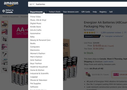
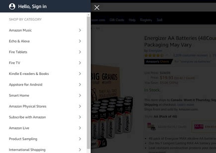
Amazon's Loaded Hamburger Menu Beats Its Older Dropdown Version In This A/B Test
At first glance some A/B tests may seem like they are beautifully simple with a single controlled variable. Yet as we look at the experiment in more detail, more and more subtle differences start coming into view. This I think is the case with Amazon's most recent experiment where it seems that only a dropdown menu was shifted into a hamburger one - which ended up winning. View Leak
Bol Discovers Something Better Than Classic Pulldown Menus, As Expected
When Bol ran their list vs grid view experiment, they also included a variation that tested for another very simple change: the exposure of menu options. That is, the listing page variant was designed to check if three more visible pull down options would be better or worse than just showing them hidden inside the pulldown. View Leak
Booking Fails To Replicate Airbnb's Signup, This Experiment Suggests
It seems to me that Booking may have attempted a replication or imitation of one of their competitors - I'll let you be the judge. View Leak
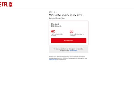
Netflix A/B Tests A Single Plan Recommendation And It Becomes Rejected
Netflix made a bold move and challenged their traditional 3 plan pricing page with a preselected single plan recommendation. Clear and equally balanced choice vs. a single mid tier plan. View Leak
Google Also A/B Tests The List Vs The Grid
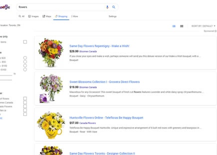
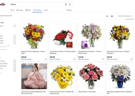
Interestingly, Google was also discovered a/b testing the list vs grid pattern just as Bol finished a similar experiment this month. The Google experiment ran on one of their shopping results pages with the specific query for "flowers". And the outcome? Looks like the grid beat the list and was rolled out in this case. View Leak
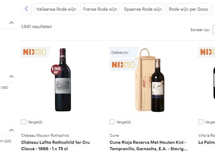
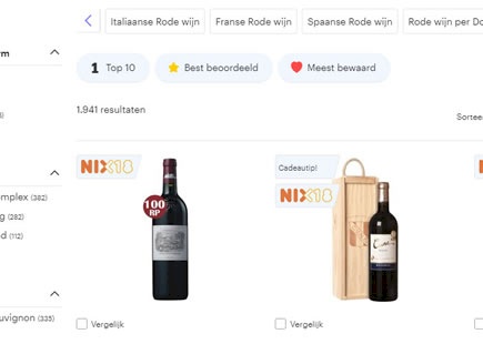
Bol A/B Tests The UI Classic: List Vs Grid View With A Clear Decision
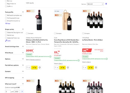
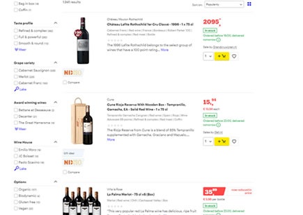
I am continously interested in answering and providing guidance on whether grid or list views are in general better, worse or indifferent as one of many UI patterns. To my surprise, Bol.com the leading Dutch web shop, has recently a/b tested this classic pattern which we were super lucky to detect on their red wine product listing pages. After anticipating their leaked design decision, we eventually learned that lists fared better for Bol. This of course we'll now use as additional and emerging evidence to tip the scales of probability (and hopefully better predict similar future experiments). View Leak
