Airbnb A/B Tests Search With Automatic Prompts Which Gets Rejected
In this listing page experiment, Airbnb tried an very similar search interaction that is already present on Booking.com's homepage. Instead of only asking users for their destination, the search interaction was extended to prompt for travel dates and number of guests. Unfortunately, it doesn't look like the experiment succeeded as it was rejected - perhaps the Auto Next interaction was taken a little too far?
A - Oct 9, 2019 Screenshot


Highlighted UI Changes From This Leak
-
Unified Search
In the B variation we can see a more unified search that shows the input, date option, guest picker, and search submit all on the same line. The search button also gained a lot more contrast with a black background. This style is also very similar to the way Booking does their search on their homepage.
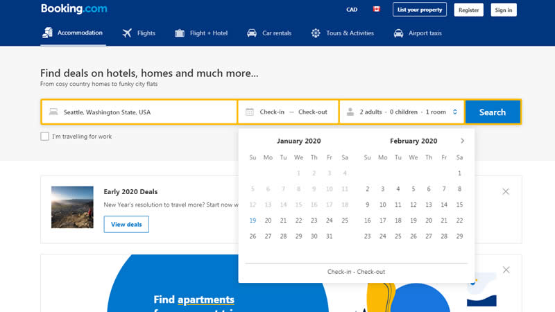
Booking.com's Similar Search -
Prompting For Dates With Auto Next
The experiment wasn't only about looks, there was another key interaction detected that was present. Upon hitting "enter" or selecting a destination, variation B further prompted the next choice on users by expanding the date selector.
This is very similar to Pattern #93: Auto Next
-
Prompting For Guests With Auto Next
Upon selecting dates, the same interaction continued on, prompting users to also enter the number of guests.
This is very similar to Pattern #93: Auto Next

So Why Didn't The Booking Search Replicate On Airbnb?
Clearly, Booking has a very similar search present on their homepage, and yet this similar treatment was rejected on Airbnb - why? I have two potential hypothesis that may or may not explain Airbnb's rejection decision:
One, Booking actually does not prompt for guests - the last option. Although Booking prompts for dates with the calendar picker, they smart default to probably the most common number of guests (ex: 2 adults, and 1 room). They also show this default visibly inside the search component and possibly save some users an extra step.
Second, Booking has this search interaction on their more general homepage, whereas Airbnb has tested it on a deeper results / listing page. Could it be that once people start seeing potential results (seen on the Airbnb screenshot), they are more interested in browsing deeper into particular listings, rather than making additional choices?
Do you have any other thoughts as to why this might be working on Booking, but not for Airbnb?


Comments
John Ostrowski 6 years ago ↑0↓0
Great detection GoodUI team!
Also, the correlation with the auto next patter is the extra mile here.
I feel that Airbnb was testing a way to grab more search metadata in the very first search interaction, possibly for retargeting reasons? demand forecasting? reduce listing frustration? - Have you ever found your perfect AirBnB location just to figure out your dates weren't available?
Why did it fail? Can we consider Booking's audience with higher intent than Airbnb in a way that suggesting the auto next backfired due to a "too much too soon" effect?
Reply
Diego Guadarrama 6 years ago ↑1↓0
Maybe it's something simpler. They might just want to keep their UX/UI experience the same on mobile and web. And that design might be too crowded on mobile...
Reply
Mario Lurig 6 years ago ↑1↓0
When browsing for a hotel, people have a specific date in mind (it tends to follow flight bookings).
When browsing for AirBnB, people will look around to see what is available and what prices are like and tends to be earlier in the process for some. The AirBnB UX has driven this behaviour home (all puns intended) over the years.
That difference is why auto-next isn't a good fit and likely resulted in a failed experiment.
Reply
Sheldon Lloyd 6 years ago ↑0↓0
I think it was the auto next that resulted in the rejection. It would probably be better to present the option for the user when they are ready to use it. Maybe even giving a hint after the first search. But as it was done it might be jarring for the user and feels forced. They might be expecting a search result after pressing enter rather than an "advanced" search option.
Reply
Hing-Cheung Li 6 years ago ↑1↓1
Perhaps a certain type of user where he/she might look for longer term accomodation instead of booking a hotel for vacation? In this specific case, the date might not matter as much at first.
Reply