Airbnb Discovers A Better Way To Let Customers Explore Listings
It looks like Airbnb once again ran an exciting experiment where they sought a better way to let customers explore property listings. I managed to detect an a/b test with changes to the homepage button which then spilled over into more changes on the listing page. I'll also admit that I am not 100% sure whether this was one bigger experiment on both pages or two separate ones. Either way, here are some of the particular differences I found really interesting ...
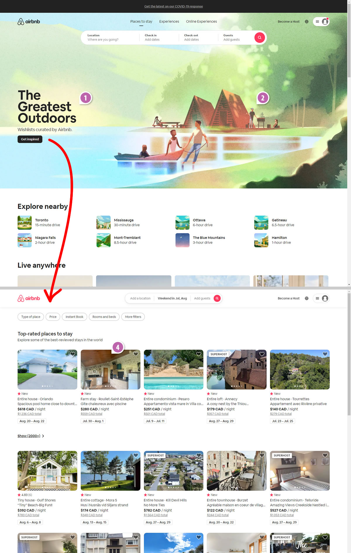
B - Jun 24, 2021 Screenshot
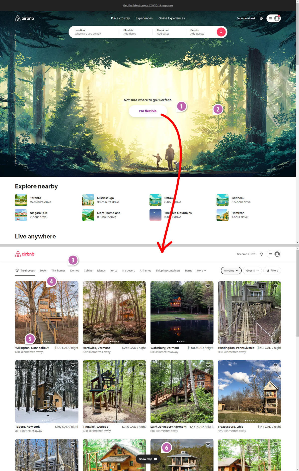
Highlighted UI Changes From This Leak
-
More Visible Button
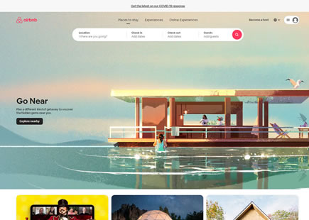
Here we can see a number of differences that I believe compound to a more visible and inviting call to action (in variation B). First of all, the control version uses the same black styling for both the headline and the button - potentially diluting the button's clickable trigger. Whereas the white background button in the winning variation is a lot more comparable to the search box at the top of the page. I think this consistent styling, right upfront conveys that there are two equal weighed choices in how customers can search.
Furthermore, the button in the B variation is also: larger, more central, has more padding, and has larger text.
I would predict that all these factors taken together have encouraged customers to click on the "I'm flexible" button a lot more.
This is very similar to Pattern #59: Inverted Or Consistent Button Styles
This is very similar to Pattern #13: Centered Forms & Buttons
This is very similar to Pattern #97: Bigger Form Fields
-
Different Background
I kind of wish this change wasn't confounding this experiment as its quite different. Although I understand that the background images might have been chosen for their lighter tones on the left (in the control) and in the center (in variation B) to make the overlapping text more readable. Other than that, I'm not going to guess if these played much of a role in the outcome.
-
More Category Choices As Tabs
After clicking on the buttons, customers would move to the next listing screen with a series of thumbnail results. Again, a little warning here that I'm not sure whether these were two separate experiments (on two separate screens) or one bigger one (wrapping both the homepage and the listing page). Either way, the first change that is interesting is the ability to switch between property categories in a tabbed interaction. Variation B shows such high level categories as: tree houses, boats, tiny homes, etc. and I'm confident this is an improvement based on this pattern.
This is very similar to Pattern #79: Product Highlights
-
Larger Home Thumbnails
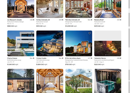
Looking at the listing thumbnails in variation B, we can see that they are both larger and better capture the home from the outside along with its environment. I don't have any data on this particular change but this seems like it might be a really interesting change to be tested in isolation.
-
Clearer Property Location And Proximity
Let's remember that most customers here probably haven't yet entered a date nor location. Variation B does a better job at highlighting the location by: bolding, placing it as the first data type, as well as including both city and state. More so, notice how a simple "X km away" data reinforces the same message of proximity. These changes feel like a great way to let customers understand how far or close a listing is away from them. Love it.
-
Ability To Switch To Map View
Finally, at the bottom of the listing screen in variation B, we can see a simple floating toggle that allows customers to swtich to a map view. Very interesting! :)
Comments