Airbnb Runs A Successful Leap Redesign Experiment For New Hosts
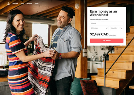
Airbnb just completed testing and rolling out a successful variation for their new host landing page. The interesting thing about this experiment is that it was a leap a/b test containing many changes (some of which are being followed up with small scale a/b tests as I'm writing this). Here is my take on some of the changes along with the corresponding patterns.

B - May 19, 2021 Screenshot

Highlighted UI Changes From This Leak
-
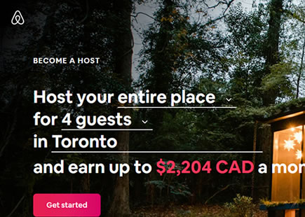
Changed Headline
The variation headline changed to one that suggests belonging or being part of something greater - possibly with some resemblance to an empowering headline. Either way, there is definitely a social element in the new headline hinting that one will join a group.
Whereas the headline in the control (A), speaks to the space rather than the host.
This is very similar to Pattern #22: Empowering Headline
-
Multiple Host Videos
The next major difference in the variation (B) was the introduction of around 4 short and silent host introduction videos. The right side of the header would play these short videos of smiling hosts that would delicately introduce themselves - along with their names and location. An amazing way of reinforcing the new headline while showing a wider variety of different hosts from around the world.
-
Right Aligned And Changed Call To Action Button
The primary sign up button shifted from left to right, while changing to "Try hosting". If the animating videos gain more attention, then this seems like a reasonable change to send some of that attention to the button as well.
-
Stronger Reassurance Copy
"Your next chapter made possible by hosting" doesn't really say much on the control. The variation is more precise and reassuring by stating that "You can host anything, anywhere."
This is very similar to Pattern #15: Bulleted Reassurances
-
More Testimonials
The control has one testimonial. The variation splits this into at least 3 visible ones (4th cut off by intention to signal a scrolling interaction). Are more testimonials better? :) I think so.
This is very similar to Pattern #4: Testimonials
-
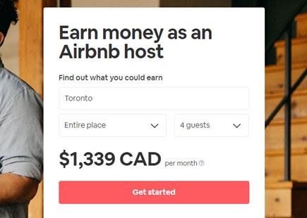
Lowered Earning Calculator
The earnings calculator has been lowered further down and it's font increased. The call to action was also expanded from 1 to 2 ("host your space" and "host your experience").
-
Lower Secondary Calls To Action
In the variation, all secondary calls to action (leading to educational or support pages) were moved from the top or middle of the page, to the bottom. This way, more of the upper and core landing page is dedicated to getting new hosts to sign up. Although we've never yet tested such a concrete move, we do have a few related experiments around the topic of surfacing educational content.
-
Removed Newsletter Signup
Finally, we can see that the newsletter signup form was removed. This keeps the focus of the landing page to the primary call to action of signing up new hosts - possibly related to the pattern of tunneling.
This is very similar to Pattern #64: Tunnel
Comments
Rodrigo Paiva 5 years ago ↑1↓0
Hi Jakub,
I wonder if you could implement some kind of popover on the image numbers so that we can read the UI change in the image context. Right now you have to scroll up and down to understand what they mean and you either see the image or the text :)
Reply