Airbnb Gets Creative In This Multiple Variation Homepage Experiment
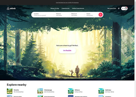
I love how Airbnb balances formal controlled experiments (containing single isolated changes) with more exploratory ones such as on this one here. They just completed a creative homepage experiment where they tested multiple variations with multiple changes of which I will show a selected few for simplification. It also seems like what most resembles variation D was eventually rolled out - suggesting it performed the best. Please also do take note that there might also been an additional photo background change after the experiment ended. With that, I wanted to pick at a few of the UI changes that stand out to me from the implemented D variation ...
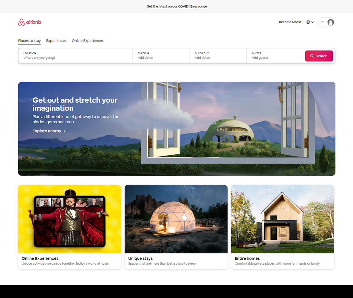
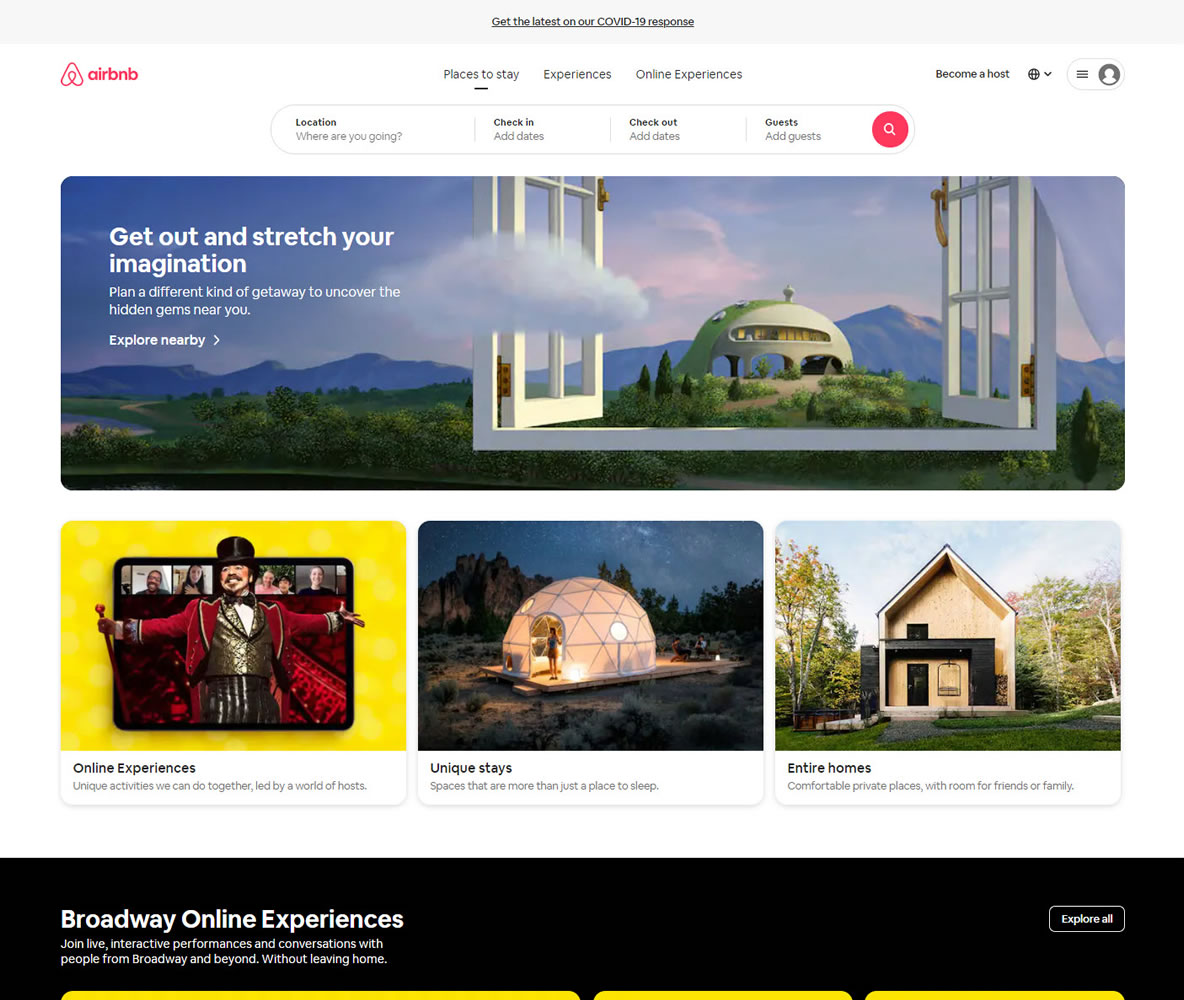
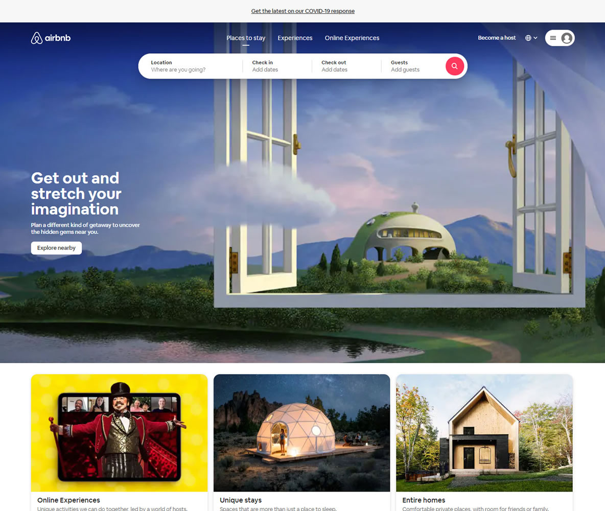
D - Sep 3, 2020 Screenshot
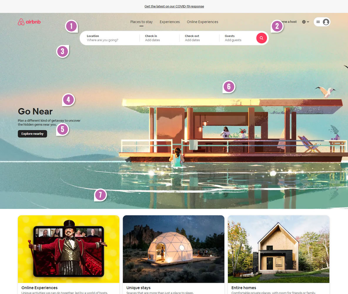
Highlighted UI Changes From This Leak
-
Smaller Search Box
One of the first changes visible in variation D is a smaller or narrower search box. I find this a little surprising as typically larger form fields have done a little better as hinted by this pattern. For example, Etsy recently detected that a larger search box worked better for them. Netflix on the other hand hit an optimal limit to the size of their signup buttons. It would have been super interesting to run this change in isolation and see the results.
This is very similar to Pattern #97: Bigger Form Fields
-
Smaller Icon Only Search Button
Equally surprising is the smaller icon only search button. Typically such buttons have been outperformed by buttons with icons and labels. Could the search icon be powerful enough to be an exception? Or does a button label still have higher potential if ran in an isolated experiment?
One additional observation is that the icon only button expands to reveal a full text label after someone enters or focuses on the location field. This could be an interesting way of directing attention first to the field itself and later to the button.
This is very similar to Pattern #2: Icon Labels
-
Input Field With Background Contrast
As the background photo was stretched in variation D, as an added effect it also made the white search box stand out more. I suspect this change might have had some subtle gains to the number of people who started searching for properties (probably a good micro engagement metric).
-
Local Messaging
The headline message was adjusted, reinforcing local or nearby searches. Could this be a message that is more inline with how some might feel these days based on what is happening with the pandemic?
-
Text Link To A Button
The "Explore Nearby" link has been changed to what looks like a more visible button style. Clicking that option sends users to a listing page with a small number of nearby destination - enabling more searches.
This is very similar to Pattern #116: Links Or Buttons
-
Adjusted Illustration
The D variation had a different illustration - possibly with the rental home being closer, different colors and maybe looking more like a home. Of course these are all subjective guesses.
-
Increased Background Image Height
Finally, the implemented D variation also has a taller background image - pushing other elements further down and possibly giving more attention to the search box. This pattern has a few positive experiments to back it up under the Full Height False Bottom pattern. Let's do keep in mind that when Airbnb ran something similar on one of their other landing pages, it seems to have been rejected.
Notes On Other Variations
For the sake of simplicity I didn't show at least 2 more variation. In reality, the experiment also had additional variations with the photo and message visible in variation D, in the same format as A and B. Just wanted to add this to paint a better picture of what is not visible here.
Comments