Are Visible Cancellation Graphs Too Much - As Airbnb Learned In Their Failed Experiment?
Some months ago Airbnb ran this experiment where they exposed a beautifully designed cancellation graph. The graph showed a series of refund scenarios someone might be eligible for relatively to the check-in date (usually shrinking over time). Fast track into the future and there is no more sign of this variant as it returned into its collapsed state hiding from view. As far as we are concerned this means one thing - the experiment failed. At least, lucky for us, it failed to beat the control which is a necessity for implementation for a rational design process like Airbnb's. Here are my thoughts as to why this might have turned out so:

B - Jan 2, 2019 Screenshot

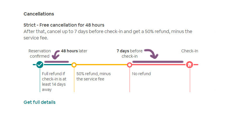
Highlighted UI Changes From This Leak
-
Visibly Increasing Loss
The cancellation message in the control (A) frames the cancellation as something positive with a lower commitment to act: It reassures people that they have 48 hours for a full refund. Flip to the variant (B) and the story is inversed with people seeing the risk of losing 50% of their deposit within 48 hours. If people are loss averse, then this alone could have dragged the whole experiment down frightening a portion of users away.
-
Two Confusing & Opposing Reference Points
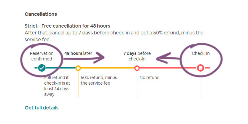
The graph shows information with two reference points which is ripe for confusion. First, readers are asked to evaluate "their eligible scenario" from the present time of booking (see the "Reservation confirmed" reference on the left with the "48 hours later".). Then, at the same time information is also shown relative to the future check-in time (see "Check-in" on the right). This creates immense ambiguity. For example, if a check-in date is tomorrow but the reservation was made today, are users eligible for a full refund or no refund at all?
A better approach would have been to pick a single time frame and display all information accordingly to avoid such confusion.
-
Lack Of Specific Dates & Times
When information is presented relatively as 14 or 7 day references, users need to do the intense calculations themselves. It would have been more beneficial if specific dates and times were added to clarify the key date points. For example: "7 day before check-in" could also have appended a specific date and time such as "Fri June 7th, 14pm+". I suspect that hour references in this contexts could be important to clarify.
-
Misaligned Labels And Descriptions
Notice that the time labels are shown as points along a line and yet the actual eligibility is a time frame. More so, the above variation also doesn't follow a consistent application of the labels (the "48 hours" label applies leftwards and the "7 days" label applies rightwards). This is a case of informational mismatch. I suspect that the labels should be aligned closer together with their corresponding descriptions for even less ambiguity.
Overall, given that experiments run for weeks, it probably is worth to fine tune them a bit more before launch. This can increase their odds of success and minimize failures (easier said than done). With some adjustments perhaps this experiment might still have some remaining potential for a greener outcome. :)
Somewhat Similar To Netflix?
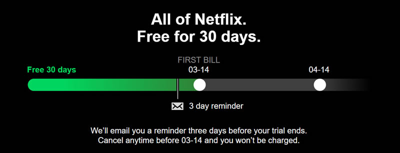
Interestingly, I also find this Airbnb variation slightly similar to a billing visual experiment which also failed for Netflix. Is this a negative pattern in the making here? Perhaps so. But let's remember that Netflix ran this experiment with numerous other changes - hence a comparison is confounded by multiple variables.


Comments
Ashwin 7 years ago ↑1↓0
Adding colors to timeline like this is not sensible. Unless its a e-commerce tracking for shipment
Reply
Maureen 7 years ago ↑0↓0
The red toward check-in seems like a warning as well. Not a positive reinforcement, which might sway users from purchasing.
Reply