All Latest 620 A/B Tests
Test #123 on
Getninjas.com.br
by  Rodolfo Lugli
Feb 11, 2022
Mobile
Thank You
X.X%
Engagement
Rodolfo Tested Pattern #71: Personalized Next Step On Getninjas.com.br

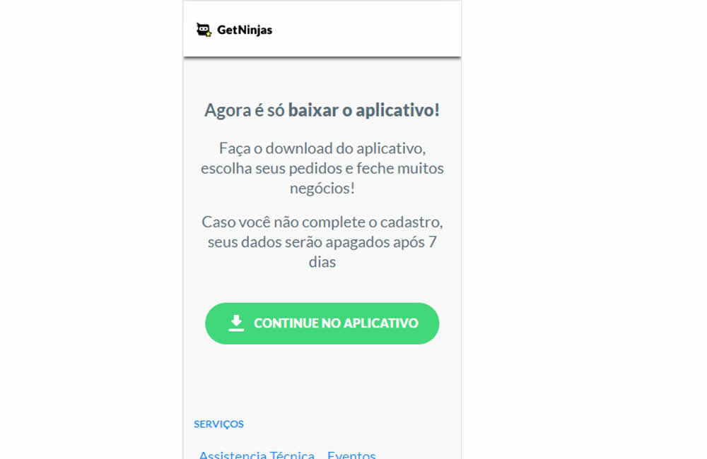
In this experiment, two app download buttons were tested against a single OS personalized one. In the control, both branded App Store and Google Play buttons were shown statically. Whereas in the variation a single download (stylized consistently with site wide button styles) button was shown depending on the user's operating system. Impact on application download was measured.
Which A Or B Actually Wins? Find Out Before You Test.
Members see every test result — the winners, the flat ones, and the losers — along with exact effects and sample sizes. Use it to estimate your tests and prioritize by probability, not gut feel. Start every experiment with the odds on your side.
Test #342 on
Backstage.com
by  Stanley Zuo
Feb 28, 2021
Desktop
Mobile
Listing
X.X%
Engagement
Stanley Tested Pattern #25: Nagging Results On Backstage.com
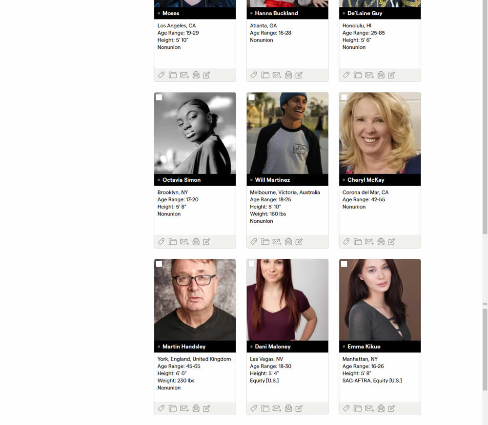
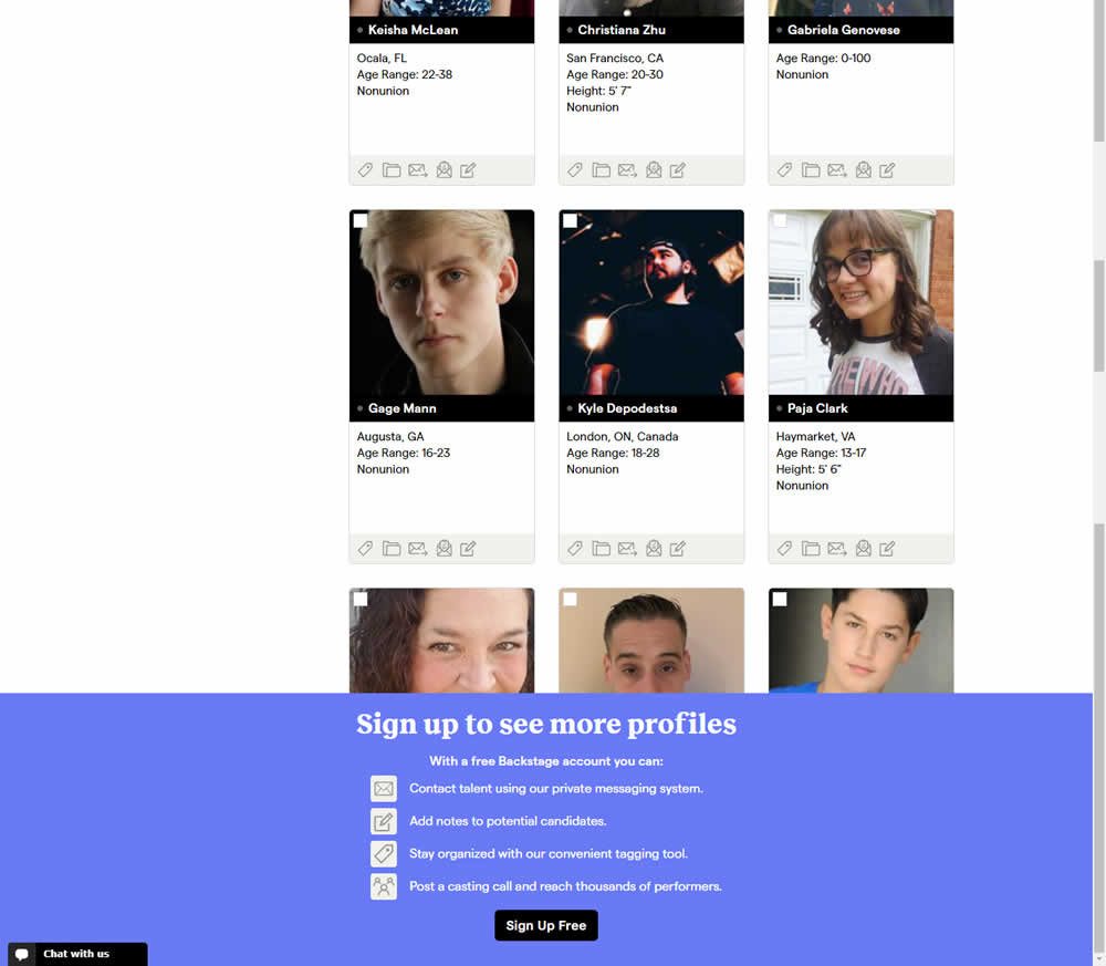
In this experiment, a registration wall was added on a listing page of casting call profiles. The registration wall appeared after the first 9 listings or so and encouraged users to sign up. Impact on registrations was measured, along with an engagement metric of "posting a job".
Test #303 on
Thomasnet.com
by  Julian Gaviria
Jun 26, 2020
Desktop
Mobile
Global
X.X%
Engagement
Julian Tested Pattern #14: Exposed Menu Options On Thomasnet.com


In this experiment variation, the saved suppliers feature was surfaced in the global navigation.It was already possible to save supplier companies from listing and specific company pages. This experiment aimed to increase the saving functions visibility and possibly increase more leads.
Test #295 on
Thomasnet.com
by  Julian Gaviria
Apr 29, 2020
Desktop
Mobile
Content
X.X%
Engagement
Julian Tested Pattern #25: Nagging Results On Thomasnet.com
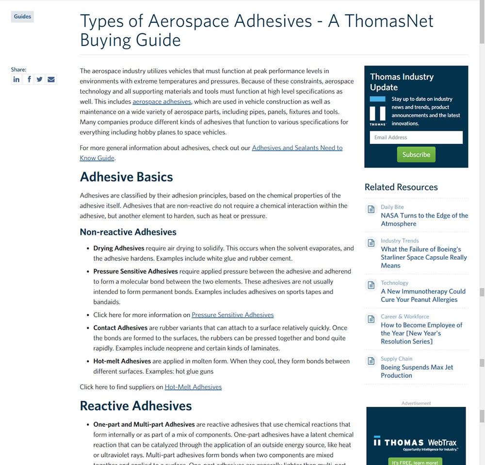
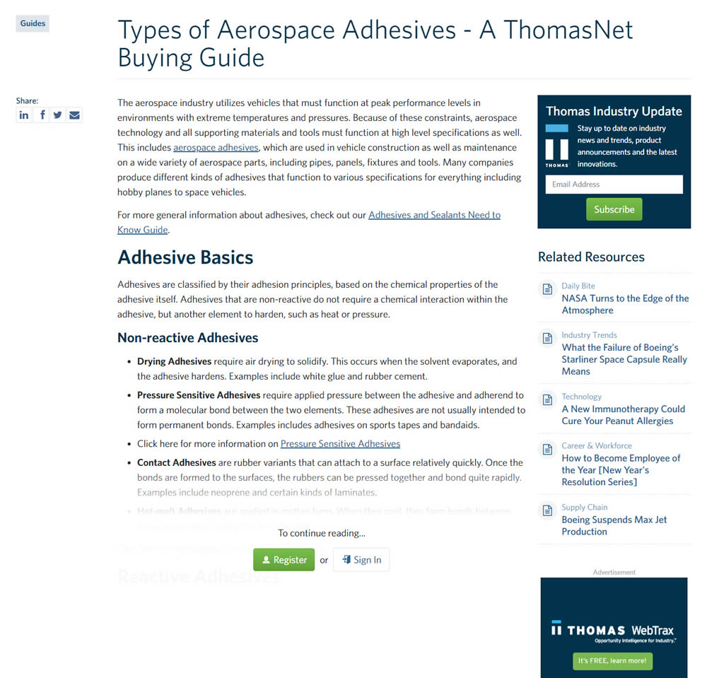
In this experiment, blog article pages were hidden behind a registration wall - requing a signup to access. The registration wall would appear after the first paragraph using gradual opacity to cover the rest of the article. We have published the effects of this change on registrations (signups) and on engagement (users viewing other more important company detail pages).
Test #252 on
Thomasnet.com
by  Julian Gaviria
Jul 30, 2019
Desktop
Mobile
Content
X.X%
Engagement
Julian Tested Pattern #107: Contrast Links & Buttons On Thomasnet.com
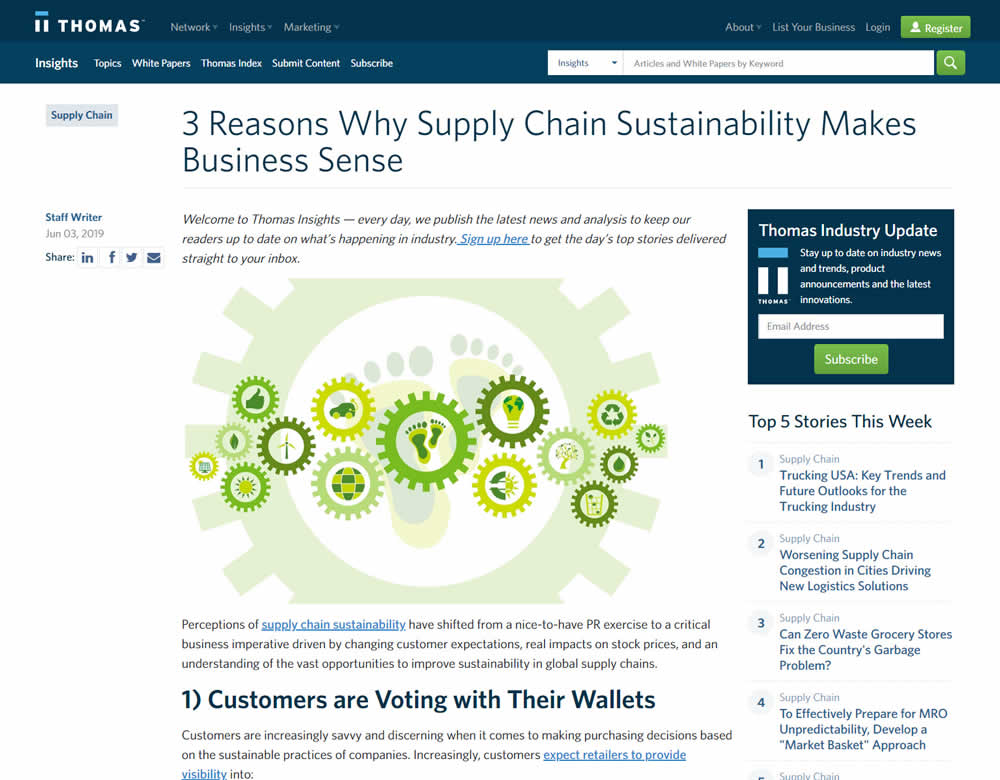
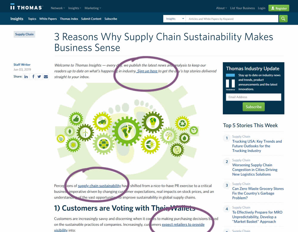
In this experiment a light blue bold link was tested against a darker blue bold link.
Test #251 on
Goodui.org
by  Jakub Linowski
Jul 25, 2019
Desktop
Mobile
Content
X.X%
Engagement
Jakub Tested Pattern #57: Maybe Later On Goodui.org


In this experiment, we tested a standard modal (with 2 choices) against a "Maybe Later" one (with 3 choices). One of the choices in the variant allowed users to postpone their decision with a "maybe" which would enable a floating bar at the bottom of the screen. Clicking on any of the "Yes" options would send people to the bottom of the screen with an email signup form. Increasing signup was our primary measure. Both modals also appeared instantly after a page load.
Test #247 on
Thomasnet.com
by  Julian Gaviria
Jun 13, 2019
Desktop
Mobile
Content
X.X%
Engagement
Julian Tested Pattern #41: Sticky Call To Action On Thomasnet.com
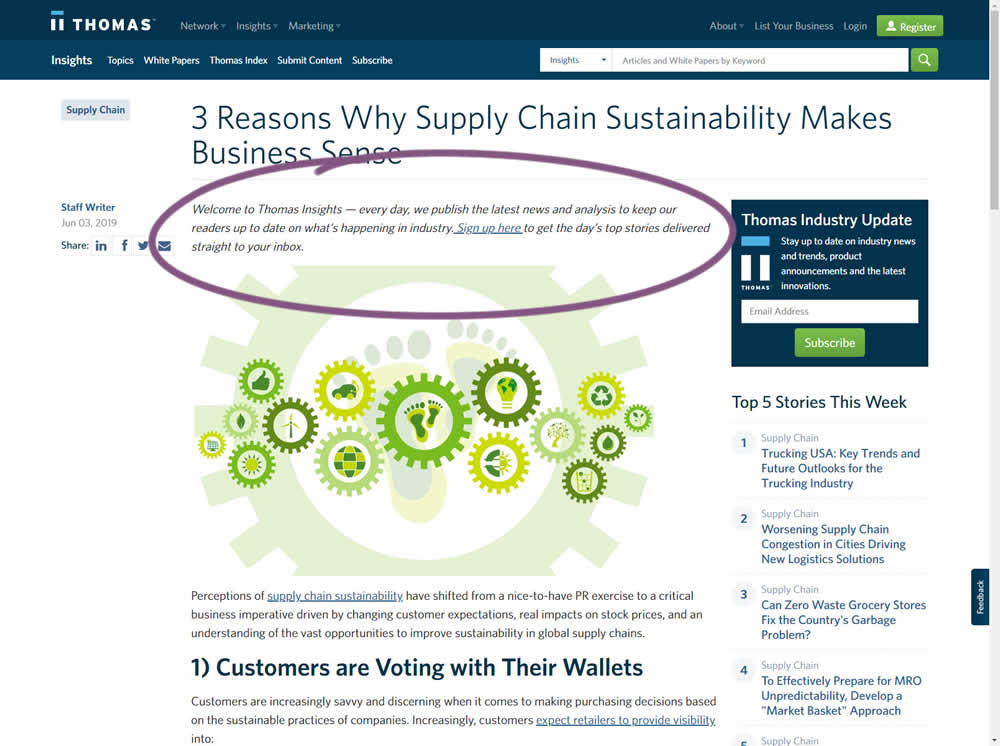
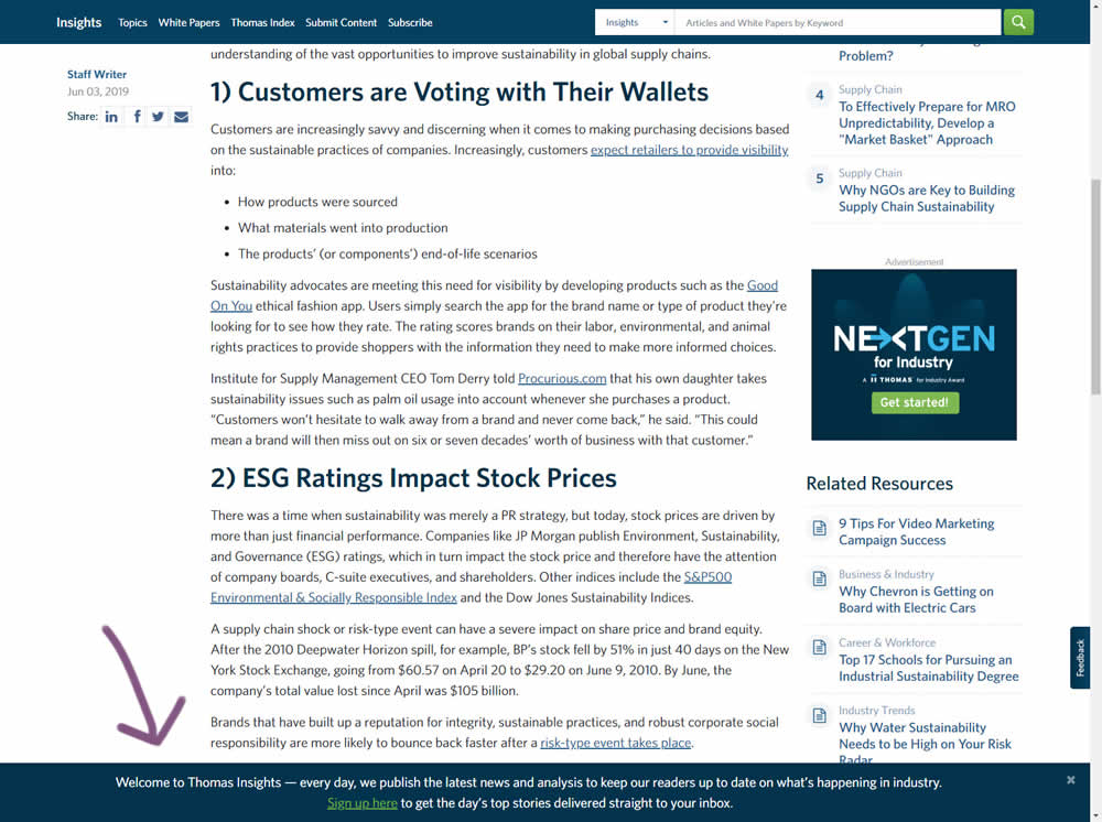
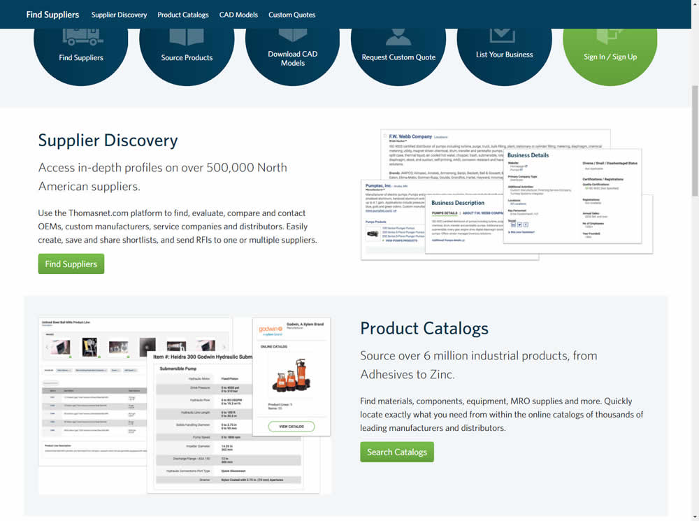
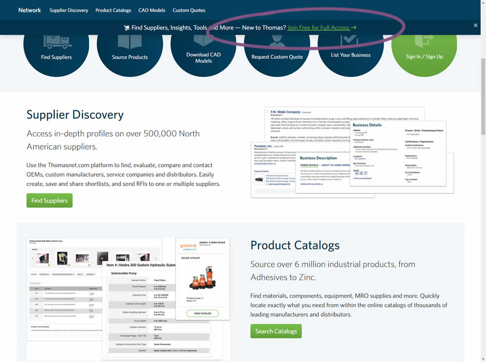
In this experiment, the same message (with a link) for signing up to a newsletter was shown in two distinct ways. The control (A) showed the signup message as inline one that preceded the content of the article at the very top. The variant showed the same signup message as a scroll-delayed sticky interaction at the bottom of the screen. The background color of the B variant was also inverted to match the style of the footer.
Test #240 on
Thomasnet.com
by  Julian Gaviria
May 16, 2019
Desktop
Listing
X.X%
Engagement
Julian Tested Pattern #13: Centered Forms & Buttons On Thomasnet.com
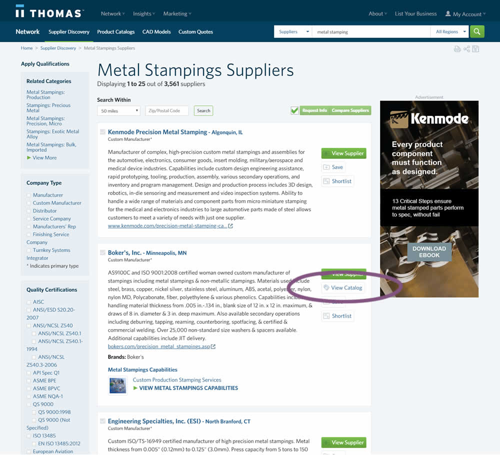
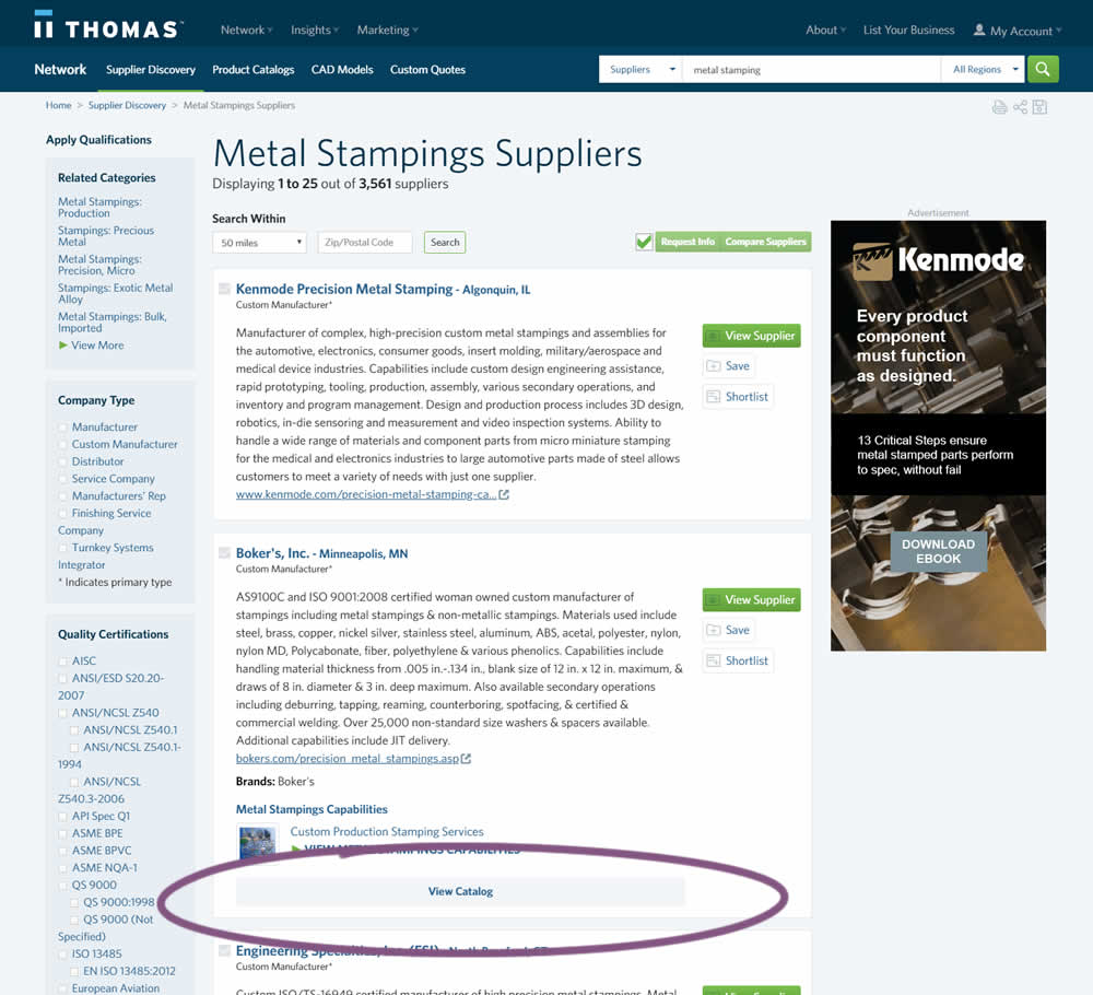
In this experiment, two different positions of the View Catalog button were compared. In version A the button was smaller and on the right. In version B the button was wider and more central. (The actual test was inverted before publishing to match the A-B of the pattern.)
Test #230 on
Goodui.org
by  Jakub Linowski
Mar 09, 2019
Desktop
Mobile
Listing
X.X%
Engagement
Jakub Tested Pattern #56: Hover Button On Goodui.org
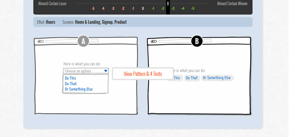
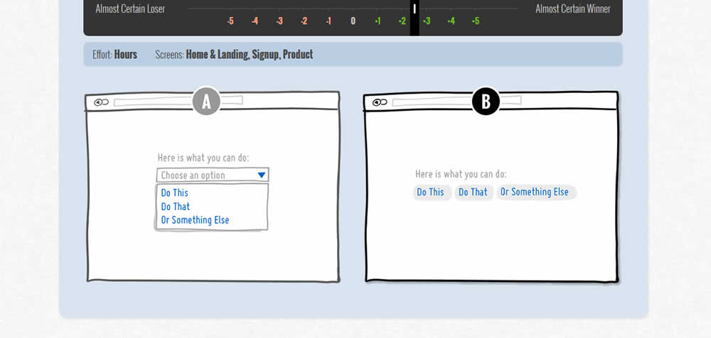
In this test we tested onhover buttons (variant) versus more traditional always exposed and visible ones.
Test #219 on
Mt.com
by  Vito Mediavilla
Jan 14, 2019
Desktop
Mobile
Home & Landing
X.X%
Engagement
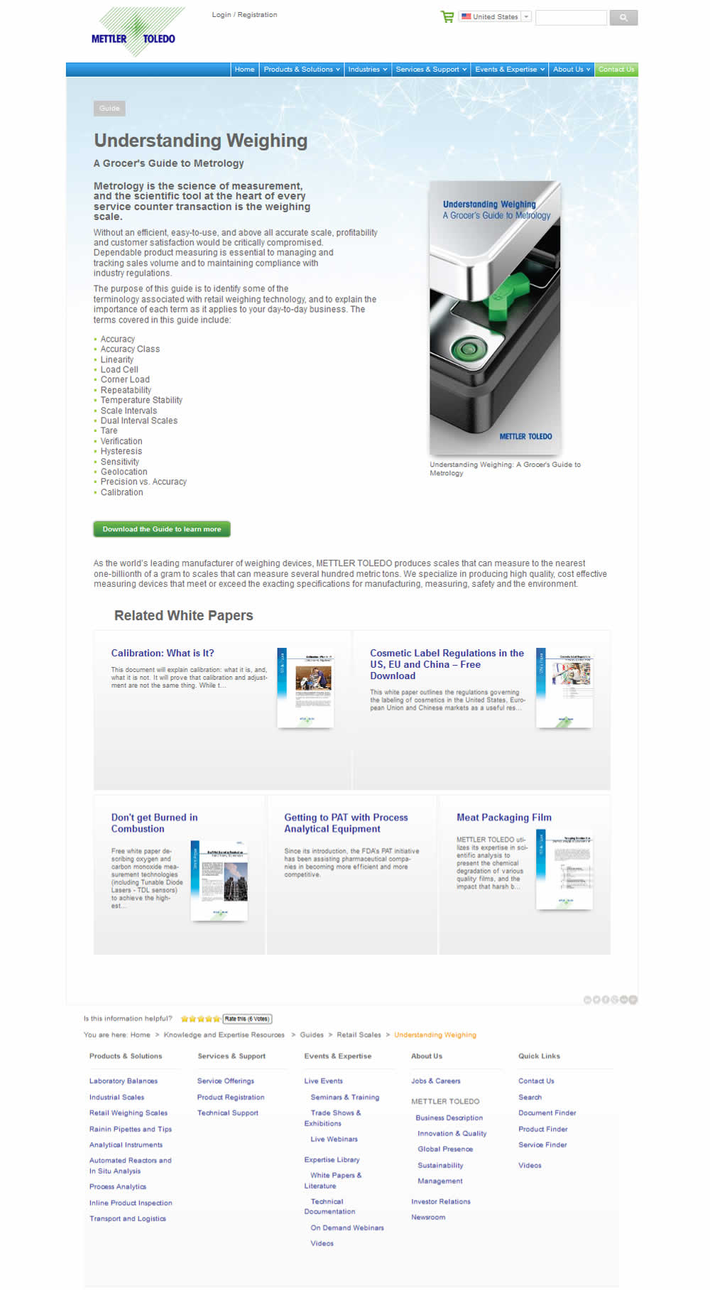
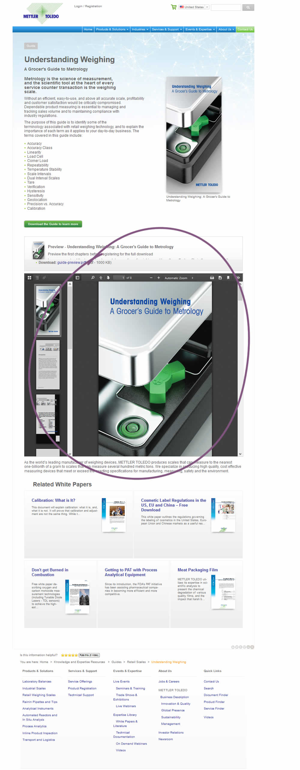
Vito Tested Pattern #95: Clickable Product Previews On Mt.com
Test #217 on
Thomasnet.com
by  Julian Gaviria
Jan 03, 2019
Desktop
Mobile
Home & Landing
X.X%
Engagement
Julian Tested Pattern #41: Sticky Call To Action On Thomasnet.com
Test #205 on
Msn.com
by  Ronny Kohavi
Oct 25, 2018
Desktop
Home & Landing
X.X%
Engagement
Ronny Tested Pattern #36: Fewer Or More Results On Msn.com

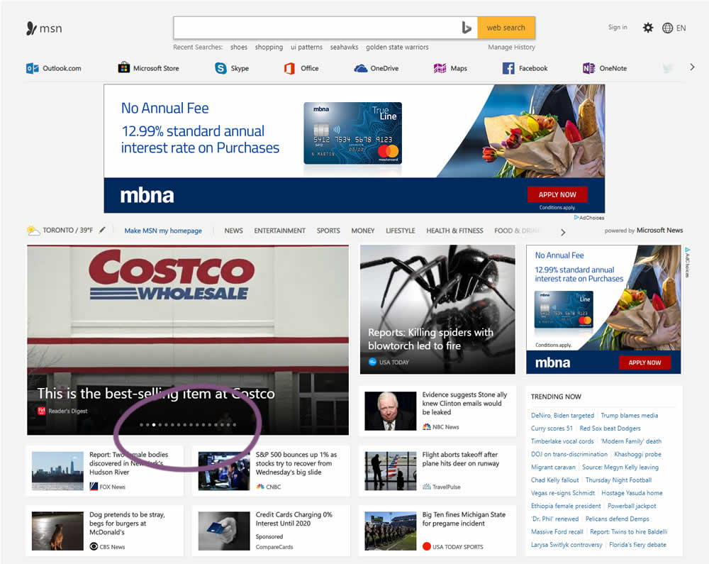
In this experiment, the carousel items were increased from 12 to 16.
Test #182 on
Yummly.com
by  Marcos Ciarrocchi
Jun 12, 2018
Desktop
Listing
X.X%
Engagement
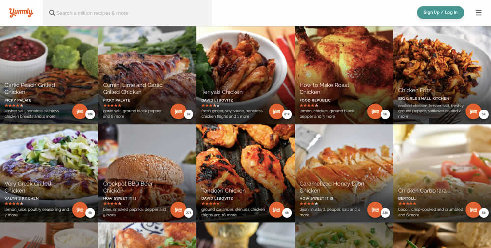
Marcos Tested Pattern #6: Customer Star Ratings On Yummly.com
Test #173 on
Rollbar.com
by  Mike Smith
May 08, 2018
Desktop
Mobile
Home & Landing
X.X%
Engagement
Mike Tested Pattern #22: Empowering Headline On Rollbar.com
