All Latest 620 A/B Tests
MOST RECENT TESTS
Test #643 on
Backstage.com
by  Stanley Zuo
Mar 28, 2026
Desktop
Mobile
Home & Landing
X.X%
Signups
Stanley Tested Pattern #135: Product Categories On Backstage.com

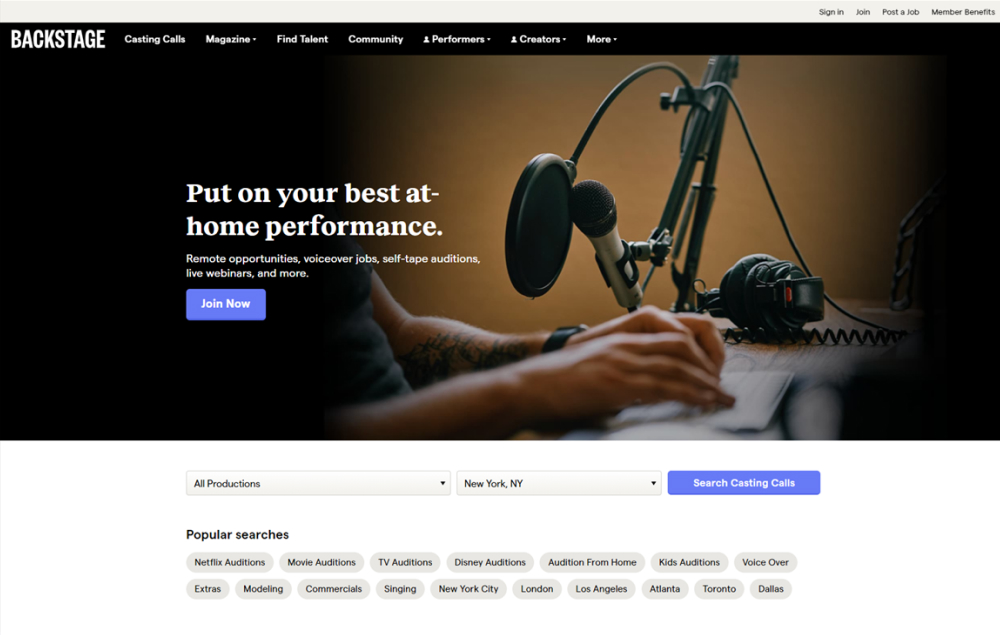
In this experiment, more popular search categories (pills) were shown on the homepage based on analyzed search volume. Impact on searches and email subscriptions were measured.
Which A Or B Actually Wins? Find Out Before You Test.
Members see every test result — the winners, the flat ones, and the losers — along with exact effects and sample sizes. Use it to estimate your tests and prioritize by probability, not gut feel. Start every experiment with the odds on your side.
Test #618 on
Livefresh.de
by  Pascal Dietz
Oct 31, 2025
Desktop
Mobile
Home & Landing
X.X%
Sales
Pascal Tested Pattern #11: Gradual Reassurance On Livefresh.de
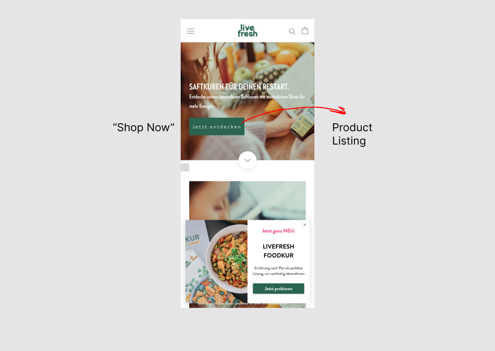
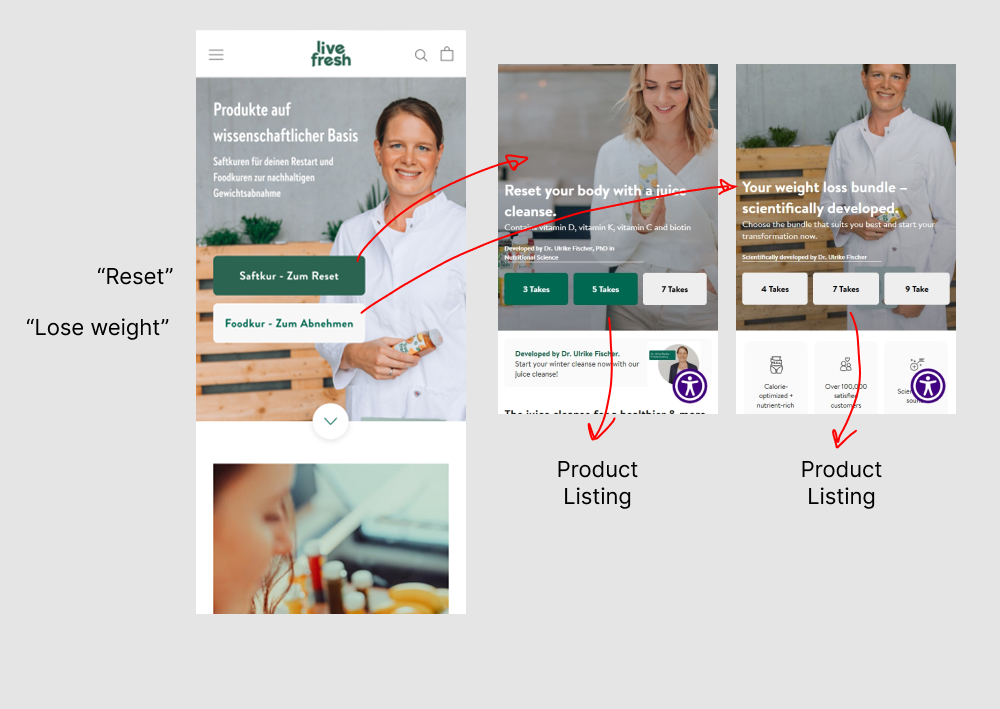
In this experiment, the homepage interaction, headline, and images were changed. In the control, users saw a single “Shop Now” button leading directly to products. In the variation, users first chose between “Reset” or “Lose Weight,” then selected a duration in days before being shown products. The impact on sales was measured.
Test #614 on
Kay.com
by  Craig Kistler
Oct 23, 2025
Mobile
Home & Landing
X.X%
Sales
Craig Tested Pattern #26: Cart Reminder And Recently Viewed On Kay.com
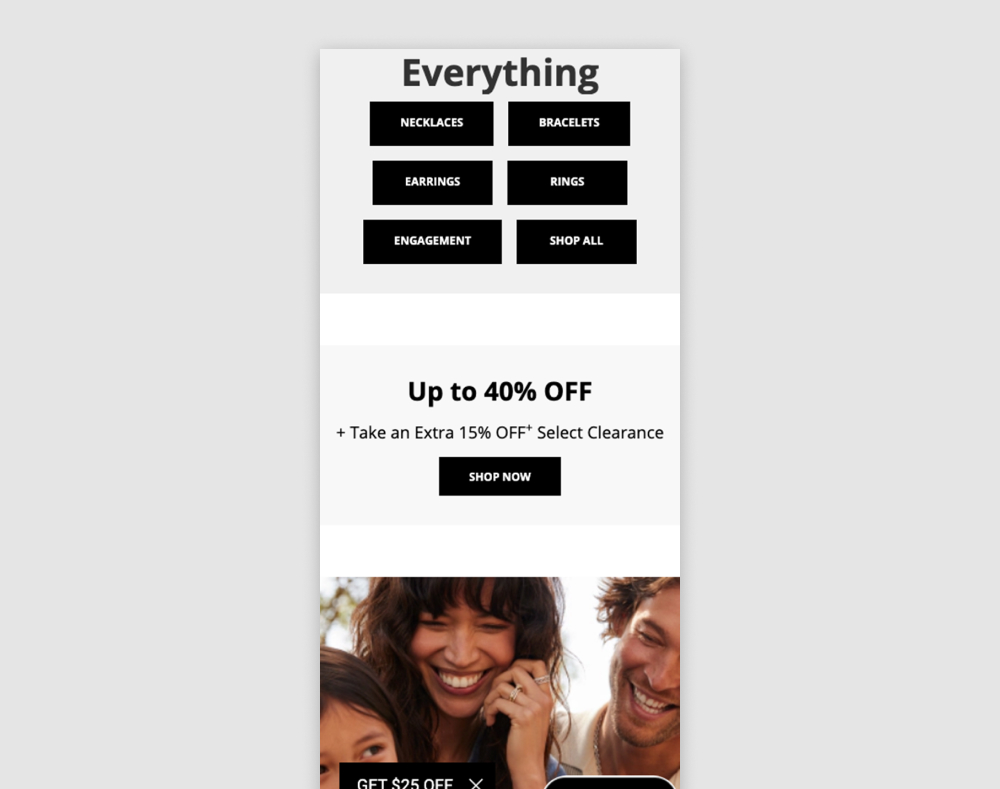
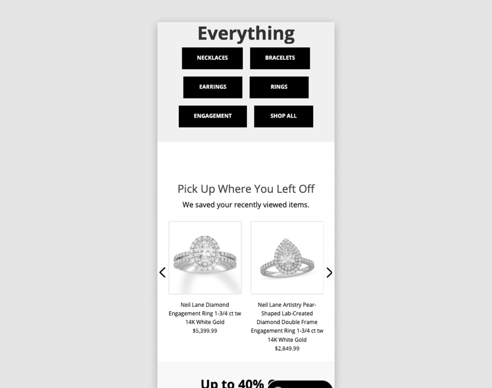
In this experiment, returning users to a homepage would be shown recently viewed items. Impact on adds to cart and sales was measured. The experiment was triggered to returning users.
Test #613 on
Online.metro-cc.ru
by  Andrey Andreev
Sep 30, 2025
Desktop
Home & Landing
X.X%
Sales
Andrey Tested Pattern #135: Product Categories On Online.metro-cc.ru
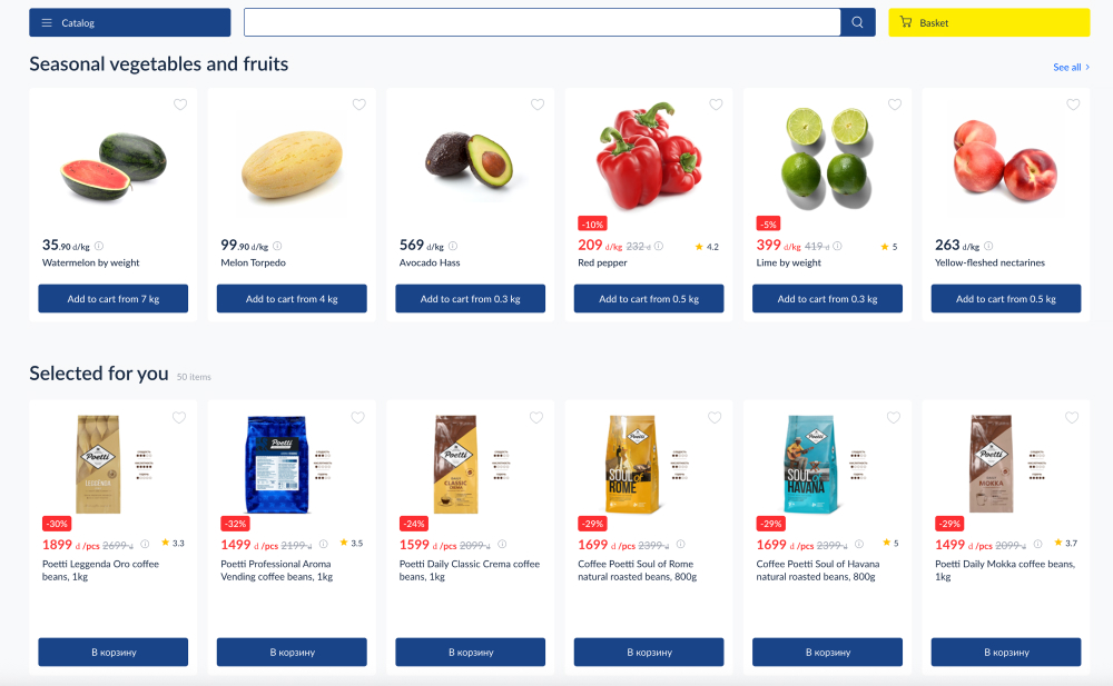
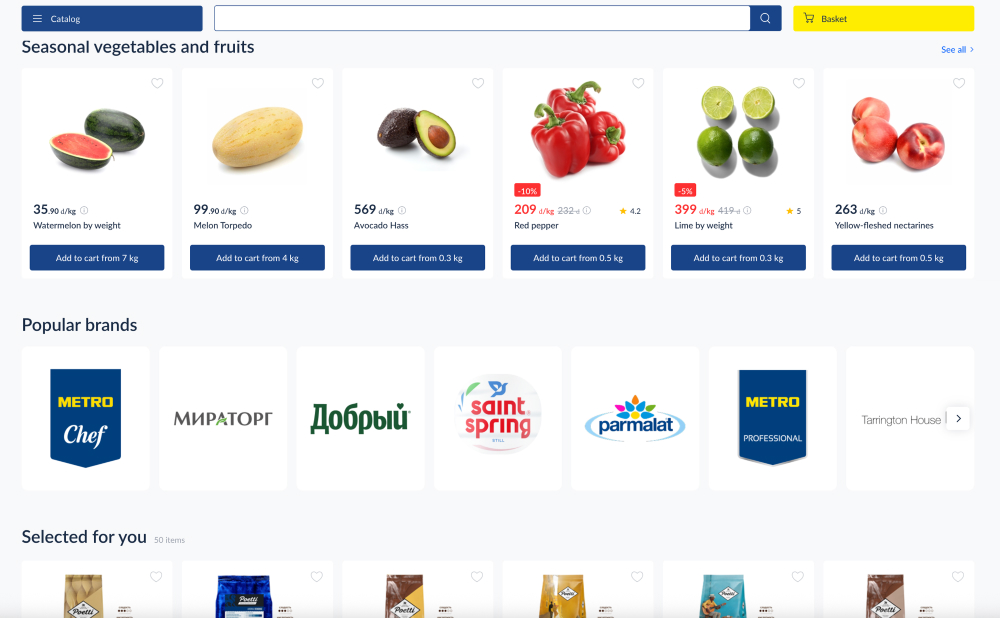
In this experiment, a series of brand logos with links to product listing pages were added - enabling another layer of search. Impact on products purchased was measured.
Test #590 on
Online.metro-cc.ru
by  Andrey Andreev
May 15, 2025
Desktop
Home & Landing
X.X%
Sales
Andrey Tested Pattern #45: Benefit Bar On Online.metro-cc.ru
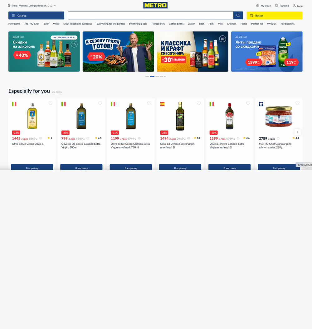
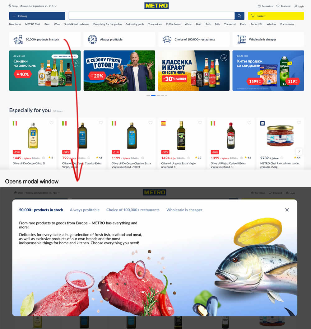
In this experiment, 4 selling points were added at the top of the homepage. Clicking on them would launch a modal with more details.
Test #570 on
Livefresh.de
by  Melina Hess
Dec 30, 2024
Desktop
Mobile
Home & Landing
X.X%
Sales
Melina Tested Pattern #79: Product Highlights On Livefresh.de
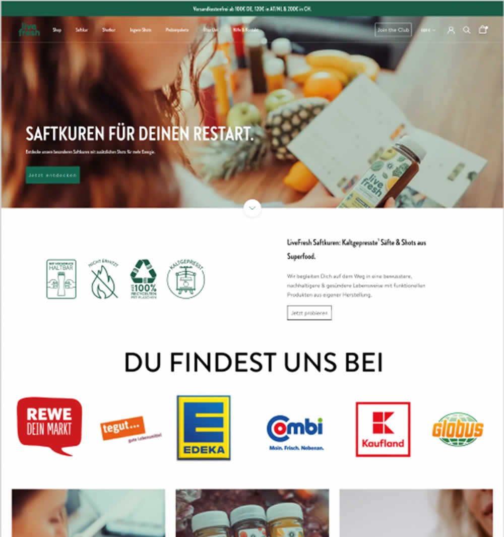
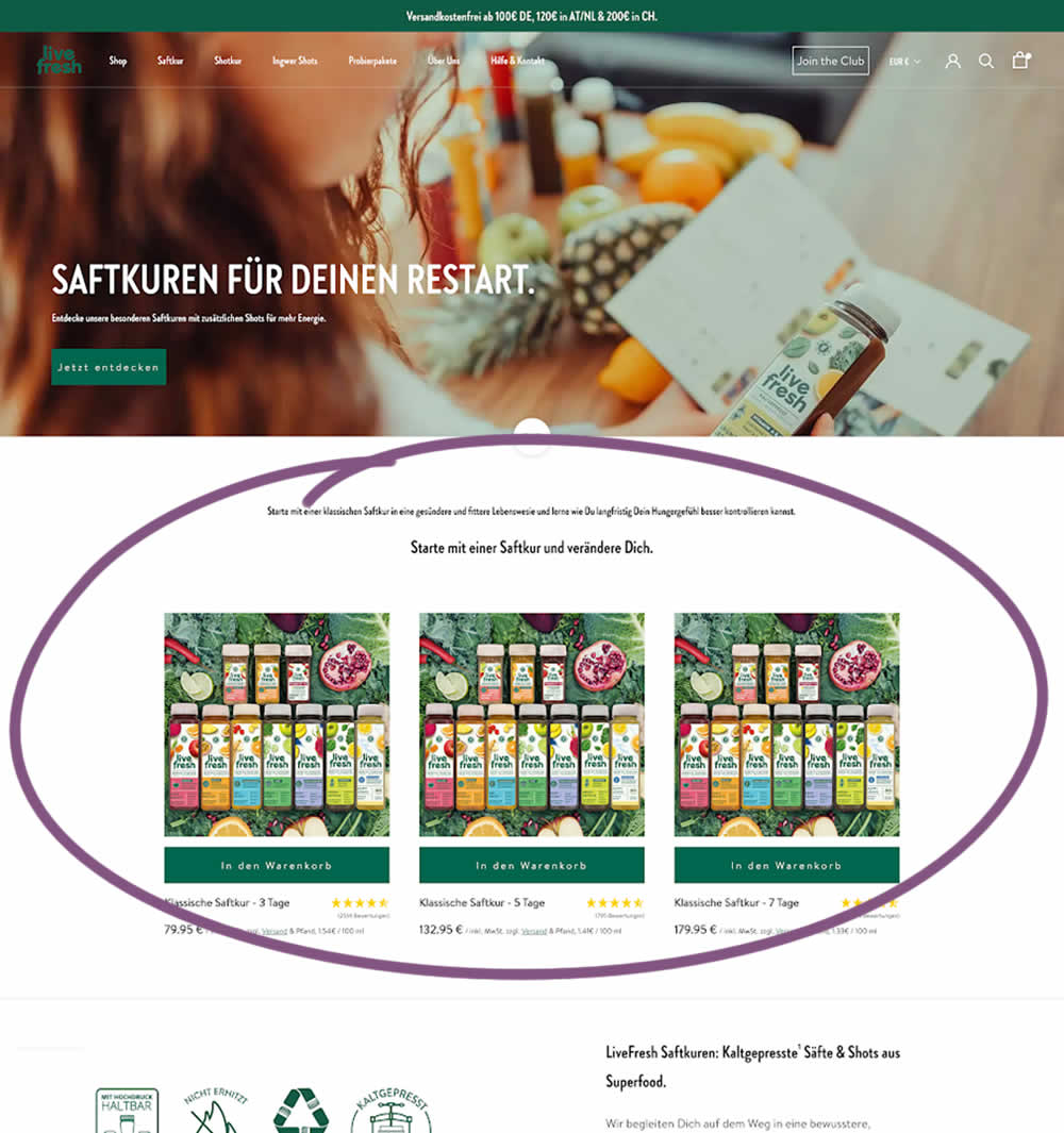
In this experiment, three popular juice products were shown higher on the variation (instead of lower in the control). Impact on sales was measured.
Test #567 on
Online.metro-cc.ru
by  Andrey Andreev
Dec 18, 2024
Mobile
Desktop
Home & Landing
X.X%
Sales
Andrey Tested Pattern #135: Product Categories On Online.metro-cc.ru
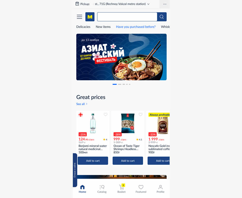
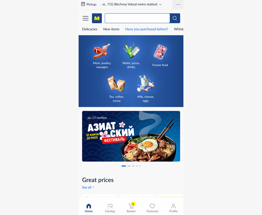
In this experiment, the variation added popular categories with links at the top of the homepage. This was done for all sets of user segments: new and returning. Impact on transactions was measured.
Test #565 on
Umbraco.com
by  Lars Skjold Iversen
Nov 30, 2024
Desktop
Home & Landing
X.X%
Leads
Lars Tested Pattern #129: Right Or Left Aligned Forms On Umbraco.com
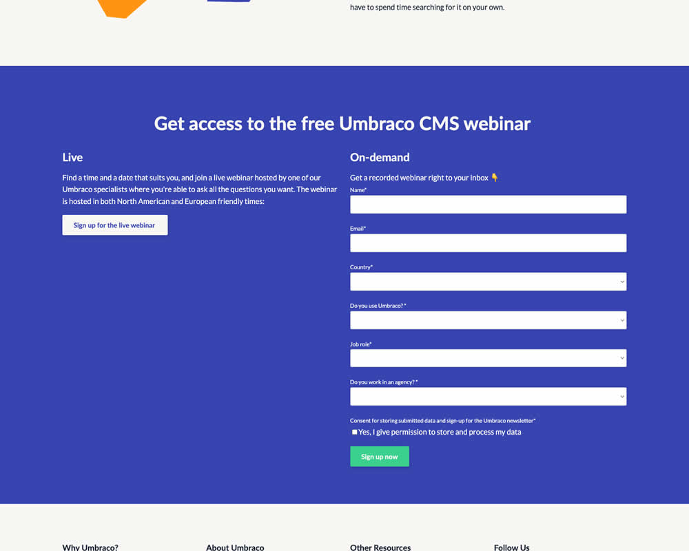
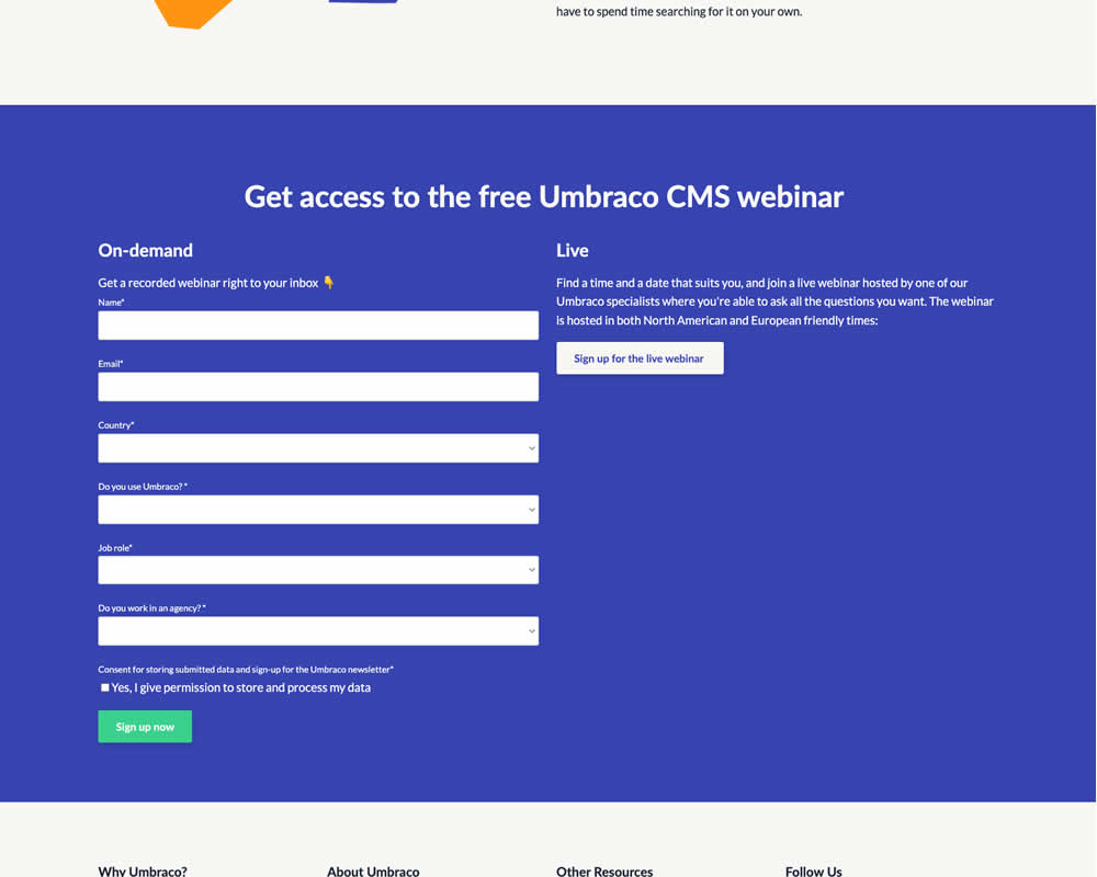
In this experiment, the right vs left position of a form (at the bottom of a landing page) was a/b tested. Impact on progression and form completion was measured.
Test #564 on
Hellostake.com
by  Louis Alston
Nov 26, 2024
Desktop
Mobile
Home & Landing
X.X%
Signups
Louis Tested Pattern #114: Less Or More Visible Prices On Hellostake.com


In this a/b test, the headline was changed to reflect pricing information (informing that trades are starting at $3). Impact on progression and signups was measured.
Test #563 on
Expertinstitute.com
by  Ardit Veliu
Nov 19, 2024
Desktop
Home & Landing
X.X%
Leads
Ardit Tested Pattern #108: Frequently Asked Questions On Expertinstitute.com


In this RETEST experiment, a Frequently Asked Questions section was added near the bottom of a short lead gen form. This test ran on one of Expert Institute's landing pages for their expert witness seeking services. Impact on leads was measured. It was also triggered by users who scrolled at least 100px downwards towards the FAQ section.
Test #542 on
Expertinstitute.com
by  Ardit Veliu
Jul 17, 2024
Desktop
Home & Landing
X.X%
Leads
Ardit Tested Pattern #108: Frequently Asked Questions On Expertinstitute.com
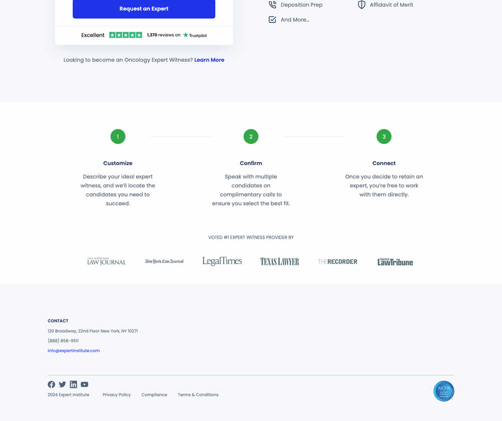
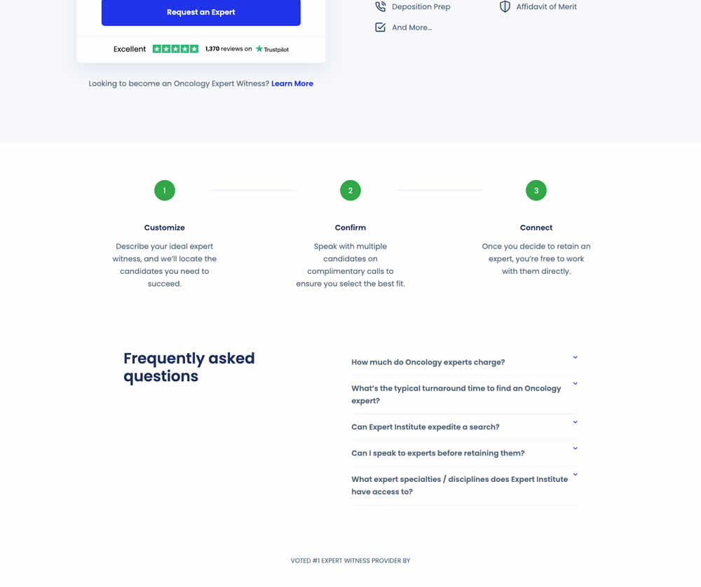
In this experiment, a Frequently Asked Questions section was added near the bottom of a short lead gen form. This test ran on one of Expert Institute's landing pages for their expert witness seeking services. Impact on leads was measured.
Test #521 on
Finn.com
by  Maksim Meged
Mar 14, 2024
Mobile
Home & Landing
X.X%
Sales
Maksim Tested Pattern #26: Cart Reminder And Recently Viewed On Finn.com
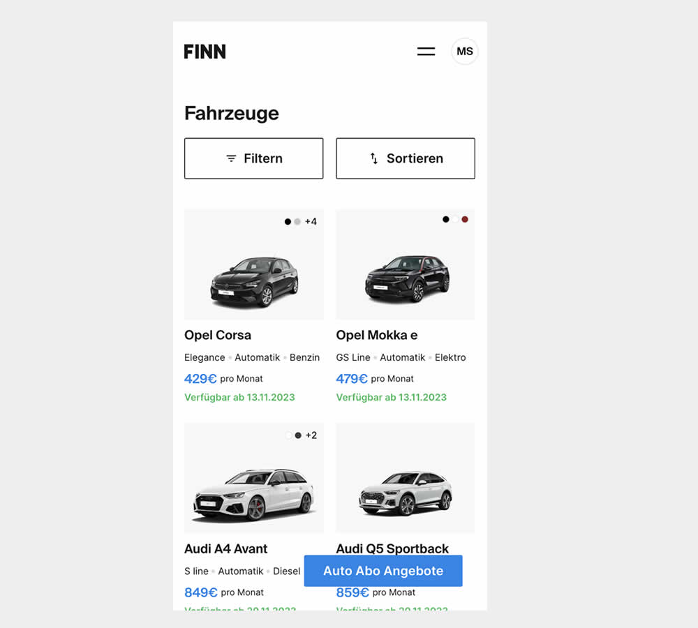
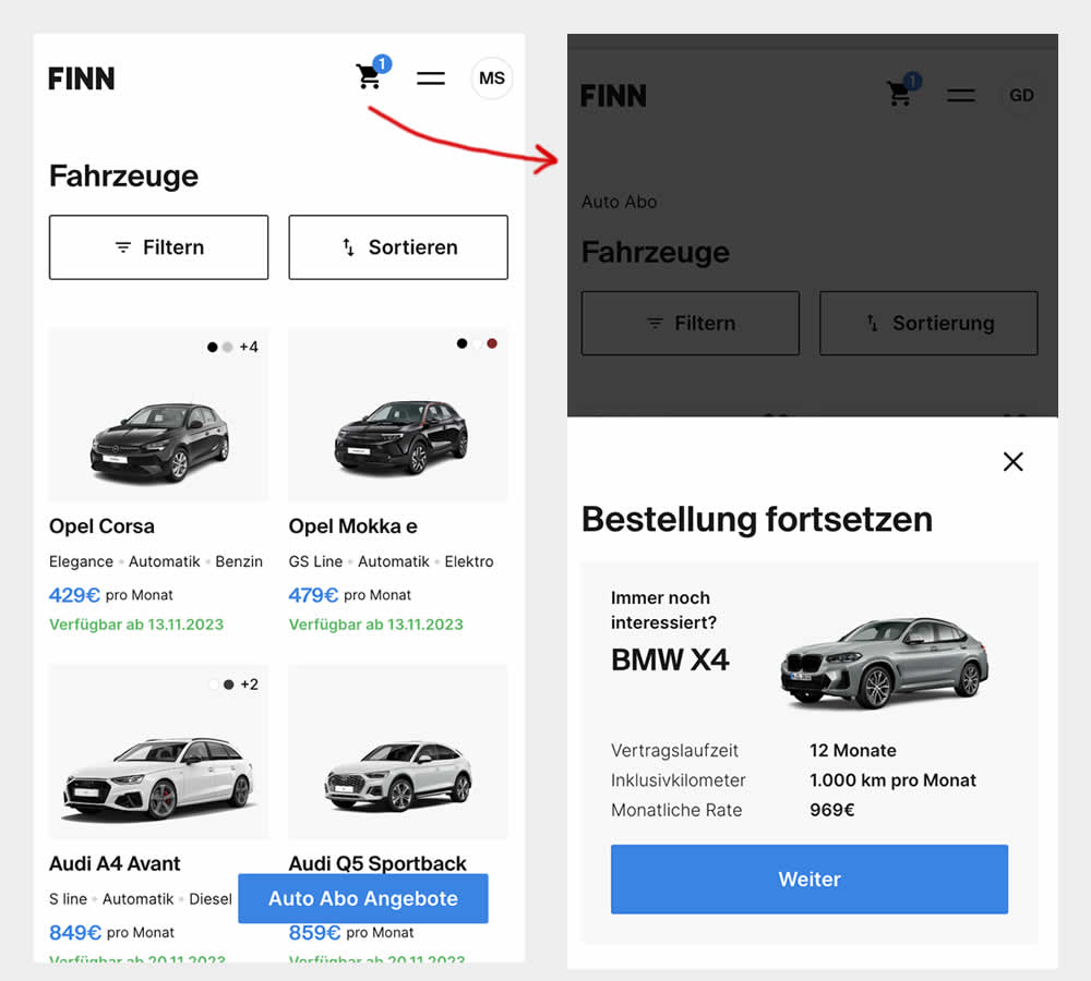
This experiment was triggered by a small segment of users who completed the first step of checkout funnel (submitted email, name, phone number), but dropped from checkout and returned to cars catalogue 7 or more minutes later.
In the control, users didn't see any cart icon nor function to resume their checkout flow.
In the variation however, users saw a filled shopping cart icon with resume functionality. Clicking on the icon would guide and redirect users to their latest abandoned stage of their checkout flow.
Test #515 on
by  Jakub Linowski
Jan 31, 2024
Desktop
Mobile
Home & Landing
X.X%
Sales
Jakub Tested Pattern #69: Autodiscounting
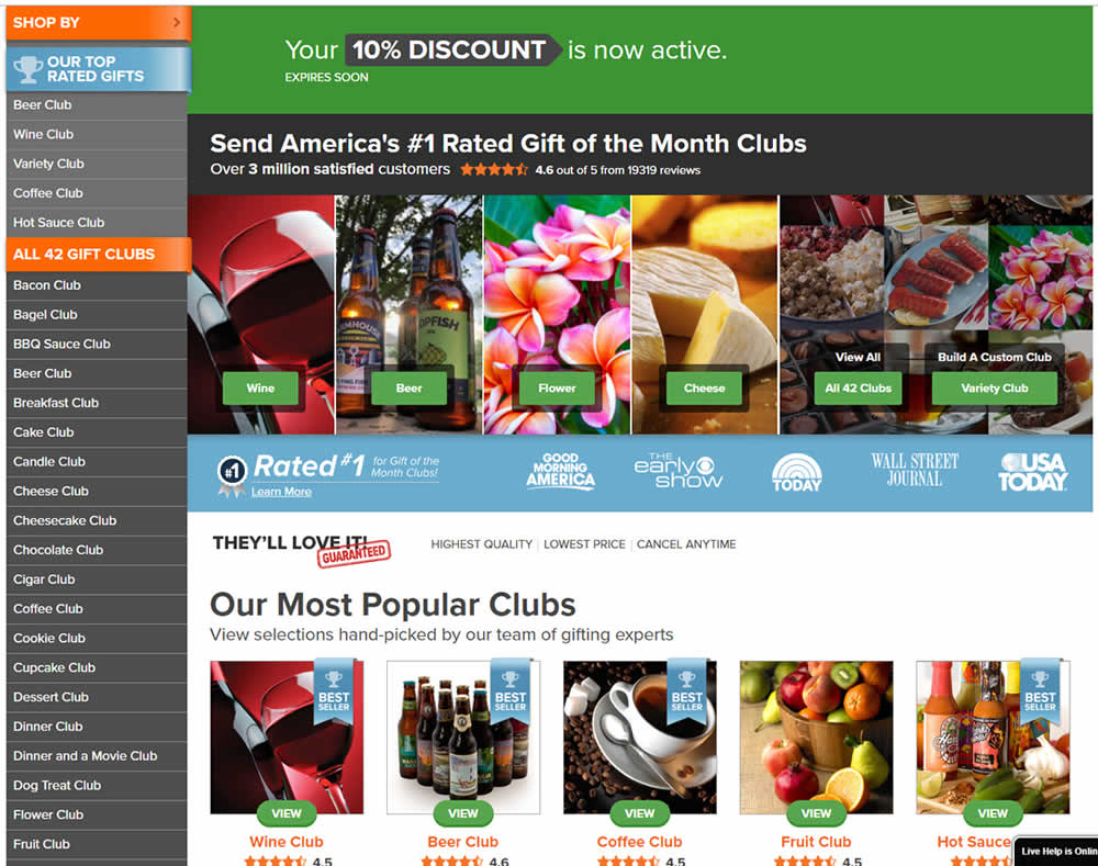
In this experiment, people who saw an offer (in an email or popup) would see a more visible site wide reinforcement of their earned discount being active. In the control, the discount was only shown during checkout. In the variation, it was shown throughout the web site on the homepage and product detail pages.
Test #511 on
Online.metro-cc.ru
by  Andrey Andreev
Jan 09, 2024
Desktop
Home & Landing
X.X%
Sales
Andrey Tested Pattern #79: Product Highlights On Online.metro-cc.ru
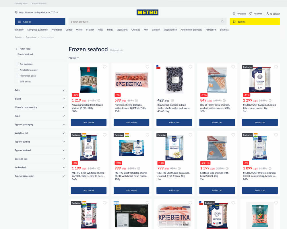
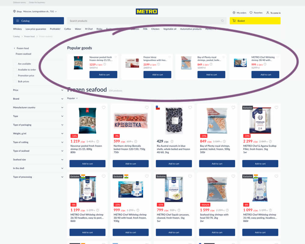
In this experiment, popular products were shown at the top of the homepage. Impact to sale was measured.
Test #510 on
Formelskin.de
by  Alexander Krieger
Dec 21, 2023
Mobile
Home & Landing
X.X%
Sales
Alexander Tested Pattern #26: Cart Reminder And Recently Viewed On Formelskin.de
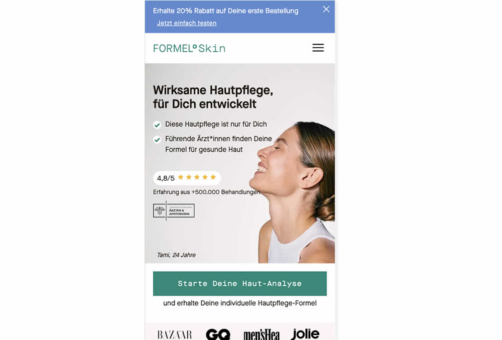
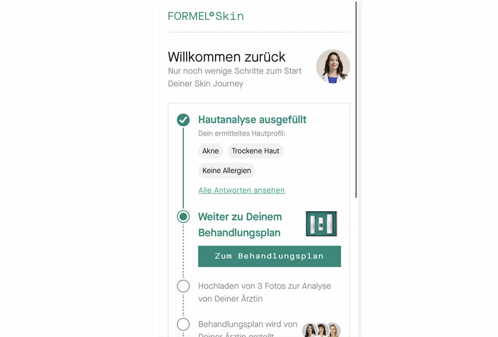
In this experiment, users that did not complete a purchase and came back to the homepage were shown two different experiences. In the control, users would see the homepage (essentially having to restart the purchase flow). Whereas, in the variation, users would be shown a "Welcome Back" summary view with the completed steps shown as completed and a quick resume button to the next incomplete step. Impact on completed sales was measured.
Test #503 on
by  Jakub Linowski
Nov 05, 2023
Desktop
Mobile
Home & Landing
X.X%
Sales
Jakub Tested Pattern #36: Fewer Or More Results
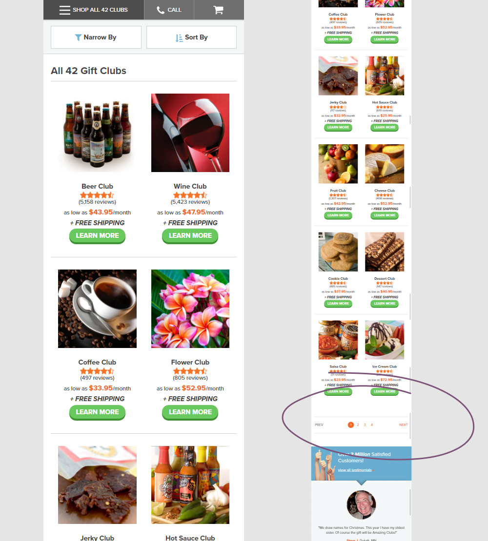
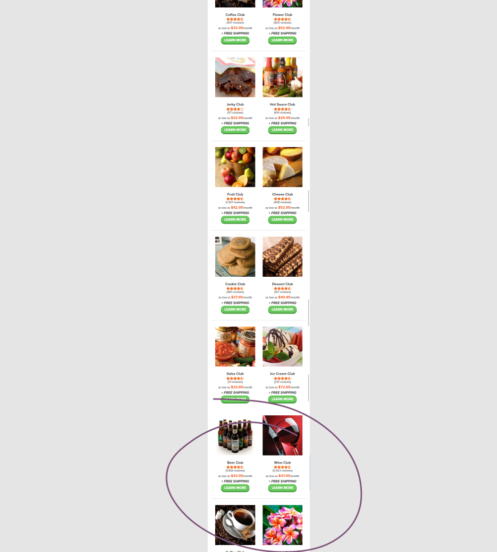
In this experiment, instead of showing 12 products per screen (with pagination), the variation showed all 42 products on a single screen. Impact on adds to cart and completed orders was measured.
Test #494 on
Online.Metro-cc.ru
by  Andrey Andreev
Sep 20, 2023
Desktop
Mobile
Home & Landing
X.X%
Sales
Andrey Tested Pattern #26: Cart Reminder And Recently Viewed On Online.Metro-cc.ru
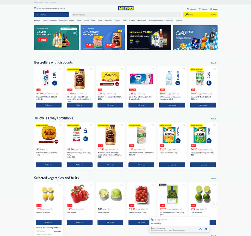
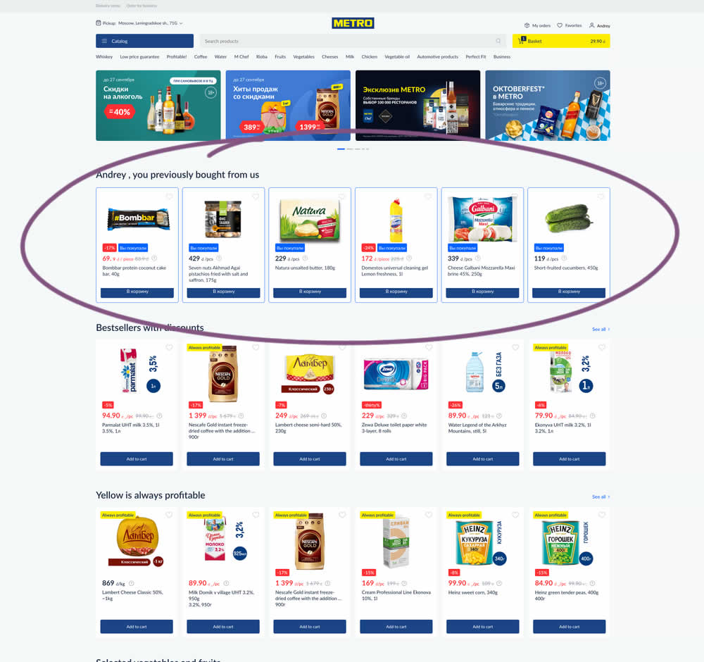
In this experiment, recently purchased products were appended at the top of the homepage. The test ran for loggedin users only. Impact on add-to-cart, sales and revenue was measured.
Test #474 on
Rollbar.com
by  Mike Smith
May 27, 2023
Desktop
Mobile
Home & Landing
X.X%
Signups
Mike Tested Pattern #4: Testimonials On Rollbar.com
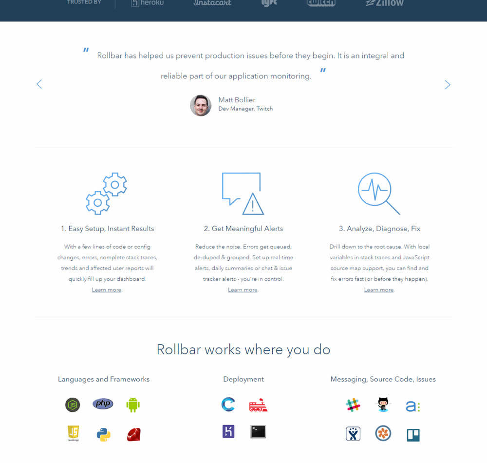
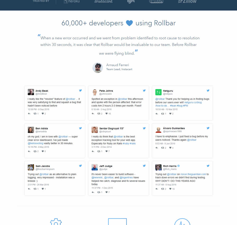
In this experiment, 9 Twitter card style testimonials were appended onto the homepage of Rollbar. These were image / screenshots recreations without links to the actual tweets.
Test #473 on
by  Jakub Linowski
May 26, 2023
Desktop
Home & Landing
X.X%
Sales
Jakub Tested Pattern #19: Benefit Testimonials
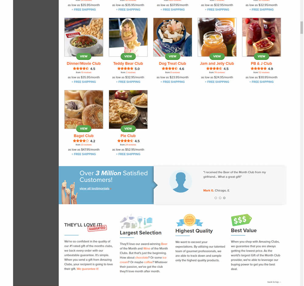
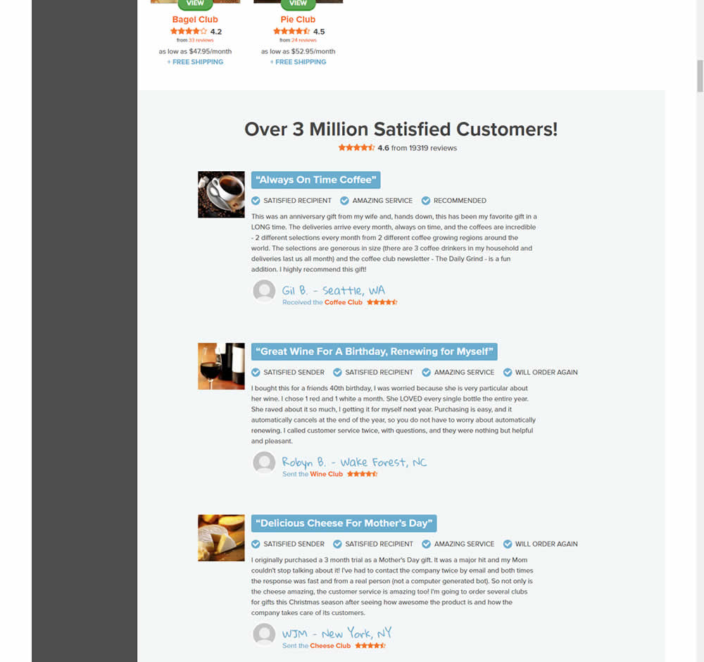
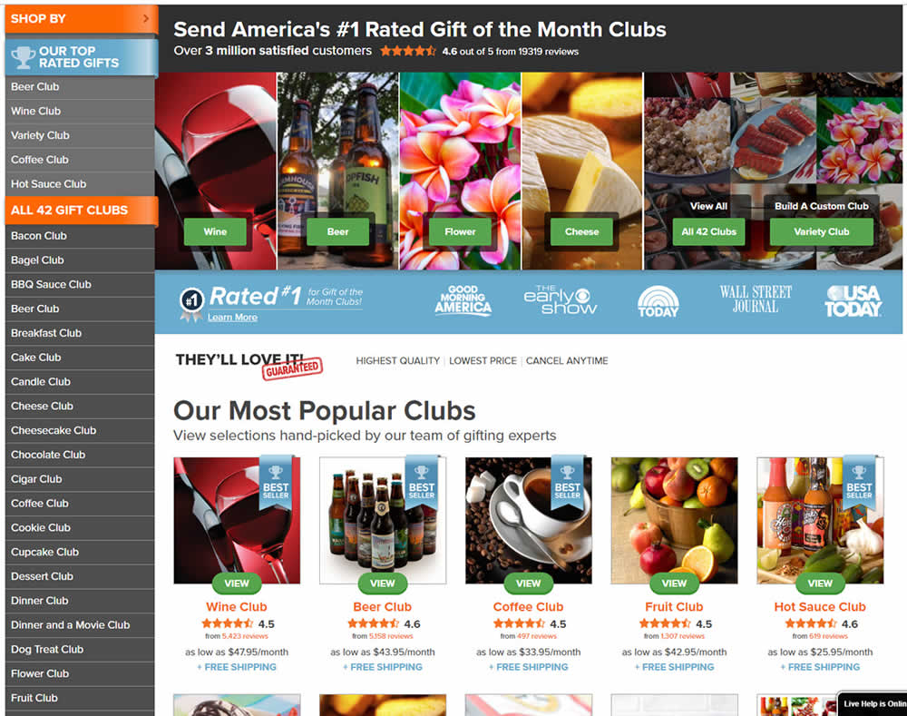
In this experiment, very short form testimonials (with a reference to over 3 million customers) were replaced with 3 more elaborate ones. These elaborate or benefit testimonials contained: highlighted statements, star reviews, emphasized location, tag summaries and photos of the purchased product. The control also contained a 3 testimonial carousel interaction.
This test appeared at the bottom of a longer homepage with additional product listings above.
Test #471 on
Expertinstitute.com
by  Ardit Veliu
May 25, 2023
Desktop
Mobile
Home & Landing
X.X%
Leads
Ardit Tested Pattern #48: Video Testimonials On Expertinstitute.com
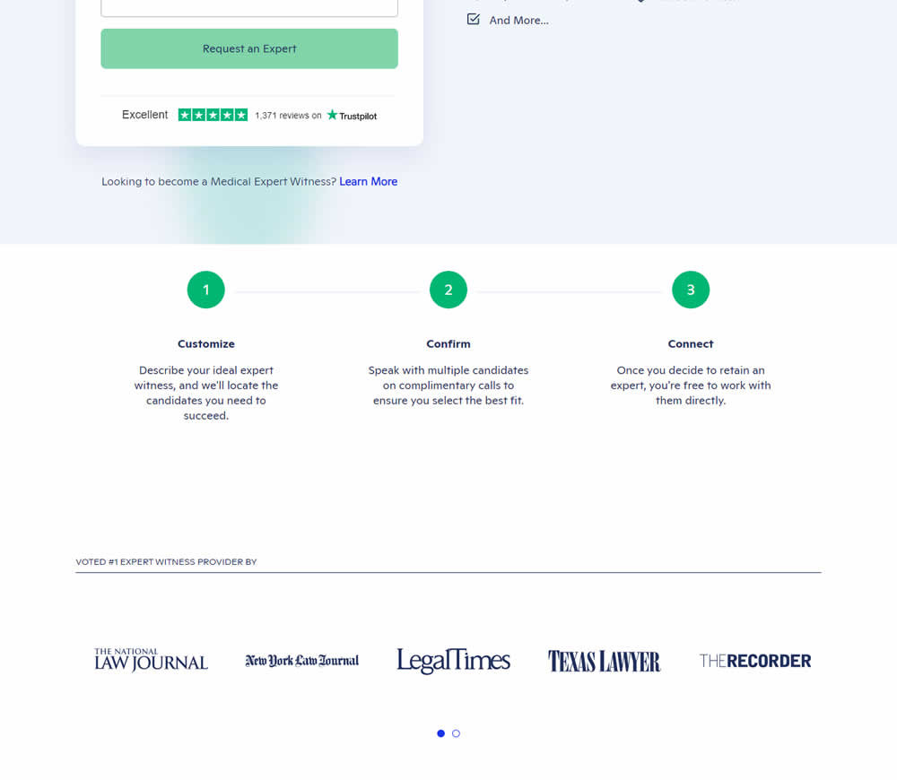
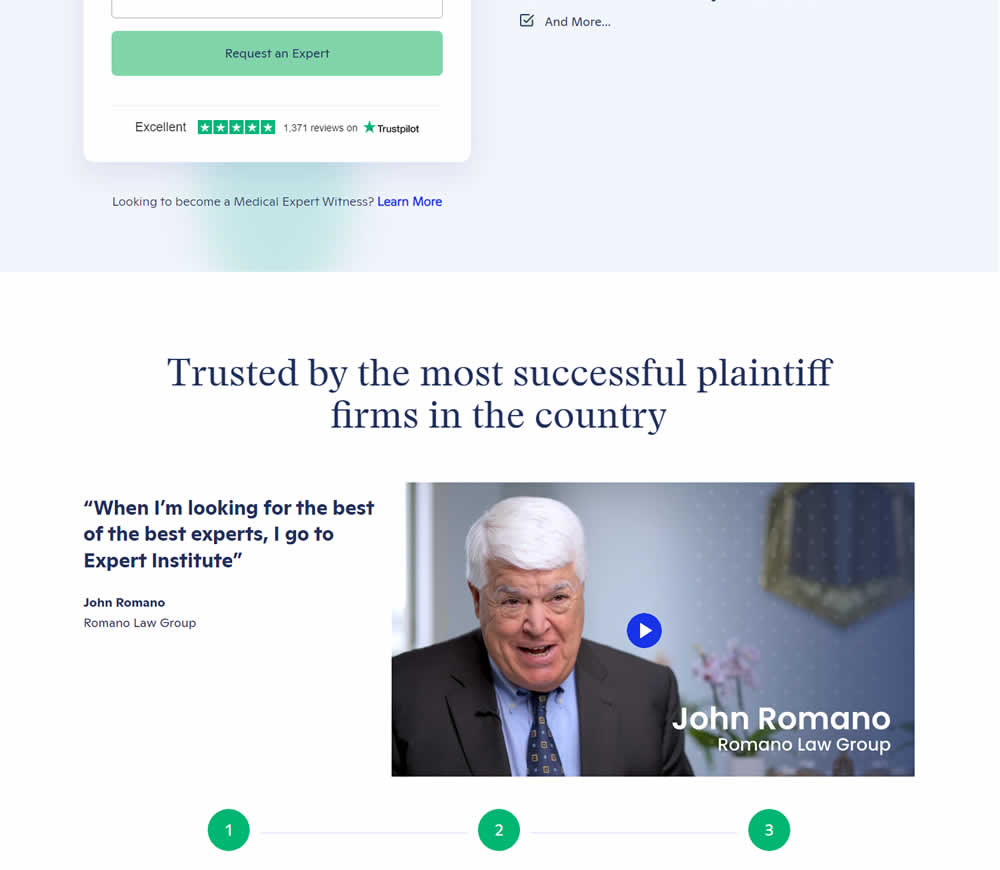
In this experiment, a video testimonial was added mid page onto a signup / lead form page.