All Latest 620 A/B Tests
MOST RECENT TESTS
Test #368 on
Mvideo.ru
by  Andrey Andreev
Aug 02, 2021
Desktop
Home & Landing
X.X%
Sales
Andrey Tested Pattern #135: Product Categories On Mvideo.ru
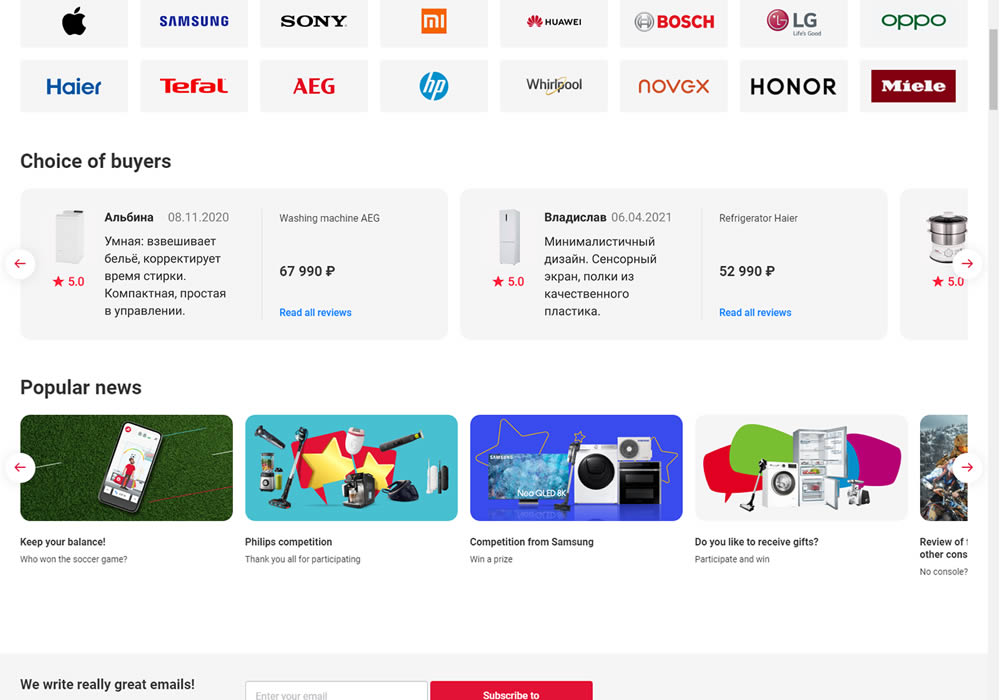
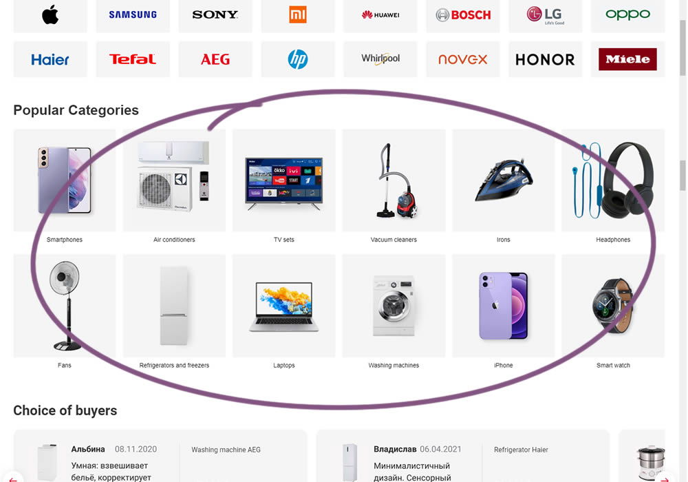
In this experiment, popular categories were added at the bottom of a long ecommerce homepage. Impact on total sales was measured.
Which A Or B Actually Wins? Find Out Before You Test.
Members see every test result — the winners, the flat ones, and the losers — along with exact effects and sample sizes. Use it to estimate your tests and prioritize by probability, not gut feel. Start every experiment with the odds on your side.
Test #358 on
Preply.com
by  Gleb Hodorovskiy
Jun 03, 2021
Desktop
Home & Landing
X.X%
Sales
Gleb Tested Pattern #58: Full Height False Bottom On Preply.com
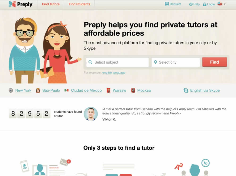
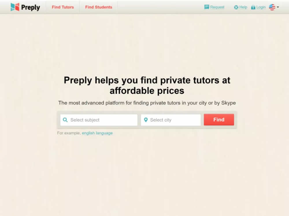
In this experiment, the header section of the homepage drastically focused around the call to action. This was done by removing elements and forcing a false bottom.
Test #356 on
Mvideo.ru
by  Andrey Andreev
May 29, 2021
Desktop
Mobile
Home & Landing
X.X%
Sales
Andrey Tested Pattern #135: Product Categories On Mvideo.ru
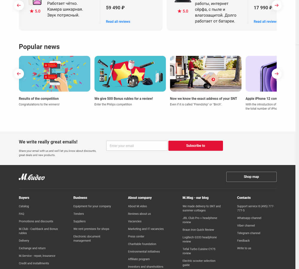
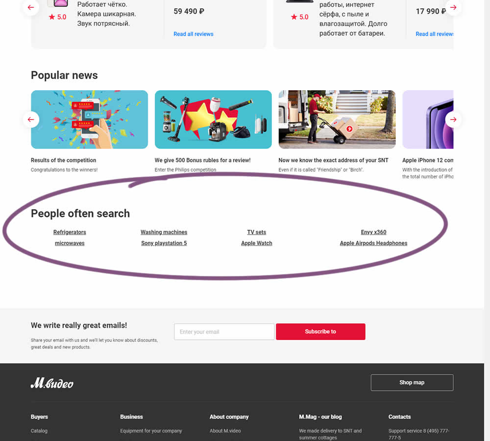
In this experiment, popular search terms were added at the bottom of a long e-commerce homepage. Hence, the variation showed additional search triggers that lead to results pages. (Translated from Russian using Google Translate)
Test #355 on
by  Jakub Linowski
May 28, 2021
Desktop
Mobile
Home & Landing
X.X%
Sales
Jakub Tested Pattern #79: Product Highlights

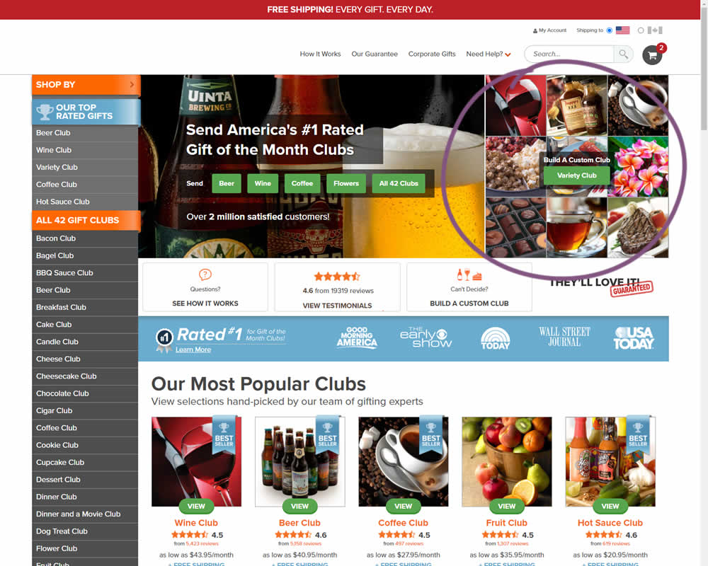
In this experiment, an extra product choice was added to the header of a homepage. Instead of only highlighting a set of four specific products, the option to build custom variety one, was added.
Test #351 on
Baremetrics.com
by  Brian Sierakowski
Apr 30, 2021
Desktop
Mobile
Home & Landing
X.X%
Signups
Brian Tested Pattern #11: Gradual Reassurance On Baremetrics.com
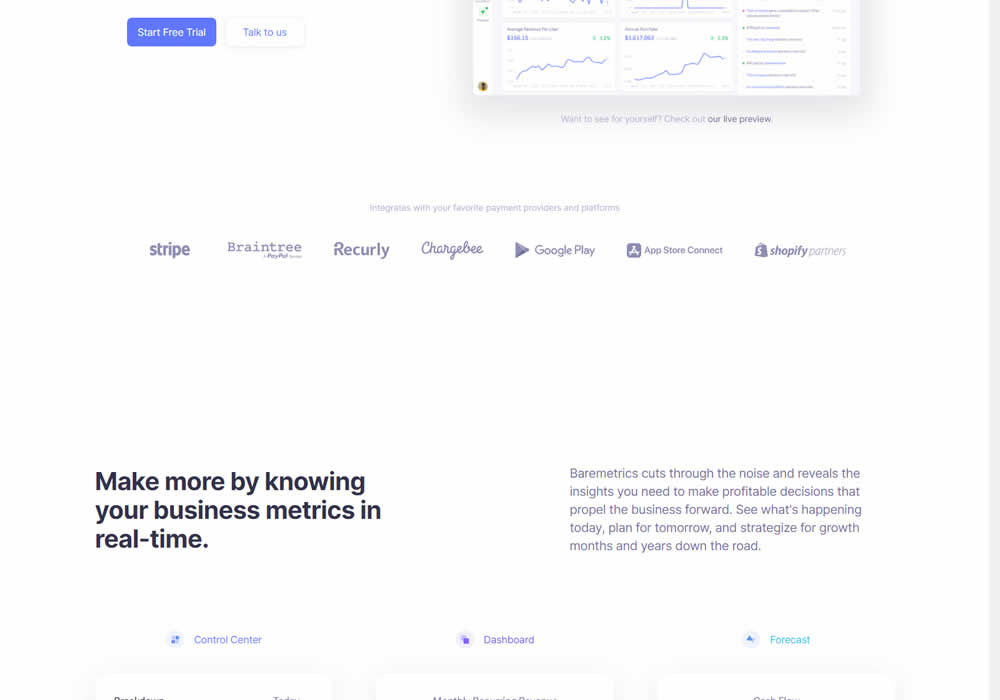
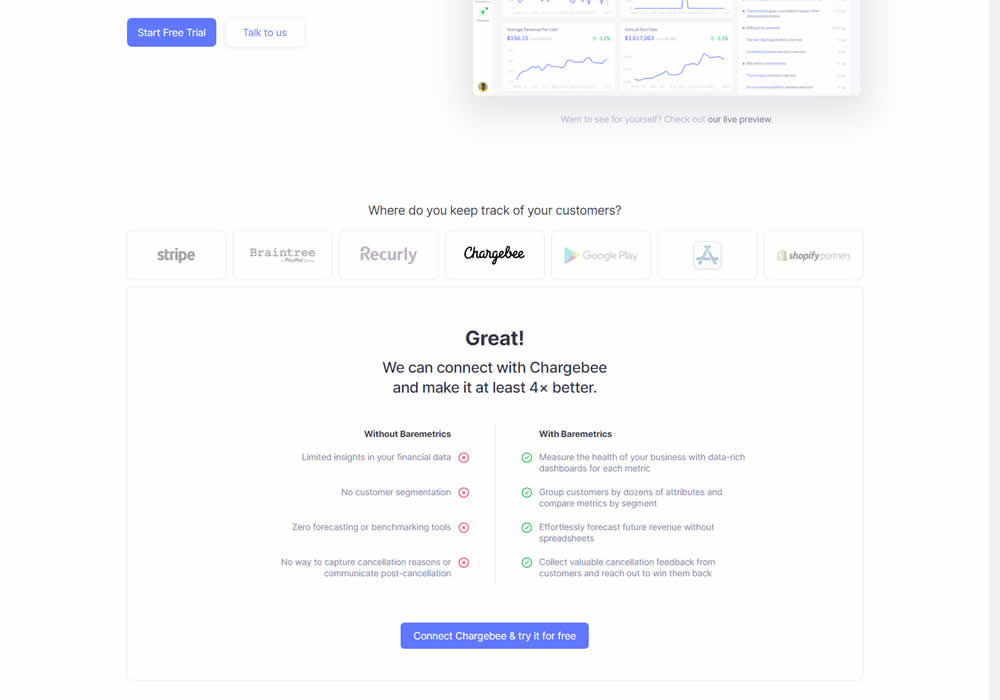
In this experiment, static integration logos were replaced with selectable ones that reassured users to signup. After clicking an integration logo, a comparison chart would appear showing how Baremetrics improves upon a selected payment processor, along with a call to signup. Impact on signups was measured.
Test #348 on
Flukenetworks.com
by  Marika Francisco
Apr 22, 2021
Desktop
Home & Landing
X.X%
Progression
Marika Tested Pattern #97: Bigger Form Fields On Flukenetworks.com
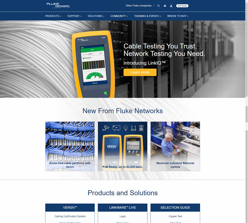
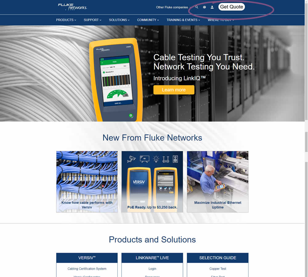
In this simple experiment, the size of the "Get Quote" button in the top navigation was increased.
Test #347 on
by  Jakub Linowski
Apr 07, 2021
Desktop
Mobile
Home & Landing
X.X%
Sales
Jakub Tested Pattern #26: Cart Reminder And Recently Viewed
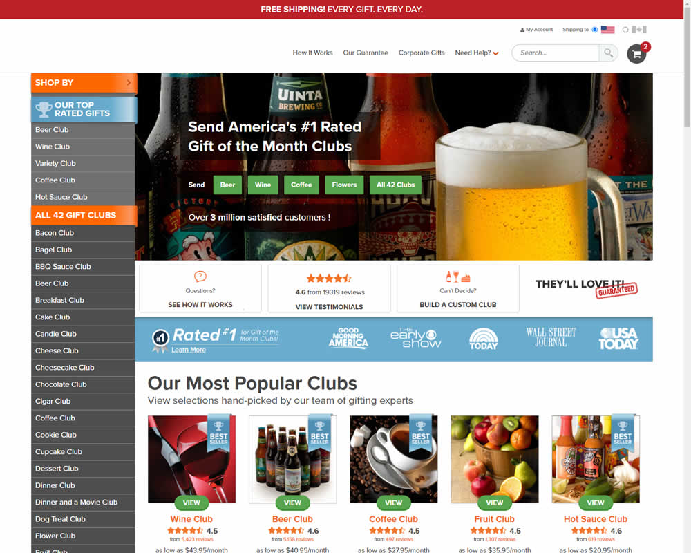
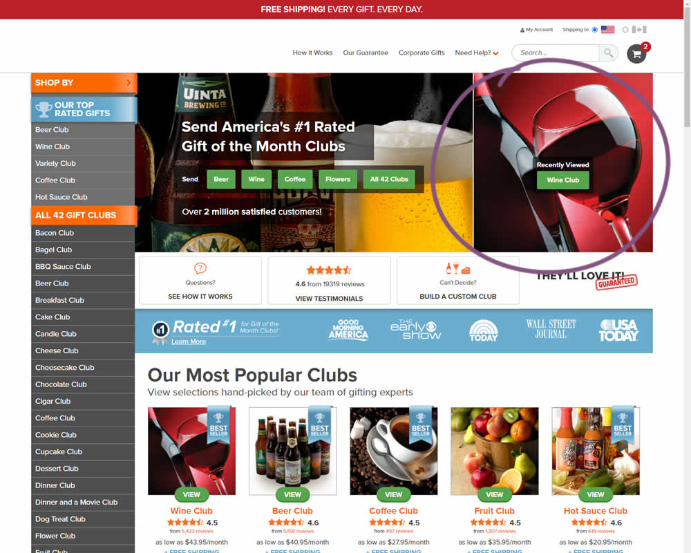
In this experiment, when customers viewed a product and returned to the homepage, they would then see the most recently viewed one - a delicate nudge. The experiment ran with full traffic and impact on sales was measured.
Test #346 on
by  Stanley Zuo
Mar 30, 2021
Desktop
Mobile
Home & Landing
X.X%
Sales
Stanley Tested Pattern #117: Company Logos
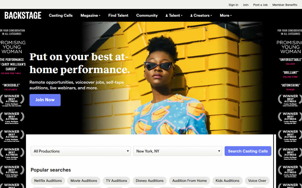

In this homepage experiment, company logos were added to the homepage. These were example clients or companies that Backstage works with and offers casting (job) listing from. Impact on the registration flow and membership checkouts was measured.
Test #345 on
Getninjas.com.br
by  Rodolfo Lugli
Mar 29, 2021
Desktop
Home & Landing
X.X%
Leads
Rodolfo Tested Pattern #9: Multiple Steps On Getninjas.com.br
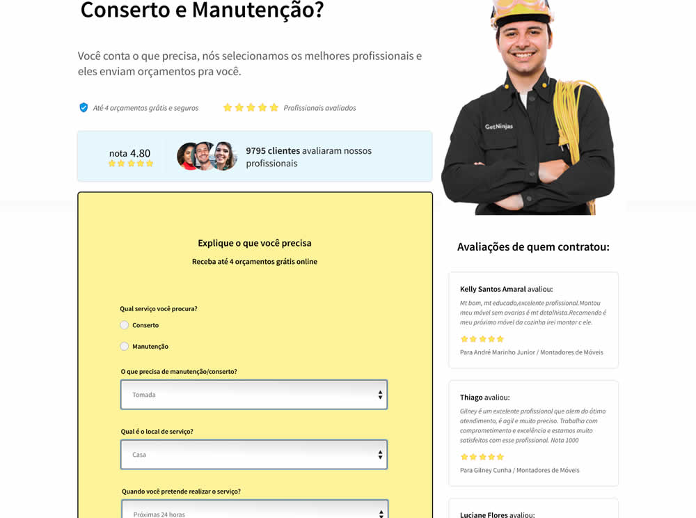
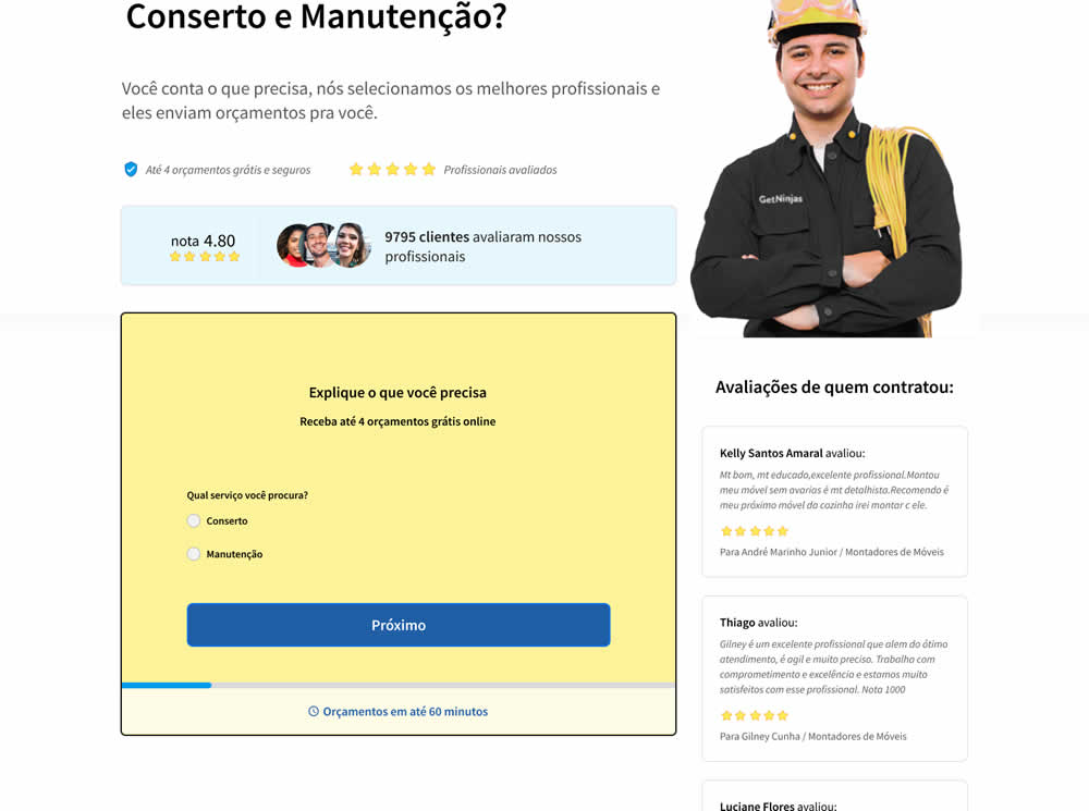
In this experiment, a single long form was broken into at least 3 steps.
Test #339 on
Expertinstitute.com
by  Ardit Veliu
Feb 23, 2021
Desktop
Home & Landing
X.X%
Leads
Ardit Tested Pattern #33: Example Situations On Expertinstitute.com

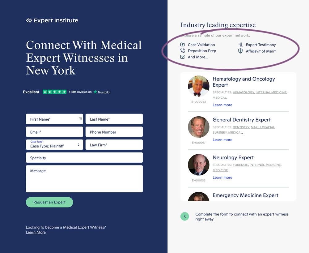
In this experiment, a number of use cases examples were added to illustrate the situations in which experts could help.
Test #338 on
Umbraco.com
by  Lars Skjold Iversen
Jan 29, 2021
Desktop
Mobile
Home & Landing
X.X%
Signups
Lars Tested Pattern #63: Trust Seals On Umbraco.com
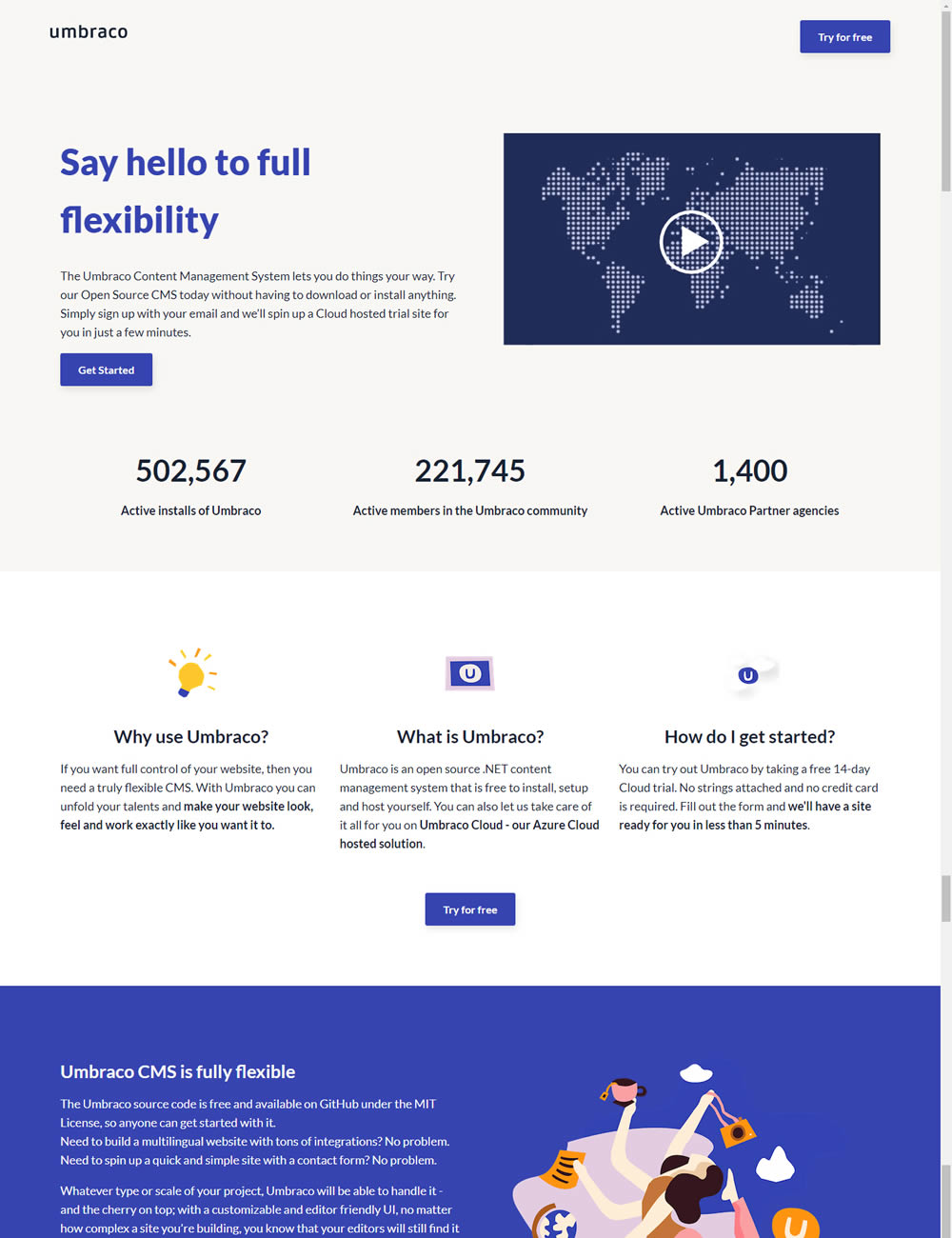
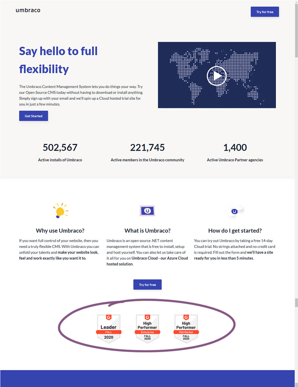
In this experiment, the variation added three G2 badges or awards. The intent was to measure the impact of this change on signups for Umbraco.
Test #335 on
by  Jakub Linowski
Jan 27, 2021
Desktop
Mobile
Home & Landing
X.X%
Sales
Jakub Tested Pattern #32: Condensed List
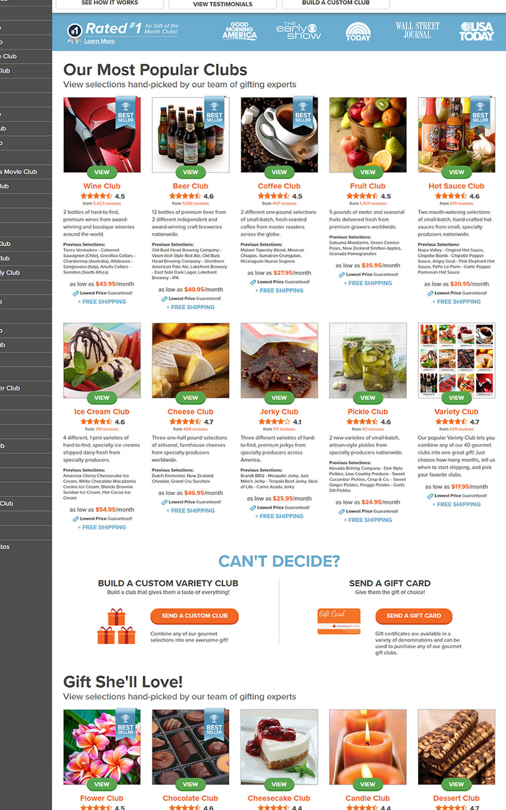
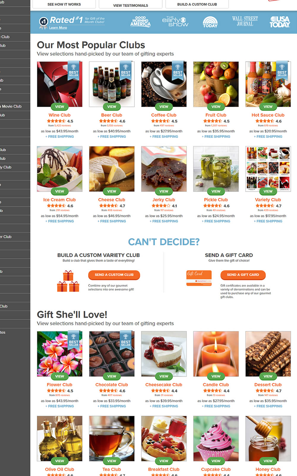
The variation here has more condensed product tiles being shown on a homepage. Two pieces of information were removed: product descriptions and past selections. Impact on product page visits and total sales was measured.
Test #333 on
Expertinstitute.com
by  Ardit Veliu
Dec 31, 2020
Desktop
Mobile
Home & Landing
X.X%
Leads
Ardit Tested Pattern #11: Gradual Reassurance On Expertinstitute.com


In this experiment, the variation broke up a lead form into two parts. In the first step users were asked for their state followed by a standard contact form on a second step. All of the states were shown as selectable options. In the control version, the landing page only showed a button which lead to the full form. The experiment measured impact on lead form submissions.
Test #329 on
Snocks.com
by  Samuel Hess
Dec 23, 2020
Mobile
Home & Landing
X.X%
Sales
Samuel Tested Pattern #14: Exposed Menu Options On Snocks.com
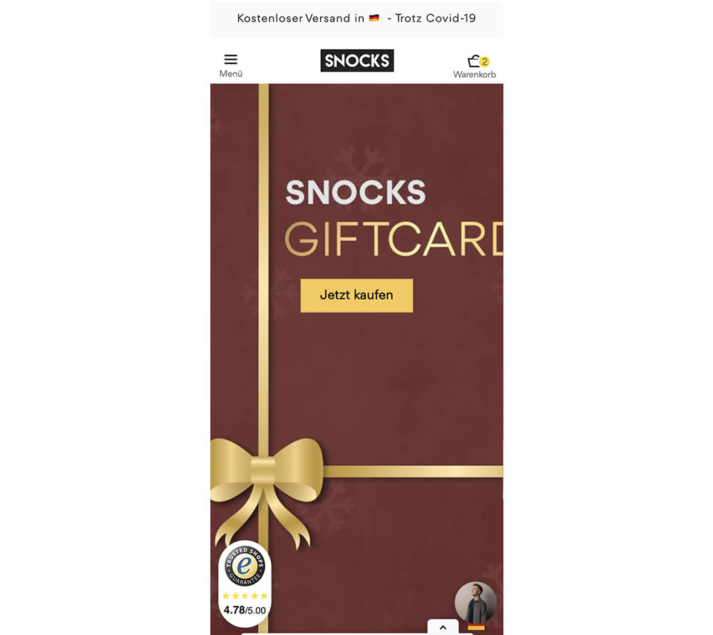
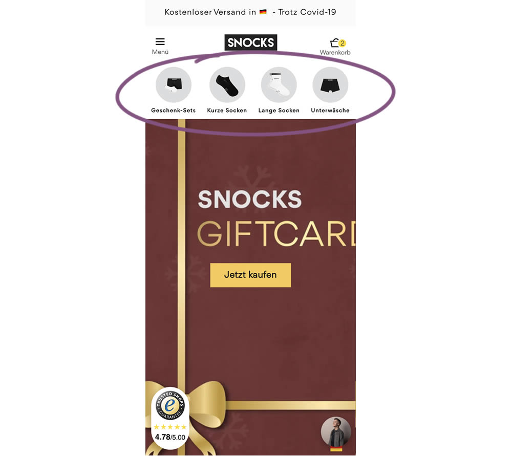
In this homepage experiment, a series of product categories were shown more visible near the top of the screen (instead of only being shown inside the hamburger menu). They linked up to corresponding listing pages with such items as: gifts, short socks, long socks, and underwear. Impact on adds-to-cart and total sales was measured.
Test #328 on
Umbraco.com
by  Lars Skjold Iversen
Dec 21, 2020
Desktop
Mobile
Home & Landing
X.X%
Signups
Lars Tested Pattern #60: Repeated Bottom Call To Action On Umbraco.com
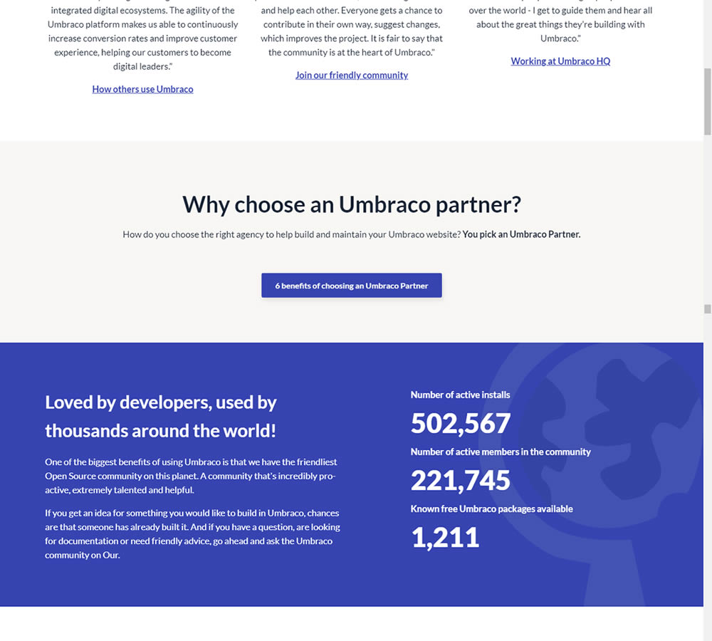
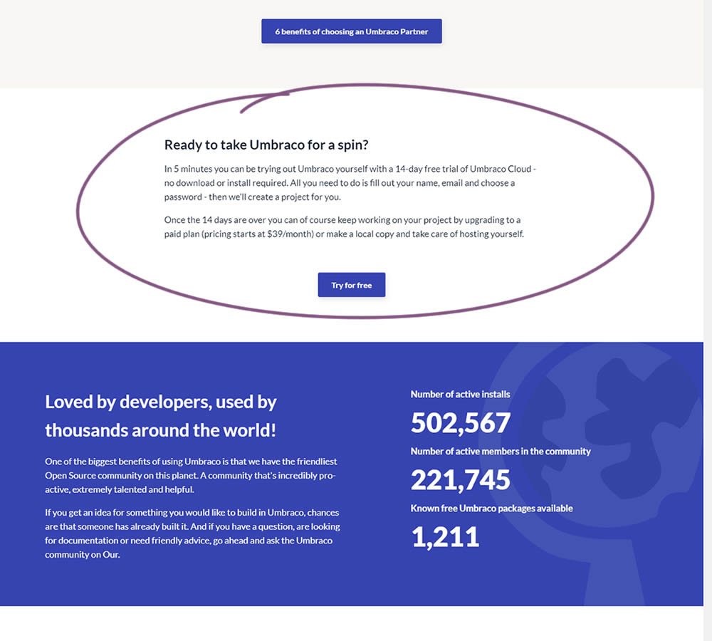
In this experiment, a trial signup section was added at the bottom of Umbraco's long homepage (CMS business). The experiment measured the impact on trial signups.
Test #10 on
Tradegecko.com
by  Syed AtiF Husain
Nov 30, 2020
Desktop
Home & Landing
X.X%
Leads
Syed AtiF Tested Pattern #10: Postponed Modal Forms On Tradegecko.com

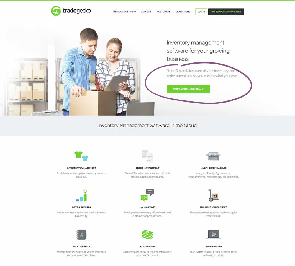
In this experiment, 3 form fields were removed (postponed to a next step) from the homepage leaving only a "Start Trail" button. When users clicked on the "Start A Free 14 Day Trial" button, in both the control and variation they've seen the same next registration page with all of the fields. The registration page repeated the same fields with their corresponding values, as well as asked for a password as an extra field. The experiment measured successful leads.
Test #316 on
Trydesignlab.com
by  Daniel Shapiro
Sep 24, 2020
Desktop
Mobile
Home & Landing
X.X%
Signups
Daniel Tested Pattern #22: Empowering Headline On Trydesignlab.com


In this experiment, the headline was changed to focus more on the end-goal of the UX Academy program - that of landing your first UI/UX role.
Test #313 on
Trydesignlab.com
by  Daniel Shapiro
Aug 19, 2020
Desktop
Mobile
Home & Landing
X.X%
Leads
Daniel Tested Pattern #11: Gradual Reassurance On Trydesignlab.com
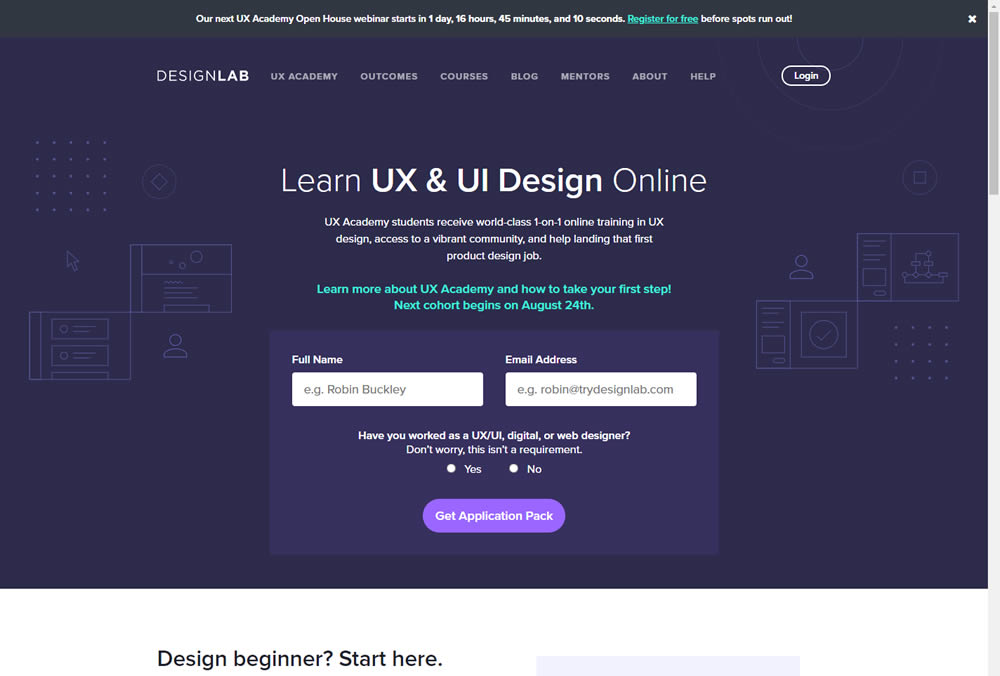
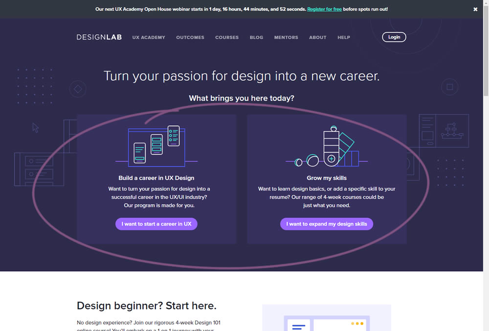
In this experiment, instead of showing a single-focused lead form (for the UX Academy Program), users were asked to express a wider set of choices first (for the UX Academy or shortter set of skill-based courses). The experiment measured overall leads for both types of programs.
Test #311 on
Backstage.com
by  Stanley Zuo
Aug 11, 2020
Desktop
Mobile
Home & Landing
X.X%
Sales
Stanley Tested Pattern #118: Category Images On Backstage.com
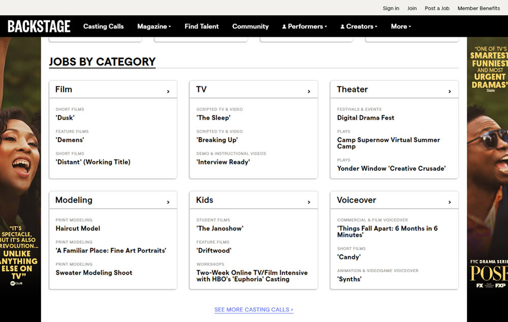
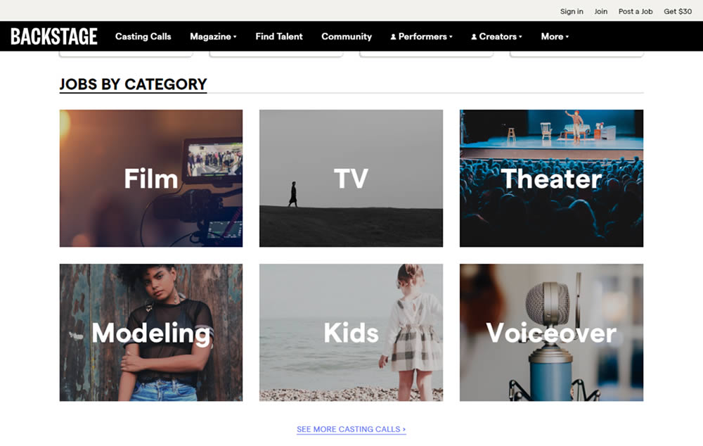
In this experiment, category links (linking to casting call search results) were replaced with tile images. In addition, 2 levels of categories were also replaced with a single text link for each tile. Finally, the font size of the link titles was also increased.
Test #308 on
Umbraco.com
by  Lars Skjold Iversen
Jul 23, 2020
Desktop
Home & Landing
X.X%
Signups
Lars Tested Pattern #4: Testimonials On Umbraco.com
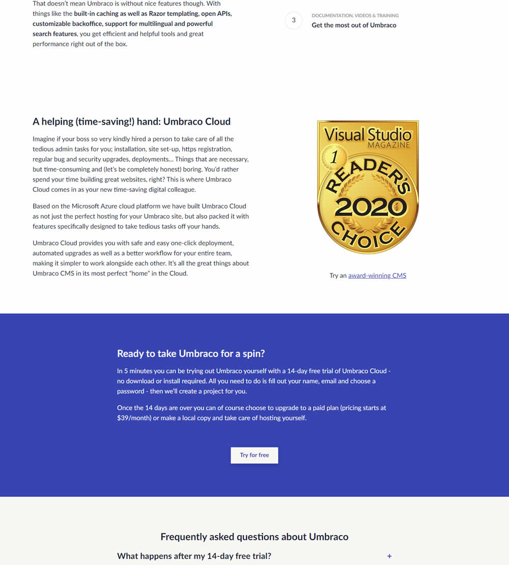
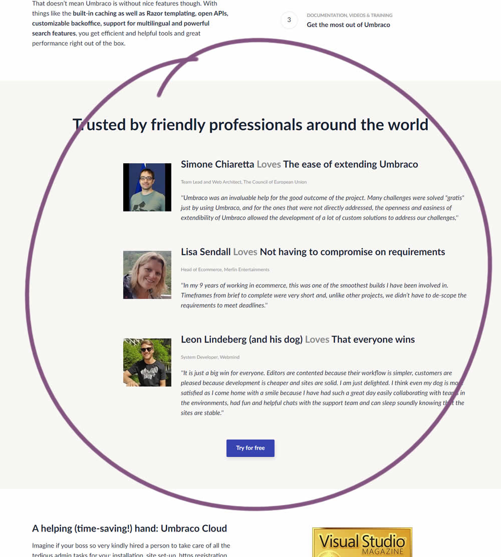
In this experiment, three testimonials were added mid way though on a CMS landing page. At the end of the customer testimonials an additional trial signup button was also added - which was also the primary metric.