All Latest 620 A/B Tests
MOST RECENT TESTS
Test #305 on
Volders.de
by Michal Fiech
Jun 30, 2020
Mobile
Desktop
Home & Landing
X.X%
Sales
Michal Tested Pattern #94: Visible Search On Volders.de

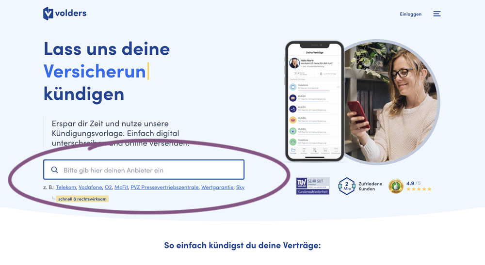
In this experiment, a search input field (to look for companies) along with most popular links (also company names) were displayed on the homepage of a leading contract cancellation service. The control (A) version instead had a button that sent users to a next page where the same selection could be made - only later. The measurable success criteria were the number of paid cancellations - a few steps down the funnel.
Which A Or B Actually Wins? Find Out Before You Test.
Members see every test result — the winners, the flat ones, and the losers — along with exact effects and sample sizes. Use it to estimate your tests and prioritize by probability, not gut feel. Start every experiment with the odds on your side.
Test #297 on
Trydesignlab.com
by  Daniel Shapiro
May 04, 2020
Desktop
Home & Landing
X.X%
Sales
Daniel Tested Pattern #41: Sticky Call To Action On Trydesignlab.com

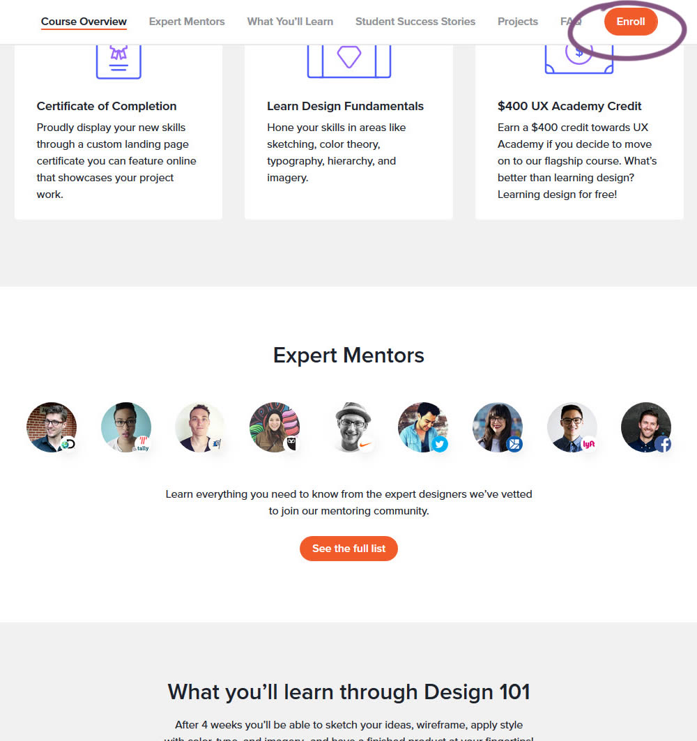
In this experiment, a sticky "Enroll" button was shown on a course landing page. The button lead to a payment funnel to allow enrolling/paying for a course. The exeperiment measured inital progression into this funnel as well as the deeper completed sales metric.
Test #288 on
Kenhub.com
by  Niels Hapke
Mar 05, 2020
Desktop
Mobile
Home & Landing
X.X%
Signups
Niels Tested Pattern #117: Company Logos On Kenhub.com
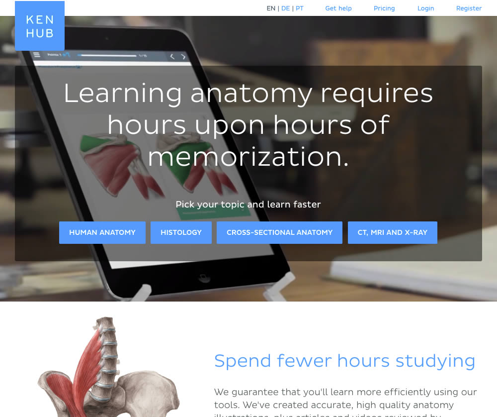
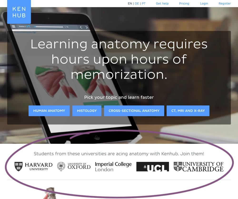
In this experiment, customer logos (of universities attended by students using Kenhub) were placed on a homepage. The experiment tested for the effect on registration visits, and premium subscription starts.
Test #286 on
Volders.de
by  Alexander Krieger
Feb 28, 2020
Desktop
Mobile
Home & Landing
X.X%
Sales
Alexander Tested Pattern #9: Multiple Steps On Volders.de
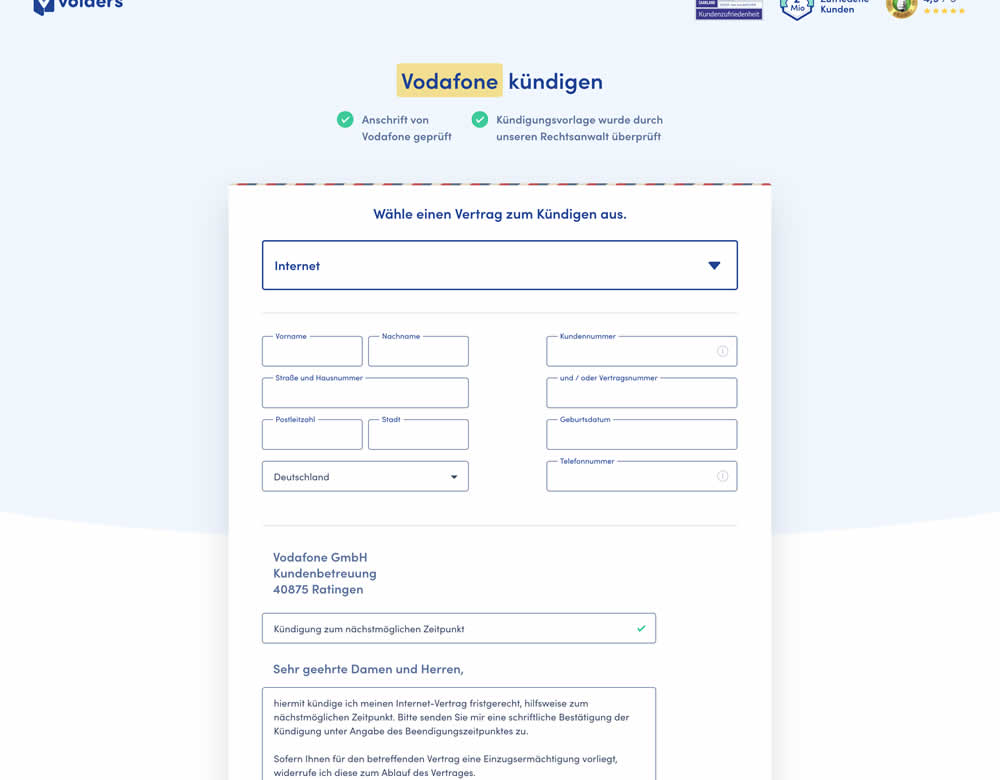
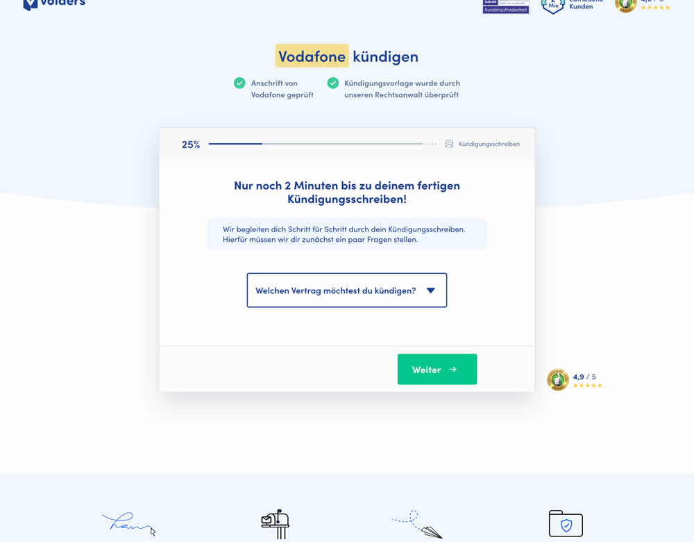
In this experiment, a long contract cancellation landing page (control) was broken down into 4 steps with 1 final summary step (variation).
Test #279 on
Umbraco.com
by  Lars Skjold Iversen
Jan 16, 2020
Desktop
Mobile
Home & Landing
X.X%
Sales
Lars Tested Pattern #79: Product Highlights On Umbraco.com
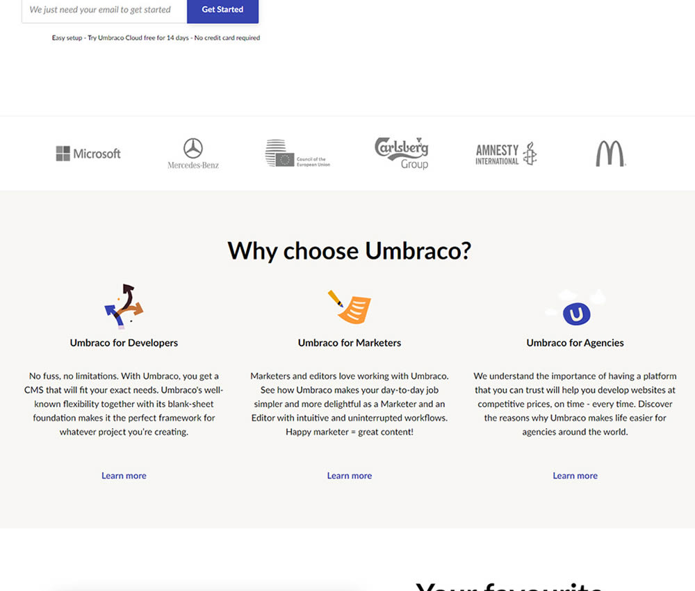
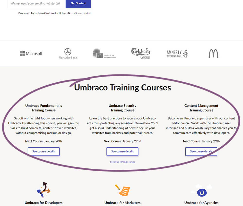
In this experiment, 3 additional course links with descriptions were added to the homepage. The idea was to increase course sales aside of the Saas subscription signups.
Test #276 on
Umbraco.com
by  Lars Skjold Iversen
Dec 31, 2019
Desktop
Mobile
Home & Landing
X.X%
Signups
Lars Tested Pattern #111: Field Explanations On Umbraco.com
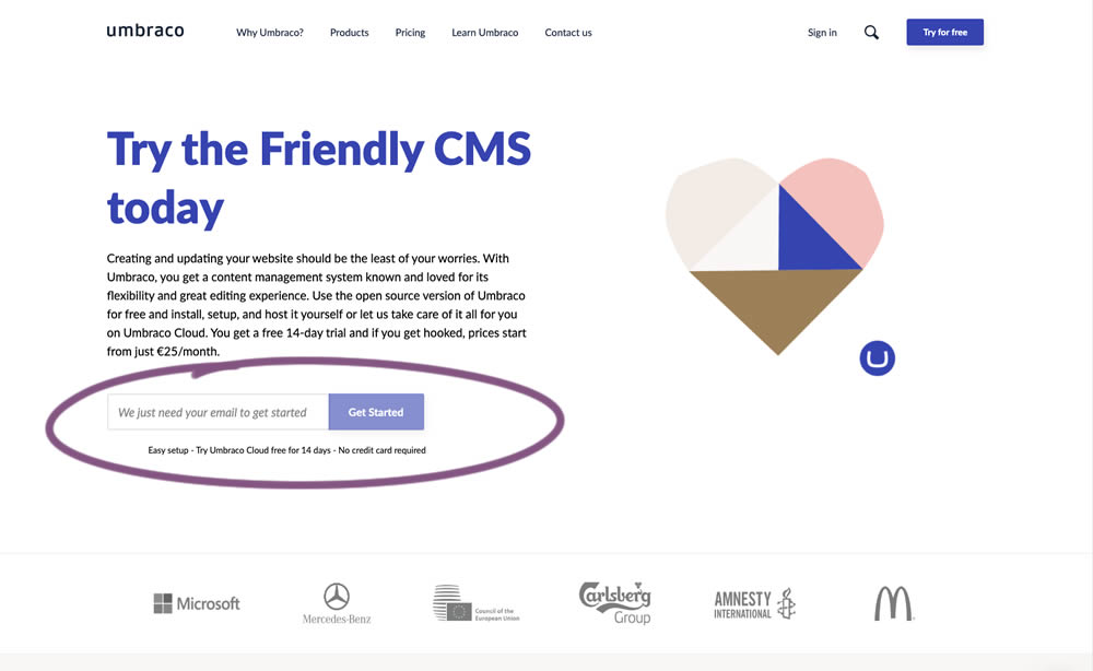
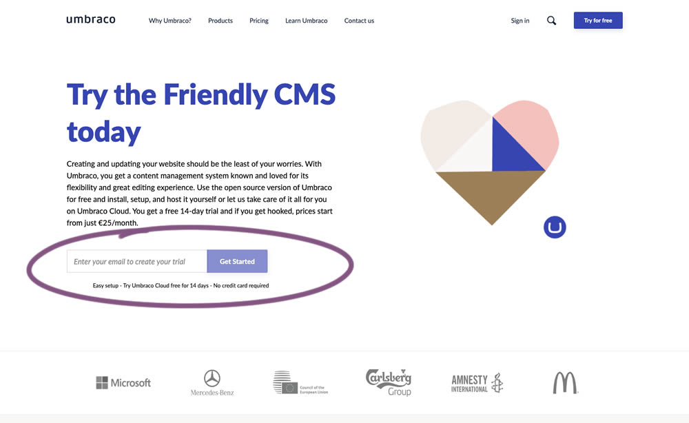
In this experiment, the idea was to move away from copy that was focusing on the needs of the company ("we need your email") towards copy that hinted at a customer benefit ("create your trial").
Test #269 on
Thomasnet.com
by  Julian Gaviria
Nov 15, 2019
Desktop
Home & Landing
X.X%
Signups
Julian Tested Pattern #14: Exposed Menu Options On Thomasnet.com


In this experiment, the variation exposed 6 of the options from the pulldown menu as tabs.
Test #263 on
Goodui.org
by  Jakub Linowski
Oct 04, 2019
Desktop
Mobile
Home & Landing
X.X%
Signups
Jakub Tested Pattern #22: Empowering Headline On Goodui.org
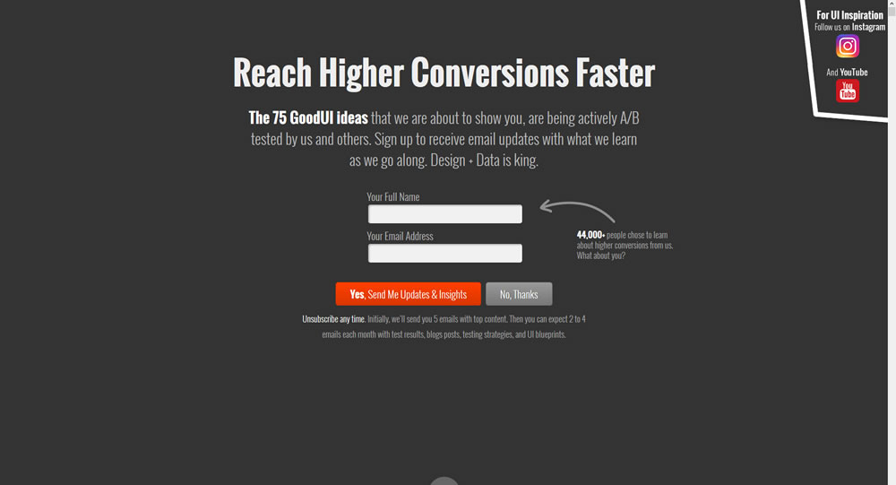
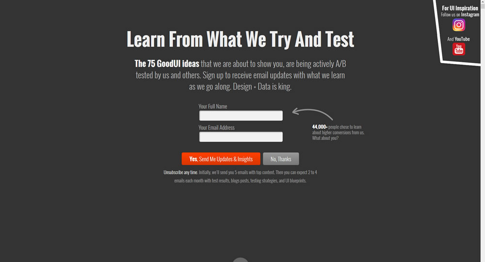
In this experiment a different headline was tested. "Reach Higher Conversions Faster" vs. "Learn From What We Try And Test".
Test #260 on
Valkexclusief.nl
by  Online Dialogue
Sep 16, 2019
Desktop
Home & Landing
X.X%
Sales
Online Tested Pattern #45: Benefit Bar On Valkexclusief.nl
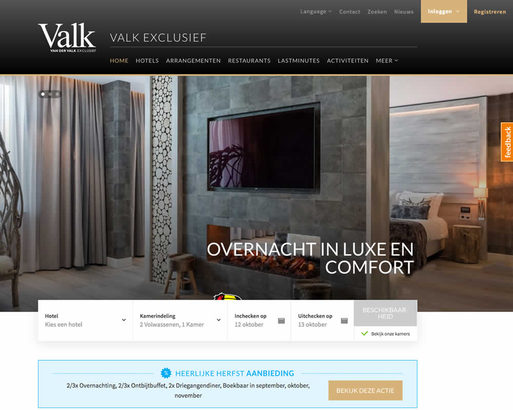
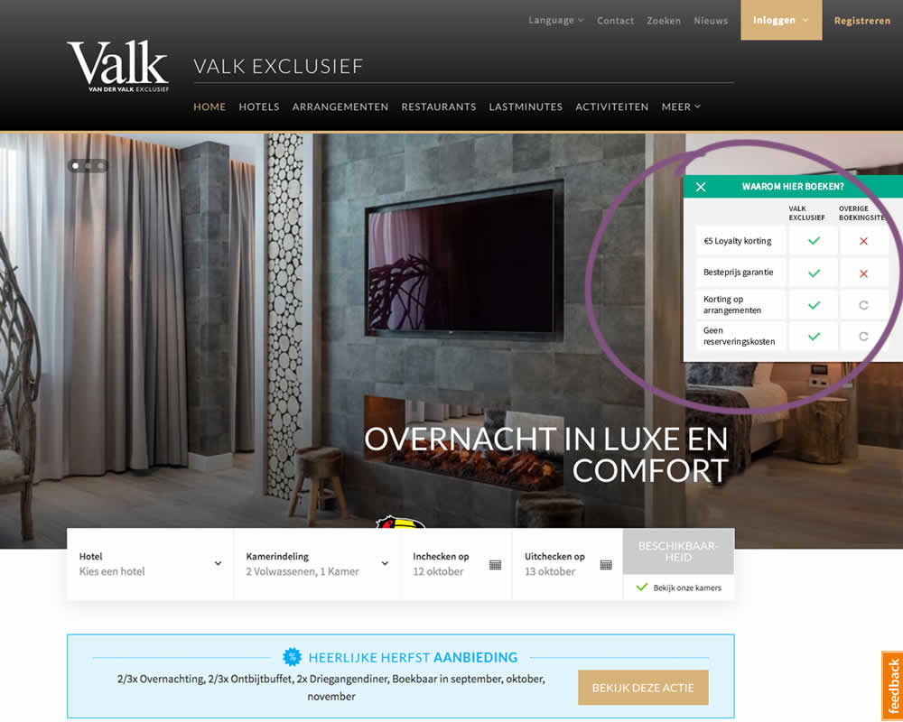
In this experiment on Valk Exclusief's web site, a transparent overview of the benefits for booking hotels was shown. The copy translates to: "Why should you book here? - 5€ Loyalty Discount - Best Price Guarantee - Discount On Packages - No Reservation Costs. Valk is a 150 year hotel chain in the Netherlands.
Test #246 on
Thomasnet.com
by  Julian Gaviria
Jun 12, 2019
Desktop
Mobile
Home & Landing
X.X%
Progression
Julian Tested Pattern #88: Action Button On Thomasnet.com
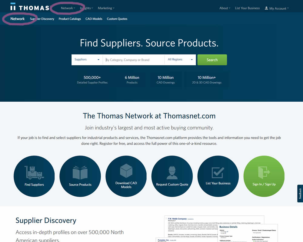
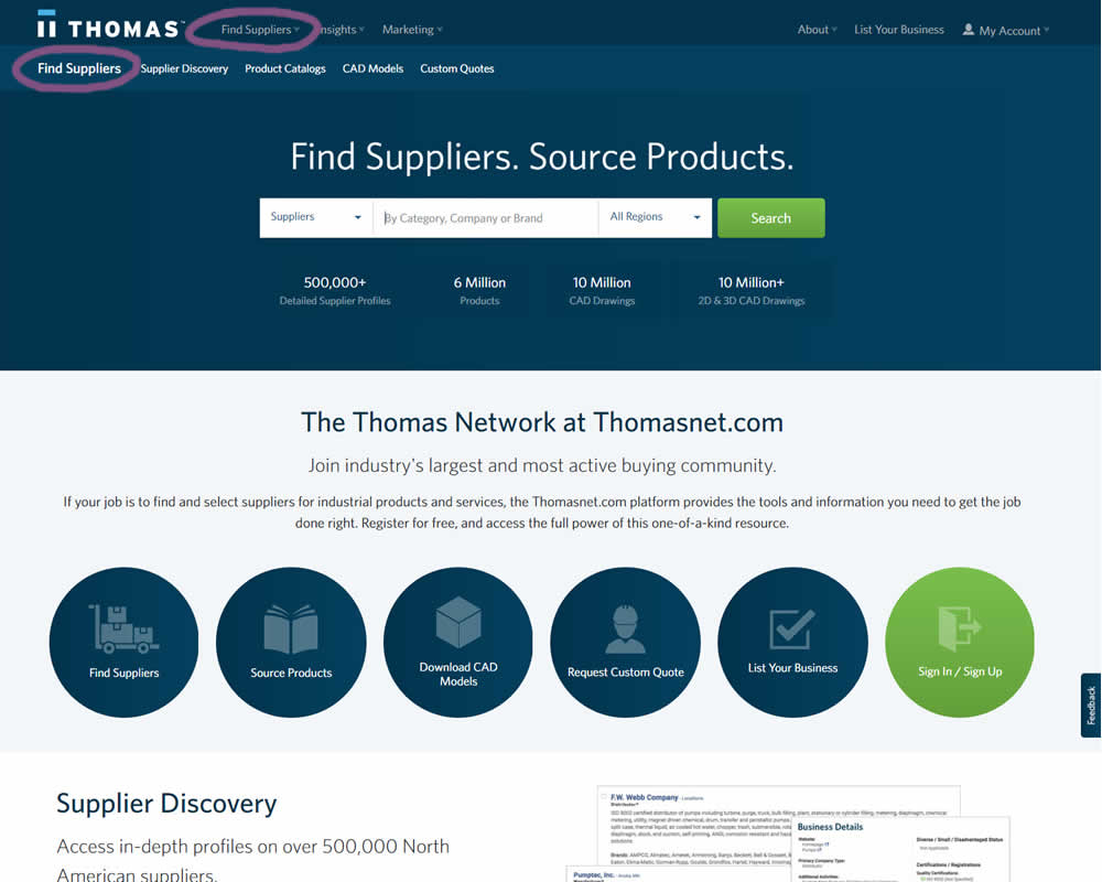
In this experiment, the navigation label was changed from "Network" to "Find Suppliers". The idea was to make use of an action label with a clearer benefit.
Test #243 on
Goodui.org
by  Jakub Linowski
Jun 05, 2019
Desktop
Mobile
Home & Landing
X.X%
Progression
Jakub Tested Pattern #77: Filled Or Ghost Buttons On Goodui.org
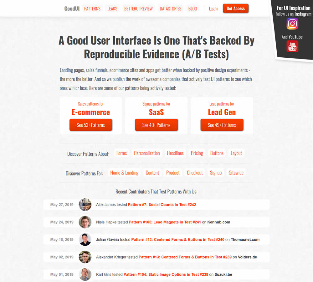
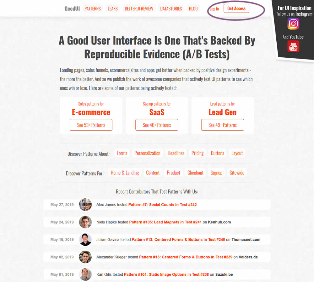
In this experiment, full red background buttons were changed to ghost buttons (red outline and transparent fill)
Test #239 on
Volders.de
by  Alexander Krieger
May 02, 2019
Desktop
Home & Landing
X.X%
Progression
Alexander Tested Pattern #13: Centered Forms & Buttons On Volders.de
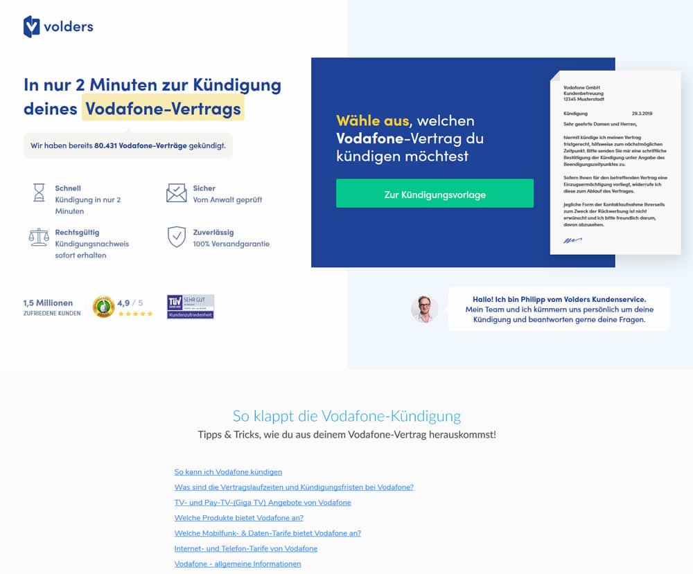
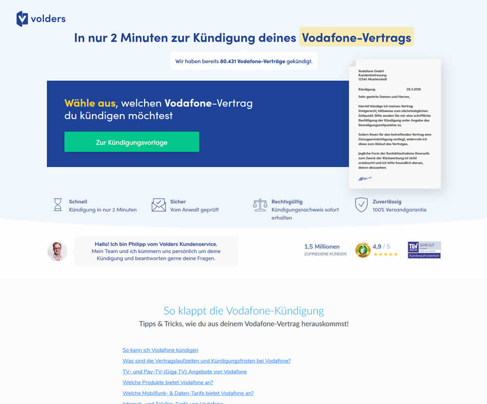
A contract cancellation landing page was tested for the effect of a single (wider CTA area with a left aligned button) vs two column layout (narrow CTA area with a right aligned button).
Test #238 on
Suzuki.be
by  Karl Gilis
May 01, 2019
Desktop
Home & Landing
X.X%
Progression
Karl Tested Pattern #104: Carousel Vs Static Grid Images On Suzuki.be
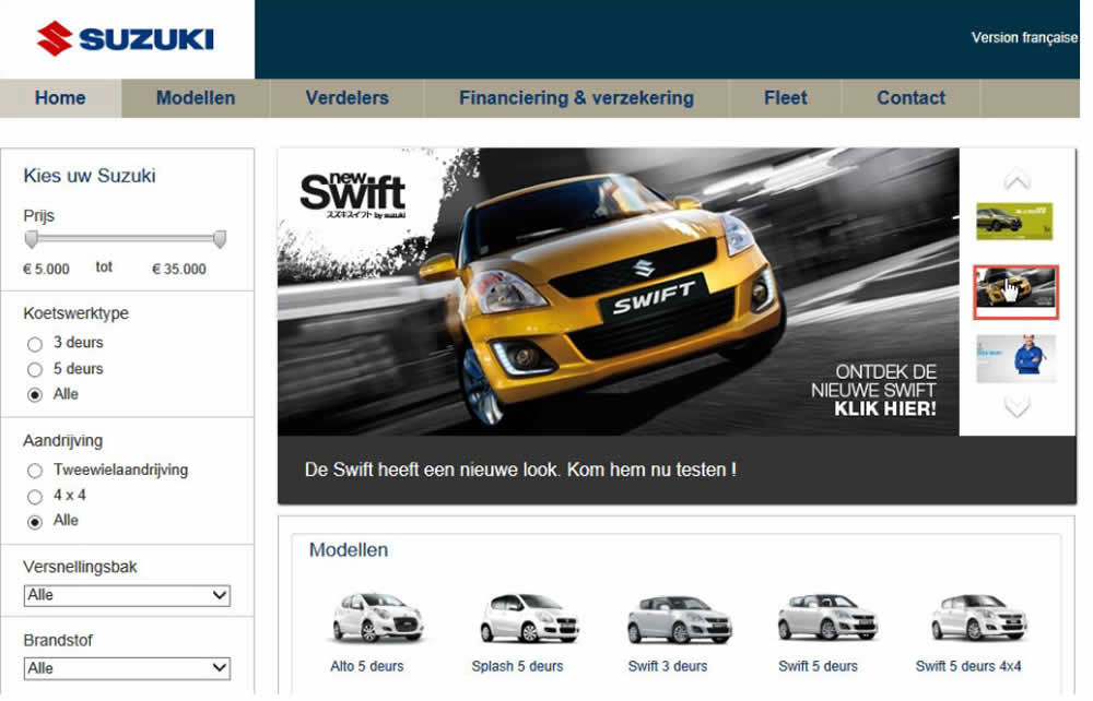
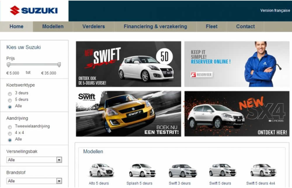
In this homepage experiment with a 4-slide carousel, the slides changed every 3.5 seconds and users could also choose another slide manually. In the variations, instead of the 4 slides in the carousel, static images were used to take up the same amount of space.
Test #235 on
Thomasnet.com
by  Julian Gaviria
Apr 02, 2019
Desktop
Mobile
Home & Landing
X.X%
Leads
Julian Tested Pattern #102: Expanded Or Condensed Layout On Thomasnet.com
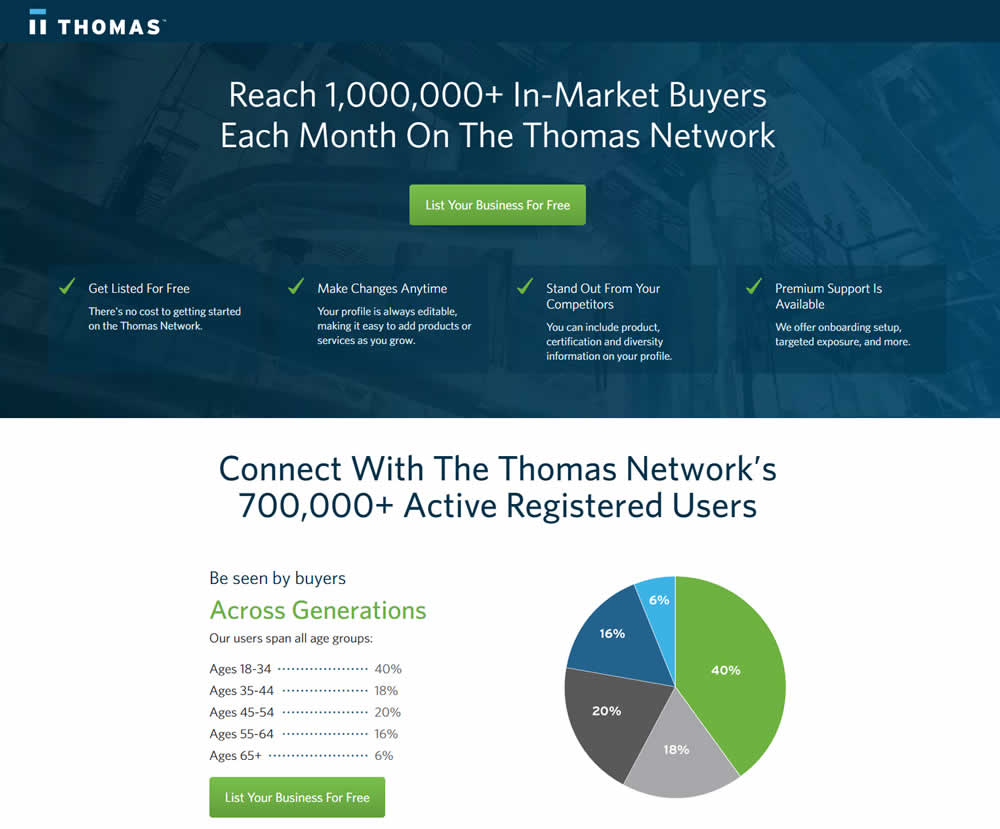
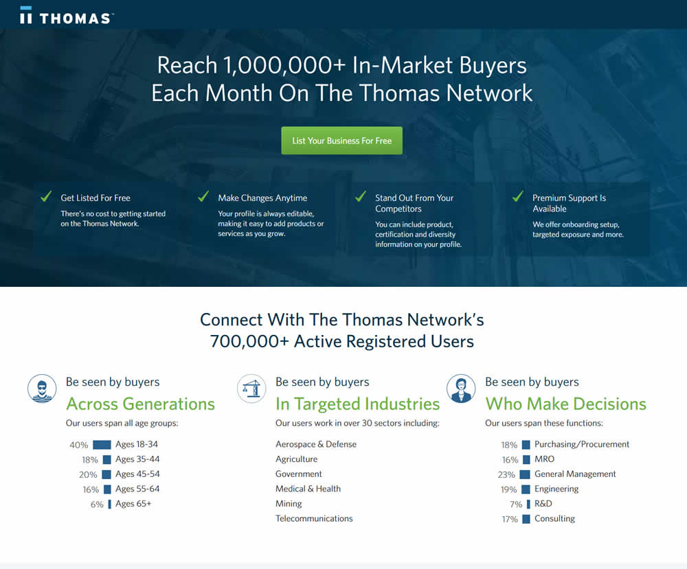
In this experiment, the layout was condensed from a taller to a shorter one.
Test #224 on
by  Alex James
Feb 11, 2019
Desktop
Home & Landing
X.X%
Progression
Alex Tested Pattern #3: Fewer Form Fields
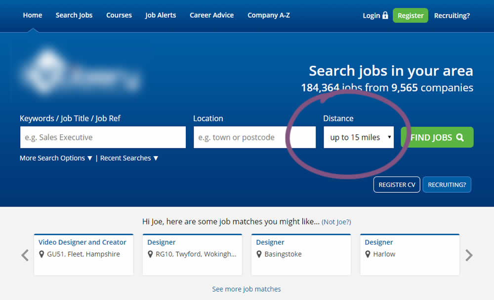
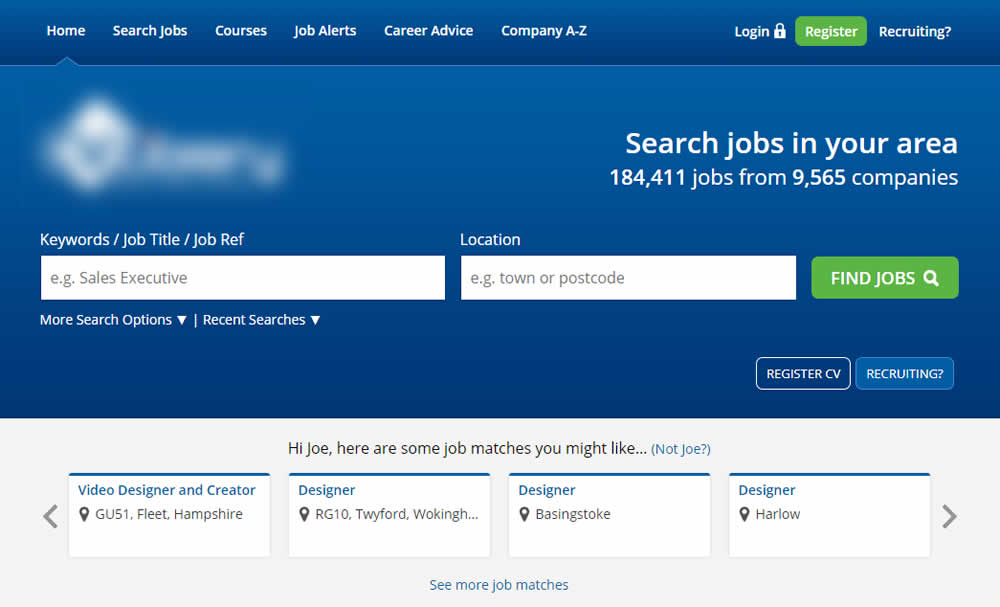
This experiment reduced the search form by removing the distance field.
Test #218 on
Yummly.com
by  Kimberly Cheung
Jan 14, 2019
Desktop
Mobile
Home & Landing
X.X%
Signups
Kimberly Tested Pattern #94: Visible Search On Yummly.com
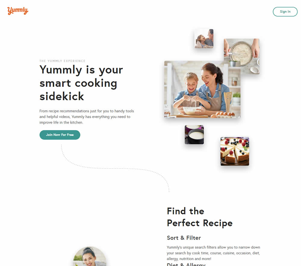
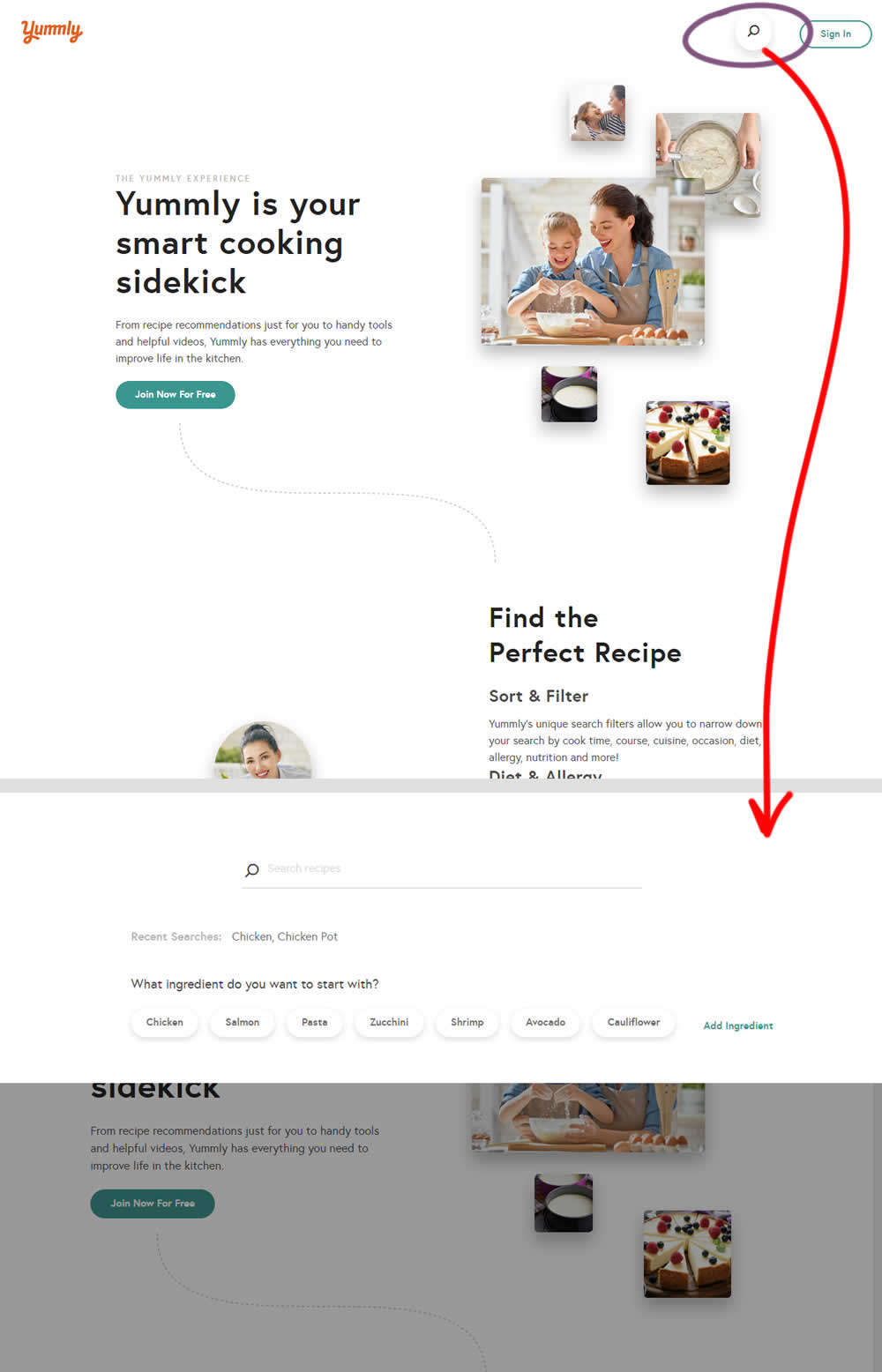
Hypothesis: Anonymous users can't use global search while on the home promo page. We believe that if we show a global search bar to anonymous users, it presents a higher converting funnel (guided search) and will increase our sign-up rates significantly.
Control (A): Logged out users don't see global search bar.
Variant (B): Logged out users see global search bar. After searching for a keyword, the signup funnel starts with a more personalized reason to continue the signup process.
Test #219 on
Mt.com
by  Vito Mediavilla
Jan 14, 2019
Desktop
Mobile
Home & Landing
X.X%
Leads
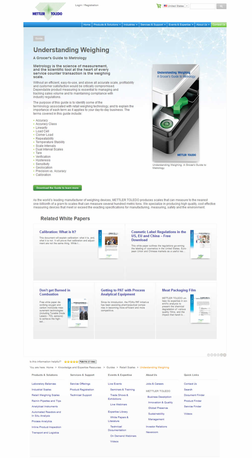
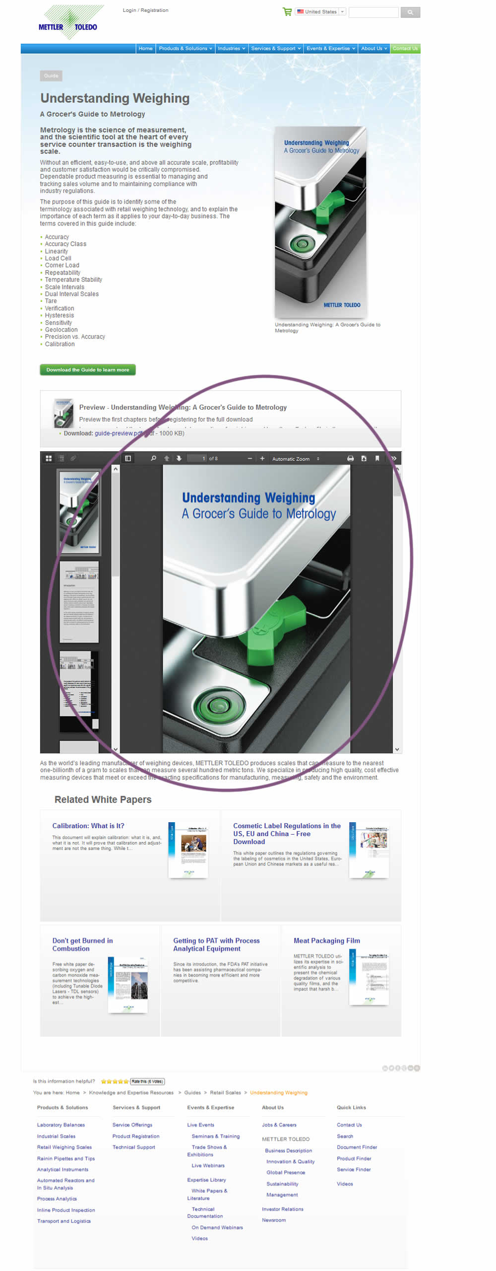
Vito Tested Pattern #95: Clickable Product Previews On Mt.com
Test #217 on
Thomasnet.com
by  Julian Gaviria
Jan 03, 2019
Desktop
Mobile
Home & Landing
X.X%
Engagement
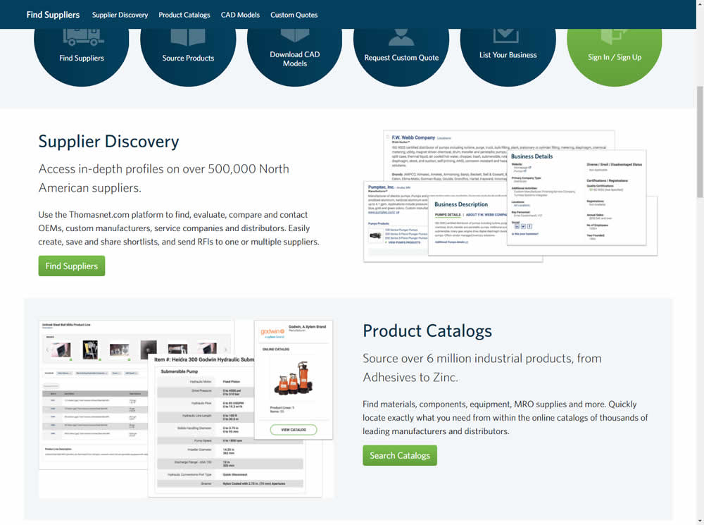
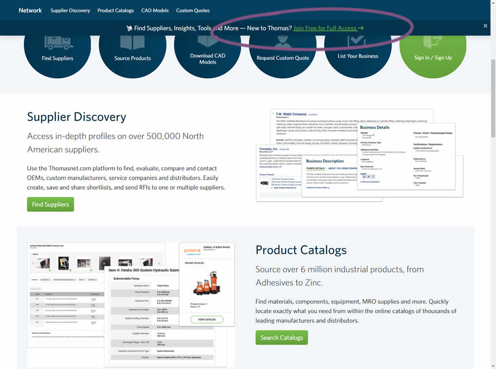
Julian Tested Pattern #41: Sticky Call To Action On Thomasnet.com
Test #216 on
Support.microsoft.co...
by  Ronny Kohavi
Dec 21, 2018
Desktop
Home & Landing
X.X%
Progression
Ronny Tested Pattern #2: Icon Labels On Support.microsoft.co...
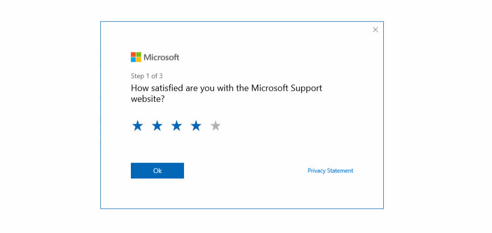
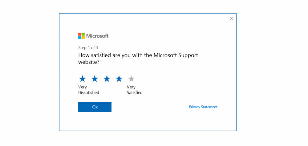
Microsoft ran an experiment on their Customer Satisfaction Survey at both support.microsoft.com and answers.microsoft.com (Desktop). The treatment contained two icon labels at the opposite sides of the star rating range (ex: Very Dissatisfied and Very Satisfied) - providing it with additional meaning.
Test #210 on
Bomgar.com
by  Lee Elkins
Nov 13, 2018
Desktop
Mobile
Home & Landing
X.X%
Signups
Lee Tested Pattern #64: Tunnel On Bomgar.com


In this experiment, the header navigation links were removed on a landing page in order to provide more focus to the signup form.