All Latest 620 A/B Tests
MOST RECENT TESTS
Test #645 on
Obs.no
by  Joachim Furuseth
Apr 16, 2026
Desktop
Listing
X.X%
Progression
Joachim Tested Pattern #34: Open In A New Tab On Obs.no
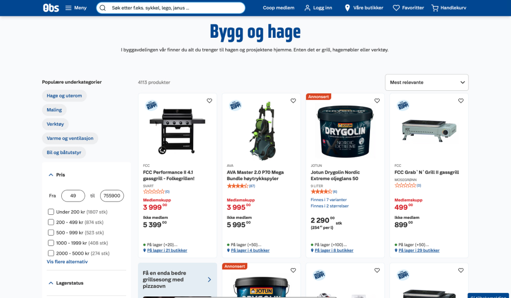
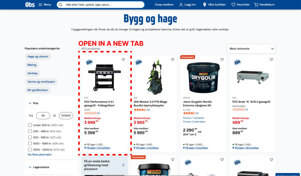
This experiment ran on desktop only, on all our regular product listing and search result page. In the control, clicking on products would open them up in the same page, whereas in the variation, the links opened in a new tab. Impact on adds-to-cart were measured.
Which A Or B Actually Wins? Find Out Before You Test.
Members see every test result — the winners, the flat ones, and the losers — along with exact effects and sample sizes. Use it to estimate your tests and prioritize by probability, not gut feel. Start every experiment with the odds on your side.
Test #644 on
Obsbygg.no
by  Joachim Furuseth
Apr 16, 2026
Desktop
Listing
X.X%
Progression
Joachim Tested Pattern #34: Open In A New Tab On Obsbygg.no
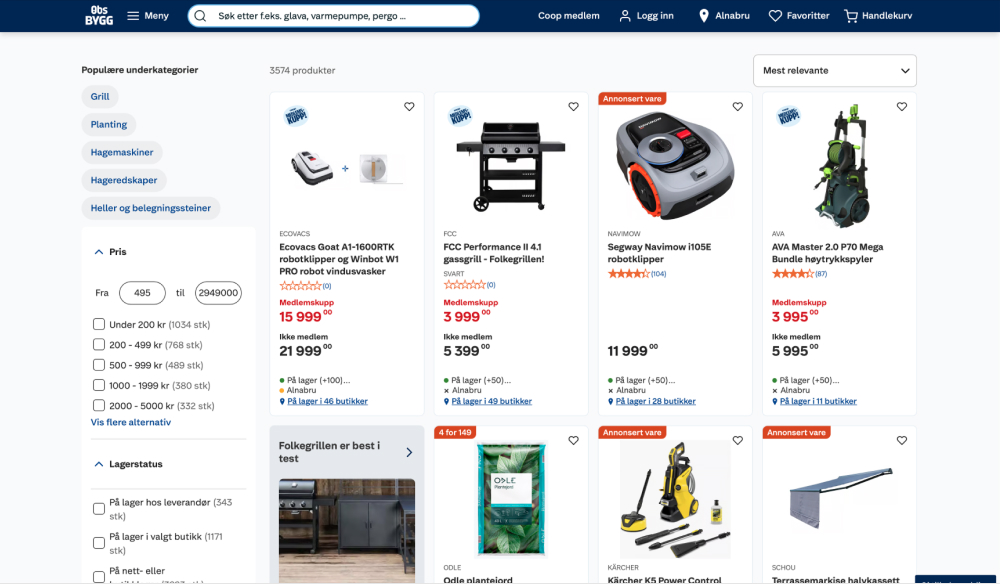
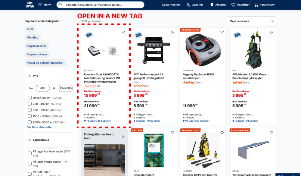
This experiment ran on desktop only, on all our regular product listing and search result page. In the control, clicking on products would open them up in the same page, whereas in the variation, the links opened in a new tab. Impact on adds-to-cart were measured.
Test #637 on
Online.metro-cc.ru
by  Andrey Andreev
Feb 26, 2026
Mobile
Listing
X.X%
Sales
Andrey Tested Pattern #137: Visible Filters On Online.metro-cc.ru

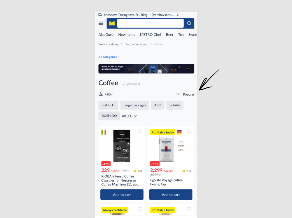
In this experiment, the sorting link (defaulting to popular) was swapped with the filter one. In the control, the sorting appeared on the left with the filter on the right, whereas in the variation these two were flipped. Impact on adds to cart and sales were measured.
Test #626 on
Jared.com
by  Craig Kistler
Dec 26, 2025
Desktop
Mobile
Listing
X.X%
Sales
Craig Tested Pattern #118: Category Images On Jared.com
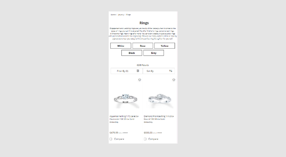
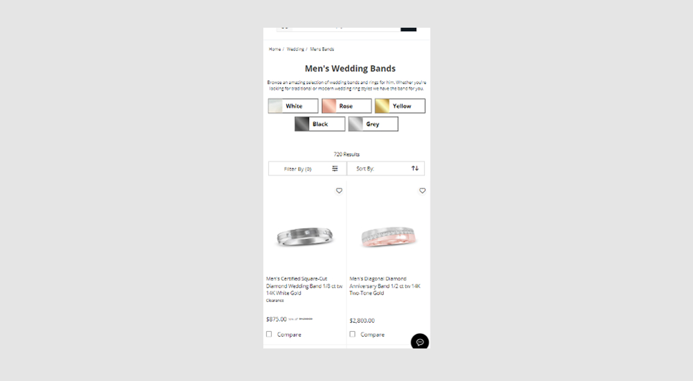
In this experiment, two types of UI filters for metal color choices were shown at the top of product listing pages. One variant only used category labels, while the other variant combined images with labels to reinforce the categories. Impact on filter usage, adds to cart and sales were measured.
Test #625 on
Online.metro-cc.ru
by  Andrey Andreev
Dec 23, 2025
Desktop
Mobile
Listing
X.X%
Sales
Andrey Tested Pattern #90: Out Of Stock Or In Stock Products On Online.metro-cc.ru
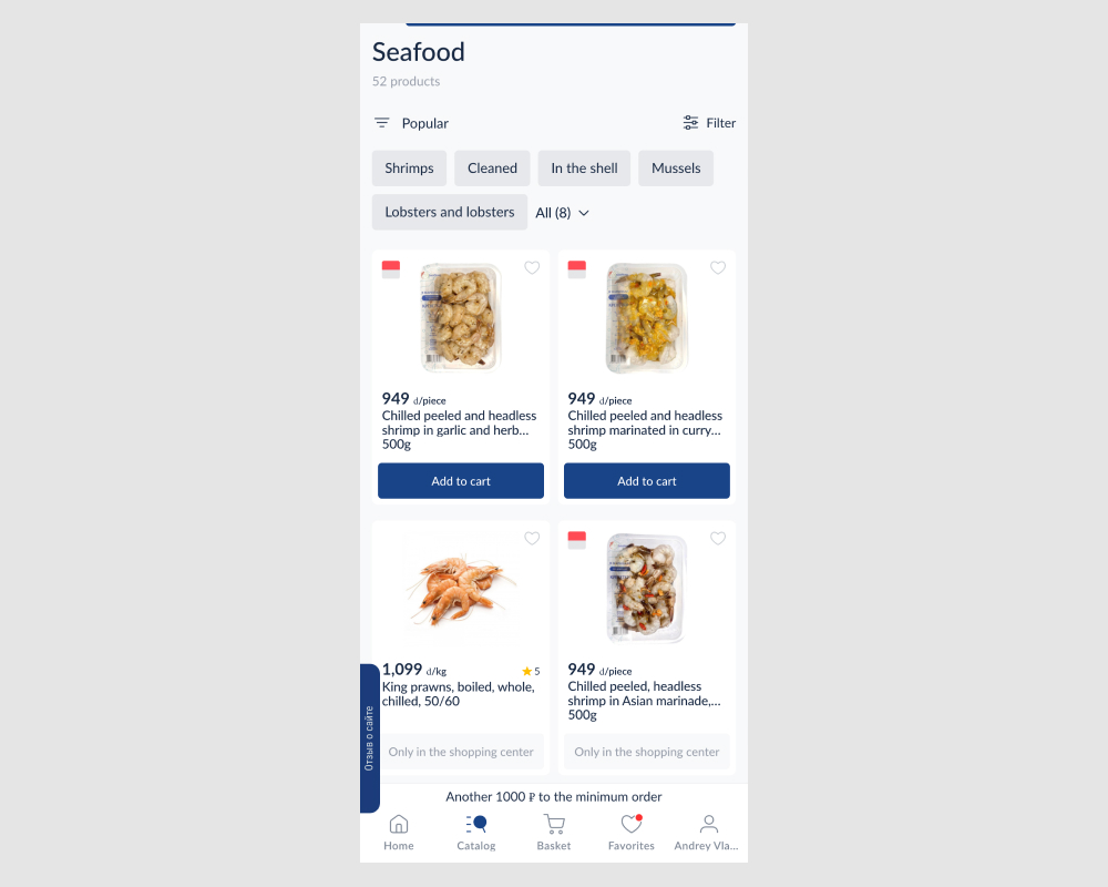
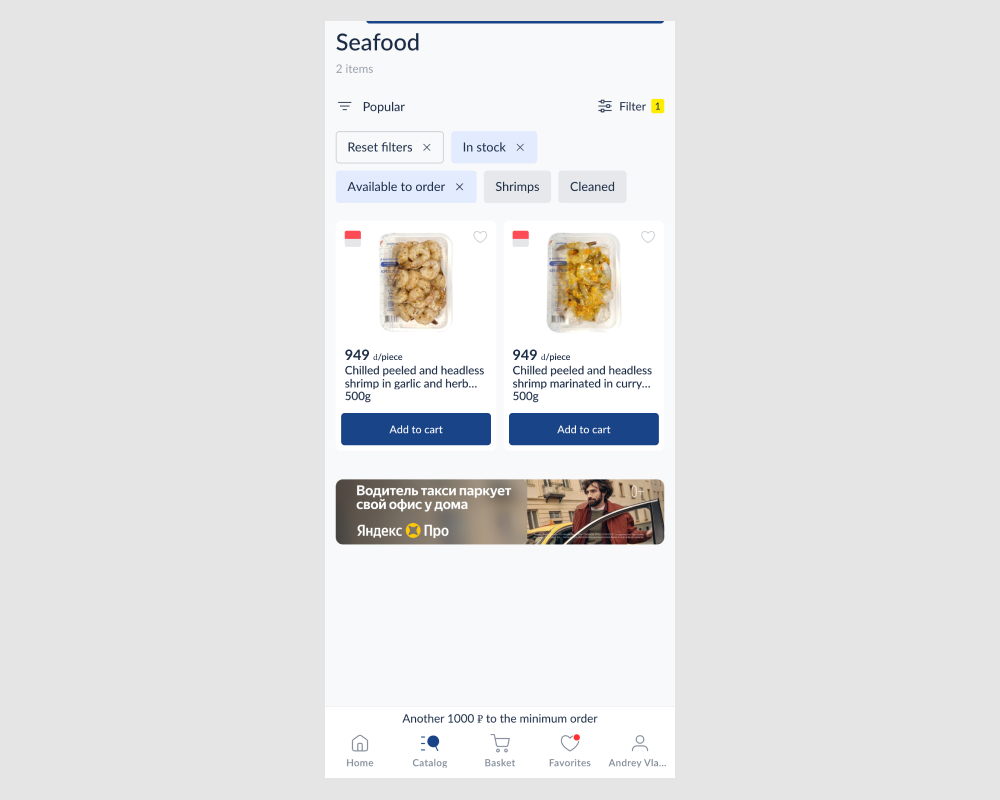
In this experiment, search results and listing pages received two additional filters to remove out-of-stock and in-store-only items. This reduced the number of results shown by default. The impact on add-to-cart actions, checkout flows, and completed sales was measured.
Test #611 on
Finn.com
by  Maksim Meged
Sep 24, 2025
Desktop
Mobile
Listing
X.X%
Sales
Maksim Tested Pattern #114: Less Or More Visible Prices On Finn.com
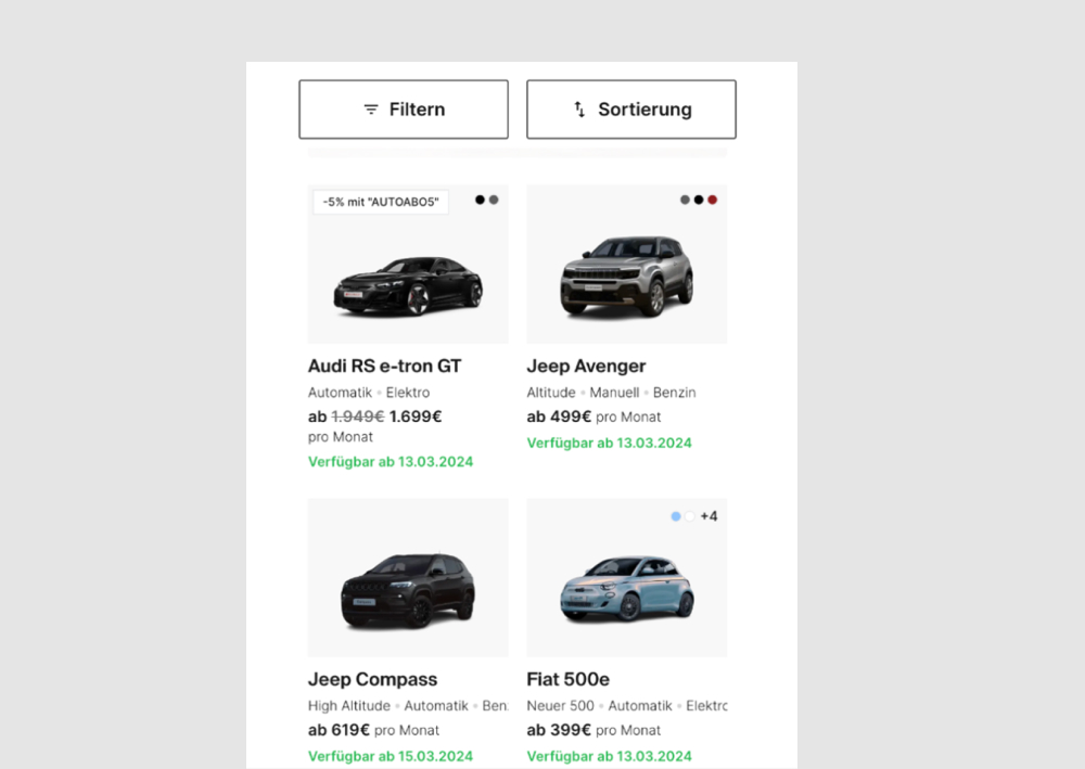
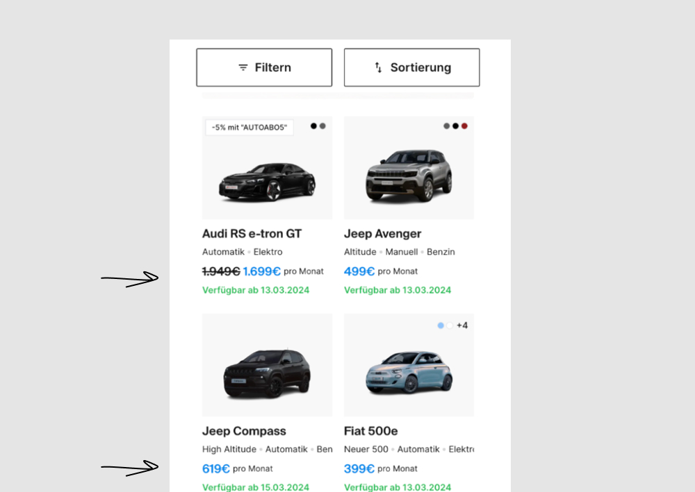
In this experiment, price was made more visible using size and a higher contrast color. Impact on progressions and bookings was measured.
Test #607 on
Backstage.com
by  Stanley Zuo
Aug 26, 2025
Mobile
Listing
X.X%
Sales
Stanley Tested Pattern #51: Shortcut Buttons On Backstage.com


In this experiment, additional "apply" buttons were shown on listing tiles which lead users one step further in the application process. These buttons were also shown with multiple role details. Impact on progression and job application starts was measured.
Test #585 on
Jared.com
by  Craig Kistler
Apr 10, 2025
Mobile
Desktop
Listing
X.X%
Sales
Craig Tested Pattern #137: Visible Filters On Jared.com
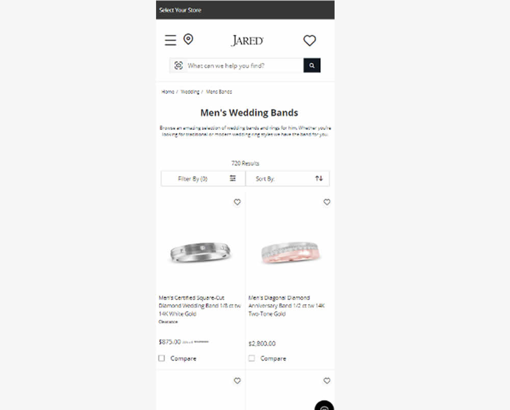
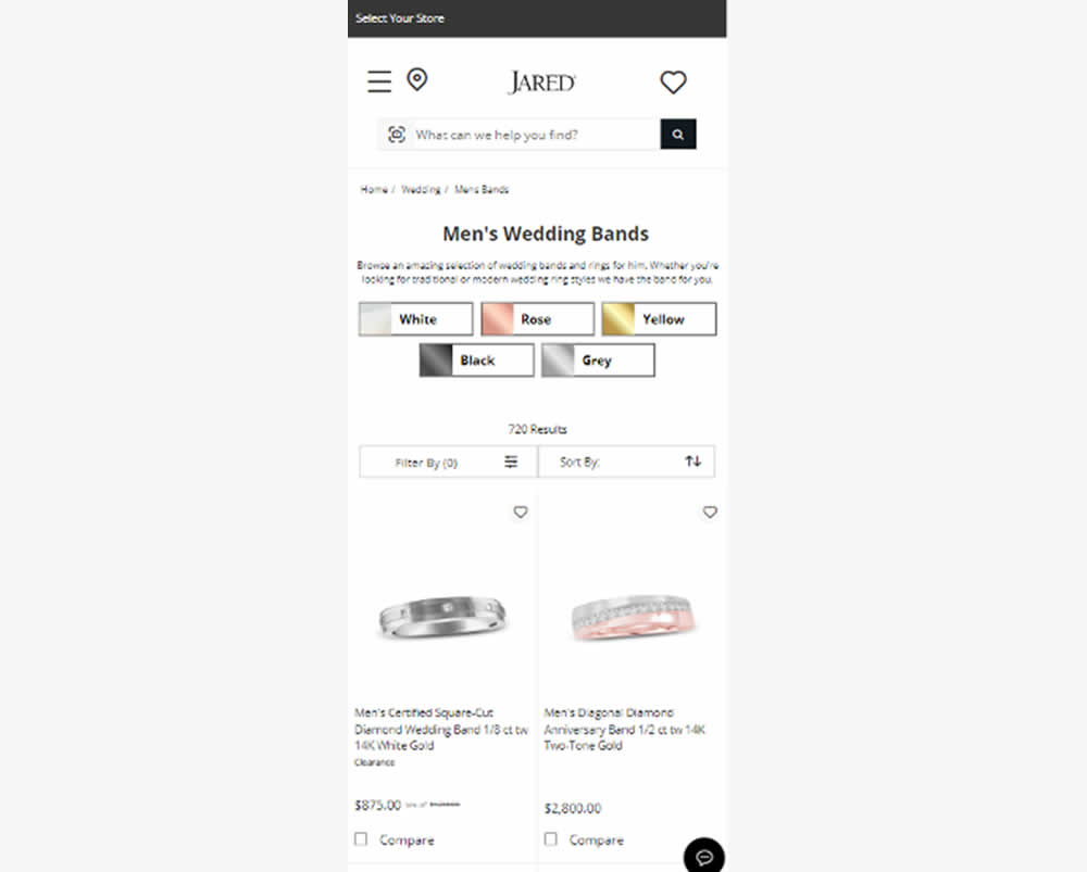
In this experiment, UI filters with metal color options were surfaced at the top of product listing pages (for Jared - an online jewelry retailer). Impact on filter usage, adds to cart and sales were measured.
Test #584 on
Snocks.com
by  Melina Hess
Mar 31, 2025
Mobile
Listing
X.X%
Sales
Melina Tested Pattern #6: Customer Star Ratings On Snocks.com
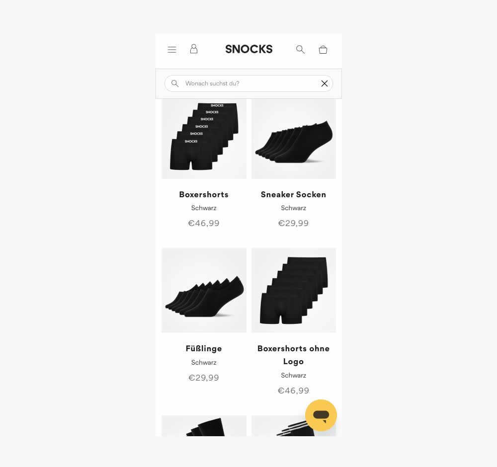
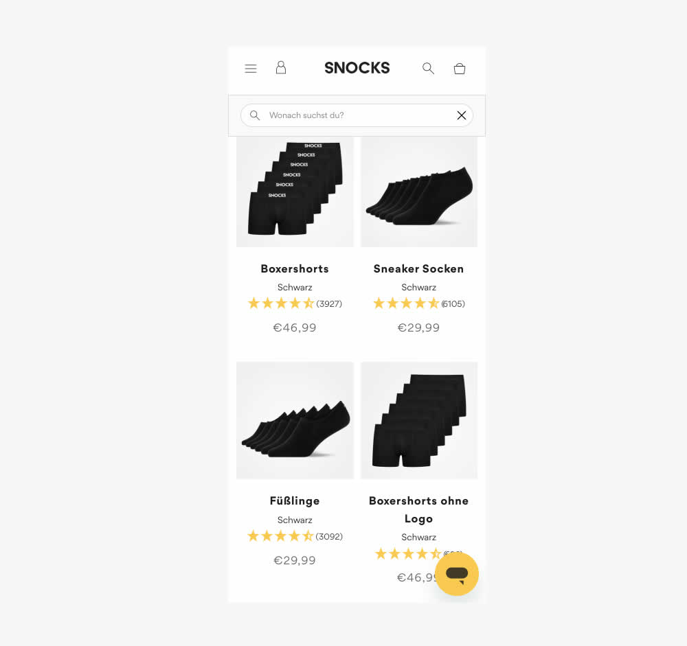
This experiment tested the presence of customer review (in the variation). As a result of adding customer reviews, the product page density decreased (requiring a bit more scrolling from longer product tiles). Impact on conversion was measured.
Also the test originally ran as a "removal of customer reviews" test. However it was flipped here to align with the pattern.
Test #583 on
Backstage.com
by  Stanley Zuo
Mar 30, 2025
Desktop
Mobile
Listing
X.X%
Sales
Stanley Tested Pattern #24: Visible Availability On Backstage.com
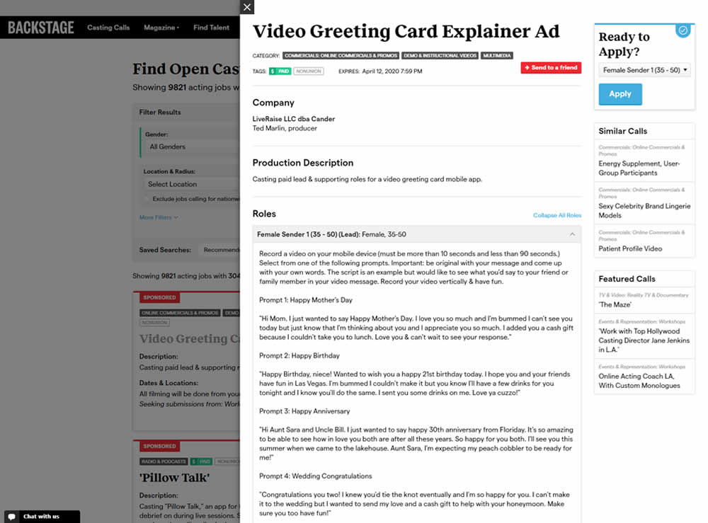
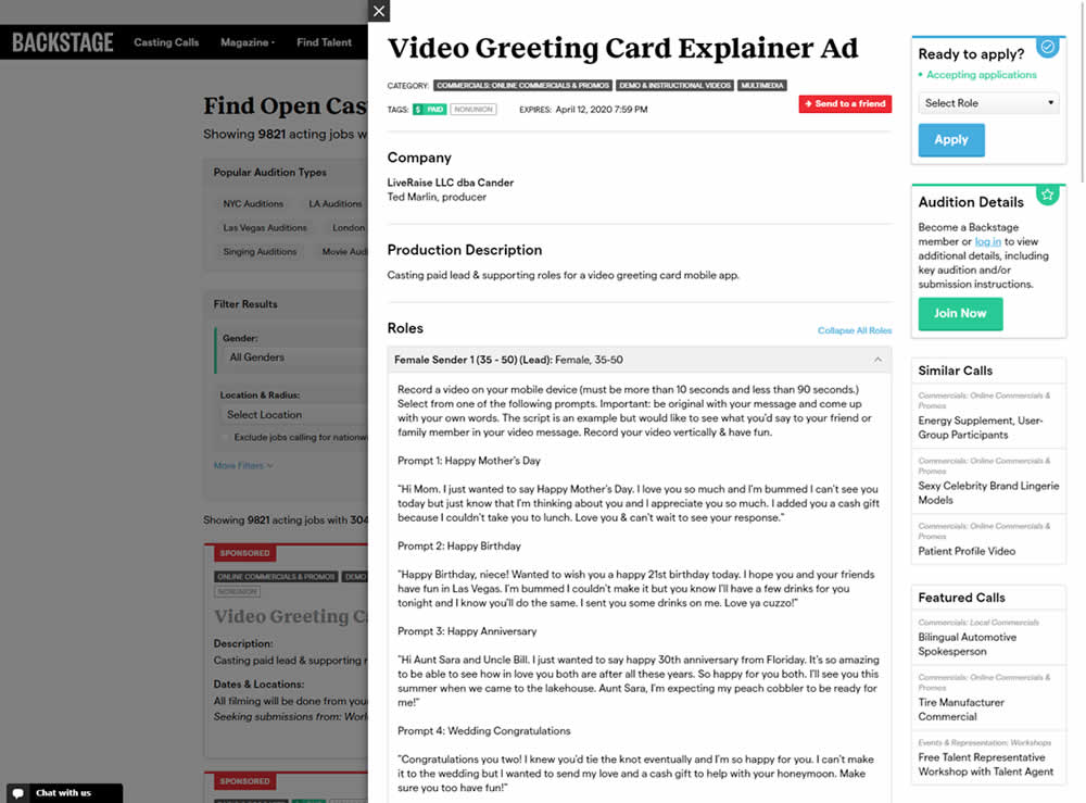
In this experiment, the active availability of a casting call (job offer) was was made more prominent using green text: "Accepting applications". The variation also made the "Join Now" button more prominent as an alternative path to signing up for a membership. The experiment reports on three metrics: clicks on apply, application starts and premium membership sales (measured a few steps further in the funnel).
Test #582 on
Online.metro-cc.ru
by  Andrey Andreev
Mar 22, 2025
Desktop
Mobile
Listing
X.X%
Sales
Andrey Tested Pattern #77: Filled Or Ghost Buttons On Online.metro-cc.ru
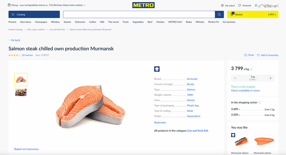
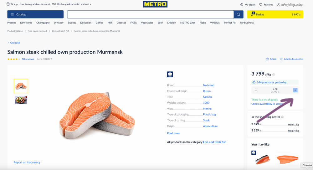
In this experiment, the plus and minus quantity icons near the add to cart button were tested with different contrasts. The control had a higher contrast from a solid background color, and the variant was lower contrast. Impact on add to cart and sales was measured. (A/B test was inverted to B/A in order to fit the pattern).
Test #576 on
Finn.com
by  Tim Karcher
Feb 12, 2025
Mobile
Listing
X.X%
Leads
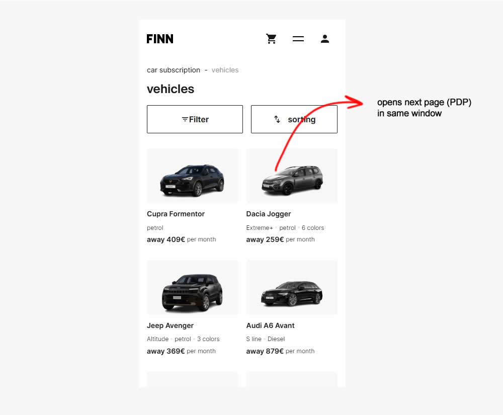
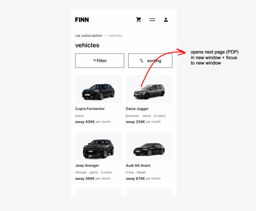
Tim Tested Pattern #34: Open In A New Tab On Finn.com
Test #575 on
Finn.com
by  Tim Karcher
Feb 12, 2025
Desktop
Listing
X.X%
Leads
Tim Tested Pattern #34: Open In A New Tab On Finn.com
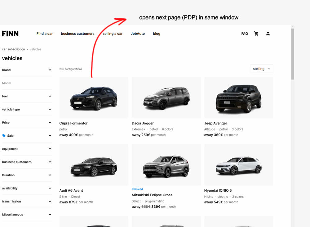
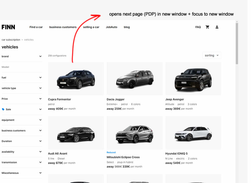
In this experiment, product listing were either opened in the same window (control) or opened in a new tab and focused on (variation). Impact on signups and sales was measured.
Test #559 on
Tourradar.com
by  Clemens Grave
Oct 18, 2024
Desktop
Listing
X.X%
Progression
Clemens Tested Pattern #137: Visible Filters On Tourradar.com
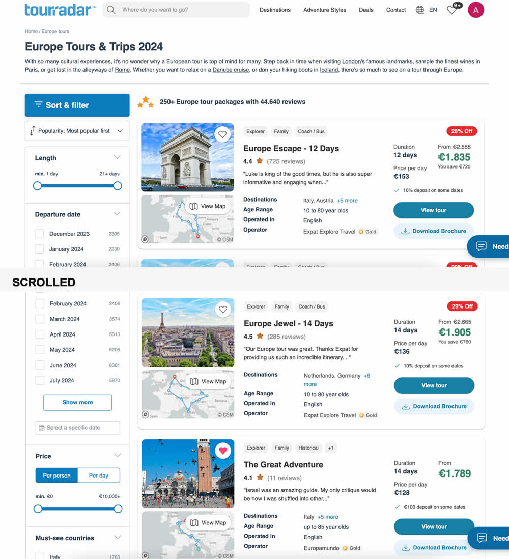

In this experiment, left column filters (control) were tested against top-aligned and sticky filters (variation). The hypothesis was to increase their visibility. Impact on their use and progression to next step (product/tour detail page) were measured.
Test #550 on
Online.metro-cc.ru
by  Andrey Andreev
Aug 14, 2024
Mobile
Listing
X.X%
Sales
Andrey Tested Pattern #137: Visible Filters On Online.metro-cc.ru
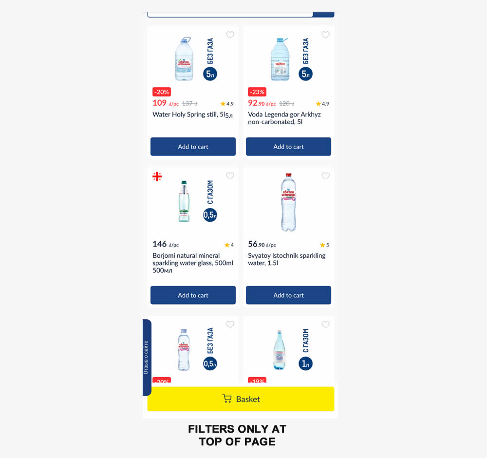
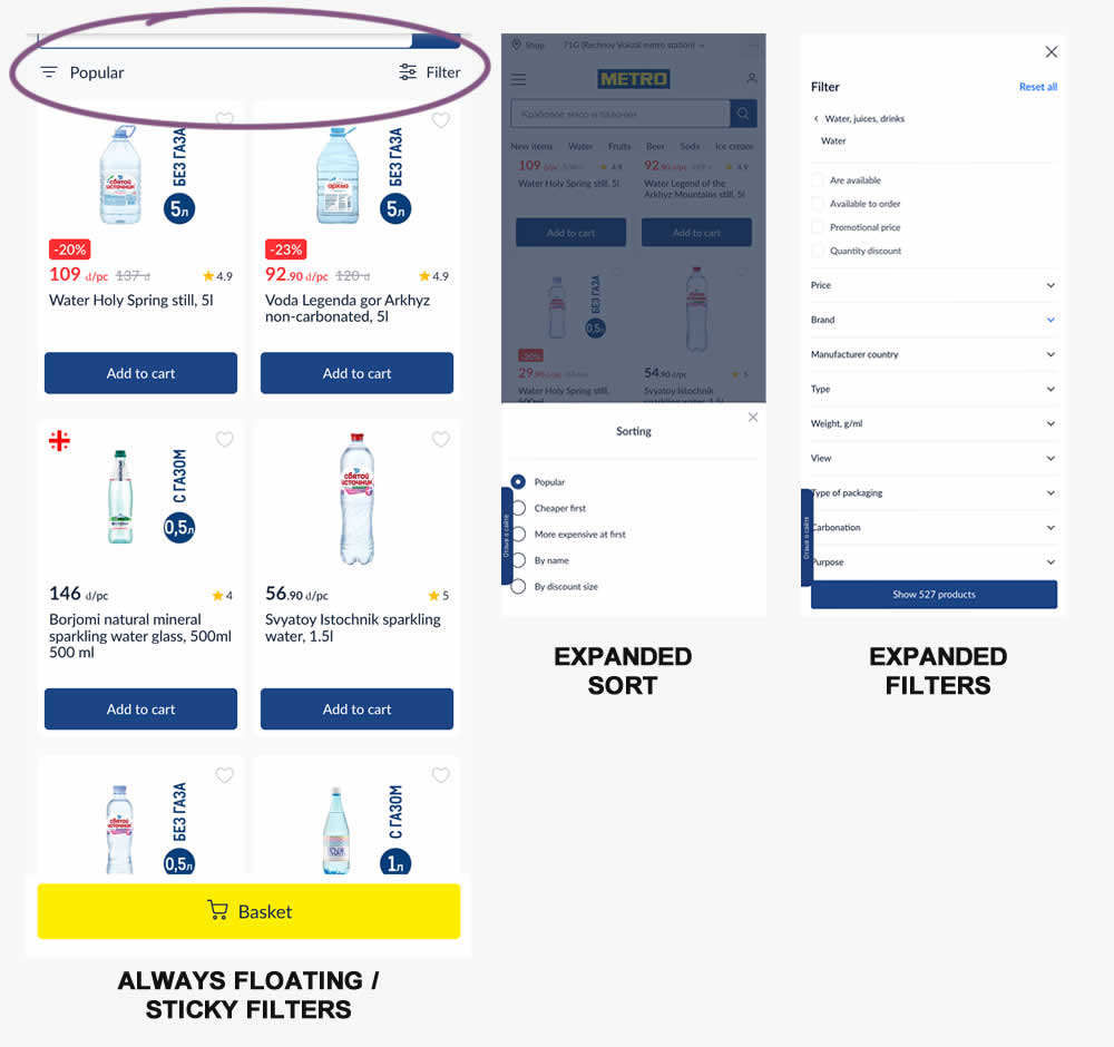
Instead of only displaying sort and filters at the top of a listing page, the variation always had them visible with a sticky/floating interaction. Impact on sales was measured.
Test #549 on
Kay.com
by  Craig Kistler
Aug 13, 2024
Desktop
Listing
X.X%
Sales
Craig Tested Pattern #138: Visible Payment Options On Kay.com
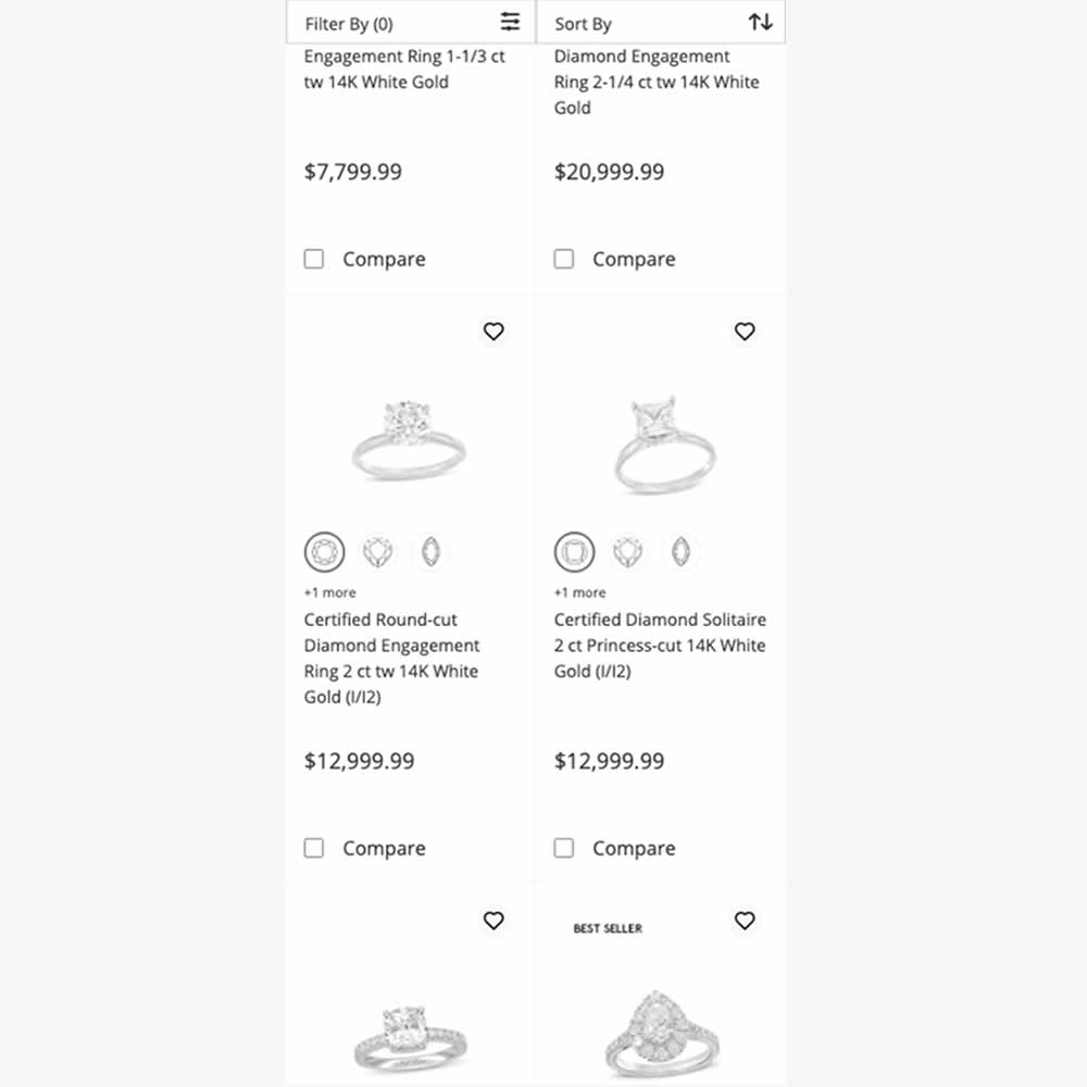
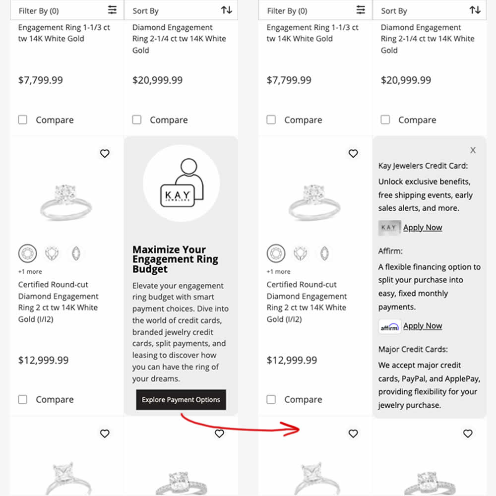
In this experiment, an inline panel was shown as a product tile. The panel informed customers about a variety of payment options (with detailed information being further presented after a button click). Impact on sales was measured.
Test #541 on
Online.metro-cc.ru
by  Andrey Andreev
Jul 10, 2024
Desktop
Listing
X.X%
Sales
Andrey Tested Pattern #137: Visible Filters On Online.metro-cc.ru
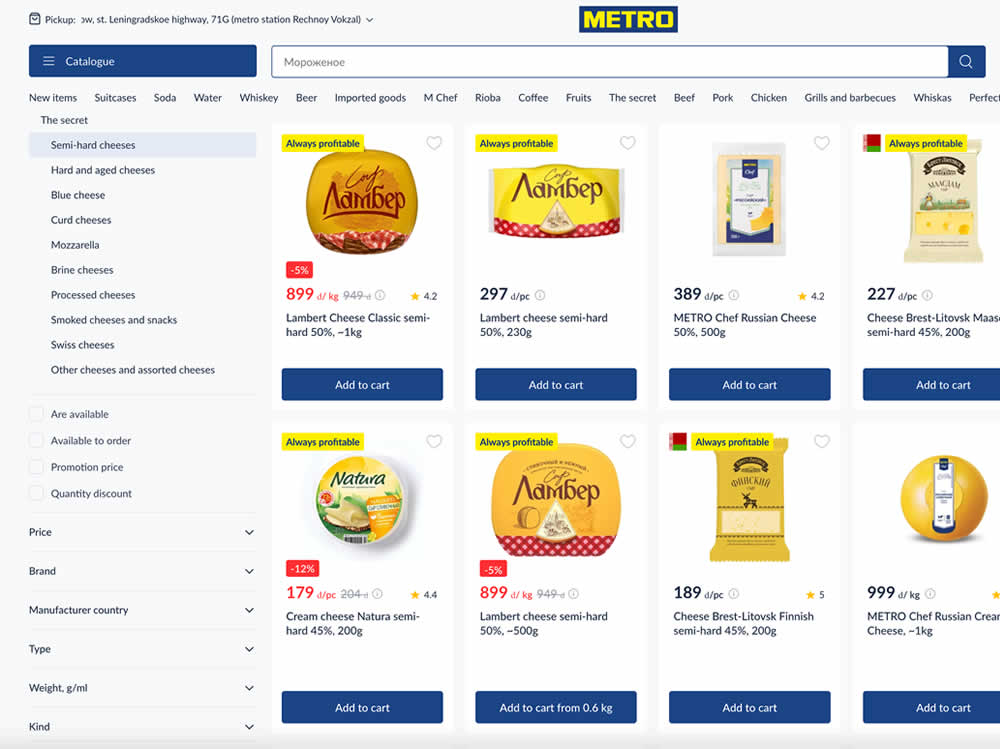
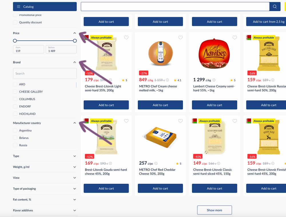
In this experiment, some side column filters were made more visible by being automatically expanded. These included: brand, price and country of manufacturing.
Test #540 on
Finn.com
by  Maksim Meged
Jun 28, 2024
Mobile
Listing
X.X%
Sales
Maksim Tested Pattern #136: Earliest Availability On Finn.com
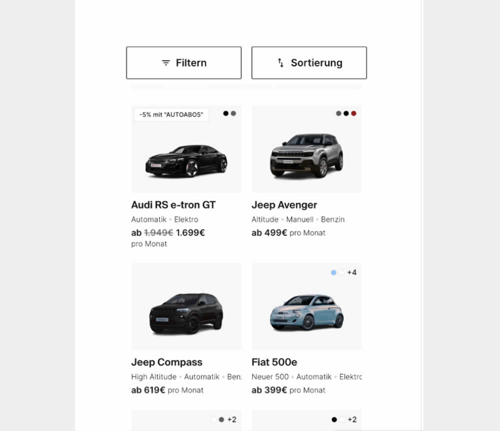
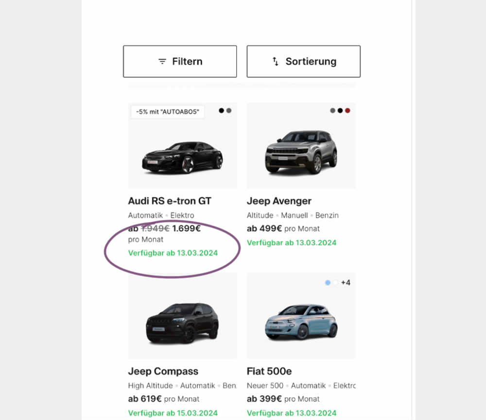
In this experiment, the earliest availability dates were displayed underneath product tiles on listing pages. This was a/b tested on a car rental service website. Impact on product adds-to-cart as well as transactions was measured.
Test #535 on
686.com
by  Adan Archila
May 31, 2024
Desktop
Listing
X.X%
Sales
Adan Tested Pattern #120: Supporting Theme Images On 686.com
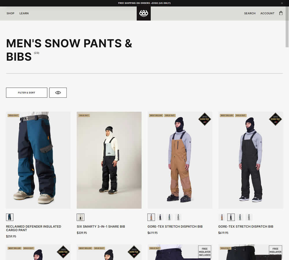
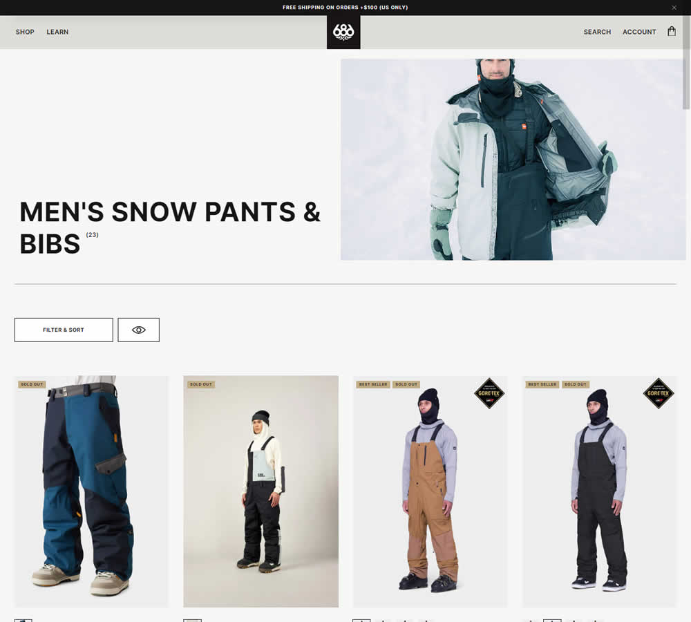
In this experiment, a static category theme image at the top of a listing page was tested against the same page but without the extra image. Impact on sales was measured.
Test #532 on
Finn.com
by  Maksim Meged
May 10, 2024
Mobile
Listing
X.X%
Sales
Maksim Tested Pattern #76: Infinite Scrolling Or Pagination On Finn.com


In this experiment, infinite scrolling was a/b tested against a paginated one.