All Latest 615 A/B Tests
MOST RECENT TESTS
Test #104 on
3dhubs.com
by  Rob Draaijer
Mar 31, 2021
Desktop
Listing
X.X%
Leads
Rob Tested Pattern #15: Bulleted Reassurances On 3dhubs.com
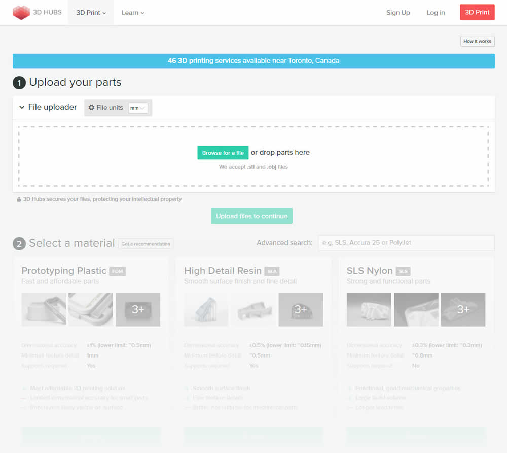
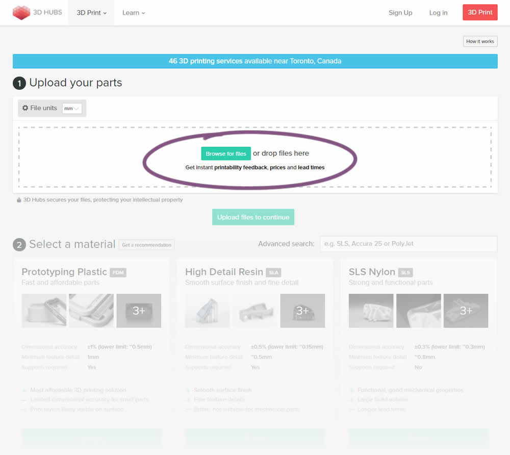
This experiment attempted to increase the number of leads on a lead-funnel. As the first step, users were being asked to upload a file. The control showed the file types that were allowed, whereas the variation changed the copy to show a number of benefits for taking that action. The text-based benefits included the: receiving feedback, prices and lead times.
Which A Or B Actually Wins? Find Out Before You Test.
Members see every test result — the winners, the flat ones, and the losers — along with exact effects and sample sizes. Use it to estimate your tests and prioritize by probability, not gut feel. Start every experiment with the odds on your side.
Test #342 on
Backstage.com
by  Stanley Zuo
Feb 28, 2021
Desktop
Mobile
Listing
X.X%
Engagement
Stanley Tested Pattern #25: Nagging Results On Backstage.com
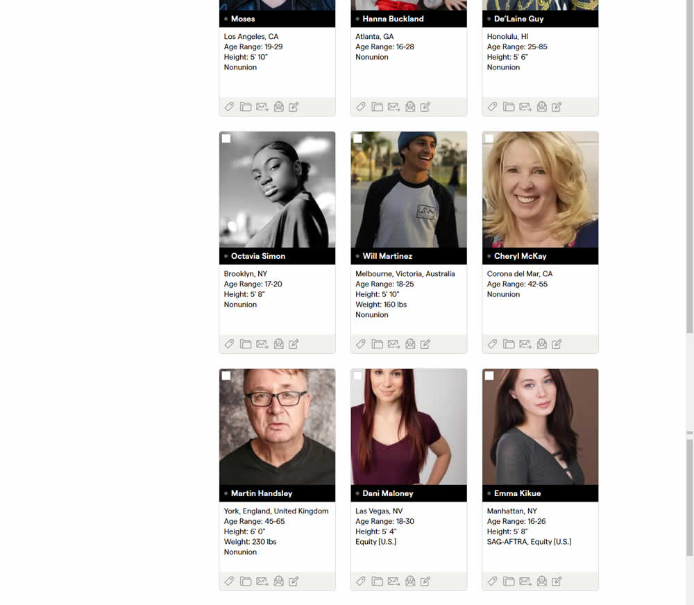
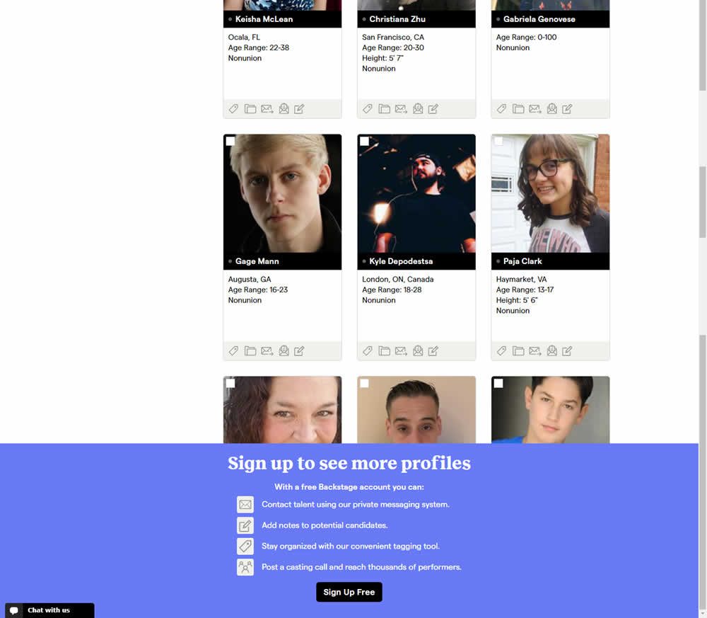
In this experiment, a registration wall was added on a listing page of casting call profiles. The registration wall appeared after the first 9 listings or so and encouraged users to sign up. Impact on registrations was measured, along with an engagement metric of "posting a job".
Test #337 on
Backstage.com
by  Stanley Zuo
Jan 28, 2021
Desktop
Mobile
Listing
X.X%
Sales
Stanley Tested Pattern #51: Shortcut Buttons On Backstage.com
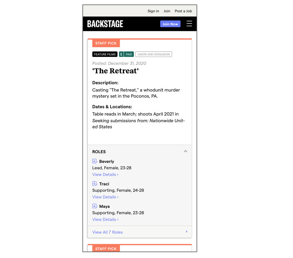
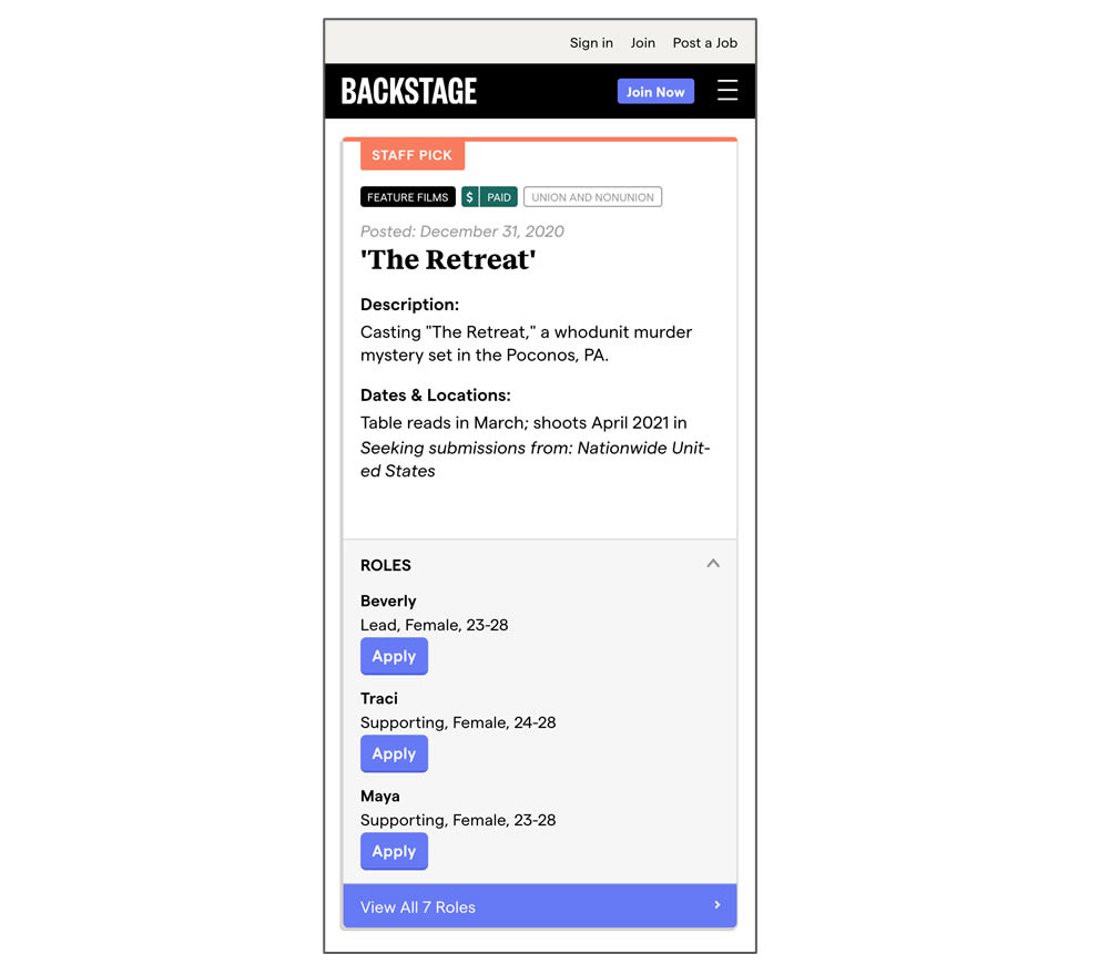
In this experiment, a listing page was expanded to show two actions (apply and view details) instead of a single one (view details only). In the variant, the "view detail" links were replaced with "apply links" starting a job application (and membership flows) sooner.
Test #336 on
Backstage.com
by  Stanley Zuo
Jan 28, 2021
Desktop
Mobile
Listing
X.X%
Sales
Stanley Tested Pattern #51: Shortcut Buttons On Backstage.com
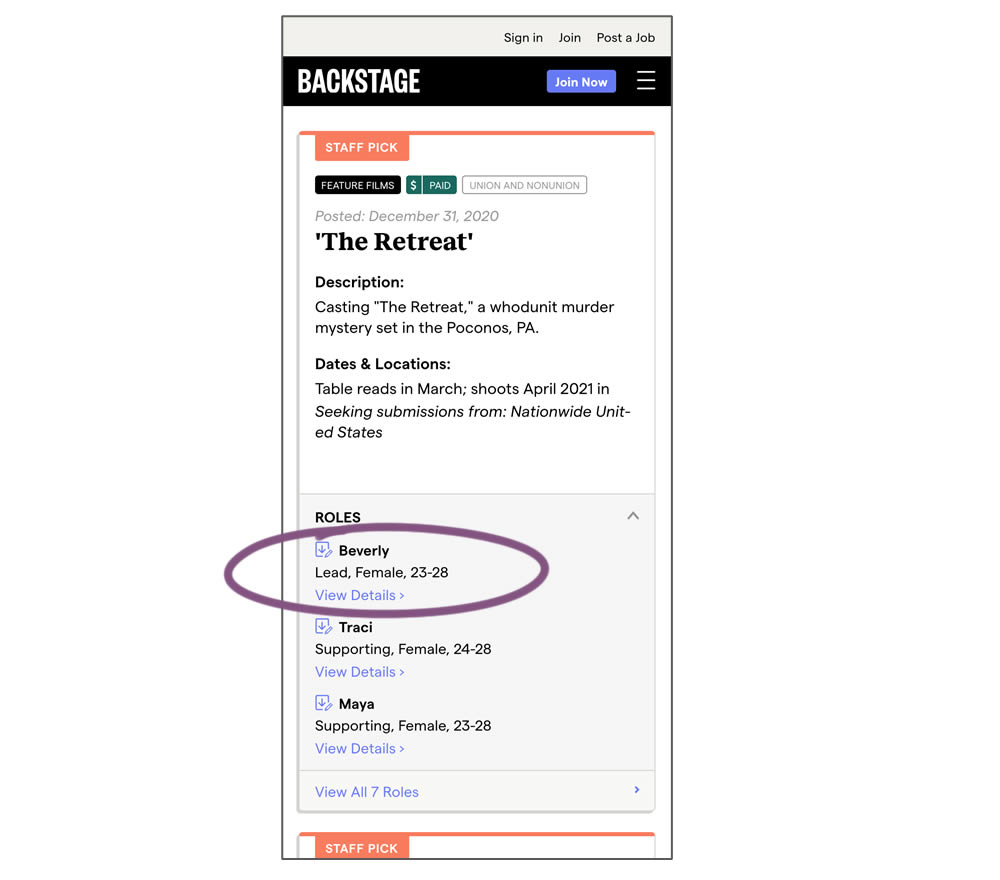
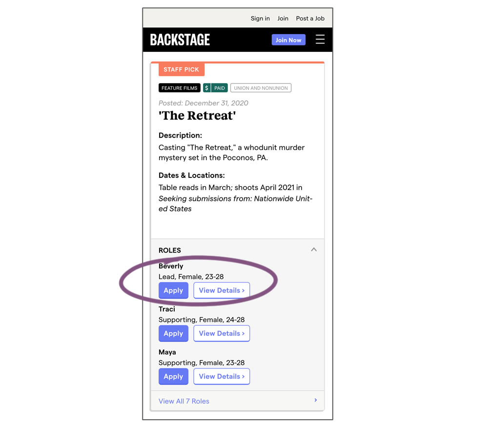
In this experiment, a listing page was expanded to show two actions (apply and view details) instead of a single one (view details only). This variation enabled users with a shortcut action to apply for roles one step earlier (and start membership flows for new users).
Test #98 on
3dhubs.com
by  Rob Draaijer
Nov 30, 2020
Desktop
Mobile
Listing
X.X%
Leads
Rob Tested Pattern #24: Visible Availability On 3dhubs.com

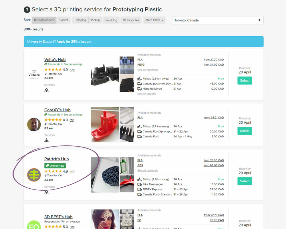
In this experiment, the variation showed a listing's owner online status as a badge, instead of showing their average "response time". More specifically, an "Online Now" badge was shown beside individual listings of a 3D printing marketplace site. The experiment measured completed quote / lead requests (a few steps further).
Test #310 on
Backstage.com
by  Stanley Zuo
Jul 25, 2020
Mobile
Listing
X.X%
Sales
Stanley Tested Pattern #77: Filled Or Ghost Buttons On Backstage.com
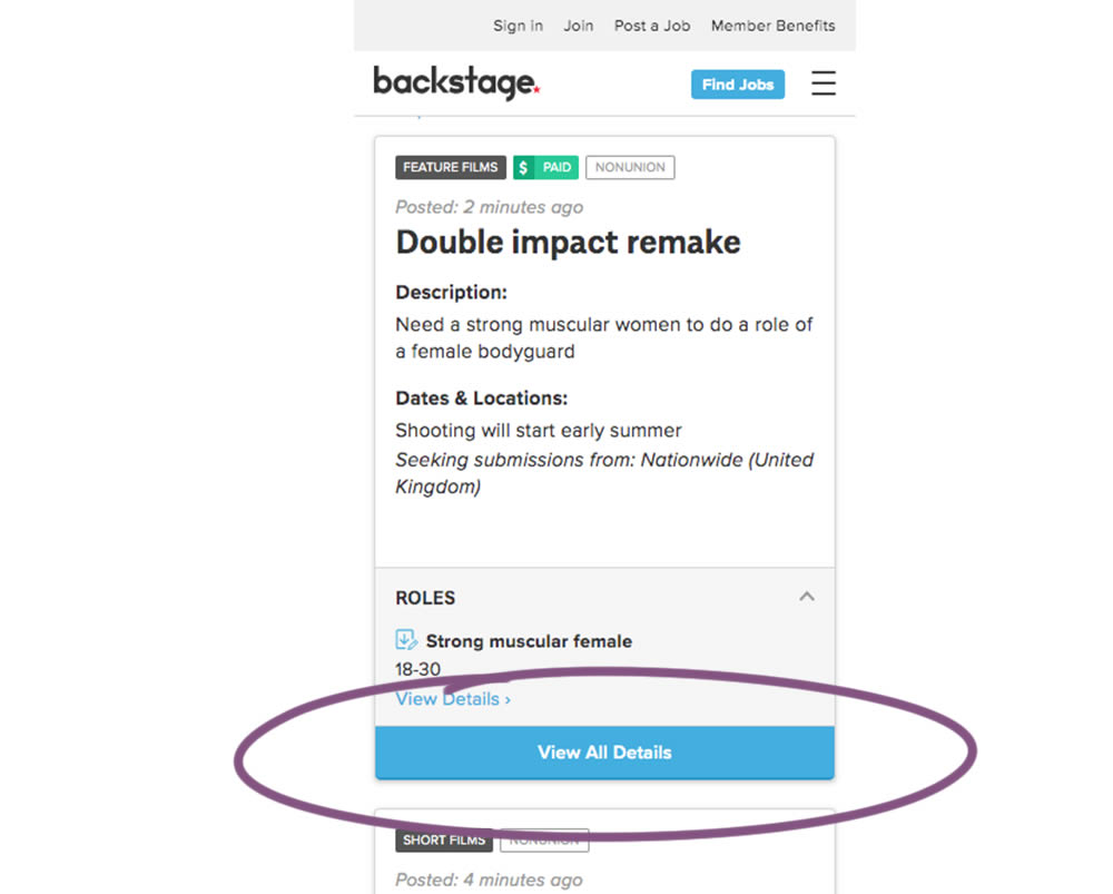
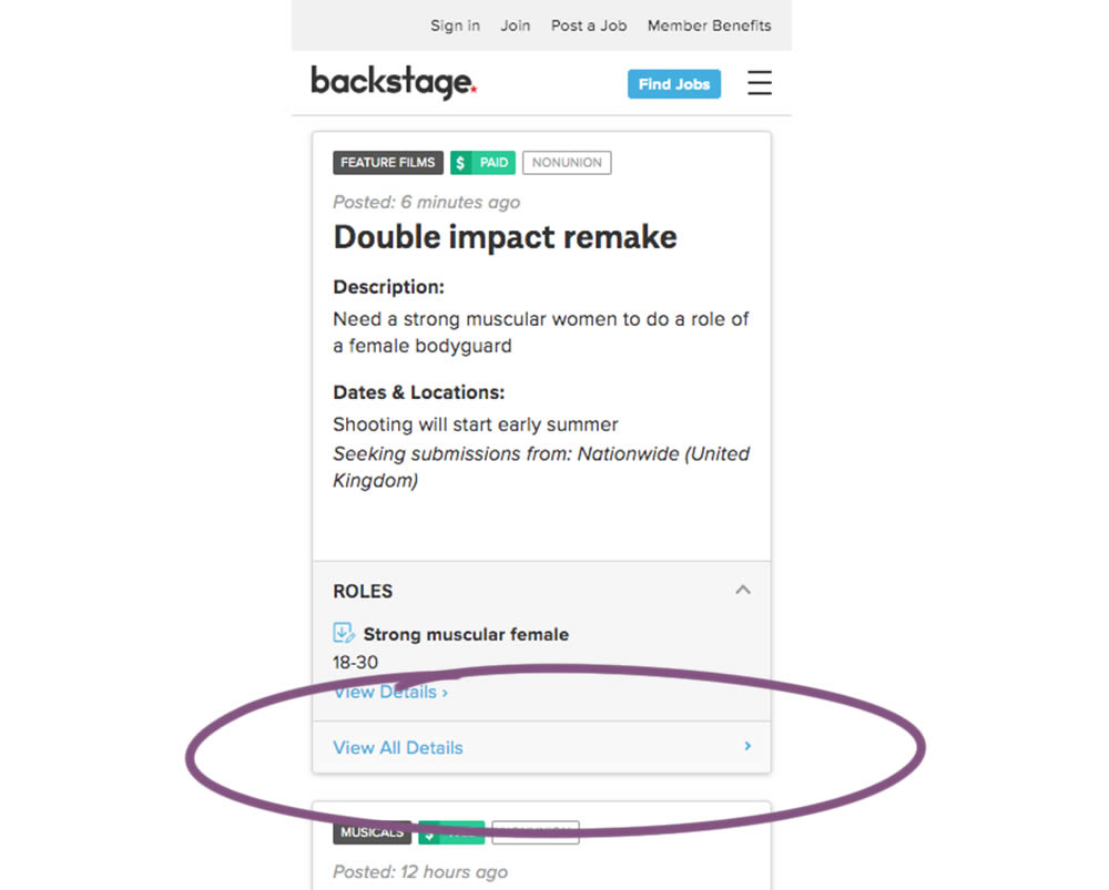
In this experiment, the style of a button leading to view detailed casting calls on a listing page was changed. In the A version the style was a filled high contrast blue background, and the B variation had a feint "ghost button" style.
Test #309 on
Thomasnet.com
by  Julian Gaviria
Jul 24, 2020
Desktop
Listing
X.X%
Progression
Julian Tested Pattern #72: Priming Step On Thomasnet.com
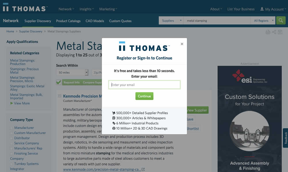
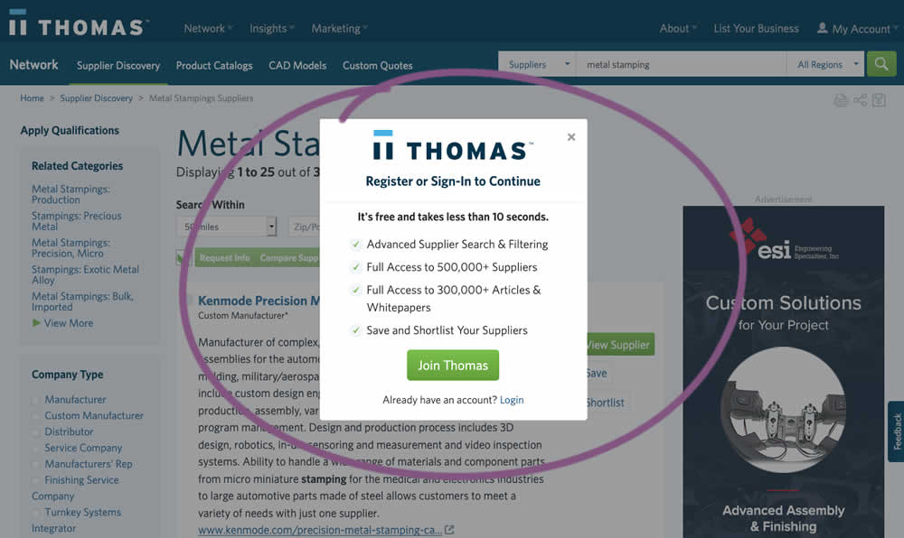
In this experiment, an extra step was prepended at the beginning of a multiple step signup modal flow. The signup modal would appear on listing pages after requests to contact a listed company. The idea was to prime users with benefits of signing up in order to increase their motivation to do so. The experiment measured the impact on the initial progression (to the step with the email form).
Test #299 on
Backstage.com
by  Stanley Zuo
May 22, 2020
Desktop
Mobile
Listing
X.X%
Sales
Stanley Tested Pattern #60: Repeated Bottom Call To Action On Backstage.com
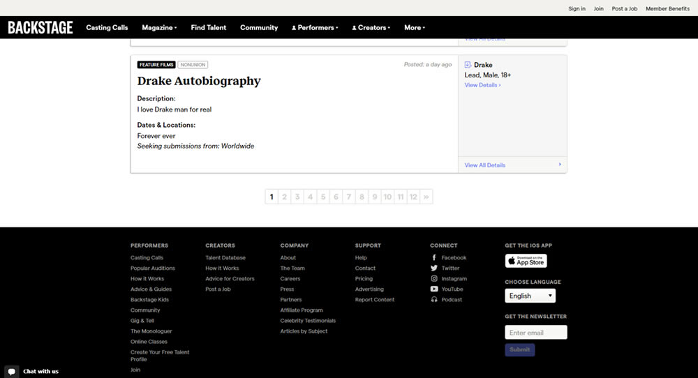
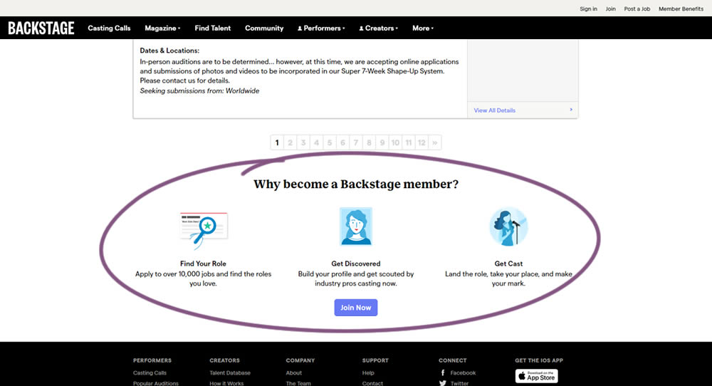
In this experiment, at the bottom of a search results screen, a membership join button was added along with 3 encouraging reasons. The experiment measured membership funnel starts, as well as paid membership transactions (sales).
Test #298 on
Zapimoveis.com.br
by  Vinicius Barros Peixoto
May 14, 2020
Desktop
Mobile
Listing
X.X%
Leads
Vinicius Tested Pattern #36: Fewer Or More Results On Zapimoveis.com.br
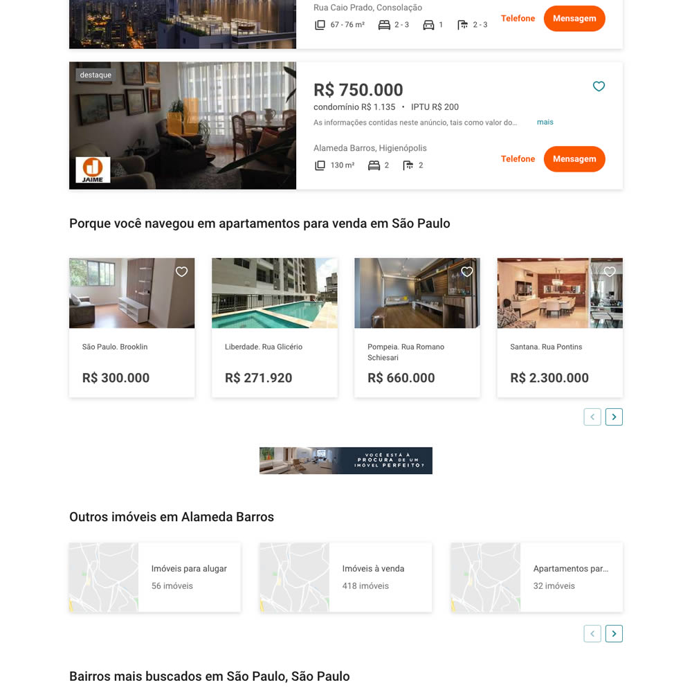
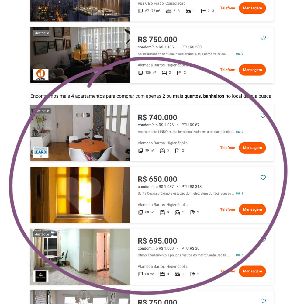
In this experiment on a listing page, the search was expanded to show more listings (variation B). Conditionally, if there were fewer than 36 results, set basic filters such as number bedrooms and bathrooms were expanded and appended to the results. Hence if someone chose 2 bedrooms and 2 bathrooms in variation A, they would only see listing with that filter. In variation B however they would first see the filtered results, and later they would also see results with 3 or more of each.
Test #292 on
Backstage.com
by  Stanley Zuo
Apr 13, 2020
Desktop
Mobile
Listing
X.X%
Sales
Stanley Tested Pattern #24: Visible Availability On Backstage.com
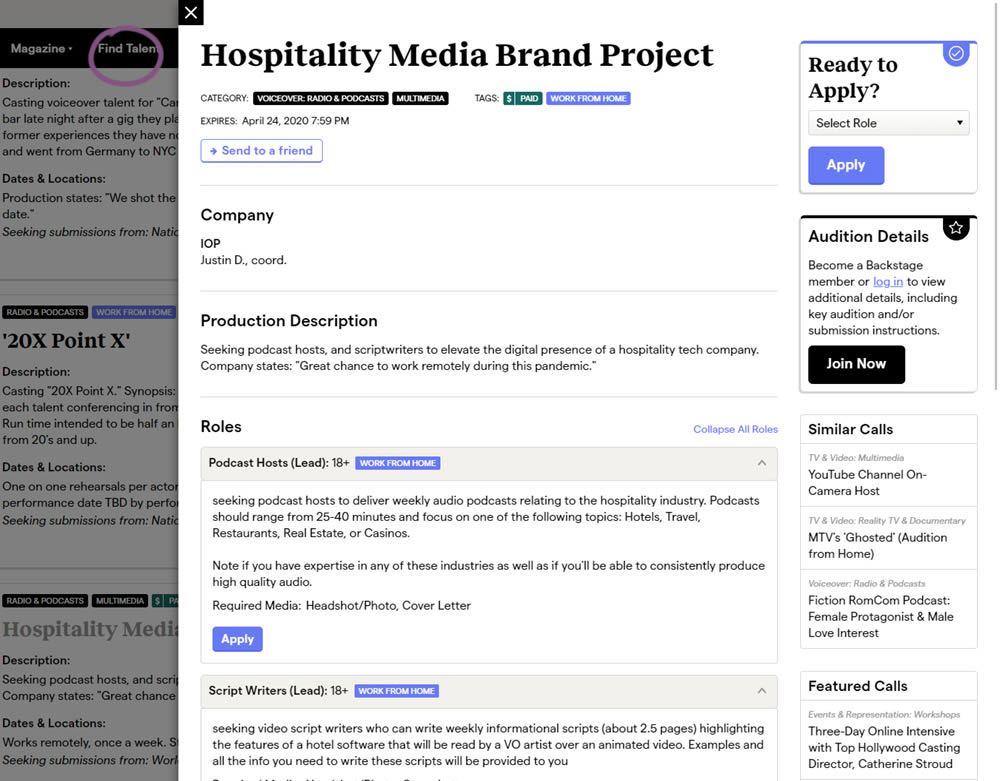
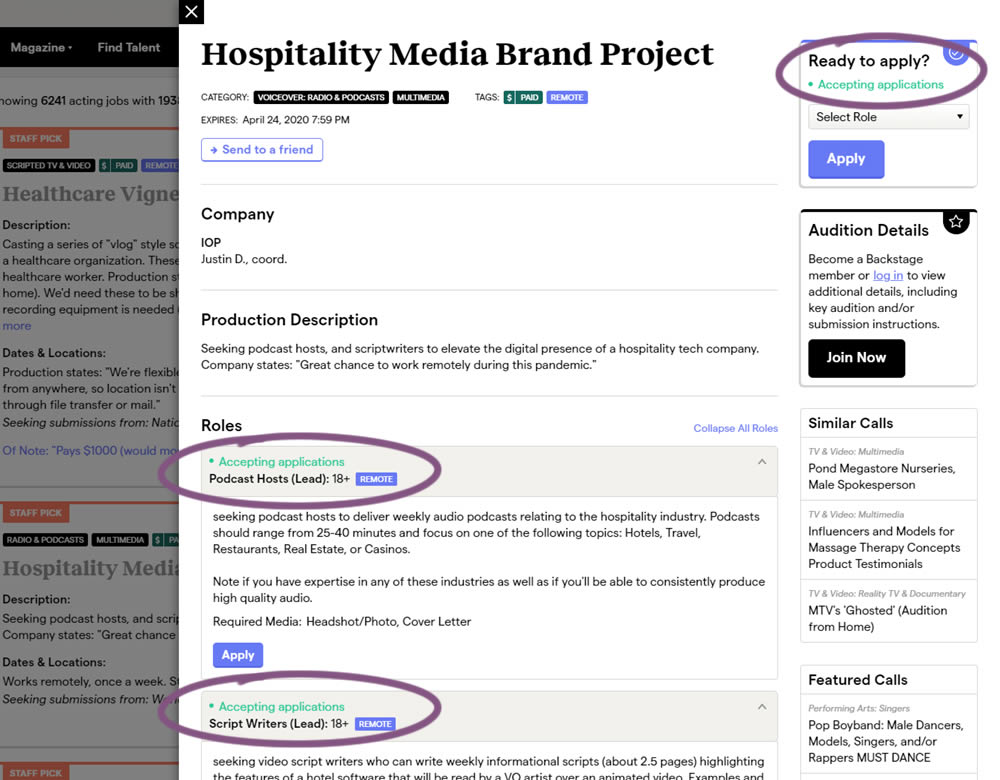
The core hypothesis of this experiment was that by showing clear availability (in green text) beside each casting call, more users would apply and become premium members. The experiment reports on two metrics: application starts (the first progression metric), and premium membership sales (measured a few steps further in the funnel).
Test #284 on
Thomasnet.com
by  Julian Gaviria
Feb 19, 2020
Desktop
Mobile
Listing
X.X%
Leads
Julian Tested Pattern #78: Tags, Badges And Structured Information On Thomasnet.com
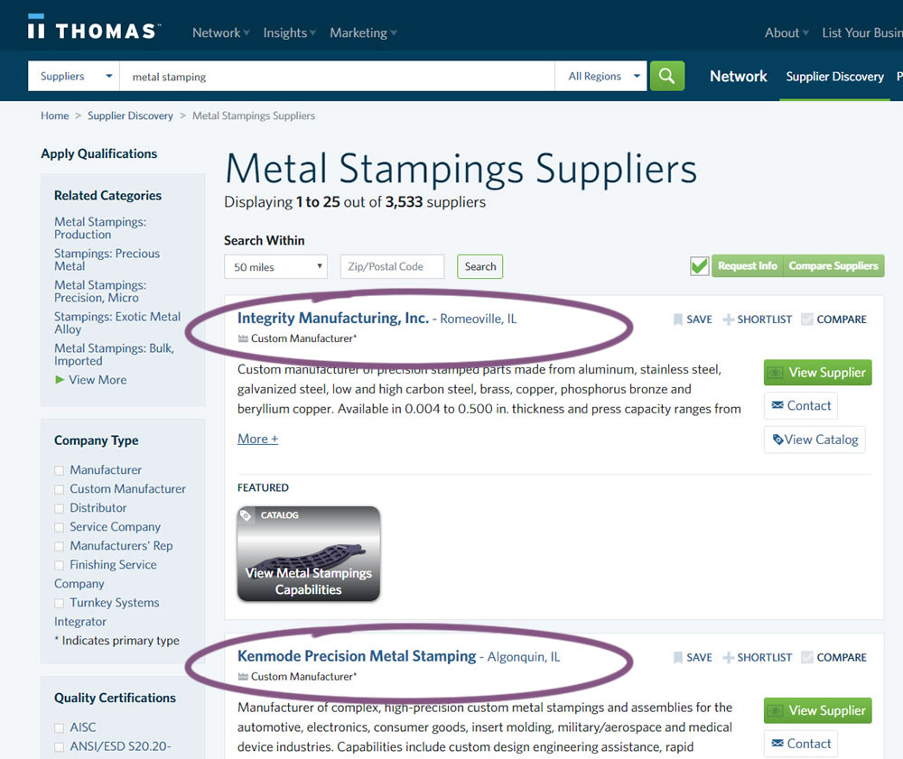
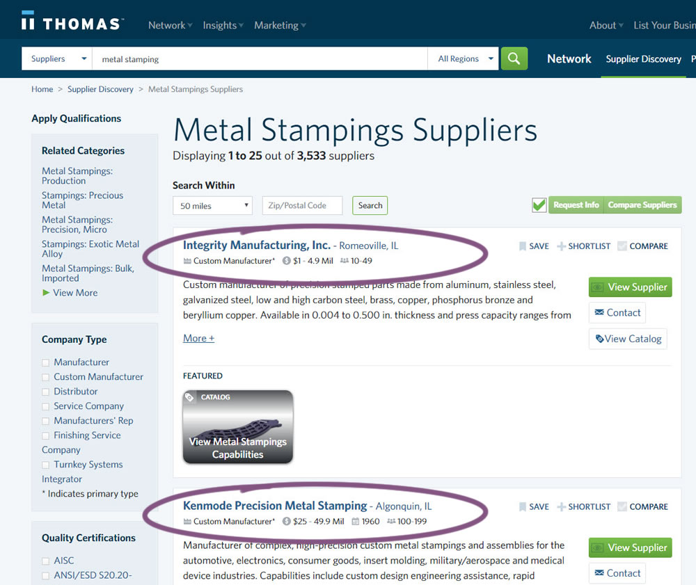
In this experiment, structured data tags were displayed on a listing page to help potential buyers make better decisions. The additional information about the listed companies included: annual revenue, employee count, and year of establishment.
Test #282 on
Thomasnet.com
by  Julian Gaviria
Feb 07, 2020
Desktop
Mobile
Listing
X.X%
Leads
Julian Tested Pattern #51: Shortcut Buttons On Thomasnet.com
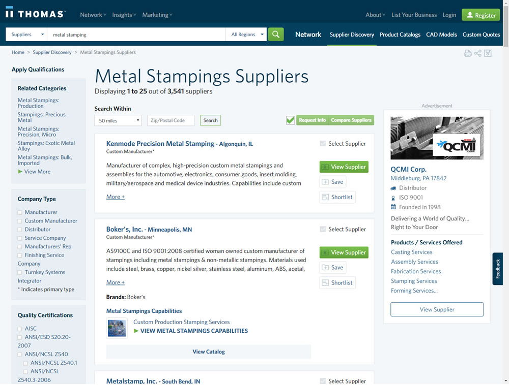
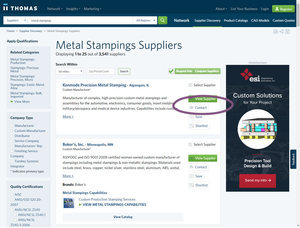
In this experiment, a contact button was added to a listing / search results page to make it faster to contact a company. This same button was also visible on the company detail page.
Test #281 on
Backstage.com
by  Stanley Zuo
Jan 31, 2020
Desktop
Listing
X.X%
Sales
Stanley Tested Pattern #116: Links Or Buttons On Backstage.com
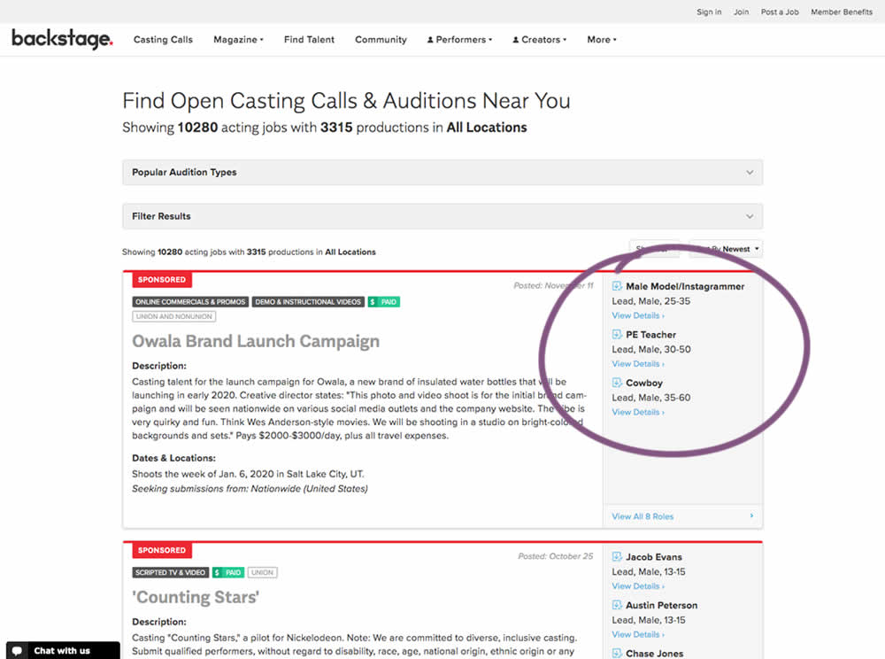
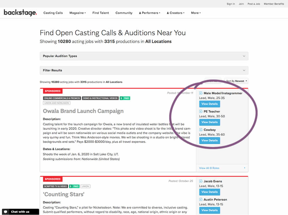
In this experiment, multiple view detail links for a listing tile were turned into higher contrast buttons.
Test #270 on
Dentalplans.com
by  J.R. Hernandez
Nov 19, 2019
Desktop
Listing
X.X%
Sales
J.R. Tested Pattern #37: List Or Grid View On Dentalplans.com
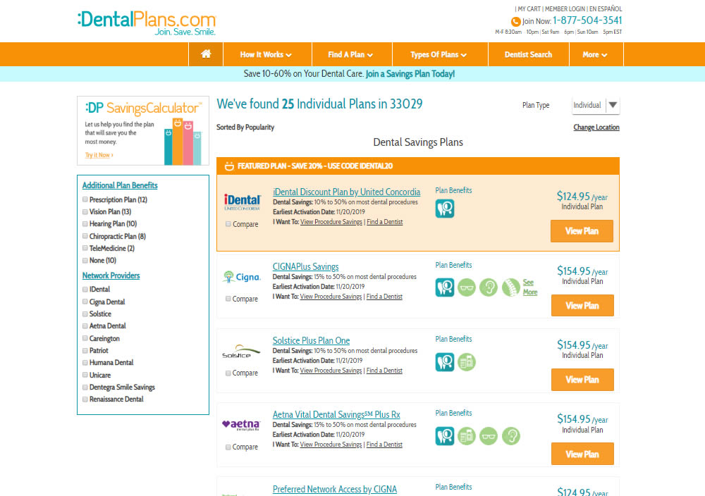
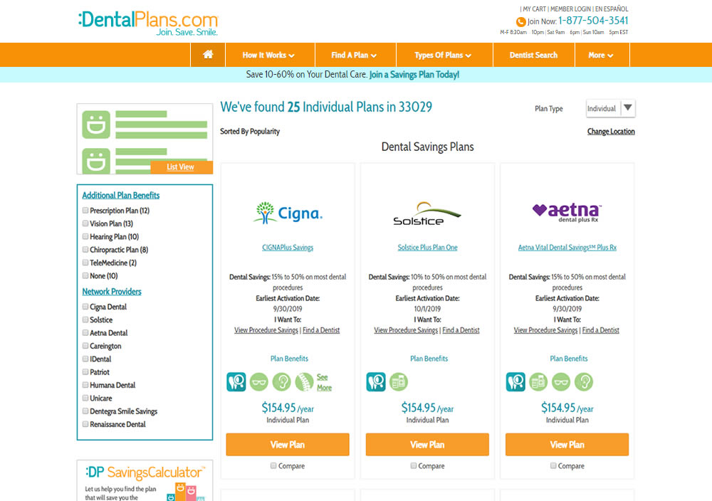
In this experiment, a list view was tested against a grid view.
Test #268 on
Backstage.com
by  Stanley Zuo
Nov 08, 2019
Mobile
Listing
X.X%
Sales
Stanley Tested Pattern #14: Exposed Menu Options On Backstage.com
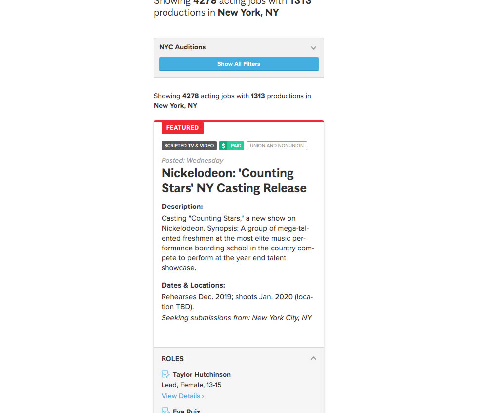
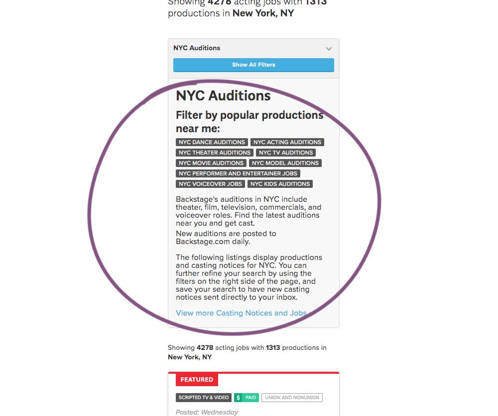
The change in this experiment was an exposed SEO panel (B) with a number of clickable filter options.
Test #262 on
Thomasnet.com
by  Julian Gaviria
Oct 03, 2019
Desktop
Mobile
Listing
X.X%
Leads
Julian Tested Pattern #32: Condensed List On Thomasnet.com
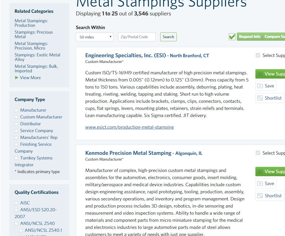
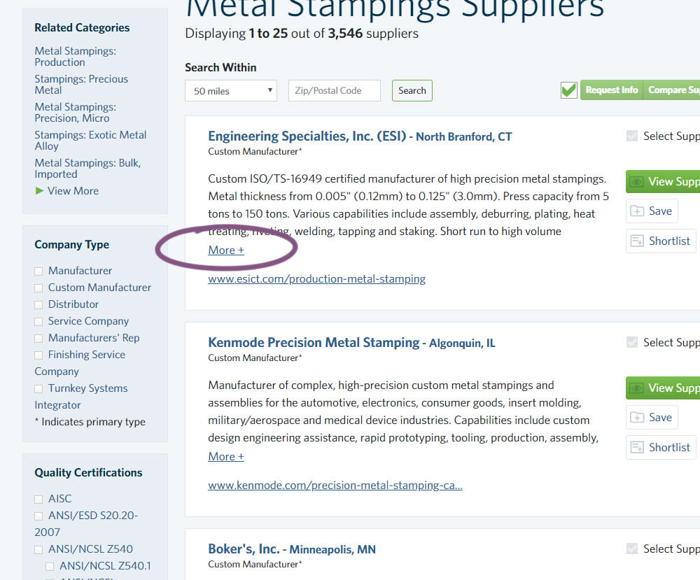
In this experiment, the B version condensed the company listings. This was done by showing less of the description and introducing a "more" and "less" dynamic links that would expand and collapse the description.
Test #240 on
Thomasnet.com
by  Julian Gaviria
May 16, 2019
Desktop
Listing
X.X%
Engagement
Julian Tested Pattern #13: Centered Forms & Buttons On Thomasnet.com
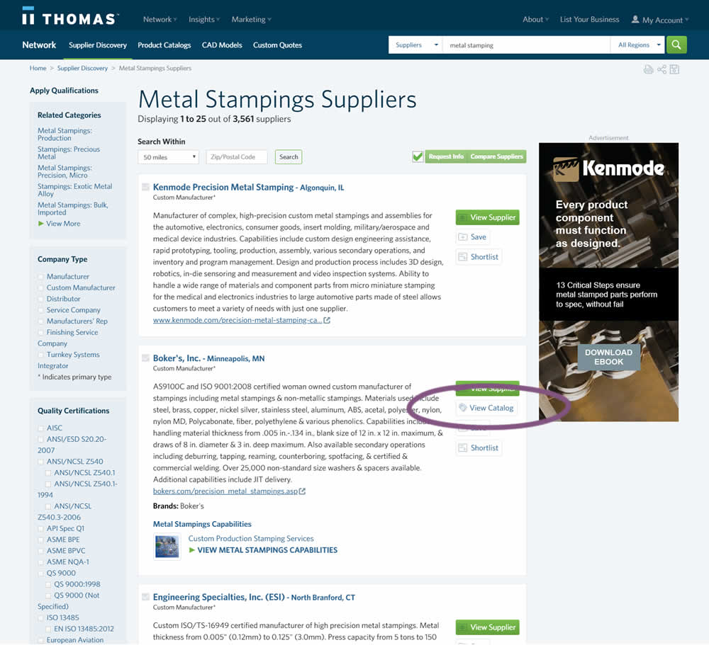
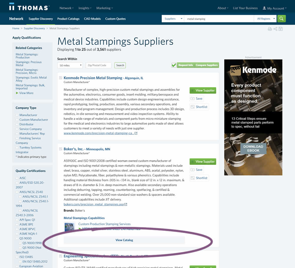
In this experiment, two different positions of the View Catalog button were compared. In version A the button was smaller and on the right. In version B the button was wider and more central. (The actual test was inverted before publishing to match the A-B of the pattern.)
Test #237 on
Goodui.org
by  Jakub Linowski
Apr 29, 2019
Desktop
Mobile
Listing
X.X%
Sales
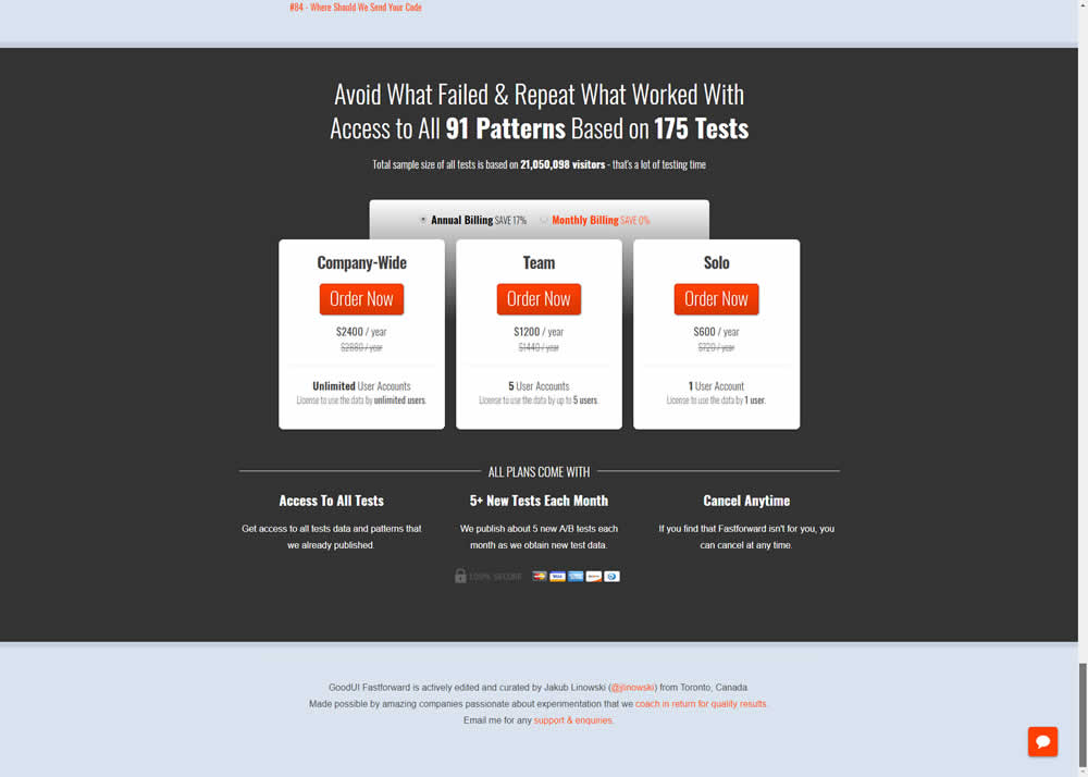
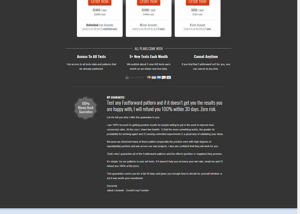
Jakub Tested Pattern #103: Money Back Guarantee On Goodui.org
Test #234 on
by  Alex James
Apr 01, 2019
Desktop
Listing
X.X%
Leads
Alex Tested Pattern #101: Search Keyword Highlighting

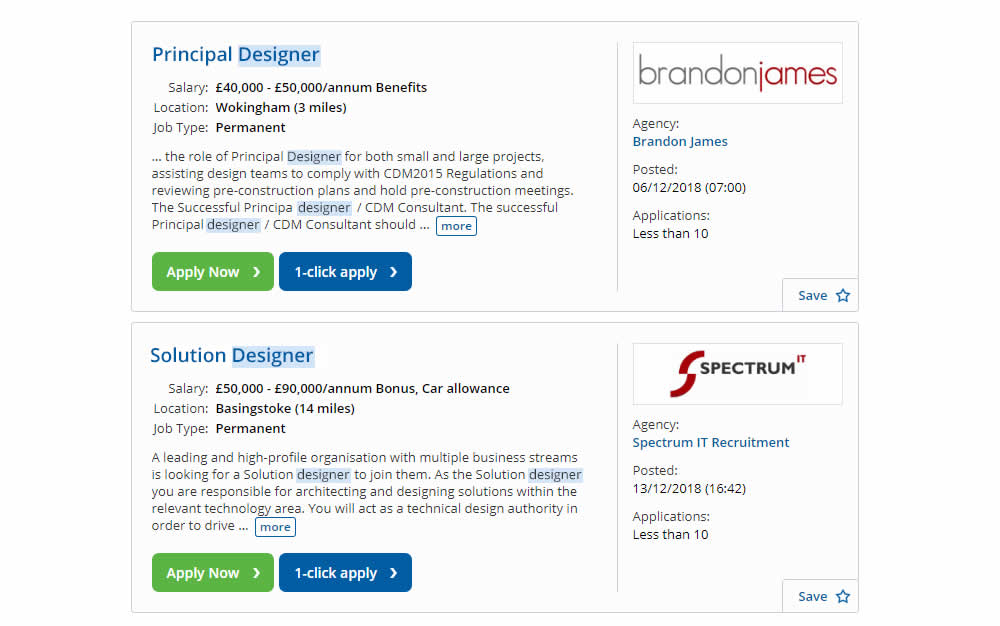
In this experiment, a different style for keyword highlighting was used.
Test #230 on
Goodui.org
by  Jakub Linowski
Mar 09, 2019
Desktop
Mobile
Listing
X.X%
Engagement
Jakub Tested Pattern #56: Hover Button On Goodui.org
In this test we tested onhover buttons (variant) versus more traditional always exposed and visible ones.