All Latest 615 A/B Tests
Become a member to unlock the abiltiy to see the highest impact a/b tests. Being able to see the actual test results and sort by impact allows growth and experimentation teams to take action on the biggest gains first
MOST RECENT TESTS
Test #524 on
Jared.com
by  Craig Kistler
Mar 26, 2024
Mobile
Listing
Craig Tested Pattern #79: Product Highlights On Jared.com
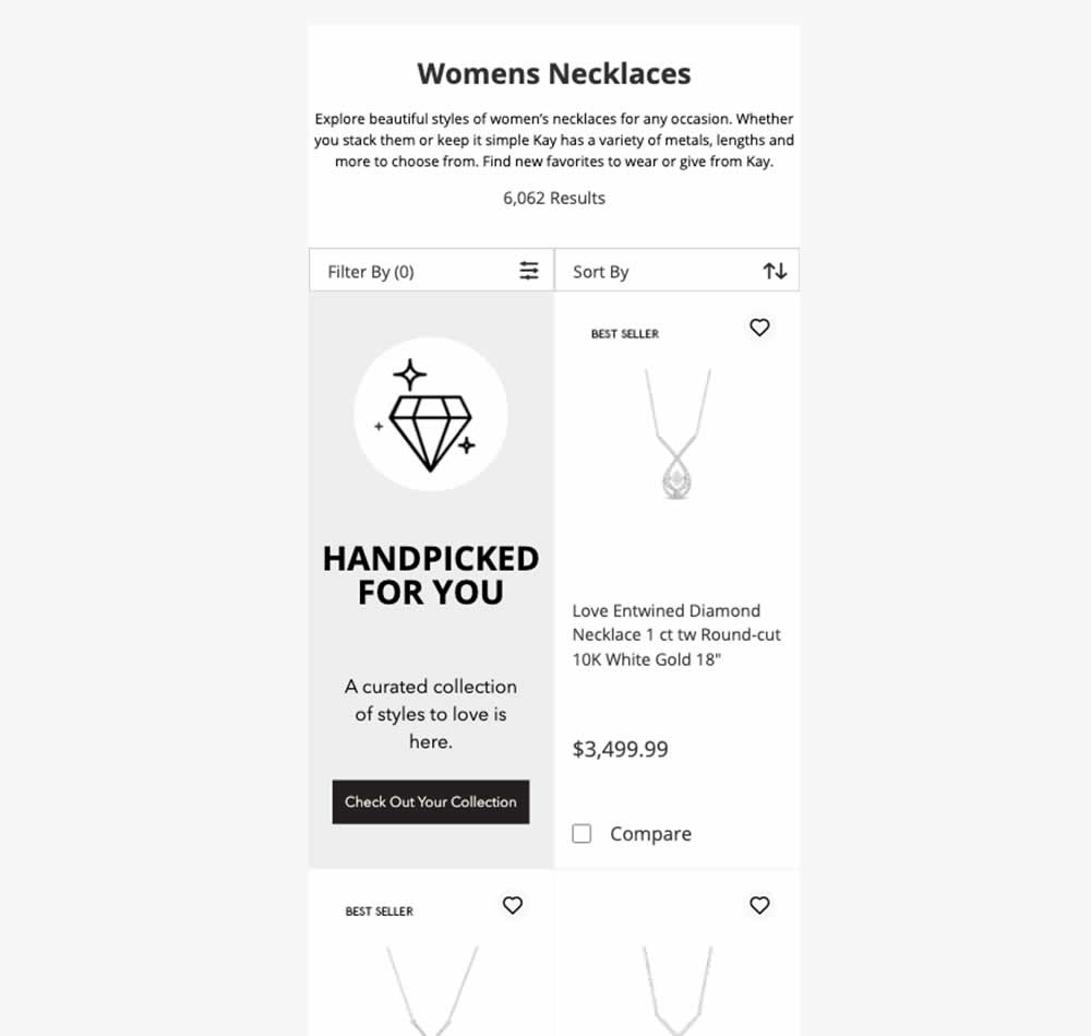
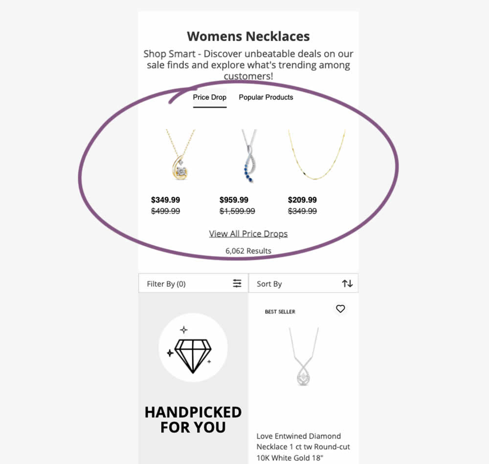
In this experiment, additional (discounted) products were shown at the top of category listing pages with a link to see more such products ("View All Price Drops"). Impact on overall sales was measured.
Test #522 on
686.com
by  Adan Archila
Mar 18, 2024
Desktop
Listing
Adan Tested Pattern #37: List Or Grid View On 686.com
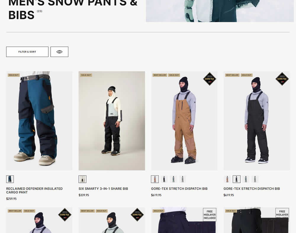
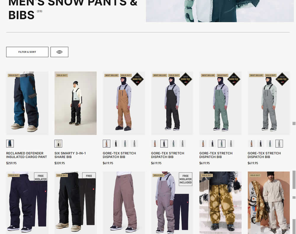
In this desktop experiment, 4 product tiles per page (control) were tested against 6. Impact on sales was measured.
Test #516 on
686.com
by  Adan Archila
Feb 05, 2024
Mobile
Listing
Adan Tested Pattern #37: List Or Grid View On 686.com
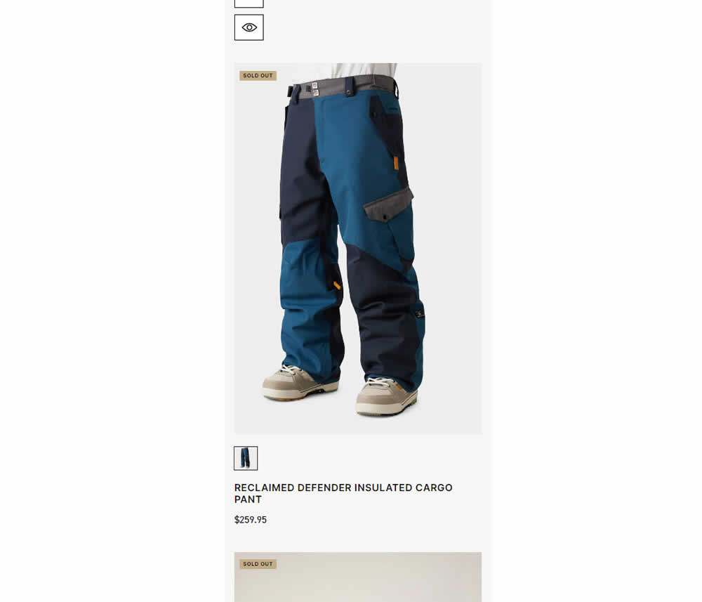
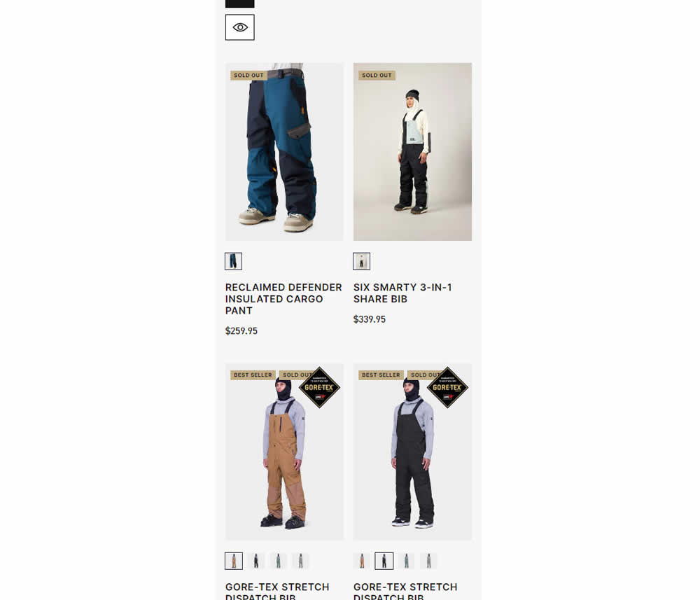
In this experiment, a one large product photo (control) was tested against a two-column layout with two smaller images (variation). Impact on sales was measured.
Test #514 on
Backstage.com
by  Stanley Zuo
Jan 24, 2024
Desktop
Listing
Stanley Tested Pattern #97: Bigger Form Fields On Backstage.com
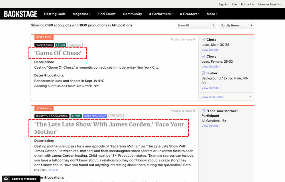
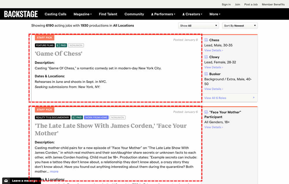
In this experiment, the click area of job listing tiles was expanded to the size of the full job tile. In the control, the click area was smaller - mostly only the job headline, along with additional "view more" links on the right hand column. Clicking the tile or headline would open up a new job details page in both control and variation. Impact on progression and membership sales was measured.
Test #507 on
Fairment.de
by  Jona Eisenberger
Dec 11, 2023
Mobile
Listing
Jona Tested Pattern #133: Product Availability On Fairment.de
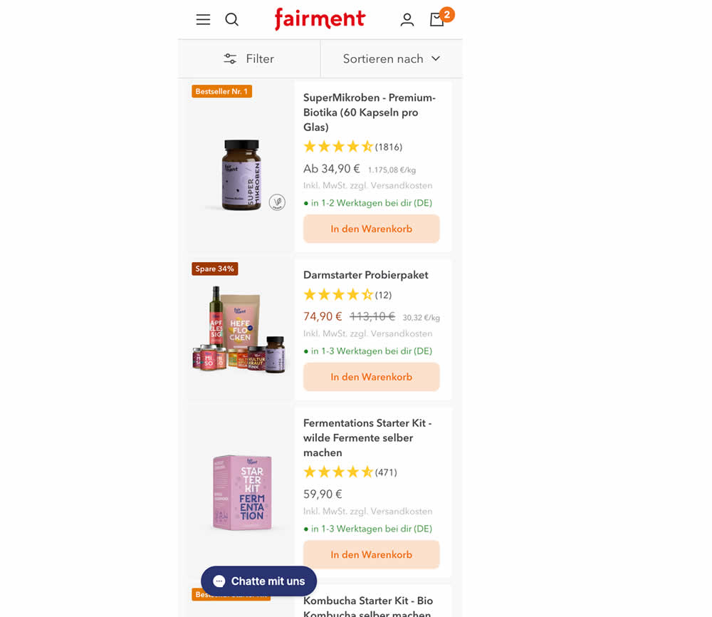
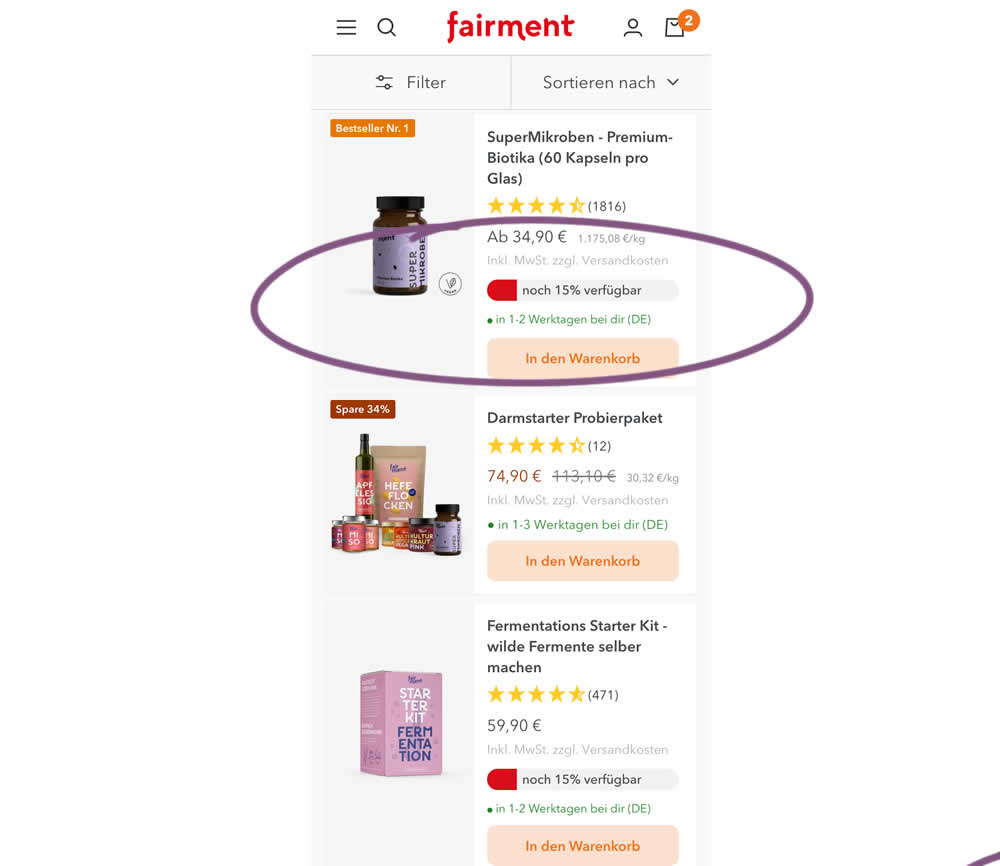
In this experiment, product availabiltiy bars were shown on products with low stock. This was shown on listing pages. Impact on adds to cart and sales was measured.
Test #502 on
Fairment.de
by  Jona Eisenberger
Nov 06, 2023
Mobile
Listing
Jona Tested Pattern #37: List Or Grid View On Fairment.de
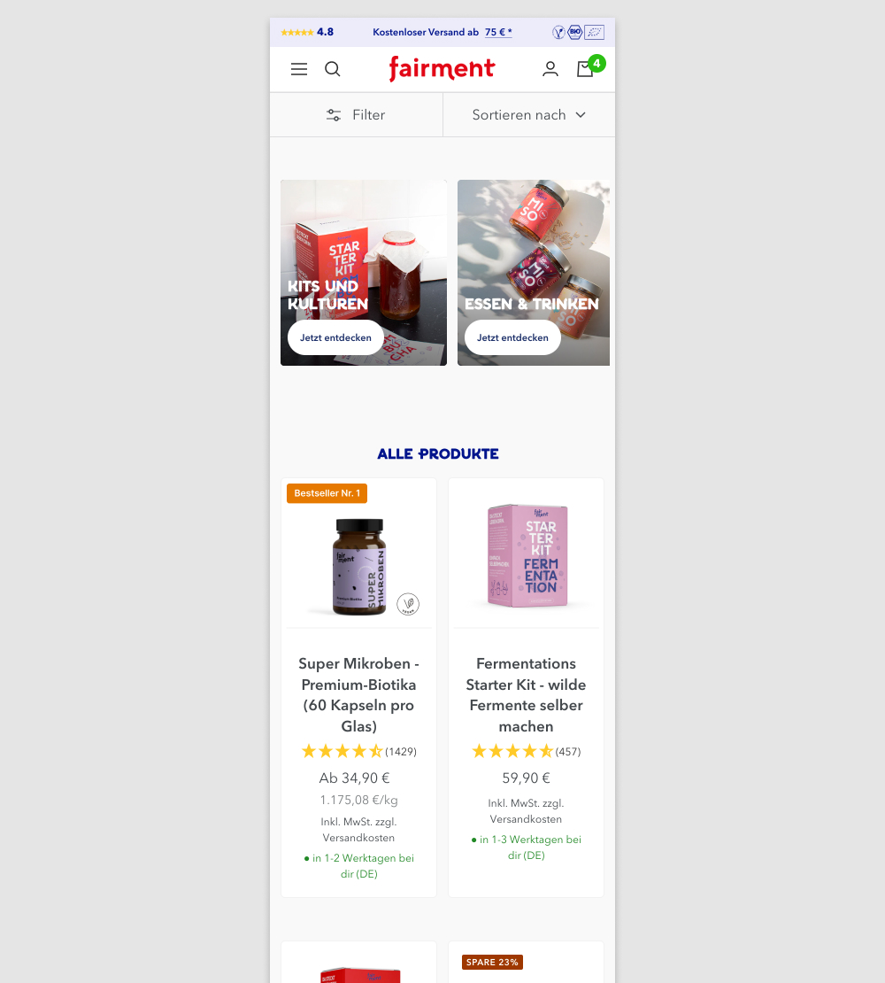
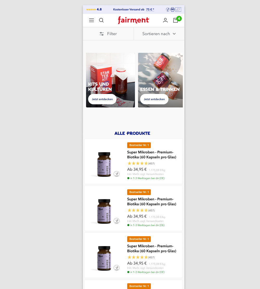
In this experiment, a two column grid layout (control) was tested against single column layout (variation) with the product information shown to the right. Please note that the screenshot shows repeated products only because it's been sourced from a Figma design file. In reality, the products in the variation were equally diverse as in the control.
(We've also flipped the A and B to match up with our grid pattern.)
Test #475 on
Online.metro-cc.ru
by  Andrey Andreev
Jun 07, 2023
Desktop
Mobile
Listing
Andrey Tested Pattern #36: Fewer Or More Results On Online.metro-cc.ru
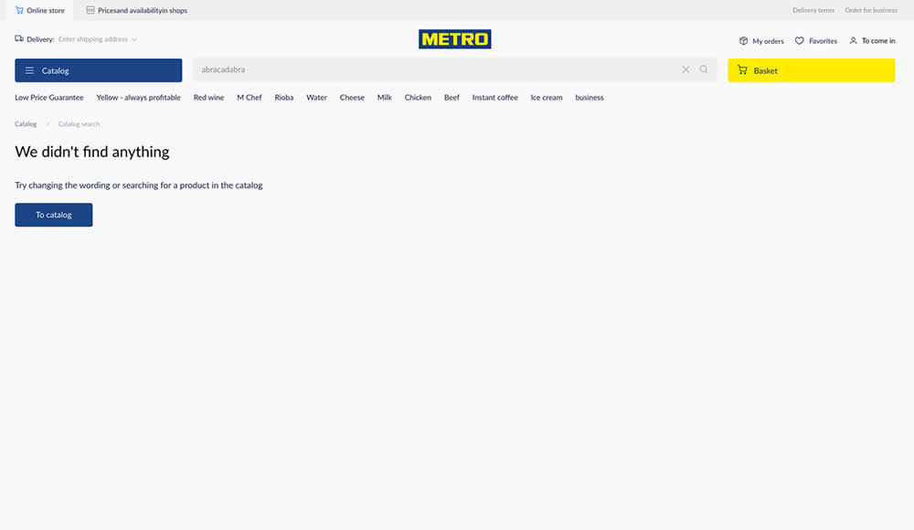
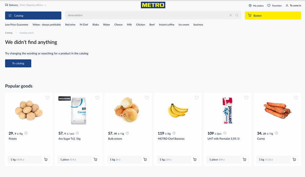
Are more (popular) product results better than none at all? In this experiment, popular products were shown during an empty search result. Impact on sales was measured.
Test #460 on
Backstage.com
by  Stanley Zuo
Mar 21, 2023
Mobile
Listing
Stanley Tested Pattern #41: Sticky Call To Action On Backstage.com
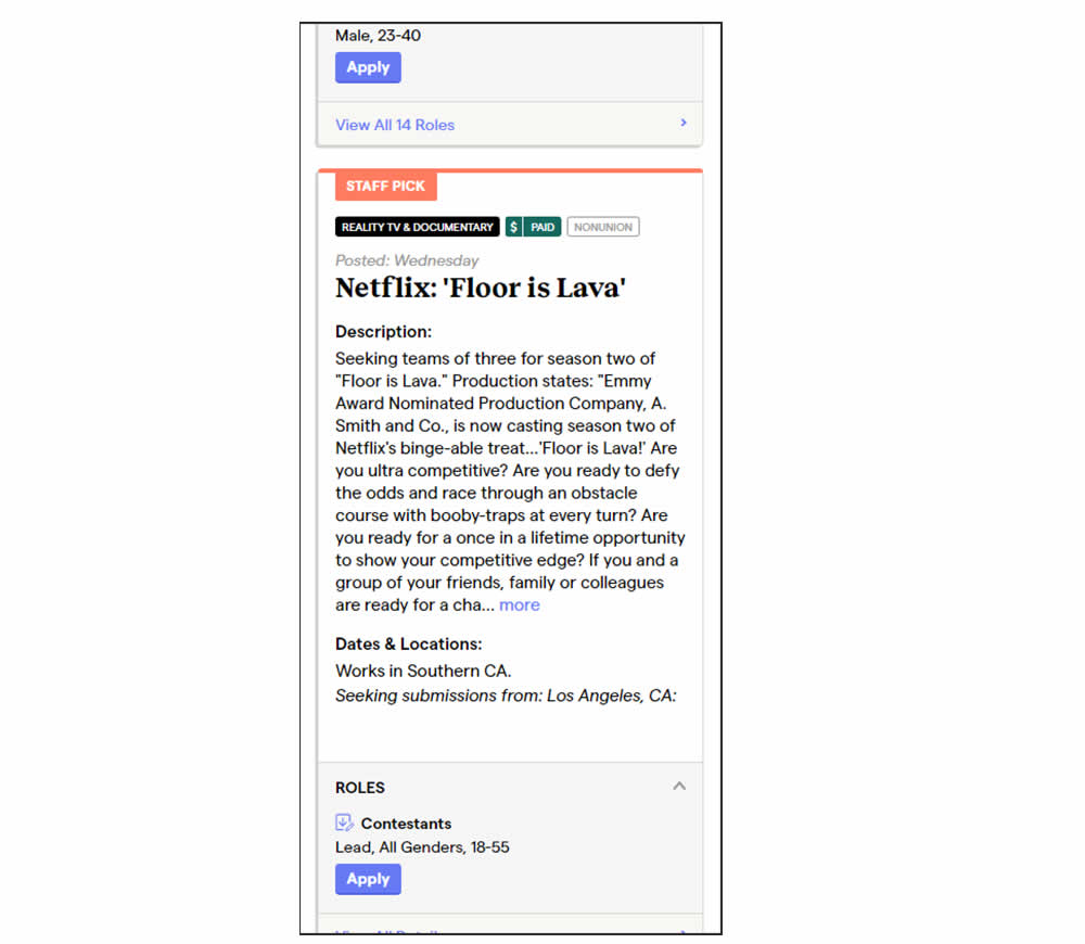
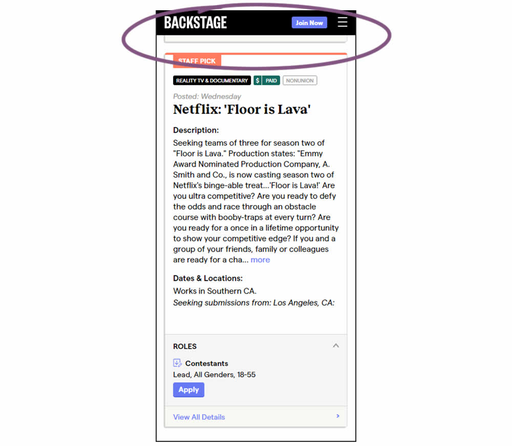
In this experiment, a floating top navigation was shown with a "Join" button. In the control, the navigation was only visible at the top of the page. Also keep in mind that signup starts were also triggered throughout multiple CTAs throughout the page and from particular job detail pages. The a/b test ran on a listing page of Backstage - a casting call job site. Impact on signups and checkouts was measured.
Test #459 on
Snocks.com
by  Melina Hess
Feb 28, 2023
Desktop
Mobile
Listing
Melina Tested Pattern #36: Fewer Or More Results On Snocks.com
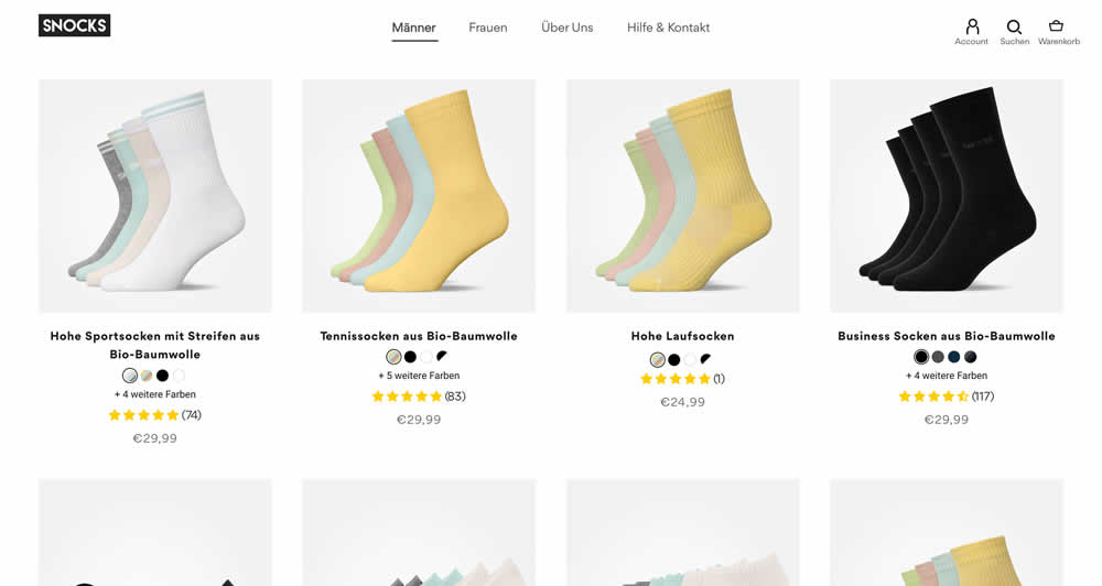
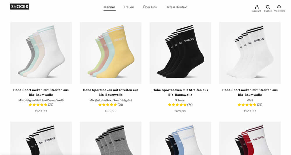
In this listing page experiment, color sets of the same product were tested against individual products with unique colors (with additional product tiles). Essentially, the A version here contained fewer product items (with color sets), while the B version contained more results and tiles (with grouped products). Impact on total sales was measured.
(The original control and variation was inverted, but was flipped to match the fewer or more results pattern).
Test #447 on
Vivareal.com.br
by  Vinicius Barros Peixoto
Dec 23, 2022
Mobile
Listing
Vinicius Tested Pattern #18: Single Or Alternative Buttons On Vivareal.com.br
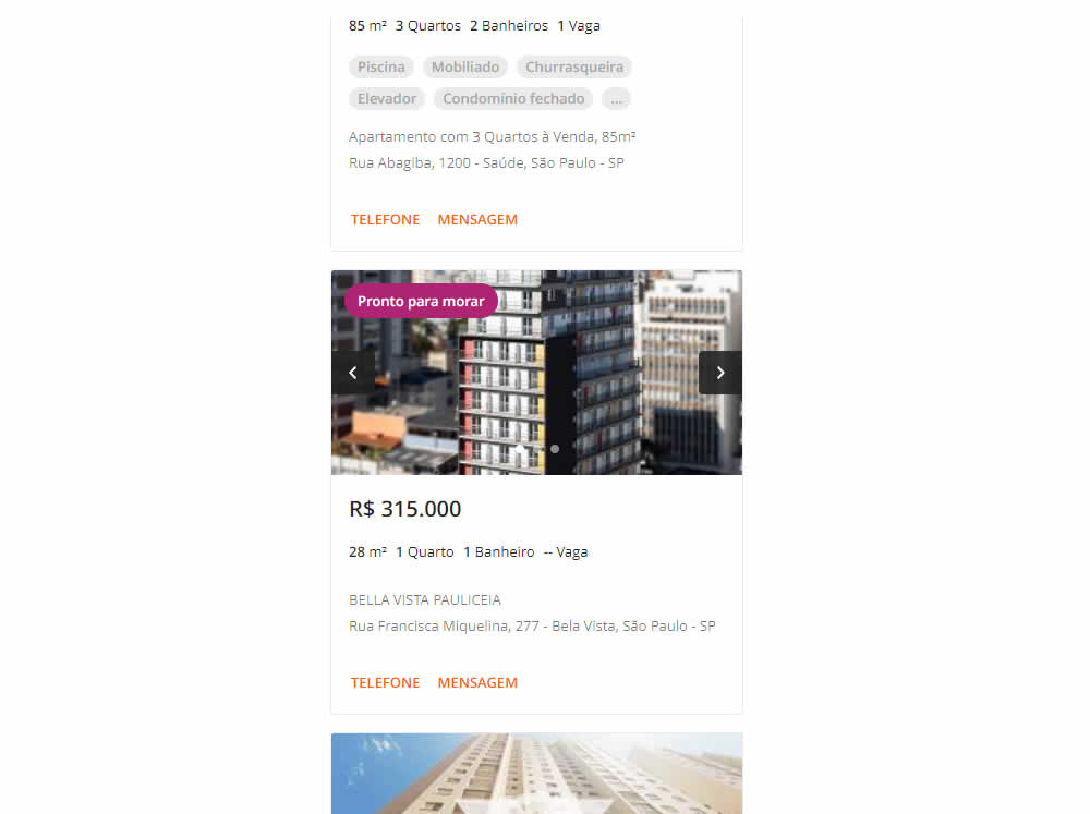
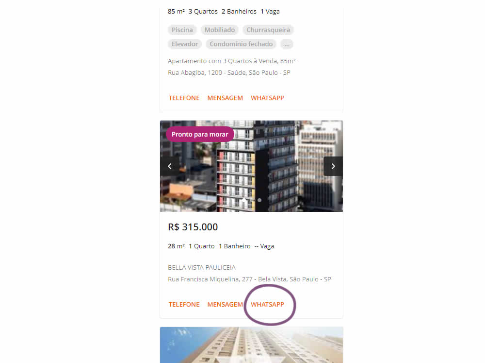
In this experiment, an additional call to action (Whatsapp link) was added on a listing page of one of Brazil's largest real estate sites.In the variation the 3 calls to action include: a link that launched the phone interaction, a general contact lead form, and finally the Whatsapp link (added in the variant). Impact on total lead starts and completions was measured.
Test #437 on
Vivareal.com.br
by  Rodrigo Maués
Oct 28, 2022
Desktop
Mobile
Listing
Rodrigo Tested Pattern #18: Single Or Alternative Buttons On Vivareal.com.br

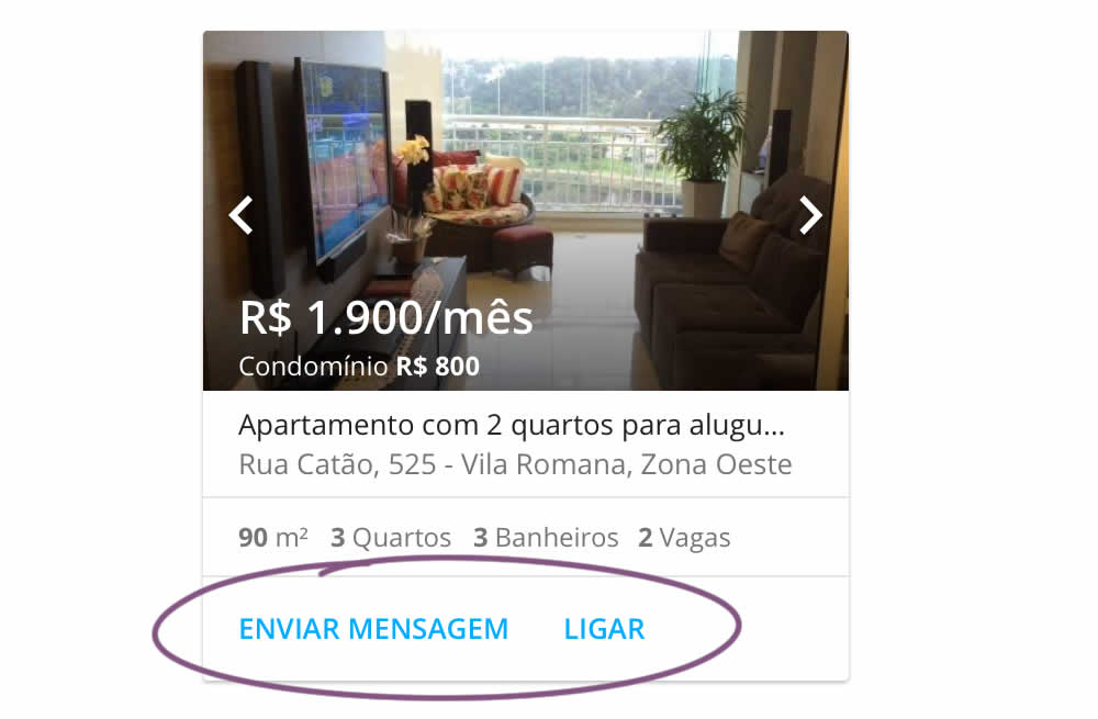
In this experiment, an additional and alternative text based call to action link was added on real estate properity listings. Instead of only having "Ligar" ("Call"), "Enviar mensagem" was also appended ("Send Message"). This additional link lead to a lead-gen form.
Test #396 on
Depositphotos.com
by  Gleb Hodorovskiy
Feb 13, 2022
Desktop
Listing
Gleb Tested Pattern #124: Confirmed Selection On Depositphotos.com
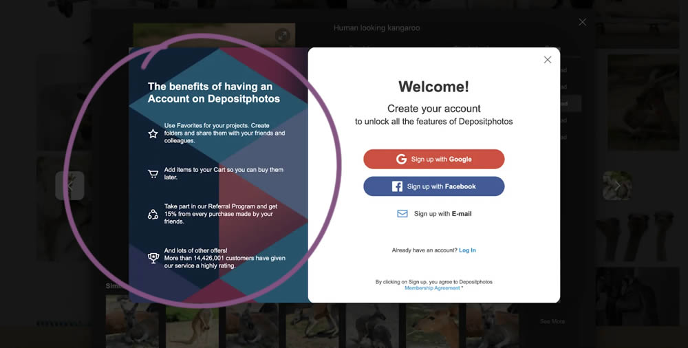
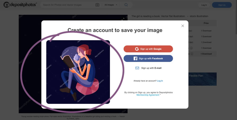
In this experiment from Conversionrate.store, the framing of the registration message was changed from a generic account creation one to a specific image selected by the user. The experiment started on a listing page of a stock photography / illustration site. The control showed a more generic message with benefits for signing up and making the purchase. Whereas the variation repeated the actual image that customers clicked on from listing pages - establishing continuity as well as providing a reason for signing up. Impact on sales was measured.
Test #391 on
Backstage.com
by  Stanley Zuo
Dec 30, 2021
Desktop
Mobile
Listing
Stanley Tested Pattern #82: Onboarding Callouts On Backstage.com
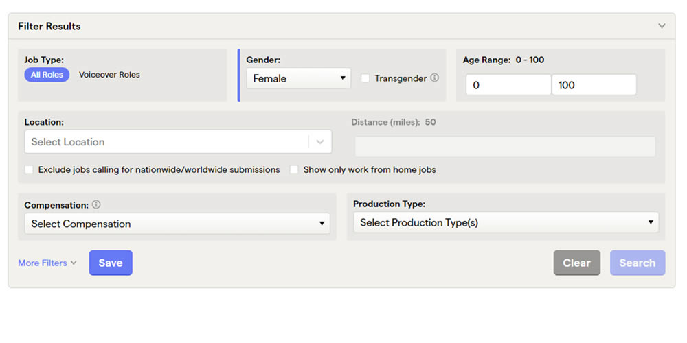
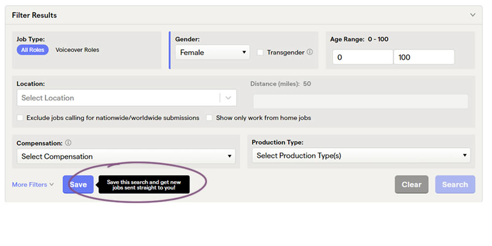
This experiment added a small nudge or callout to encourage more signups. Attention was directed towards the save function, which lead to the signup flow for anyone not signed it. Impact on signups was measured.
Test #388 on
by  Jakub Linowski
Dec 09, 2021
Mobile
Listing
Jakub Tested Pattern #51: Shortcut Buttons
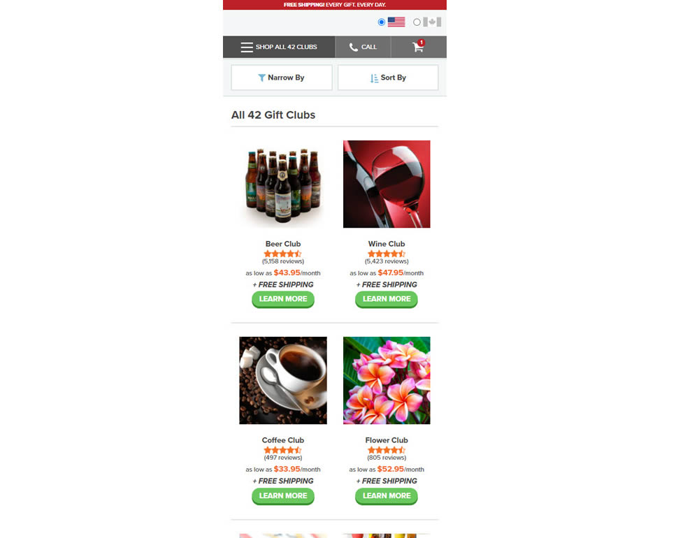
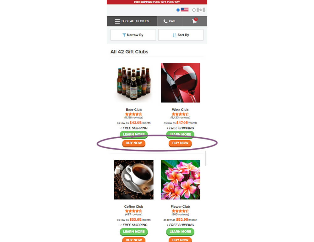
In this experiment, extra "buy now" buttons were added on a listing page. These buttons were shortcuts to an add to cart flow, whereas the "learn more" buttons lead customers to product detail pages (visible in both control and variation). Impact on adds-to-cart and sales was measured.
Test #387 on
by  Jakub Linowski
Nov 30, 2021
Mobile
Listing
Jakub Tested Pattern #88: Action Button
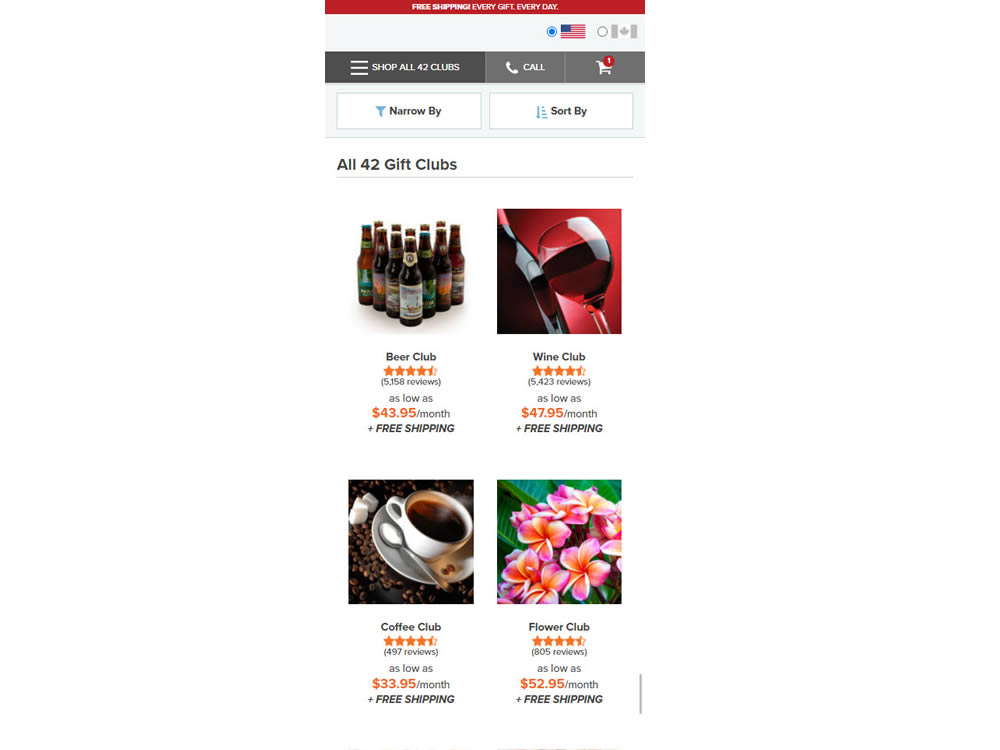
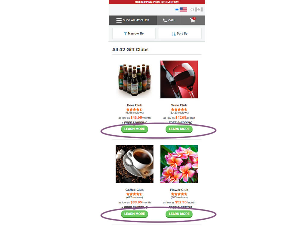
In this experiment, simple "Learn More" buttons were added underneath each product thumbnail. These buttons were additional triggers that linked to product detail pages on top of the existing thumbnails and product names (that also linked to the PDPs). Impact on product visits and sales was measured.
Test #375 on
Backstage.com
by  Stanley Zuo
Sep 17, 2021
Mobile
Listing
Stanley Tested Pattern #32: Condensed List On Backstage.com
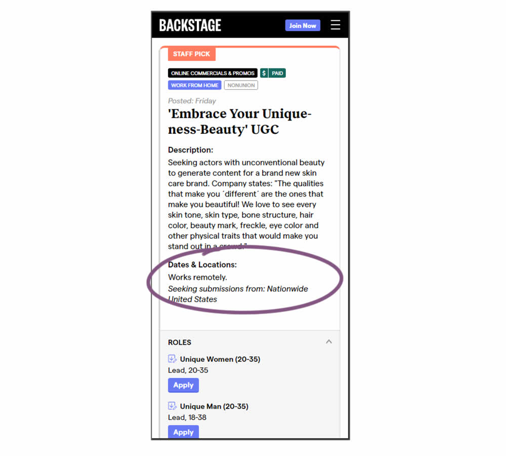
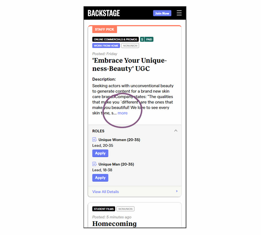
Similar to experiment 373, listing descriptions were shortened dynamically using exposable "more" links AND dates/location data was removed. This way, the variation showed shorter listings and therefore more listings per screens. Impact on listing clicks (progression) along with membership starts was measured.
Test #373 on
Backstage.com
by  Stanley Zuo
Sep 06, 2021
Mobile
Listing
Stanley Tested Pattern #32: Condensed List On Backstage.com
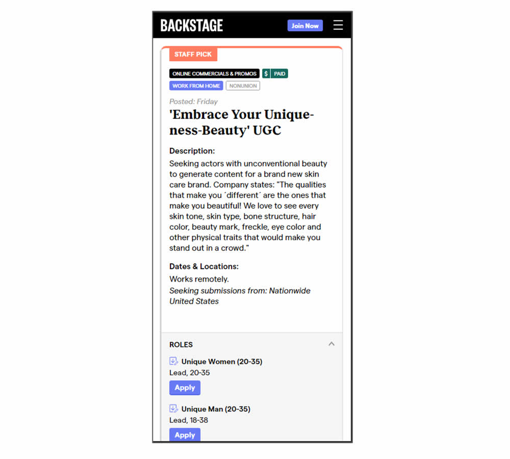
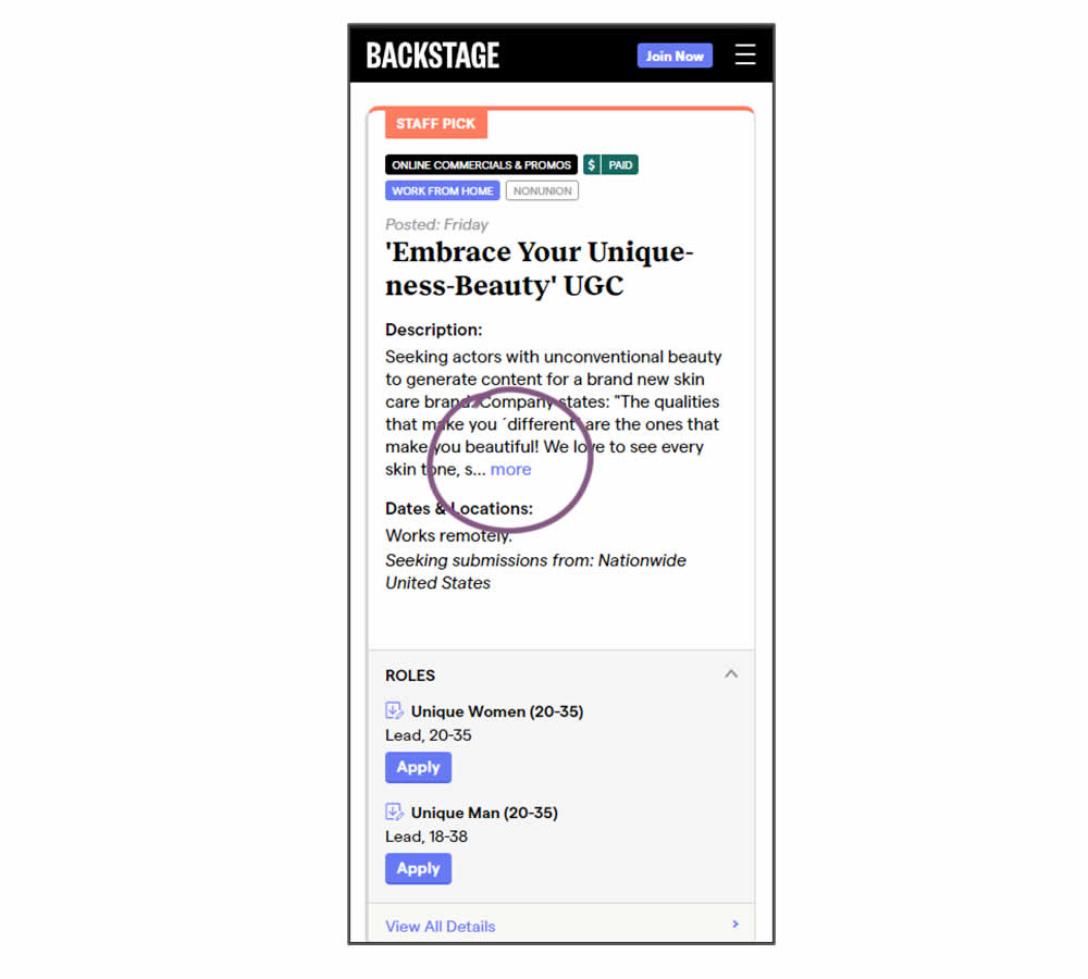
In this experiment, listing descriptions were shortened dynamically using exposable "more" links. This way, the variation showed shorter listings and therefore more listings per screens. Impact on listing clicks (progression) along with membership starts was measured.
Test #371 on
by  Jakub Linowski
Aug 18, 2021
Desktop
Listing
Jakub Tested Pattern #51: Shortcut Buttons
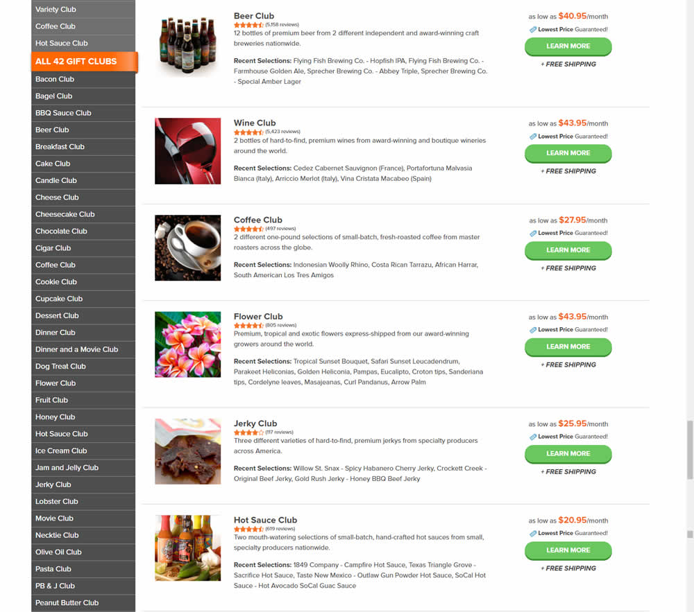
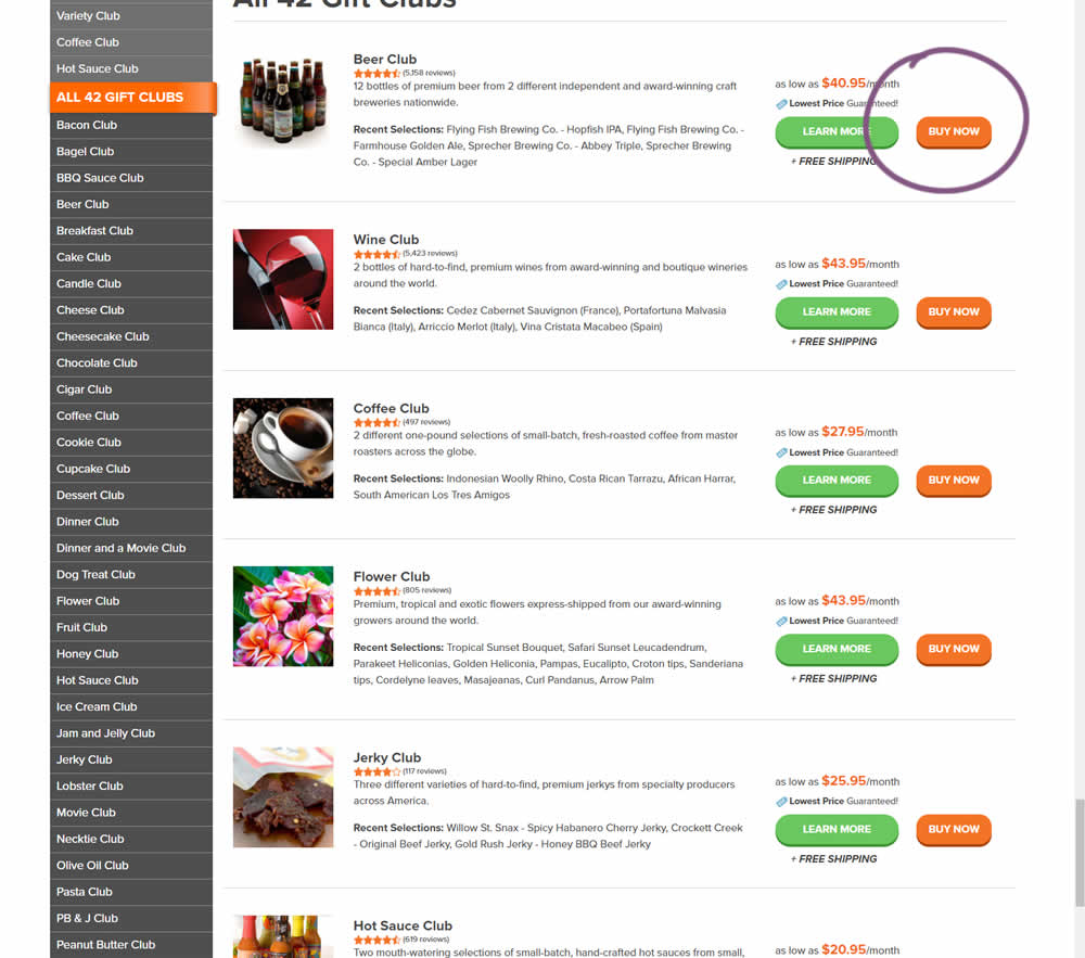
In this experiment, the variation added an extra "Buy Now" button that linked directly into the cart process. The variation only had a learn more button linking directly to a product page.
Test #370 on
Thomasnet.com
by  Julian Gaviria
Aug 16, 2021
Desktop
Mobile
Listing
Julian Tested Pattern #88: Action Button On Thomasnet.com

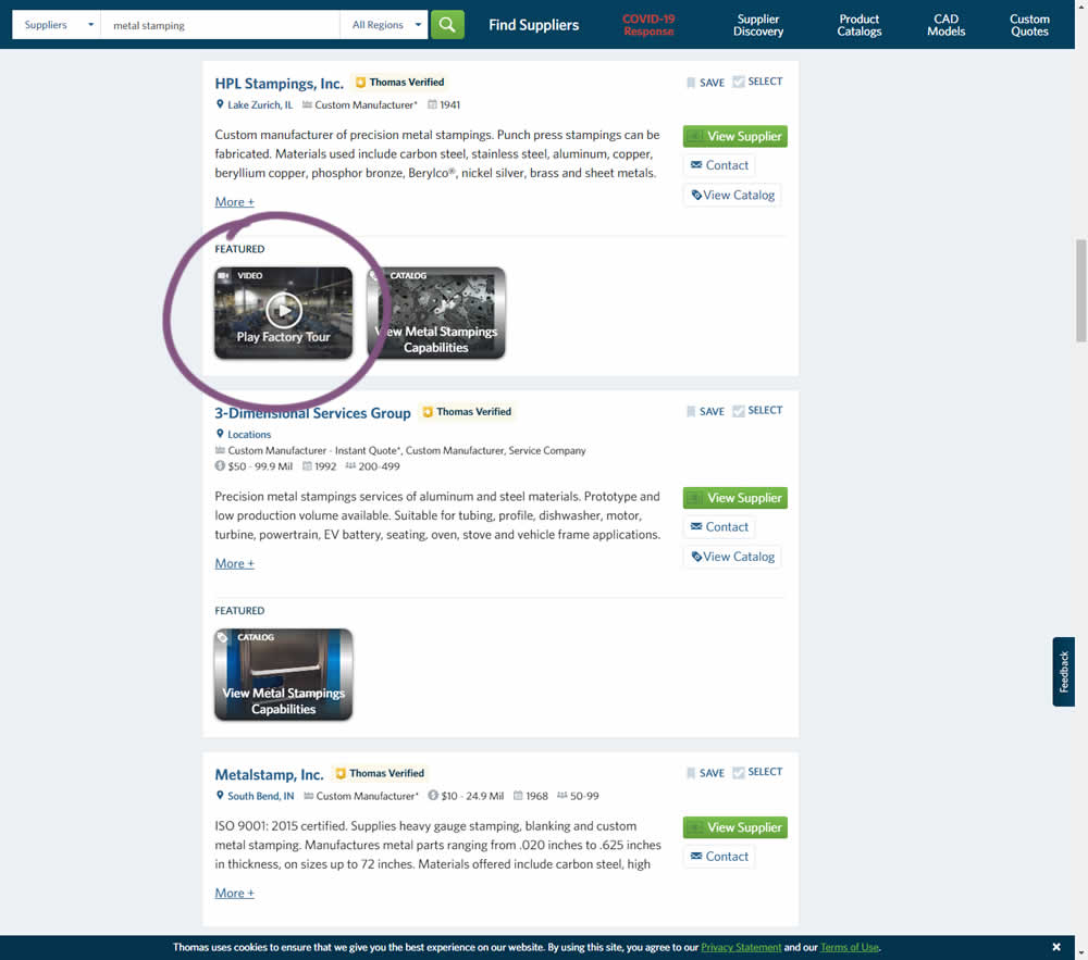
This experiment added the simple verb ("play") before the "factory video" label to encourage more video plays. Impact on progression / clicks was measured.
Test #78 on
Mvideo.ru
by  Andrey Andreev
May 06, 2021
Desktop
Mobile
Listing
Andrey Tested Pattern #90: Out Of Stock Or In Stock Products On Mvideo.ru
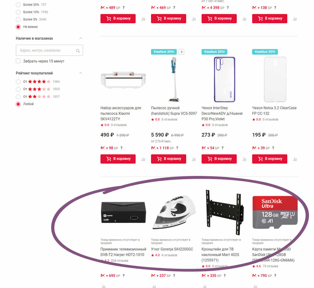
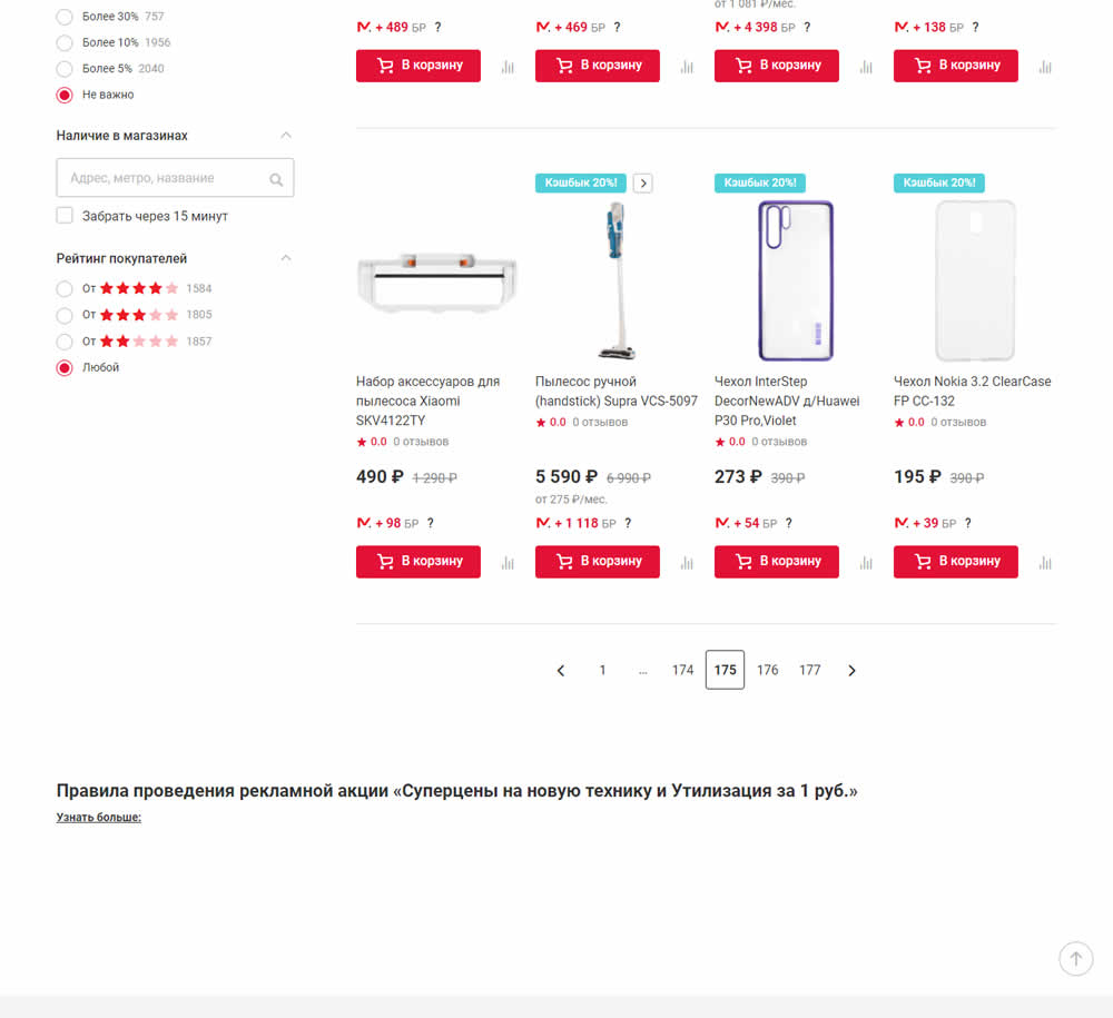
In this experiment, products which were out of stock were removed from listing pages and replaced with in stock ones (not visible in the screenshot).