All Latest 620 A/B Tests
MOST RECENT TESTS
Test #647 on
by  Jakub Linowski
Apr 27, 2026
Mobile
Product
X.X%
Sales
Jakub Tested Pattern #79: Product Highlights
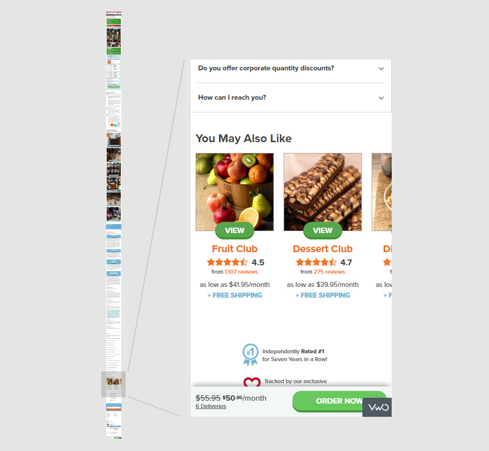
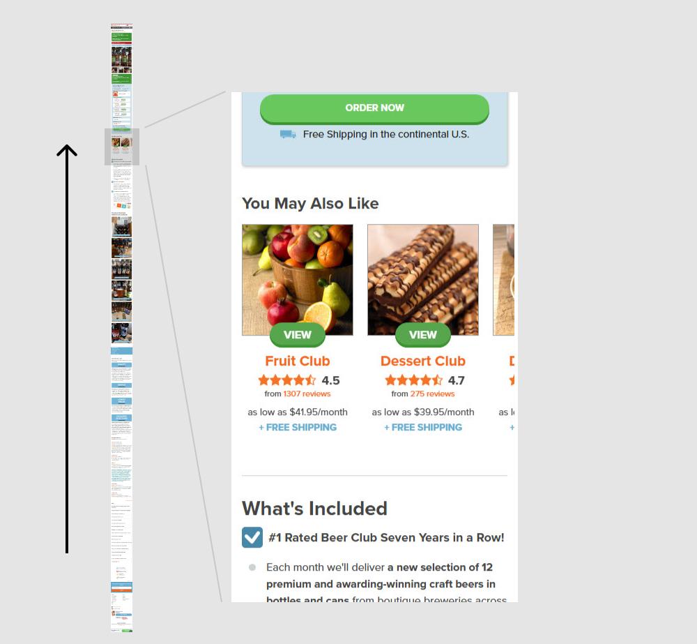
In this experiment, a set of 5 alternative product recommendations were moved from the very bottom of the page (control) to the top (variation). These "You May Also Like " recommendations were moved just above the existing product descriptions. Impact on adds to cart and sales was measured.
Which A Or B Actually Wins? Find Out Before You Test.
Members see every test result — the winners, the flat ones, and the losers — along with exact effects and sample sizes. Use it to estimate your tests and prioritize by probability, not gut feel. Start every experiment with the odds on your side.
Test #646 on
by  Jakub Linowski
Apr 25, 2026
Desktop
Product
X.X%
Sales
Jakub Tested Pattern #79: Product Highlights
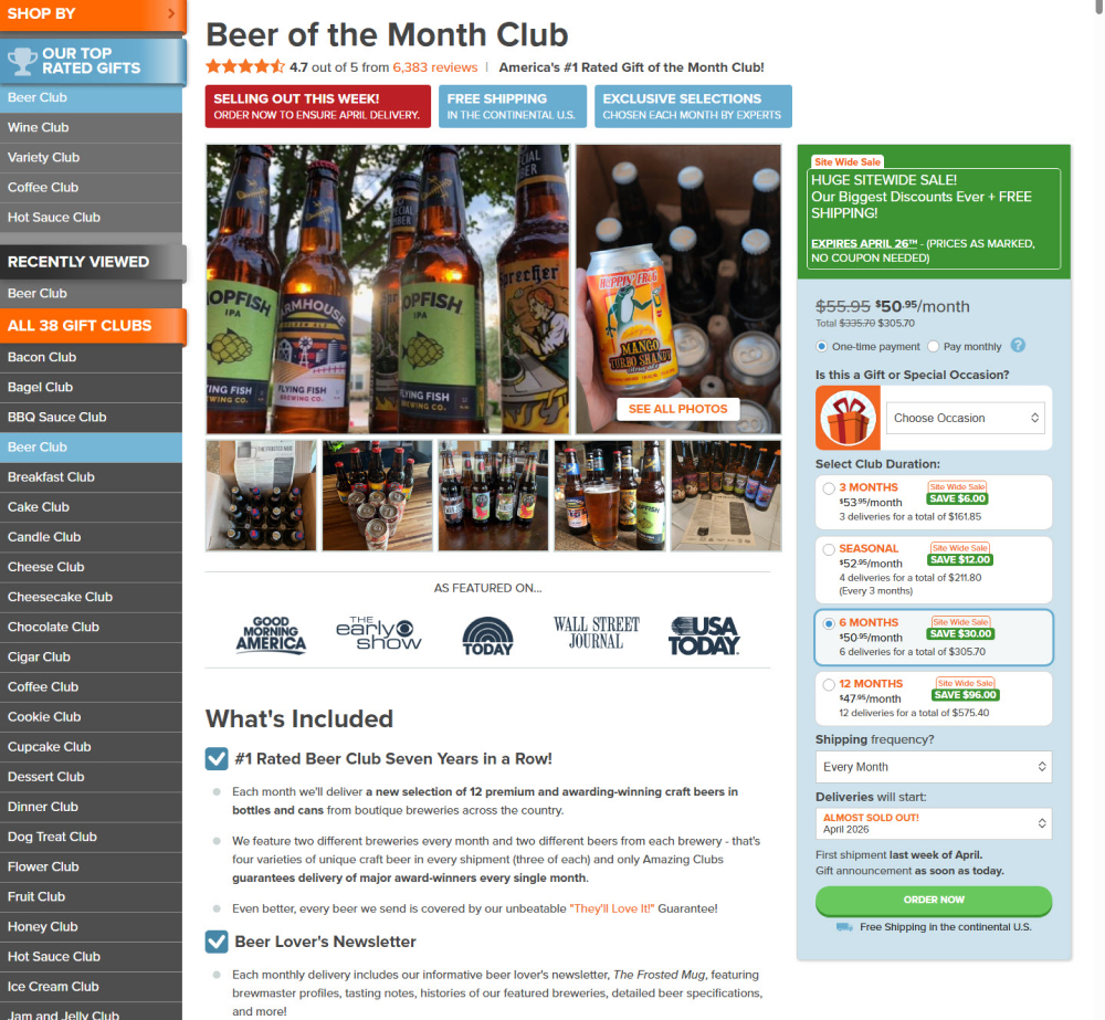
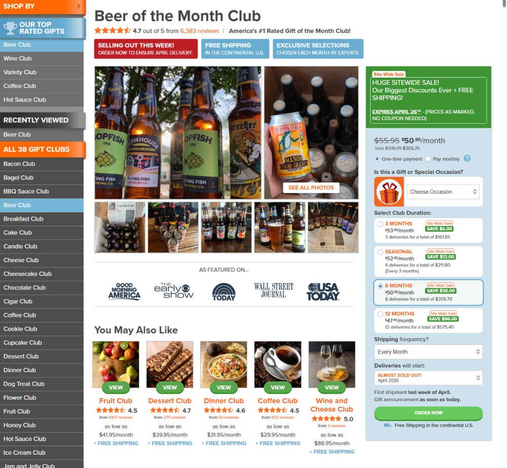
In this experiment, a set of 5 alternative product recommendations were moved from the very bottom of the page (control) to the top (variation). These "You May Also Like " recommendations were moved just above the existing product descriptions. Impact on adds to cart and sales was measured.
Test #638 on
by  Frazer Mawson
Feb 28, 2026
Mobile
Product
X.X%
Sales
Frazer Tested Pattern #41: Sticky Call To Action
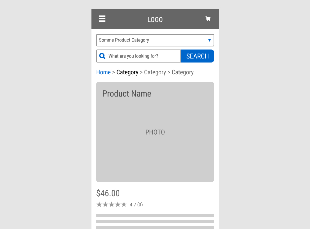
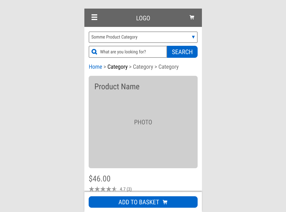
A floating Add to Basket button was added to a product page. Impact on sales was measured.
Test #633 on
Reverb.com
by  Nicholas Evans
Jan 31, 2026
Desktop
Mobile
Product
X.X%
Sales
Nicholas Tested Pattern #103: Money Back Guarantee On Reverb.com
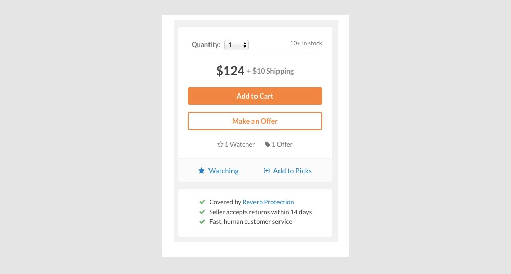
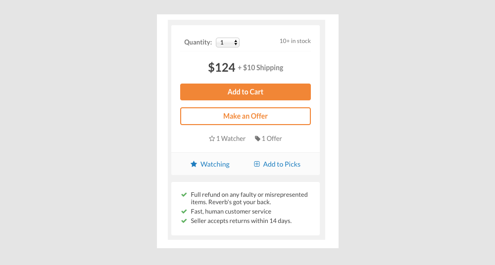
In this experiment, different reassurance messages were shown at the bottom of the add-to-cart widget on a product page. The variation emphasized full refunds for faulty or misrepresented items.
Test #630 on
Kay.com
by  Craig Kistler
Jan 27, 2026
Desktop
Mobile
Product
X.X%
Sales
Craig Tested Pattern #21: What It's Worth On Kay.com
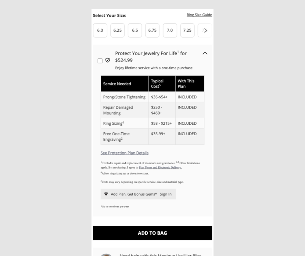
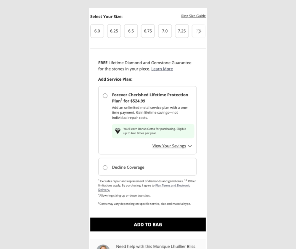
In this experiment, a pricing table (an upsell of product protection plan coverages) was tested against a more explicit yes/no toggle for including the plan. Impact was measured on adds to cart, orders, and upsell rate, using an 80/20 traffic split.
Test #627 on
by  Jakub Linowski
Dec 29, 2025
Product
X.X%
Sales
Jakub Tested Pattern #26: Cart Reminder And Recently Viewed
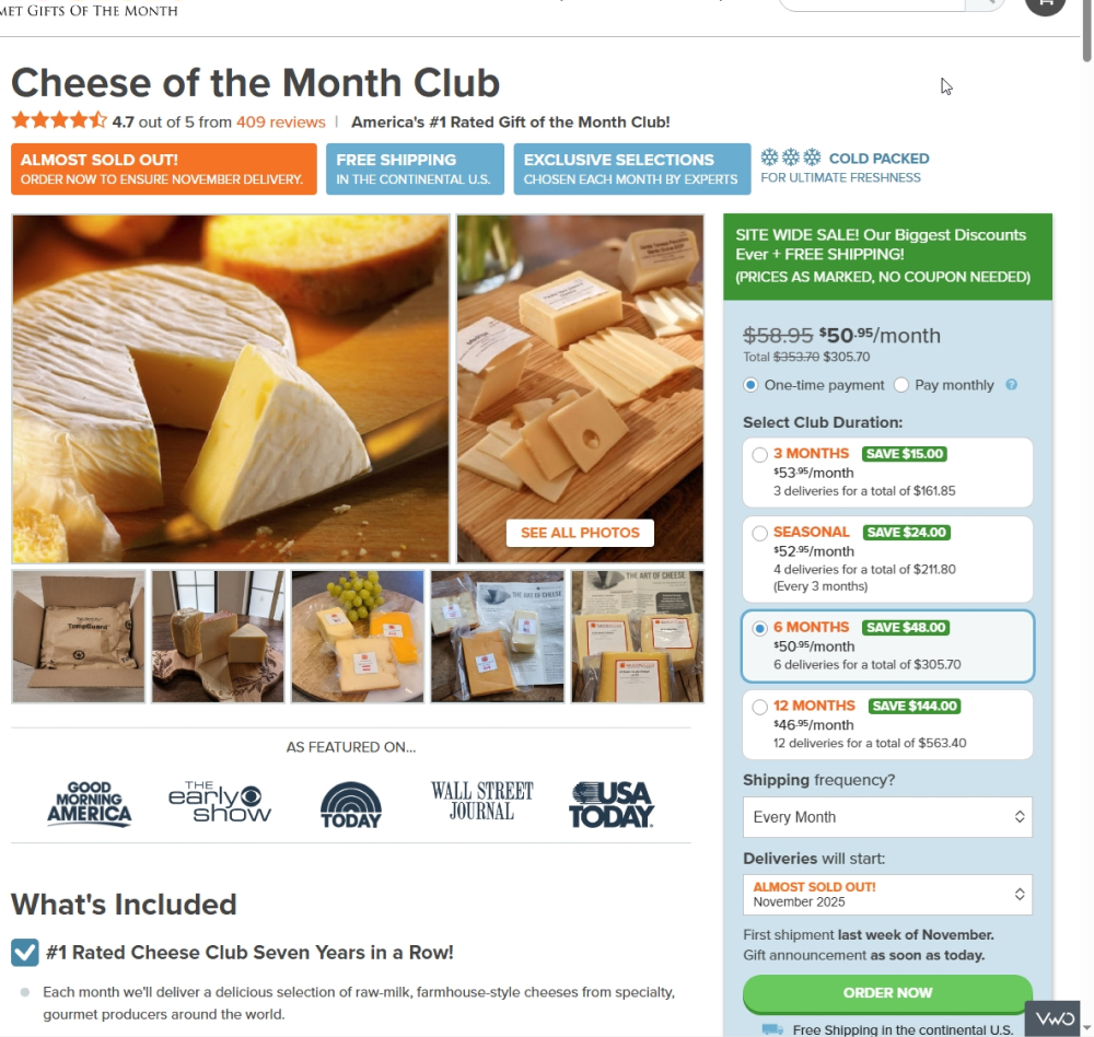
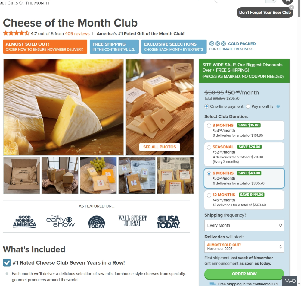
In this tightly triggered experiment, users who (1) did not complete a purchase and (2) visited a different product page saw a button in the top-right corner labeled “Don’t Forget Your Club.” Clicking this button resumed the checkout process at the point where they left off, without requiring the same information to be re-entered.
Test #623 on
by  Jakub Linowski
Nov 29, 2025
Desktop
Mobile
Product
X.X%
Sales
Jakub Tested Pattern #139: Page Level Navigation
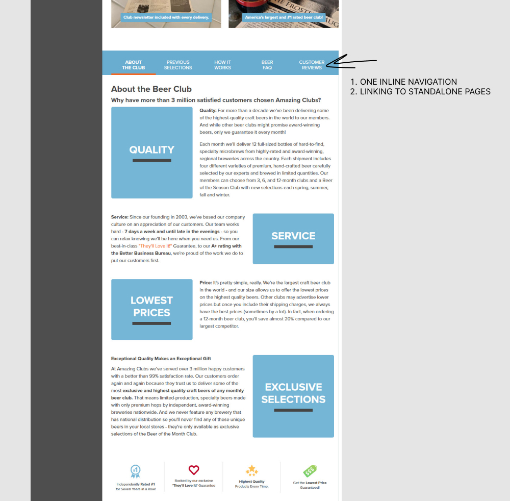
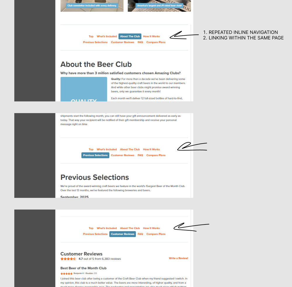
In this experiment, a single inline page navigation (going to external sub pages) was replaced with multiple and repeated inline page navigations (that linked within the same page). Impact on adds to cart an sales was measured.
Test #621 on
Kay.com
by  Craig Kistler
Nov 26, 2025
Desktop
Mobile
Product
X.X%
Sales
Craig Tested Pattern #36: Fewer Or More Results On Kay.com
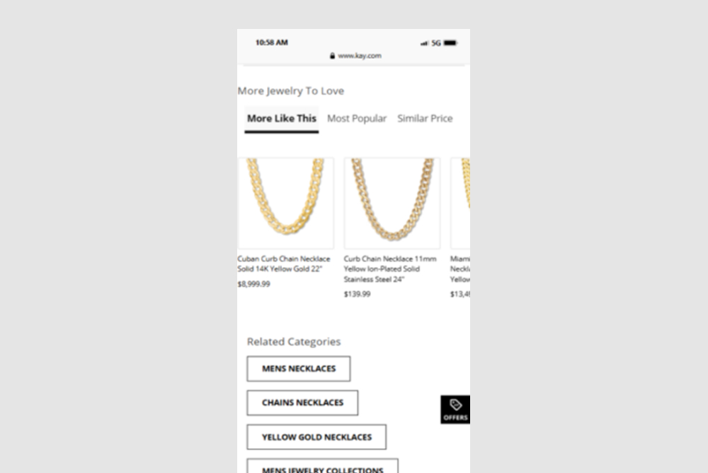
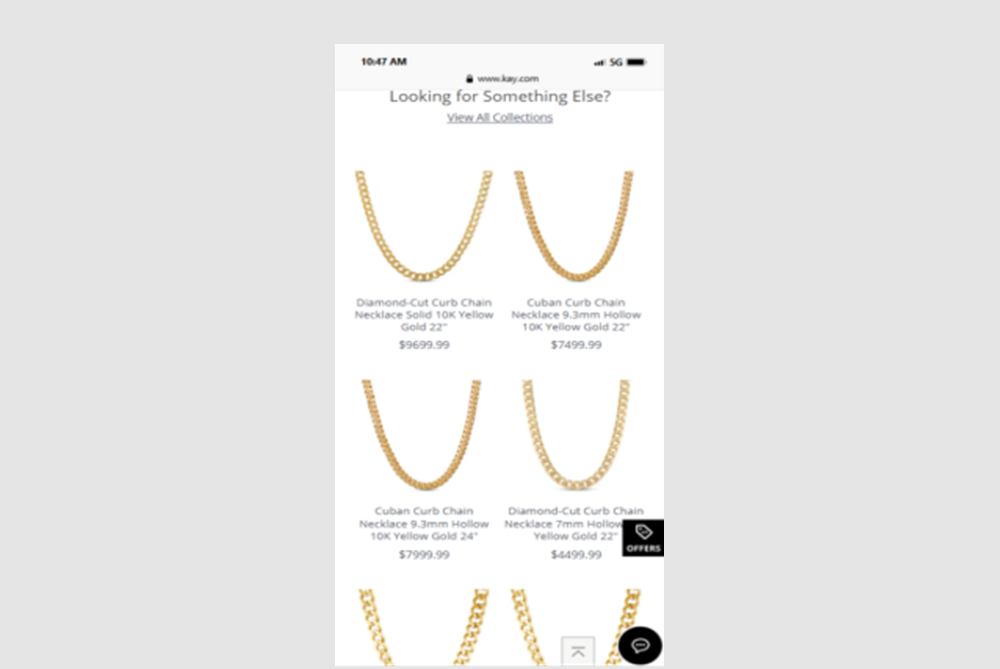
In this experiment, a horizontally scrolling set of products was replaced with an expanded and more visible grid of suggested products - enabling more discovery.
Test #620 on
Online.metro-cc.ru
by  Andrey Andreev
Nov 24, 2025
Desktop
Product
X.X%
Sales
Andrey Tested Pattern #42: Countdown Timer On Online.metro-cc.ru
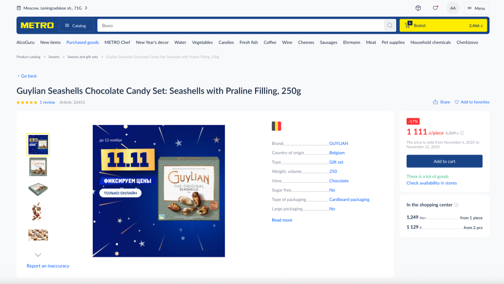

In this experiment, 96 hours before the end of a promotion, a countdown timer was displayed on the desktop with a 80/20 split. Also excluded new users. Impact on sales was measured.
Test #616 on
Finn.com
by  Maksim Meged
Oct 29, 2025
Mobile
Product
X.X%
Sales
Maksim Tested Pattern #136: Earliest Availability On Finn.com
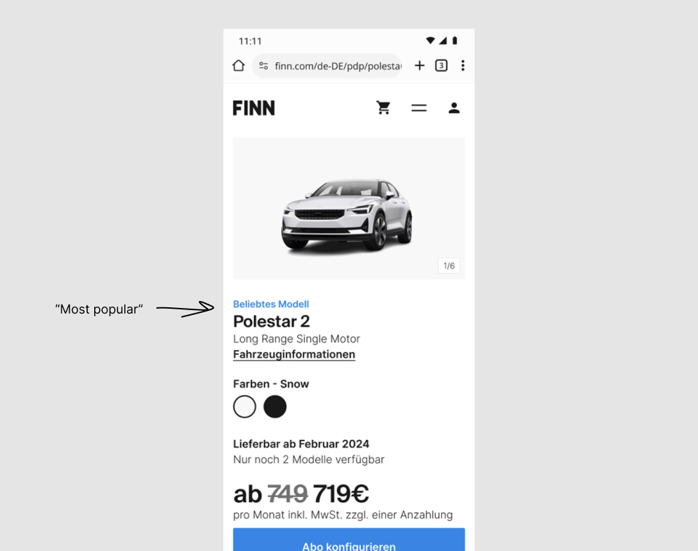
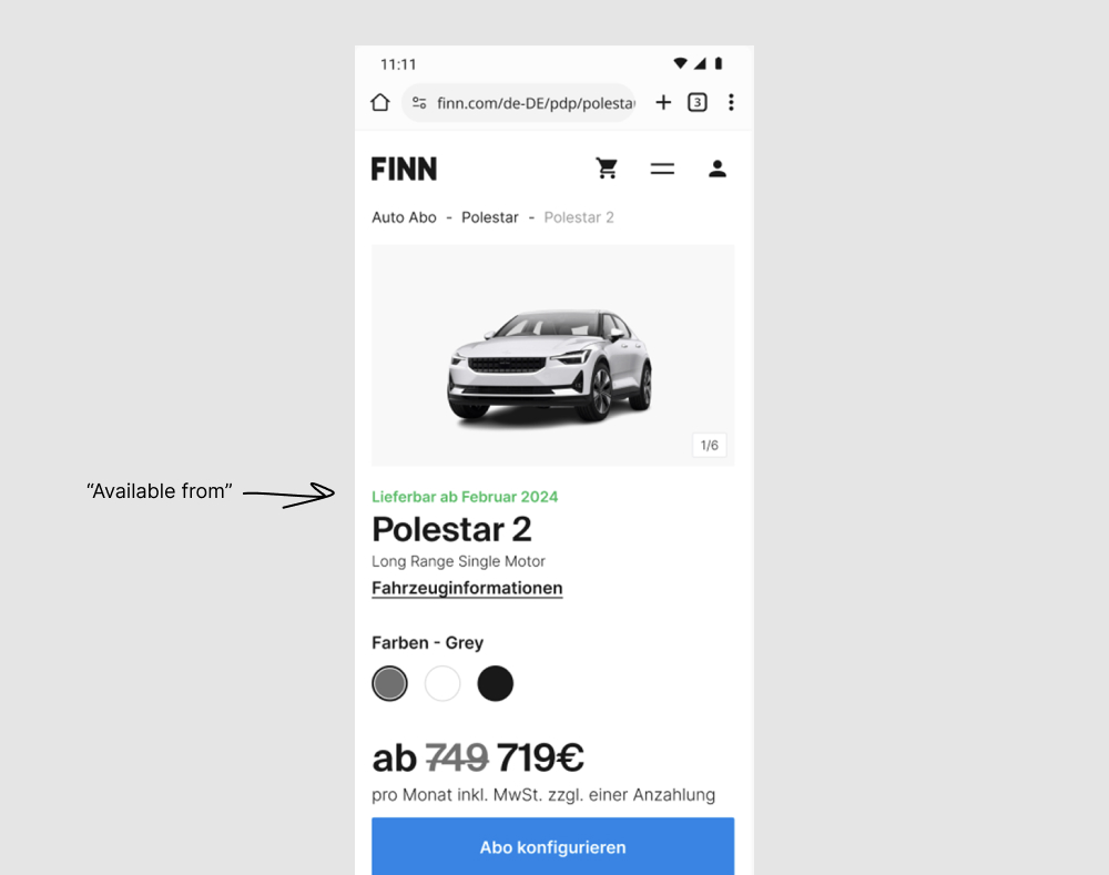
A number of copy tweaks were made in this experiment which was flipped around to match the earliest availability pattern (one of the more visible changes). Under this assumption, one of the more visible copy changes is the switch from using a blue "Most popular" tag towards a green "Available from [DATE]". The "available from" is also visible in the other version, except further down and with lower contrast. Impact on adds to cart and orders was measured.
Test #610 on
by  Jakub Linowski
Sep 04, 2025
Desktop
Product
X.X%
Sales
Jakub Tested Pattern #111: Field Explanations
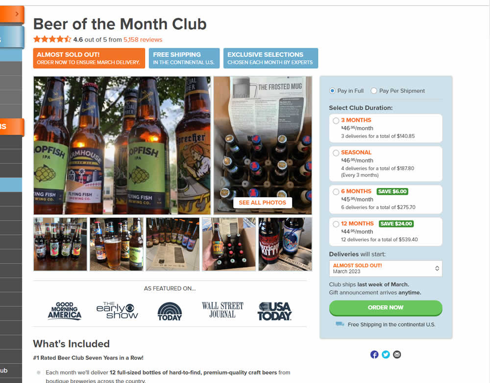
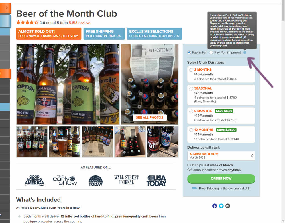
In this product detail page experiment, the variation showed a tooltip icon. Upon hovering on the icon it expanded additional information explaining the difference between pay in full and pay per shipment. Impact on sales was measured.
Test #609 on
by  Melina Hess
Aug 31, 2025
Mobile
Product
X.X%
Sales
Melina Tested Pattern #46: Pay Later
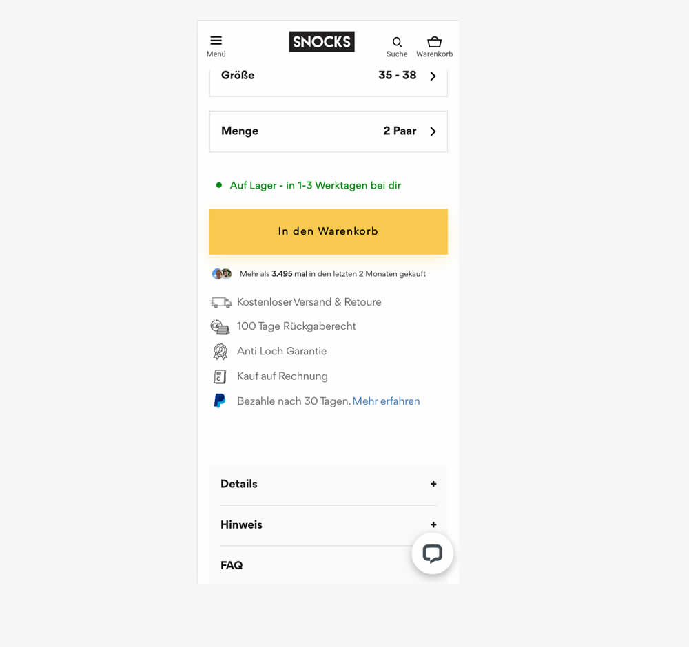
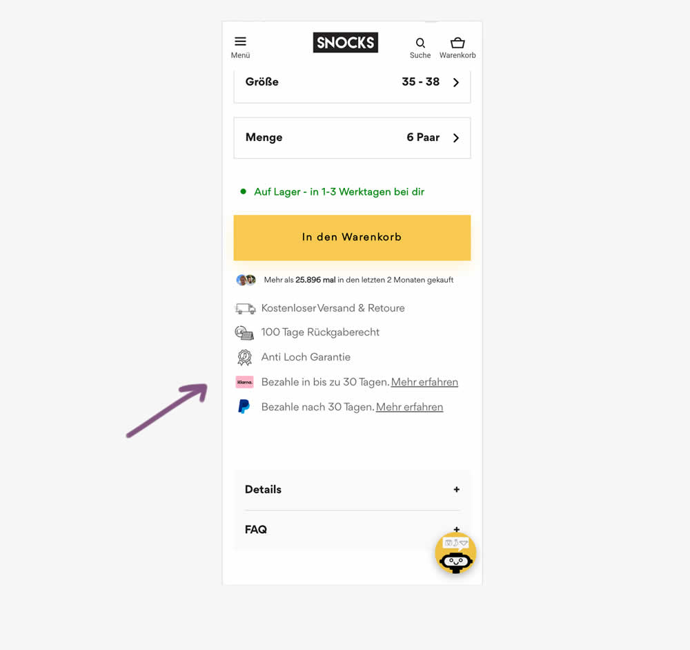
In this experiment, a Klarna buy now pay later badge was added to the PDP. It was added above the paypal buy now pay later badge in the benefit section below the ATC button. Impact on adds to cart and sales was measured.
Test #606 on
Online.metro-cc.ru
by  Andrey Andreev
Aug 22, 2025
Mobile
Product
X.X%
Sales
Andrey Tested Pattern #4: Testimonials On Online.metro-cc.ru
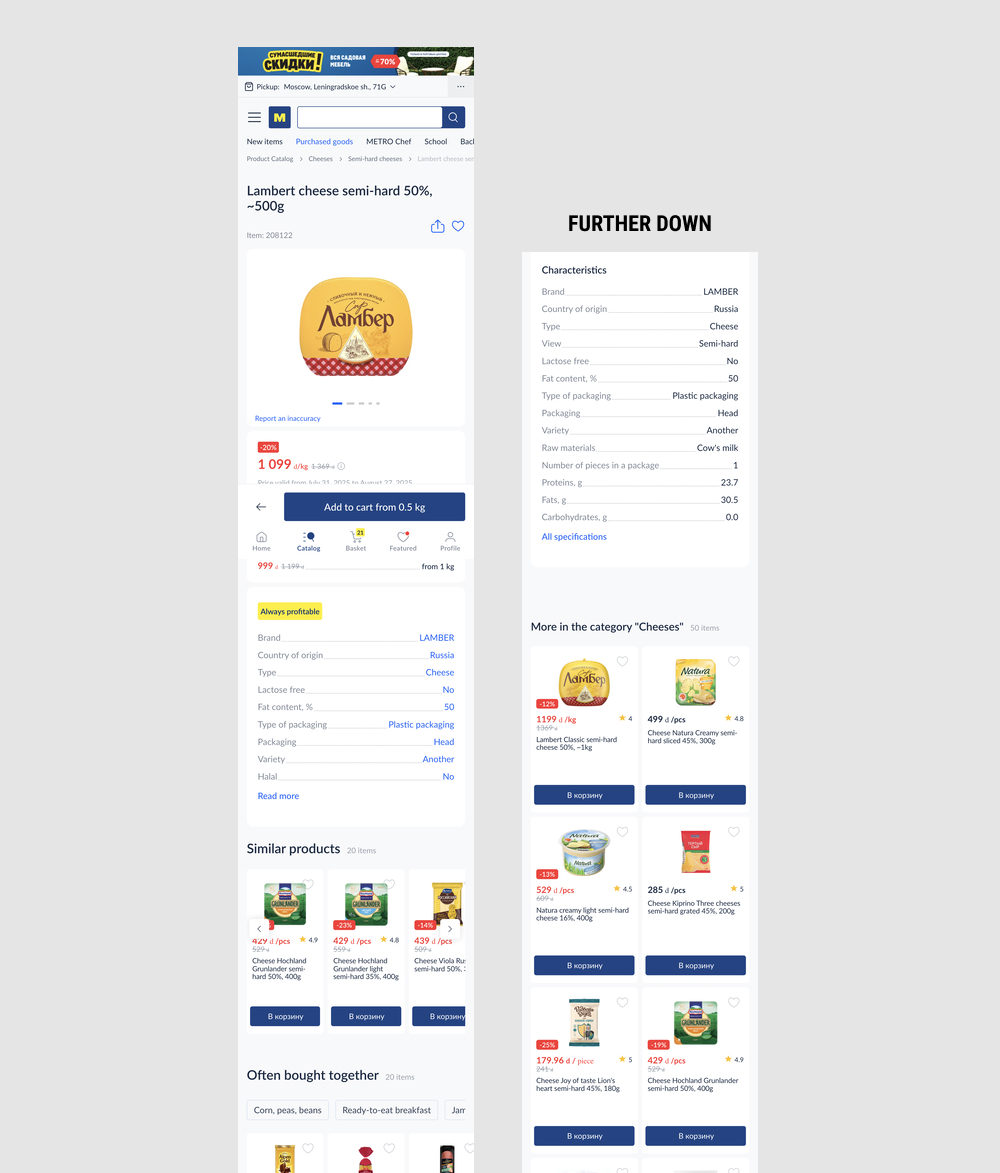
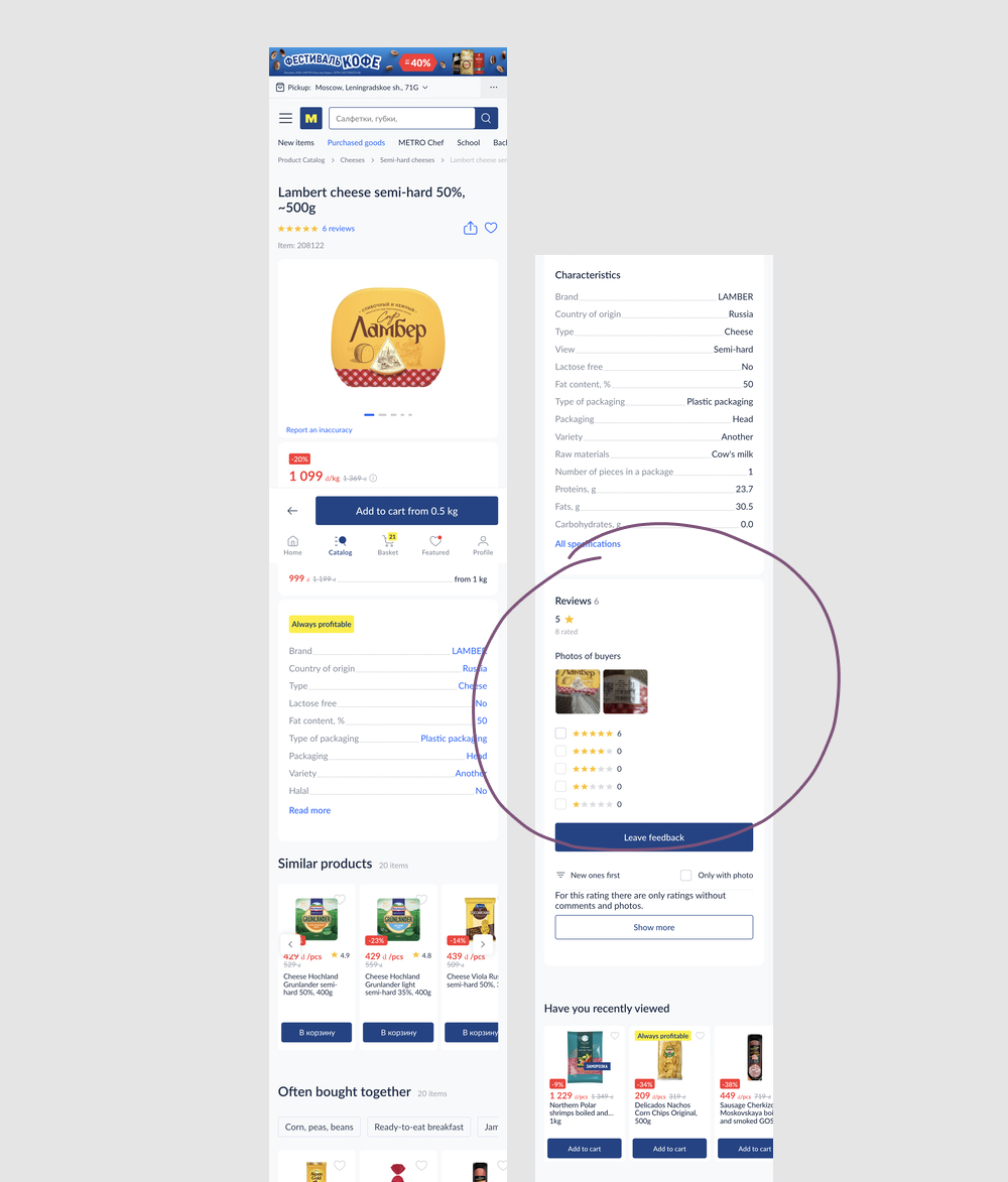
In this experiment, the presence of customer reviews were A/B tested on product pages of an online grocery store. Impact on adds to cart and sales was measured. (The expert was ran as a reverse/removal, but was inverted here to match the pattern).
Test #605 on
by  Jakub Linowski
Aug 21, 2025
Desktop
Mobile
Product
X.X%
Revenue
Jakub Tested Pattern #113: More Or Fewer Plans
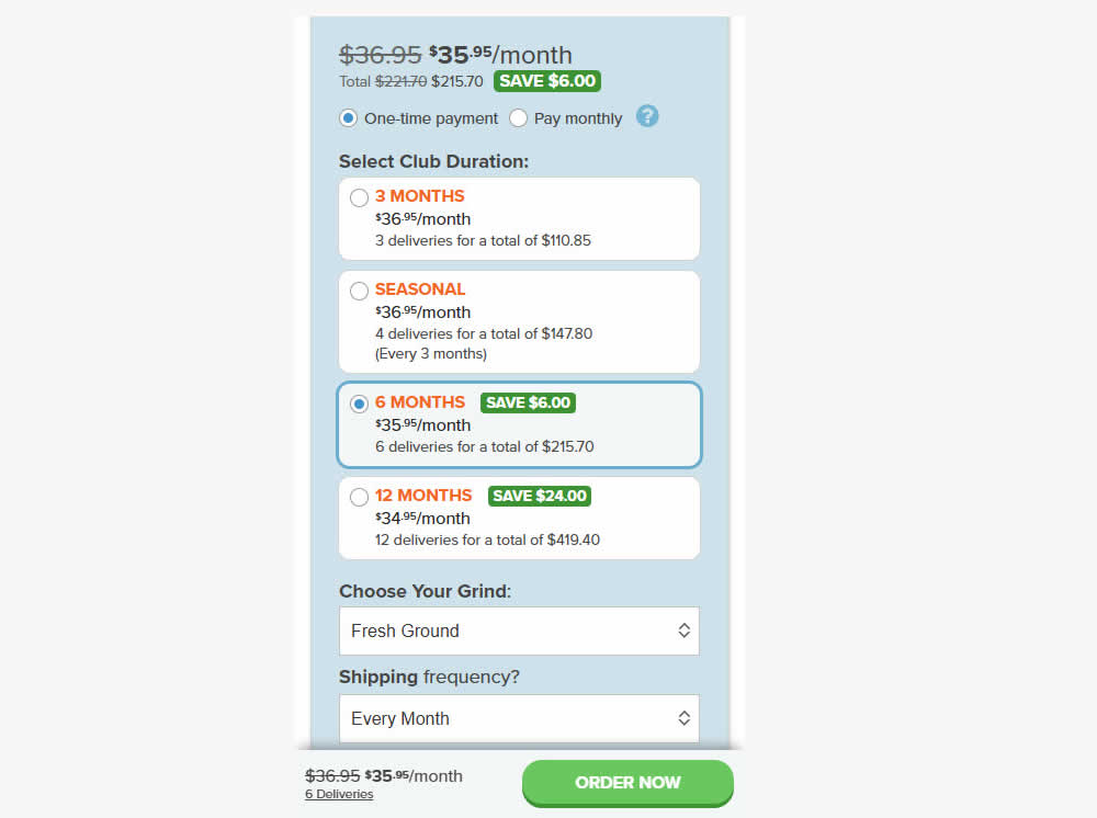
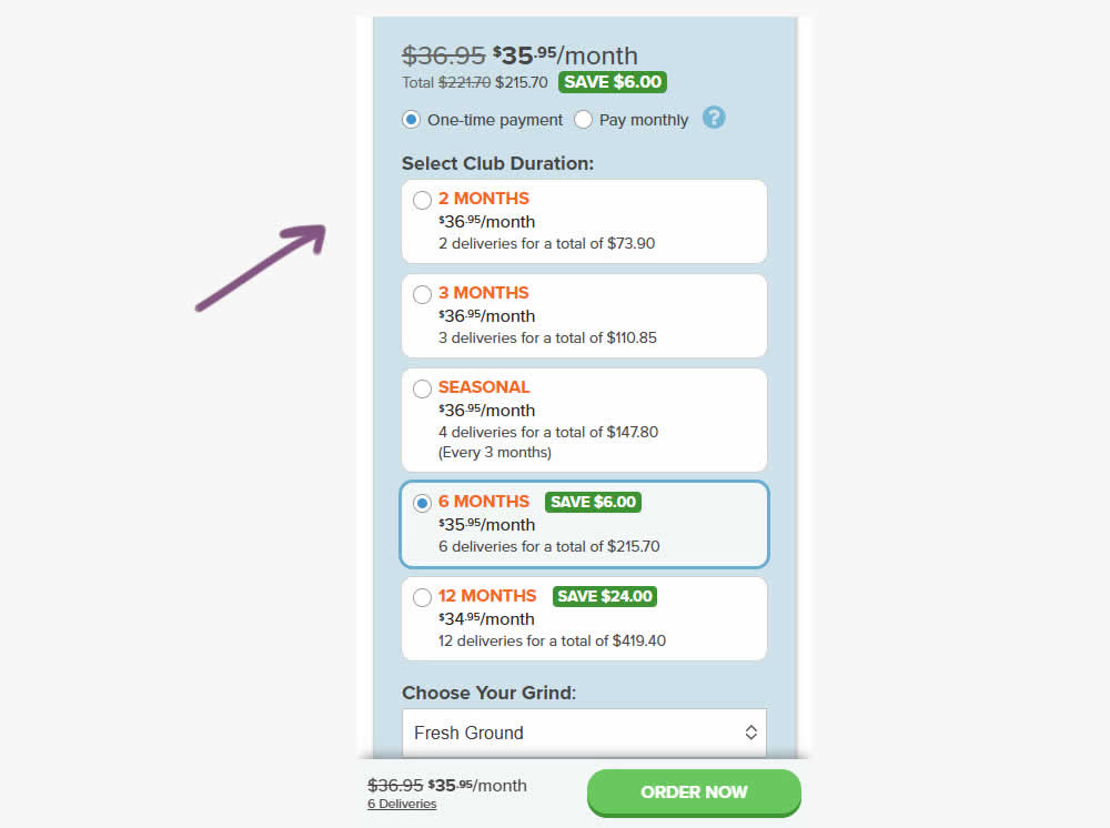
A less expensive product choice (club duration) was added at the beginning of the options. Impact on adds-to-cart, sales and revenue were measured.
Test #604 on
by  Melina Hess
Jul 31, 2025
Mobile
Product
X.X%
Sales
Melina Tested Pattern #46: Pay Later
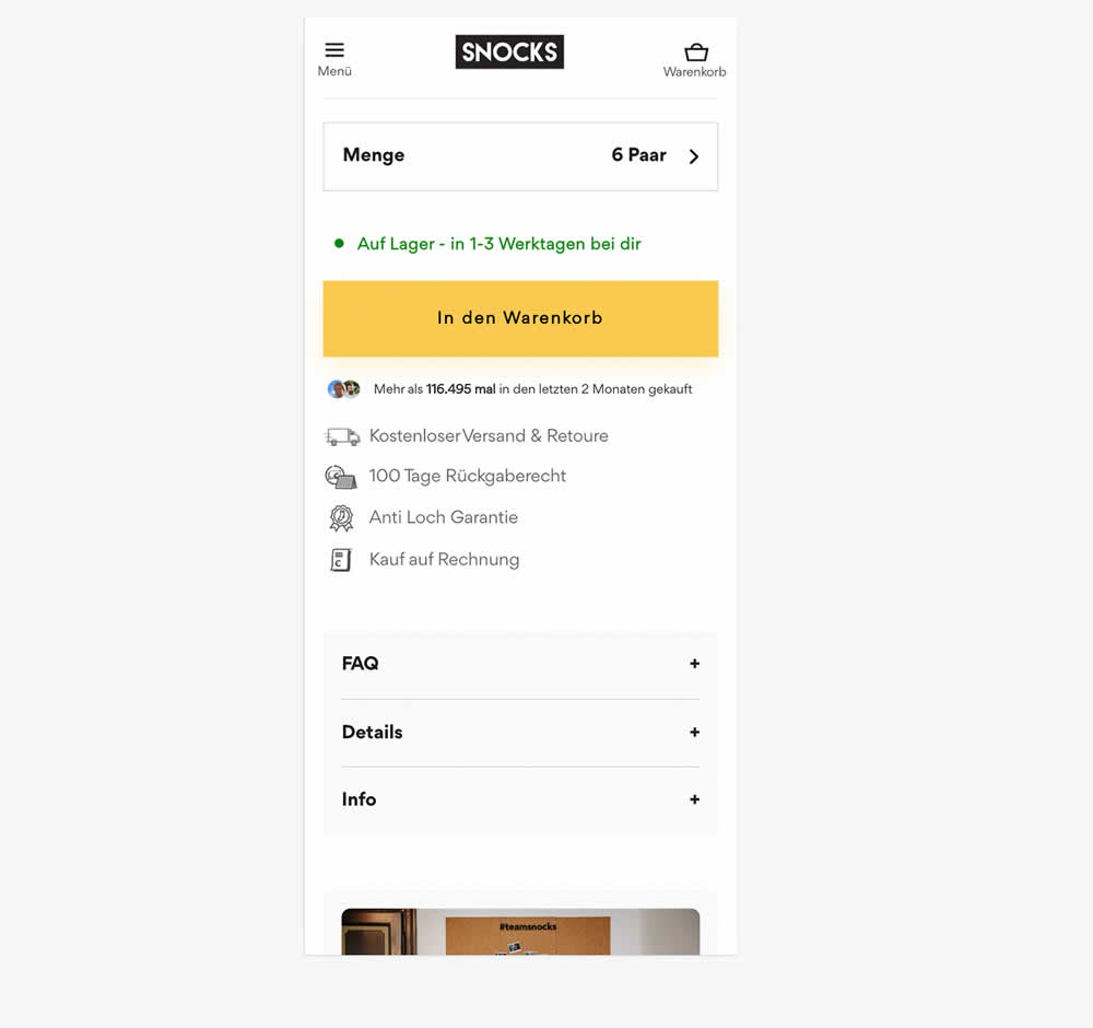
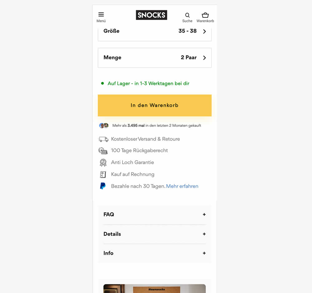
In this experiment, a Paypal badge with "buy now pay later" copy (pay within 30 days) was added underneath the add-to-cart button on product pages. Impact on adds to cart and sales was measured.
Test #603 on
Kay.com
by  Craig Kistler
Jul 30, 2025
Desktop
Mobile
Product
X.X%
Sales
Craig Tested Pattern #55: Conversational Filters On Kay.com
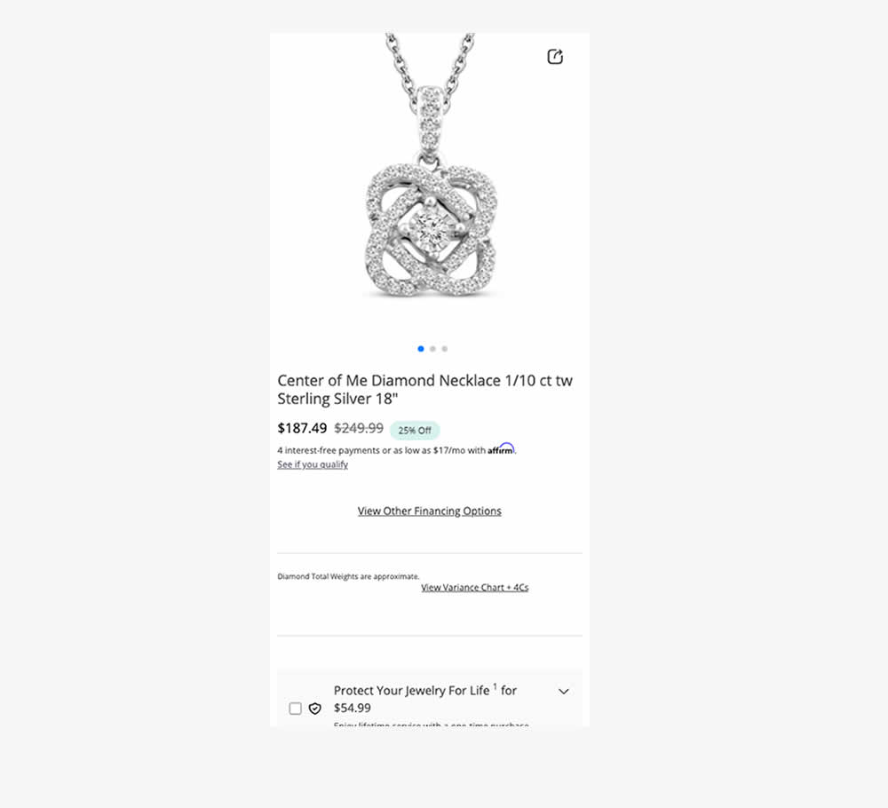
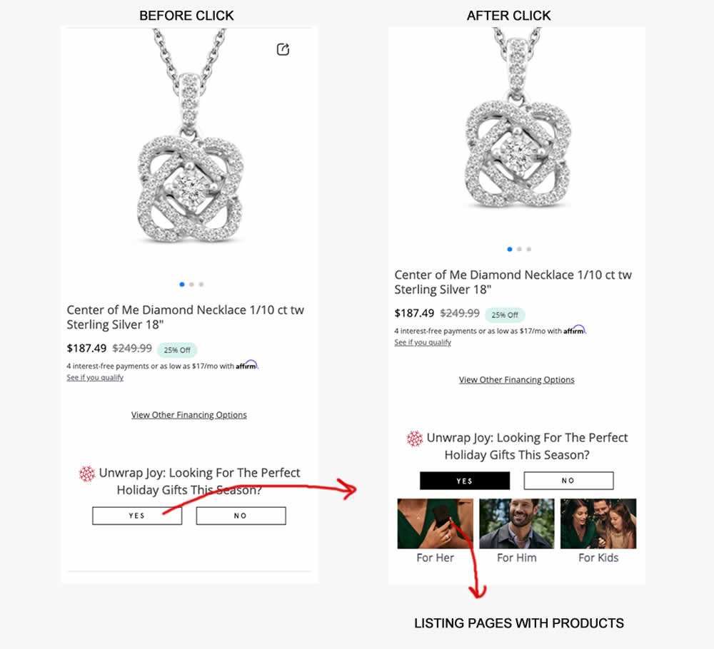
In this experiment, product pages (variant) asked users if they were interested to see holiday gifts with two buttons. Upon clicking "yes", the UI expanded to make another choice in order to see gifts for: Her, Him or Kids. Clicking any of these three would send users to dedicated listing pages with more product recommendations. Impact on sales was measured.
Test #601 on
Online.metro-cc.ru
by  Andrey Andreev
Jul 22, 2025
Desktop
Product
X.X%
Sales
Andrey Tested Pattern #45: Benefit Bar On Online.metro-cc.ru
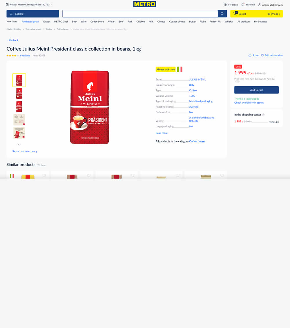
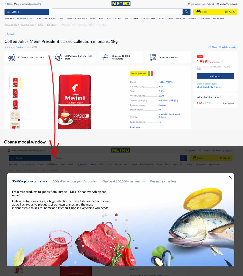
In this experiment, 4 selling points were added at the top of product details pages. Clicking on them would launch a modal with more details.
Test #598 on
by  Jakub Linowski
Jun 27, 2025
Desktop
Mobile
Product
X.X%
Sales
Jakub Tested Pattern #26: Cart Reminder And Recently Viewed
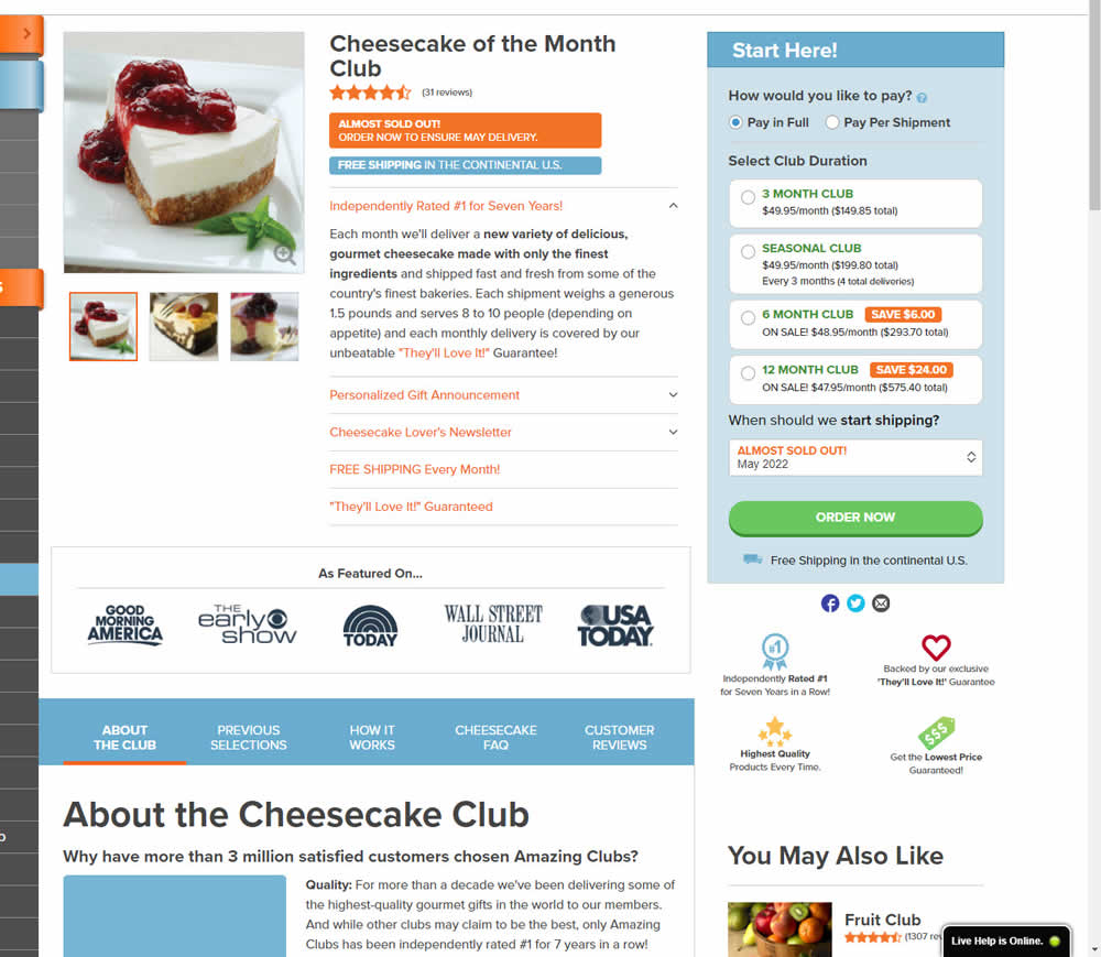
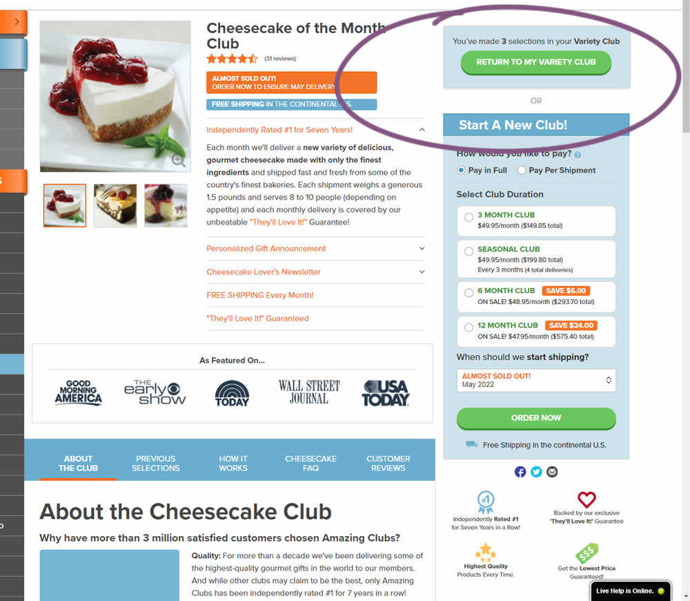
This experiment started when a user started a custom product build and visited any other product page. In the variation, a resume button appeared that would bring the customers back to their custom build. Impact on checkouts and sales was measured.
Test #599 on
Finn.com
by  Tim Karcher
Jun 27, 2025
Mobile
Product
X.X%
Leads
Tim Tested Pattern #10: Postponed Modal Forms On Finn.com
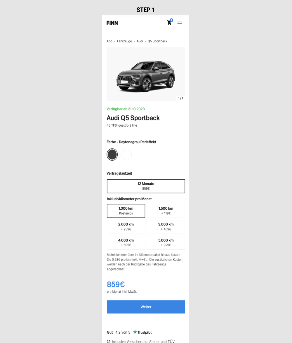
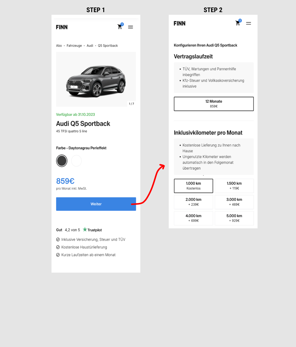
This is a heavily confounded multi-change experiment. In the variation, product choices on product detail pages were taken off and moved to a 2nd step (a new step). This also resulted in the price and primary button becoming more visible from an upward position shift. Impact on adds-to-cart and lead generation was measured.
Test #597 on
by  Frazer Mawson
Jun 26, 2025
Mobile
Product
X.X%
Sales
Frazer Tested Pattern #41: Sticky Call To Action
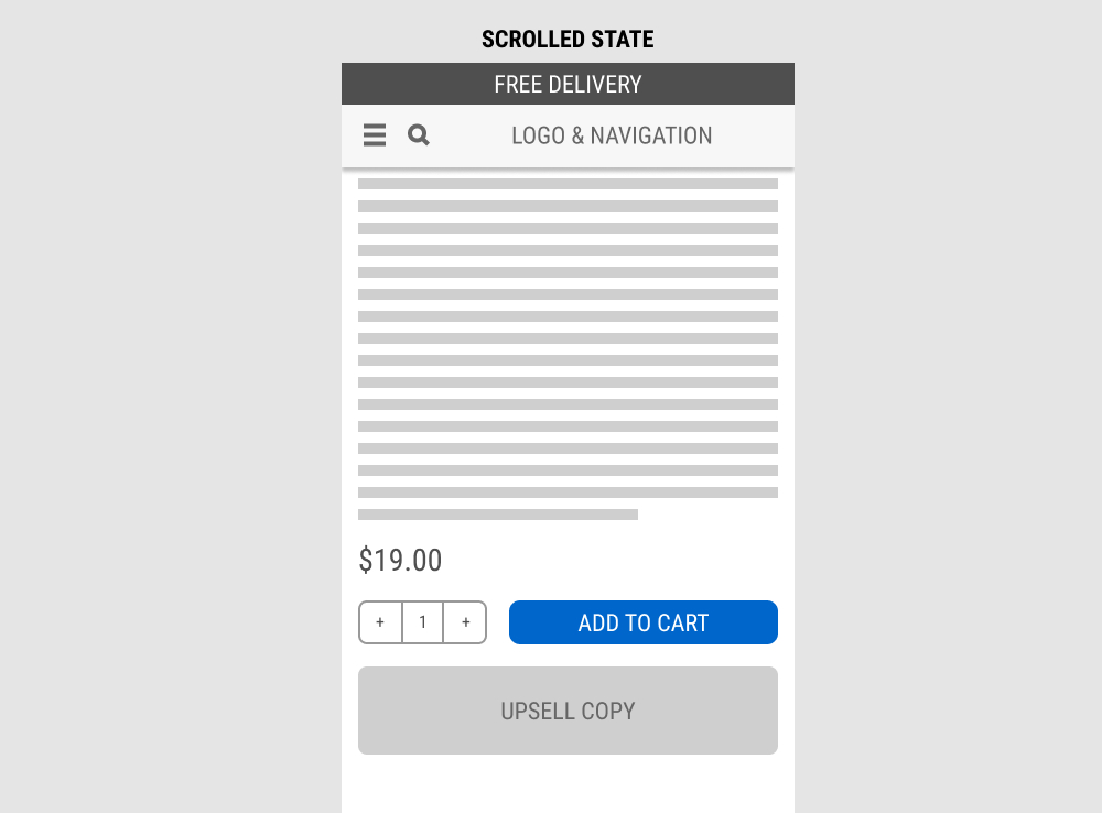
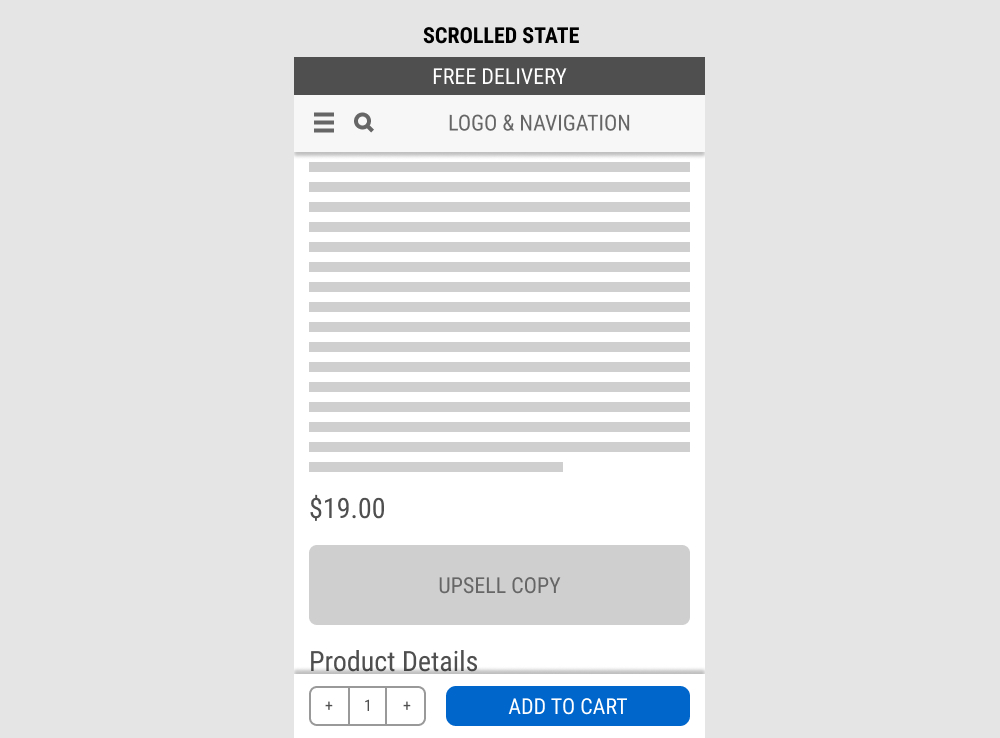
In this experiment, a fixed add-to-cart button along with the quantity selector was transformed into an always floating one. Impact on sales was measured. (Visitors are session based).