All Latest 620 A/B Tests
MOST RECENT TESTS
Test #441 on
by  Melina Hess
Nov 23, 2022
Desktop
Mobile
Product
X.X%
Sales
Melina Tested Pattern #41: Sticky Call To Action
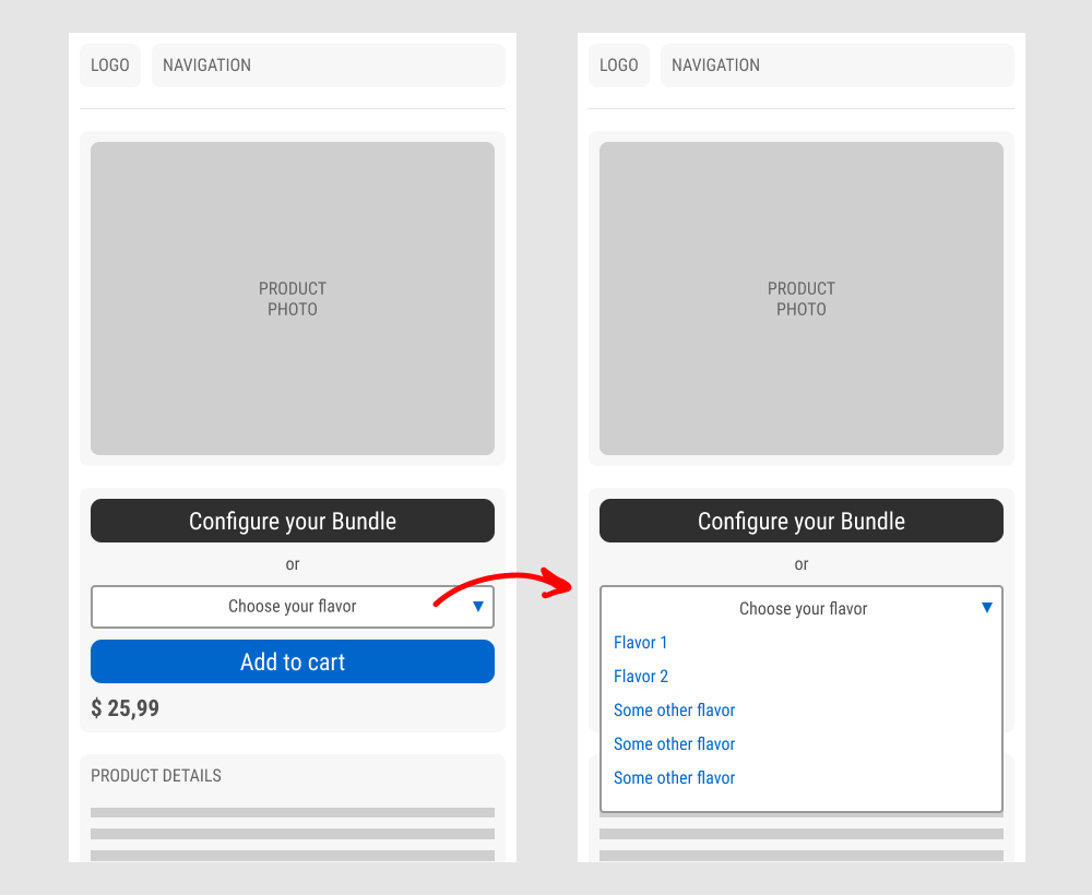
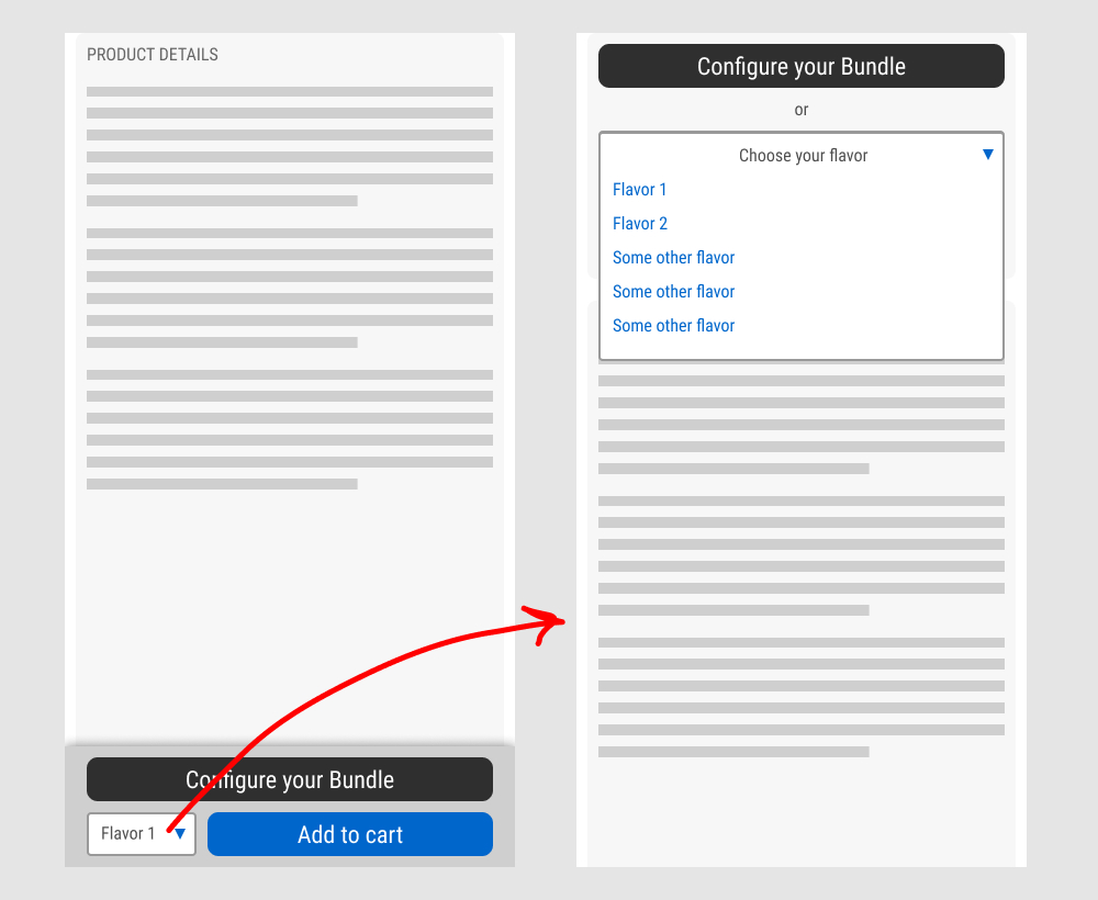
In this experiment, a floating sticky bar was added on product pages. The sticky elements only appeared after users scrolled beyond the fixed buy box area that is relatively high on the page (visible on the control screenshot). The sticky bar contained three elements: a button to configure up to three product choices, a flavor selection pulldown, and the add-to-cart button.
In the variation, when users clicked on the flavor pulldown three things happened. First, they were anchored back to the top of the buy box. Second, the floating sticky disappeared. And third, the flavors pulldown automatically expanded (overlapping the original primary add-to-cart button).
The control did not have any of the sticky behaviors.
Impact to total sales was measured.
Which A Or B Actually Wins? Find Out Before You Test.
Members see every test result — the winners, the flat ones, and the losers — along with exact effects and sample sizes. Use it to estimate your tests and prioritize by probability, not gut feel. Start every experiment with the odds on your side.
Test #430 on
by  Jakub Linowski
Sep 20, 2022
Desktop
Product
X.X%
Sales
Jakub Tested Pattern #26: Cart Reminder And Recently Viewed
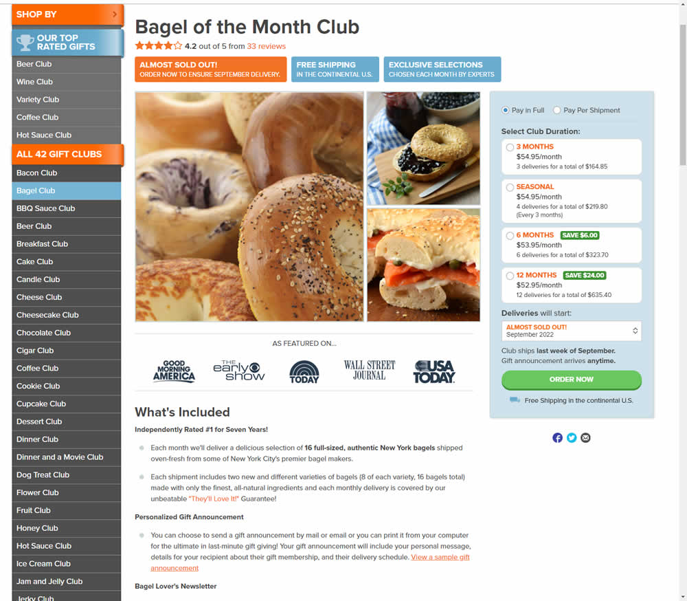
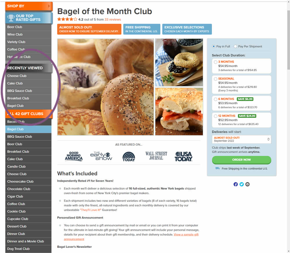
In this experiment, up to 5 recently viewed product pages would appear on the left hand navigation. The idea was to make it easier for users get back to what they were looking at in case they were browsing. These recently viewed products were not visibile in the control. Impact on adds-to-cart and completed transactions was measured.
Test #429 on
Snocks.com
by  Melina Hess
Aug 16, 2022
Mobile
Desktop
Product
X.X%
Sales
Melina Tested Pattern #121: Free Shipping On Snocks.com
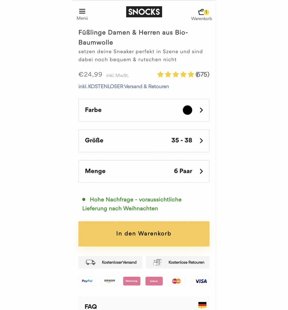
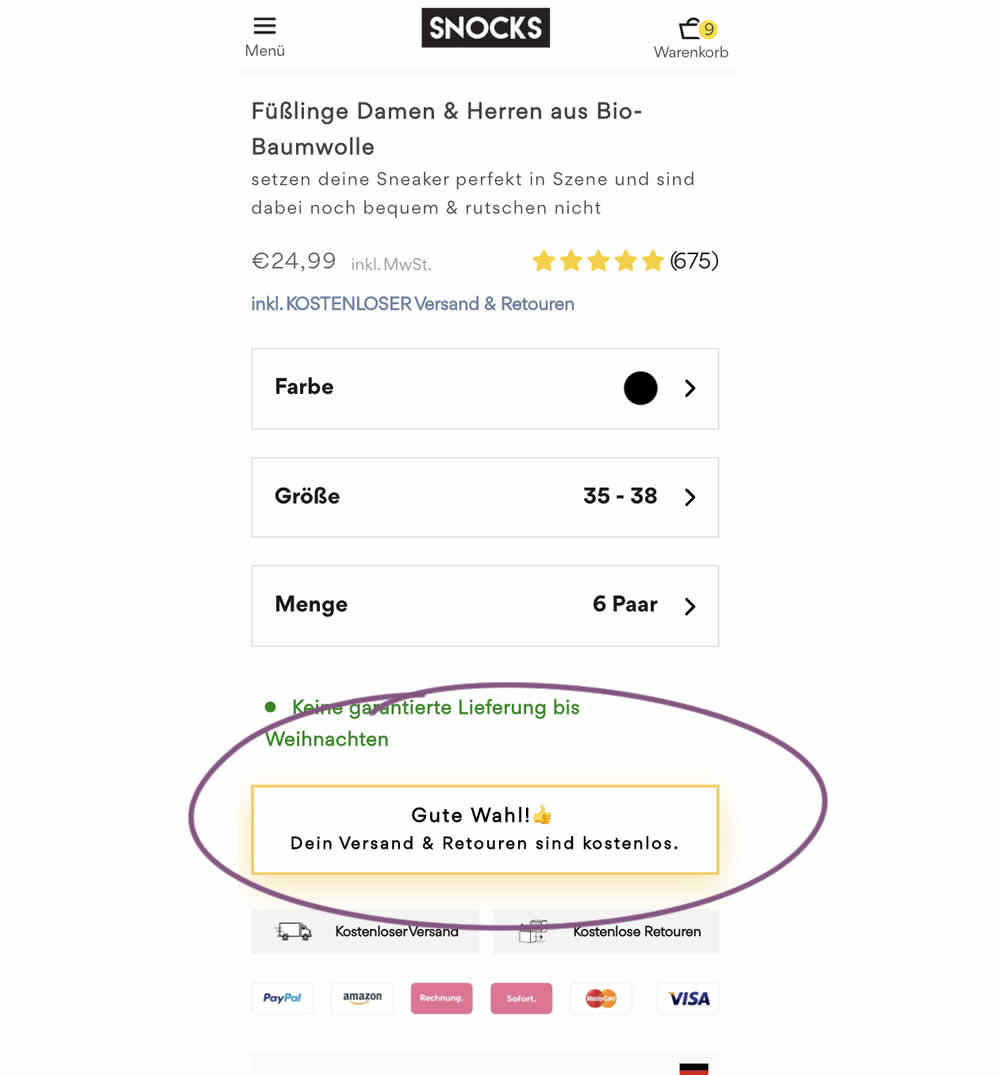
Upon clicking the Add-To-Cart button, the button label changed to a cheering message which congratulated the user on his choice and ensuring that shipping is free. Translation: "Good choice. Your shipping and returns are free."
Test #425 on
by  Jakub Linowski
Aug 03, 2022
Desktop
Product
X.X%
Sales
Jakub Tested Pattern #41: Sticky Call To Action
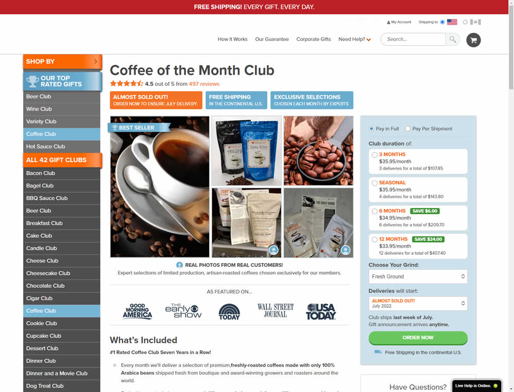
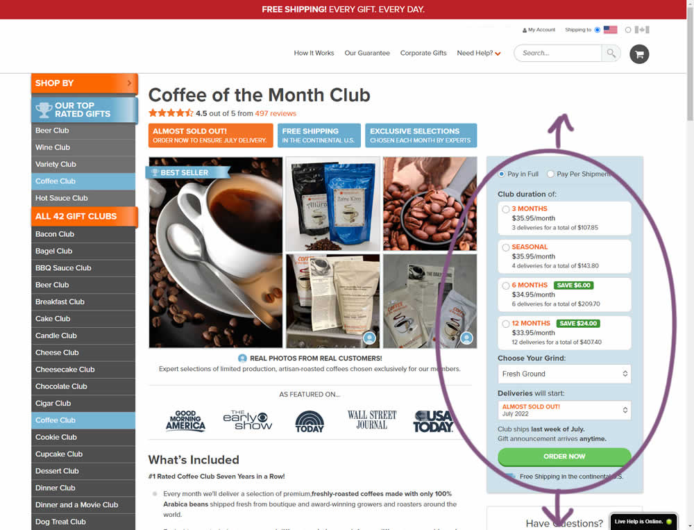
In this experiment, the complete buy box on a product detail page, floated along as users scrolled through the long screen. The variation made sure the product choice and order now button was always visible. Impact on adds-to-cart and sales was measured.
Test #421 on
Amazon.com
by  Marika Francisco
Jul 15, 2022
Desktop
Mobile
Product
X.X%
Sales
Marika Tested Pattern #43: Long Titles On Amazon.com
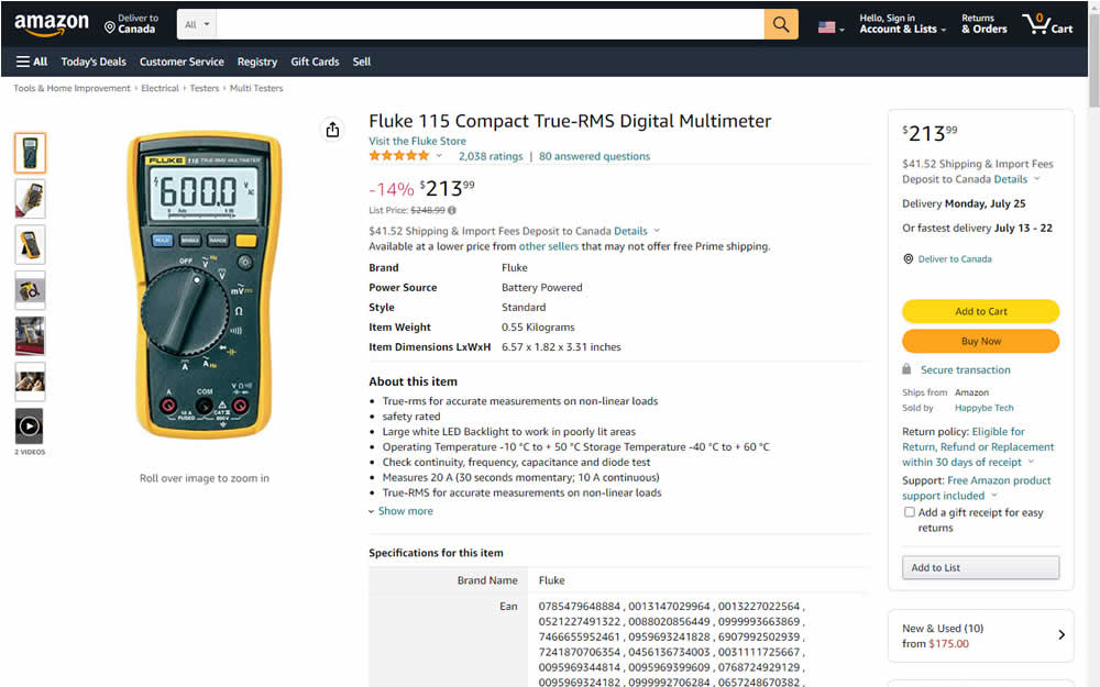
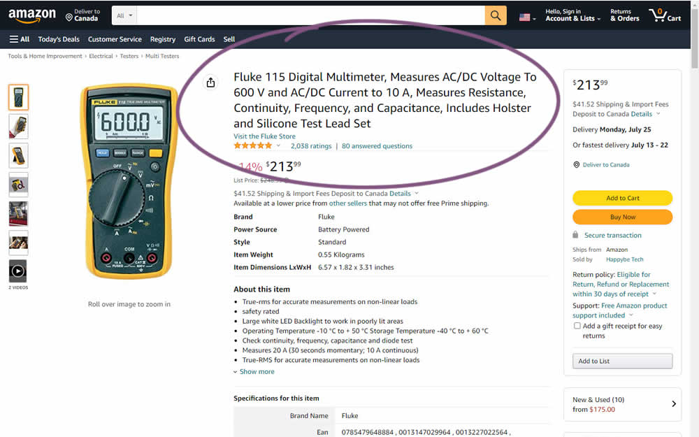
Fluke is an industrial manufacterer of measurement and calibration devices and they ran a test on their Amazon store for a series of their prodcts. Instead of using short product names, they tested longer and more descriptive ones. Impact was measured on sales.
Test #420 on
Designlab.com
by  Daniel Shapiro
Jul 12, 2022
Desktop
Mobile
Product
X.X%
Leads
Daniel Tested Pattern #115: Pricing Comparison Table On Designlab.com
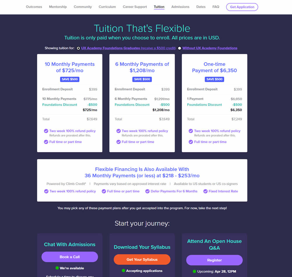
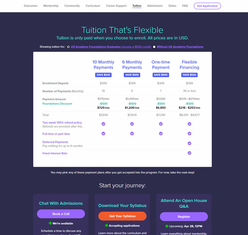
In this experiment, pricing plans were laid out horizontally for easier comparison. In the variation, most of the plan benefits, features and differences were also referenced using a single lable that was left-aligned. The idea was to make the variables aligned and therefore more comparable.
This pricing table appeared at the bottom of a long design program landing page. Impact on leads and applications was measured.
Test #416 on
Designlab.com
by  Daniel Shapiro
Jun 20, 2022
Desktop
Mobile
Product
X.X%
Sales
Daniel Tested Pattern #105: Lead Magnets On Designlab.com
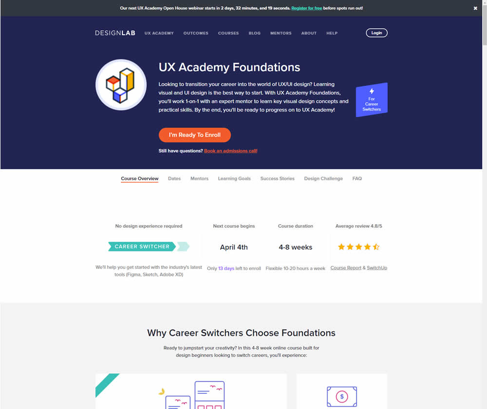
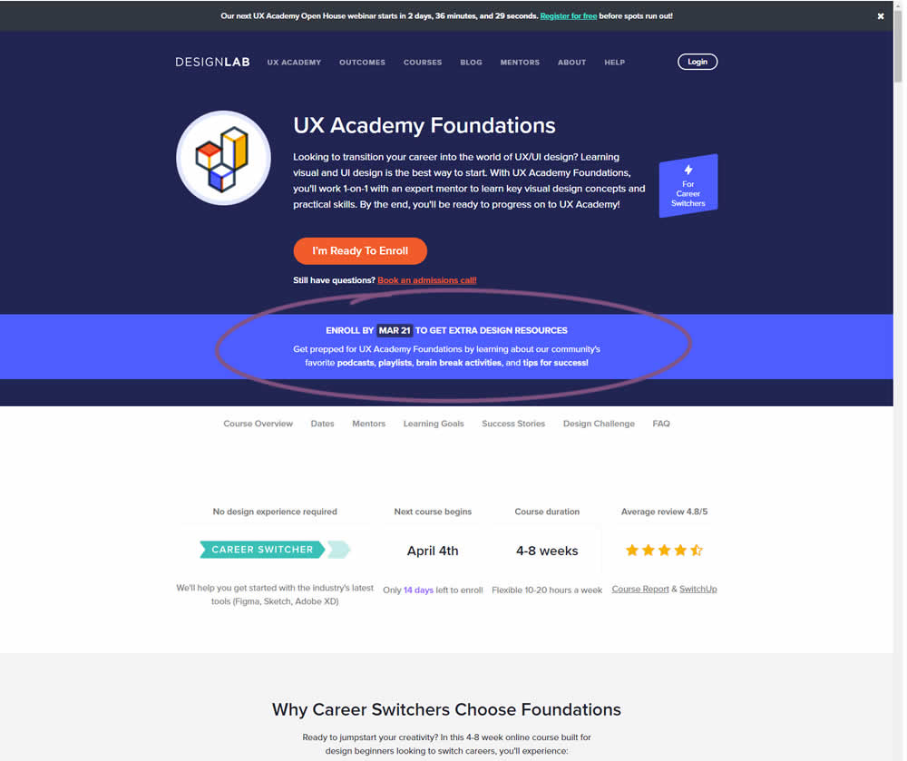
In this experiment, copy was added which communicated that students signing up for a course would receive extra design resources (the lead magnet). This was added in multiple states of the course page. Impact on lead generation and enrollment was measured.
Test #411 on
by  Ayat Shukairy
May 09, 2022
Desktop
Mobile
Product
X.X%
Sales
Ayat Tested Pattern #126: Bottom Or Left Thumbnails
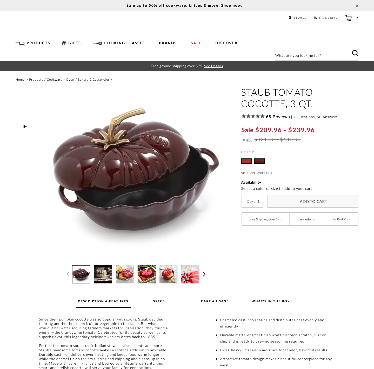
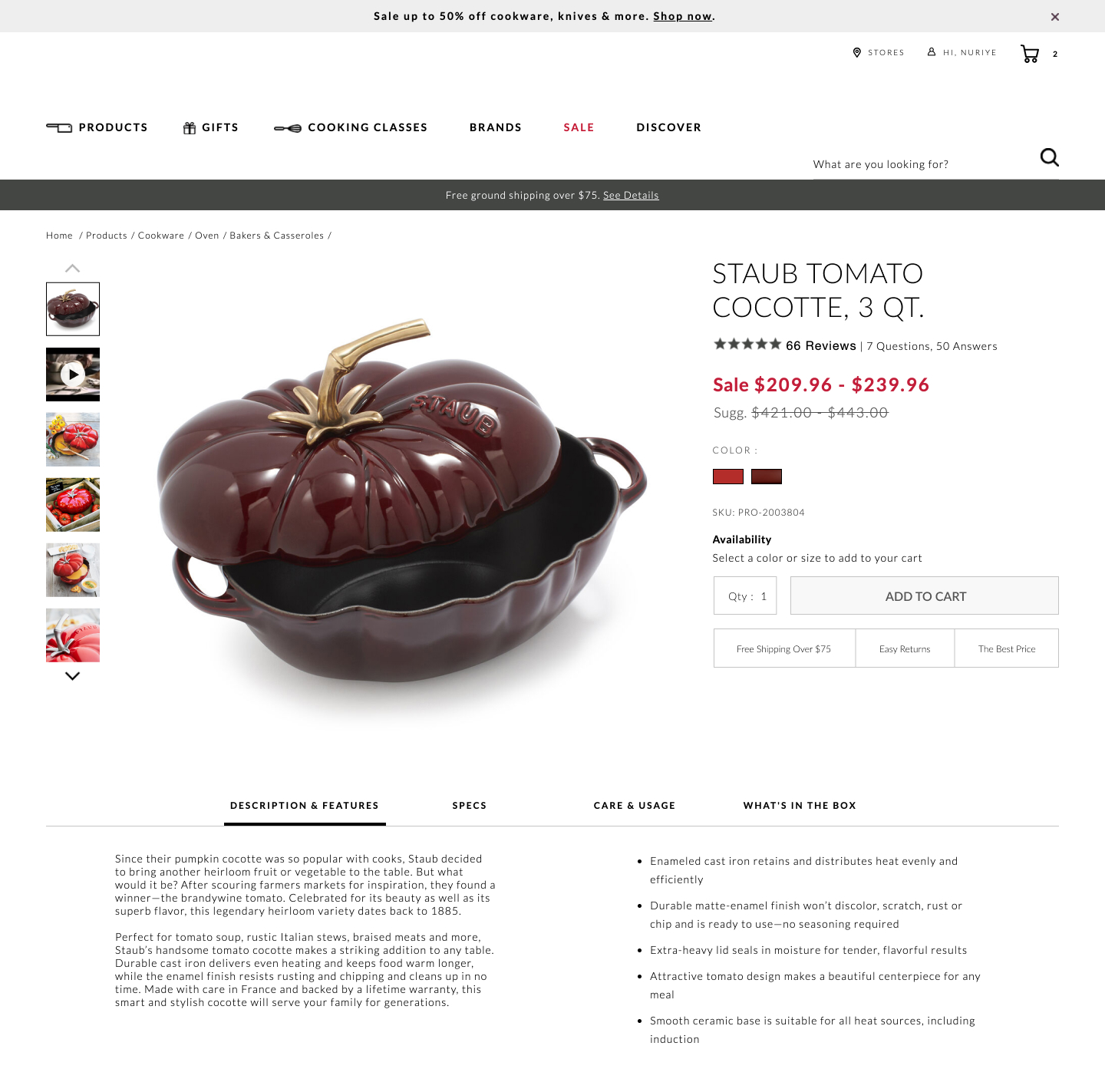
Bottom aligned thumbnails were shifted to the left side on a product image. Doing so, also shifted the product descriptions a little higher. Impact on adds-to-cart and total transactions was measured.
Test #408 on
by  Jakub Linowski
Apr 29, 2022
Desktop
Mobile
Product
X.X%
Sales
Jakub Tested Pattern #67: Currency & Taxes
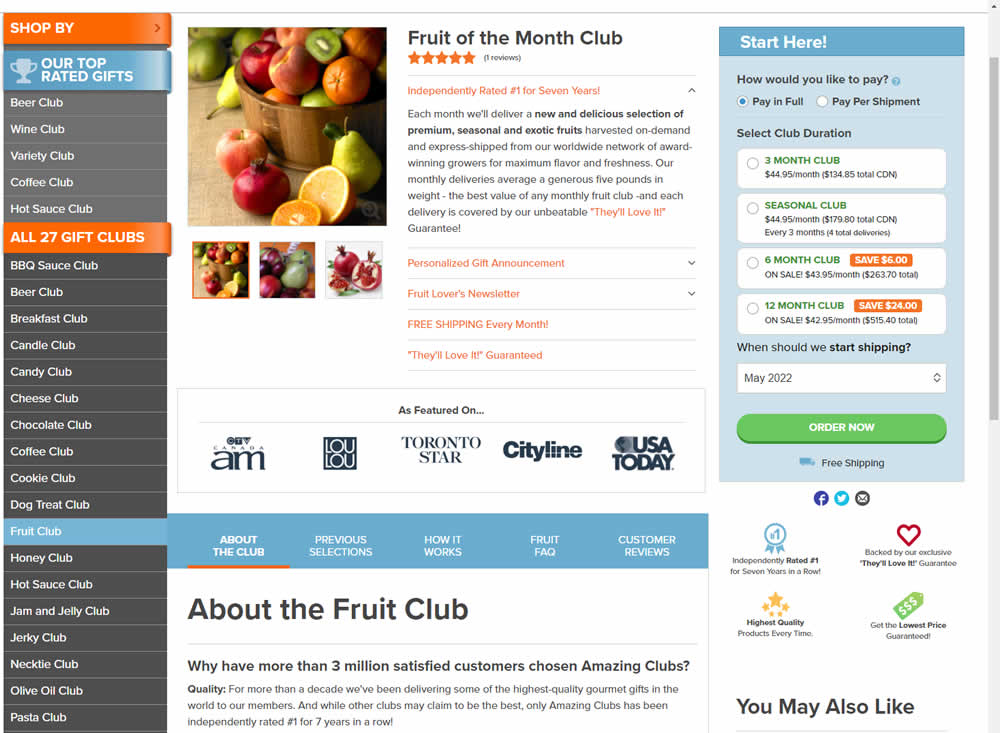
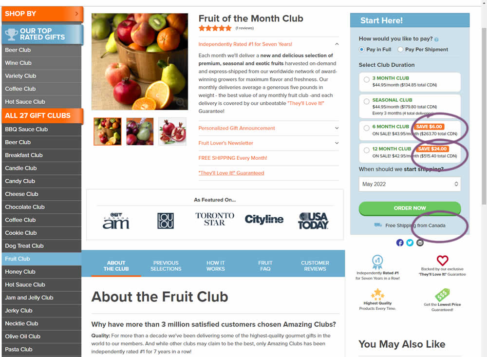
Here is a very simple experiment where CDN currency copy was appended to prices being shown on a Canadian ecommerce site. Additional copy ("from Canada") was appended to an existing shipping message.
Test #407 on
Snocks.com
by  Melina Hess
Apr 22, 2022
Desktop
Mobile
Product
X.X%
Sales
Melina Tested Pattern #125: Unit Prices On Snocks.com
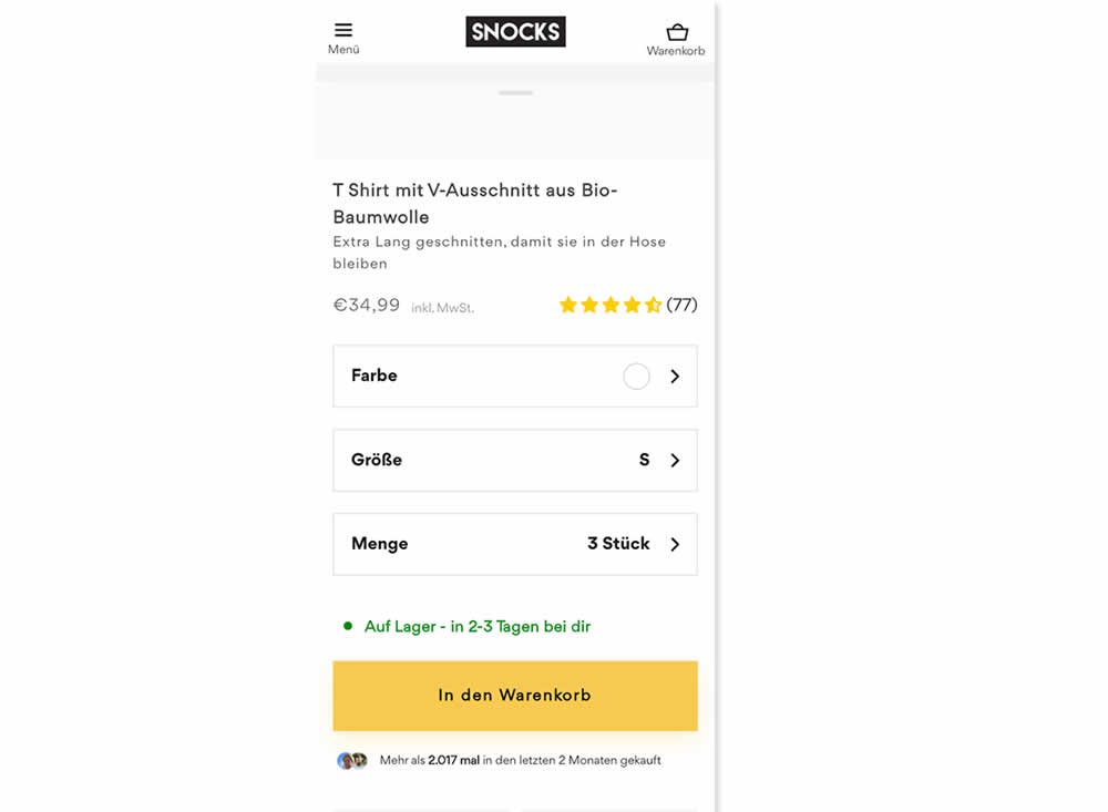
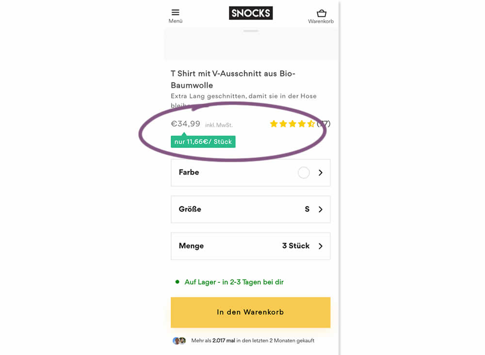
Here is an experiment with an added "price per pair" in the context of products with multiple items (packs).A high contrast badge-like copy was appended underneath the price which translates to "only $X per item". Impact on sales was measured.
Test #406 on
Chaos.com
by  Velin Penev
Apr 12, 2022
Desktop
Mobile
Product
X.X%
Sales
Velin Tested Pattern #112: Lower Price Frames On Chaos.com
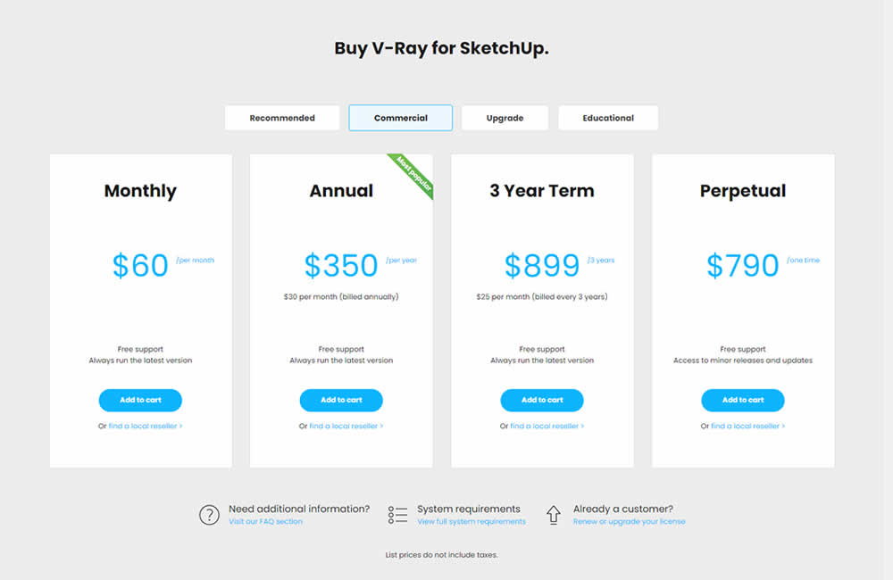
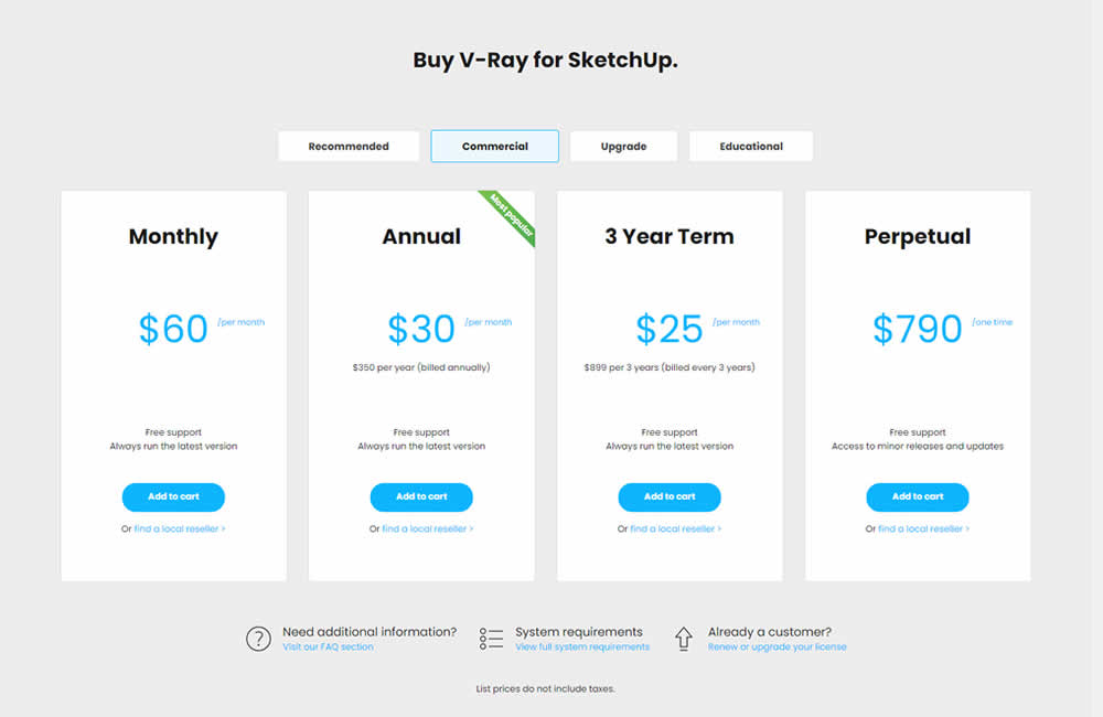
In this experiment, the pricing of three software plans was consistently framed into a more comparable monthly context. Whereas the control version only showed the total prices for each plan, the variation showed both the total and monthly prices. Impact on sales was measured.
Test #402 on
Snocks.com
by  Melina Hess
Mar 25, 2022
Mobile
Product
X.X%
Sales
Melina Tested Pattern #103: Money Back Guarantee On Snocks.com
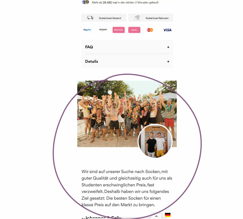
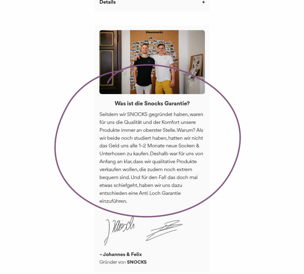
In this experiment on a product screen, a message about quality (from the founders) was reformatted to reinforce the "Anti Hole Guarantee" (in the context of socks). The founders were also made more prominent and their signature added as well. Interestingly, the actual guarantee copy (and its important detail about a 6 month product replacement) was present further down on both the control and variation.
The translation of the new copy (Google Translate) reads:
Since we founded SNOCKS, the quality and comfort of our products have always been our top priority. Why? When we both were still studying, we didn't have the money to buy new socks & underpants every 1-2 months. That's why it was clear to us from the start that we wanted to sell quality products that are also extremely comfortable. And just in case something goes wrong, we have decided to introduce an anti-hole guarantee.
Test #397 on
Snocks.com
by  Melina Hess
Feb 24, 2022
Mobile
Product
X.X%
Revenue
Melina Tested Pattern #121: Free Shipping On Snocks.com
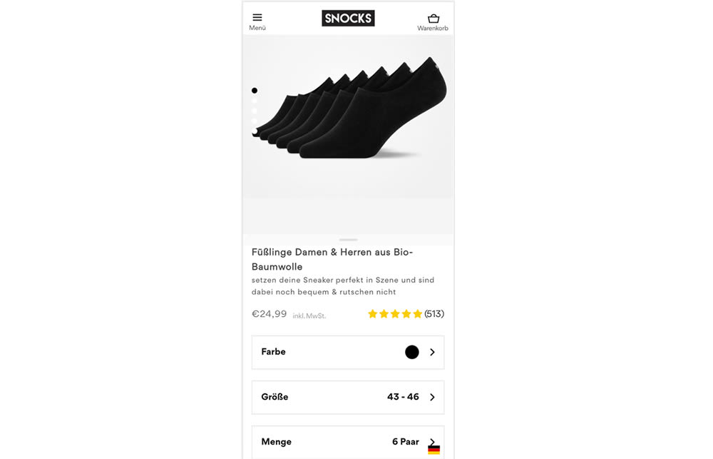
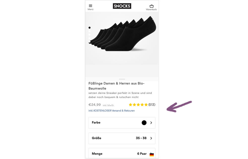
In this experiment a "Free Shipping & Returns" message was added just below the price information.
Test #395 on
by  Jakub Linowski
Jan 31, 2022
Desktop
Mobile
Product
X.X%
Sales
Jakub Tested Pattern #52: How It Works
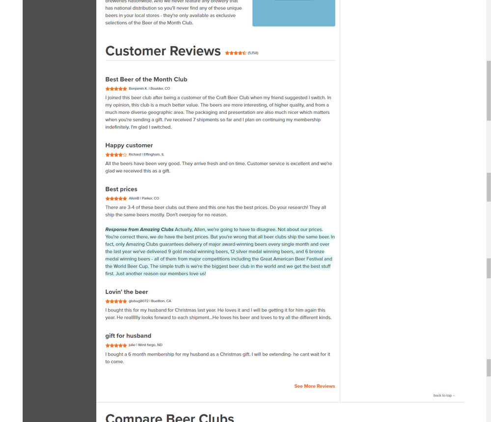
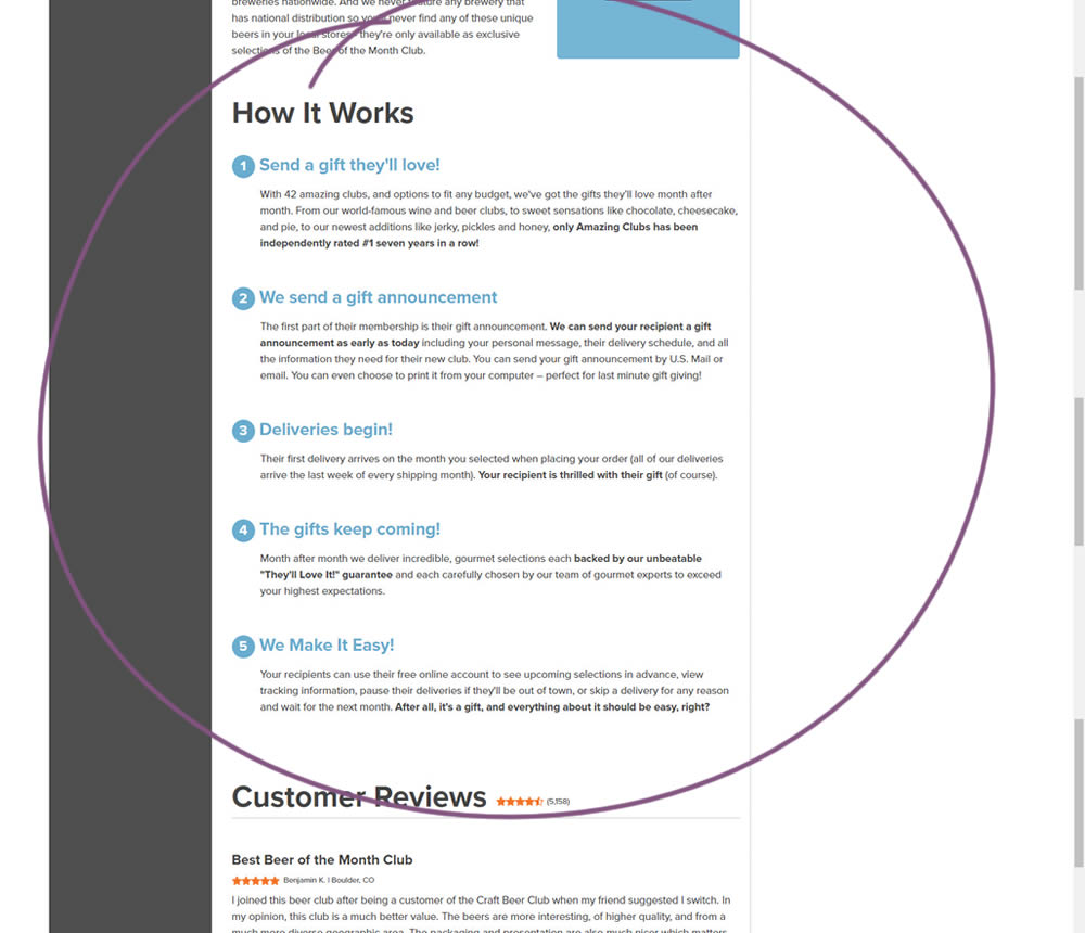
In this experiment, a How It Works section was appended on a product detail page just above product reviews.
Test #394 on
Chaos.com
by  Velin Penev
Jan 29, 2022
Desktop
Product
X.X%
Sales
Velin Tested Pattern #113: More Or Fewer Plans On Chaos.com
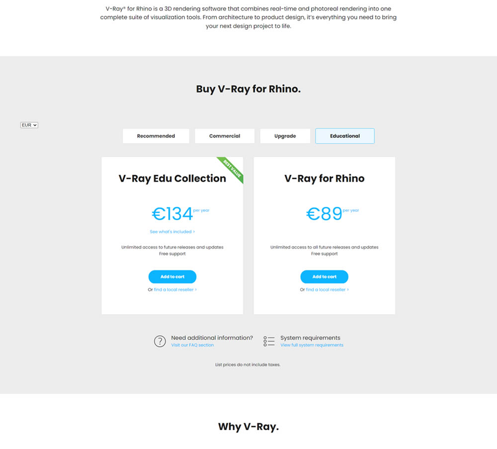
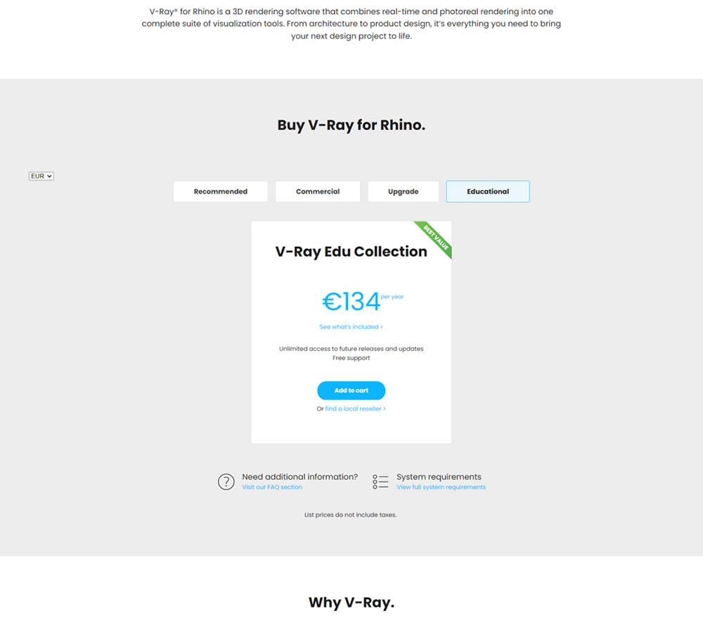
In this experiment, a two plan pricing plan (standalone product with a higher collection set) was tested against a single plan one (only a collection set). Impact on clicks and total sales was measured.
Test #5 on
Busyteacher.org
by  Andrei Zakhareuski
Jan 23, 2022
Desktop
Mobile
Product
X.X%
Sales
Andrei Tested Pattern #21: What It's Worth On Busyteacher.org
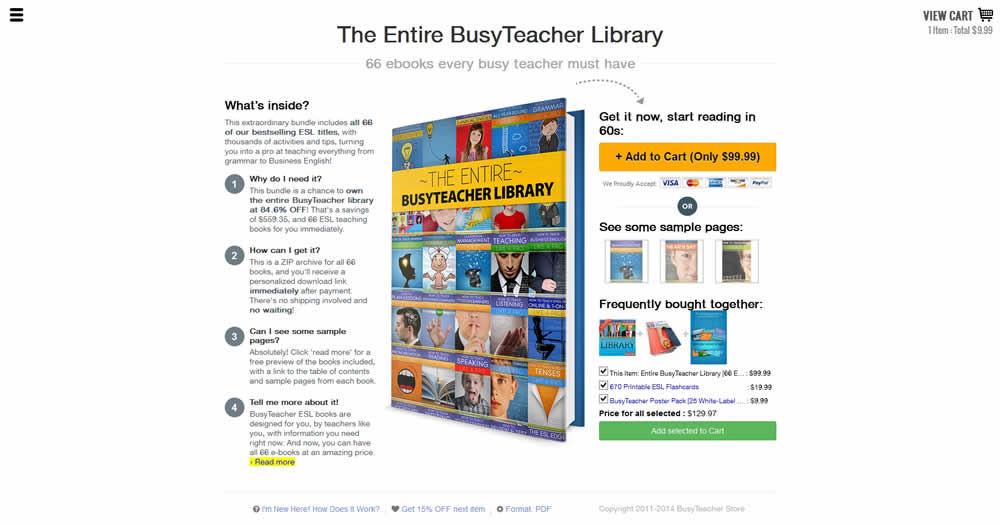
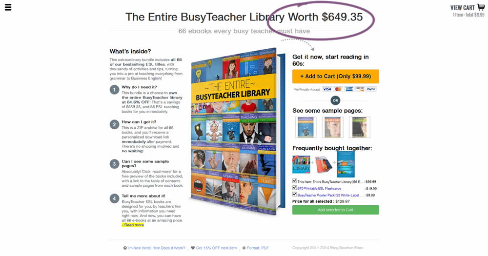
The variation included a simple extention of the headline to include the full dollar worth of a discounted bundle deal.
Test #122 on
Designlab.com
by  Daniel Shapiro
Jan 22, 2022
Desktop
Mobile
Product
X.X%
Leads
Daniel Tested Pattern #30: Authentic Photos On Designlab.com
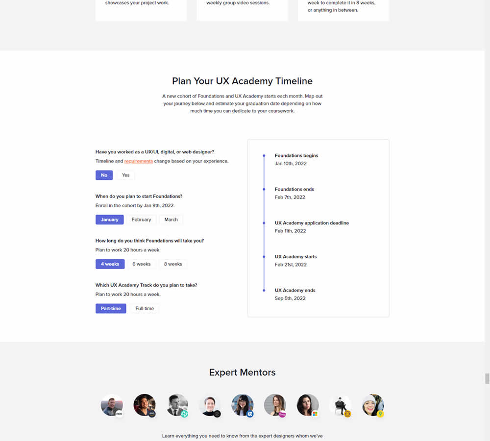
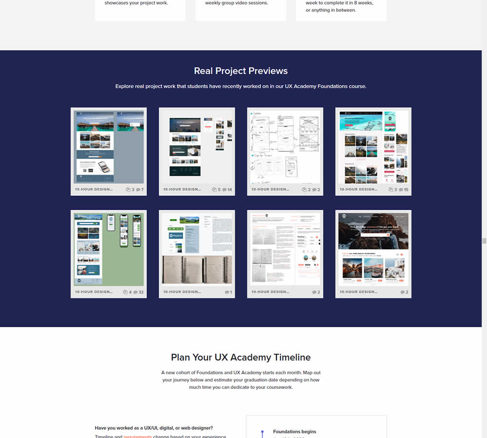
In this experiment for an online design course, the variation had an extra section with student work previews. The previews were not clickable but were added just below the fold. Impact on leads was measured by potential students requesting a syllabus through an online form throughout the long landing page.
Test #392 on
by  Jakub Linowski
Dec 31, 2021
Desktop
Mobile
Product
X.X%
Sales
Jakub Tested Pattern #122: Zigzag Layout
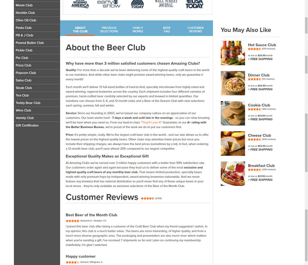
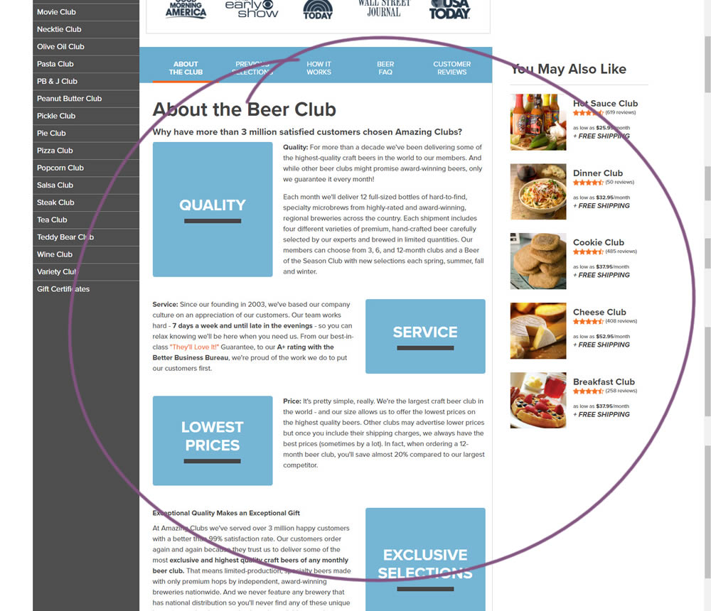
In this experiment, paragraph style copy was reorganized into a zig zag layout with key sections being reinforiced with copy-as-image statements. Impact on adds-to-cart and sales was measured.
Test #385 on
Snocks.com
by  Samuel Hess
Nov 25, 2021
Mobile
Product
X.X%
Sales
Samuel Tested Pattern #63: Trust Seals On Snocks.com
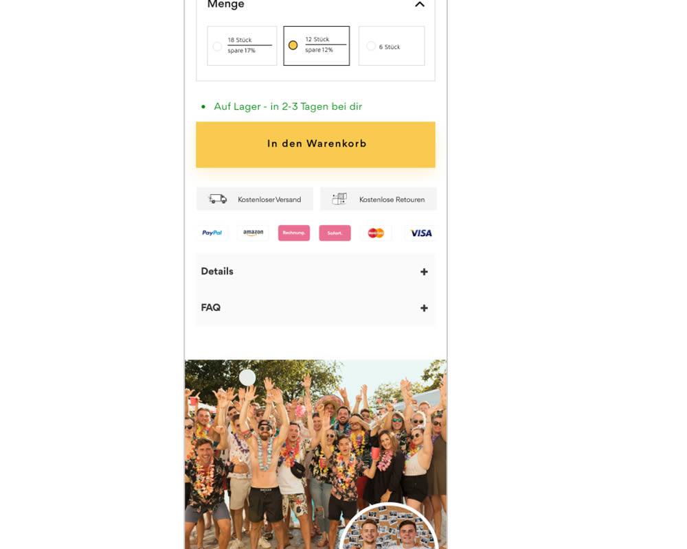
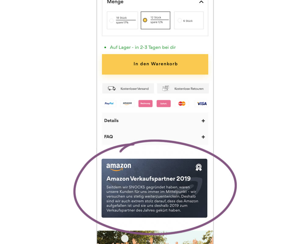
In this experiment, a simple Amazon badge was added on a product page. The translated (Google) language read: "Since we founded snocks, our customers have always been our focus - we are constantly trying to develop further. That's why we're extremely proud that Amazon attracted attention and that they named us Sales Partner of the Year in 2019."
Test #382 on
Snocks.com
by  Samuel Hess
Oct 31, 2021
Desktop
Product
X.X%
Sales
Samuel Tested Pattern #43: Long Titles On Snocks.com
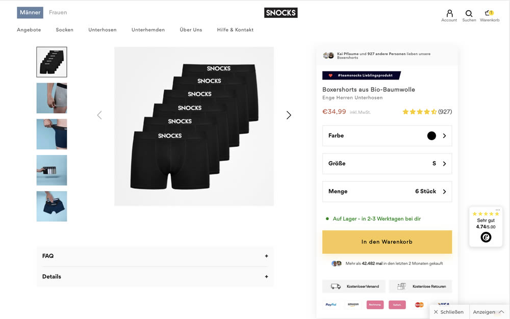
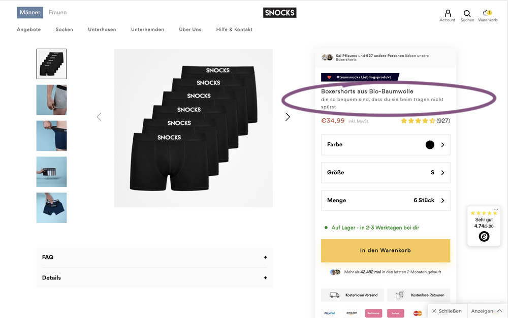
In this experiment, the variation contained a simple text change that described the quality of the product. According to Google Translate the text changed from "tight men's underpants" (control) to "are so comfortable that you don't feel them when you wear them" (variation).