All Latest 620 A/B Tests
MOST RECENT TESTS
Test #556 on
Snocks.com
by  Melina Hess
Oct 08, 2024
Mobile
Product
X.X%
Sales
Melina Tested Pattern #65: Add More For Extra Incentive On Snocks.com
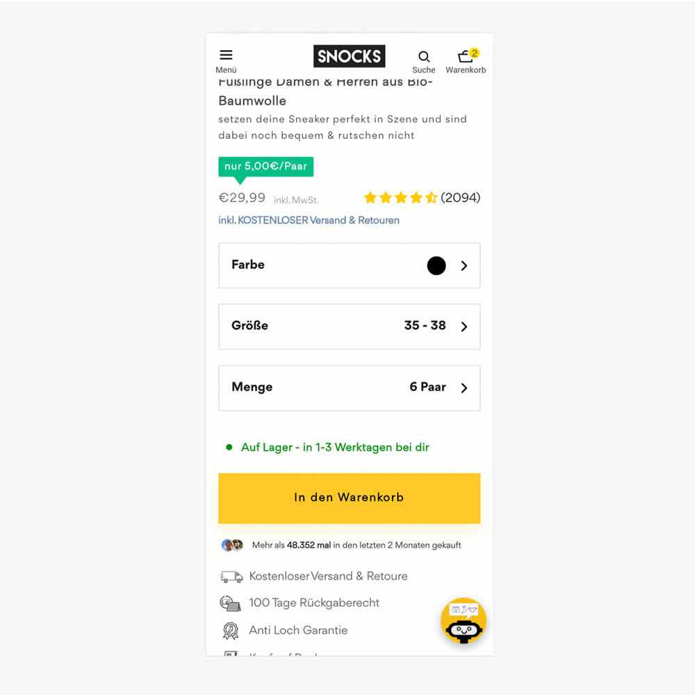
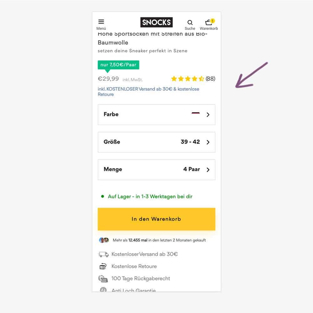
In this experiment, free shipping was a/b tested against free shipping with a 30€ purchase or higher. Hence, in the variation, customers needed to reach a cart amount total in order to be eligible for the free shipping.
Which A Or B Actually Wins? Find Out Before You Test.
Members see every test result — the winners, the flat ones, and the losers — along with exact effects and sample sizes. Use it to estimate your tests and prioritize by probability, not gut feel. Start every experiment with the odds on your side.
Test #555 on
Obs.no
by  Joachim Furuseth
Sep 30, 2024
Mobile
Product
X.X%
Sales
Joachim Tested Pattern #41: Sticky Call To Action On Obs.no
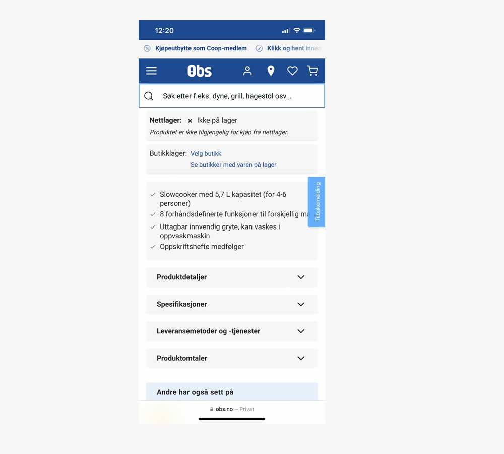
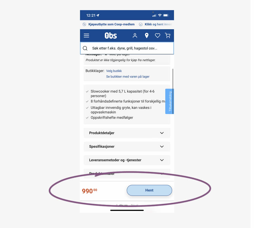
A sticky floating navigation bar was tested on product pages. The floating navigation contained: the product name, price and two add to cart buttons (add to cart; pickup in store). Impact on sales was measured. (Mobile only)
Test #554 on
Obs.no
by  Joachim Furuseth
Sep 30, 2024
Desktop
Product
X.X%
Sales
Joachim Tested Pattern #41: Sticky Call To Action On Obs.no
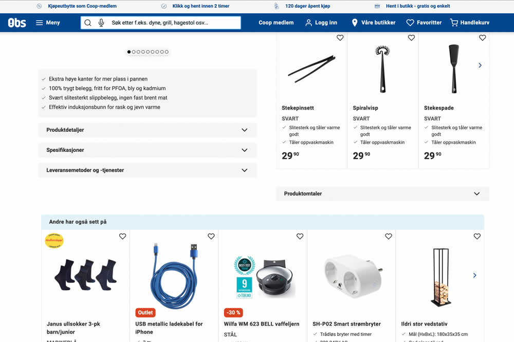
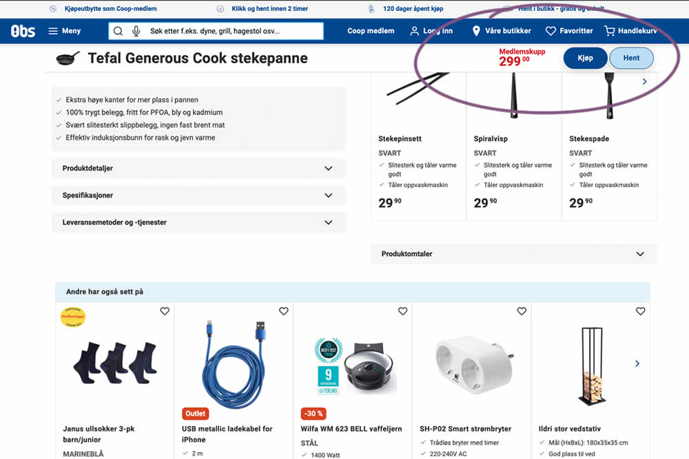
A sticky floating navigation bar was tested on product pages. The floating navigation contained: the product name, price and two add to cart buttons (add to cart; pickup in store). Impact on sales was measured. (Desktop Only)
Test #552 on
Tourradar.com
by  Clemens Grave
Sep 19, 2024
Product
X.X%
Progression
Clemens Tested Pattern #15: Bulleted Reassurances On Tourradar.com
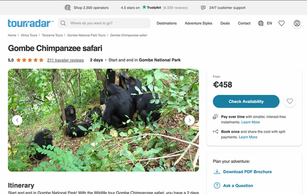

In this experiment, existing reassurance copy was changed. The control contained copy that focused on splitting payments and paying over time. The variation challenged this and showed a best price guarantee and the ability to earn credits.
Test #551 on
Tourradar.com
by  Clemens Grave
Sep 04, 2024
Desktop
Product
X.X%
Progression
Clemens Tested Pattern #139: Page Level Navigation On Tourradar.com
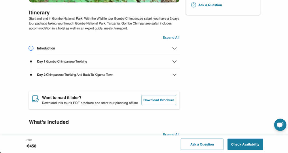
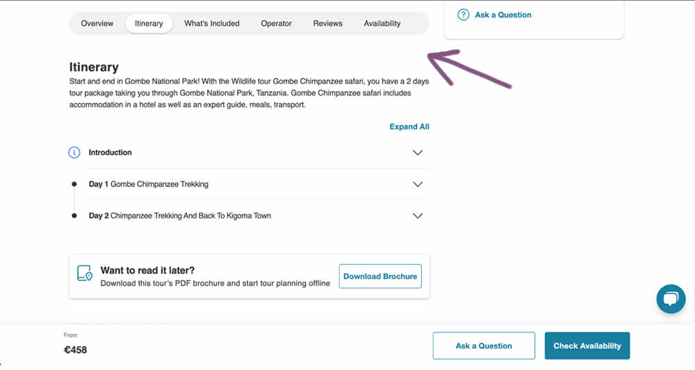
In this experiment, a floating page level navigation was added near the top of the product pages (under the main image). The navigation links included: Overview, Itinerary, What's Included, Operator, Reviews and Availability. Impact on next step progression was measured.
Test #548 on
Livefresh.de
by  Melina Hess
Aug 13, 2024
Desktop
Mobile
Product
X.X%
Sales
Melina Tested Pattern #17: Least Or Most Expensive First On Livefresh.de
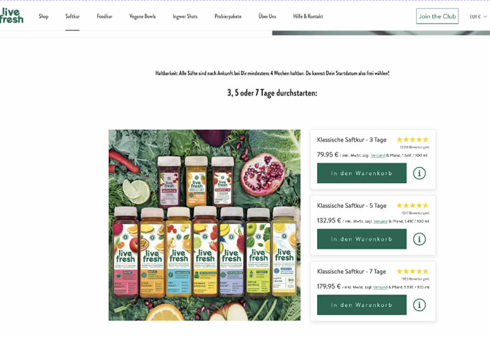
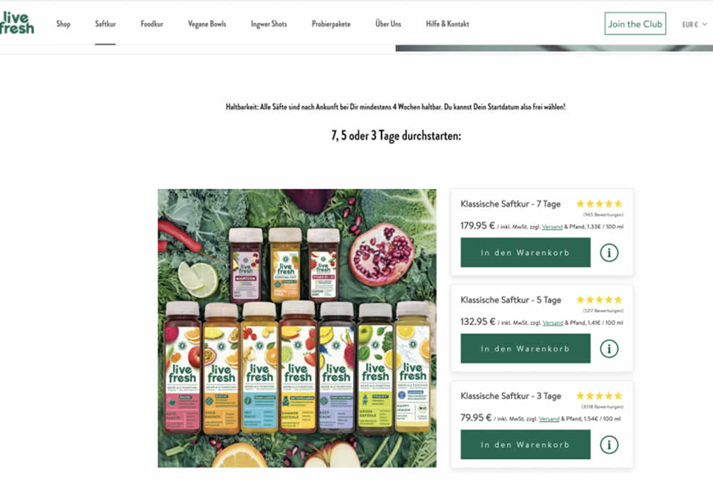
In this product landing page experiment, the plan sort order was rearranged. In the control it was sorted from least expensive to most expensive. In the variation, the plans were shown as most expensive first. Impact on sales and revenue was measured.
Test #545 on
Banter.com
by  Craig Kistler
Jul 29, 2024
Desktop
Product
X.X%
Revenue
Craig Tested Pattern #66: Complementary Upsell On Banter.com
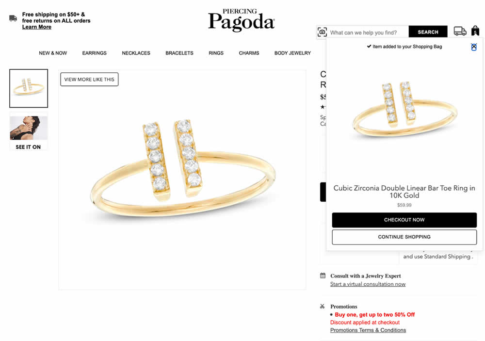
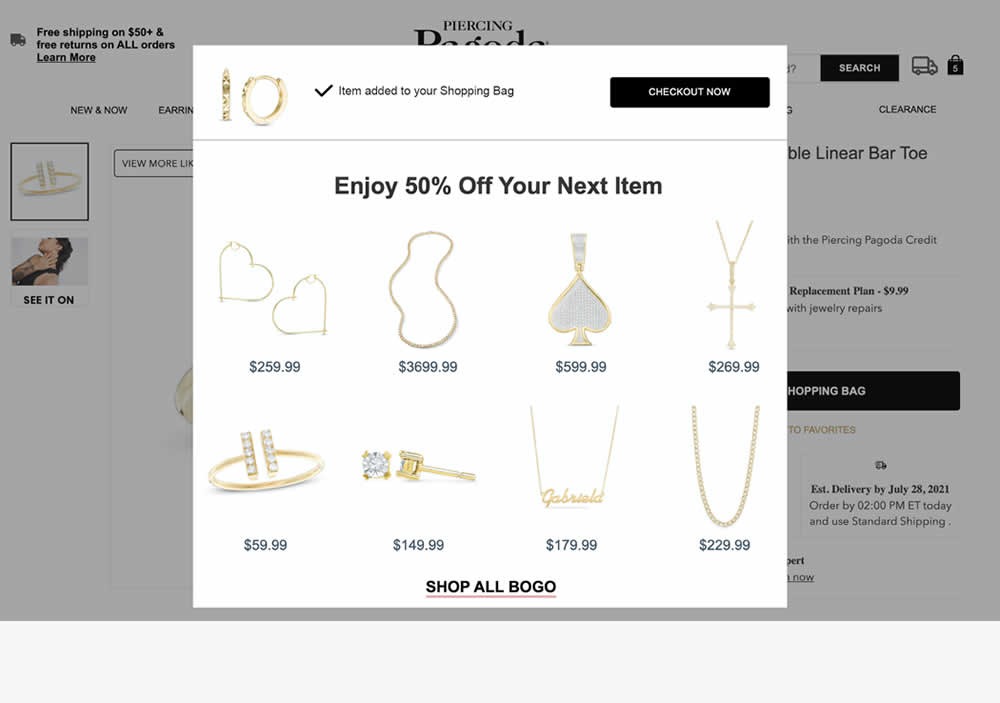
In this experiment, a modal based message was shown to encourage extra products being added as complementary upsells. In the control, the promotion text appeared at the bottom as red text ("Buy one, get up to two 50% Off"). Whereas in the variation, specific products were shown on the modal (post add-to-cart). Impact on adds-to-cart, sales and average revenue was measured.
Test #544 on
686.com
by  Adan Archila
Jul 25, 2024
Desktop
Product
X.X%
Sales
Adan Tested Pattern #104: Carousel Vs Static Grid Images On 686.com
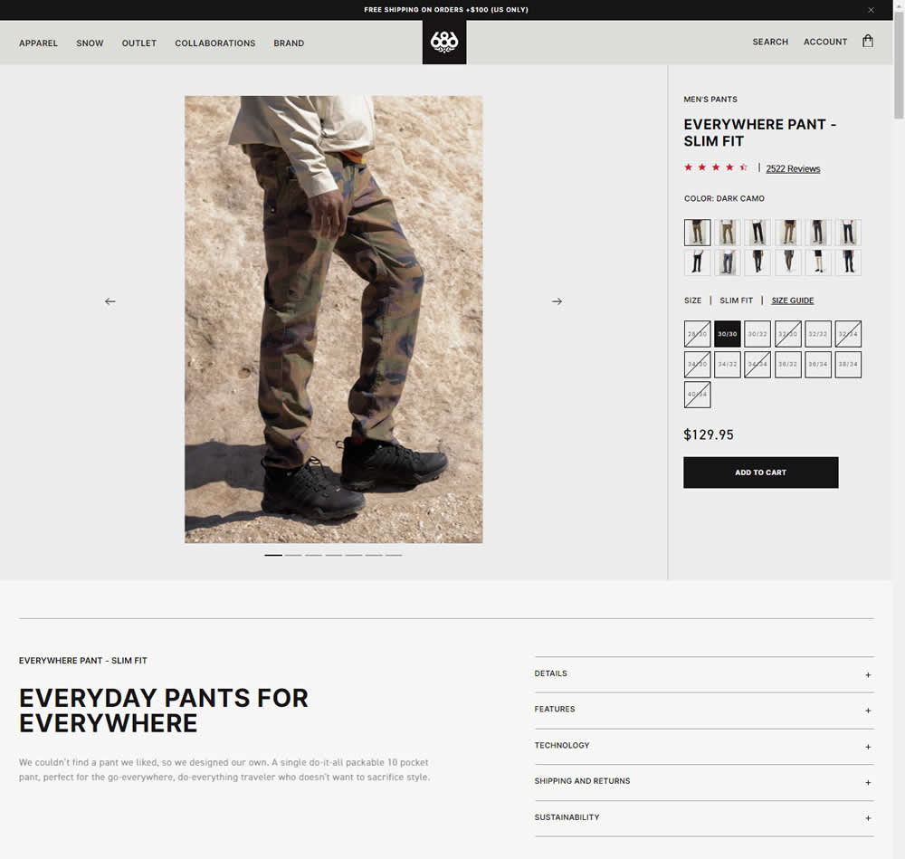
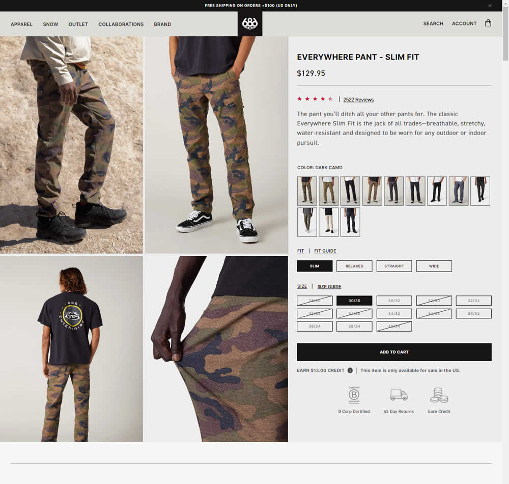
In this experiment, a single image carousel gallery was replaced with a grid gallery. In addition the variation also used: taller swatches; a wider size box, added fit (slim, relaxed, straight, wide) options; and used a wider Add to Cart CTA (full width of the column). Impact on sales was measured.
Test #543 on
by  Jakub Linowski
Jul 22, 2024
Desktop
Mobile
Product
X.X%
Sales
Jakub Tested Pattern #7: Social Counts
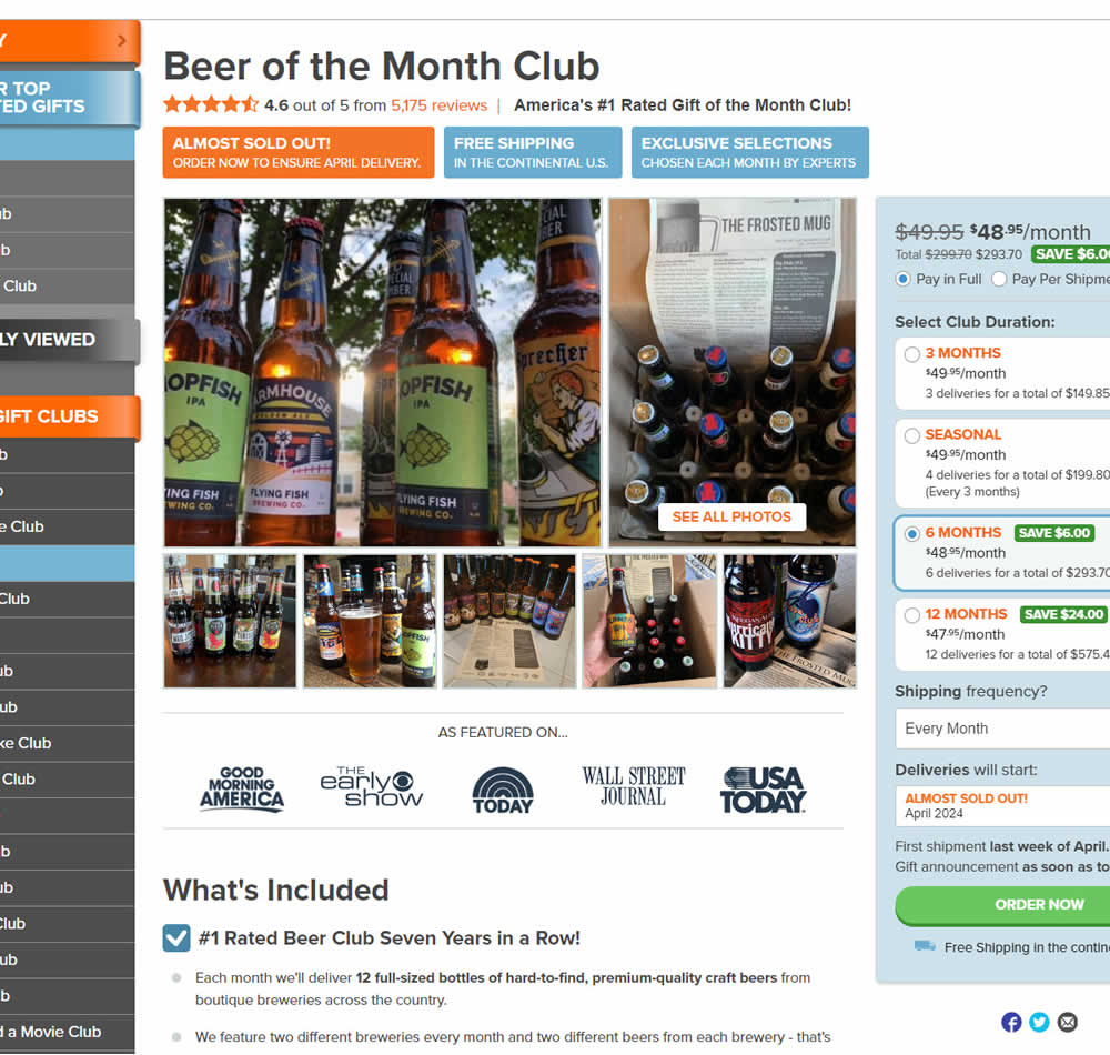
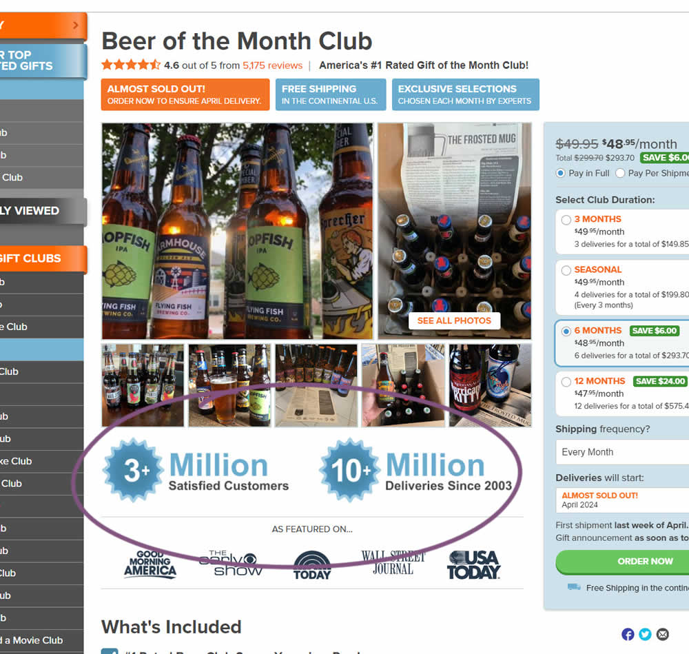
In this experiment, social proof copy was added just below product photos. The copy emphasied that "3 million satisfied customers" and "10 million deliveries since 2003". Impact on sales was measured.
Test #537 on
Online.metro-cc.ru
by  Andrey Andreev
Jun 19, 2024
Desktop
Mobile
Product
X.X%
Sales
Andrey Tested Pattern #135: Product Categories On Online.metro-cc.ru
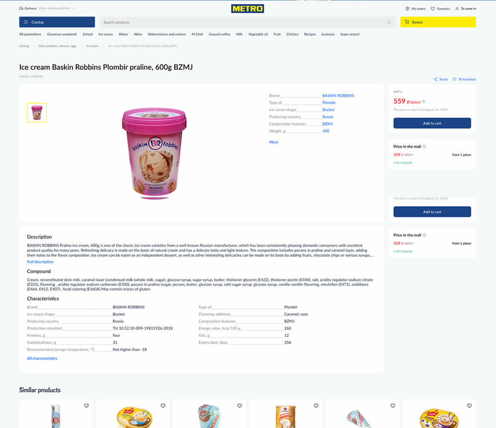
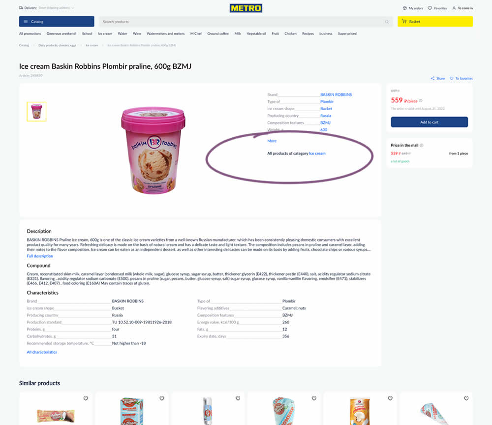
In this experiment, a simple product category link was added on product detail pages. These links linked to listing pages with more of a similar product type. Impact on sales was measured.
Test #527 on
by  Jakub Linowski
Apr 23, 2024
Desktop
Mobile
Product
X.X%
Sales
Jakub Tested Pattern #132: One Time Payment Copy
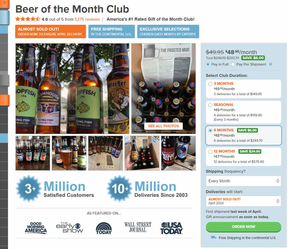
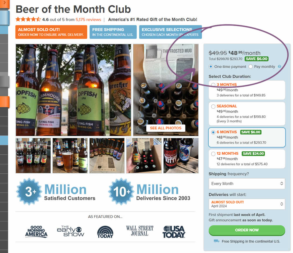
In this experiment, copy related to payment duration types (paid in full or ongoing) was changed. In the the control, one of the option used the "Pay in Full" copy, whereas the variation changed this to "One-time payment". Impact on sales was measured.
Test #525 on
by  Jakub Linowski
Mar 27, 2024
Desktop
Mobile
Product
X.X%
Sales
Jakub Tested Pattern #119: Unselected Or Selected Defaults
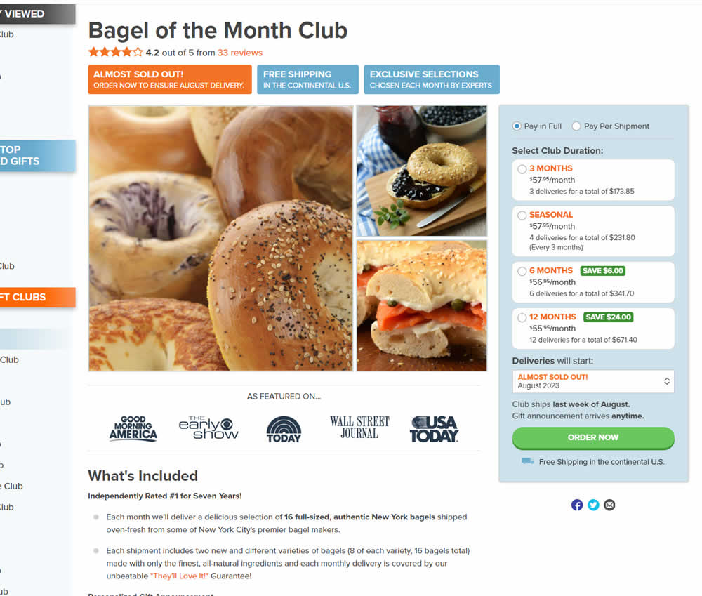
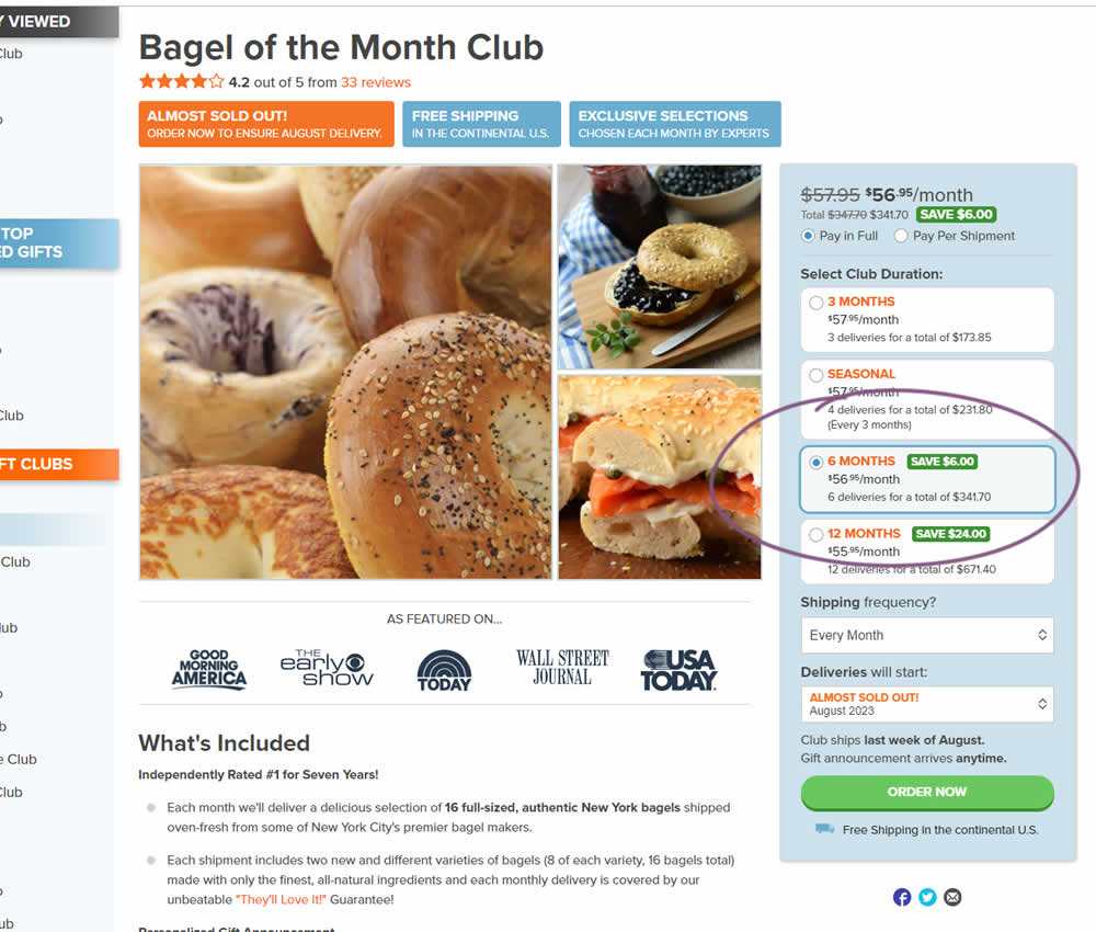
In this experiment, a club subscription duration was preselected to 6 in the variation. The control had no club durations preselected. As a result of preselecting a club duration, a more visible price also appeared at the top (sooner in the variation). Impact on sales was measured.
Test #523 on
Livefresh.de
by  Pascal Dietz
Mar 21, 2024
Mobile
Product
X.X%
Sales
Pascal Tested Pattern #131: Authority On Livefresh.de
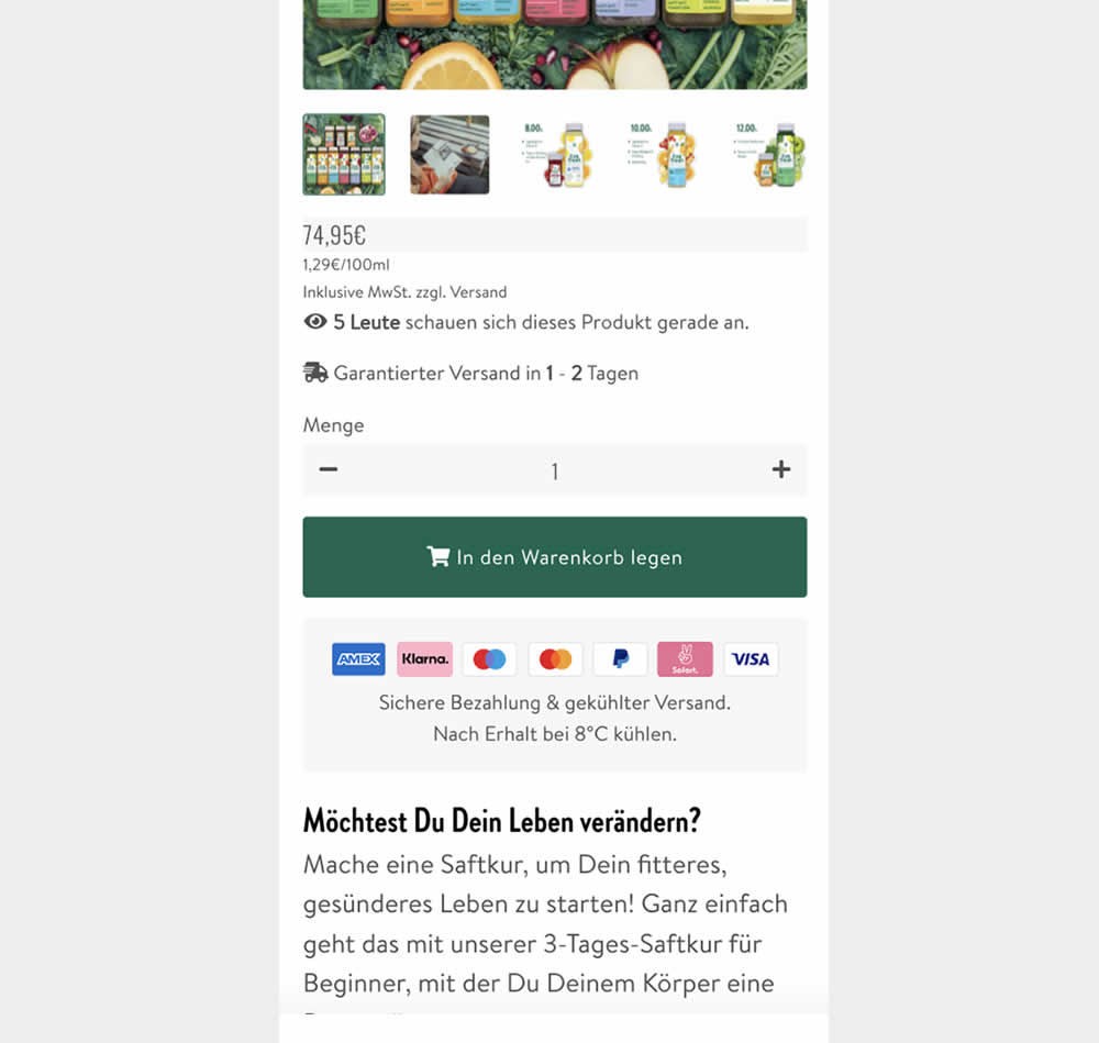
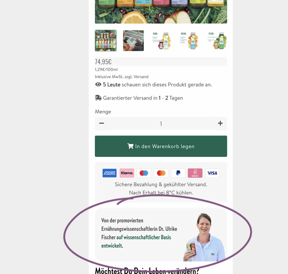
In this experiment, a photo of a doctor (who researched and created the a cleanising juice - the product) was appended after the add to cart button. The copy is translated as follows from "Von der promovierten Ernährungswissenschaftlerin Dr. Ulrike Fisher auf wissenschaftlicher Basis entwickelt." [German] -> "Developed by doctoral nutritionist Dr. Ulrike Fisher with a scientific basis." Impact on sales was measured.
Test #520 on
Asics.com
by  Andrey Prokhorov
Feb 29, 2024
Mobile
Product
X.X%
Revenue
Andrey Tested Pattern #51: Shortcut Buttons On Asics.com
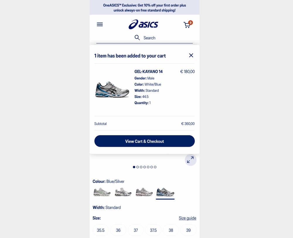
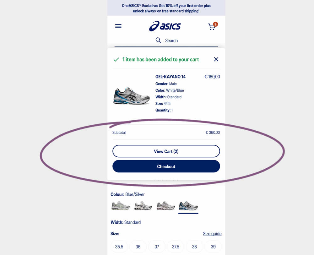
This experiment started when users would click add-to-cart on product detail pages. In both the control and variation, a modal would appear. In the control the modal contained a "View Cart and Checkout" button that lead users to the cart page. In the variation the modal showed separate "View Cart" and "Checkout" buttons. The a/b test variation also introduced a green confirmation message about the product being added to cart. Impact on transactions and revenue was measured.
Test #513 on
Dripl.de
by  Jona Eisenberger
Jan 23, 2024
Mobile
Desktop
Product
X.X%
Sales
Jona Tested Pattern #15: Bulleted Reassurances On Dripl.de
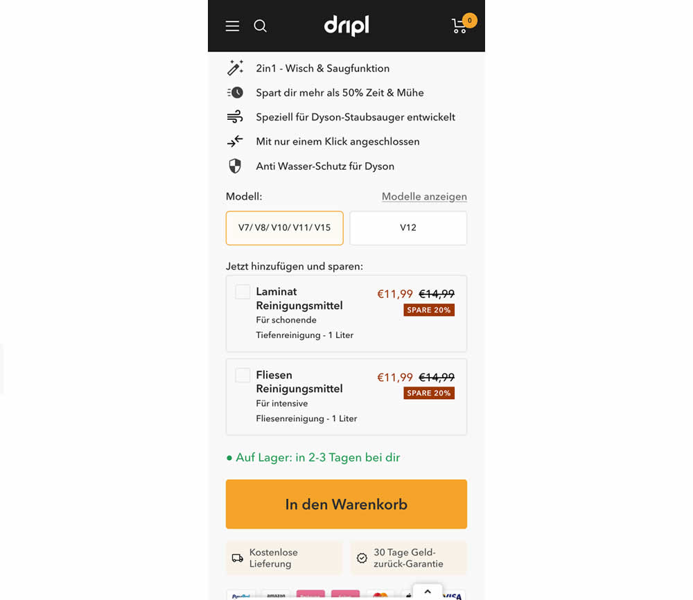
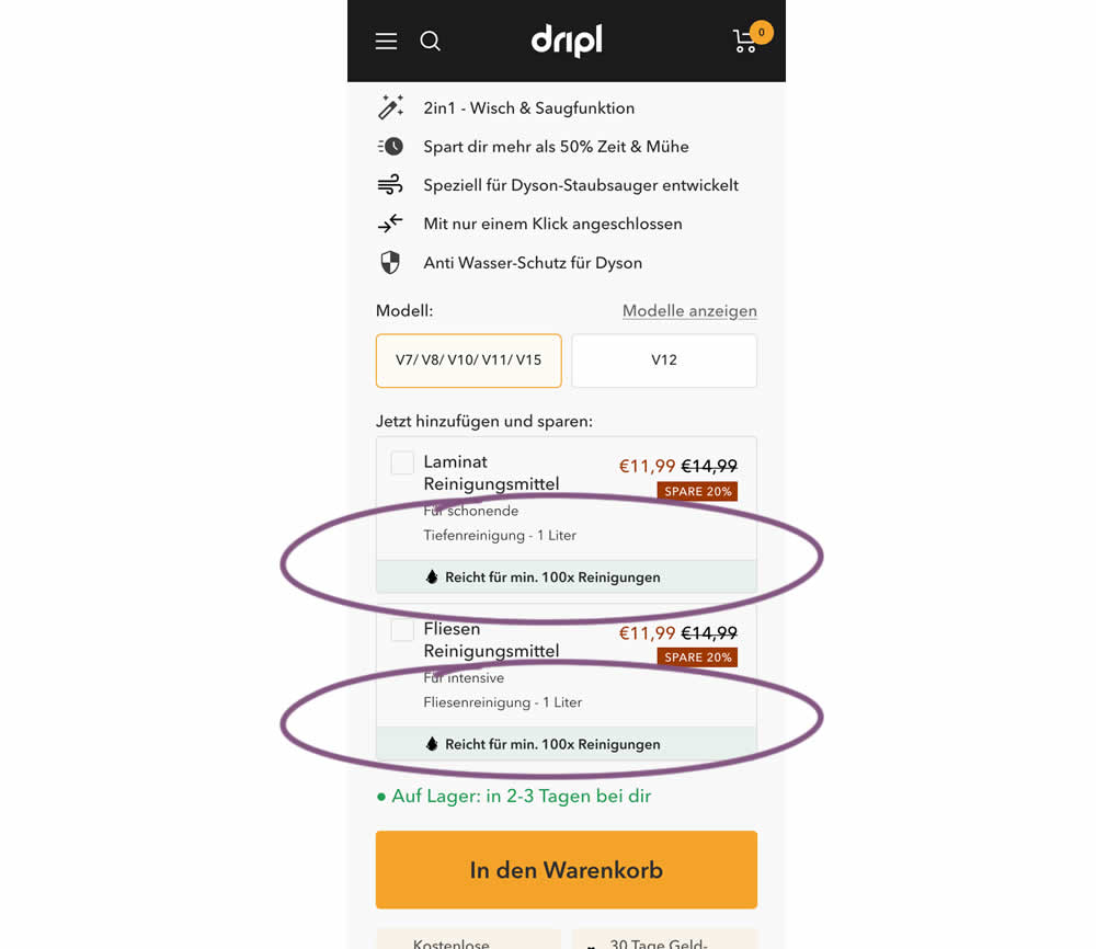
In this experiment of a floor cleaning product, a reassurance about product uses was appended to two cleaning agent upsells. In the control users saw the 2 standard upsells for laminate and tiles. And in the variation the copy "Right for me. 100x Cleanings" (uses) was appended.
Test #512 on
Snocks.com
by  Melina Hess
Jan 17, 2024
Mobile
Product
X.X%
Sales
Melina Tested Pattern #65: Add More For Extra Incentive On Snocks.com
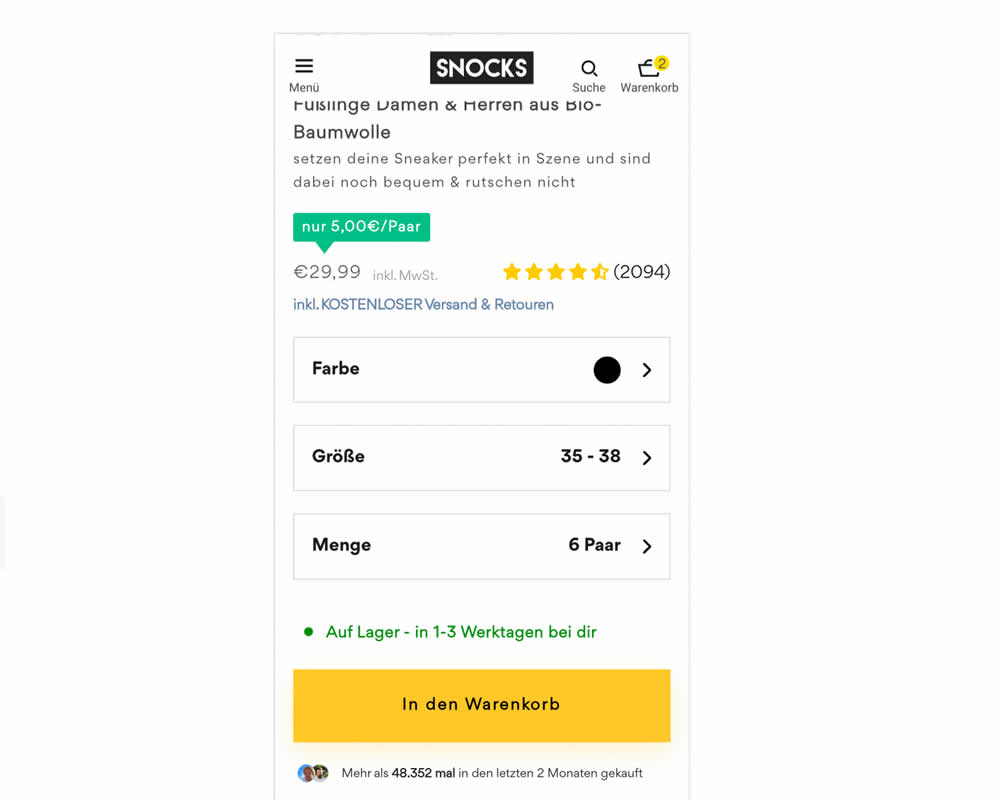
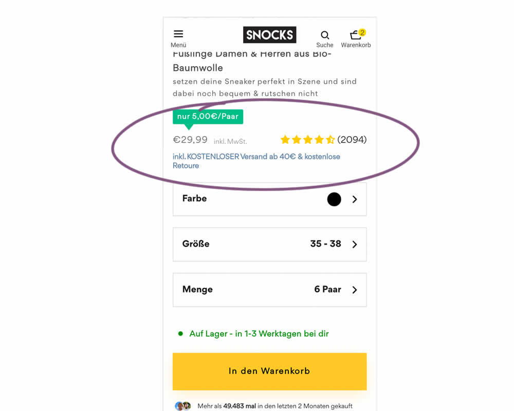
In this experiment, free shipping was a/b tested against free shipping with a 40€ purchase or higher. Hence, in the variation, customers needed to reach a cart amount total in order to be eligible for the free shipping.
Test #509 on
Jared.com
by  Craig Kistler
Dec 18, 2023
Desktop
Product
X.X%
Sales
Craig Tested Pattern #66: Complementary Upsell On Jared.com
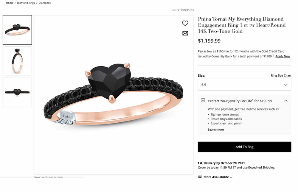
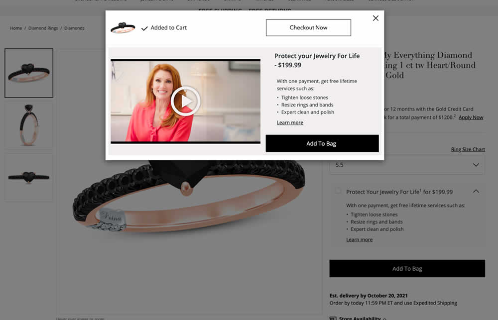
In this experiment, a protection plan was launched as a modal for customers that clicked add-to-cart without choosing the upsell. Impact on adds-to-cart and sales was measured.
Test #508 on
Online.metro-cc.ru
by  Andrey Andreev
Dec 15, 2023
Mobile
Product
X.X%
Sales
Andrey Tested Pattern #93: Auto Next On Online.metro-cc.ru
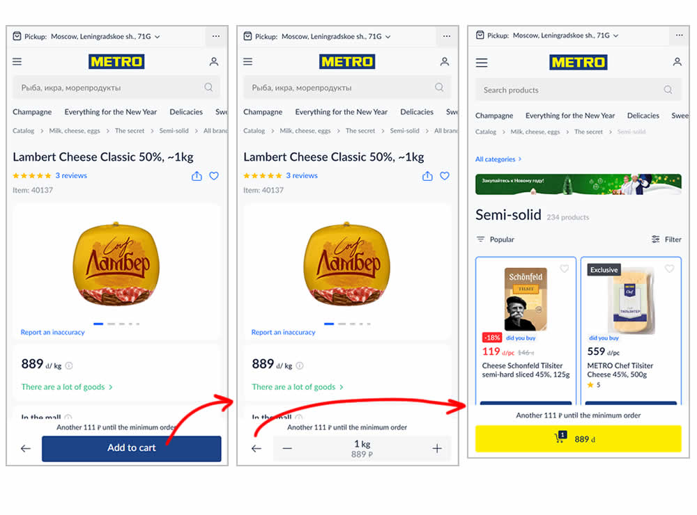
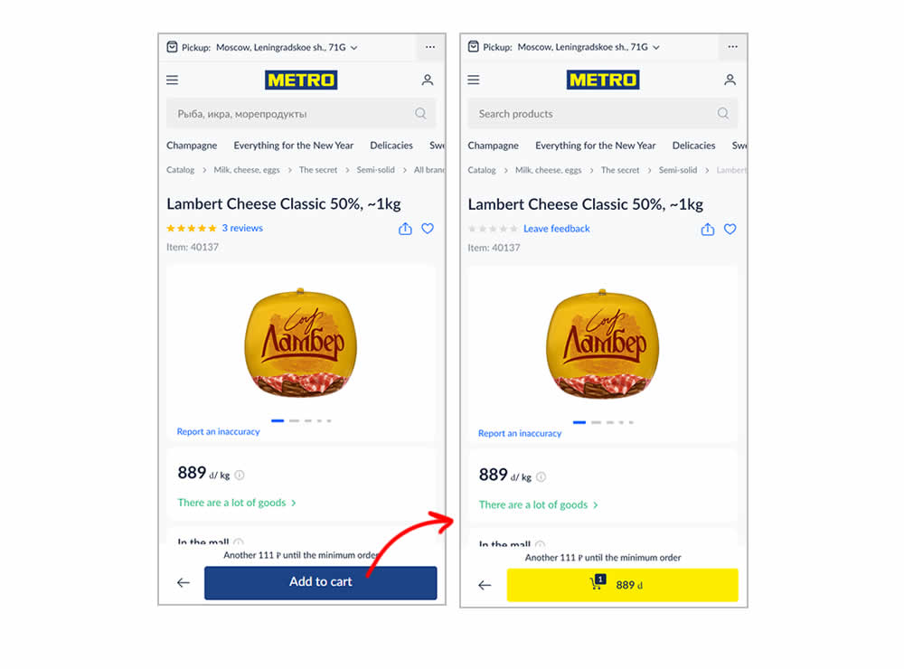
In this experiment, the variation transformed an add-to-cart button into a shopping cart one (making it a two step process). The control had an interaction where an add-to-cart button would become a quantity selection and then a shopping cart action (a three step process). In a way, the control kept users in a "dead-end" quantity selection middle state that required clicking the back button to continue the sale. Whereas the variation automatically moved users into the next step (closer towards being able to make a purchase). Impact on sales was measured.
Test #506 on
by  Jakub Linowski
Dec 07, 2023
Desktop
Mobile
Product
X.X%
Sales
Jakub Tested Pattern #4: Testimonials
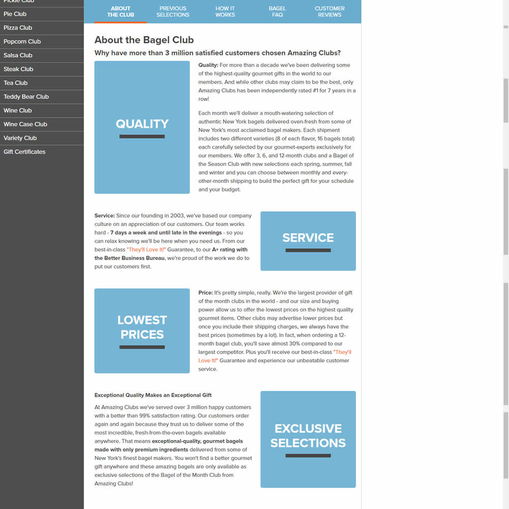
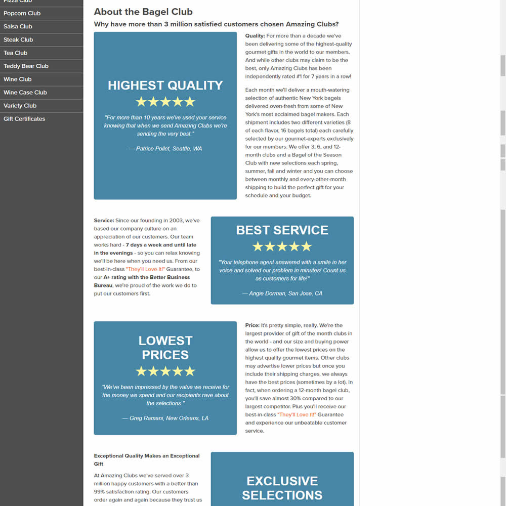
In this experiments, reinforcing section tiles were replaced with additional customer testimonials. Impact on adds to cart and sales was measured.
Test #500 on
Kayoutlet.com
by  Craig Kistler
Oct 25, 2023
Mobile
Product
X.X%
Sales
Craig Tested Pattern #7: Social Counts On Kayoutlet.com
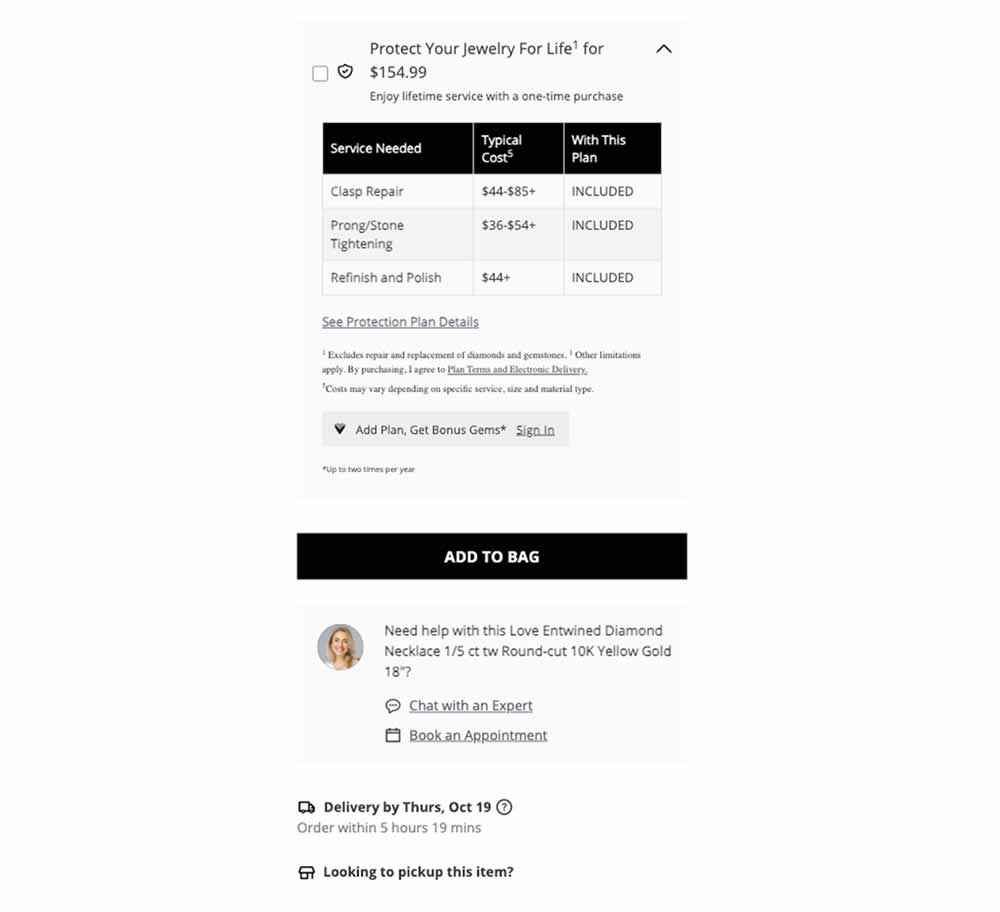
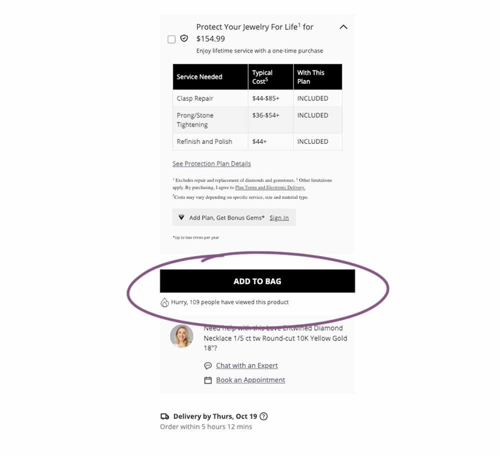
This was a replication attempt similar to experiment 497. A social proof message was added below add to cart buttons on product detail pages. Impact on adds to cart and transactions was measured.