All Latest 618 A/B Tests
MOST RECENT TESTS
Test #350 on
Expertinstitute.com
by  Ardit Veliu
Apr 29, 2021
Desktop
Content
X.X%
Leads
Ardit Tested Pattern #16: Welcome Mat - Partial On Expertinstitute.com


In this experiment, a lead generating section with a call to action (welcome mat) was appended at the top of article pages. Impact on lead generation was measured.
Which A Or B Actually Wins? Find Out Before You Test.
Members see every test result — the winners, the flat ones, and the losers — along with exact effects and sample sizes. Use it to estimate your tests and prioritize by probability, not gut feel. Start every experiment with the odds on your side.
Test #330 on
Backstage.com
by  Stanley Zuo
Dec 29, 2020
Desktop
Content
X.X%
Signups
Stanley Tested Pattern #116: Links Or Buttons On Backstage.com
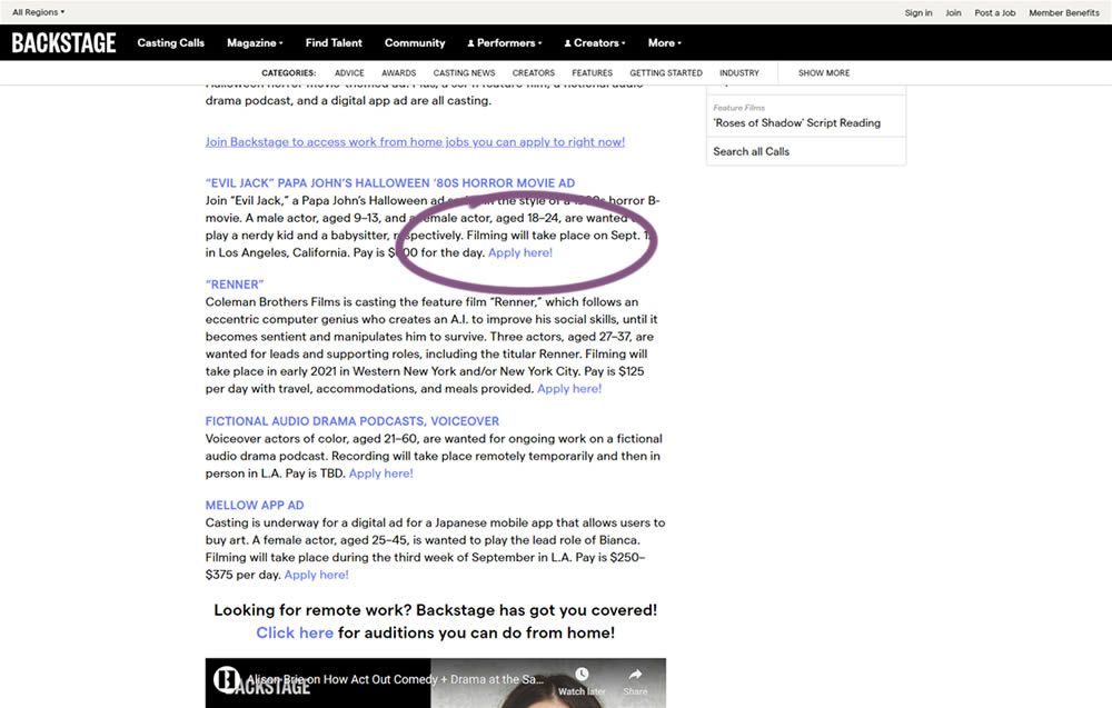
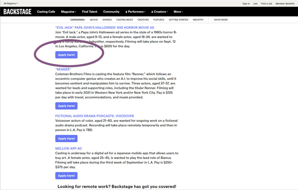
In this simple experiment on a content page, links were turned into more prominent buttons. The experiment measured clicks and signups.
Test #326 on
Thomasnet.com
by  Kyle Phillips
Nov 25, 2020
Desktop
Mobile
Content
X.X%
Progression
Kyle Tested Pattern #41: Sticky Call To Action On Thomasnet.com


In this simple experiment on an article page, the variation slid out a sticky call to action linking to the next article. The sliding interaction triggered after some scrolling threshold (around 1000px or so). Afterwards, the sticky call to action maintained its floating position. The experiment measured clicks on this "next article" button.
Test #318 on
Thomasnet.com
by  Kyle Phillips
Sep 29, 2020
Desktop
Mobile
Content
X.X%
Signups
Kyle Tested Pattern #60: Repeated Bottom Call To Action On Thomasnet.com
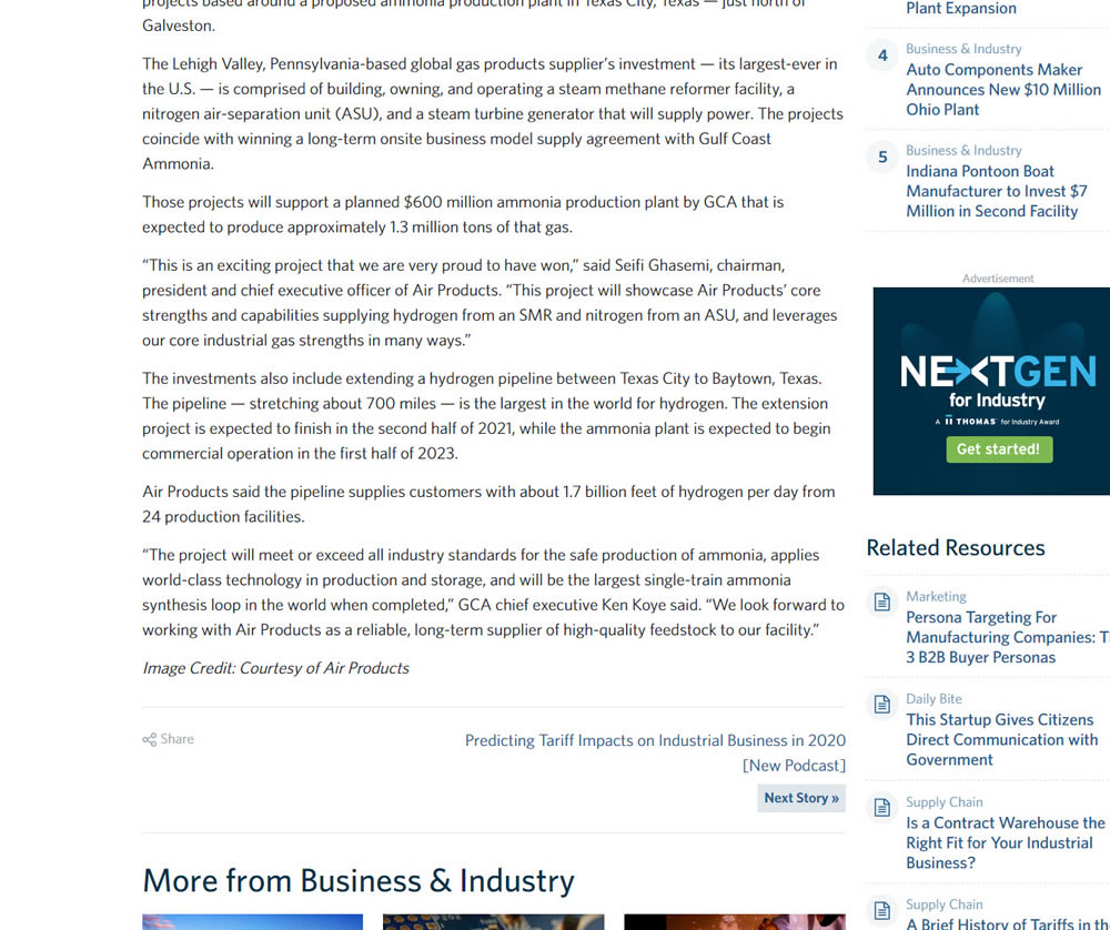
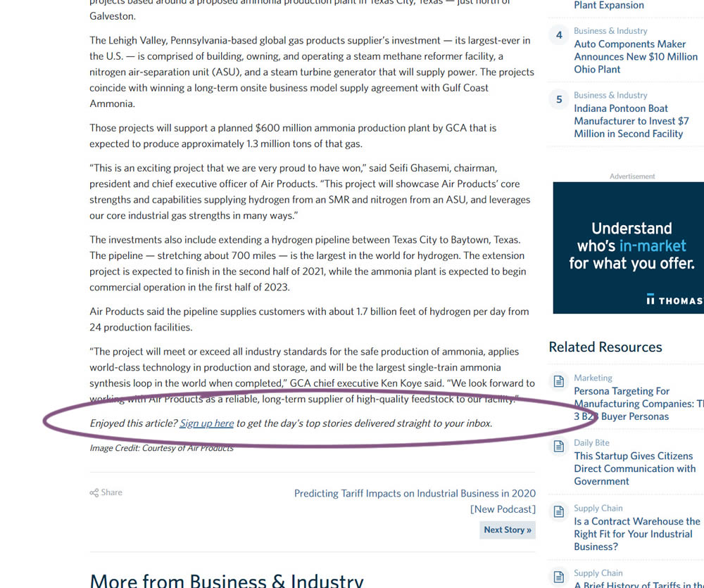
In this experiment, a simple link to a newsletter signup landing page was added at the bottom of an article. The newsletter landing page then encouraged users to provide their email address for future article updates.
Test #296 on
Backstage.com
by  Stanley Zuo
Apr 30, 2020
Mobile
Content
X.X%
Sales
Stanley Tested Pattern #23: Inline Link Nudge On Backstage.com
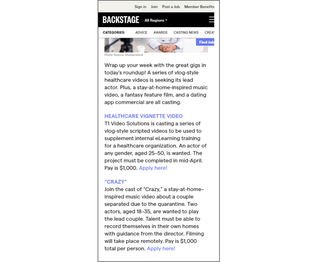
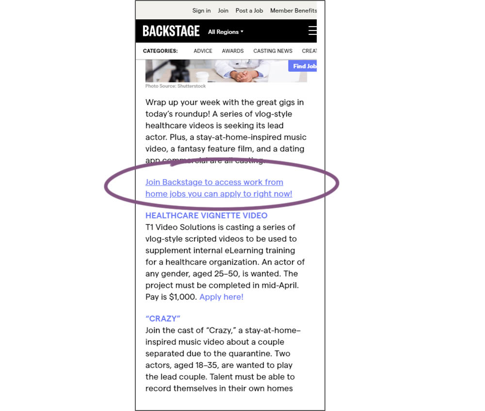
In this simple experiment, a text link to a join page was injected on an article page. The hypothesis was that more users would signup as a result of this subtle trigger.
Test #295 on
Thomasnet.com
by  Julian Gaviria
Apr 29, 2020
Desktop
Mobile
Content
X.X%
Engagement
Julian Tested Pattern #25: Nagging Results On Thomasnet.com
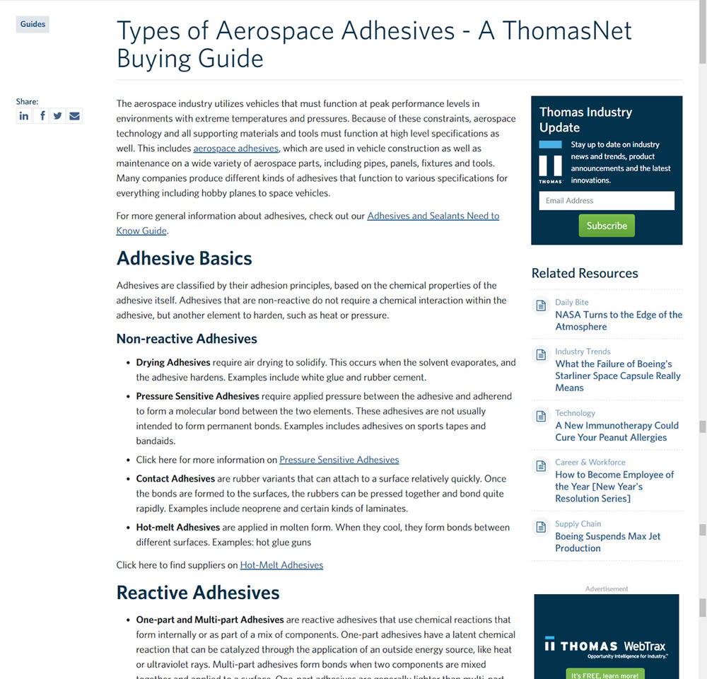
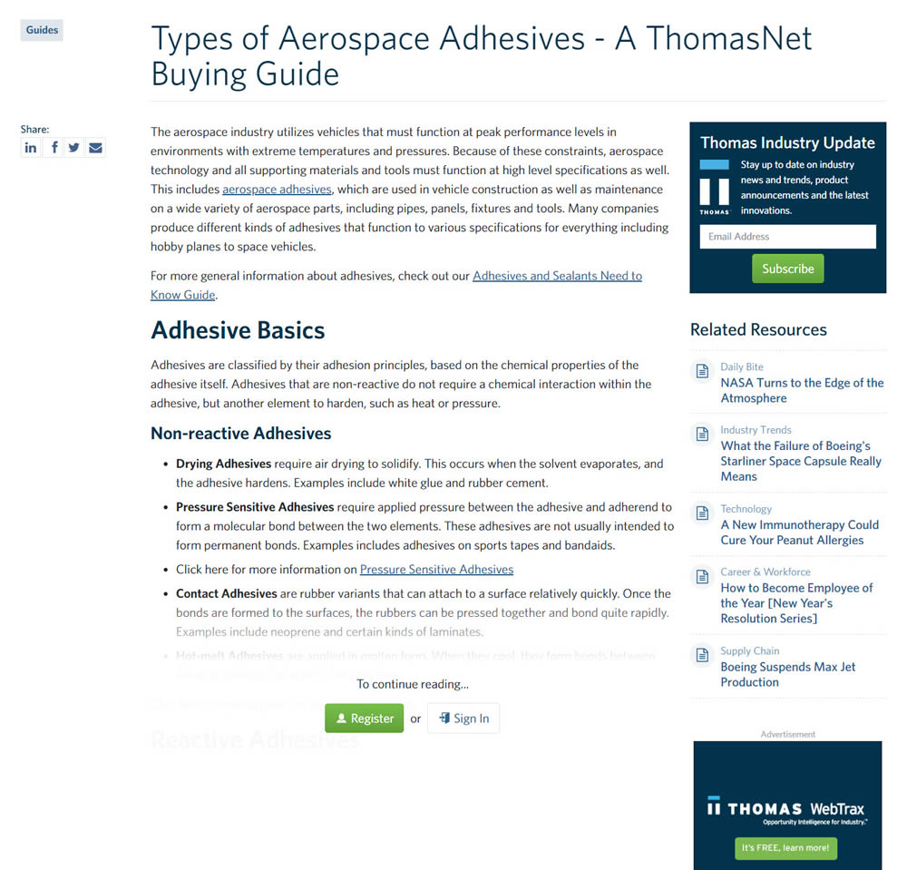
In this experiment, blog article pages were hidden behind a registration wall - requing a signup to access. The registration wall would appear after the first paragraph using gradual opacity to cover the rest of the article. We have published the effects of this change on registrations (signups) and on engagement (users viewing other more important company detail pages).
Test #252 on
Thomasnet.com
by  Julian Gaviria
Jul 30, 2019
Desktop
Mobile
Content
X.X%
Engagement
Julian Tested Pattern #107: Contrast Links & Buttons On Thomasnet.com
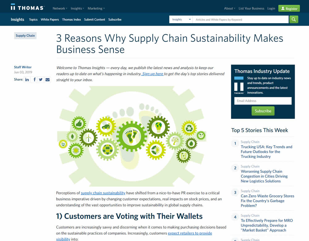
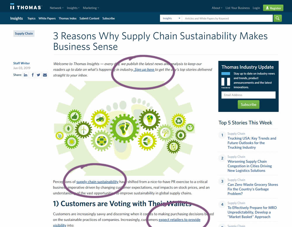
In this experiment a light blue bold link was tested against a darker blue bold link.
Test #251 on
Goodui.org
by  Jakub Linowski
Jul 25, 2019
Desktop
Mobile
Content
X.X%
Signups
Jakub Tested Pattern #57: Maybe Later On Goodui.org


In this experiment, we tested a standard modal (with 2 choices) against a "Maybe Later" one (with 3 choices). One of the choices in the variant allowed users to postpone their decision with a "maybe" which would enable a floating bar at the bottom of the screen. Clicking on any of the "Yes" options would send people to the bottom of the screen with an email signup form. Increasing signup was our primary measure. Both modals also appeared instantly after a page load.
Test #247 on
Thomasnet.com
by  Julian Gaviria
Jun 13, 2019
Desktop
Mobile
Content
X.X%
Signups
Julian Tested Pattern #41: Sticky Call To Action On Thomasnet.com
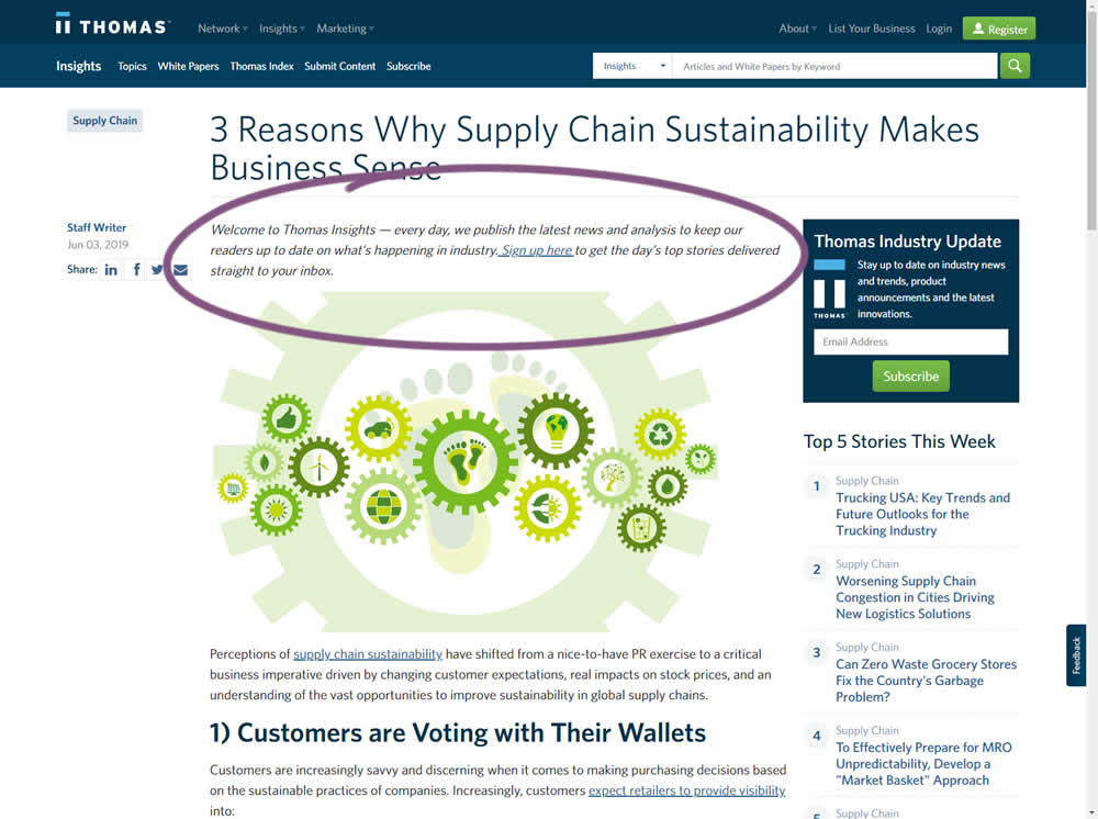
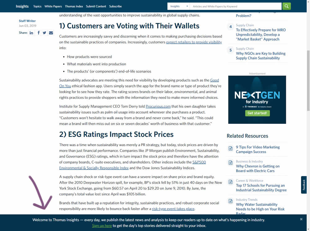
In this experiment, the same message (with a link) for signing up to a newsletter was shown in two distinct ways. The control (A) showed the signup message as inline one that preceded the content of the article at the very top. The variant showed the same signup message as a scroll-delayed sticky interaction at the bottom of the screen. The background color of the B variant was also inverted to match the style of the footer.
Test #175 on
Thomasnet.com
by  Julian Gaviria
May 14, 2018
Desktop
Mobile
Content
X.X%
Leads
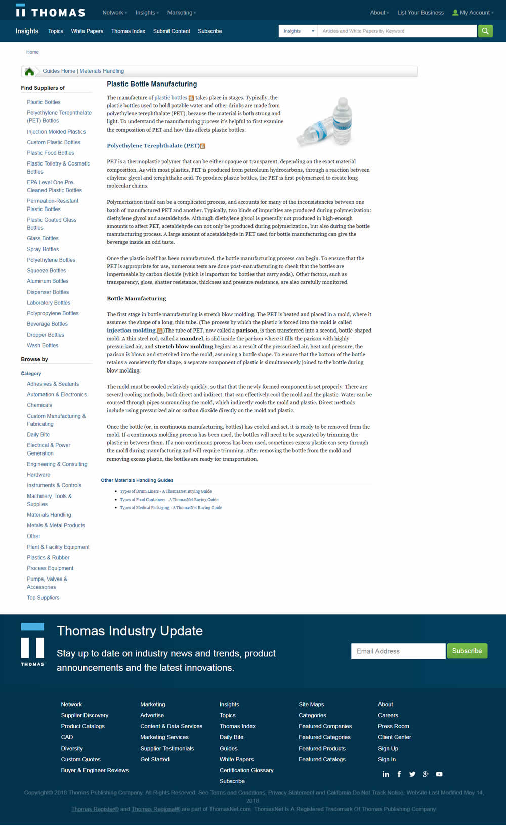
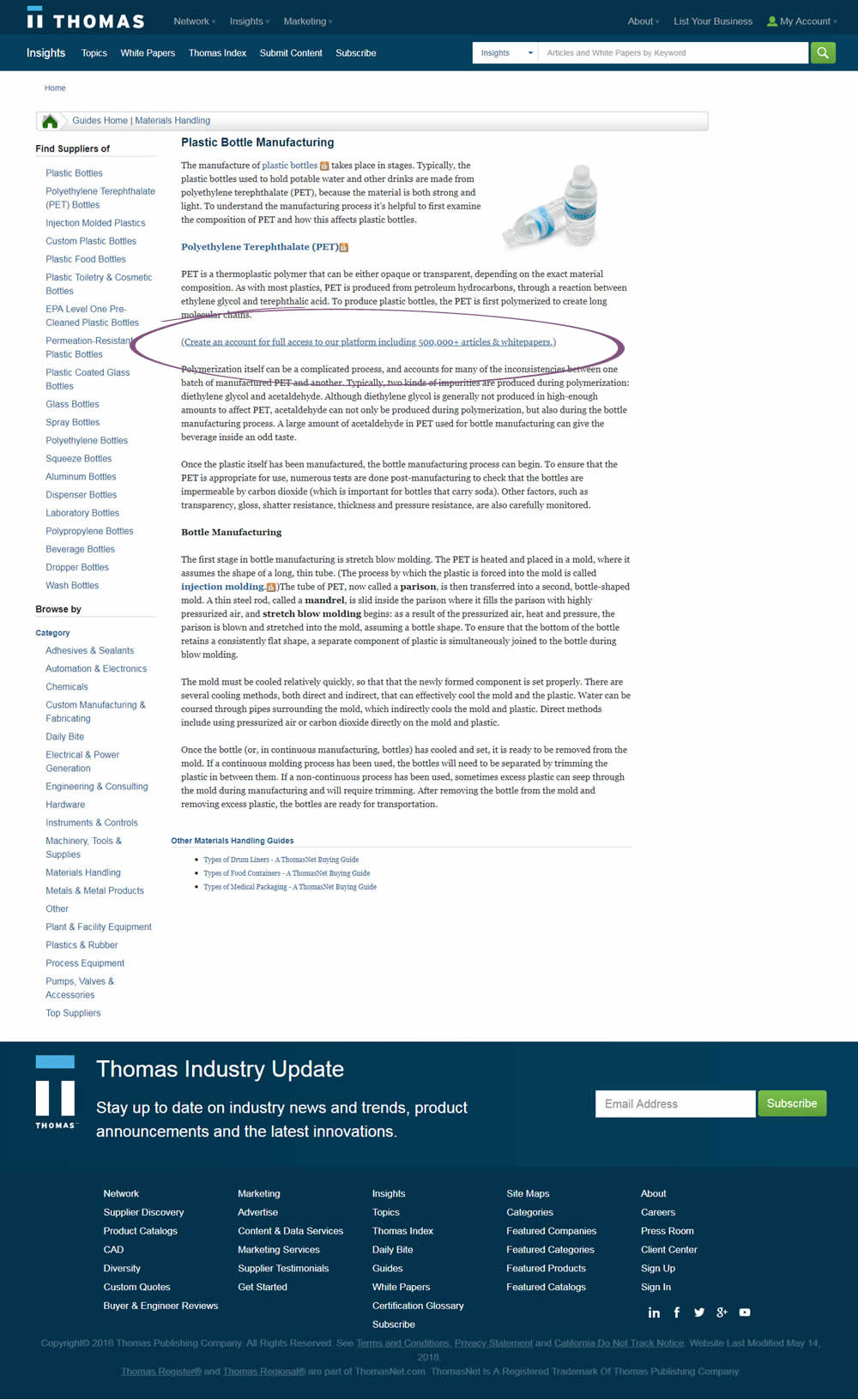
Julian Tested Pattern #23: Inline Link Nudge On Thomasnet.com
Test #101 on
Acousticalsurfaces.c...
by  Julian Gaviria
May 02, 2017
Desktop
Mobile
Content
X.X%
Leads
Julian Tested Pattern #23: Inline Link Nudge On Acousticalsurfaces.c...

