All Latest 620 A/B Tests
MOST RECENT TESTS
Test #641 on
Kay.com
by  Craig Kistler
Mar 26, 2026
Desktop
Mobile
Global
X.X%
Sales
Craig Tested Pattern #130: Less Or More Visible Offer Pages On Kay.com
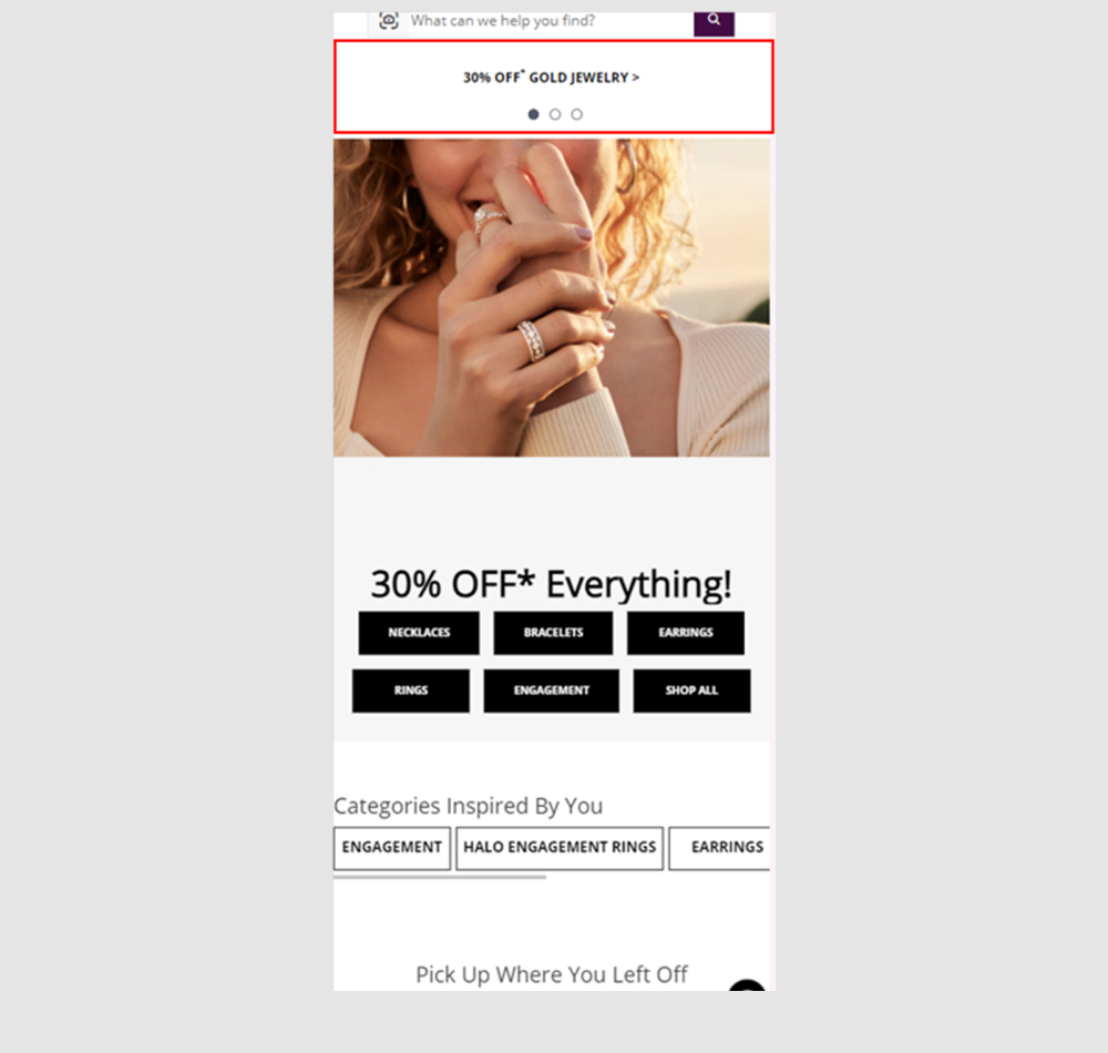
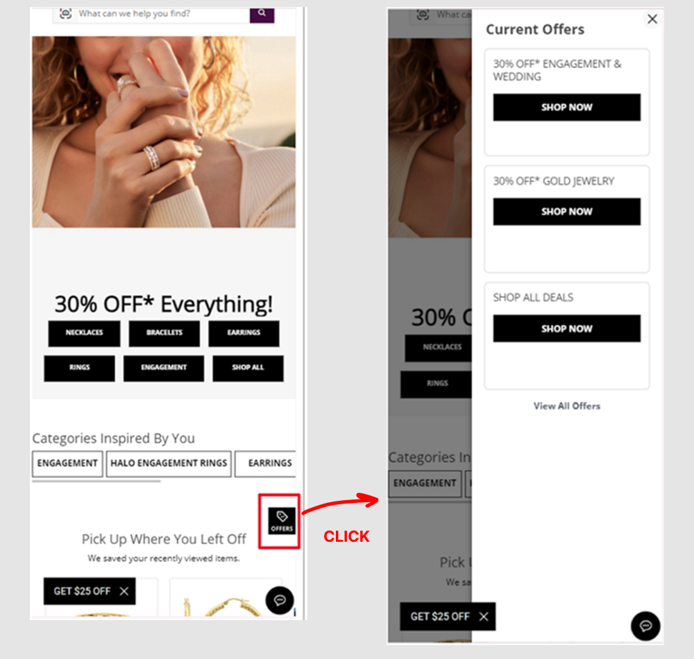
A global flyout drawer was added that consolidated sale promotions into one centralized location, replacing the customary placement of promotions throughout the site.
Which A Or B Actually Wins? Find Out Before You Test.
Members see every test result — the winners, the flat ones, and the losers — along with exact effects and sample sizes. Use it to estimate your tests and prioritize by probability, not gut feel. Start every experiment with the odds on your side.
Test #601 on
Online.metro-cc.ru
by  Andrey Andreev
Jul 22, 2025
Desktop
Product
X.X%
Sales
Andrey Tested Pattern #45: Benefit Bar On Online.metro-cc.ru
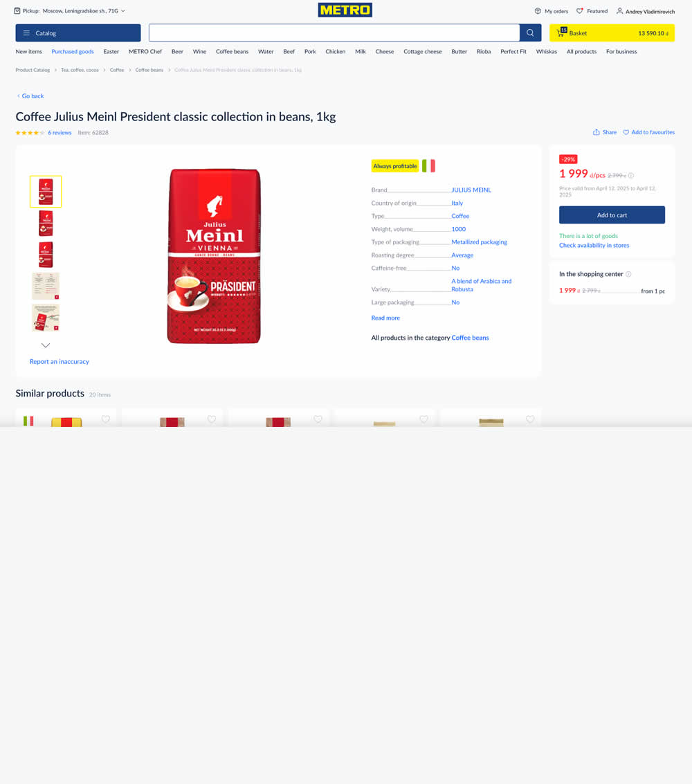
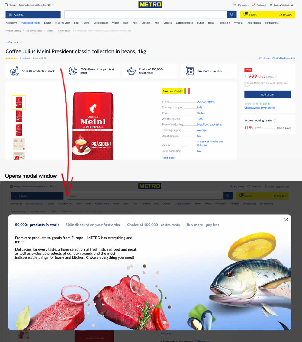
In this experiment, 4 selling points were added at the top of product details pages. Clicking on them would launch a modal with more details.
Test #589 on
by  Jakub Linowski
Apr 30, 2025
Desktop
Product
X.X%
Sales
Jakub Tested Pattern #68: Welcome Discount
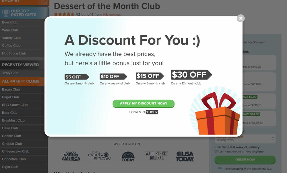
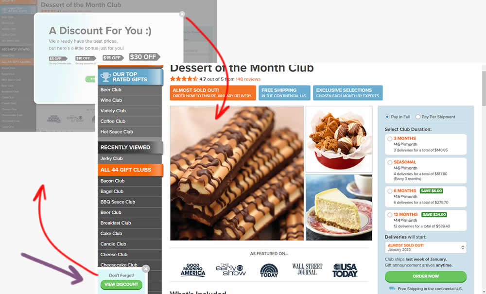
This experiment added one extra layer of persistence to an appearing welcome discount offer. In the variation, a welcome discount appeared on product pages after some inactivity behavior combined with a delay. In the variation, the only thing that was modified was the "collapse" behavior - basically creating a small floating micro modal in the bottom right. The micro modal allowed users to return to the larger modal or collaping it for good (with a second X collapse button). Impact on sales was measured.
Test #509 on
Jared.com
by  Craig Kistler
Dec 18, 2023
Desktop
Product
X.X%
Sales
Craig Tested Pattern #66: Complementary Upsell On Jared.com
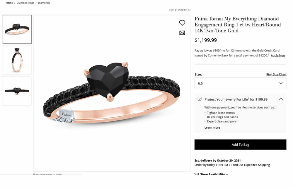
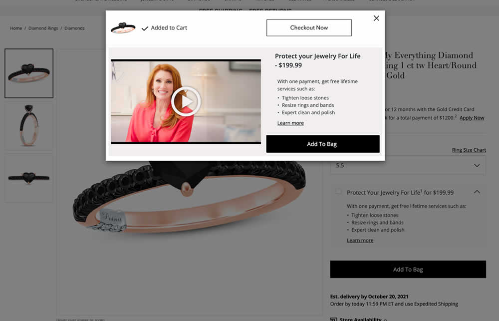
In this experiment, a protection plan was launched as a modal for customers that clicked add-to-cart without choosing the upsell. Impact on adds-to-cart and sales was measured.
Test #434 on
Learnwithhomer.com
by  Stanley Zuo
Sep 30, 2022
Mobile
Signup
X.X%
Signups
Stanley Tested Pattern #66: Complementary Upsell On Learnwithhomer.com
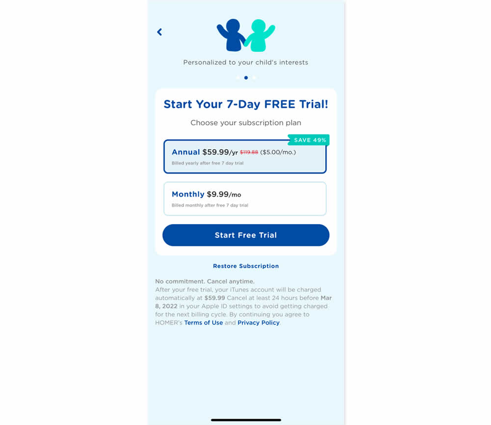
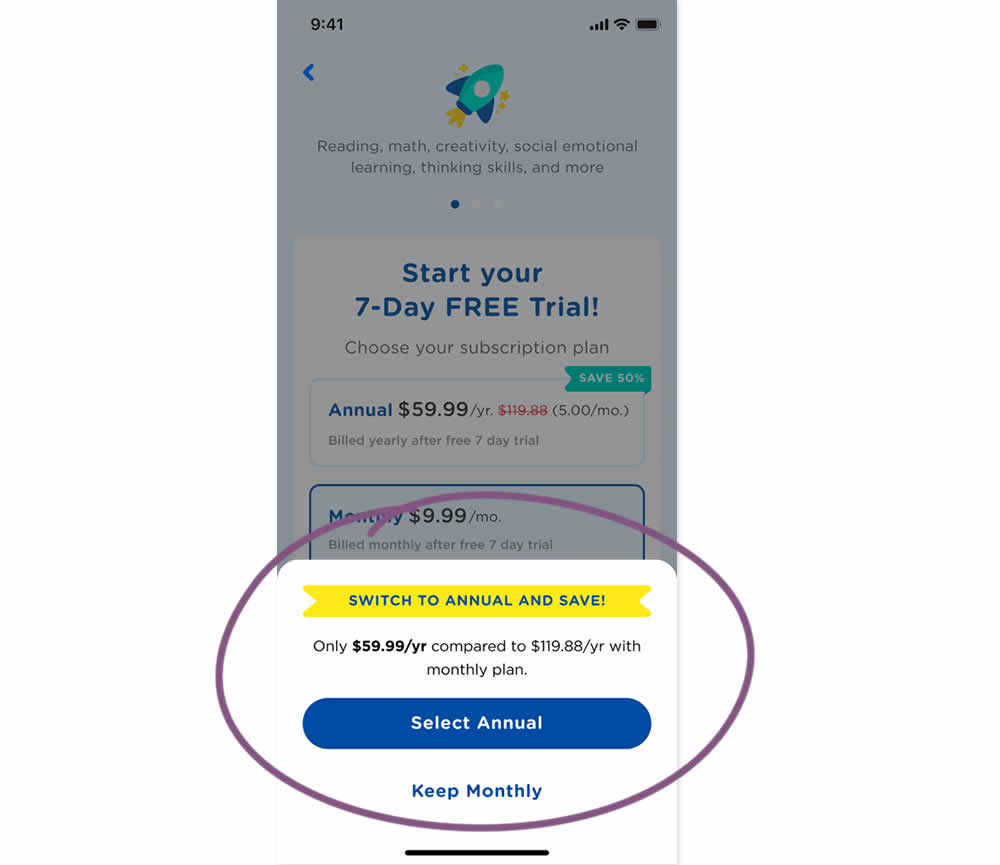
In this experiment, an upsell modal appeared during a signup funnel. In the variation, if users did not select a monthly plan, they were nudged to an annual one. Impact on overall and annual signups was measured.
Test #419 on
by  Jakub Linowski
Jun 29, 2022
Desktop
Home & Landing
X.X%
Sales
Jakub Tested Pattern #68: Welcome Discount
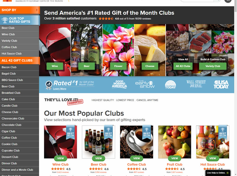
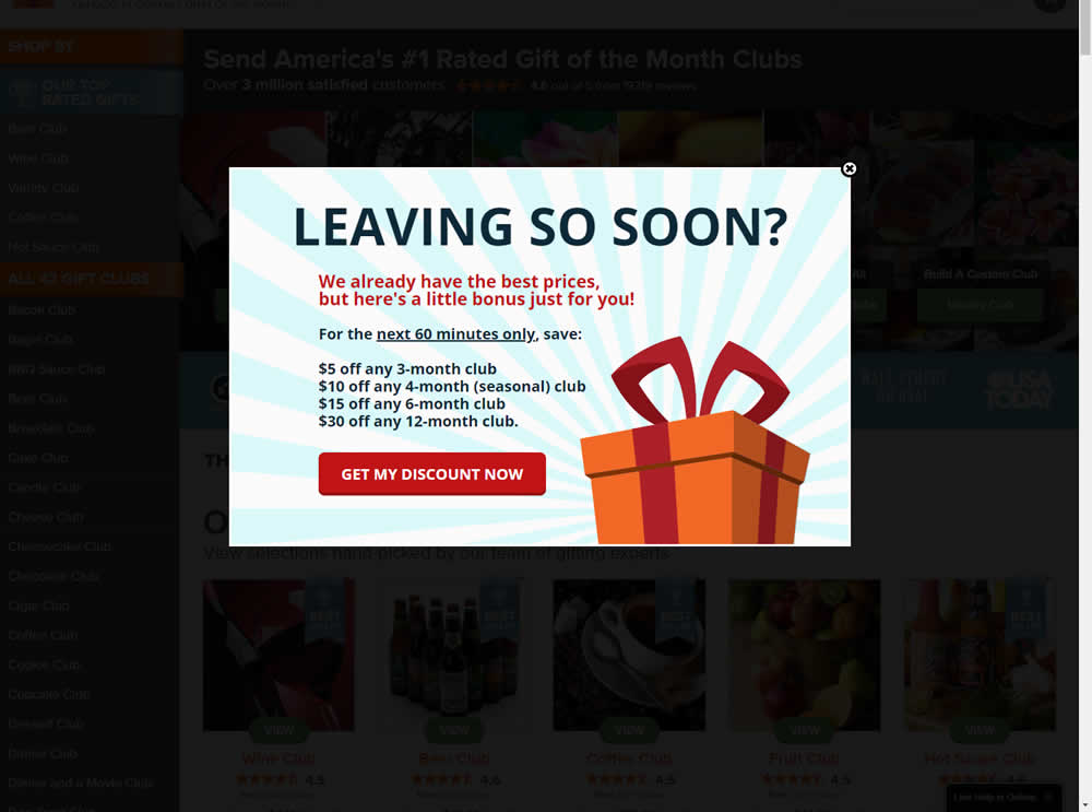
In this experiment, the presence of a discount modal (bigger discount for larger purchases) was tested on home and product pages. The trigger happend after a scroll down, a few second pause, and a mouse scroll up interaction. Impact on sales was measured.
Test #391 on
Backstage.com
by  Stanley Zuo
Dec 30, 2021
Desktop
Mobile
Listing
X.X%
Signups
Stanley Tested Pattern #82: Onboarding Callouts On Backstage.com
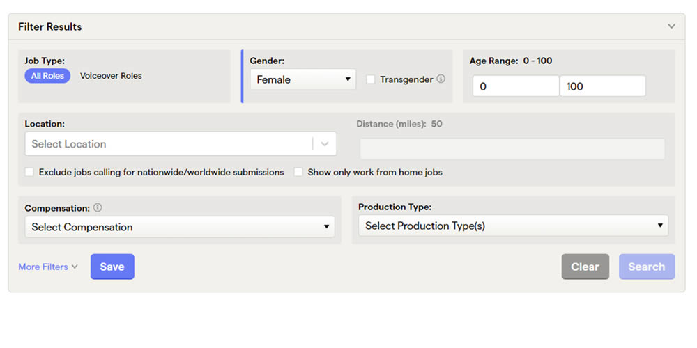
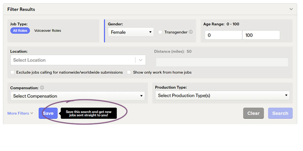
This experiment added a small nudge or callout to encourage more signups. Attention was directed towards the save function, which lead to the signup flow for anyone not signed it. Impact on signups was measured.
Test #322 on
Thomasnet.com
by  Kyle Phillips
Oct 27, 2020
Desktop
Mobile
Product
X.X%
Signups
Kyle Tested Pattern #82: Onboarding Callouts On Thomasnet.com
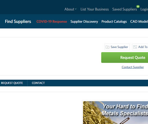
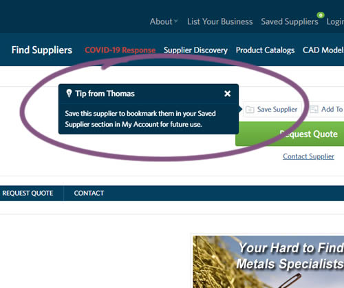
This experiment variation prompted users to save (bookmark) a company profile on a company detail page. Clicking on the save feature while logged out, would prompt a registration modal. Hence the save feature acted as an extra reason to signup. The number of people engaging or interacting with the feature was measured, as well as registrations.
Test #301 on
Zapimoveis.com.br
by  Vinicius Barros Peixoto
May 31, 2020
Desktop
Mobile
Product
X.X%
Leads
Vinicius Tested Pattern #21: What It's Worth On Zapimoveis.com.br


In this experiment, the B variation property prices were framed using higher and crossed out price points from 12 months ago - achieving a relative discount. A tooltip was also shown which explained the higher price point on hover. The example in the screenshot translates to "2% less compared to 12 months ago". This high-power experiment measured the number of leads that were generated on property (product) screens.
Test #264 on
Kenhub.com
by  Niels Hapke
Oct 05, 2019
Desktop
Mobile
Global
X.X%
Sales
Niels Tested Pattern #41: Sticky Call To Action On Kenhub.com
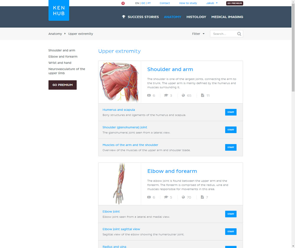
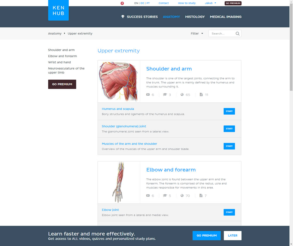
In this experiment users saw a sticky bar advertising the benefits of a Premium account across the bottom of the website, wherever they navigate. The sticky call to action appeared with a 4 second delay and was floating.
Test #105 on
Inktweb.nl
by  Martijn Oud
Sep 23, 2019
Desktop
Mobile
Signup
X.X%
Signups
Martijn Tested Pattern #111: Field Explanations On Inktweb.nl
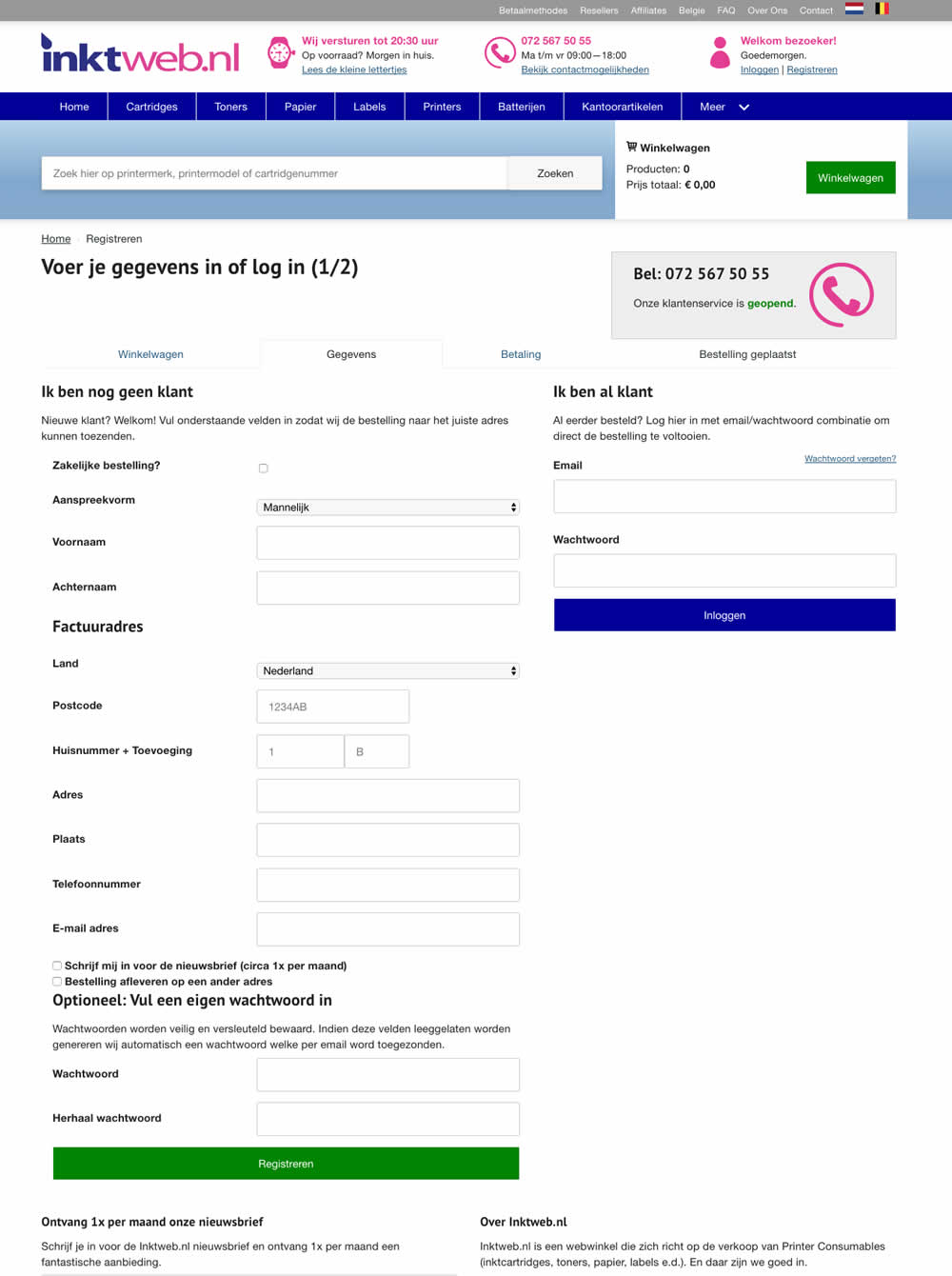
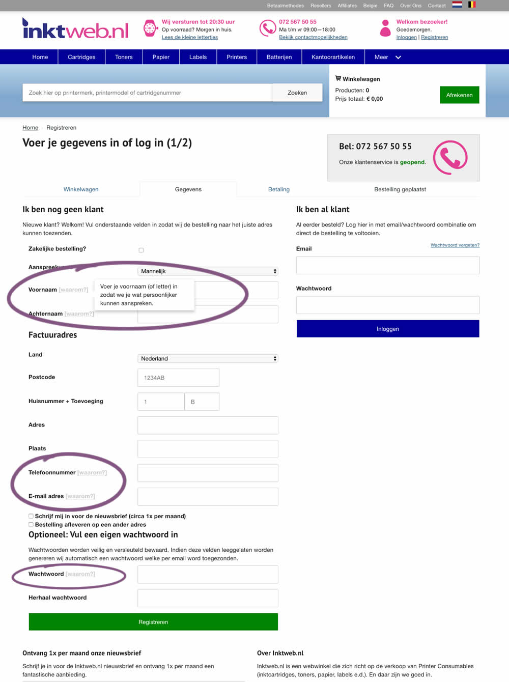
In this experiment, onhover tooltip explanations were added to selected fields (Firstname, Lastname, Phone, Email and Password). One translation example of the Firstname tooltip was the following "Enter your first name (or letter) so that we can address you in a more personal way".
Test #247 on
Thomasnet.com
by  Julian Gaviria
Jun 13, 2019
Desktop
Mobile
Content
X.X%
Signups
Julian Tested Pattern #41: Sticky Call To Action On Thomasnet.com
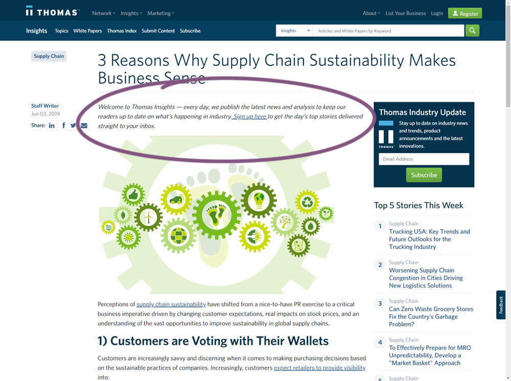
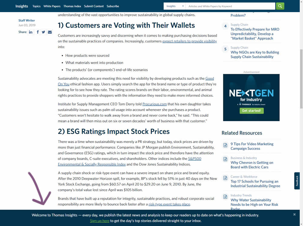
In this experiment, the same message (with a link) for signing up to a newsletter was shown in two distinct ways. The control (A) showed the signup message as inline one that preceded the content of the article at the very top. The variant showed the same signup message as a scroll-delayed sticky interaction at the bottom of the screen. The background color of the B variant was also inverted to match the style of the footer.
Test #162 on
Bullymax.com
by  Viljo Vabrit
Mar 20, 2018
Desktop
Home & Landing
X.X%
Sales
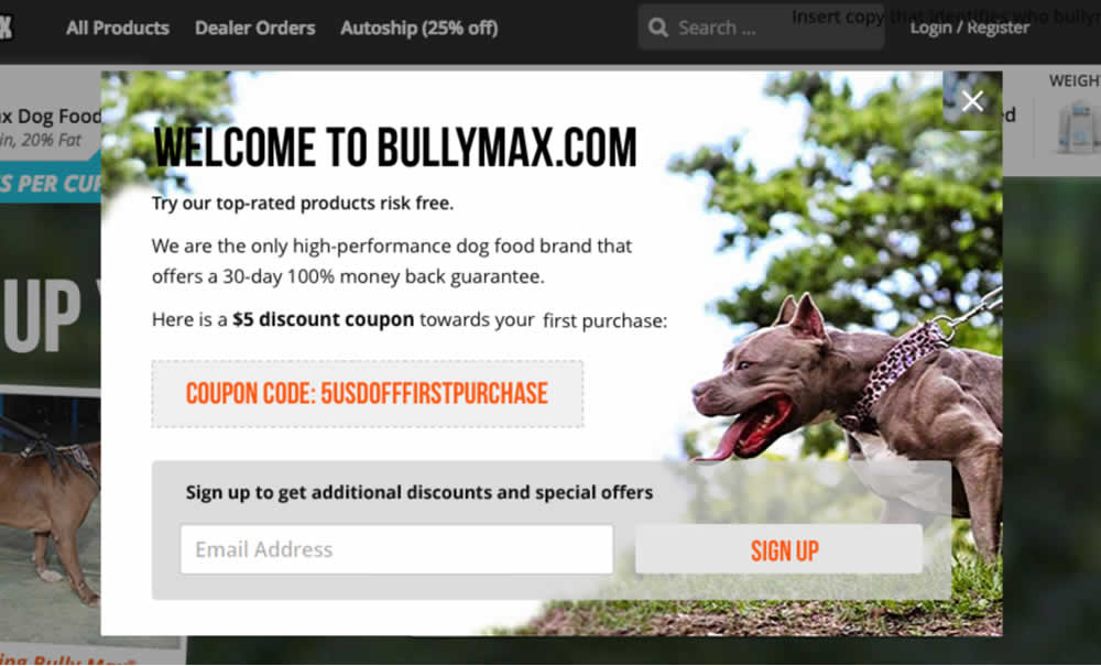
Viljo Tested Pattern #68: Welcome Discount On Bullymax.com

Test #21 on
Findsomeone.co.nz
by  Daniel Bridges
Jan 01, 2016
Desktop
Mobile
Listing
X.X%
Signups
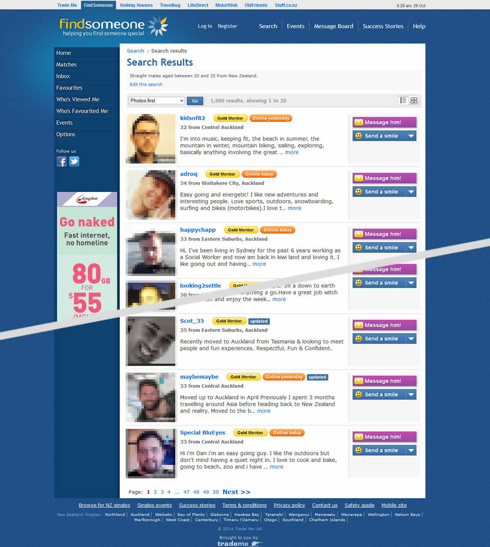
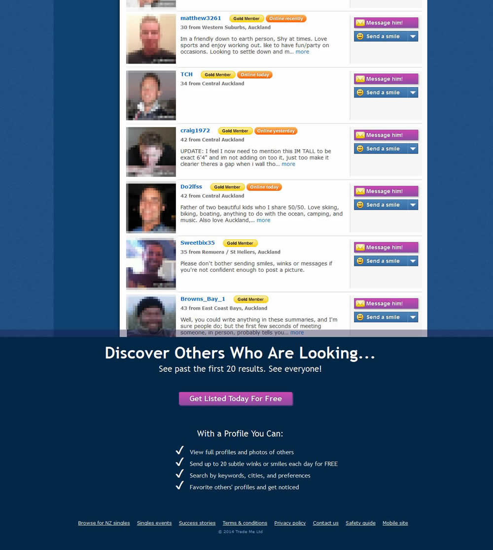
Daniel Tested Pattern #25: Nagging Results On Findsomeone.co.nz
