Amazon's Beautifully Designed And Failed Three vs. Two Column Layout Experiment
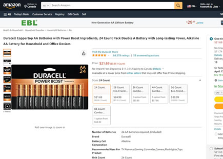
Amazon found the courage to run a beautiful a/b test where they put their old three column product page layout against a new two column one. Although the two column layout was arguably more beautiful with the addition of white space, margins and shadows, it was nevertheless rejected. Before it was removed we decided to leak it here to ensure its beautiful failure continues to teach us well into the future. Finally, you might also notice that this leap experiment introduced multiple changes. Given that we track the win/lose rates of some of these changes as patterns, we can infer that Amazon introduced a mixed bag of both negative and positive changes at the same time - the exact mistake that often destroys such well-intentioned and beautiful redesigns. Here are some of them:
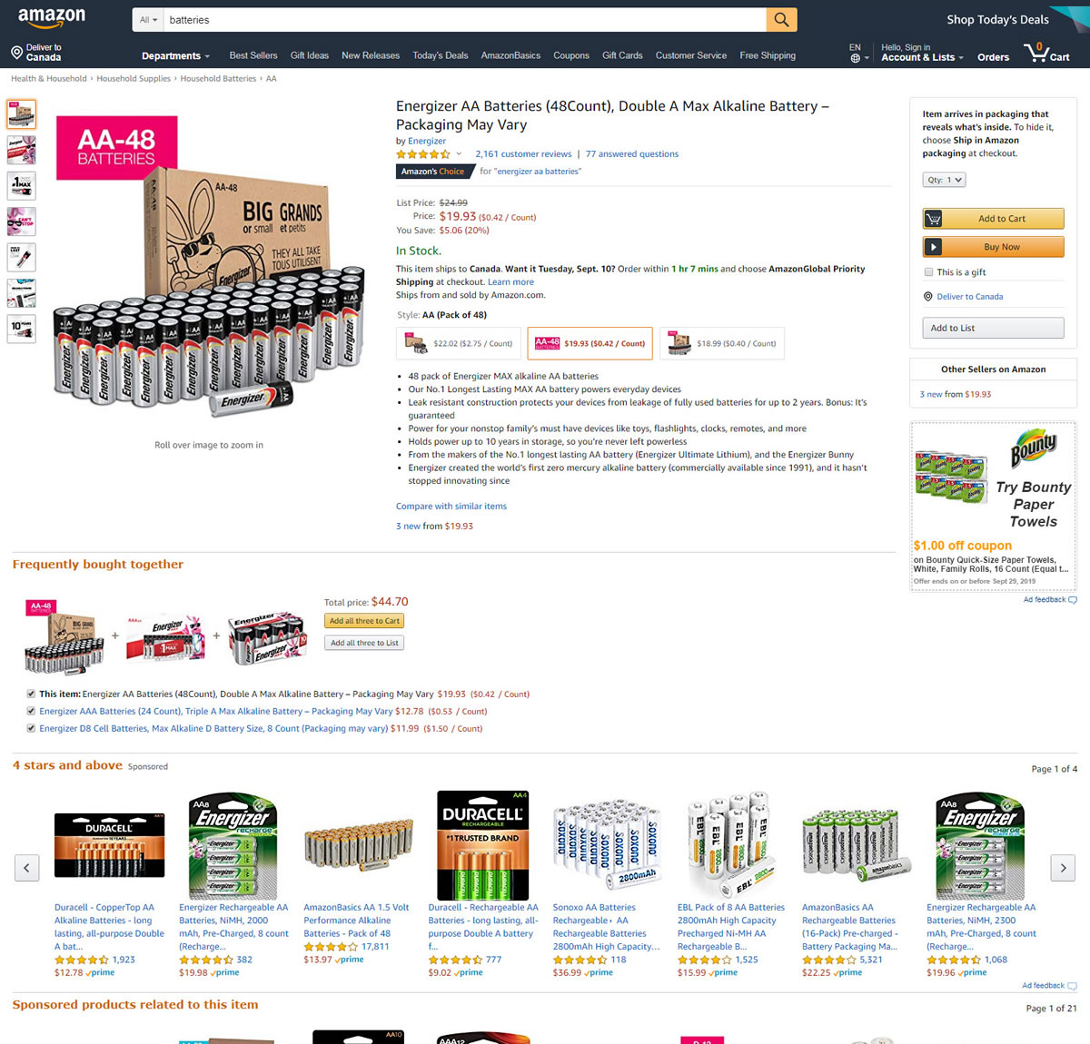
B - Sep 6, 2019 Screenshot
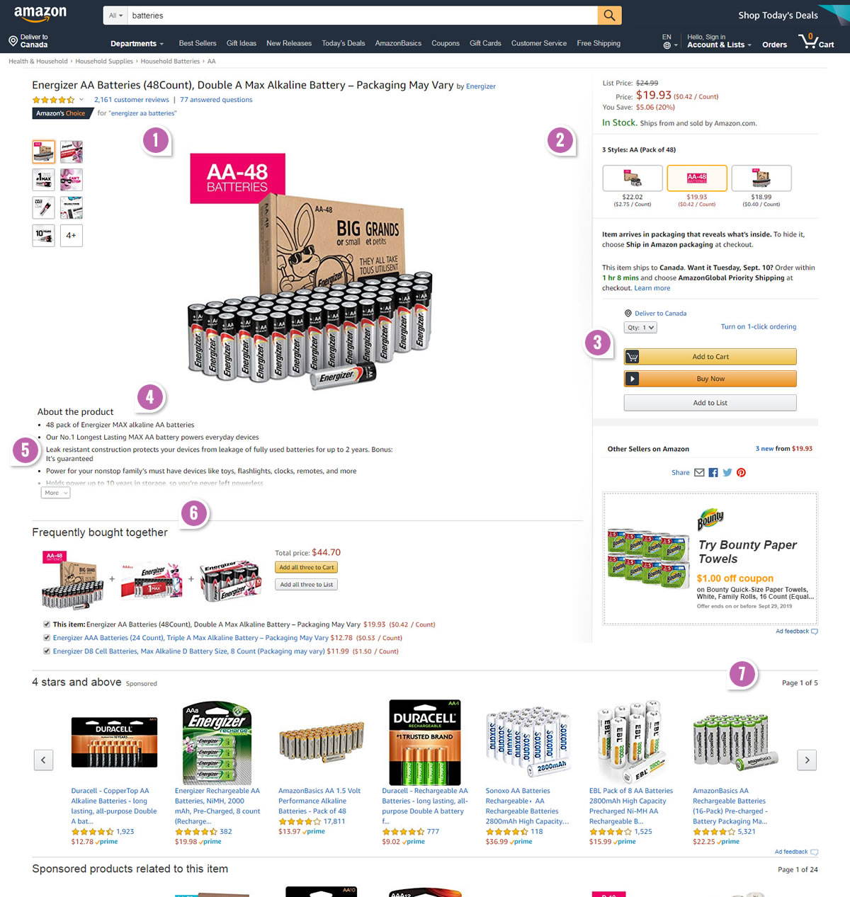
Highlighted UI Changes From This Leak
-
Wider & Centralized Product Image - Column One
In the A version, the product photo is more tightly squeezed into the left column (of the three column layout). While the B variation clearly increased the white space around the main product image and also made it more central. This key change begins the shift toward a two column layout.
-
Wider Product Selection And Add To Cart Box - Column Two
As the product / add-to-cart selection box widened in variation B, it also absorbed a number of other elements. Price information, product size selection and availability information all shifted into the right column above the add to cart button. Was this a positive, flat or negative change? I have no evidence on this, so I do not know.
-
Lower And Wider Calls To Action
Look at the A version which has more narrow and higher up buttons compared to B. These two changes are a perfect example of very subtle changes which we do have accumulating evidence for. We're starting to understand that lowering buttons is most likely worse, while increasing their size is most likely better - and Amazon has combined such positive and negative changes together, potentially canceling them out.
This is very similar to Pattern #49: Above The Fold Call To Action
This is very similar to Pattern #97: Bigger Form Fields
-
Lowered Product Description ... And Everything Else
The B variation lowered the product description below the product photo. More so, to minimize lowering all other information (ex: upsells) a partial collapse was introduced with an expandable "More" interaction. Nevertheless all other content below was pushed down. I'll stay neutral on this change as I'm really not sure what kind of impact this might have had, if any.
-
Wider Margins
In the B version, around 15px to 20px of margins were added for better or for worse.
-
Orange To Black Section Titles
The A version had orange section titles which were changed to black. More contrast? Maybe, maybe not.
-
Fewer Product Titles
Remember those wider margins? Well, there is no such thing as a free lunch and something had to give. The A version had 8 product titles, whereas the B version lost one. Interestingly we started tracking whether showing more results is better or worse as an isolated pattern.
This is very similar to Pattern #36: Fewer Or More Results
How To Do Leap Experiments A Little Better?
I hope I didn't discourage anyone from running multiple change experiments. In fact, I strongly believe that companies should run such experiments. The key thing of course is to make a solid assessment of what you know and what you don't know. Afterwards only group the positive probability changes into your big leap variation, while pushing all unknowns into separate variations that can be tested in the future. And how can you tell what has positive or negative probability? Keep track of your winning and losing experiments or use the evidence-based patterns we already track for you from numerous companies that are nice enough to share.

Comments
AB 6 years ago ↑0↓0
Three things:
1) Why does the description have a "More" button in the B variation? That annoys me a little, I don't want to click more to have more information on the product. If the A variation had longer text, how would it look?
2) I don't mind the "styles" of the product on the right but they added a new visual effect - the drop shadow which is nowhere in the A variation and that too is a little disturbing coming from the used to look from the A variation.
3) Will a bigger picture increase my tendency to buy? I don't think so, I would rather the picture is same size as A and the description on the right (rather than down).
Overall I think it would have been good if they moved only the "styles" to the right so the customer is sure this is what they want before they click the "Add to Cart" button.
Reply
Darrell 6 years ago ↑1↓1
I appreciate the comparison analysis—well done—but what I'm lacking is understanding why the two-column failed. Without that, we really don't know what design decisions moved what business lever or how to correct it.
What was the failure from Amazon's perspective? Is it sales of this product dropped? Is it sales of another product linked to this product dropped? Only until we understand the purpose and intended business outcome can we truly know whether a design choice moved the needle one way or the other.
One of the comments here said they "hated" the new design and their reasons point to an unfamiliarity with the new layout. While that is a valid reaction that needs to be accounted for as part of "Change Management" it is only a weighty design consideration if it changes some important factor of Amazon's business goals. Just because people are "used" to a certain design doesn't mean it always must remain that way to be successful. Understanding user's preferences, yes, but use that as leverage to design a new layout that helps the user and achieve business goals. That is even more powerful. (Ironically, I remember seeing this page in my shopping and I loved it—found it easier to read, etc. Again, that only measures sentiment and the amount of change management I'd need for adopting this new design, not whether it actually moves a business needle).
As far as aesthetics, Amazon's pages are so, so noisy. There are so many cross-selling injections and ads vying for my attention I end up ignoring a lot of it. Yet, when I'm researching a product I love the cross-sells because it helps me discover. Just like eBay, Amazon has struggled for decades (in my opinion) to add an aesthetic personality and layout sensibilities. Whatever your opinion of Apple, they demonstrate it is possible to design a shopping experience that has aesthetics. It would be interesting to bring some of those sensibilities over and see what happens to the brand and business. Of course, only if it aligns with their priorities. "Don't shake the apple cart!"
It's ironic that in 2019 Amazon makes the minute changes, but I am neither on the team and neither do I discourage testing—testing to understand what design decisions move what business needle. I can only hope the team is asking these business-driving questions while still considering the whole person.
Reply
Jakub Linowski 6 years ago ↑1↓0
Since I only captured this experiment from what was publicly visible to everyone I also don't have the deeper view that Amazon has on this. Given it's an e-commerce leader, we can only infer or assume that they are optimizing for some calculus of: more sales, revenue, profit, referrals, repeat-purchases. I'd place my bets that for some segment (or most?) some of these metrics took a hit.
If I had to take a wild guess, it could have been lower revenue for new customers given that the add-to-cart and upsells were pushed lower (and repeat customers already know of their existence).
Reply
Craig 6 years ago ↑1↓1
I can tell you why the incumbent won (for me) and I'm glad things are back to normal.
I remember the few days I saw the B version of this test and I hated it.
First time I saw it, I thought I'd increased the zoom on my browser and spent about 5 or 6 seconds sorting that out. Frustrating UX.
Second, the product options (or styles) moved from their long-standing location, forcing me to look around to find the quantity/size options. The eye-flow is across and up, and then down.
The original layout has what *feels* like a more normal left-to-right eye scan (product image --> options/styles/variables --> buttons).
Reply
Ross 6 years ago ↑0↓1
It seems like the only real, significant difference to this new UI is that they made the product photo larger, forcing users to scroll even more to get to other parts of the product page. Everything else that was already in the "above the fold" part of the page just got shifted to different locations.
Reply
shiva 6 years ago ↑0↓1
Great post!
Is there, by chance, a post where one can read about this A/B test a little more in detail?
Would love to know what worked and what didn't!
Reply
Jakub Linowski 6 years ago ↑0↓0
Thanks Shiva. Unfortunately we don't know much more than: 1) that it was an active experiment with all those grouped changes, and 2) that the B variation looks like it was rejected. This is because we only detect such experiments from what is already publicly visible (ex: we don't have visibility on the actual measurable effects that Amazon sees).
Reply
Artem 6 years ago ↑1↓1
Great experience. Do more such experiments, please.
Reply
Hakon 6 years ago ↑1↓1
Great analysis as always.
Must be difficult to understand for Amazon what has a real effect on the user when running so many experiments at once.
I have been thinking about why Amazon has not done any tests with a fixed sticky header when scrolling and also why they are not testing a buy button that will follow you when you are scrolling.
Have you see any tests like that?
Reply
Jakub Linowski 6 years ago ↑1↓1
Hakon, Amazon does run many MVP experiments (multiple changes arranged as multiple variations). And for that I'm sure they have the stats to do proper analysis. This particular experiment was a leap one where all of these changes were grouped together as a single variation.
As far as the sticky bar, yes I'd love to see if they have tested it and if it worked for them or not (ex: how Airbnb does it). There is a lot of evidence in favor of this pattern - but I'd remain open to the possibility that some implementations could have different effects. :)
Reply
Mike 6 years ago ↑1↓1
Brilliant analysis, thank you for breaking it down so nicely.
Reply