All Latest 595 A/B Tests
Become a member to unlock the abiltiy to see the highest impact a/b tests. Being able to see the actual test results and sort by impact allows growth and experimentation teams to take action on the biggest gains first
MOST RECENT TESTS
Test #561 on
Aboalarm.de
by
 Katharina Lay
Nov 07, 2024
Desktop
Signup
Katharina Lay Tested Pattern #40: Blurred Product Background In Test #561 On Aboalarm.de
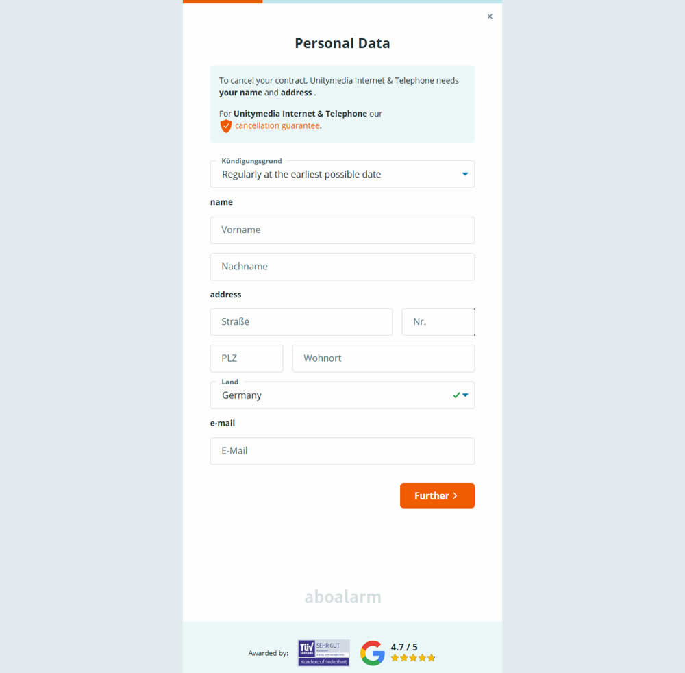
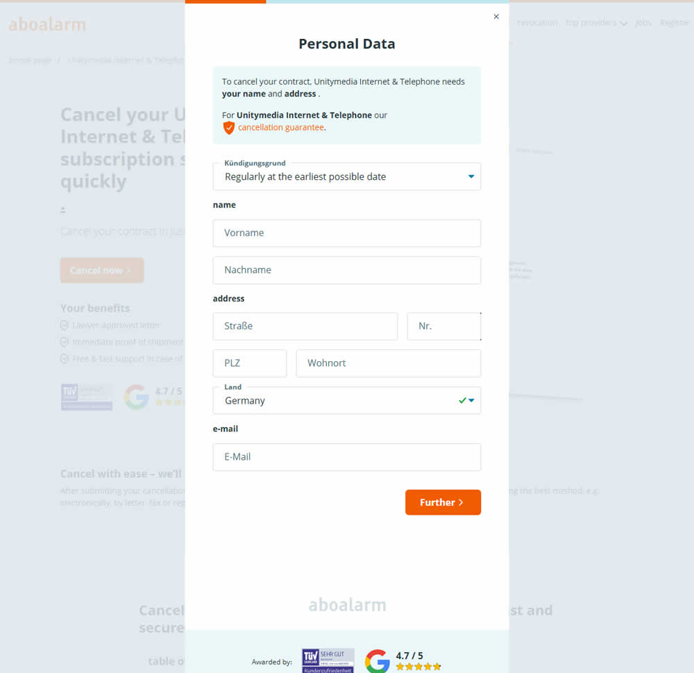
In this experiment, as a multi-step sign up funnel launched as a modal, there was a different treatment of the background. In the A version the background was a flat color, whereas in the B version the background used a transparent opacity to show through the landing page underneath. Impact on sign ups was measured.
Test #546 on
Finn.com
by
 Maksim Meged
Aug 01, 2024
Desktop
Signup
Maksim Meged Tested Pattern #129: Right Or Left Aligned Forms In Test #546 On Finn.com
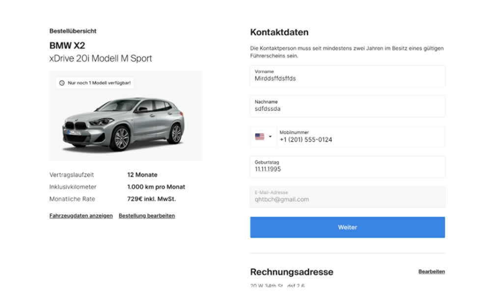
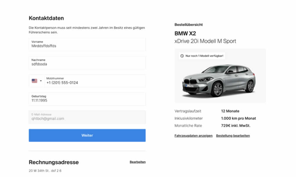
In this signup flow experiment, form fields on the right hand side (control) were shifted to the left column (variation). Impact on account creations and checkouts was measured.
Test #466 on
Volders.de
by
 Daria Kurchinskaia
Apr 26, 2023
Desktop
Signup
Daria Kurchinskaia Tested Pattern #4: Testimonials In Test #466 On Volders.de
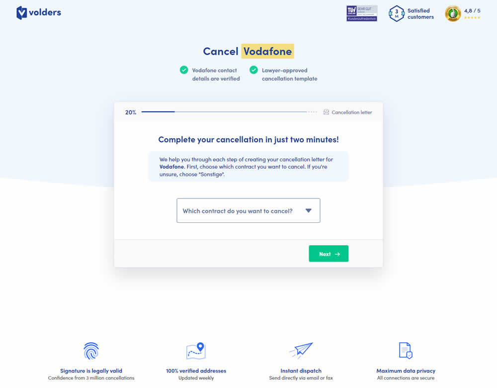
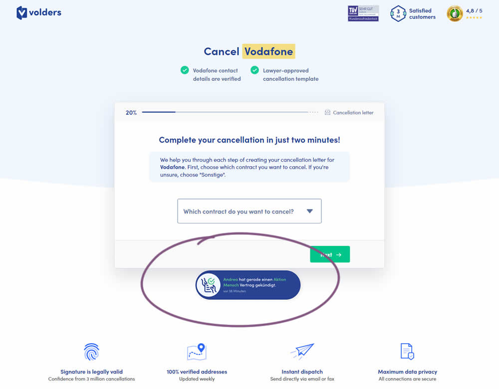
In this experiment, a social proof popups were added to the signup / funnel pages for a contract cancellation service. The added social testimonials appeared as other customers used the service, anywhere except on the final checkout page. Additionaly, the interval at which these messaged appeared was 60 seconds, and they were shown for 10s. The messages translated to "[Name] had recently canncelled a contract with [Company], in the last 38 minutes". Impact on sales was measured.
Test #456 on
Aboalarm.de
by
 Daria Kurchinskaia
Feb 23, 2023
Desktop
Mobile
Signup
Daria Kurchinskaia Tested Pattern #28: Easiest Fields First In Test #456 On Aboalarm.de
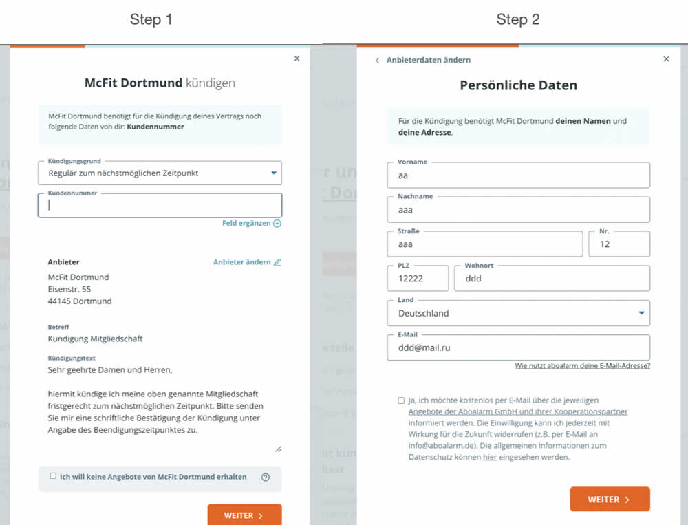
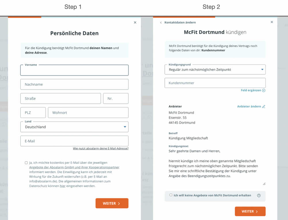
In this experiment, a more difficult step of a contract cancelation service flow was rearranged toward a later step. In the variation, the easier step (hypothetically) with personal details and address fields was placed as the first step. Whereas the step with contract or account numbers (hypothetically more difficult) were placed as the second step.
Test #428 on
Volders.de
by
 Daria Kurchinskaia
Aug 16, 2022
Desktop
Mobile
Signup
Daria Kurchinskaia Tested Pattern #26: Cart Reminder And Recently Viewed In Test #428 On Volders.de
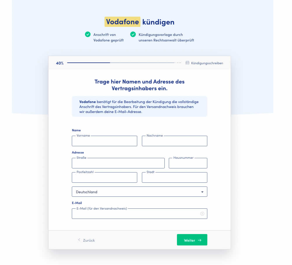
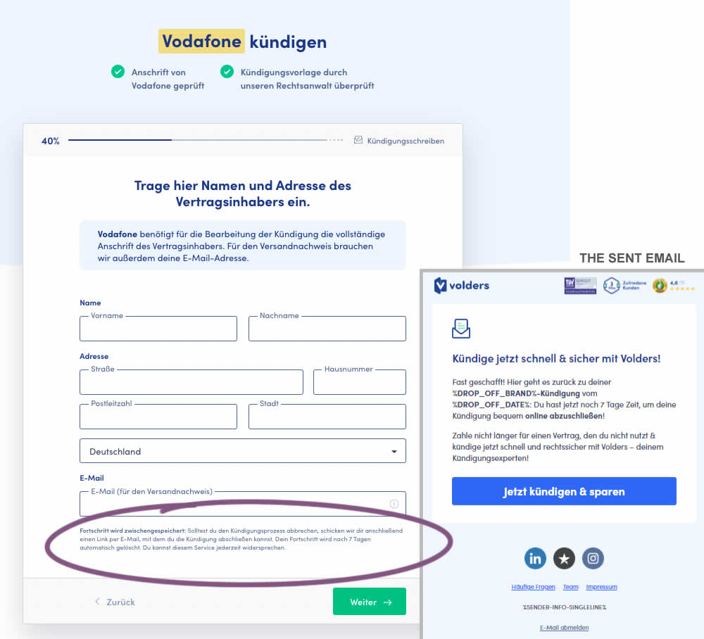
In this test 1) a passive hint communicated to users that their data will be saved for 7 days for them to be able to continue their cancellation later and 2) dropped off users were targeted with an email campaign within the first 4 hours after drop off. The reminder email linked users to a shipping page (checkout page) without them requiring to fill out their personal, contract information one more time.
Test #367 on
Backstage.com
by
 Stanley Zuo
Jul 22, 2021
Desktop
Mobile
Signup
Stanley Zuo Tested Pattern #124: Confirmed Selection In Test #367 On Backstage.com
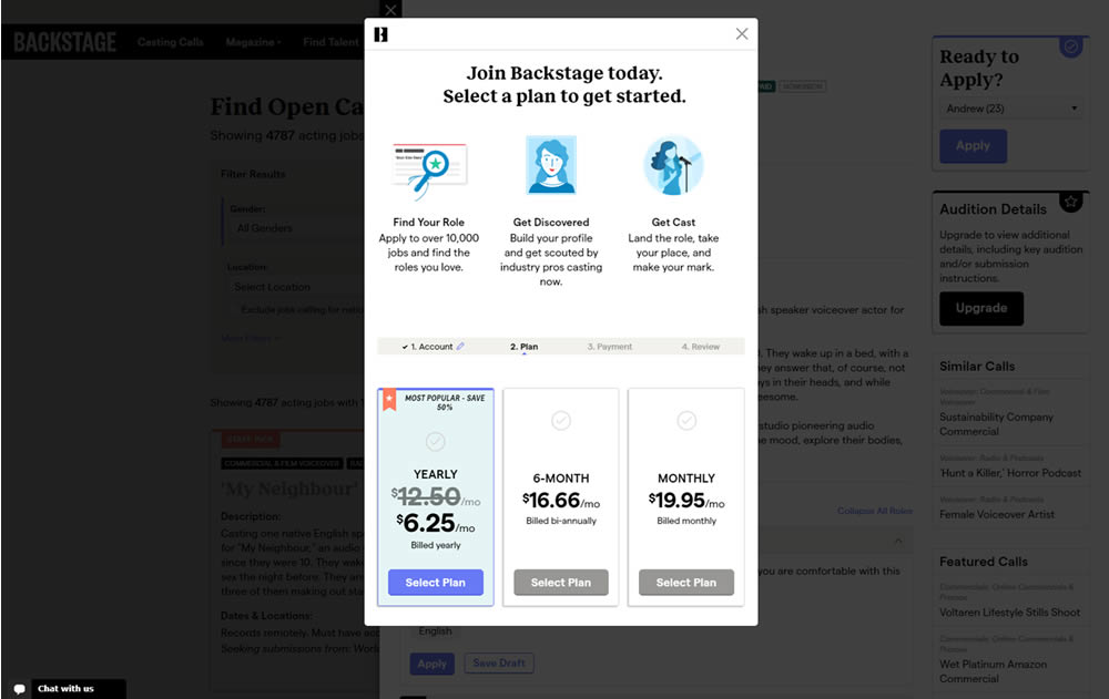
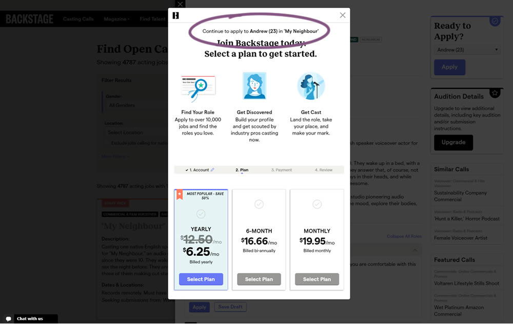
In this experiment, a confiming text was added at the top of a signup modal. The text reinforced the selection from a previous listing page, giving a good reason for continuing the signup process.
Test #302 on
Volders.de
by
Michal Fiech
Jun 09, 2020
Desktop
Mobile
Signup
Michal Fiech Tested Pattern #83: Progressive Fields In Test #302 On Volders.de
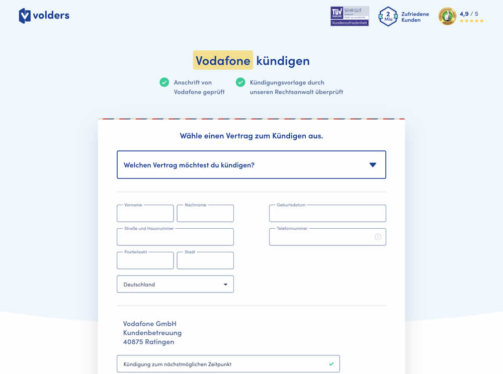
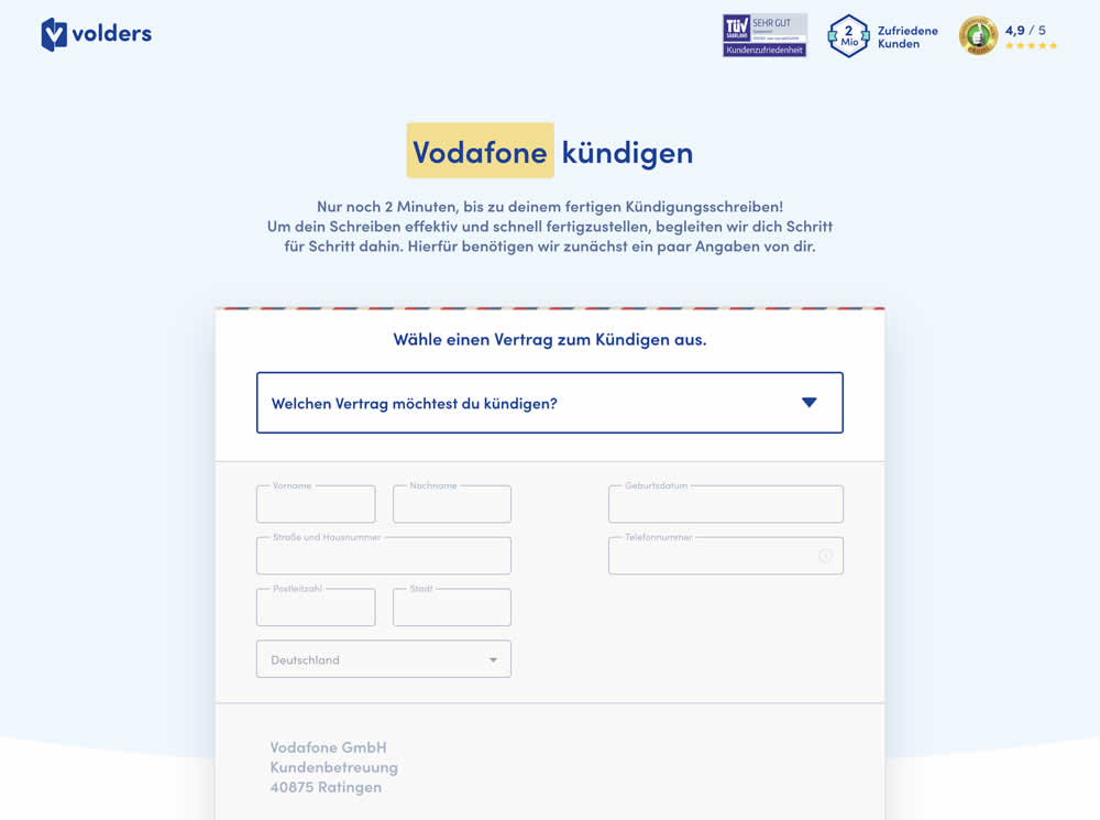
In this experiment a long form (A) was replaced with a progressive form interaction (B). Most of the form fields would appear in a grey-disabled style, until the prerequioste fields were first filled out.
Test #280 on
Volders.de
by
 Alexander Krieger
Jan 24, 2020
Desktop
Mobile
Signup
Alexander Krieger Tested Pattern #3: Fewer Form Fields In Test #280 On Volders.de
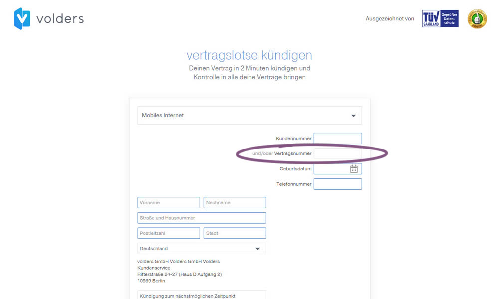
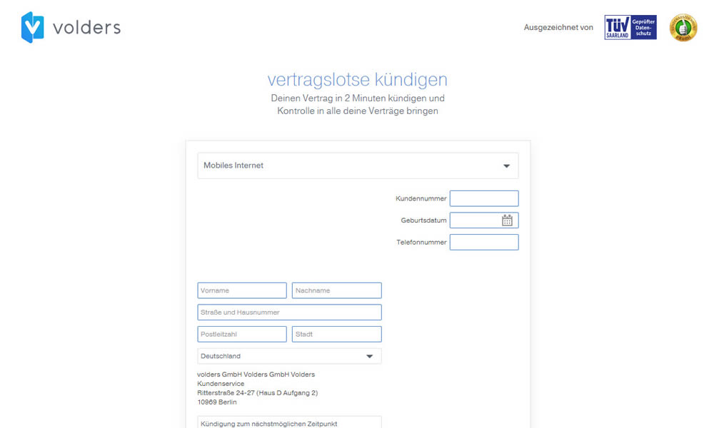
In this experiment on a contract cancellation funnel, one field was removed - a secondary contract ID. The control and variation both had a primary "customer ID" with which to identify and cancel someone's contract with.
Test #254 on
Volders.de
by
 Alexander Krieger
Aug 16, 2019
Desktop
Mobile
Signup
Alexander Krieger Tested Pattern #17: Least Or Most Expensive First In Test #254 On Volders.de
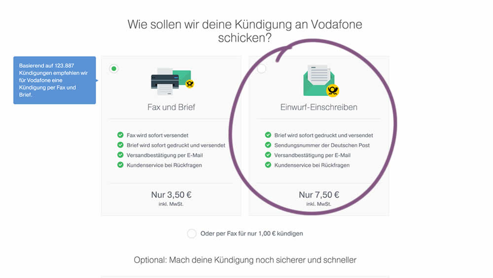
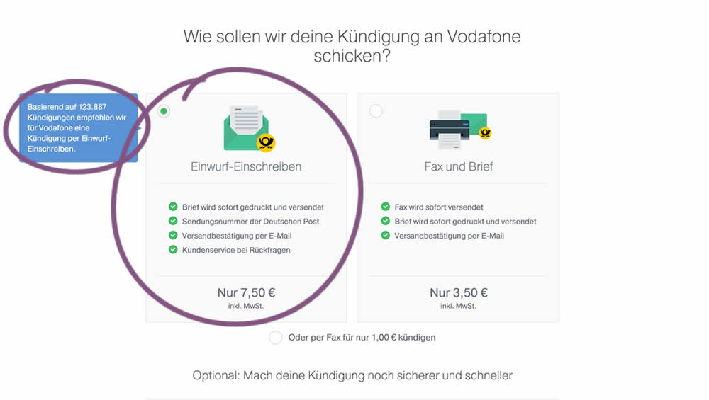
In this experiment, 4 things were adjusted in the variation: the highest pricing plan was shifted to the left, it was set as the default one, the recommendation was also adjusted to point to the highest plan, and one benefit from the lowest plan was removed (customer support).
Test #253 on
Volders.de
by
 Alexander Krieger
Aug 08, 2019
Desktop
Mobile
Signup
Alexander Krieger Tested Pattern #17: Least Or Most Expensive First In Test #253 On Volders.de
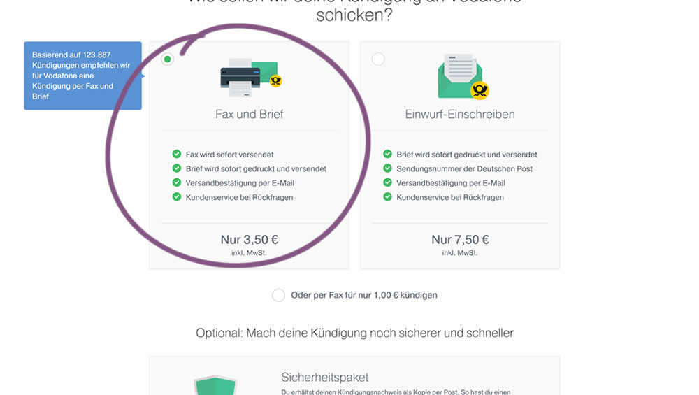
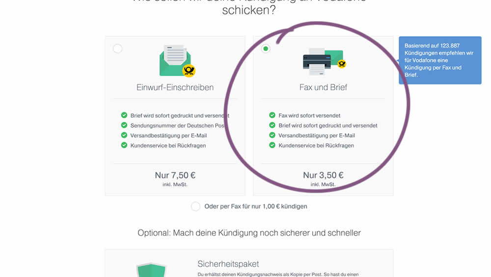
In this experiment, two pricing plans were inverted to show the most expensive plan first (in the variation).
Test #248 on
Volders.de
by
 Alexander Krieger
Jul 16, 2019
Desktop
Signup
Alexander Krieger Tested Pattern #20: Canned Response In Test #248 On Volders.de

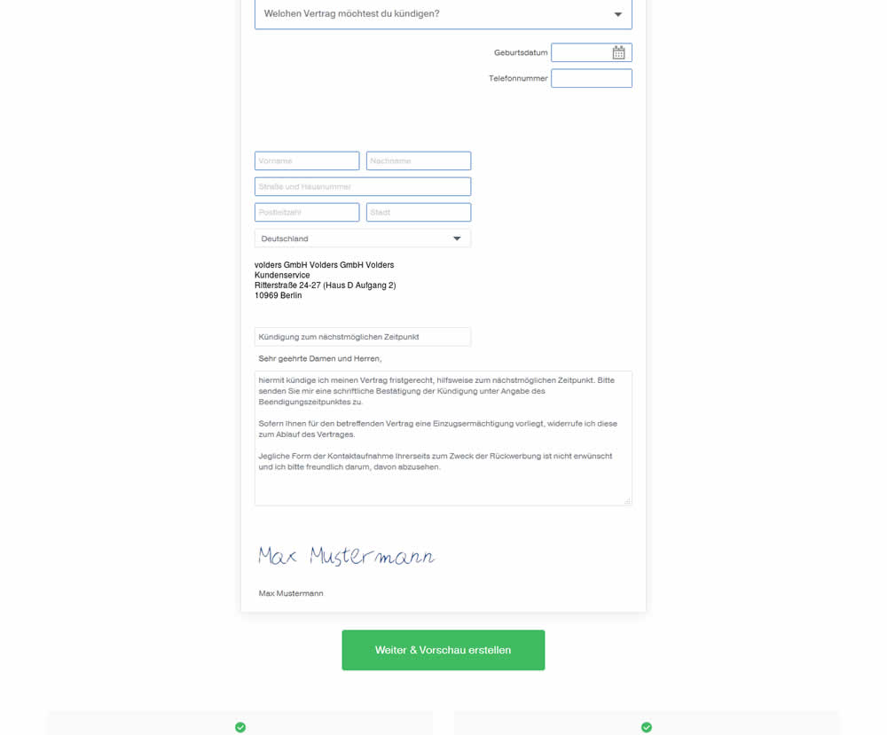
In this experiment, an editable contract cancellation letter was tested against a non-editable one. The editable letter first appeared in a text state, which required a click on a link in order for it to be transformed into an editable textarea field.
Test #233 on
Annonce.cz
by
 Ondřej Ilinčev
Apr 01, 2019
Desktop
Signup
Ondřej Ilinčev Tested Pattern #100: Postponed Registration In Test #233 On Annonce.cz
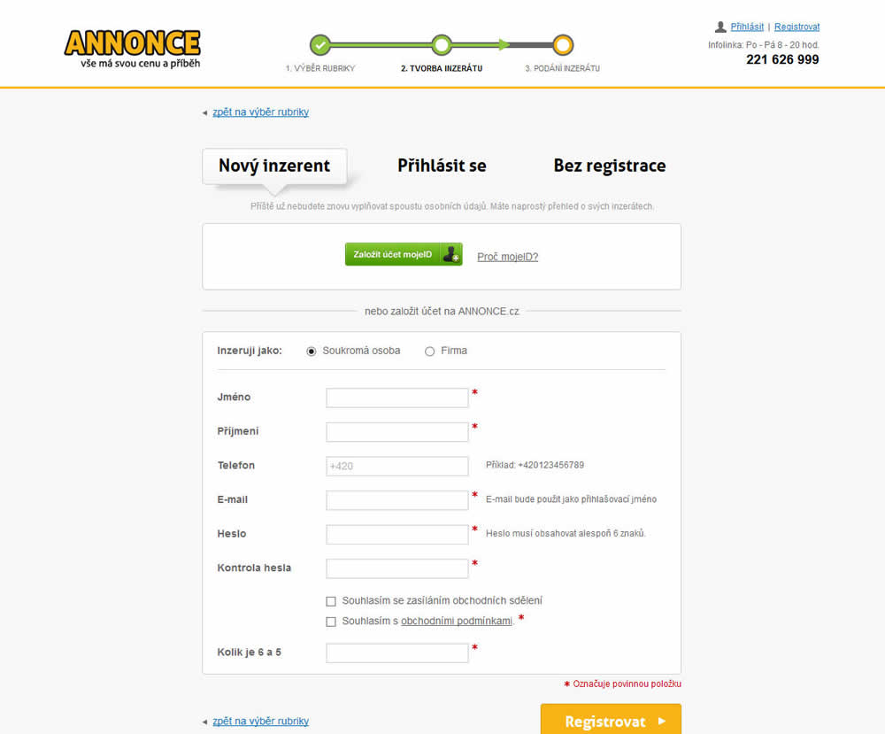
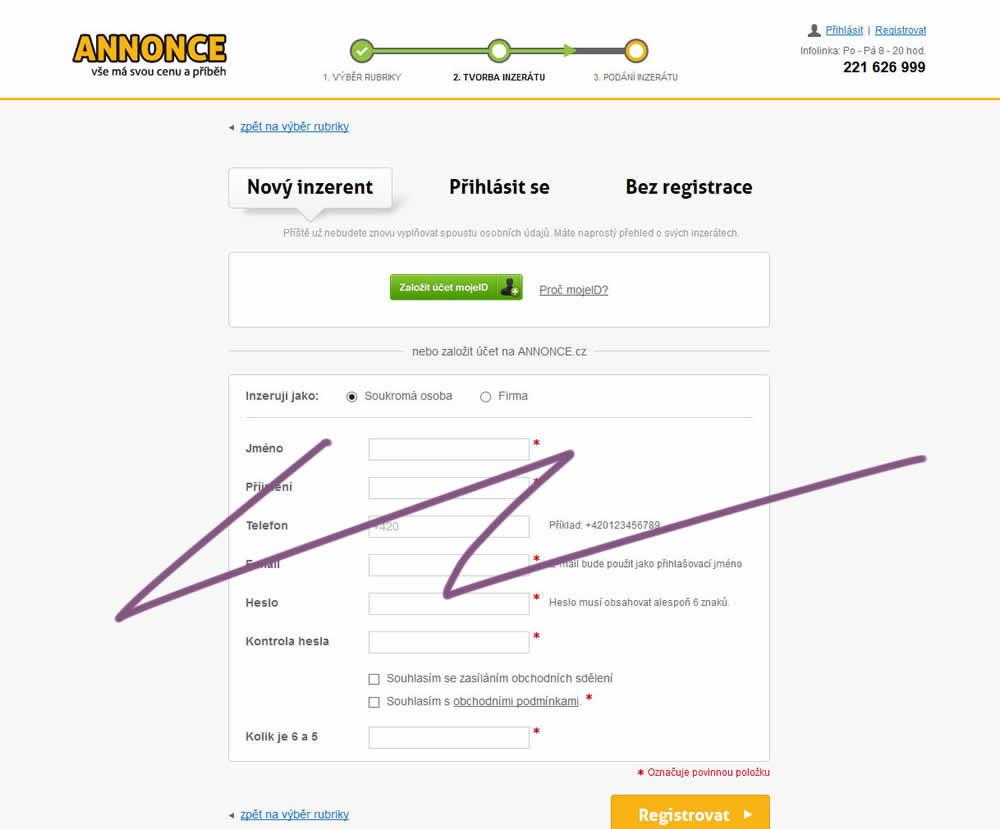
In this experiment, the old flow had a login / register / guest checkout as a second step. The variant B flow removed this step and treated everyone as a guest (and later offered to login / register). In the B version guests had a voluntary registration on the thank you page and in a confirmation email.