Discover UI Design Decisions Of Leading Companies,
From Leaked Screenshots & A/B Tests.
Showing 24 results
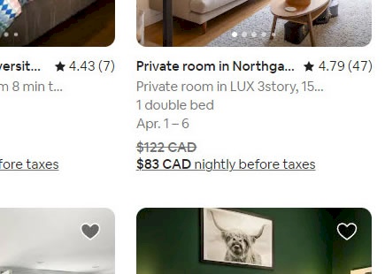
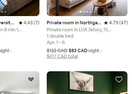
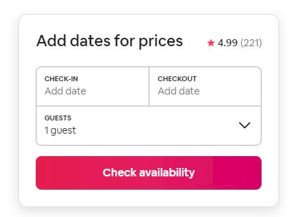
Airbnb A/B Tests Hidden Vs Shown Price Totals
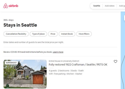
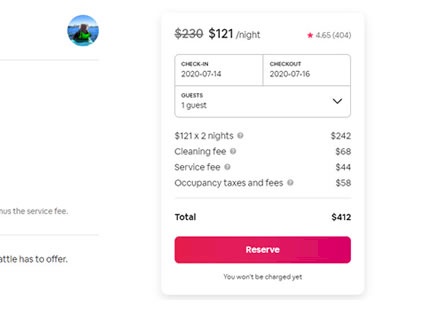
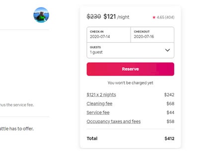
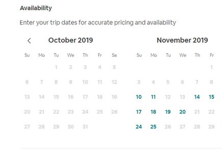
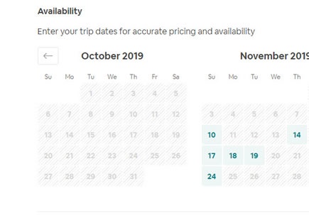
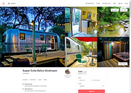
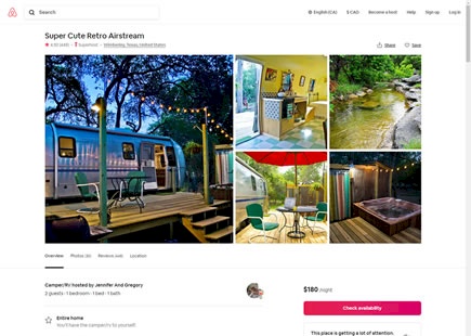
Months ago Airbnb ran this A/B test on their listing pages where they showed price totals for a given date range. This was one step beyond the already visible day rates (in the control). They also used default dates for the total calculation when someone didn't enter a date, or user specified dates when users expressed them. View Leak
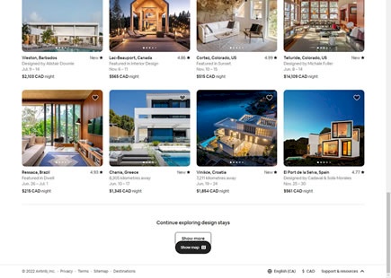
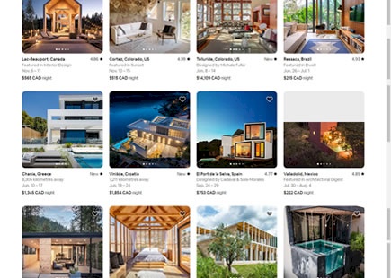
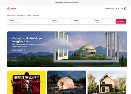
Airbnb Retests The Infamous Infinite Scroll
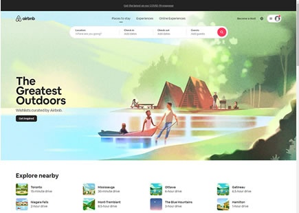
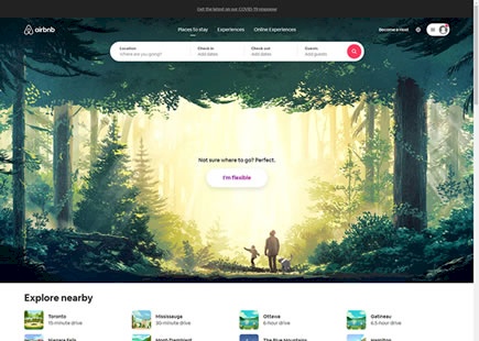
I believe Airbnb just a/b tested infinite scrolling and rolled it out. Sometime this year they evolved their homepage to include specific property listings. As these property tiles appeared, a month ago I also managed to capture a screenshot of two versions of their homepage: one with 40 results per page that would load more listings with a "Show More" button; and another version with an endless or infinite scroll. View Leak
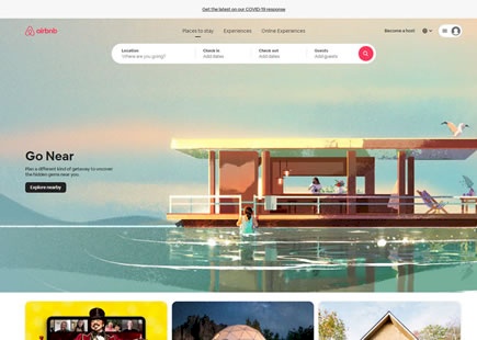
Airbnb Discovers A Better Way To Let Customers Explore Listings
It looks like Airbnb once again ran an exciting experiment where they sought a better way to let customers explore property listings. I managed to detect an a/b test with changes to the homepage button which then spilled over into more changes on the listing page. I'll also admit that I am not 100% sure whether this was one bigger experiment on both pages or two separate ones. Either way, here are some of the particular differences I found really interesting ... View Leak
Airbnb A/B Tests More Filters On Their Listing Screens With This Outcome
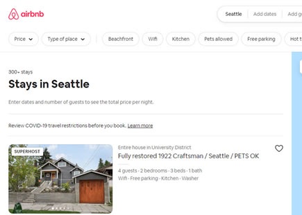
Here is a filter experiment I managed to detect on Airbnb's listing pages a few months ago. At the outset it looks like Airbnb was simply trying to add more filter options, but in reality there are at least three changes confounded together. If we break these changes up into individual patterns we might learn that some of them might be better than others. Perhaps this combination or interaction of both negative and positive changes could be an explanation as to why it looks like the variation was eventually rejected. View Leak
Airbnb Runs A Successful Leap Redesign Experiment For New Hosts
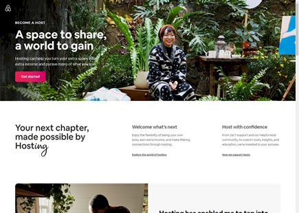
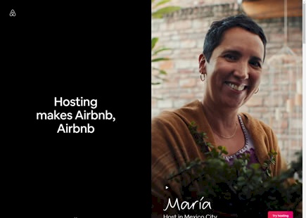
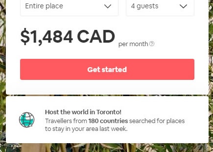
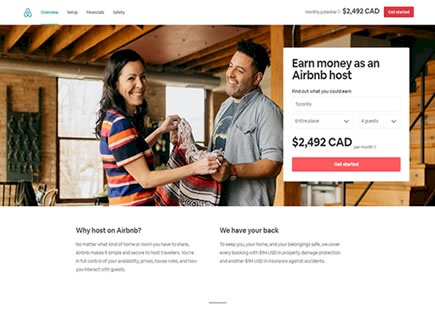
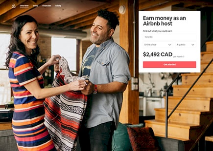
Airbnb just completed testing and rolling out a successful variation for their new host landing page. The interesting thing about this experiment is that it was a leap a/b test containing many changes (some of which are being followed up with small scale a/b tests as I'm writing this). Here is my take on some of the changes along with the corresponding patterns. View Leak
Airbnb A/B Tests And Rejects A Natural Language Form
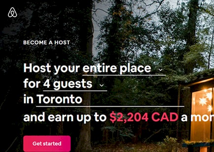
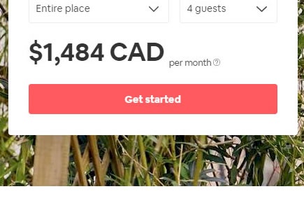
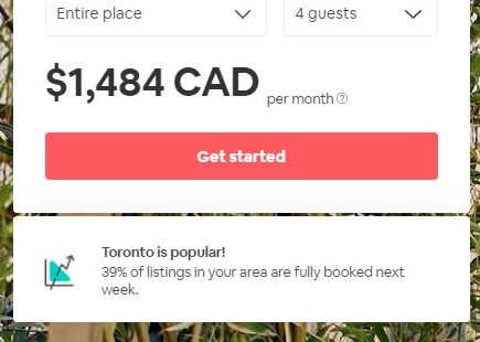
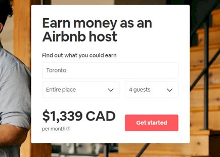
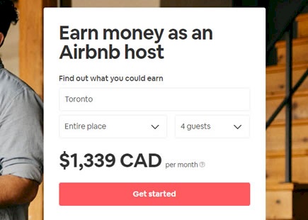
Airbnb just completed an interesting experiment on their Become A Host landing page. They replaced a simple headline with a more dynamic natural language form that provided a sense of how much money someone could make from hosting their place. View Leak
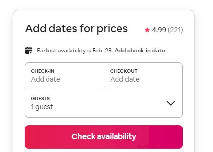
Airbnb Once Again Rejects Next Available Date Suggestions
Once again Airbnb a/b tested an idea of surfacing the next available dates near their calendar picker. And once again the experiment looks like it was rejected just like previously. View Leak
Airbnb Gets Creative In This Multiple Variation Homepage Experiment
I love how Airbnb balances formal controlled experiments (containing single isolated changes) with more exploratory ones such as on this one here. They just completed a creative homepage experiment where they tested multiple variations with multiple changes of which I will show a selected few for simplification. View Leak
Airbnb Rejects Auto Suggested Dates In This Failed A/B Test
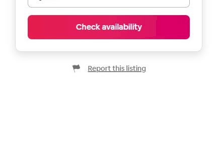
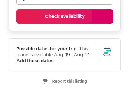
Not all experiments succeed including this one that Airbnb recently ran on their property pages. Their a/b test was automatically suggesting a next available date below the "Check Availability" button when someone didn't already have any chosen dates. A month later however, the experiment completed and was rejected. View Leak
Airbnb A/B Tests And Discovers That A Higher Button Position Is Better
Airbnb ran this wonderful experiment on one of their primary reservation buttons. The A/B test adjusted the position of the button, shifting it higher on all property pages - which was implemented once ended. View Leak
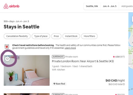
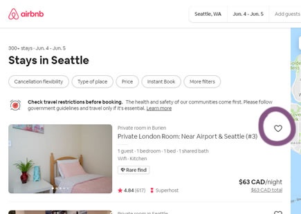
Airbnb A/B Tests And Detects A Better Placement For Saving Properties
It looks like Airbnb just discovered a better placement for the "heart icon" that allows users to save properties to custom lists. Instead of placing the icon directly over property thumbnails (as in the control), it was A/B tested with a rightmost position of a wide listing - and eventually implemented. View Leak
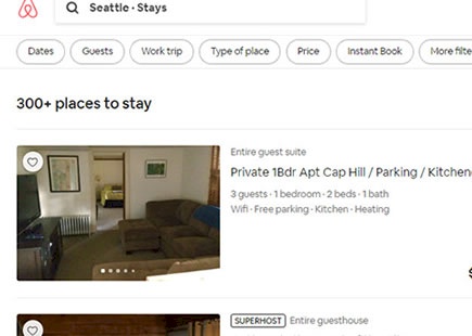
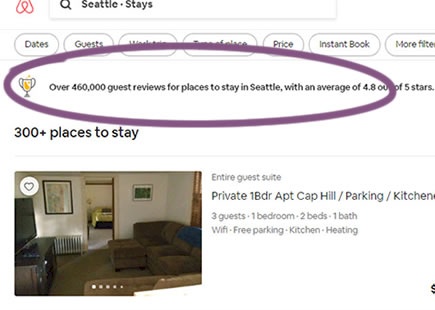
Airbnb A/B Tests And Implements Customer Rating Averages Above Search Results
In this simple experiment, Airbnb tested the display of customer rarings averages on their search results screen. The tested copy was a form of social proof which showed the average rating of the properties for a given city (defined by the search). View Leak
Airbnb Discovers A Better Calendar Picker Component From This UI Experiment
This was a simple calendar picker experiment that Aribnb recently ran and eventually rolled out. The A/B test contains at least 4 simple UI changes which might have contributed to a positive outcome. And so this also shows us what a slightly better UI component looks like. View Leak
Airbnb Attempts A Big Property Page Redesign But It Is Rejected After This A/B Test
Over two months ago I managed to detect this exciting product/property page redesign on Airbnb with at least 17 UI changes. Unfortunately, as hard as the Airbnb team must have worked on these layout improvements, we now can see that the experiment has ended and the old control version (A) remains the better performer. View Leak
Airbnb A/B Tests Search With Automatic Prompts Which Gets Rejected
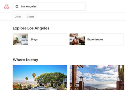
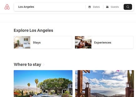
In this listing page experiment, Airbnb tried an very similar search interaction that is already present on Booking.com's homepage. Instead of only asking users for their destination, the search interaction was extended to prompt for travel dates and number of guests. View Leak
Airbnb A/B Tests And Rejects Both Of These Social Proof Statements
Many companies have already tried and tested the pattern of displaying numerical social proof in some form or another. In this leaked experiment from Airbnb on their host signup landing page, we managed to detect two social proof statements that were eventually rejected. Here are some potential explanations as to possibly why they failed to deliver on an improvement. View Leak
Airbnb Discovers A Better Way To Display Customer Ratings In This A/B Test
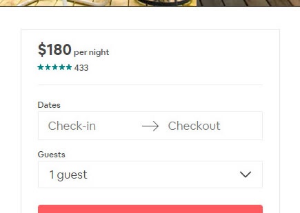
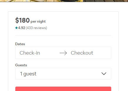
In this tiny and well isolated experiment, Airbnb tried a slightly different approach to displaying customer ratings on their property (product) pages. From the observed implementation decision one month later, we learned that using decimal places for customer rating averages seems to be the better approach. :) View Leak
Airbnb A/B Tests And Rejects Full Height Photos On Their Landing Page
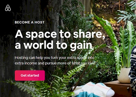
Airbnb ran an experiment where they increased the size of the header photo on their Host signup landing page. And interestingly it was rejected a month later. View Leak
Airbnb A/B Tested These 3 Button Labels And They All Failed
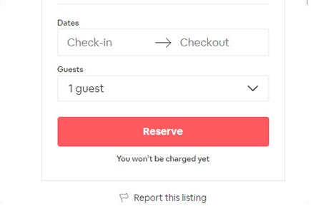
Button label tests are easy to setup, including this one that Airbnb ran on their property listing pages. In total we detected that they a/b tested 3 variations against the original control. One month later, all treatment variations were rejected suggesting that the "Reserve" button defended its superior performance. View Leak
Airbnb Switched To A Bigger Button After Running This Design Experiment
Here is a perfectly simple optimization of a "Get started" button on Airbnb's host signup landing page. Airbnb ran an experiment of a smaller vs larger button size. I know because I managed to capture two diverse screenshots with the same date stamp. :) More so, a few months later Airbnb rolled out the later button to 100% of their traffic - hinting at a successful experiment outcome. View Leak
