All Latest 617 A/B Tests
Test #389 on
Svsound.com
by  Keenan Davis
Dec 16, 2021
Desktop
Mobile
Checkout
X.X%
Revenue
Keenan Tested Pattern #1: Remove Coupon Fields On Svsound.com
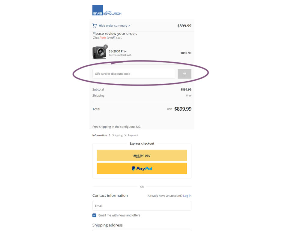
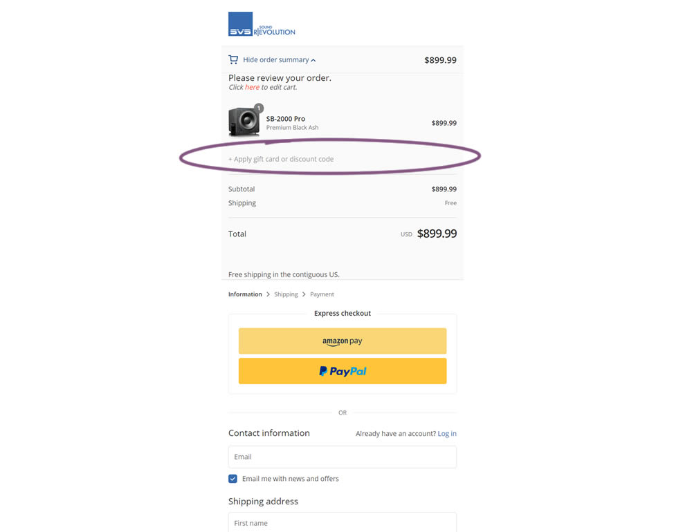
In this simple experiment, a highly visible coupon field was replaced with a less visible (but clickable) link in the variation. Clicking on the link would show the coupon field. Impact on sales and revenue was measured.
Which A Or B Actually Wins? Find Out Before You Test.
Members see every test result — the winners, the flat ones, and the losers — along with exact effects and sample sizes. Use it to estimate your tests and prioritize by probability, not gut feel. Start every experiment with the odds on your side.
Test #354 on
Mvideo.ru
by  Andrey Andreev
May 25, 2021
Desktop
Mobile
Product
X.X%
Revenue
Andrey Tested Pattern #69: Autodiscounting On Mvideo.ru
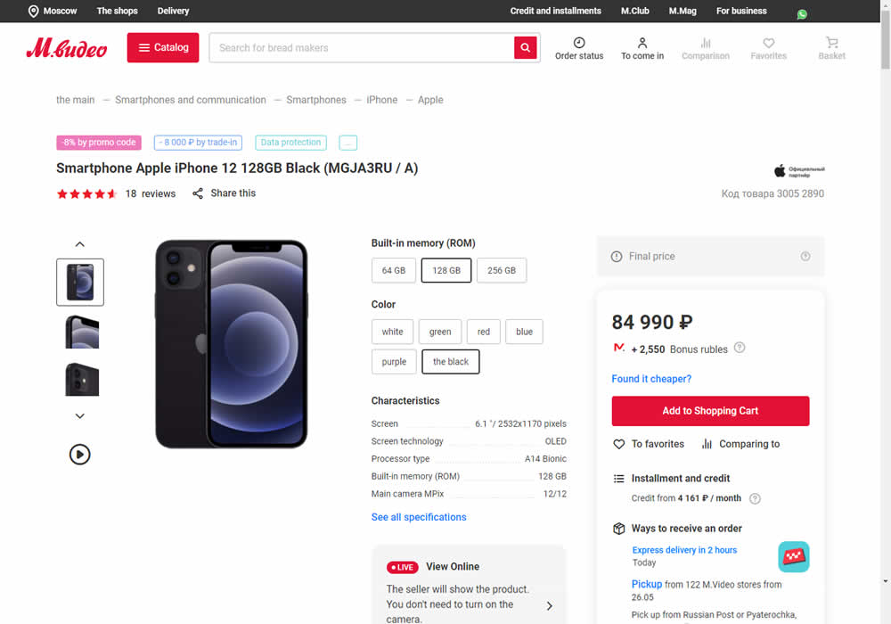
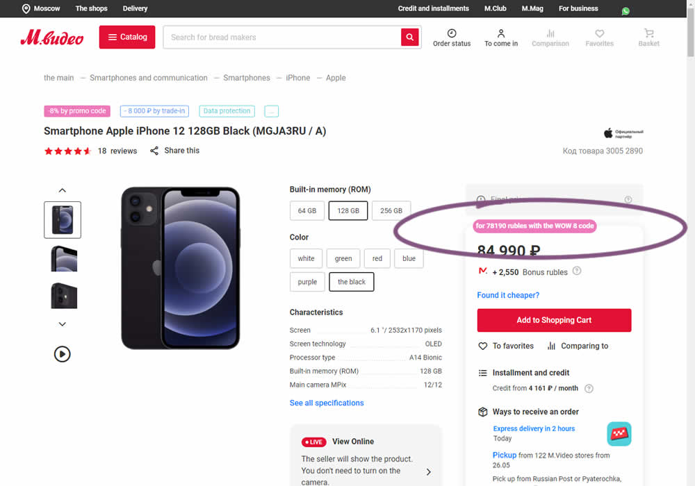
In this experiment, the discounted price was shown along with an active promotion. The control only showed that the relative -8% discount was present with the pre-discounted price.
Test #324 on
by  Jakub Linowski
Oct 30, 2020
Desktop
Mobile
Product
X.X%
Revenue
Jakub Tested Pattern #17: Least Or Most Expensive First
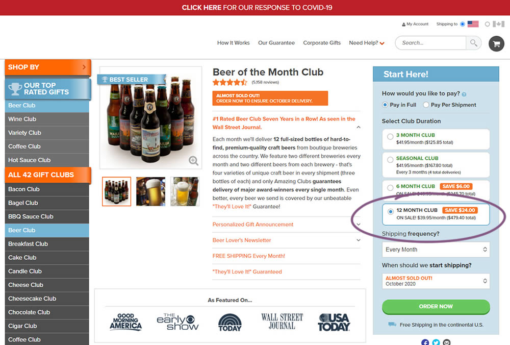
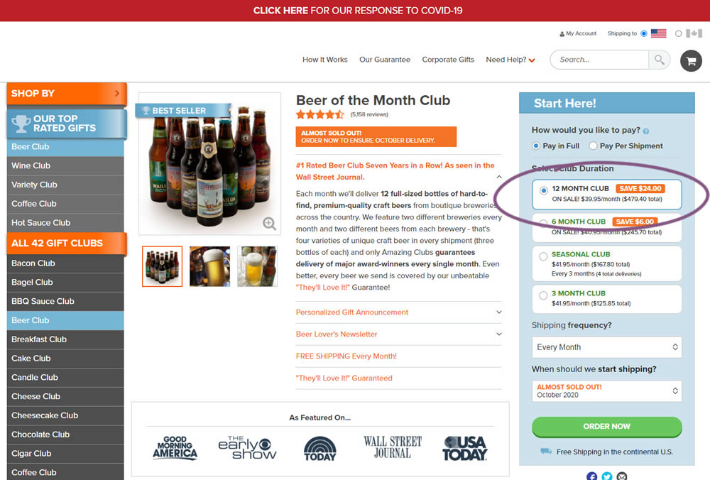
This experiment tested the order of purchase plans. The control version sorted the purchase options by the least expensive while the variation sorted them by the most expensive first. Impact on sales and revenue was measured.
Test #319 on
Backstage.com
by  Stanley Zuo
Sep 30, 2020
Desktop
Pricing
X.X%
Revenue
Stanley Tested Pattern #113: More Or Fewer Plans On Backstage.com
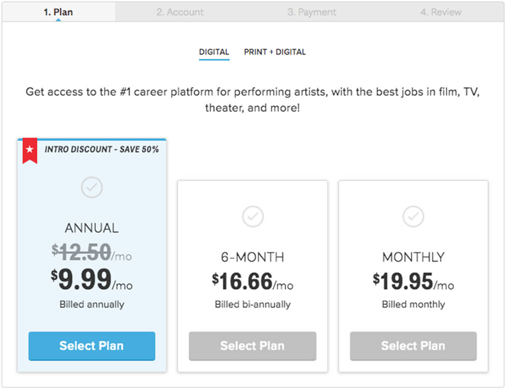
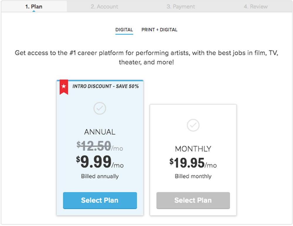
In this experiment, a 3 plan vs 2 plan pricing page was shown to potential customers. Impact on sales and revenue were measured.
Test #289 on
Prepagent.com
by  Arthur Sparks
Mar 23, 2020
Desktop
Pricing
X.X%
Revenue
Arthur Tested Pattern #17: Least Or Most Expensive First On Prepagent.com
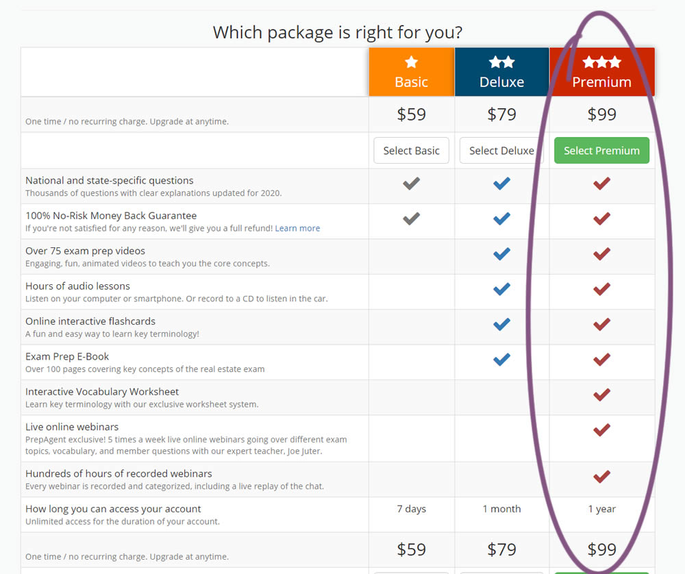
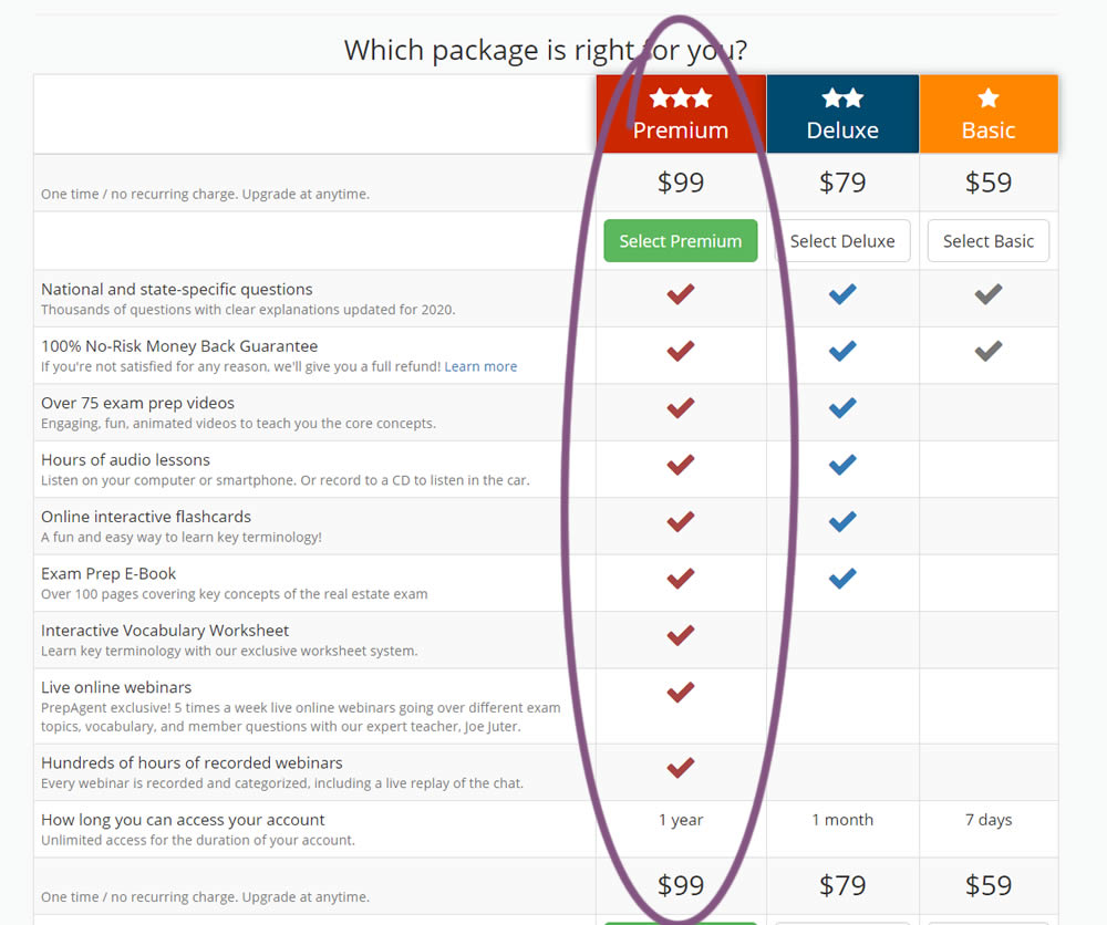
In this experiment, the order of pricing plans was rearranged as to show the most expensive one first.
Test #277 on
Prepagent.com
by  Arthur Sparks
Jan 03, 2020
Desktop
Pricing
X.X%
Revenue
Arthur Tested Pattern #115: Pricing Comparison Table On Prepagent.com
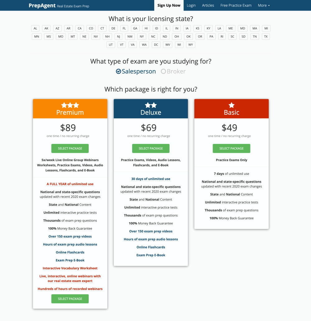
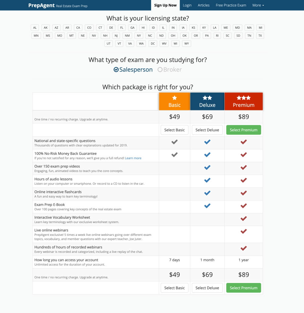
In this experiment, side-by-side plan features were aligned and changed to a comparison table with checkmarks for easier comparison.
Test #275 on
Prepagent.com
by  Arthur Sparks
Dec 31, 2019
Desktop
Pricing
X.X%
Revenue
Arthur Tested Pattern #114: Less Or More Visible Prices On Prepagent.com
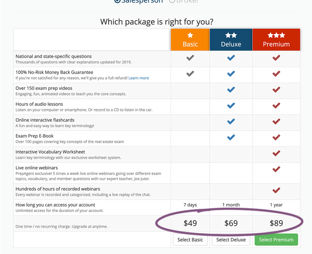
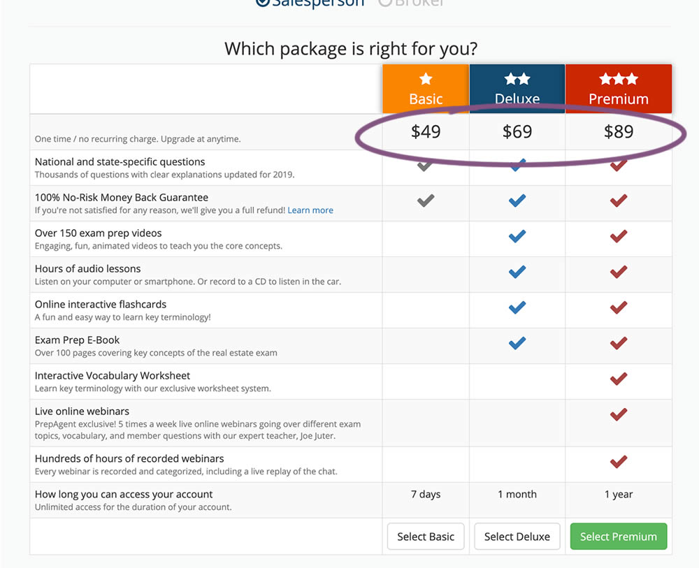
In this experiment, all three prices of each plan were shifted higher for greater visibility.
Test #272 on
Backstage.com
by  Stanley Zuo
Dec 03, 2019
Desktop
Pricing
X.X%
Revenue
Stanley Tested Pattern #113: More Or Fewer Plans On Backstage.com
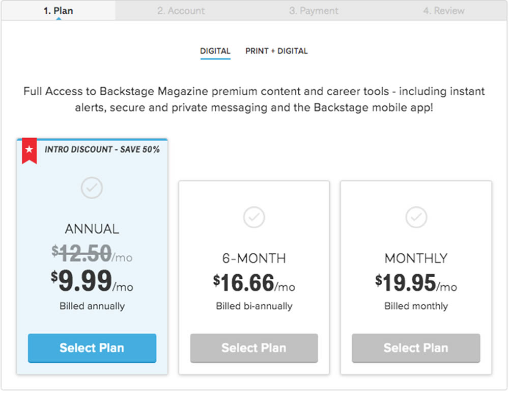
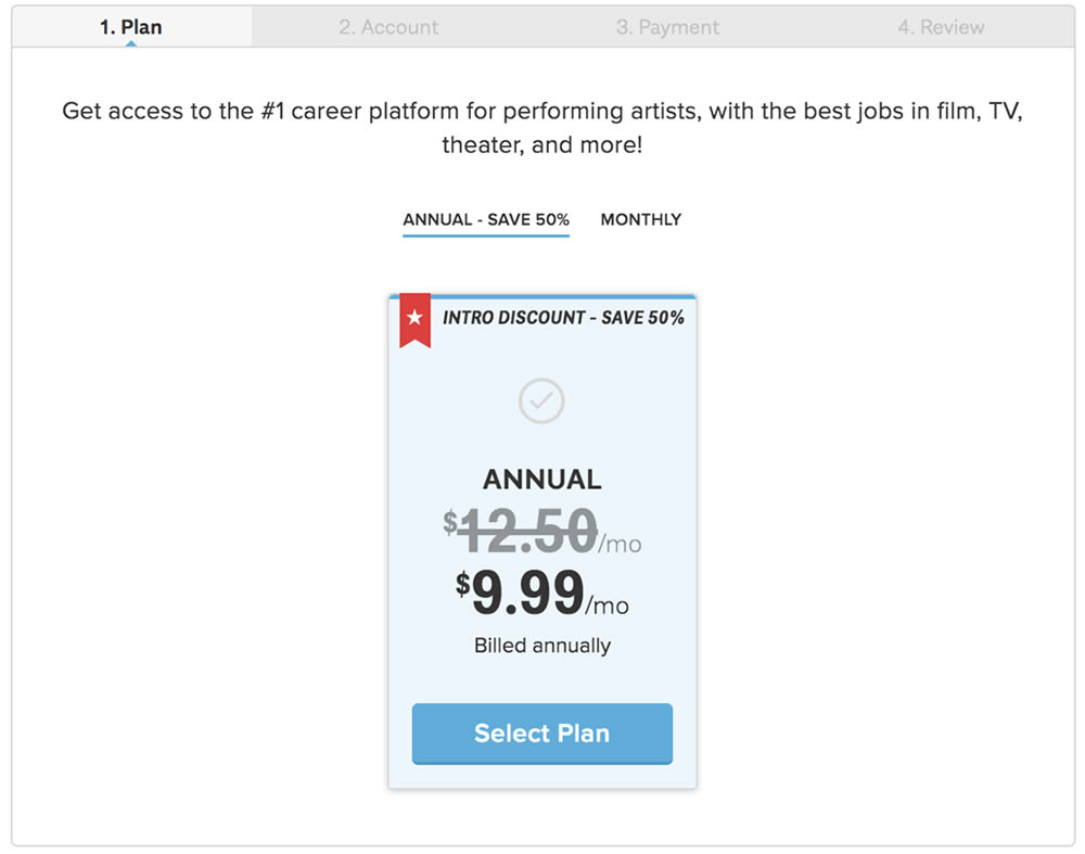
In this experiment, the three pricing plans were condensed into a single recommended plan (annual), with a secondary option to choose the monthly plan.
Test #254 on
Volders.de
by  Alexander Krieger
Aug 16, 2019
Desktop
Mobile
Signup
X.X%
Revenue
Alexander Tested Pattern #17: Least Or Most Expensive First On Volders.de
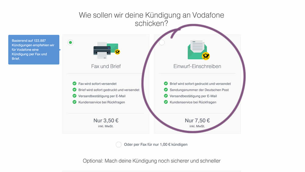
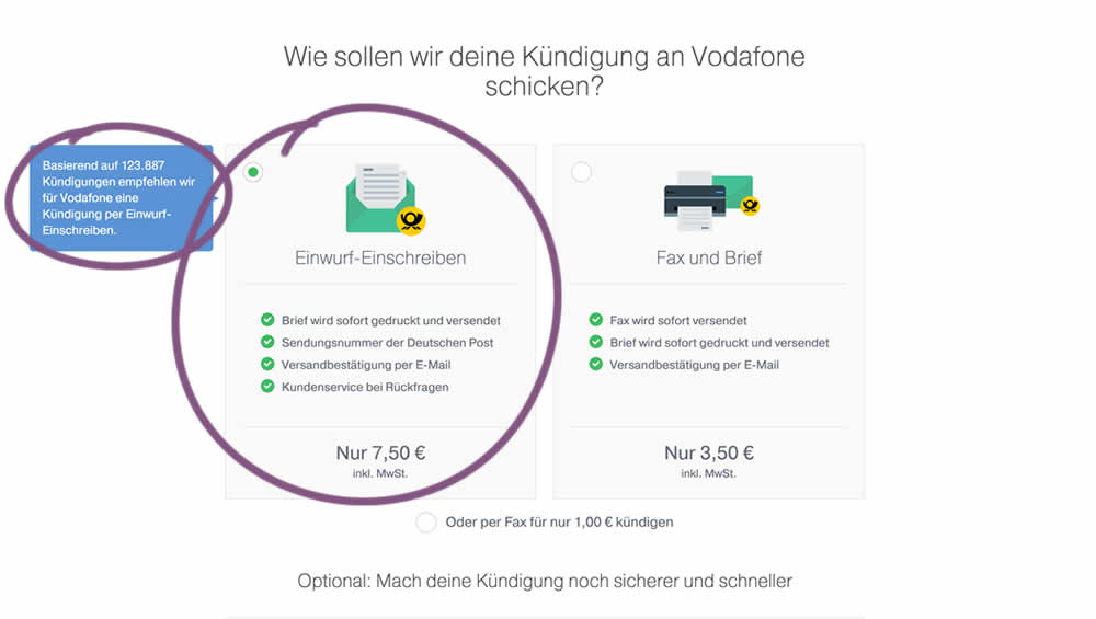
In this experiment, 4 things were adjusted in the variation: the highest pricing plan was shifted to the left, it was set as the default one, the recommendation was also adjusted to point to the highest plan, and one benefit from the lowest plan was removed (customer support).
Test #253 on
Volders.de
by  Alexander Krieger
Aug 08, 2019
Desktop
Mobile
Signup
X.X%
Revenue
Alexander Tested Pattern #17: Least Or Most Expensive First On Volders.de
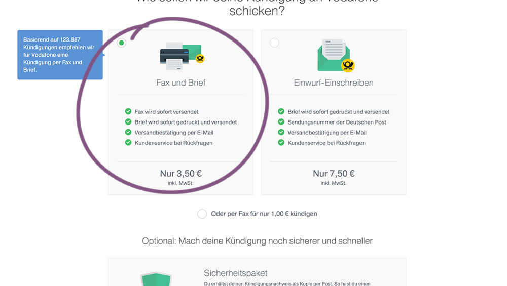
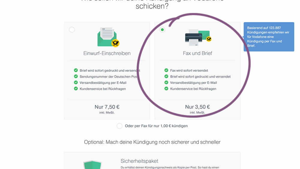
In this experiment, two pricing plans were inverted to show the most expensive plan first (in the variation).
Test #223 on
Volders.de
by  Alexander Krieger
Feb 01, 2019
Desktop
Mobile
Signup
X.X%
Revenue
Alexander Tested Pattern #12: Payment First On Volders.de
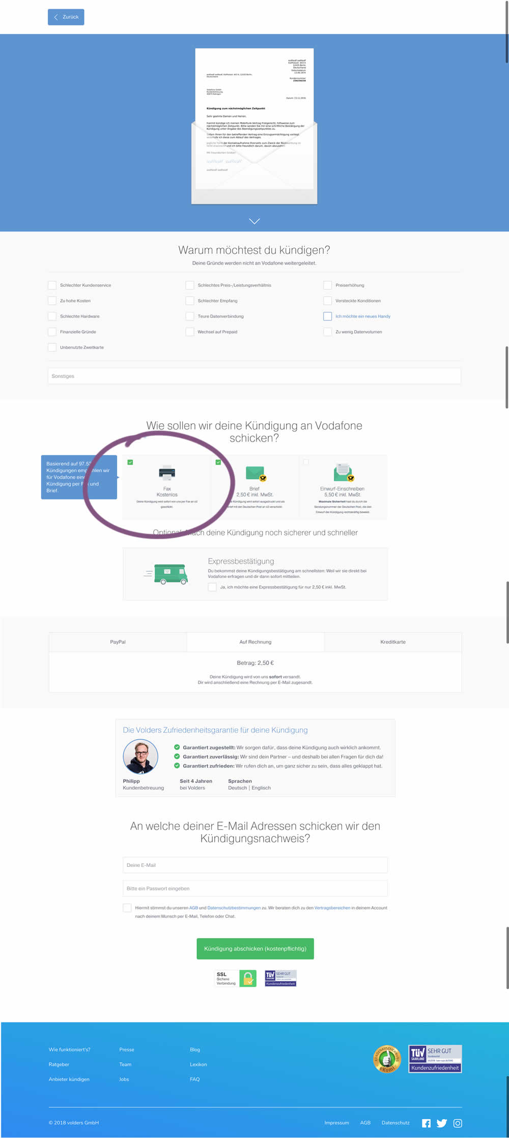
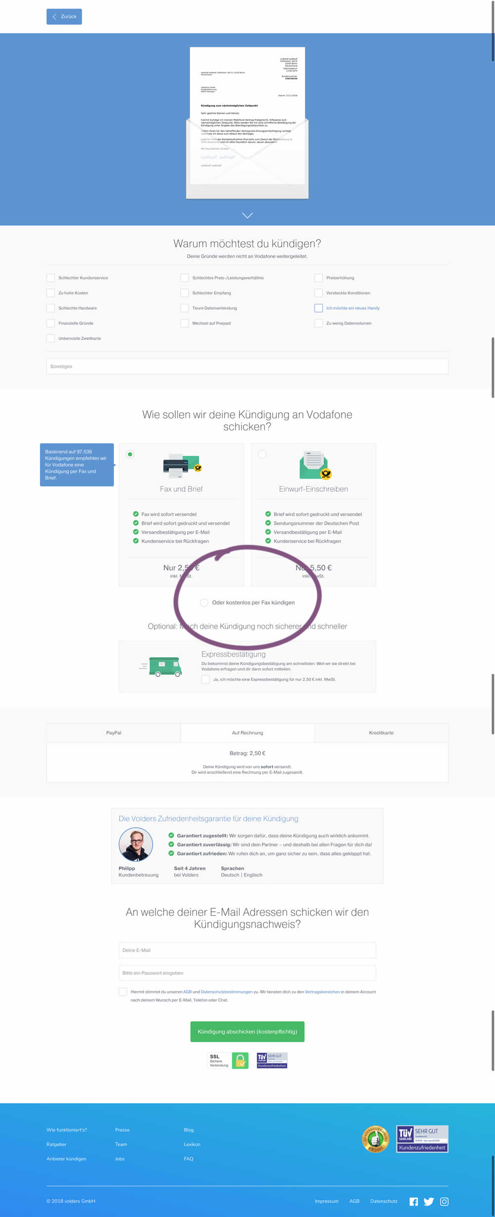
This test deprioritized the free option (kostenlos) of cancelling a contract. It did so by placing it under the paid options as small text link / radio option.
Test #177 on
by  Devesh Khanal
May 17, 2018
Desktop
Shopping Cart
X.X%
Revenue
Devesh Tested Pattern #66: Complementary Upsell
Test #163 on
Lovehoney.co.uk
by  Matthew Curry
Mar 27, 2018
Mobile
Desktop
Product
X.X%
Revenue
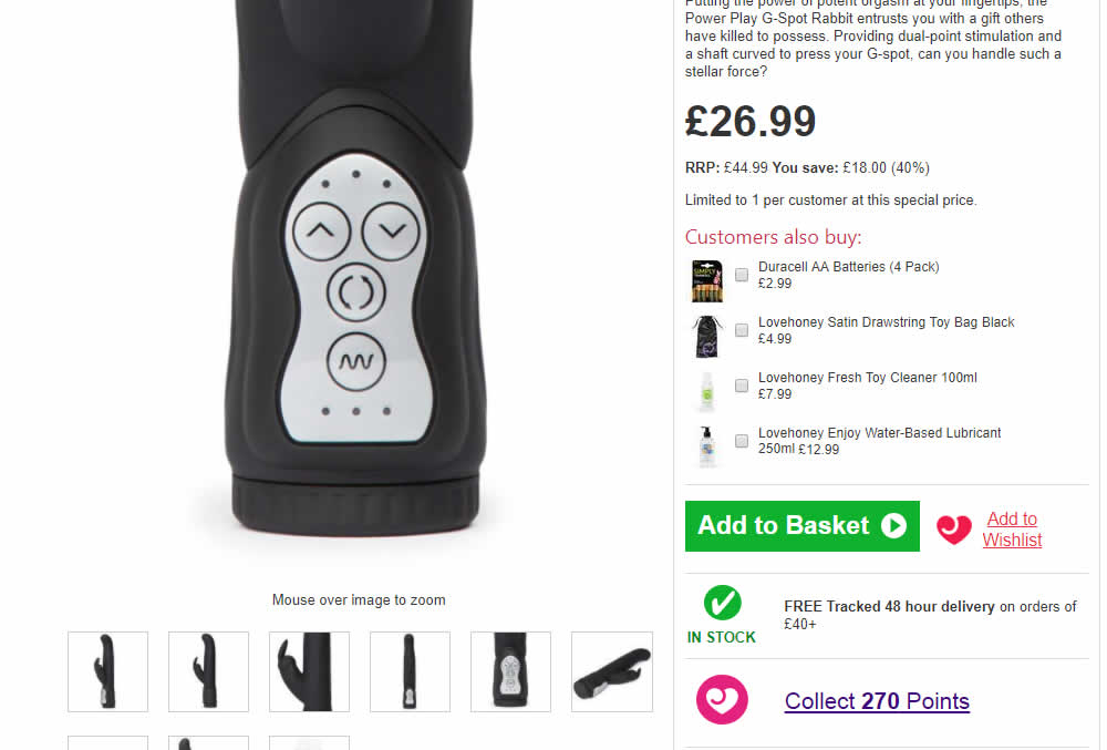
Matthew Tested Pattern #62: Urgent Next Day Delivery On Lovehoney.co.uk

Test #133 on
Bing.com
by  Ronny Kohavi
Dec 13, 2017
Desktop
Mobile
Listing
X.X%
Revenue
Ronny Tested Pattern #43: Long Titles On Bing.com
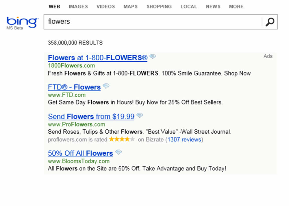
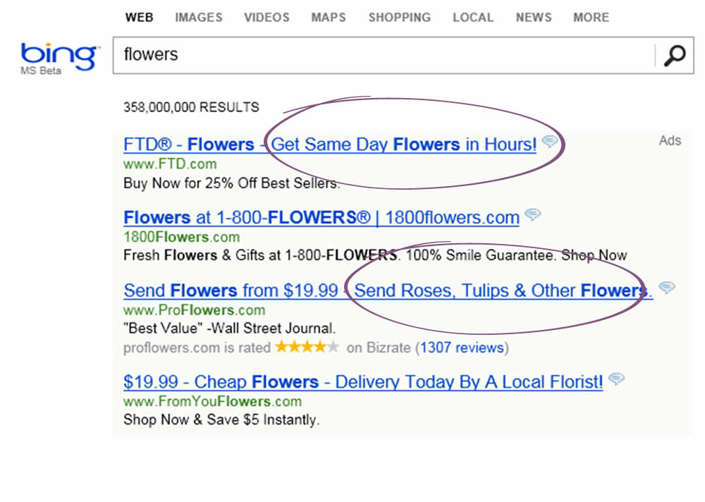
In 2012 a Microsoft employee working on Bing had an idea about changing the way the search engine displayed ad headlines. Developing it wouldn’t require much effort—just a few days of an engineer’s time—but it was one of hundreds of ideas proposed, and the program managers deemed it a low priority. So it languished for more than six months, until an engineer, who saw that the cost of writing the code for it would be small, launched a simple online controlled experiment—an A/B test—to assess its impact. Within hours the new headline variation was producing abnormally high revenue, triggering a “too good to be true” alert.
HBR, September–October 2017 Issue, https://hbr.org/2017/09/the-surprising-power-of-online-experiments
Note: This experiment was a solid success and replicated multiple times over a period of months. It worked at Bing and had a profound influence. The only reason why we atributed a 0.25 point (a "Maybe") was because we don't have the exact sample size and conversion data.
Test #130 on
Kenhub.com
by  Niels Hapke
Dec 07, 2017
Desktop
Pricing
X.X%
Revenue
Niels Tested Pattern #17: Least Or Most Expensive First On Kenhub.com
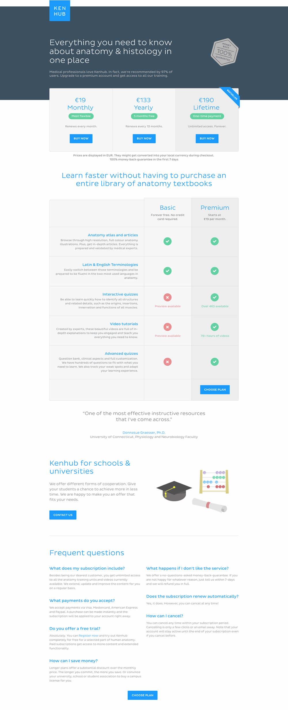
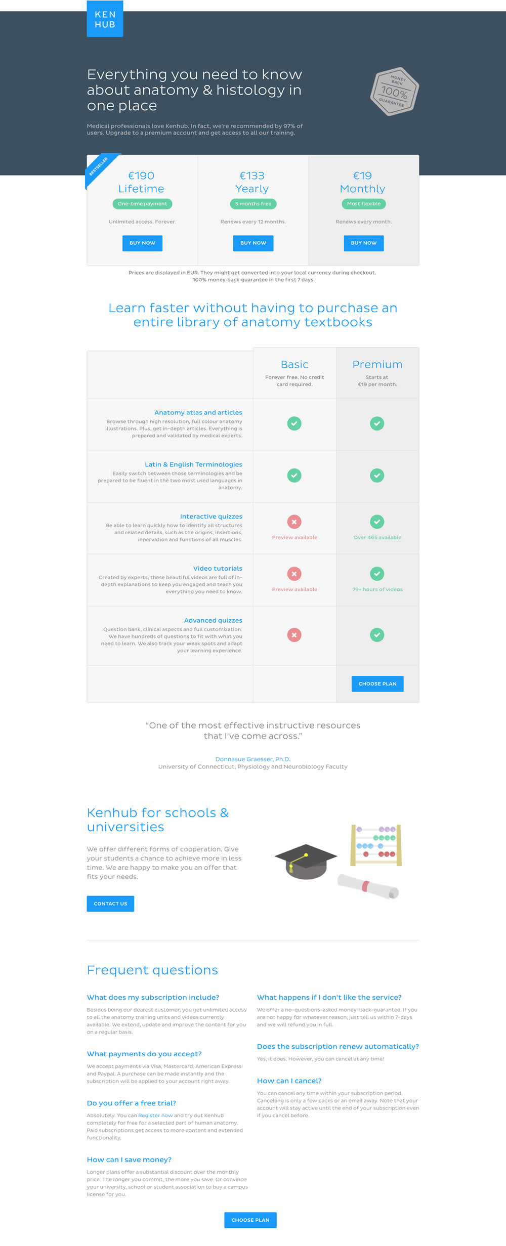
In this experiment, the plans were sorted by the most expensive first, left to right (variation).
Test #70 on
Uptowork.com
by  Kuba Koziej
Nov 01, 2016
Desktop
Pricing
X.X%
Revenue
Kuba Tested Pattern #17: Least Or Most Expensive First On Uptowork.com
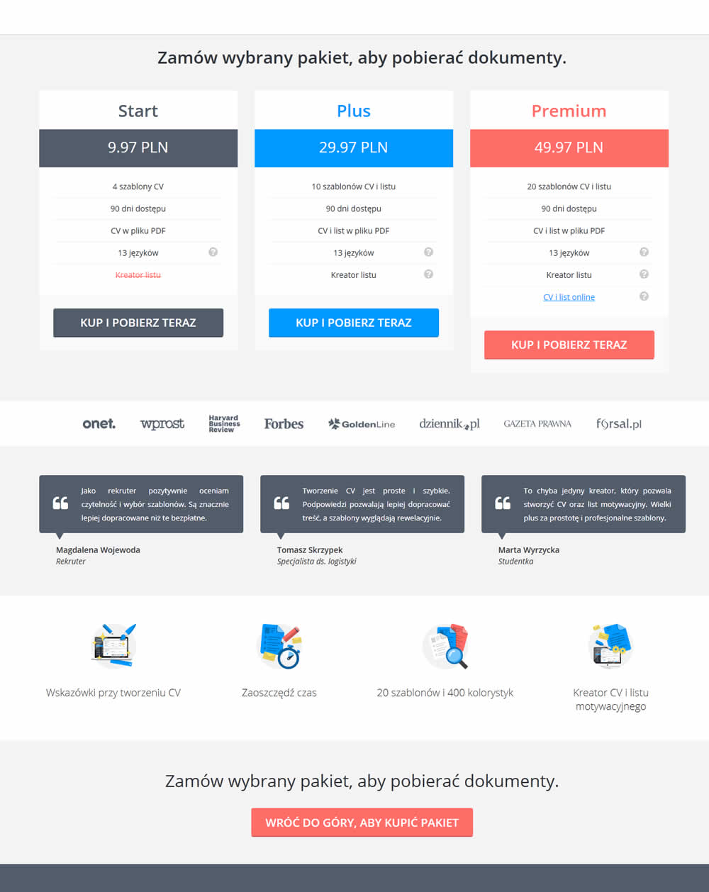
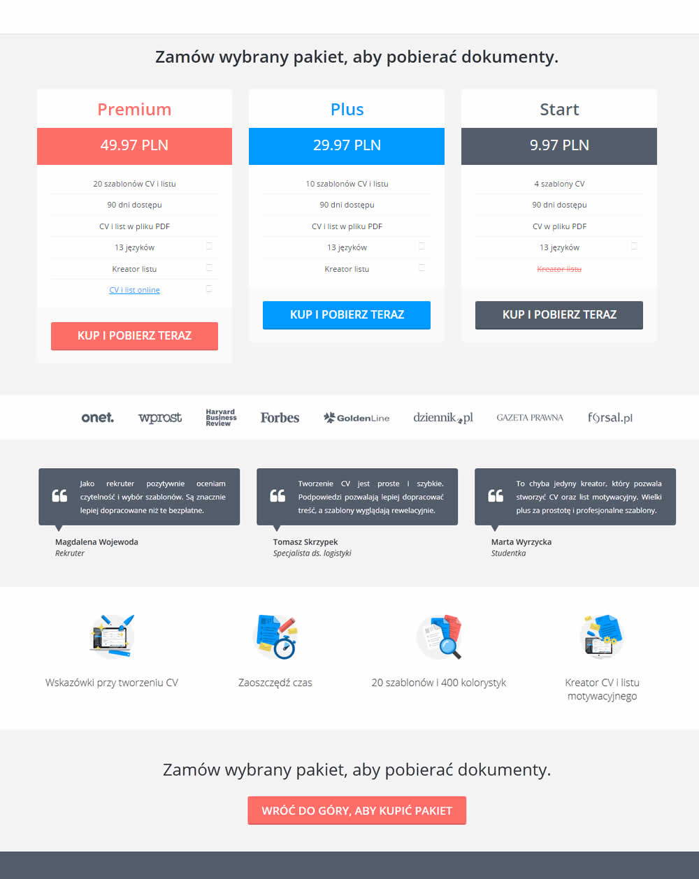
This test simply ordered the pricing plans from highest to most expensive. Overall sales decreased by an insignificant -1% with a possible +14% increase to the most expensive plan. The net effect was an insignificant 0.9% increase the the premium plans.
Test #121 on
Bionicgloves.com
by  VWO
Mar 13, 2015
Shopping Cart
X.X%
Revenue
VWO Tested Pattern #1: Remove Coupon Fields On Bionicgloves.com
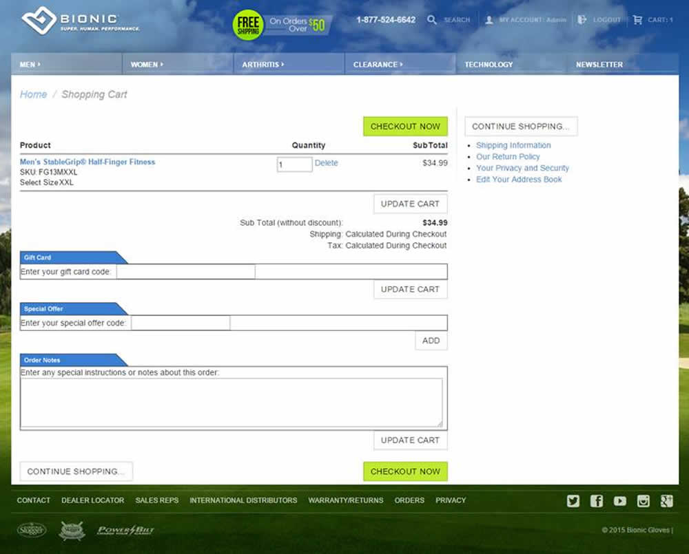
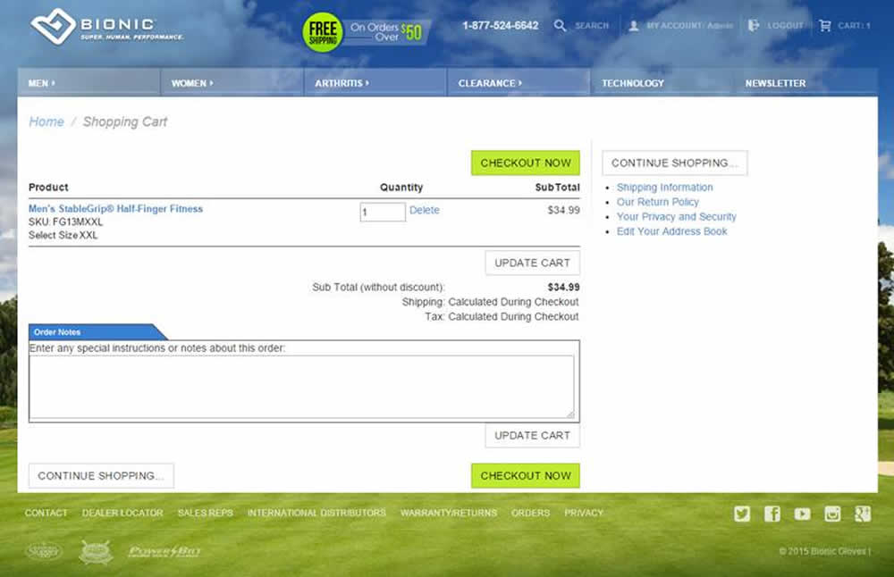
VWO.com published this test which removed two coupon fields on a shopping cart: a gift card code and a special offer code.
Test #129 on
Barackobama.com
by  Kyle Rush
Jun 01, 2012
Desktop
Checkout
X.X%
Revenue
Kyle Tested Pattern #9: Multiple Steps On Barackobama.com
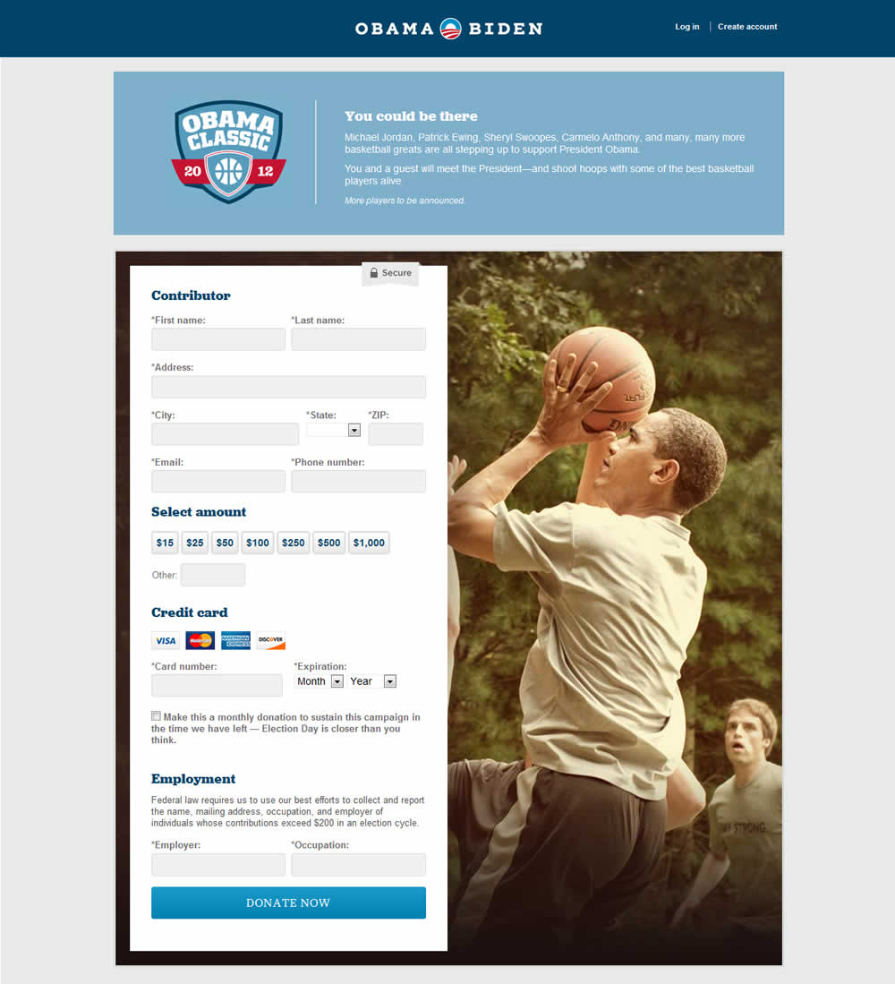
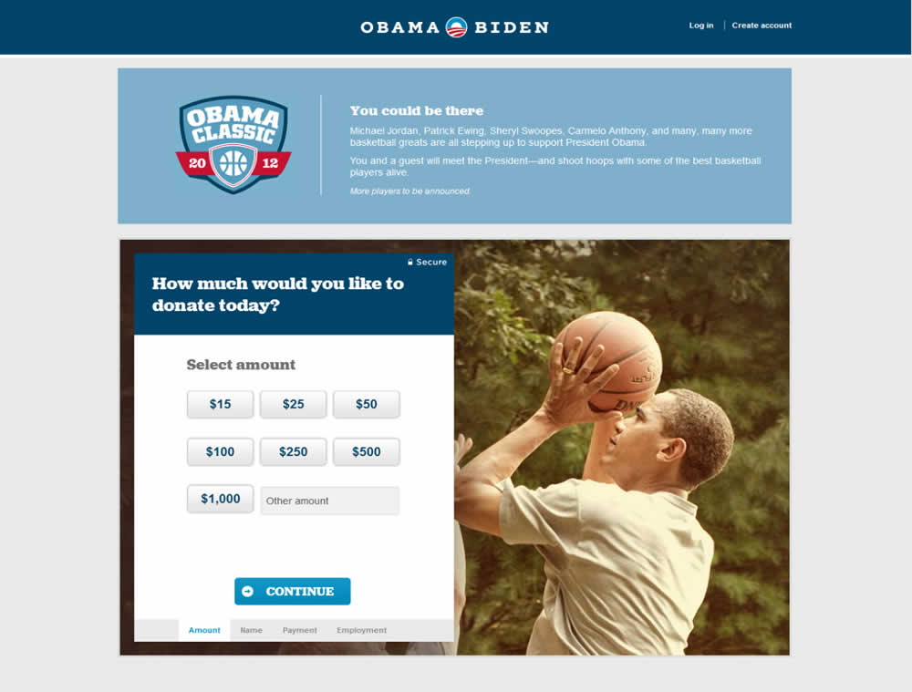
Kyle's team changed a donation form for the Barack Obama 2012 campaign from a single step to a 4 step one. The 4 steps were: amount, personal information, billing information and occupation/employer.
"Our plan was to separate the field groups into four smaller steps so that users did not feel overwhelmed by the length of the form." - Kyle Rush