How Etsy's Product Page Design Evolved Between 2019 And 2020
I recently found a 2019 product page screenshot from Etsy's which was just asking for a comparison with the newer 2020 version from today. By doing this little exercise we can see how the screen has evolved with numerous UI changes - some of which were probably tested while others possibly decided upon. Overall, it looks like the new 2020 layout is a little more condensed (shorter in length), and yet it still managed to increase the size of key information as well as form fields. Here are the 15 changes which I thought were the most interesting ...

B - Apr 21, 2020 Screenshot

Highlighted UI Changes From This Leak
-
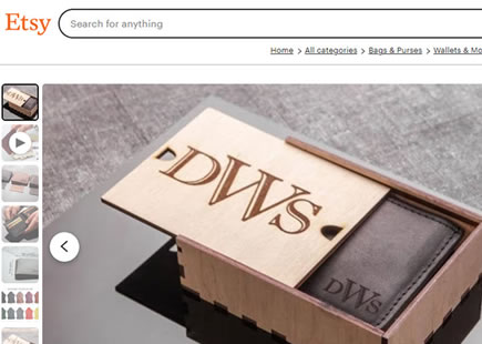
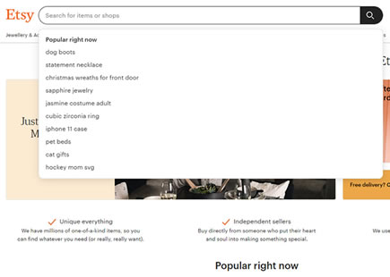
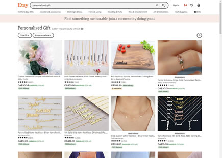
Larger Search Field
The first UI change related to a bigger search field at the top of the page. We also know that this was actually tested in an isolated experiment with some positive effect, covered earlier..
This is very similar to Pattern #97: Bigger Form Fields
-
Left Aligned Image Thumbnails
The small image thumbs changed their position from underneath the big image towards the left of it.
-
Changed Styling Of Slideshow Arrows
Instead of using semi-transparent rectangular slideshow arrows, they were restylized with drop shadows, rounding, and a full opacity white background. Perhaps such styling brings them out more across a range of dark and light images?
-
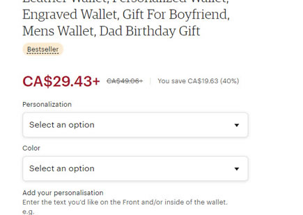
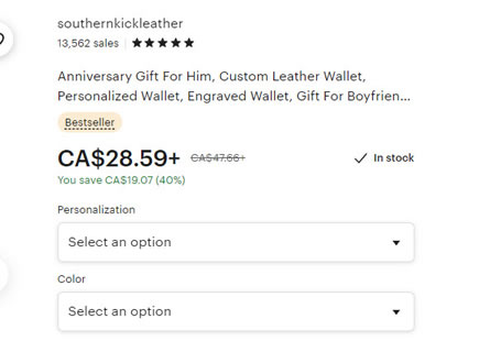
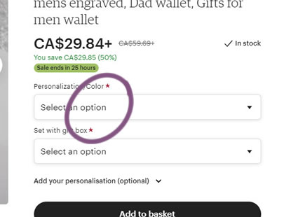
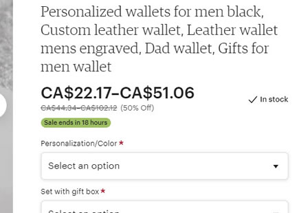
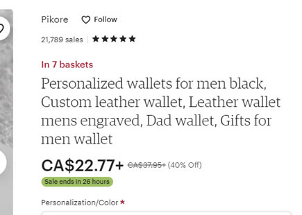
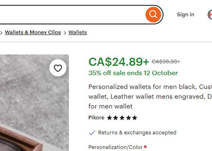
Larger Price
In the 2020 version, the price of the product has been made more visible using a larger font and more padding.
This is very similar to Pattern #114: Less Or More Visible Prices
-
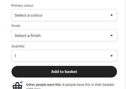
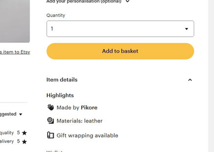
Larger Form Fields
Notice how most of the field elements gained in size, along with a font-size increase.
This is very similar to Pattern #97: Bigger Form Fields
-
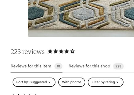
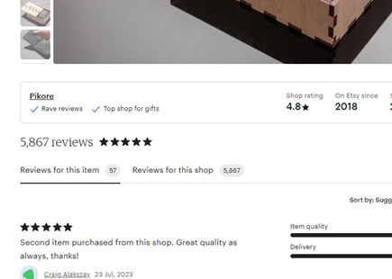
More Emphasis On Customer Star Ratings And Number Of Reviews
The customer reviews along with the review counts have also increased in size.
This is very similar to Pattern #6: Customer Star Ratings
-
Distinction Between Shop & Product Reviews
Interestingly, reviews have been organized into two tabs. One for shop reviews and another set for product reviews (defaulted of course).
-
Condensed And More Complete Reviews
The actual customer reviews have been condensed by removing large inline authentic customer photos. And yet, some truncation has been relaxed by allowing more complete multiple-line reviews to be displayed.
-
Exposed Pagination
Comparing the old version to the newer 2020 one, we can see that a tiny "more" link for customer reviews has been replaced with more exposed pagination - most likely making it clearer that there are more reviews.
This is very similar to Pattern #14: Exposed Menu Options
-
Larger Authentic Customer Photos
The size of the customer submitted photos has been increased, decreasing their maximum display from 5 photos to 4.
This is very similar to Pattern #30: Authentic Photos
-
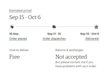
Larger Availability Information
Information about when an item can be shipped and when it can arrive has been drastically increased in size.
This is very similar to Pattern #24: Visible Availability
This is very similar to Pattern #62: Urgent Next Day Delivery
-
Simpler Returns Information
In the older version, a full section about detailed returns has been displayed. In the newer version, all of this has been simplified into a few lines of text - with the ability to see detailed store policies.
-
More Visible Seller Contact Action
The new version has a more prominent "Contact Seller" button.
-
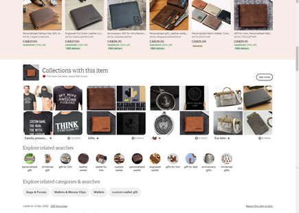
Unique Style For Other Products From The Same Store Owner
A unique background color has been used to differentiate between other products from the same store owner (skin tone background), vs other products from other sellers (white background and further down).
-
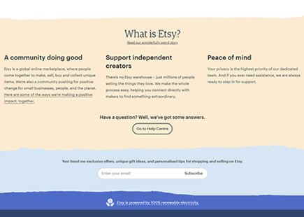
Darker Footer
Finally, the footer has been differentiated from the core screen with a darker background color.
Comments
Sebbe 6 years ago ↑1↓0
Thank you Jakub, for this overview - showcasing better UI patterns in practice.
Reply