Discover UI Design Decisions Of Leading Companies,
From Leaked Screenshots & A/B Tests.
Showing 112 results
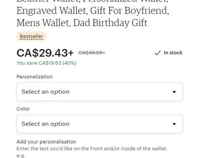
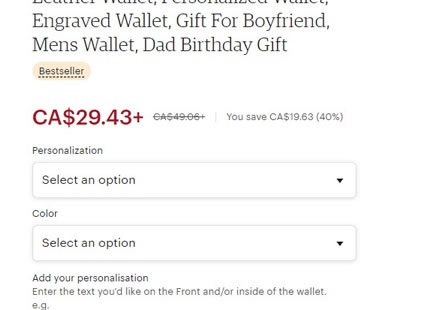
Etsy A/B Tests A Different Price Style
Etsy just ran an a/b test of how prices were displayed on their product pages. The three related changes were detected as a single variation and it now seems like the experiment ended up being rejected - suggesting a loss or insignificant outcome. Although the changes were confounded, based on some positive data related to showing availability, perhaps removing the "In stock" copy was one change too many. Here is what the experiment looked like: View Leak
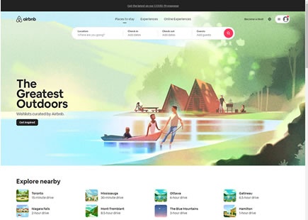
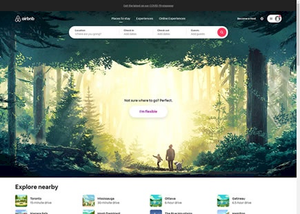
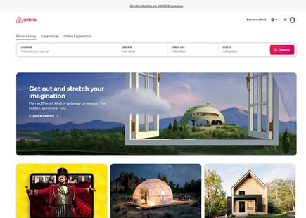
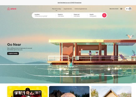
Airbnb Discovers A Better Way To Let Customers Explore Listings
It looks like Airbnb once again ran an exciting experiment where they sought a better way to let customers explore property listings. I managed to detect an a/b test with changes to the homepage button which then spilled over into more changes on the listing page. I'll also admit that I am not 100% sure whether this was one bigger experiment on both pages or two separate ones. Either way, here are some of the particular differences I found really interesting ... View Leak
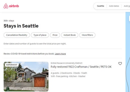
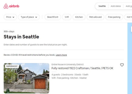
Airbnb A/B Tests More Filters On Their Listing Screens With This Outcome
Here is a filter experiment I managed to detect on Airbnb's listing pages a few months ago. At the outset it looks like Airbnb was simply trying to add more filter options, but in reality there are at least three changes confounded together. If we break these changes up into individual patterns we might learn that some of them might be better than others. Perhaps this combination or interaction of both negative and positive changes could be an explanation as to why it looks like the variation was eventually rejected. View Leak
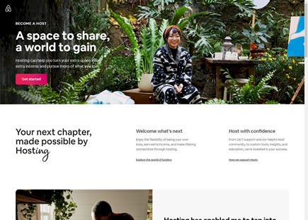
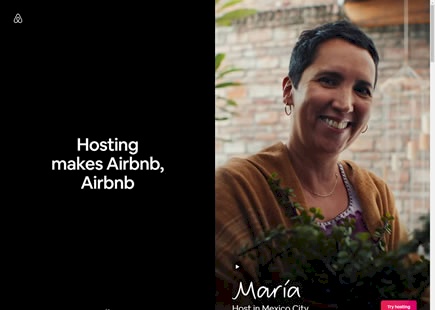
Airbnb Runs A Successful Leap Redesign Experiment For New Hosts
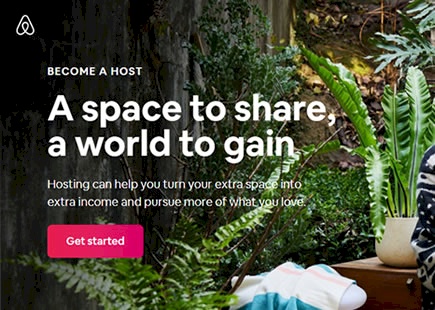
Airbnb just completed testing and rolling out a successful variation for their new host landing page. The interesting thing about this experiment is that it was a leap a/b test containing many changes (some of which are being followed up with small scale a/b tests as I'm writing this). Here is my take on some of the changes along with the corresponding patterns. View Leak
Airbnb A/B Tests And Rejects A Natural Language Form
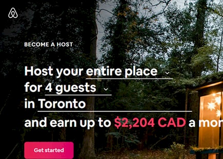
Airbnb just completed an interesting experiment on their Become A Host landing page. They replaced a simple headline with a more dynamic natural language form that provided a sense of how much money someone could make from hosting their place. View Leak
Amazon A/B Tests And Rolls Out Product Reassurances
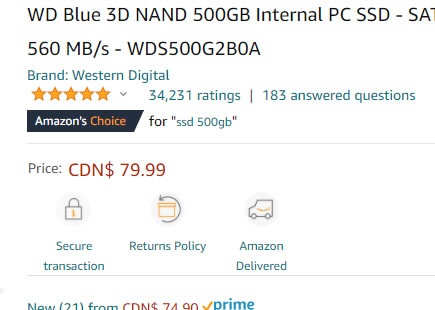
Amazon (Canadian) recently ran this A/B test where they added these three little reassurances on some of their products. This experiment is similar to the maturing Benefit Bar pattern that addresses common objections to a purchase. View Leak
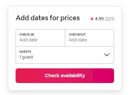
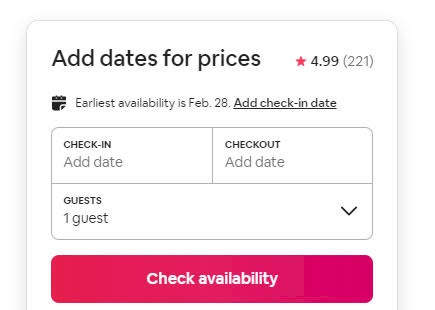
Airbnb Once Again Rejects Next Available Date Suggestions
Once again Airbnb a/b tested an idea of surfacing the next available dates near their calendar picker. And once again the experiment looks like it was rejected just like previously. View Leak
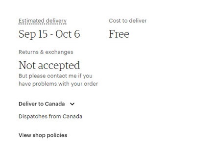
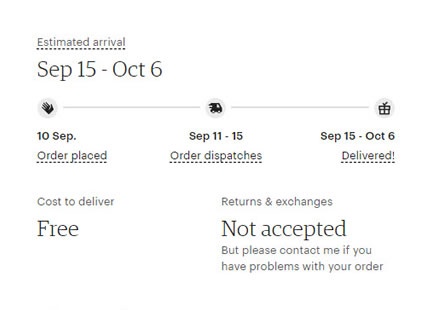
Etsy A/B Tests A Winning Shipping Timeline
Etsy ran an interesting experiment on their product pages by trying to clarify the shipping process. In this a/b test we can see that the control version displayed a simple delivery range with text. Whereas the variation displayed a linear shipping timeline with 3 steps - possibly creating a stronger sense of urgency. Checking up on this a few months later, we detected that the variation was implemented. View Leak
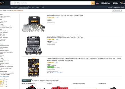
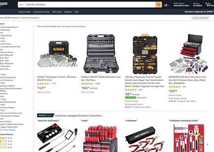
Amazon A/B Tests The List Vs Grid Layout
A month ago I managed to detect this classic list vs grid layout experiment on two of Amazon's product listing pages. I learned that this a/b test ran at least on two random queries such as "tools for mechanics" and "sports gear". Today, the grid layout view now looks like it was implemented. View Leak
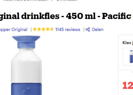
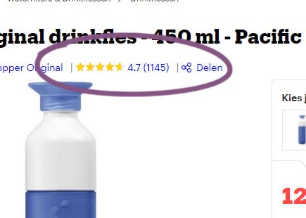
Bol Replicates Airbnb's Experiment Which Confirms A Better Customer Rating Format
Bol has been noticed a/b testing at least 3 different versions of customer rating formats on their product detail pages. More interestingly, whether the e-commerce giant is aware of it or not, this can be considered a direct replication of a very similar Airbnb A/B test ran in the past. View Leak
Airbnb Gets Creative In This Multiple Variation Homepage Experiment
I love how Airbnb balances formal controlled experiments (containing single isolated changes) with more exploratory ones such as on this one here. They just completed a creative homepage experiment where they tested multiple variations with multiple changes of which I will show a selected few for simplification. View Leak
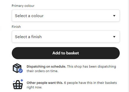
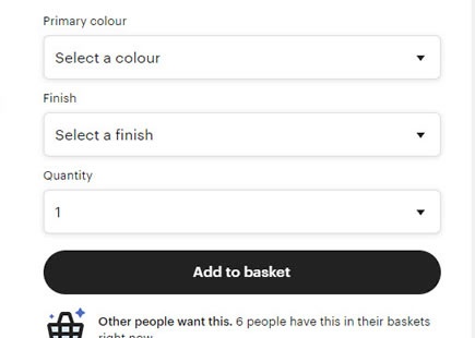
Etsy's Product Quantity Options Receive A Confirmation From This A/B Test
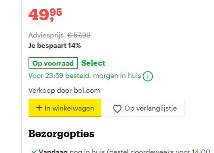
Etsy was noticed a/b testing a product quantity pulldown menu on some of their products. Customers were basically given the option to purchase more than one item. View Leak
Airbnb Rejects Auto Suggested Dates In This Failed A/B Test
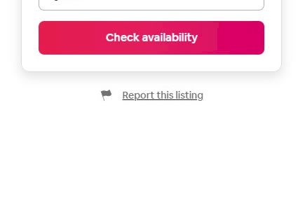
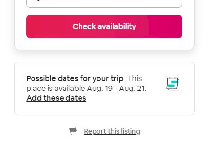
Not all experiments succeed including this one that Airbnb recently ran on their property pages. Their a/b test was automatically suggesting a next available date below the "Check Availability" button when someone didn't already have any chosen dates. A month later however, the experiment completed and was rejected. View Leak
Amazon Discovers That Showing Structured Product Details Is Better
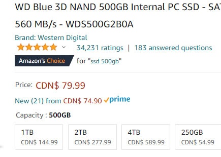
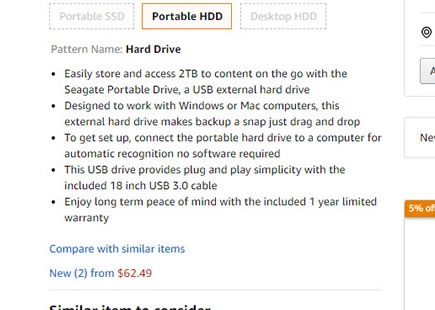
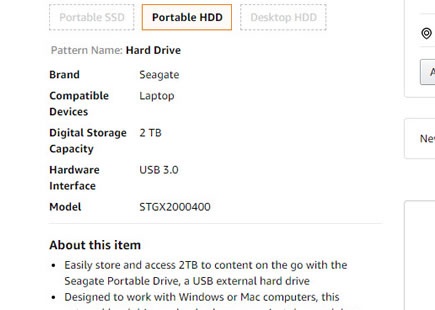
Amazon has been seen a/b testing the addition of product details or technical specifications, visibly above the fold. In this captured screenshot for example, we see such technical information as storage size, model numbers and types of interfaces. Interestingly, this change was rolled out when the experiment finished - hinting at a positive probability. View Leak
Airbnb A/B Tests And Discovers That A Higher Button Position Is Better
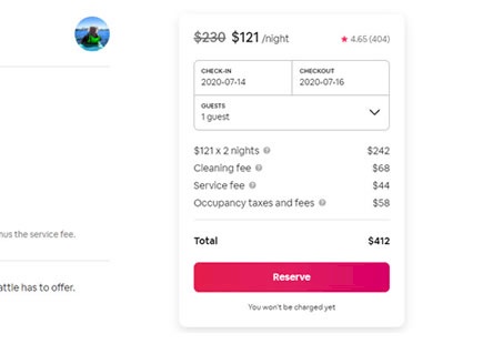
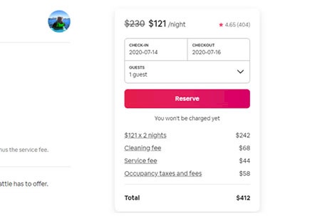
Airbnb ran this wonderful experiment on one of their primary reservation buttons. The A/B test adjusted the position of the button, shifting it higher on all property pages - which was implemented once ended. View Leak
Amazon Finally A/B Tests Their Full Vs. Fixed Width Layout In This Experiment
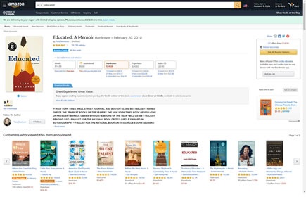
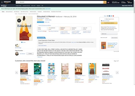
Amazon just completed this wonderful product page layout experiment. The experiment was visible on wider monitors where the main content column was set to either full width (control) or fixed to 1500 pixels (B variation). View Leak
Bol Discovers That Showing Product Quantity Options Is Better In This Experiment
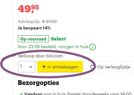
In this interesting e-commerce experiment, Bol displayed a simple product quantity option on some of their product pages. When the experiment completed this month, the variation with the change was rolled out - potentially hinting at some positive effect. View Leak
Airbnb A/B Tests And Detects A Better Placement For Saving Properties
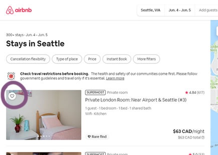
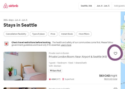
It looks like Airbnb just discovered a better placement for the "heart icon" that allows users to save properties to custom lists. Instead of placing the icon directly over property thumbnails (as in the control), it was A/B tested with a rightmost position of a wide listing - and eventually implemented. View Leak
Bol A/B Tests And Rolls Out Expanded Color and Brand Filters
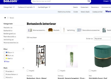
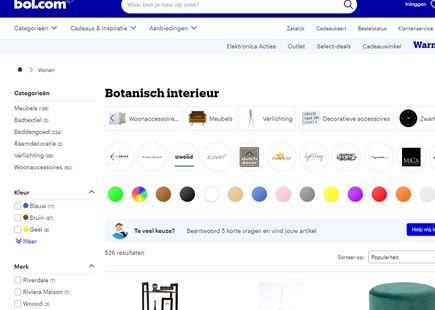
I managed to detect a nice little experiment on Bol's listing screen with at least 2 cascading variations. The experiment expanded more horizontal filters providing customers to narrow their search results with color and brand options. View Leak
Netflix A/B Tests Displaying A Password Field Which Fails And Gets Rejected
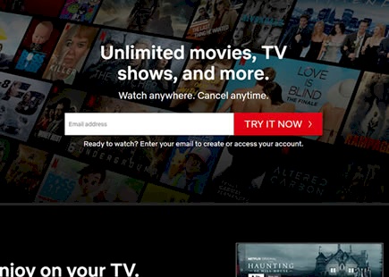
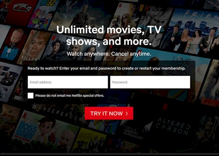
It looks like Netflix has been iterating on showing additional fields upfront on their homepage. After they succeeded at displaying an email address upfront, this experiment now takes next step of showing a password field. The result of the leaked experiment however suggests a negative outcome as they reverted back to the control version - without the visible password. View Leak
