All Latest 620 A/B Tests
Test #619 on
Aboalarm.de
by  Katharina Lay
Nov 23, 2025
Desktop
Mobile
Checkout
X.X%
Revenue
Katharina Tested Pattern #15: Bulleted Reassurances On Aboalarm.de
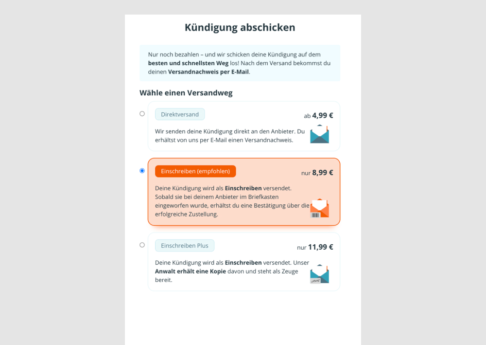
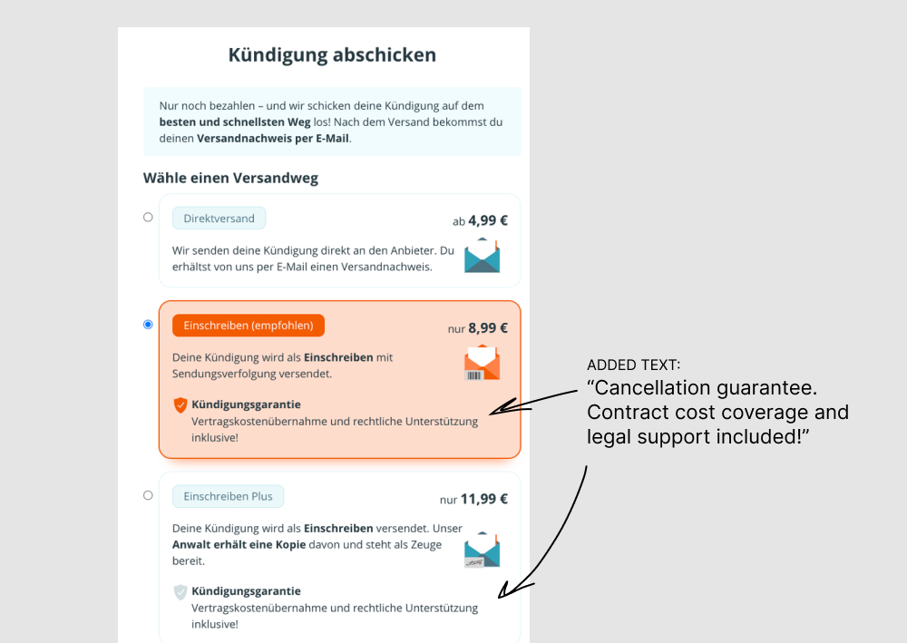
In this experiment, reassuring copy was added to 2 of 3 pricing plans of a contract cancellation service. The copy was translated as "Cancellation guarantee. Contract cost coverage and legal support included!” Impact on overall revenue was measured.
Which A Or B Actually Wins? Find Out Before You Test.
Members see every test result — the winners, the flat ones, and the losers — along with exact effects and sample sizes. Use it to estimate your tests and prioritize by probability, not gut feel. Start every experiment with the odds on your side.
Test #605 on
by  Jakub Linowski
Aug 21, 2025
Desktop
Mobile
Product
X.X%
Revenue
Jakub Tested Pattern #113: More Or Fewer Plans
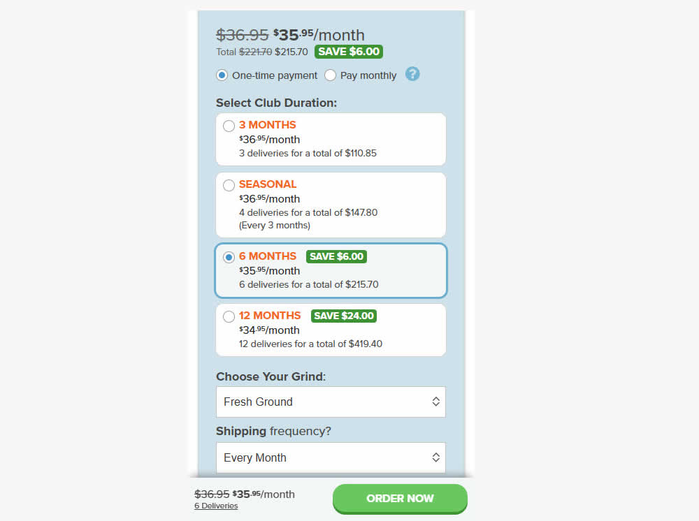
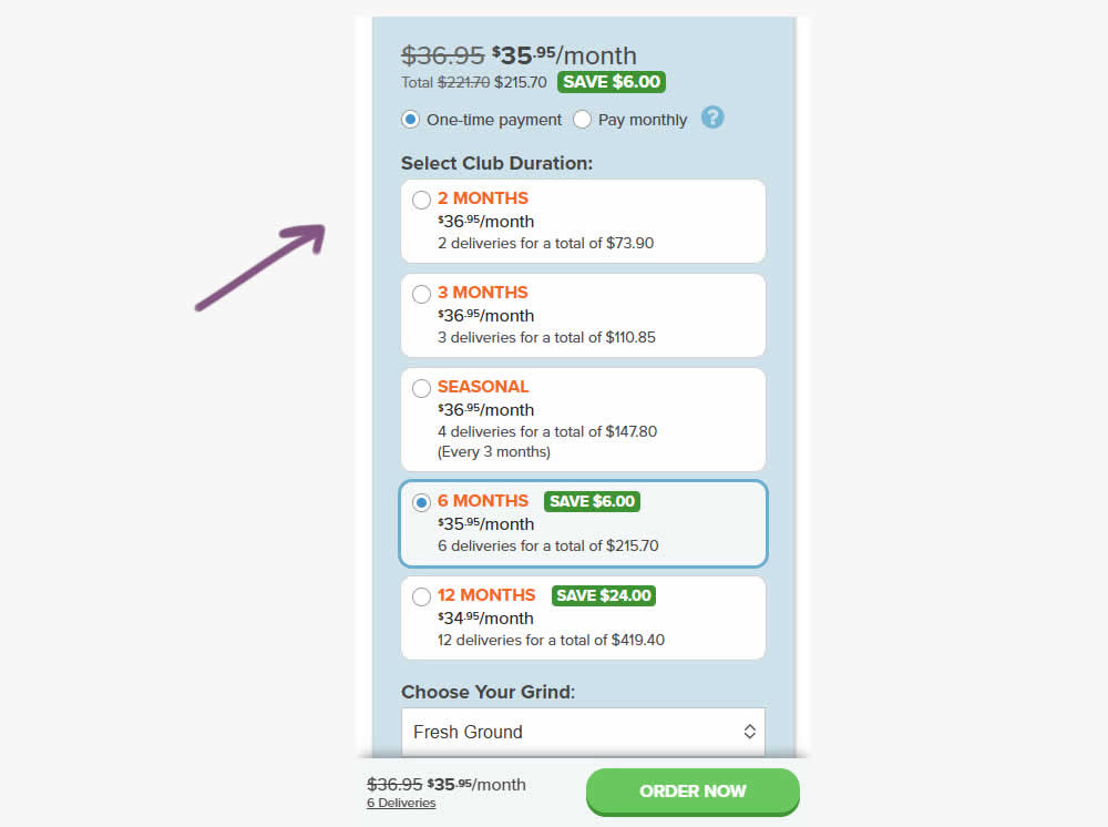
A less expensive product choice (club duration) was added at the beginning of the options. Impact on adds-to-cart, sales and revenue were measured.
Test #566 on
Banter.com
by  Craig Kistler
Dec 11, 2024
Desktop
Product
X.X%
Revenue
Craig Tested Pattern #66: Complementary Upsell On Banter.com
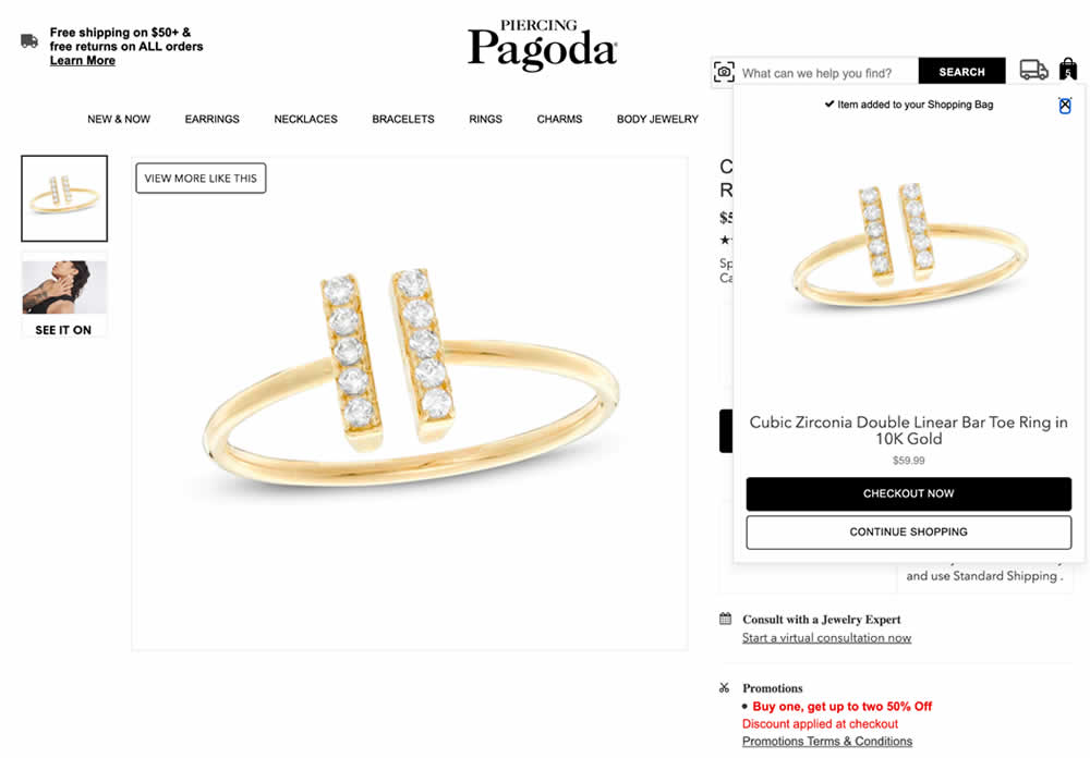
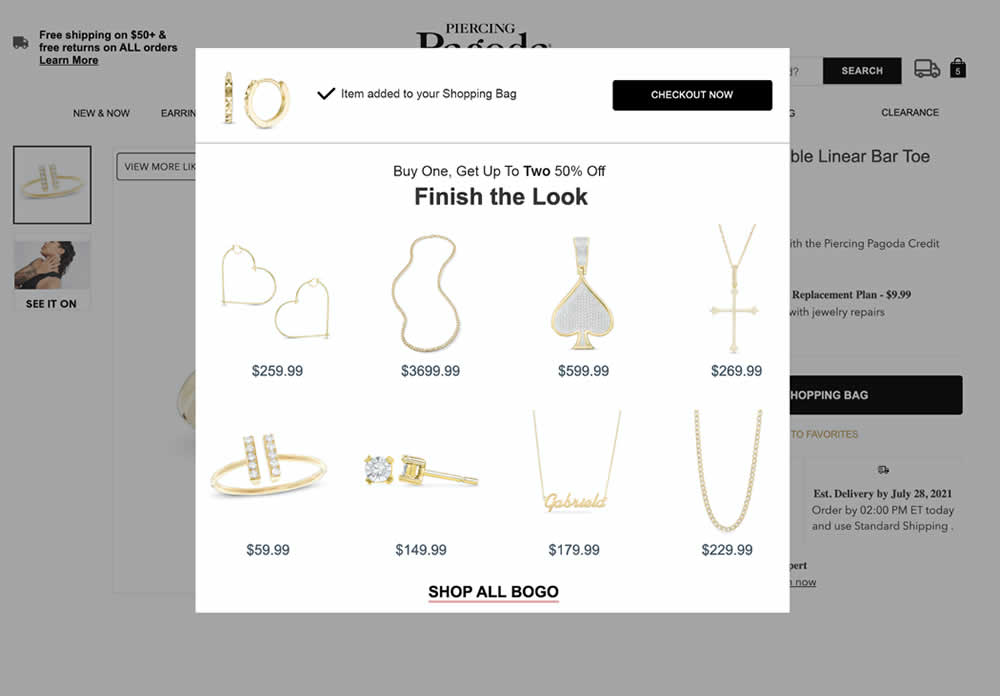
In this experiment, a modal based message was shown to encourage extra products being added as complementary upsells. In the control, the promotion text appeared at the bottom as red text ("Buy one, get up to two 50% Off"). Whereas in the variation, specific products were shown on the modal (post add-to-cart). Impact on adds-to-cart, sales and average revenue was measured.
Test #556 on
Snocks.com
by  Melina Hess
Oct 08, 2024
Mobile
Product
X.X%
Revenue
Melina Tested Pattern #65: Add More For Extra Incentive On Snocks.com
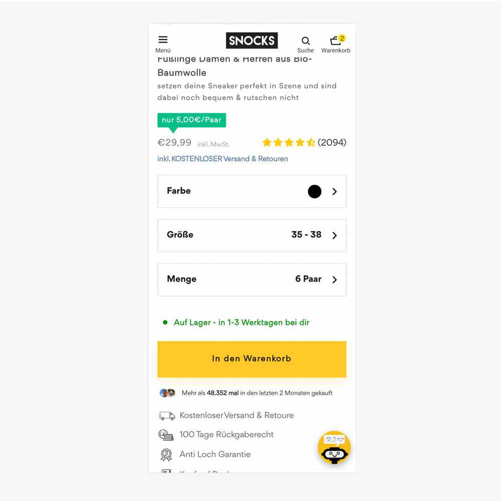
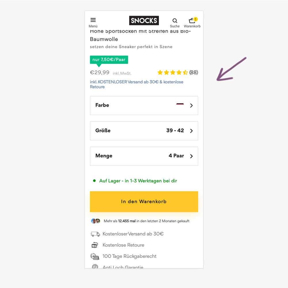
In this experiment, free shipping was a/b tested against free shipping with a 30€ purchase or higher. Hence, in the variation, customers needed to reach a cart amount total in order to be eligible for the free shipping.
Test #553 on
Online.metro-cc.ru
by  Andrey Andreev
Sep 27, 2024
Mobile
Desktop
Checkout
X.X%
Revenue
Andrey Tested Pattern #69: Autodiscounting On Online.metro-cc.ru
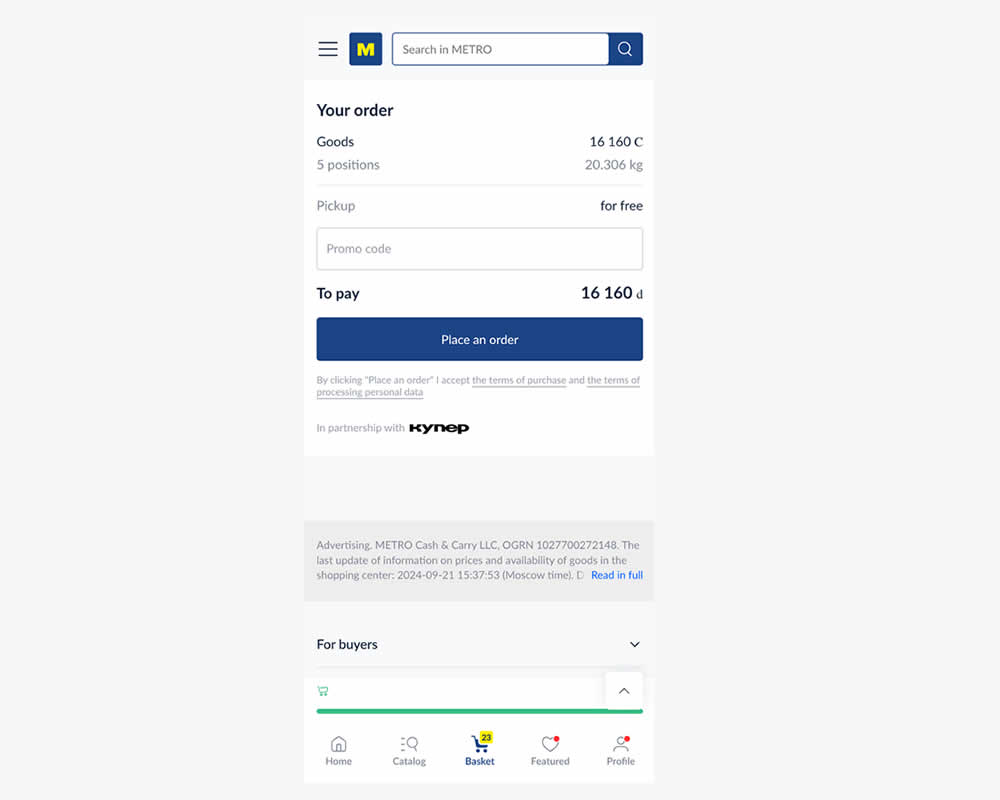
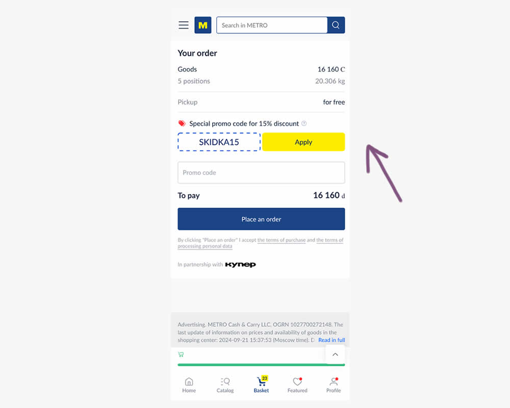
In this experiment, a preset coupon code with -15% amount and an easy to "apply" button was shown to new users who have never made a purchase. In the variation, the an empty coupon field was shown. Impact and transactions and revenue was measured.
Test #548 on
Livefresh.de
by  Melina Hess
Aug 13, 2024
Desktop
Mobile
Product
X.X%
Revenue
Melina Tested Pattern #17: Least Or Most Expensive First On Livefresh.de
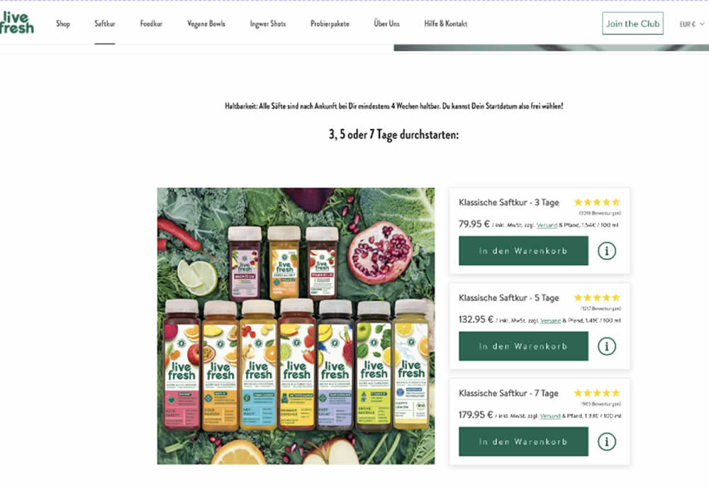
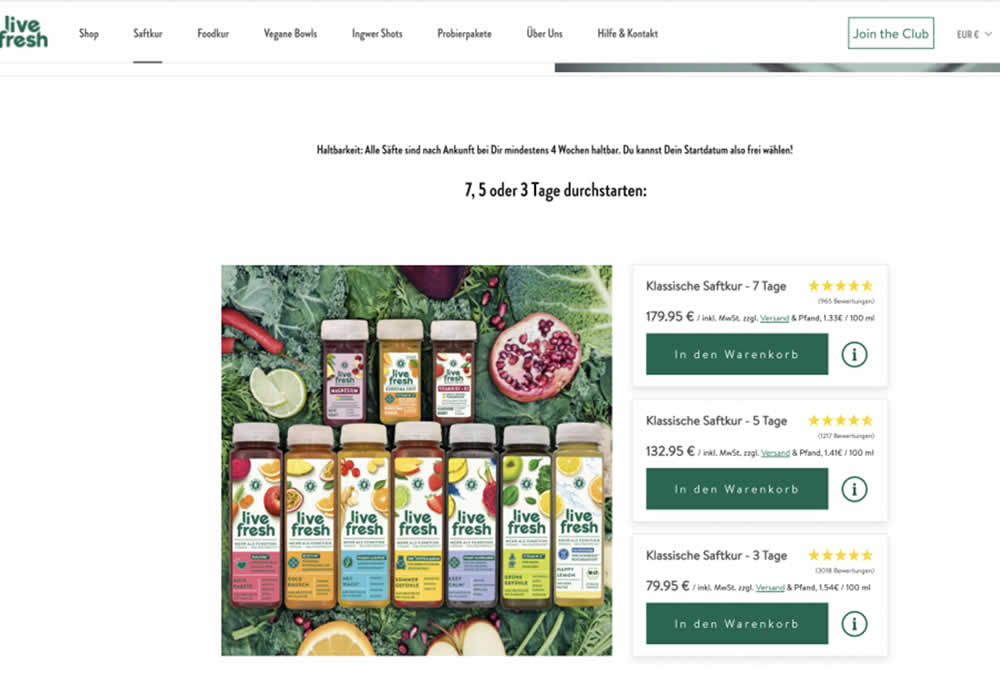
In this product landing page experiment, the plan sort order was rearranged. In the control it was sorted from least expensive to most expensive. In the variation, the plans were shown as most expensive first. Impact on sales and revenue was measured.
Test #545 on
Banter.com
by  Craig Kistler
Jul 29, 2024
Desktop
Product
X.X%
Revenue
Craig Tested Pattern #66: Complementary Upsell On Banter.com
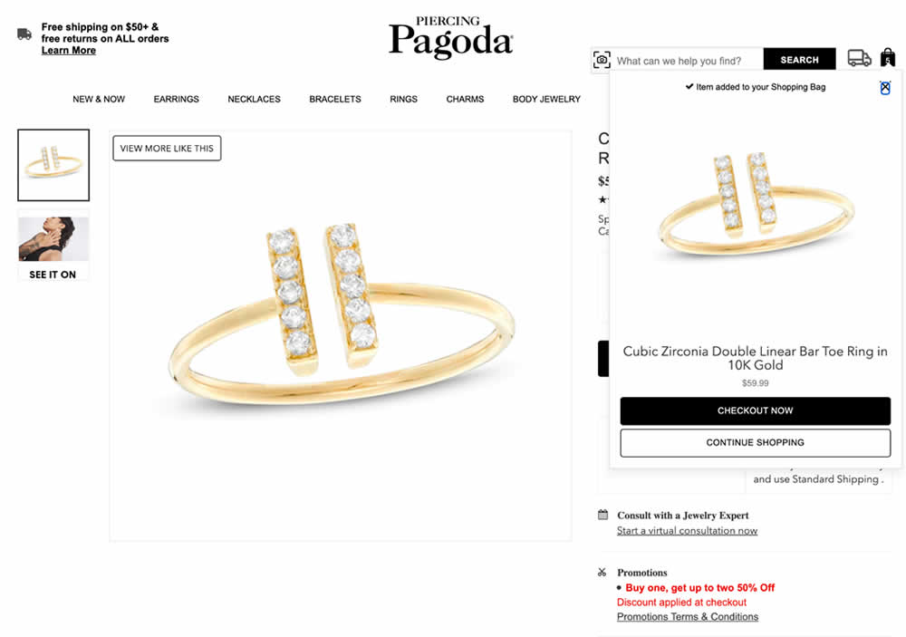
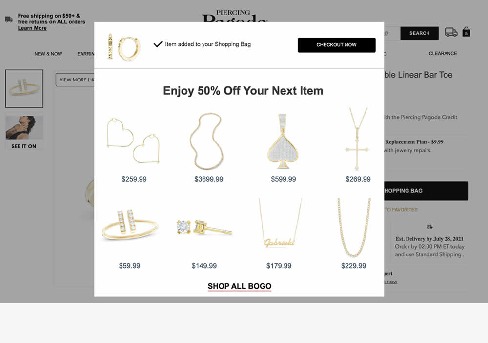
In this experiment, a modal based message was shown to encourage extra products being added as complementary upsells. In the control, the promotion text appeared at the bottom as red text ("Buy one, get up to two 50% Off"). Whereas in the variation, specific products were shown on the modal (post add-to-cart). Impact on adds-to-cart, sales and average revenue was measured.
Test #524 on
Jared.com
by  Craig Kistler
Mar 26, 2024
Mobile
Listing
X.X%
Revenue
Craig Tested Pattern #79: Product Highlights On Jared.com
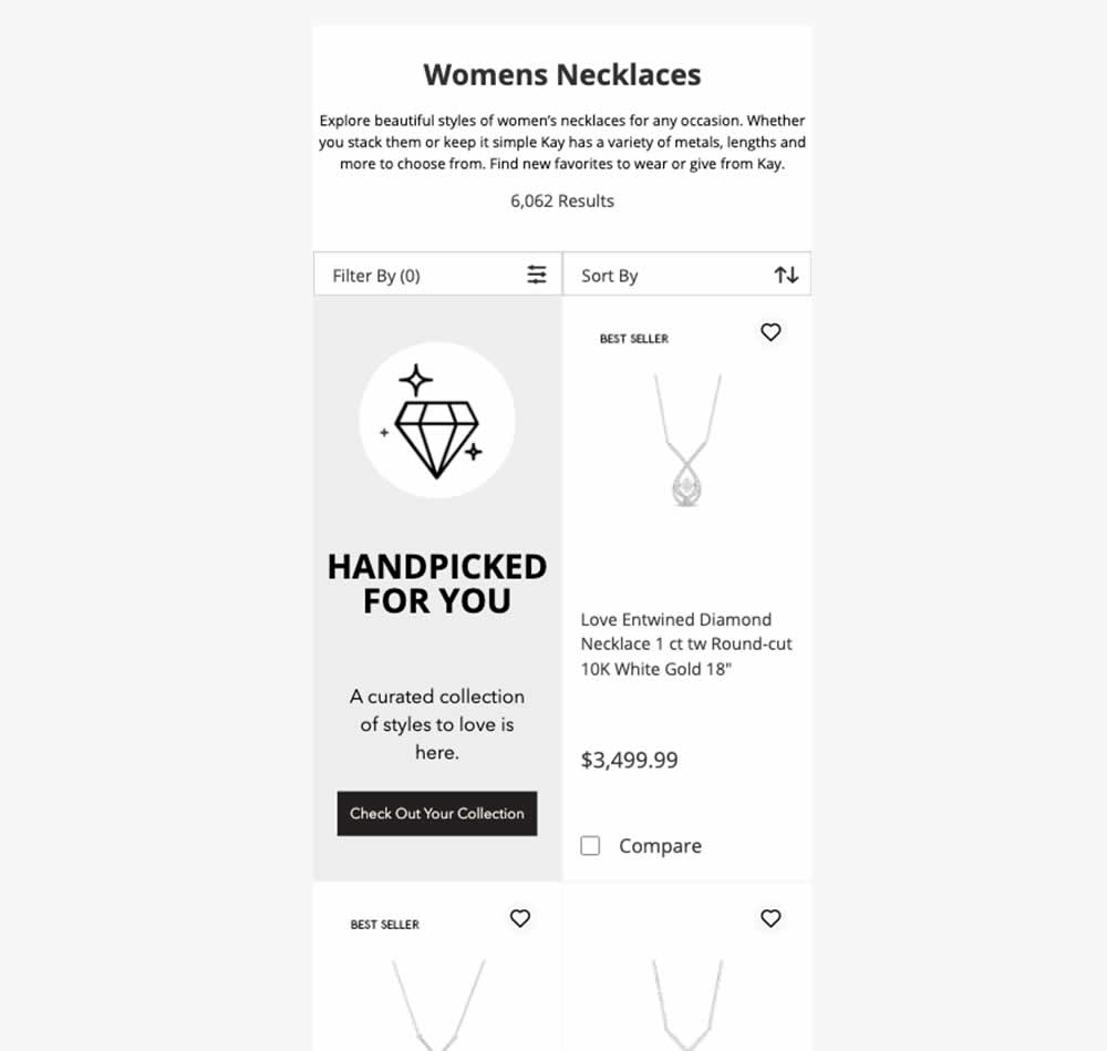
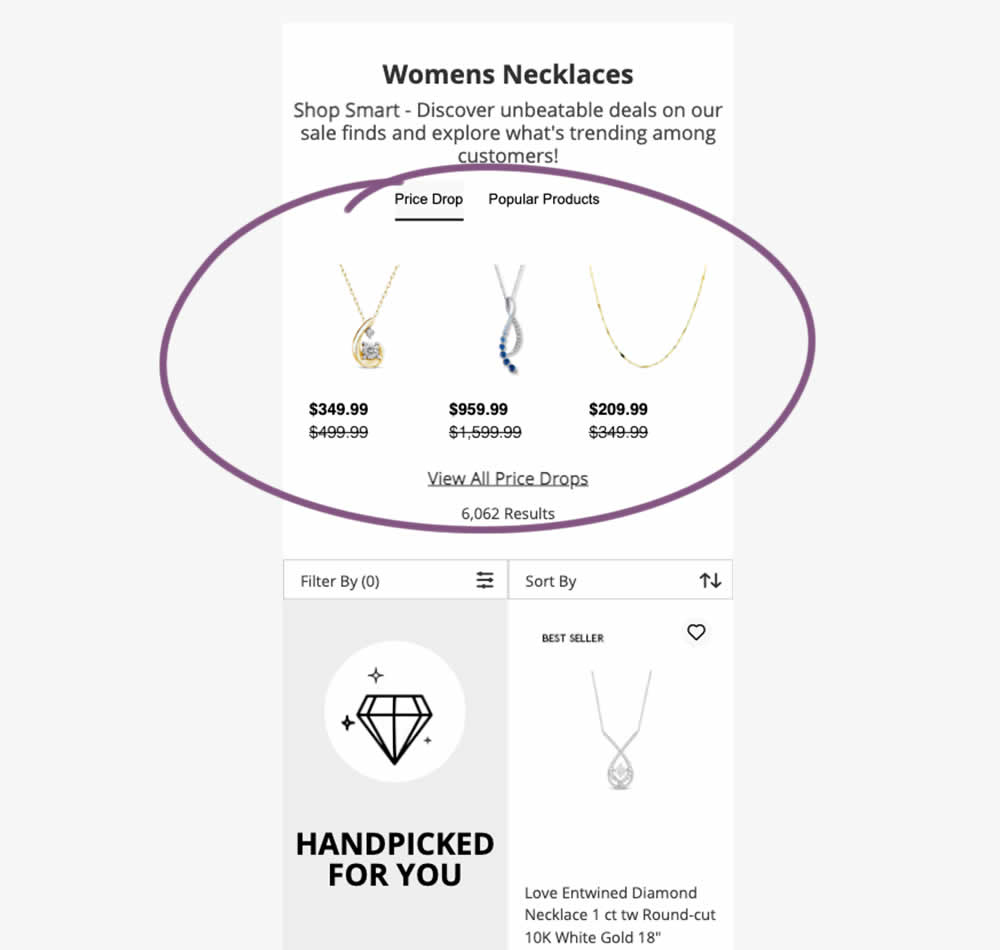
In this experiment, additional (discounted) products were shown at the top of category listing pages with a link to see more such products ("View All Price Drops"). Impact on overall sales was measured.
Test #520 on
Asics.com
by  Andrey Prokhorov
Feb 29, 2024
Mobile
Product
X.X%
Revenue
Andrey Tested Pattern #51: Shortcut Buttons On Asics.com
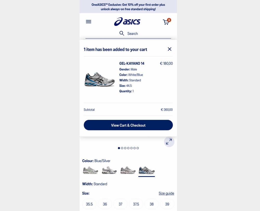
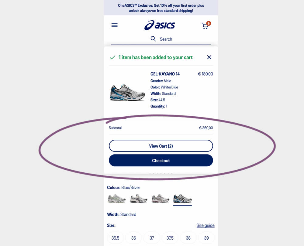
This experiment started when users would click add-to-cart on product detail pages. In both the control and variation, a modal would appear. In the control the modal contained a "View Cart and Checkout" button that lead users to the cart page. In the variation the modal showed separate "View Cart" and "Checkout" buttons. The a/b test variation also introduced a green confirmation message about the product being added to cart. Impact on transactions and revenue was measured.
Test #517 on
Aboalarm.de
by  Daria Kurchinskaia
Feb 12, 2024
Desktop
Checkout
X.X%
Revenue
Daria Tested Pattern #78: Tags, Badges And Structured Information On Aboalarm.de
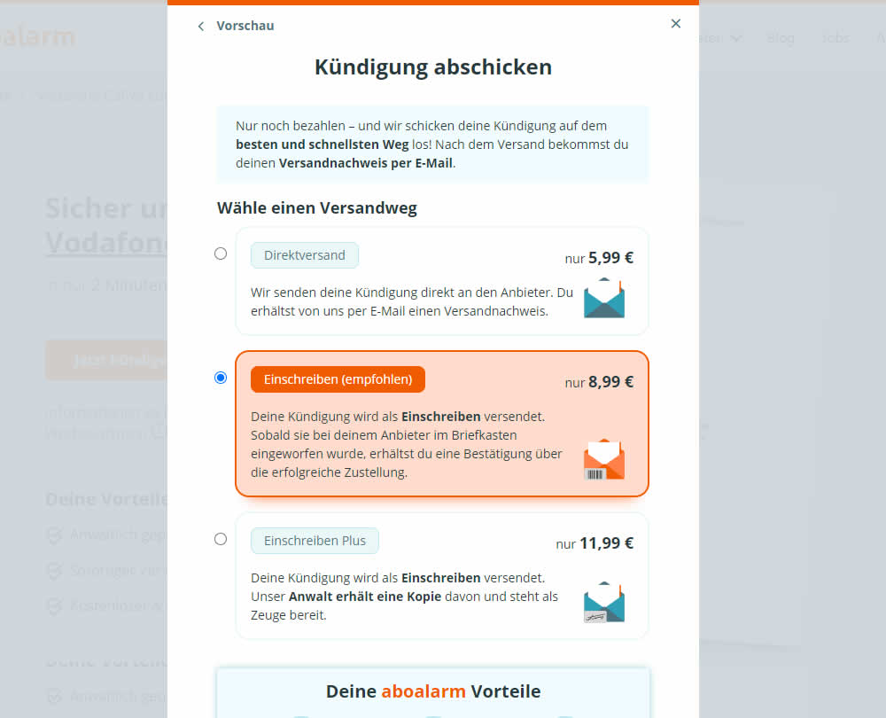
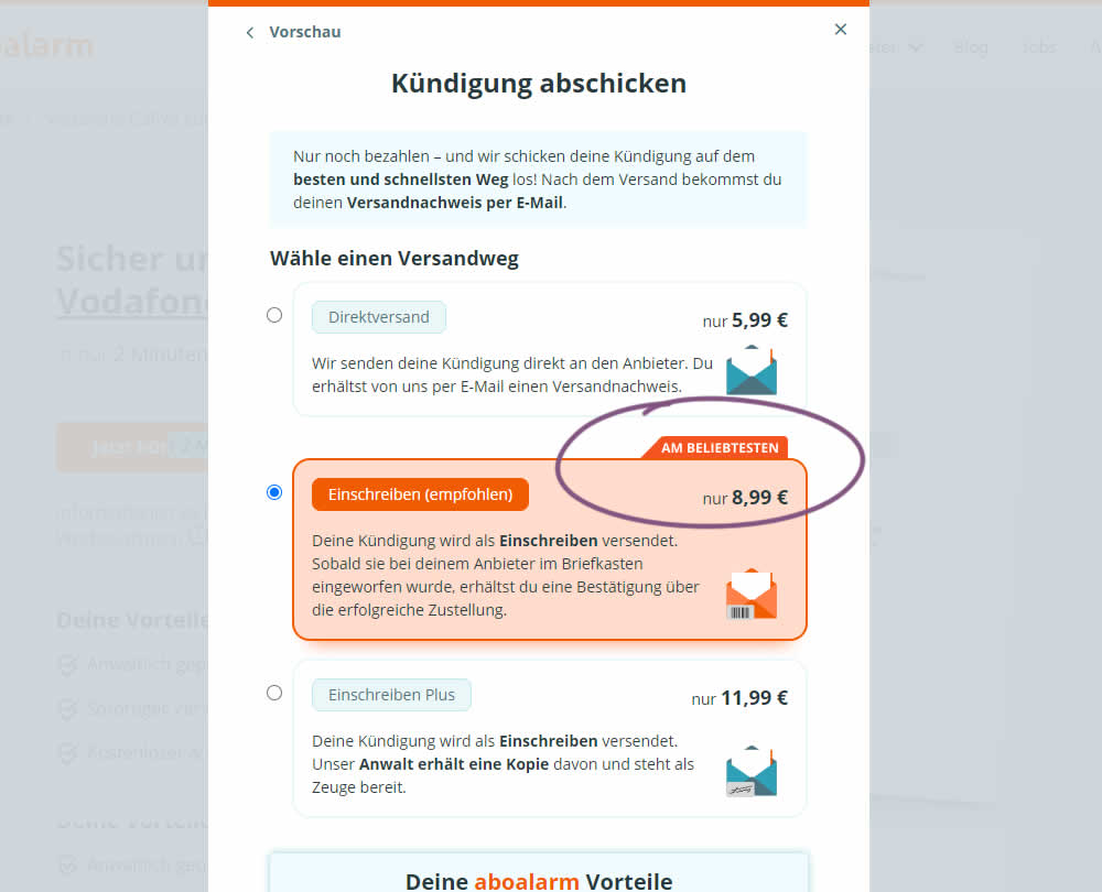
In this experiment, a "most popular" badge ("am beliebsten") was appended to the middle plan of a contract cancellation service. Impact on overall purchases and revenue was measured.
Test #512 on
Snocks.com
by  Melina Hess
Jan 17, 2024
Mobile
Product
X.X%
Revenue
Melina Tested Pattern #65: Add More For Extra Incentive On Snocks.com
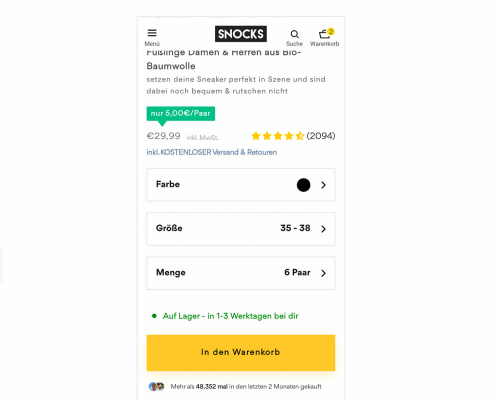
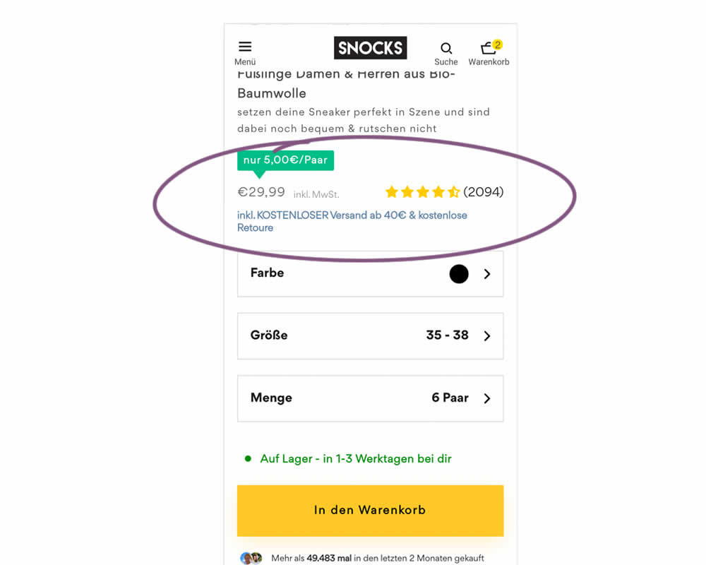
In this experiment, free shipping was a/b tested against free shipping with a 40€ purchase or higher. Hence, in the variation, customers needed to reach a cart amount total in order to be eligible for the free shipping.
Test #504 on
Volders.de
by Michal Fiech
Nov 17, 2023
Desktop
Mobile
Pricing
X.X%
Revenue
Michal Tested Pattern #113: More Or Fewer Plans On Volders.de
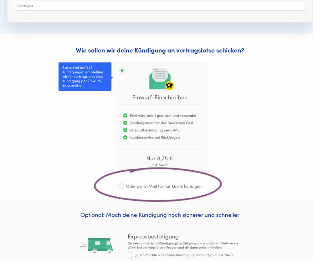
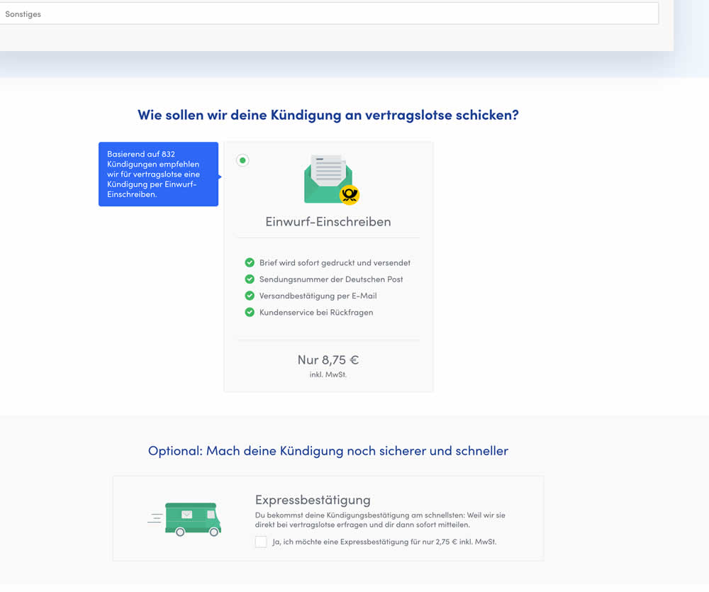
In this experiment, the cheapest pricing plan was removed from a set of 2 options. This only left the most expensive pricing plan as the option. Impact on sales and revenue was measured.
Test #496 on
Livefresh.de
by  Pascal Dietz
Oct 03, 2023
Desktop
Mobile
Product
X.X%
Revenue
Pascal Tested Pattern #43: Long Titles On Livefresh.de
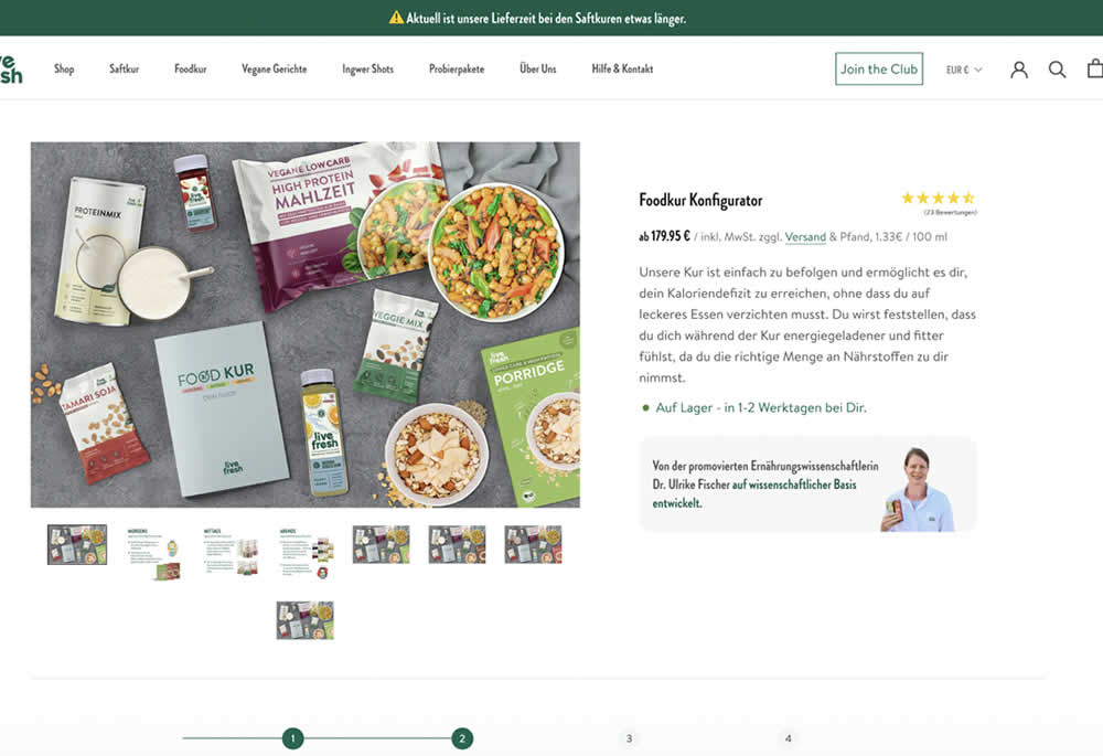
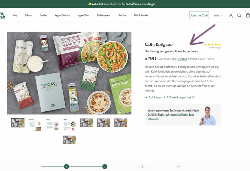
In this product detail page experiment a simple subheadline was appended to a new product. The tagline read "Lose weight sustainably and healthily." (Google translated from German "Nachhaltig und gesund Gewicht verlieren."). Impact on sales and revenue was measured.
Test #493 on
by  Jakub Linowski
Sep 19, 2023
Desktop
Mobile
Product
X.X%
Revenue
Jakub Tested Pattern #69: Autodiscounting
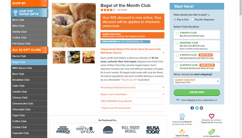
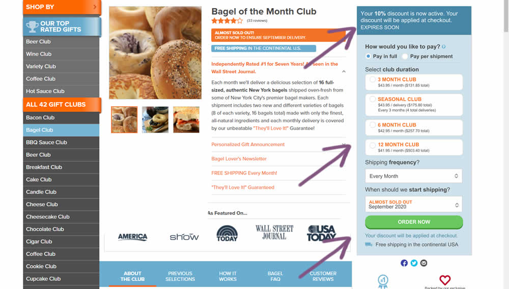
This experiment was technically a larger multi-change one that ran on product detail pages. The control showed an automatically applied coupon (for people opening up targeted emails with the discount). The variation attempted to make this better with the following changes:
- The discount message shifted closer towards the price / product selection (above the buy box)
- Removal of sale discount amounts and messages tied to longer durations (6 and 12 month duration)
- Reinforcing that the actual discount will be calculated further on checkout
Test #479 on
Aboalarm.de
by  Daria Kurchinskaia
Jun 15, 2023
Desktop
Mobile
Checkout
X.X%
Revenue
Daria Tested Pattern #15: Bulleted Reassurances On Aboalarm.de
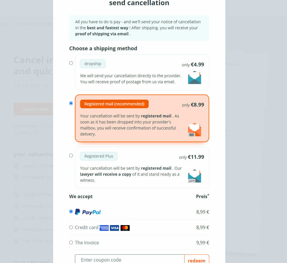
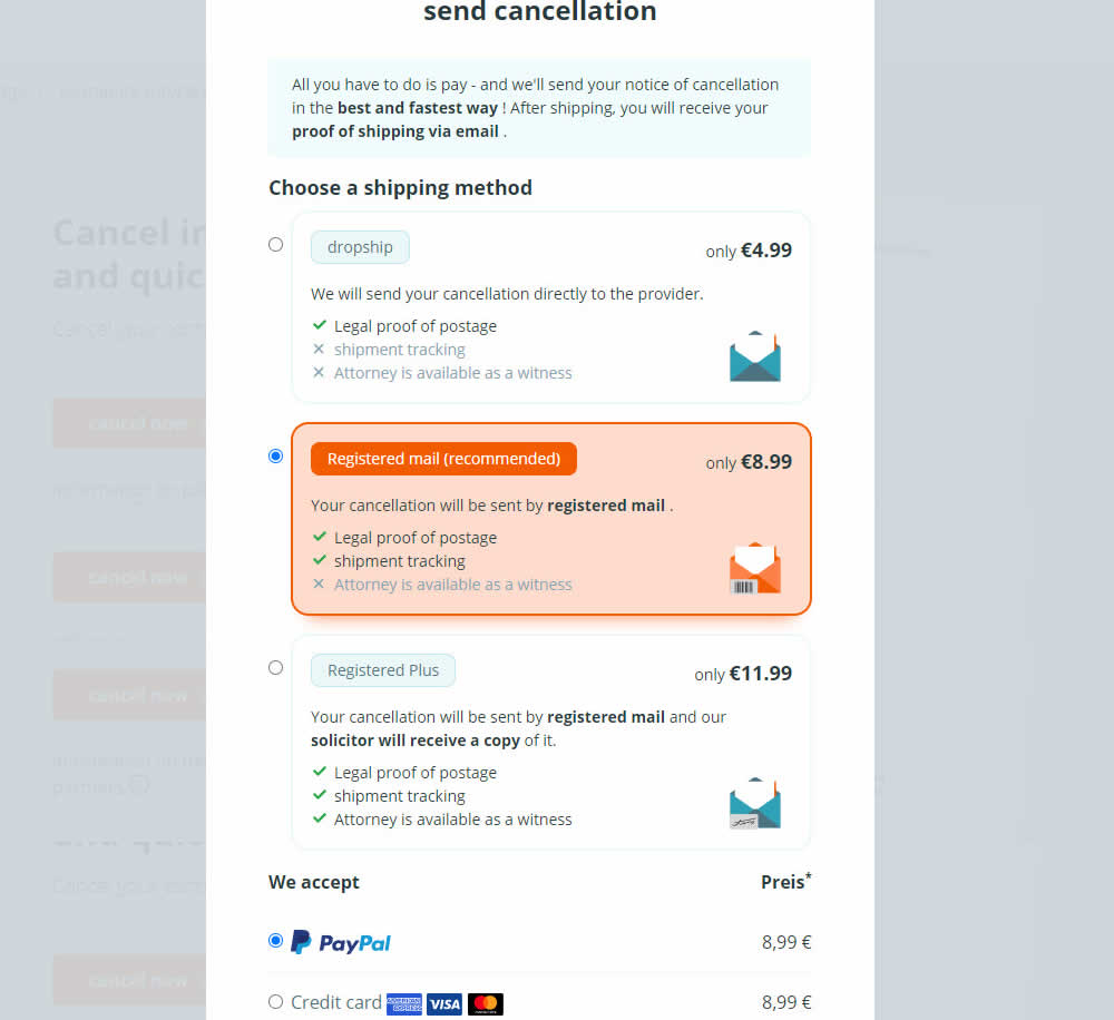
In this experiment, a list of benefits were shown for each of the 3 plans on the last step of a contract cancelation service. Benefit items not included in the lower plans were also shown with grayed out styles (and an "x"). Clearly the higher paid plan had all the benefits listed. Impact on transactions was measured.
Test #480 on
Aboalarm.de
by  Daria Kurchinskaia
Jun 15, 2023
Desktop
Mobile
Checkout
X.X%
Revenue
Daria Tested Pattern #15: Bulleted Reassurances On Aboalarm.de

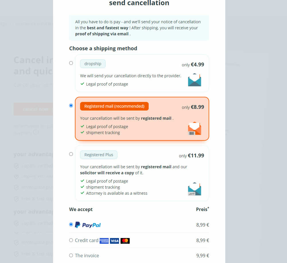
In this experiment, a list of benefits were shown for each of the 3 plans on the last step of a contract cancelation service. The lowest plan only had one benefit, whereas the highest plan had 3. Impact on transactions was measured.
Test #465 on
by  Melina Hess
Apr 22, 2023
Desktop
Mobile
Product
X.X%
Revenue
Melina Tested Pattern #15: Bulleted Reassurances
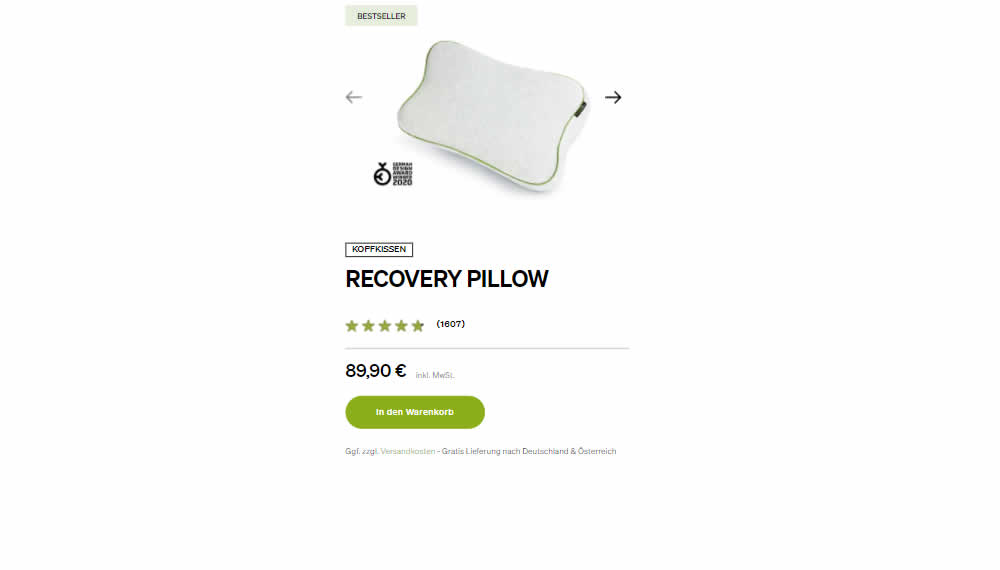
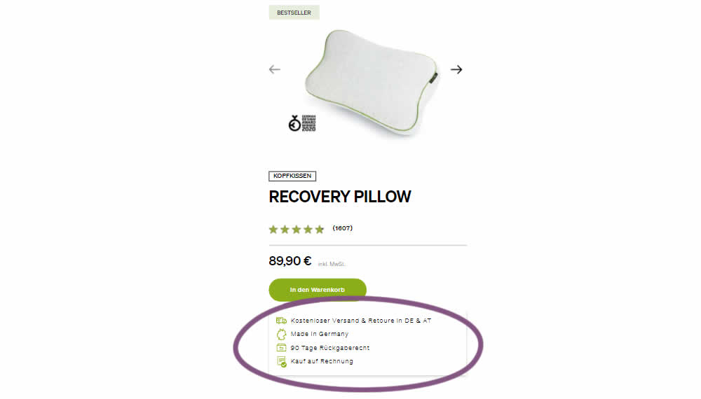
In this product detail page experiment, a number of reassurances were brought out visually in a lined or bulleted way. The 4 reassurances included: free shipping and returns; Made in Germany, 90 Day Returns; and Buy With Invoice (popular in Germany). Impact on revenue per user was measured. The control contained very feint copy (smaller and more subtle) about free shipping.
Test #421 on
Amazon.com
by  Marika Francisco
Jul 15, 2022
Desktop
Mobile
Product
X.X%
Revenue
Marika Tested Pattern #43: Long Titles On Amazon.com
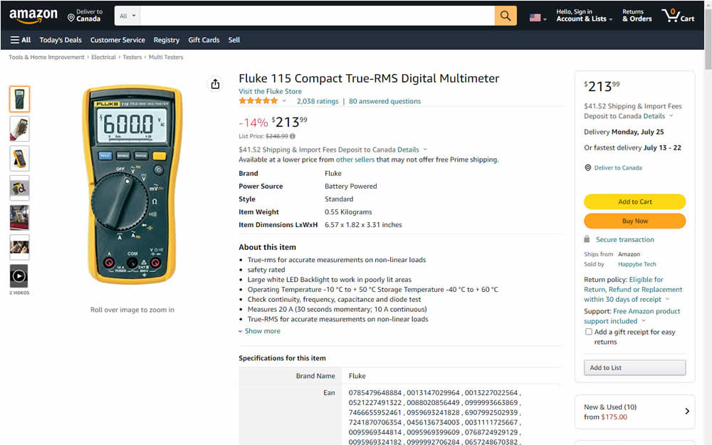
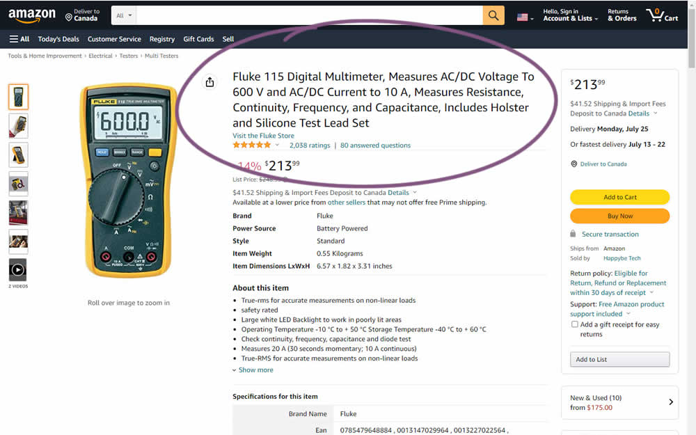
Fluke is an industrial manufacterer of measurement and calibration devices and they ran a test on their Amazon store for a series of their prodcts. Instead of using short product names, they tested longer and more descriptive ones. Impact was measured on sales.
Test #397 on
Snocks.com
by  Melina Hess
Feb 24, 2022
Mobile
Product
X.X%
Revenue
Melina Tested Pattern #121: Free Shipping On Snocks.com
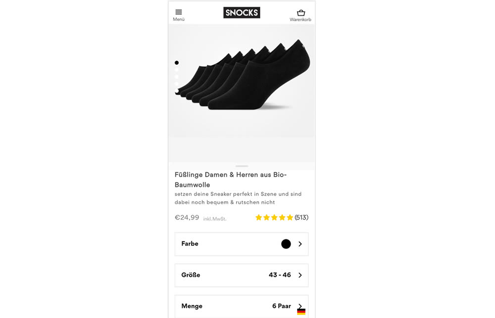
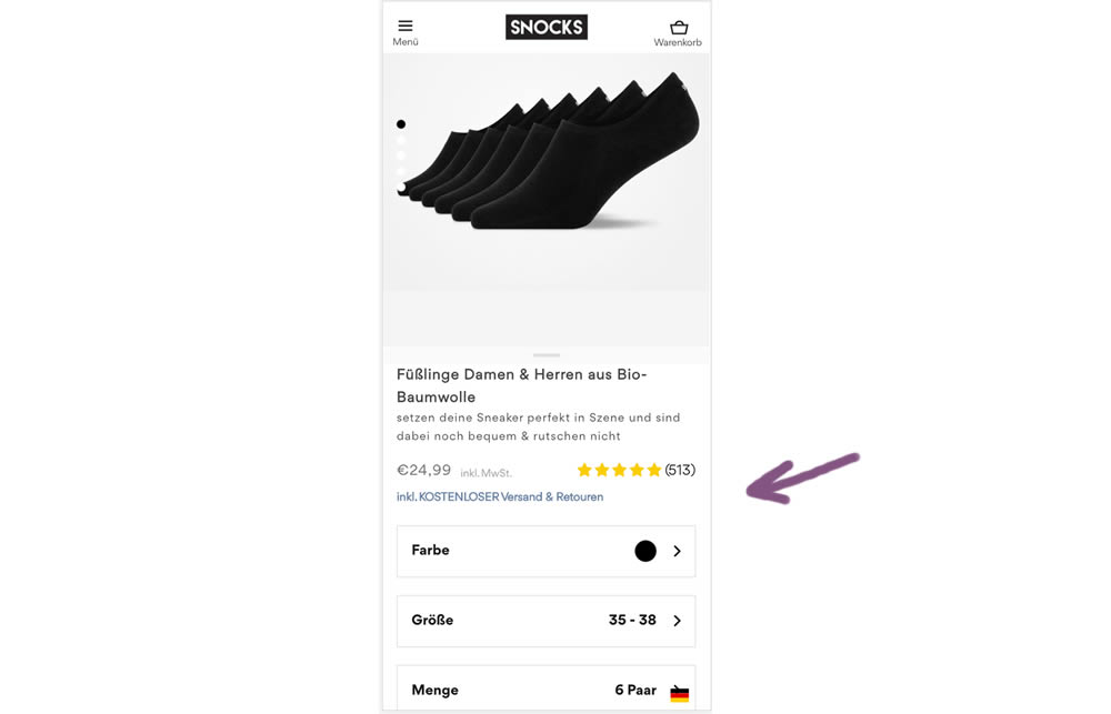
In this experiment a "Free Shipping & Returns" message was added just below the price information.
Test #396 on
Depositphotos.com
by  Gleb Hodorovskiy
Feb 13, 2022
Desktop
Listing
X.X%
Revenue
Gleb Tested Pattern #124: Confirmed Selection On Depositphotos.com
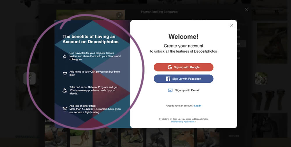
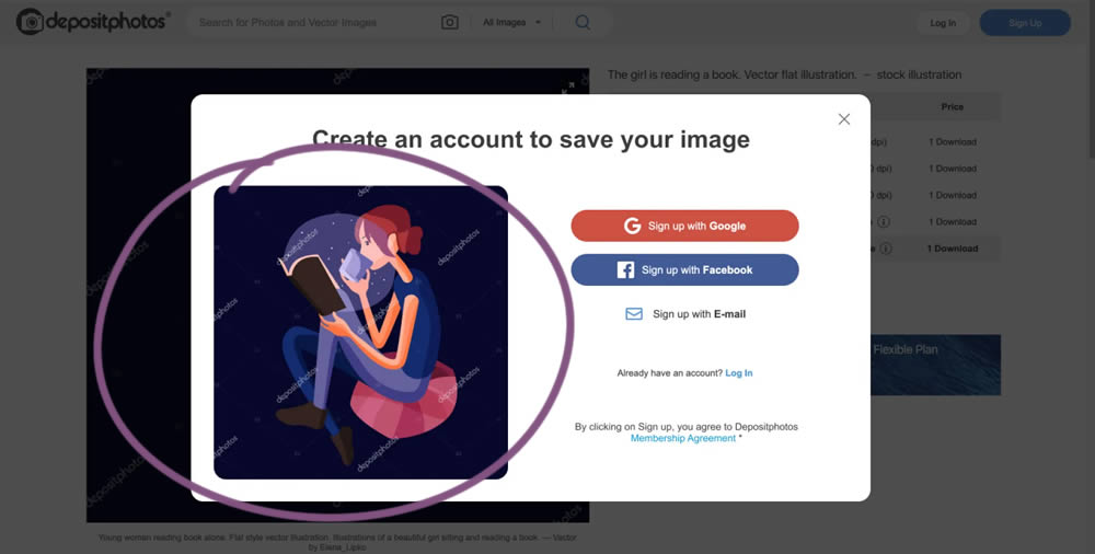
In this experiment from Conversionrate.store, the framing of the registration message was changed from a generic account creation one to a specific image selected by the user. The experiment started on a listing page of a stock photography / illustration site. The control showed a more generic message with benefits for signing up and making the purchase. Whereas the variation repeated the actual image that customers clicked on from listing pages - establishing continuity as well as providing a reason for signing up. Impact on sales was measured.