All Latest 620 A/B Tests
MOST RECENT TESTS
Test #649 on
Online.metro-cc.ru
by  Andrey Andreev
Apr 28, 2026
Desktop
Mobile
Global
X.X%
Sales
Andrey Tested Pattern #82: Onboarding Callouts On Online.metro-cc.ru
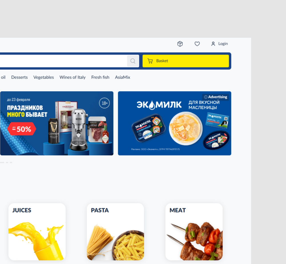
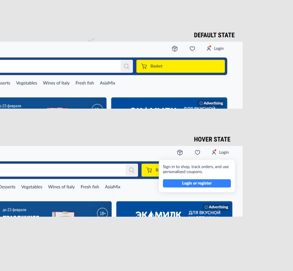
In this experiment, a red dot was added to the login link, along with a hover state that clarified the benefits of doing so. Impact on adds to cart and sales was measured.
Which A Or B Actually Wins? Find Out Before You Test.
Members see every test result — the winners, the flat ones, and the losers — along with exact effects and sample sizes. Use it to estimate your tests and prioritize by probability, not gut feel. Start every experiment with the odds on your side.
Test #641 on
Kay.com
by  Craig Kistler
Mar 26, 2026
Desktop
Mobile
Global
X.X%
Sales
Craig Tested Pattern #130: Less Or More Visible Offer Pages On Kay.com
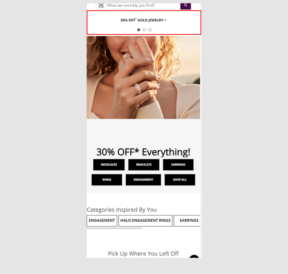
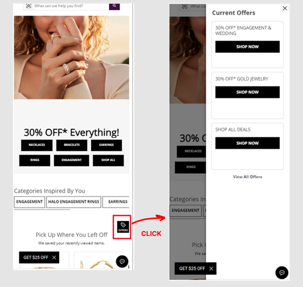
A global flyout drawer was added that consolidated sale promotions into one centralized location, replacing the customary placement of promotions throughout the site.
Test #588 on
Hellostake.com
by  Louis Alston
Apr 28, 2025
Mobile
Global
X.X%
Sales
Louis Tested Pattern #26: Cart Reminder And Recently Viewed On Hellostake.com
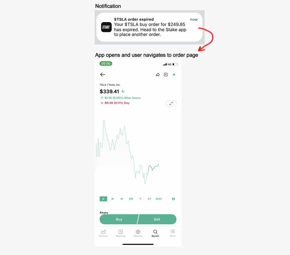
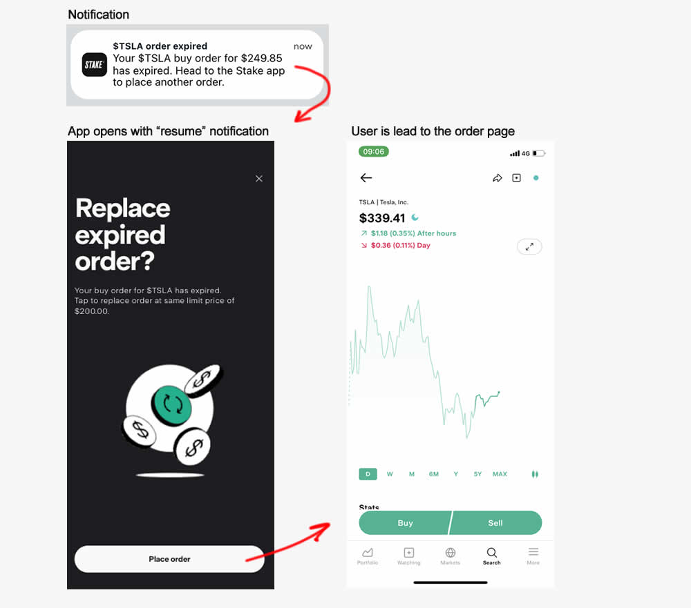
This experiment started right after users of a trading app received trade order expiry notification (for a security trading app). In the control, after clicking the notifications, users would have to navigate to the trade themselves. In the variation, 1) an additional step was added which informed what happened (an order was not place and expired) and 2) they were automatically send to the order page. Impact on orders placed was measured.
Test #539 on
Snocks.com
by  Melina Hess
Jun 24, 2024
Desktop
Global
X.X%
Sales
Melina Tested Pattern #135: Product Categories On Snocks.com
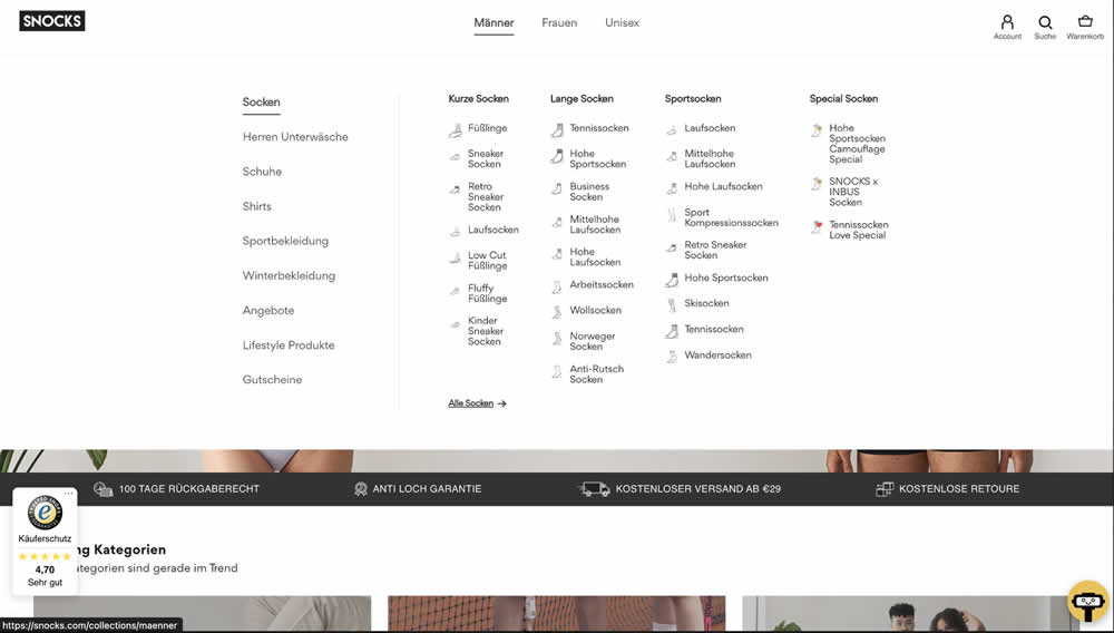
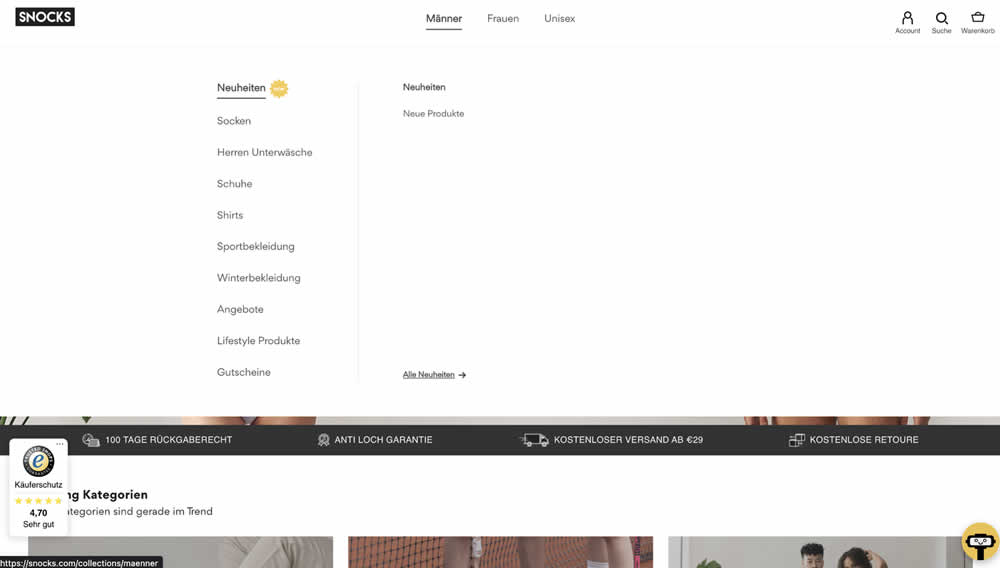
In this experiment, two different navigation defaults were tested against each other. In one version we can see 1) more popular products with 2) more categorical granularity being shown in the expanded state. In the other version we see "new products" being shown as the default (with a lot fewer product subcategories) to choose from.
Test #534 on
Online.metro-cc.ru
by  Andrey Andreev
May 28, 2024
Desktop
Global
X.X%
Sales
Andrey Tested Pattern #82: Onboarding Callouts On Online.metro-cc.ru
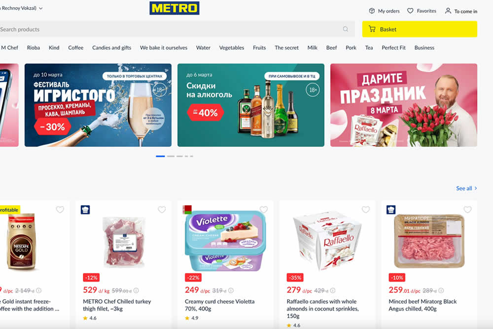
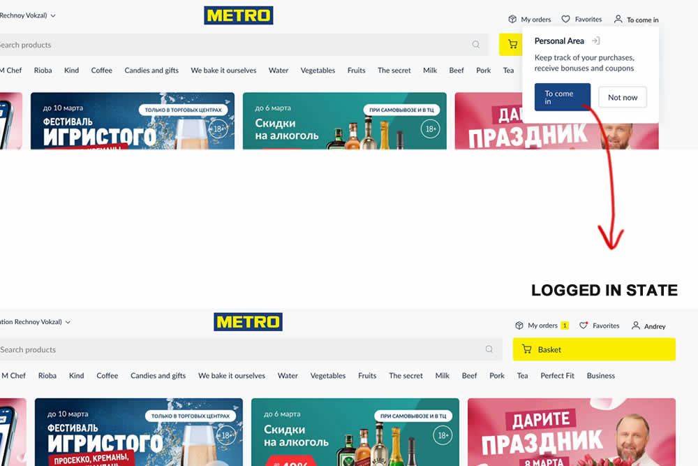
In this site wide experiment, logged out customers were directed to sign in with the help of a top navigation callout. The experiment was triggered for anyone who saw the callout message. After signing in, the user would 1) remain on the same screen they were on and 2) the top header slightly changed to show a logged in state (with their orders, favorites and active username). Impact on successful logins and overall purchases was measured.
Test #533 on
by  Jakub Linowski
May 23, 2024
Desktop
Global
X.X%
Sales
Jakub Tested Pattern #94: Visible Search
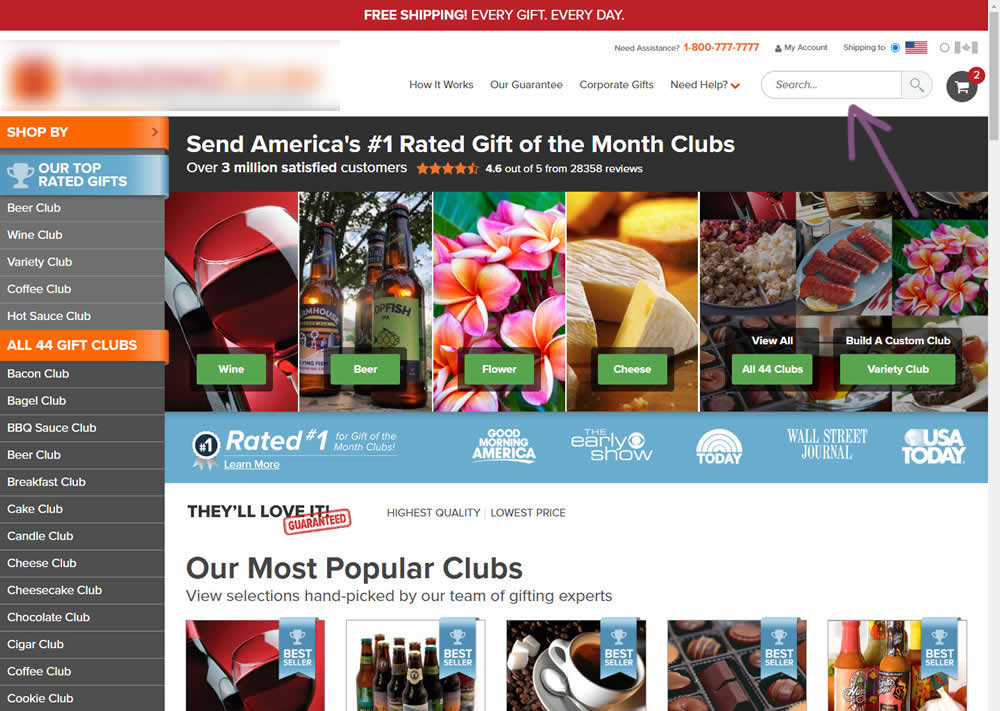

In this experiment, the presence of a search bar was tested against no search bar altogether. The control had search, and in the variation it was removed. The variation also exposed items from within the "Need Help?" menu, making "My account", "Contact Us" and "FAQ" more prominent.
(Here the AB test is inverted / flipped to match the pattern).
Test #526 on
Online.metro-cc.ru
by  Andrey Andreev
Apr 17, 2024
Desktop
Mobile
Global
X.X%
Sales
Andrey Tested Pattern #77: Filled Or Ghost Buttons On Online.metro-cc.ru
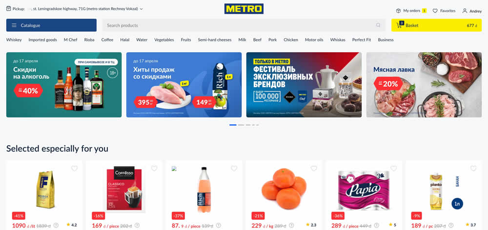
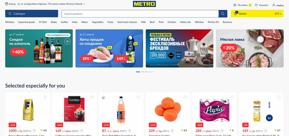
In this experiment, a higher contrast search bar with a blue border and a filled blue button style was tested against a more feint style. Impact on searches and purchases was measured. (A/B test was inverted to B/A in order to fit the filled-vs-ghost button pattern).
Test #478 on
Estilomma.com
by  José Álvarez
Jun 14, 2023
Mobile
Global
X.X%
Sales
José Tested Pattern #130: Less Or More Visible Offer Pages On Estilomma.com
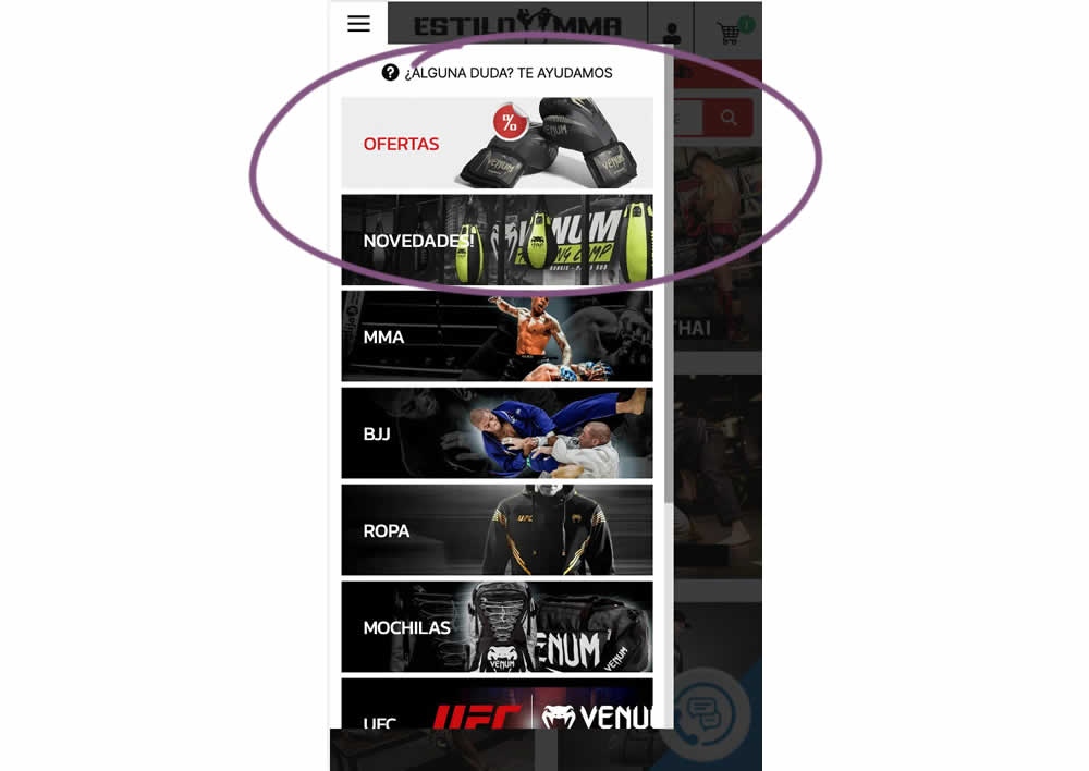
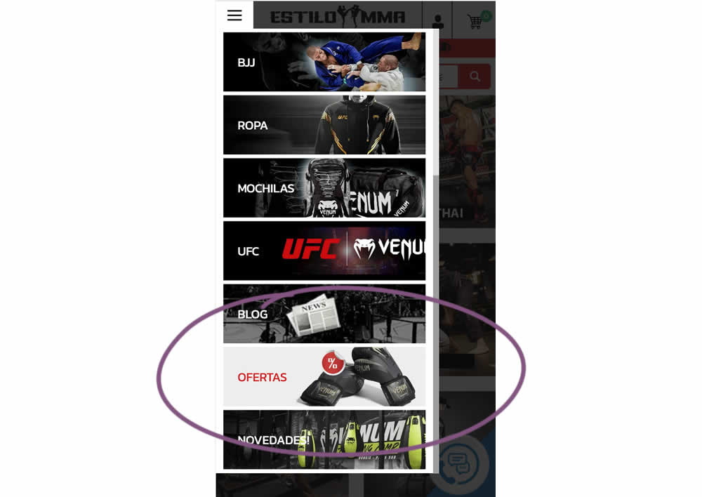
In this experiment, an offers page was shifted all the way down inside an expanded mobile navigation. The control showed it at the very top. The variation showed it at the bottom. (Note that the screen shot shows an already scrolled navigation - in the initial view, users would not be able to see the discount page right away, as it required some scrolling). Impact on overall sales was measured.
Test #432 on
Snocks.com
by  Melina Hess
Sep 29, 2022
Mobile
Global
X.X%
Sales
Melina Tested Pattern #94: Visible Search On Snocks.com
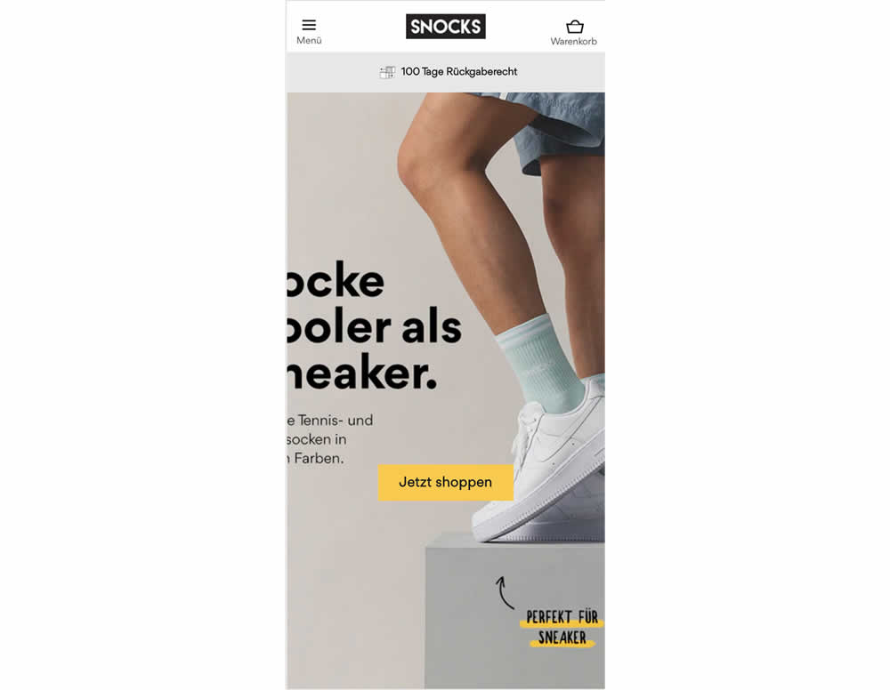
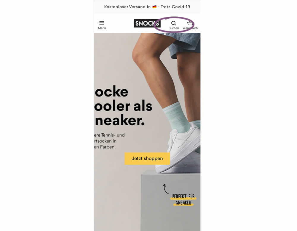
In this experiment, search functionality was added in the variation, globally on mobile. Impact on sales was measured
Test #352 on
Us.flukecal.com
by  John Hickey
May 11, 2021
Desktop
Global
X.X%
Leads
John Tested Pattern #123: Single Or Double Column Form Fields On Us.flukecal.com
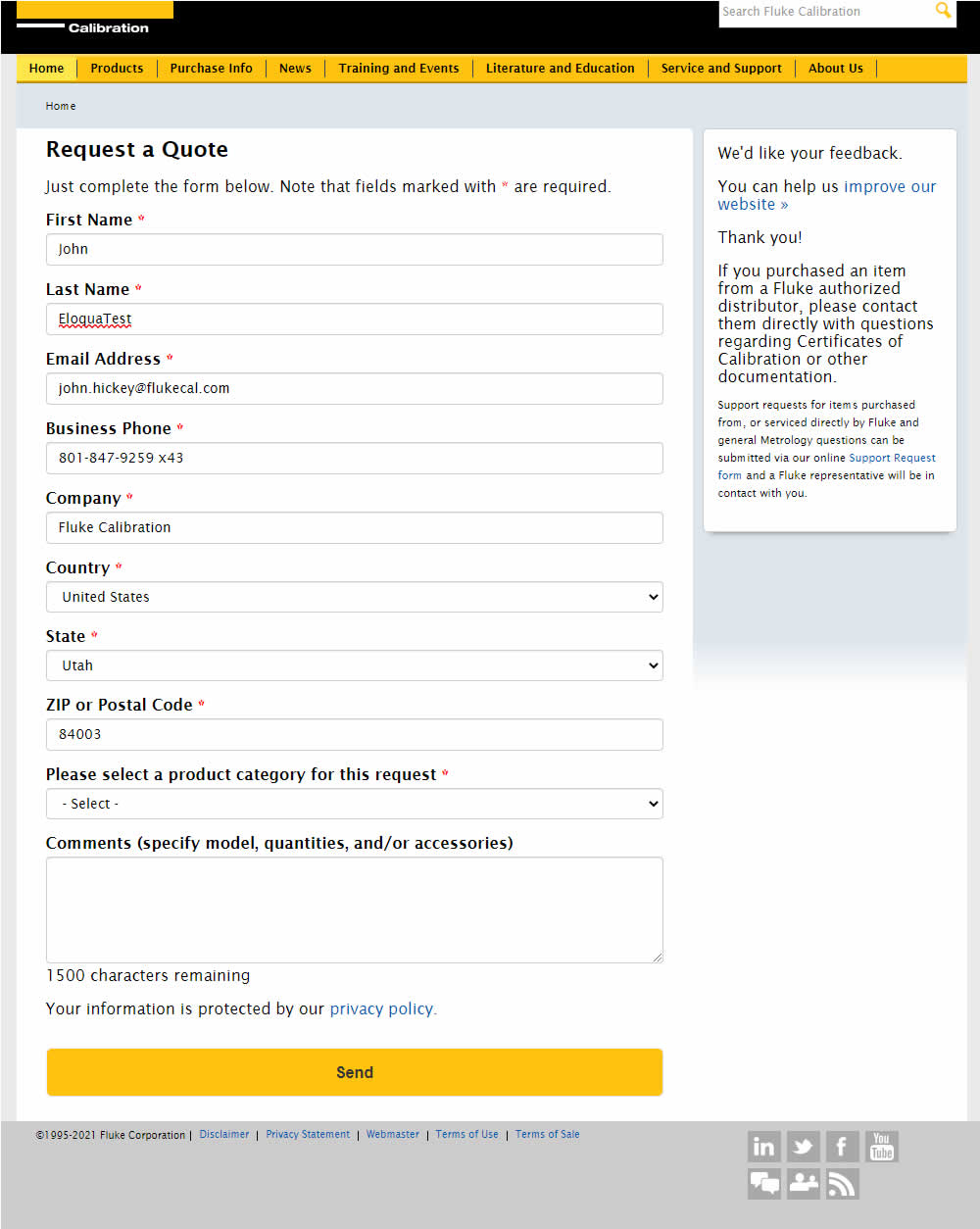
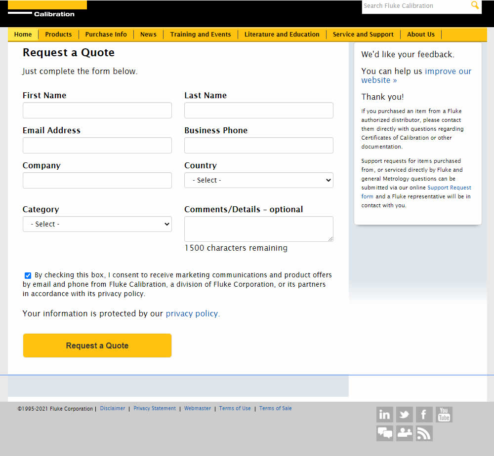
In this experiment, single column (longer) form fields were tested against a two column layout (more compact).
Test #349 on
Backstage.com
by  Stanley Zuo
Apr 27, 2021
Mobile
Global
X.X%
Sales
Stanley Tested Pattern #49: Above The Fold Call To Action On Backstage.com
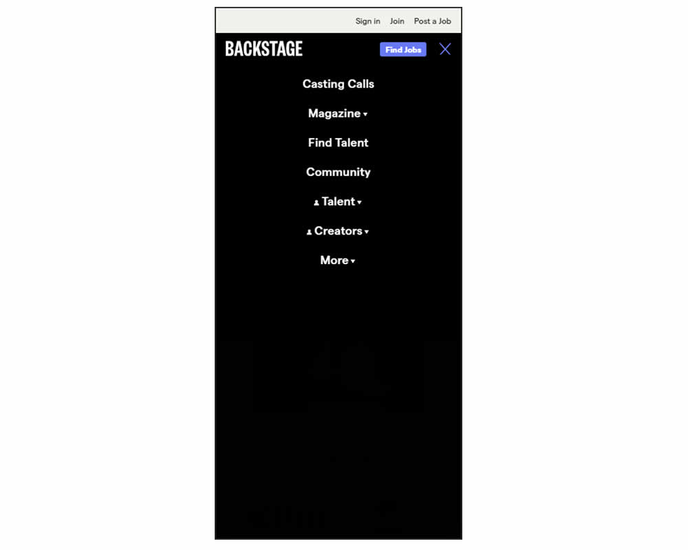
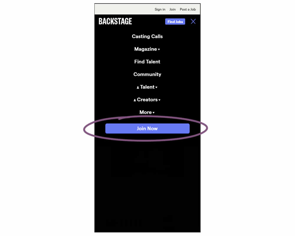
In this experiment, a simple "Join Now" button was added inside an expanded mobile navigation menu. Clicking the button would start a multiple step membership subscription process. Impact on subscription starts and final sales were tracked.
Test #334 on
Thomasnet.com
by  Kyle Phillips
Jan 25, 2021
Desktop
Mobile
Global
X.X%
Progression
Kyle Tested Pattern #2: Icon Labels On Thomasnet.com
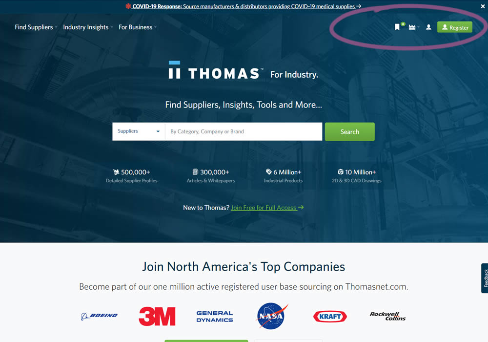
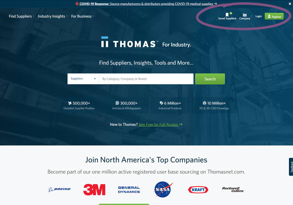
This experiment measured the impact of adding text labels to three icon-only nav items.
Test #325 on
Snocks.com
by  Samuel Hess
Nov 24, 2020
Desktop
Global
X.X%
Sales
Samuel Tested Pattern #45: Benefit Bar On Snocks.com
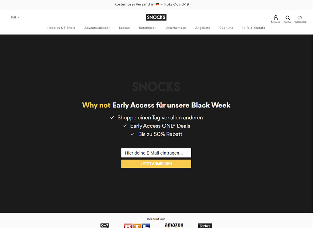
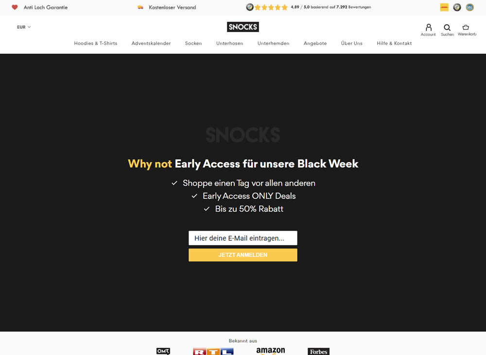
In this experiment, a set of reassurances and reviews were added in the header of this ecommerce website. Translating from German, these read: "Anti Hole Guarantee", "Free Shipping" and "X Ratings out of Y Reviews".
Test #303 on
Thomasnet.com
by  Julian Gaviria
Jun 26, 2020
Desktop
Mobile
Global
X.X%
Leads
Julian Tested Pattern #14: Exposed Menu Options On Thomasnet.com

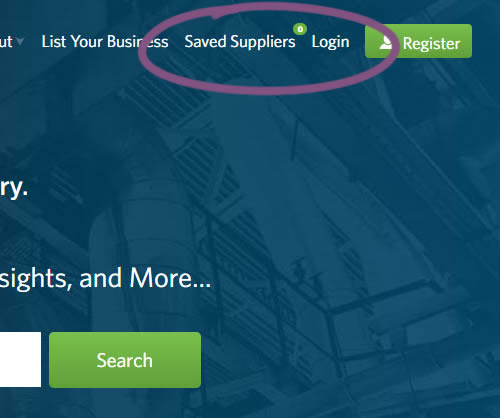
In this experiment variation, the saved suppliers feature was surfaced in the global navigation.It was already possible to save supplier companies from listing and specific company pages. This experiment aimed to increase the saving functions visibility and possibly increase more leads.
Test #283 on
Kenhub.com
by  Niels Hapke
Feb 08, 2020
Desktop
Mobile
Global
X.X%
Sales
Niels Tested Pattern #42: Countdown Timer On Kenhub.com
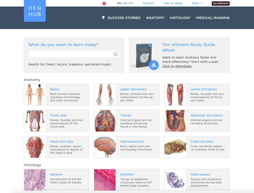
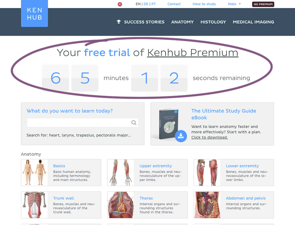
In this experiment, registered trial users were shown a 65 minute counter on multiple pages (dashboard, listing, quiz, articles) encouraging them to get a full subscription and study all content. Both A and B experiences offered the same limited content for trial users. After the 65 minutes came to an end, the B variation showed an additional "Go Premium" button on all pages, but continued to offer the same limited content.
Test #264 on
Kenhub.com
by  Niels Hapke
Oct 05, 2019
Desktop
Mobile
Global
X.X%
Sales
Niels Tested Pattern #41: Sticky Call To Action On Kenhub.com
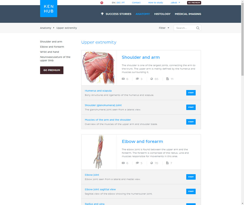
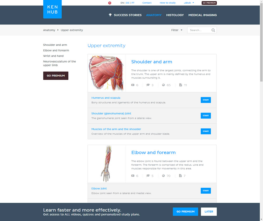
In this experiment users saw a sticky bar advertising the benefits of a Premium account across the bottom of the website, wherever they navigate. The sticky call to action appeared with a 4 second delay and was floating.
Test #211 on
Skype App
by  Ronny Kohavi
Nov 20, 2018
Mobile
Global
X.X%
Progression
Ronny Tested Pattern #2: Icon Labels
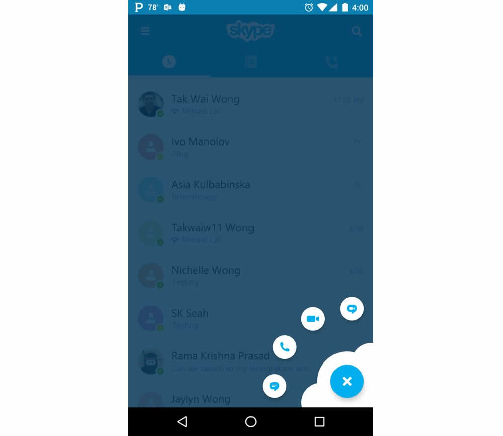
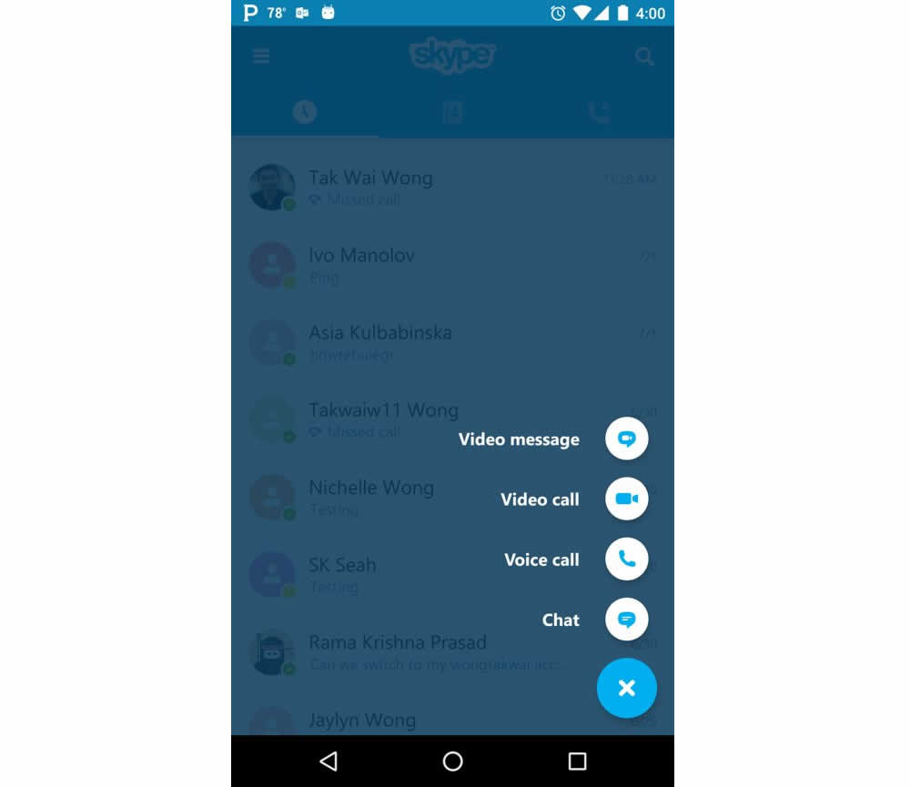
Microsoft Skype ran an experiment for the mobile segment of the Skype application with a treatment having combined icons with corresponding labels. The control only showed icons.
Test #204 on
Kenhub.com
by  Niels Hapke
Oct 11, 2018
Desktop
Mobile
Global
X.X%
Sales
Niels Tested Pattern #85: Benefit Button On Kenhub.com
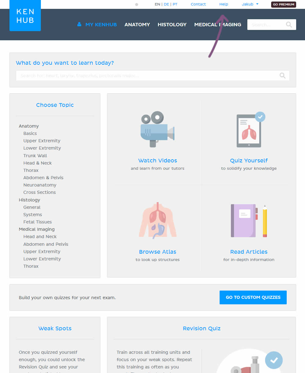
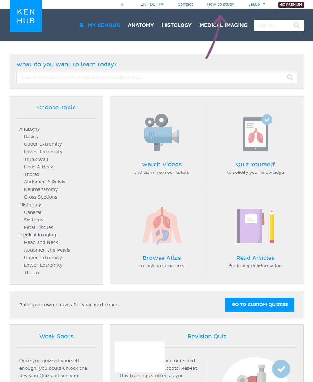
In the variation, the "Help" section was reworded to "How to study".
Test #203 on
Driving-tests.org
by  Andrei Zakhareuski
Oct 10, 2018
Desktop
Global
X.X%
Sales
Andrei Tested Pattern #85: Benefit Button On Driving-tests.org
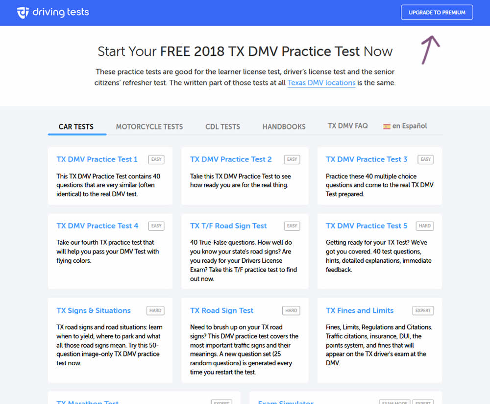
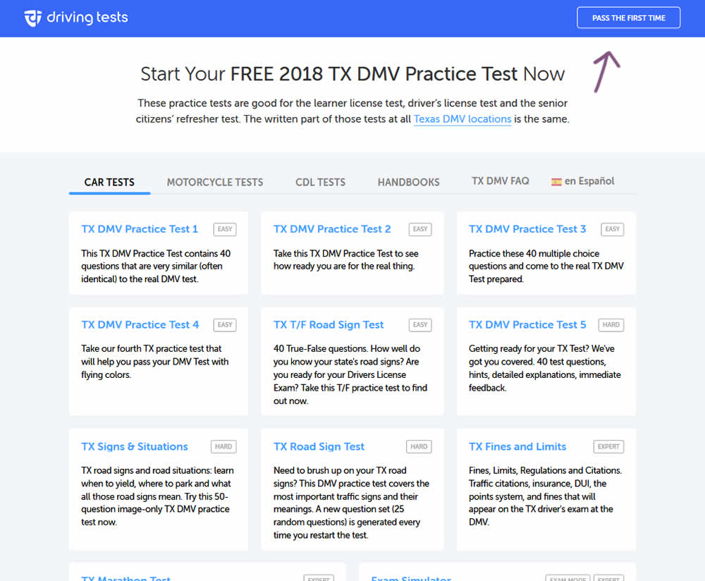
In the variation, the button label "Upgrade To Premium" was changed to one with a clearer benefit of "Pass The First Time".
Test #190 on
Diamondcandles.com
by  Peep Laja
Jul 26, 2018
Mobile
Global
X.X%
Sales
Peep Tested Pattern #2: Icon Labels On Diamondcandles.com
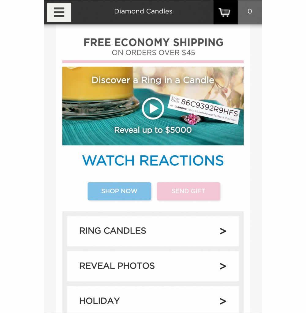
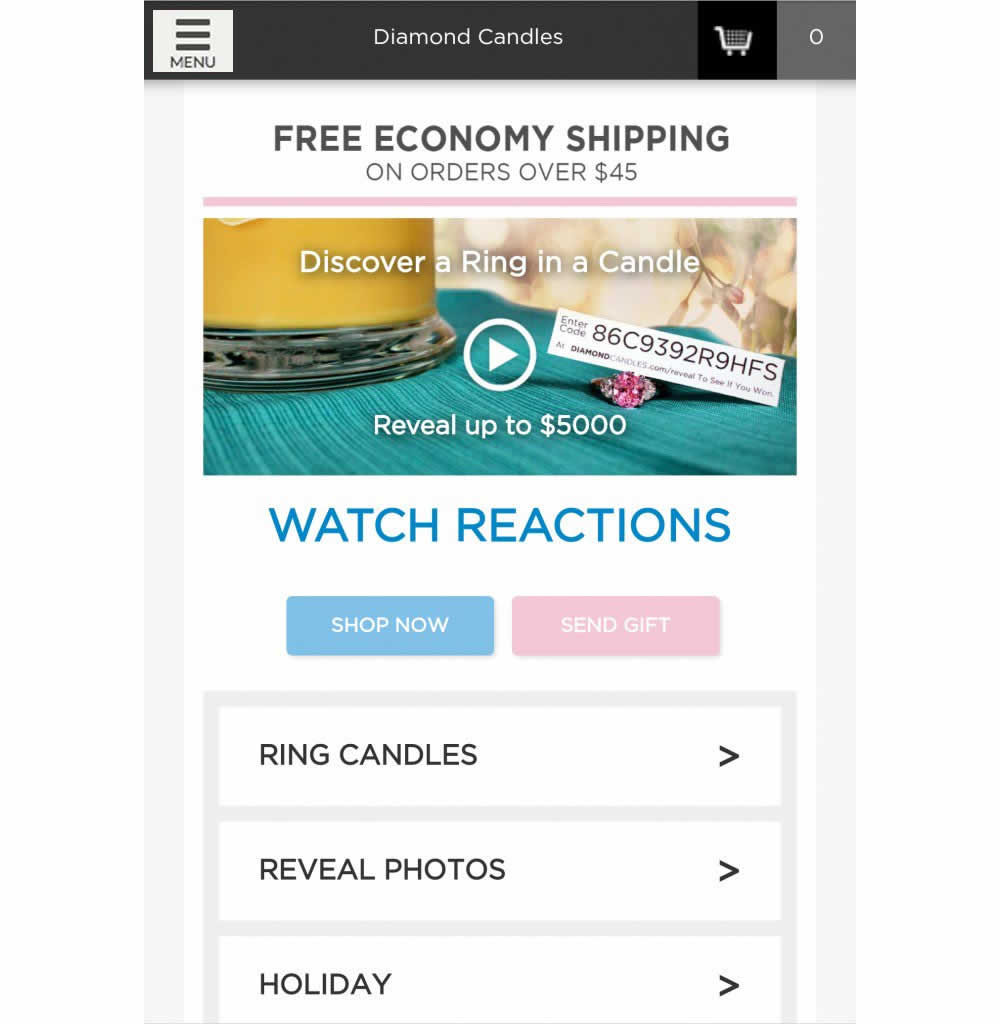
This test has explored numerous hamburger menu variations and has been covered in detail over at https://conversionxl.com/blog/testing-hamburger-icon-revenue/ - Thanks Peep Laja for sharing. Here we reported on a consistent increase in both menu clicks and sales.