All Latest 620 A/B Tests
MOST RECENT TESTS
Test #312 on
by  Jakub Linowski
Aug 14, 2020
Desktop
Mobile
Product
X.X%
Sales
Jakub Tested Pattern #83: Progressive Fields
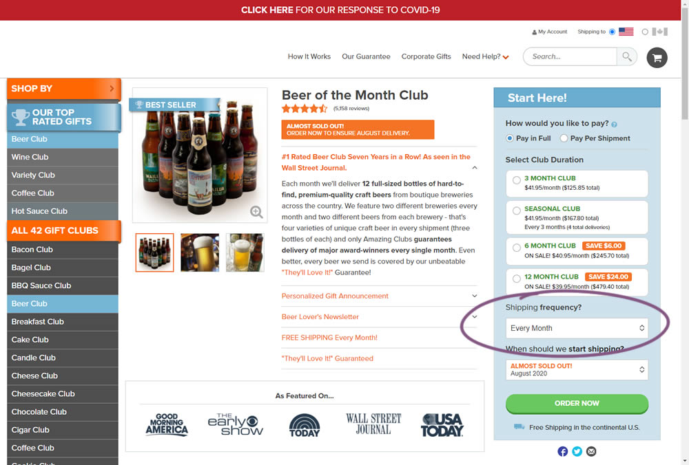
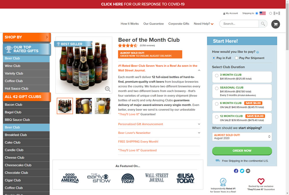
In this experiment, we tested a visible "Shipping Frequency" (A) option against a progressively displayed one (B) that would only appear after someone first chose a duration option. Thus in variation B, the buy box component would initially appear with fewer fields and smaller. The experiment measured initial progression and actual sales.
Note on the data: the experiment was run a little shorter than usual, as one of the variations triggered a stop rule to protect losses (so the effect might be somewhat inflated from a lower power).
Which A Or B Actually Wins? Find Out Before You Test.
Members see every test result — the winners, the flat ones, and the losers — along with exact effects and sample sizes. Use it to estimate your tests and prioritize by probability, not gut feel. Start every experiment with the odds on your side.
Test #309 on
Thomasnet.com
by  Julian Gaviria
Jul 24, 2020
Desktop
Listing
X.X%
Progression
Julian Tested Pattern #72: Priming Step On Thomasnet.com
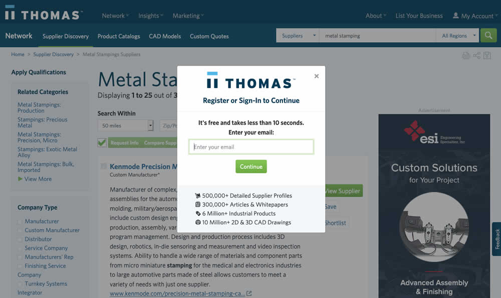
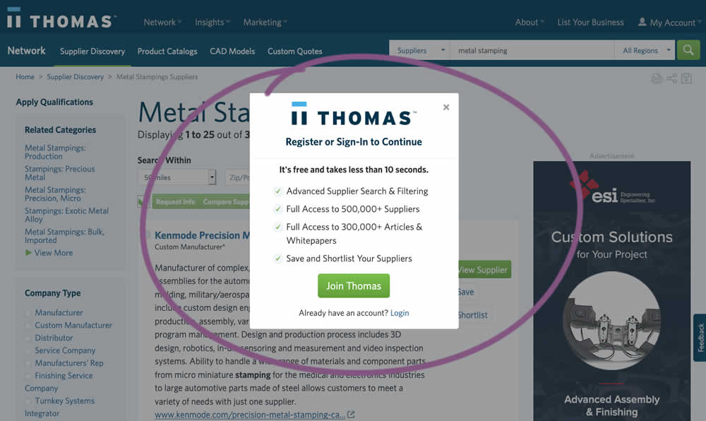
In this experiment, an extra step was prepended at the beginning of a multiple step signup modal flow. The signup modal would appear on listing pages after requests to contact a listed company. The idea was to prime users with benefits of signing up in order to increase their motivation to do so. The experiment measured the impact on the initial progression (to the step with the email form).
Test #305 on
Volders.de
by Michal Fiech
Jun 30, 2020
Mobile
Desktop
Home & Landing
X.X%
Sales
Michal Tested Pattern #94: Visible Search On Volders.de

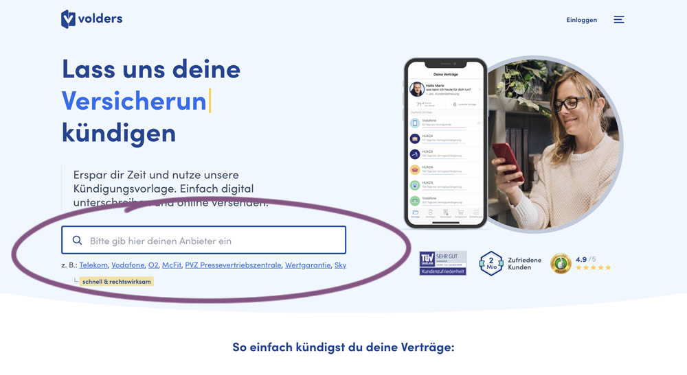
In this experiment, a search input field (to look for companies) along with most popular links (also company names) were displayed on the homepage of a leading contract cancellation service. The control (A) version instead had a button that sent users to a next page where the same selection could be made - only later. The measurable success criteria were the number of paid cancellations - a few steps down the funnel.
Test #302 on
Volders.de
by Michal Fiech
Jun 09, 2020
Desktop
Mobile
Signup
X.X%
Sales
Michal Tested Pattern #83: Progressive Fields On Volders.de
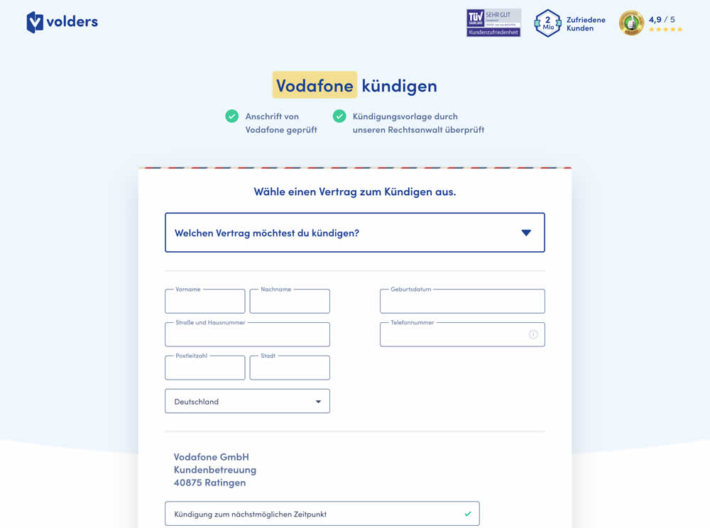
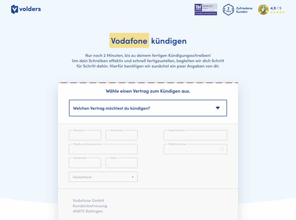
In this experiment a long form (A) was replaced with a progressive form interaction (B). Most of the form fields would appear in a grey-disabled style, until the prerequioste fields were first filled out.
Test #300 on
Volders.de
by Michal Fiech
May 25, 2020
Desktop
Mobile
Signup
X.X%
Progression
Michal Tested Pattern #3: Fewer Form Fields On Volders.de

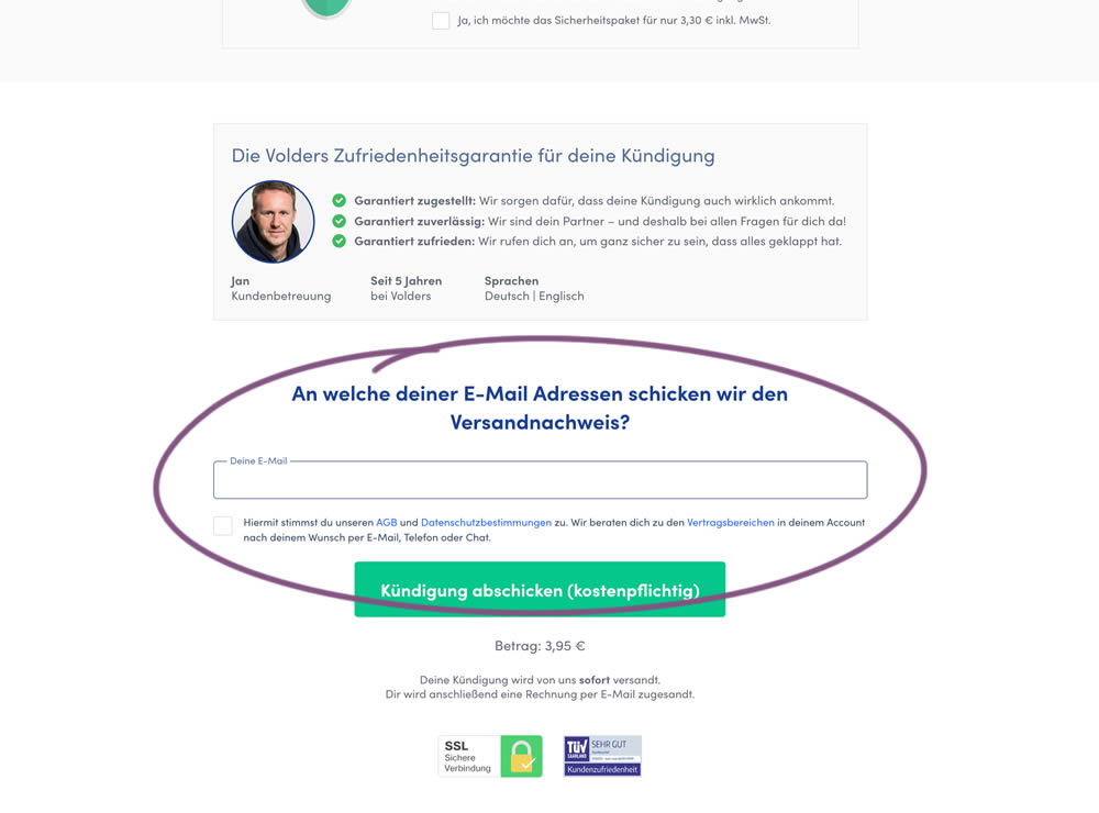
In this experiment, a password field was removed on a contract cancellation form (Volders).
In the control version, users were required to enter their email address and a password. If the email address was associated with an existing account, then the password was used to authenticate the user (and validated). When users entered a new email address, then the password field was used to create a new account.
In the variation, the password field was removed, as the authentication happened after the conversion itself using other backend mechanisms.
Test #290 on
Prepagent.com
by  Arthur Sparks
Mar 23, 2020
Desktop
Pricing
X.X%
Sales
Arthur Tested Pattern #14: Exposed Menu Options On Prepagent.com
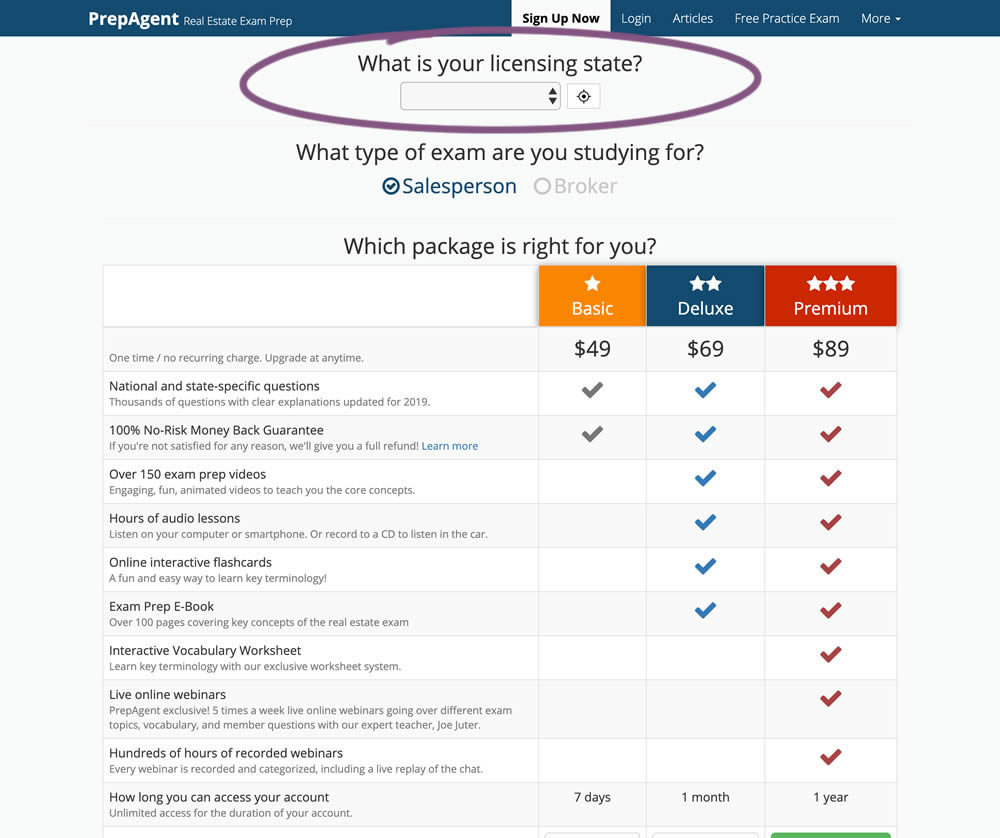
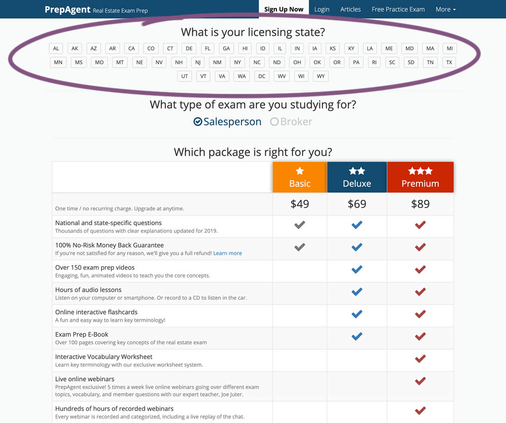
In this experiment, a simple pulldown menu (for US state selection) was replaced with all state options shown as selectable buttons. The states were also abbreviated.
Test #286 on
Volders.de
by  Alexander Krieger
Feb 28, 2020
Desktop
Mobile
Home & Landing
X.X%
Sales
Alexander Tested Pattern #9: Multiple Steps On Volders.de
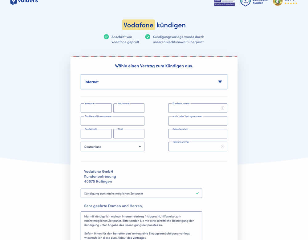
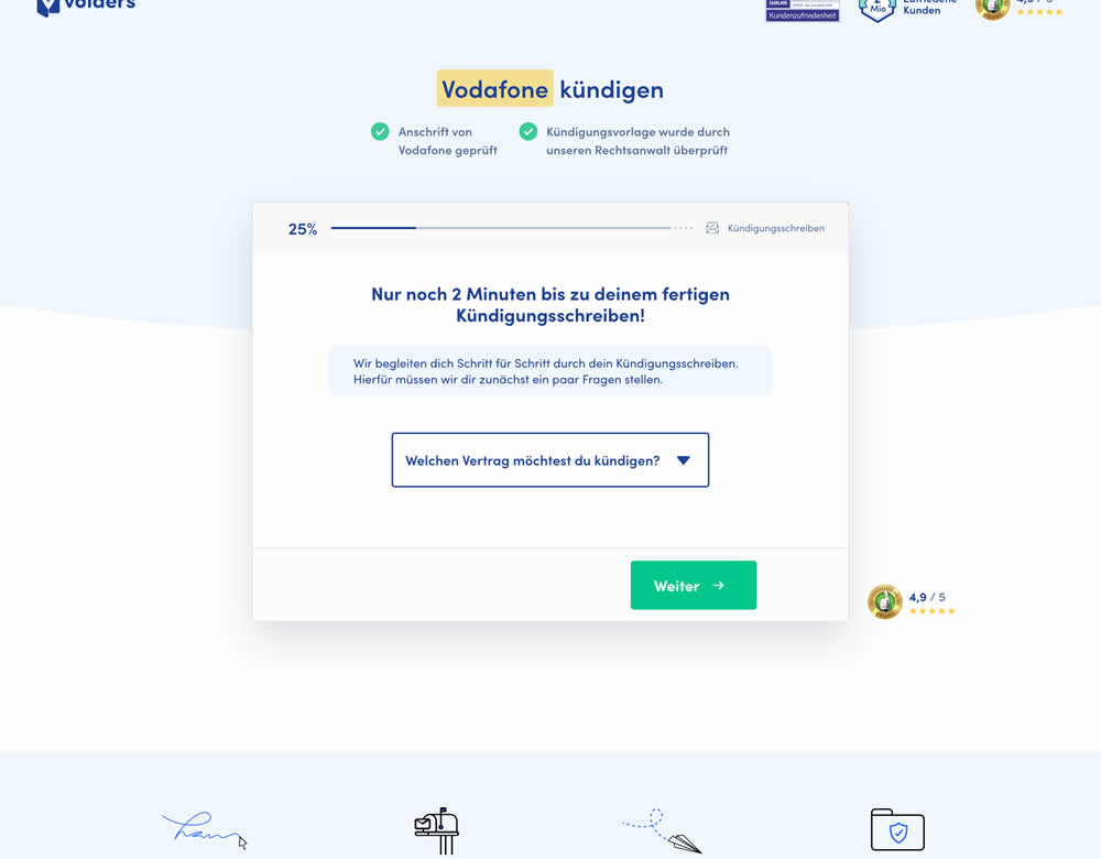
In this experiment, a long contract cancellation landing page (control) was broken down into 4 steps with 1 final summary step (variation).
Test #280 on
Volders.de
by  Alexander Krieger
Jan 24, 2020
Desktop
Mobile
Signup
X.X%
Sales
Alexander Tested Pattern #3: Fewer Form Fields On Volders.de
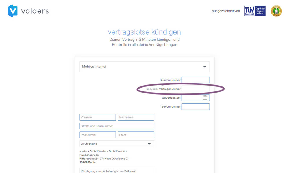
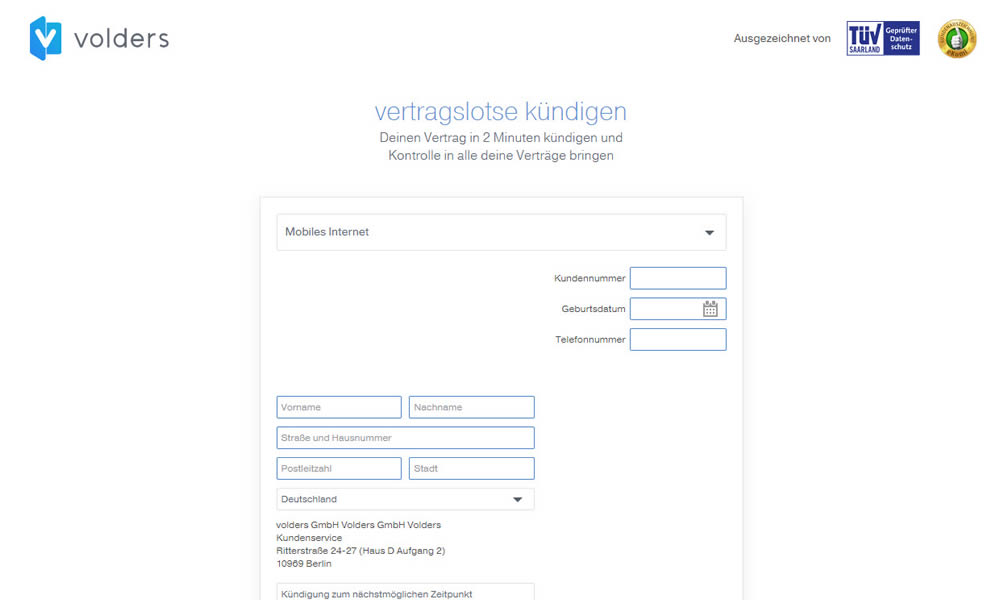
In this experiment on a contract cancellation funnel, one field was removed - a secondary contract ID. The control and variation both had a primary "customer ID" with which to identify and cancel someone's contract with.
Test #274 on
by  Someone
Dec 16, 2019
Desktop
Mobile
Checkout
X.X%
Sales
Someone Tested Pattern #1: Remove Coupon Fields
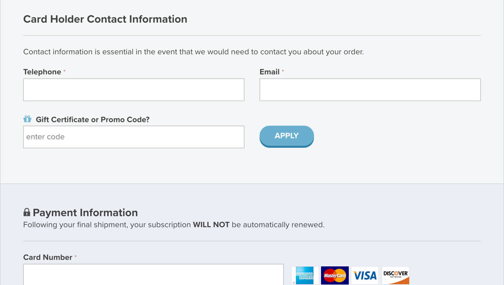
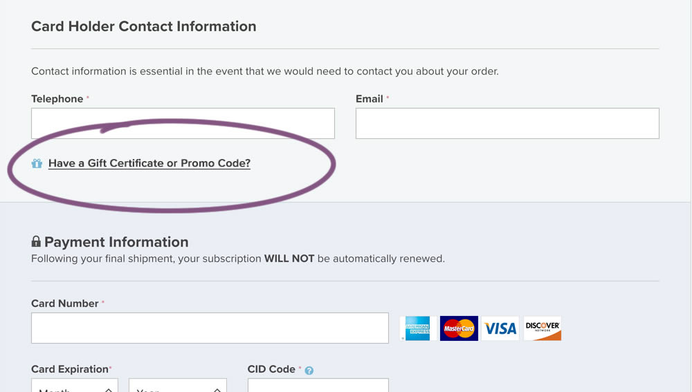
In this experiment, a fully visible coupon field (A) was made less visible by turning it into a default collaped link (B). Clicking on the link caused the coupon field to appear.
Test #269 on
Thomasnet.com
by  Julian Gaviria
Nov 15, 2019
Desktop
Home & Landing
X.X%
Signups
Julian Tested Pattern #14: Exposed Menu Options On Thomasnet.com


In this experiment, the variation exposed 6 of the options from the pulldown menu as tabs.
Test #258 on
Thomasnet.com
by  Julian Gaviria
Sep 12, 2019
Desktop
Mobile
Signup
X.X%
Signups
Julian Tested Pattern #110: Optional Field Labels On Thomasnet.com

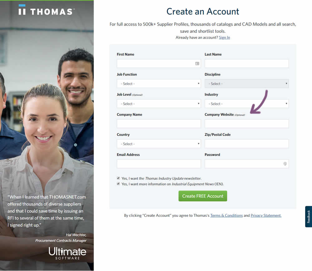
In this variation an optional field label was added.
Test #259 on
Thomasnet.com
by  Julian Gaviria
Sep 12, 2019
Desktop
Mobile
Signup
X.X%
Signups
Julian Tested Pattern #110: Optional Field Labels On Thomasnet.com
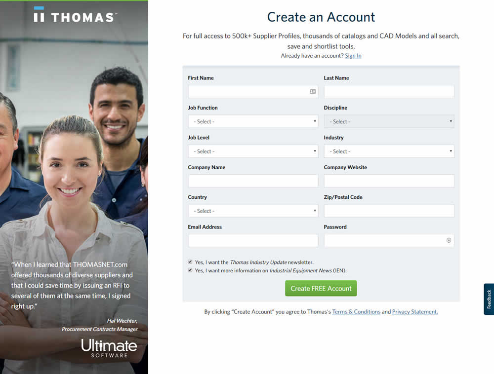
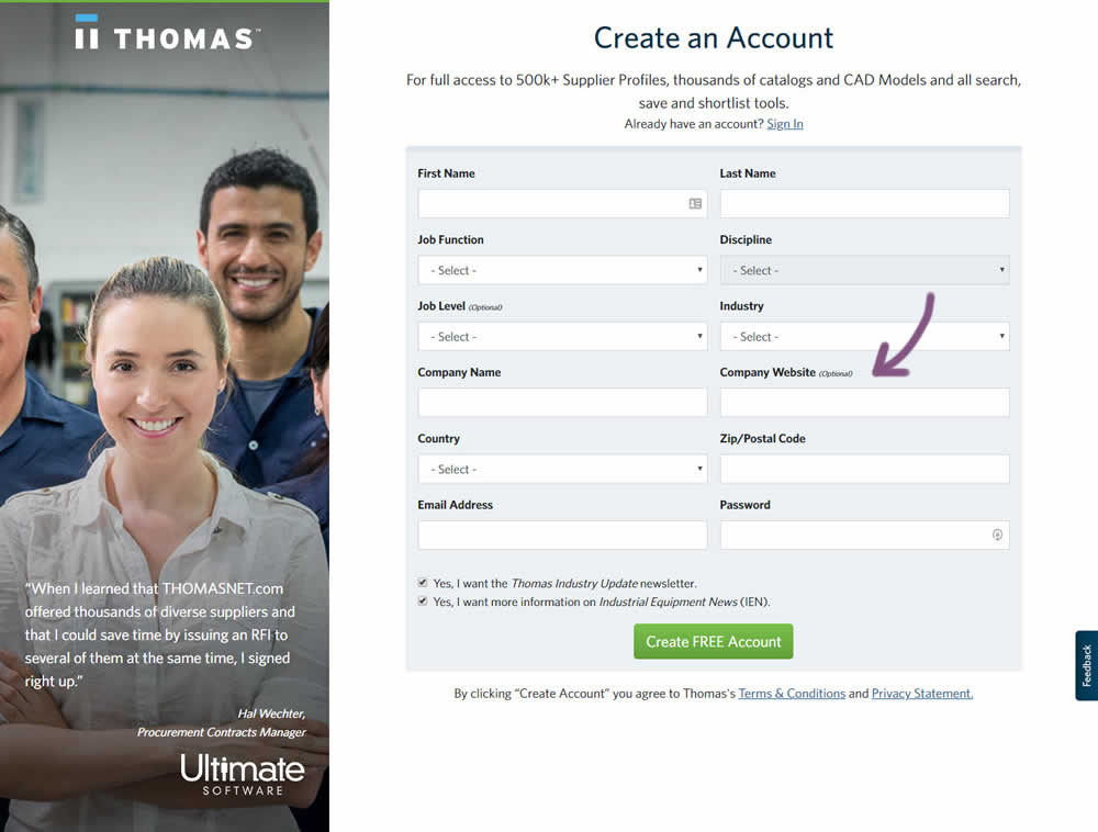
Test #257 on
Thomasnet.com
by  Julian Gaviria
Sep 09, 2019
Desktop
Mobile
Signup
X.X%
Signups
Julian Tested Pattern #109: Required Field Labels On Thomasnet.com


In this followup experiment, field labels without and with a marked asterisk were tested.
Test #256 on
by  Alex James
Aug 23, 2019
Desktop
Mobile
Signup
X.X%
Signups
Alex Tested Pattern #109: Required Field Labels
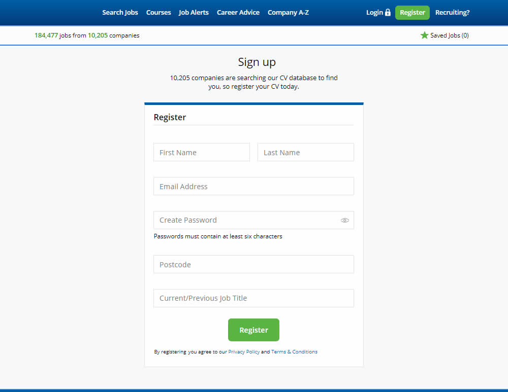
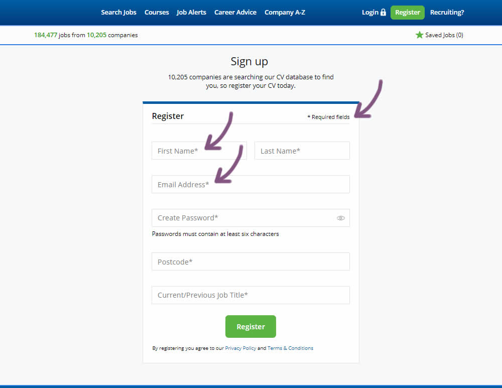
The original had no fields marked as required. The variant had all fields marked as required with an asterisk (and a reference note).
Test #255 on
Thomasnet.com
by  Julian Gaviria
Aug 22, 2019
Desktop
Mobile
Signup
X.X%
Signups
Julian Tested Pattern #109: Required Field Labels On Thomasnet.com
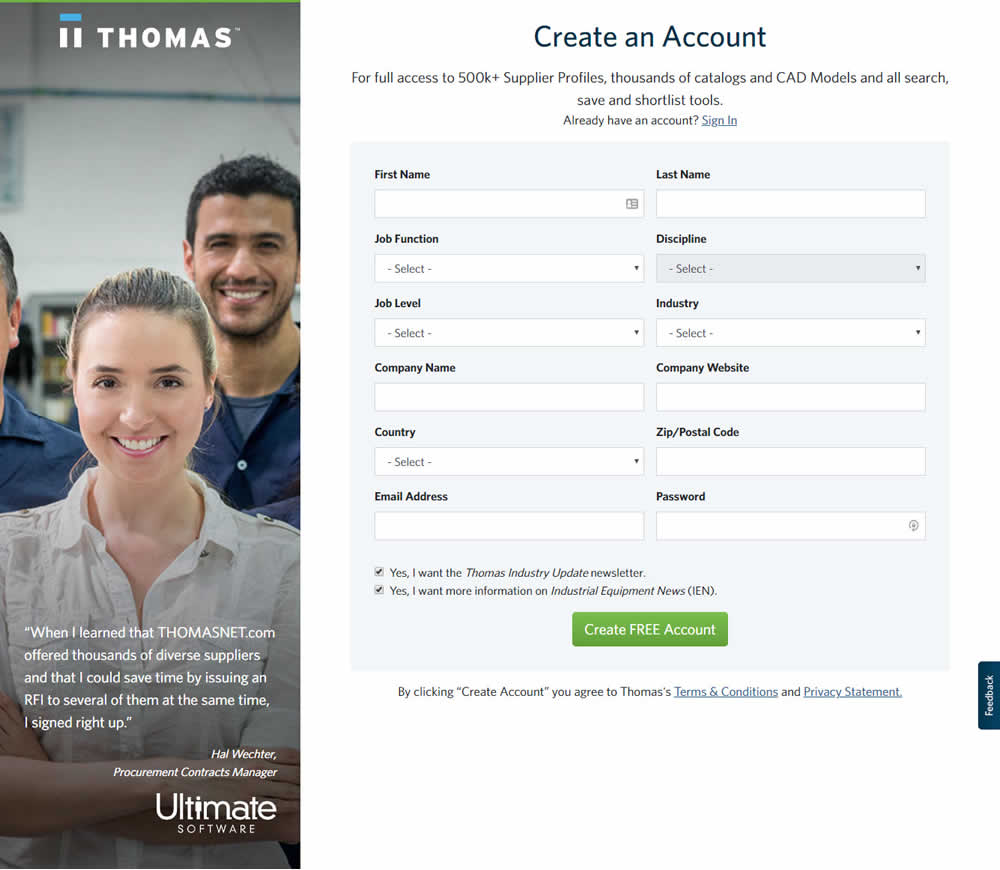

In this experiment, field labels without and with a marked asterisk were tested.
Test #39 on
Over-blog.com
by  Tael Pinault
Jul 02, 2019
Desktop
Signup
X.X%
Signups
Tael Tested Pattern #83: Progressive Fields On Over-blog.com
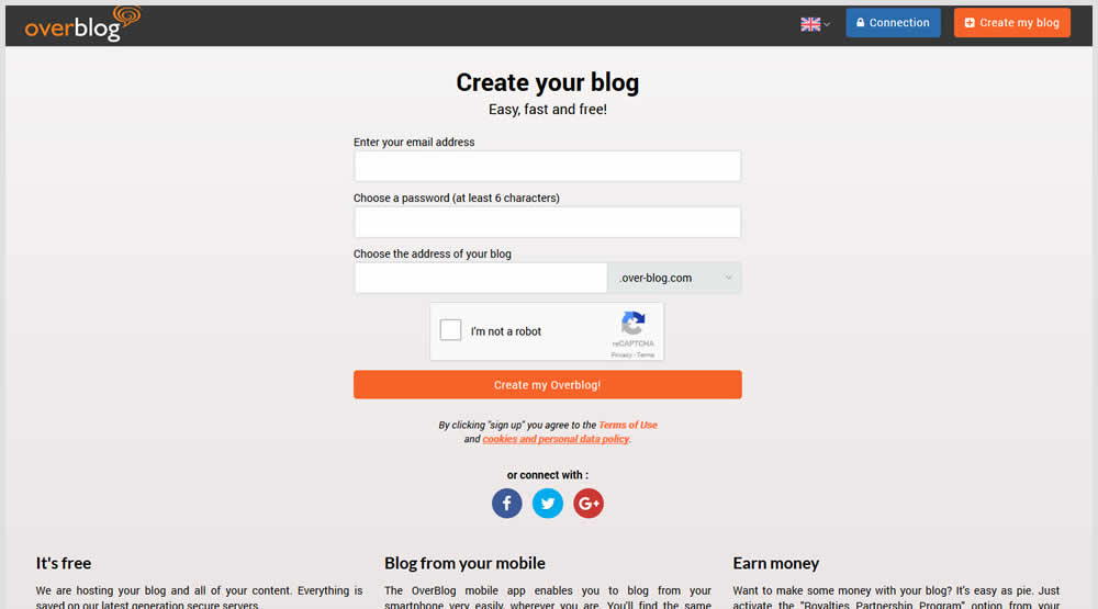
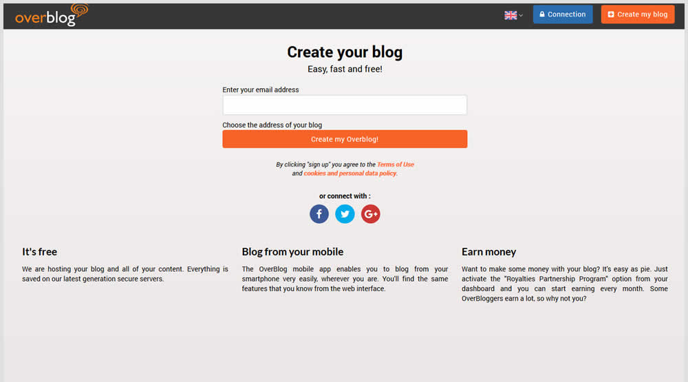
This test explored a progressive disclosure interaction in variation B. When a user started typing text into the first field, two more fields expanded into view.
Test #236 on
by  Alex James
Apr 04, 2019
Desktop
Signup
X.X%
Signups
Alex Tested Pattern #9: Multiple Steps
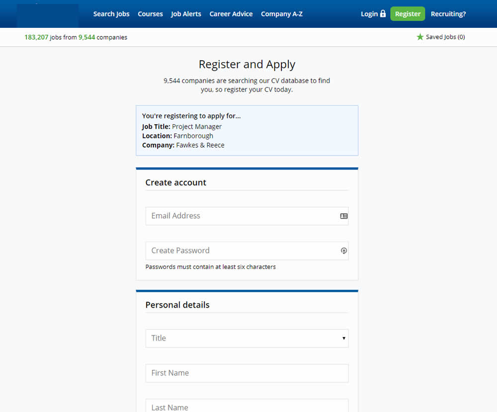
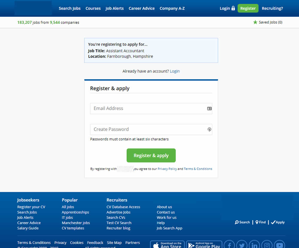
In this experiment a single screen signup process was broken into 2 separate steps: account creation & details.
Test #233 on
Annonce.cz
by  Ondřej Ilinčev
Apr 01, 2019
Desktop
Signup
X.X%
Sales
Ondřej Tested Pattern #100: Postponed Registration On Annonce.cz
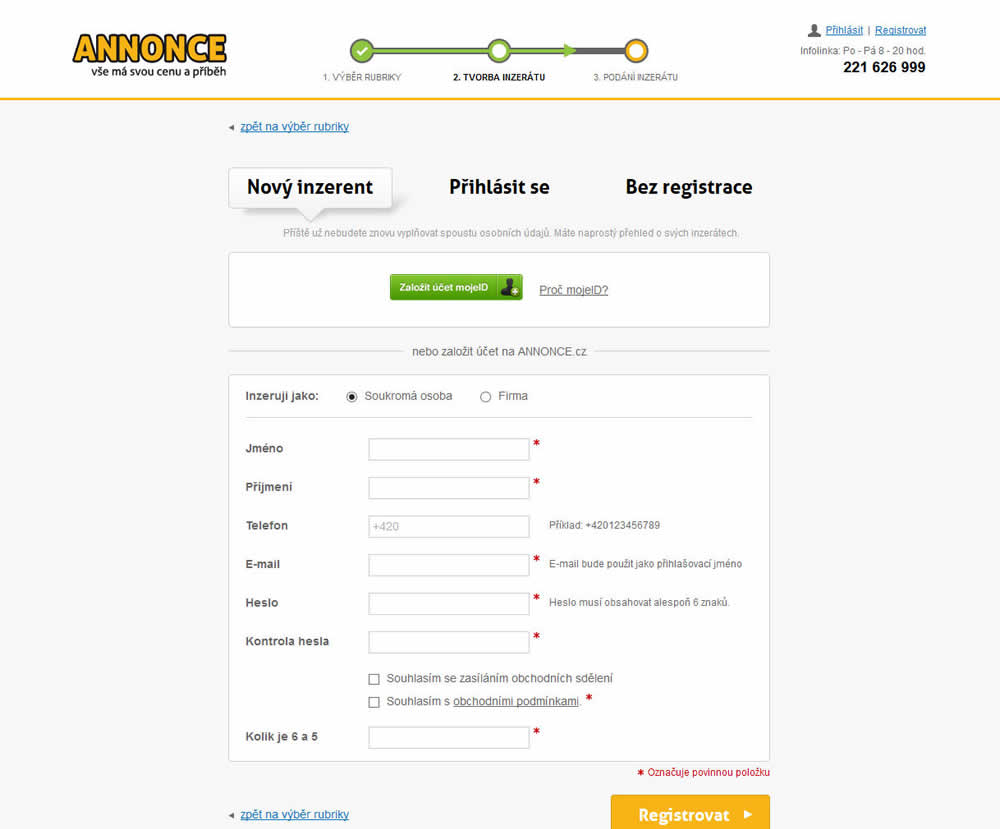
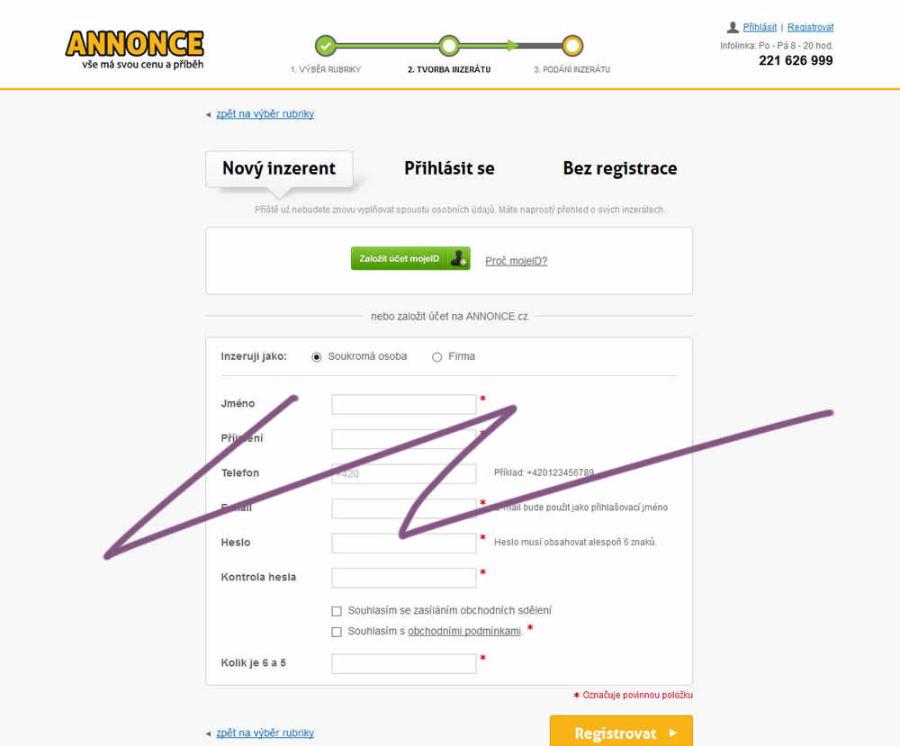
In this experiment, the old flow had a login / register / guest checkout as a second step. The variant B flow removed this step and treated everyone as a guest (and later offered to login / register). In the B version guests had a voluntary registration on the thank you page and in a confirmation email.
Test #231 on
Glass.net
by  Mark Freedle
Mar 14, 2019
Desktop
Mobile
Signup
X.X%
Leads
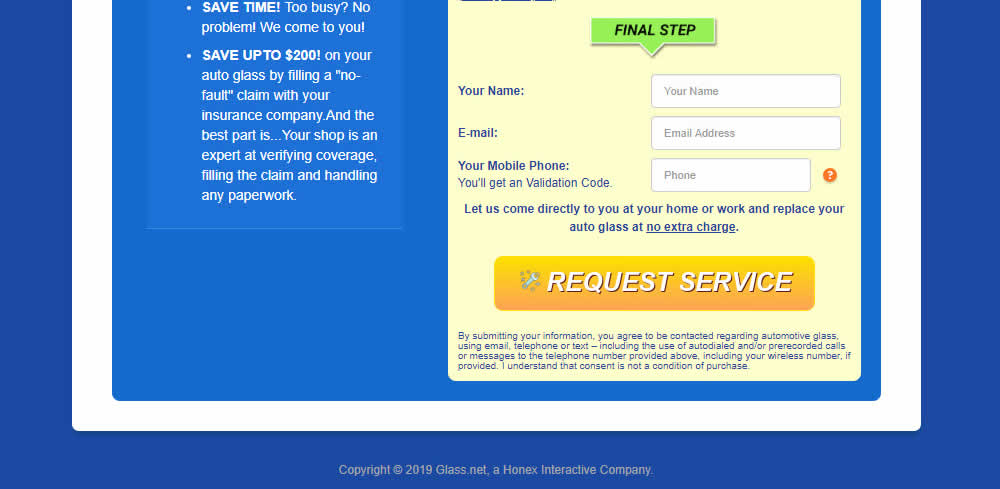
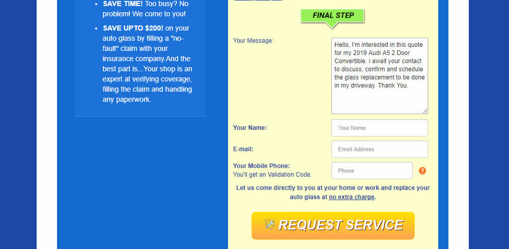
Mark Tested Pattern #20: Canned Response On Glass.net
Test #224 on
by  Alex James
Feb 11, 2019
Desktop
Home & Landing
X.X%
Progression
Alex Tested Pattern #3: Fewer Form Fields
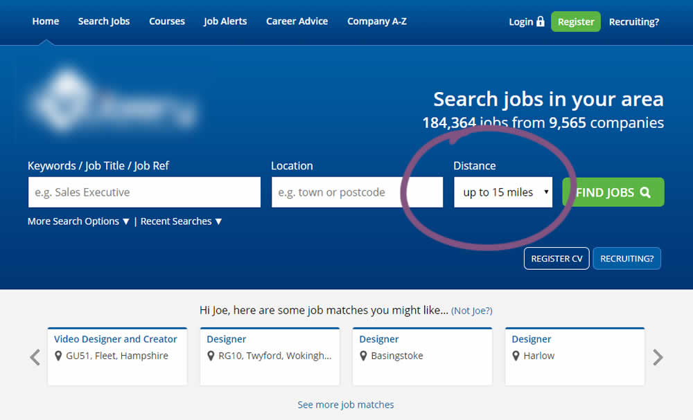
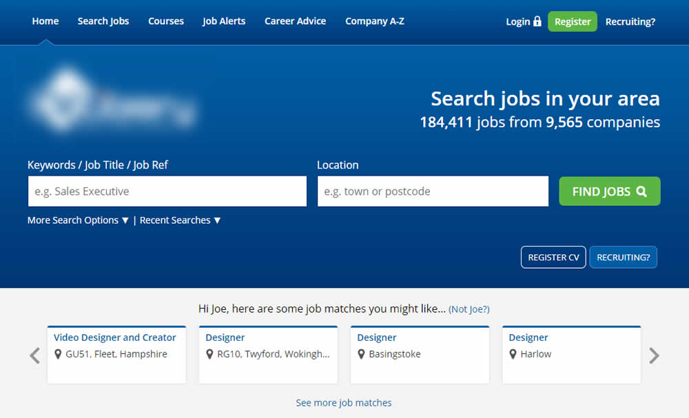
This experiment reduced the search form by removing the distance field.