All Latest 620 A/B Tests
MOST RECENT TESTS
Test #454 on
Trenyrkarna.cz
by  Ondřej Ilinčev
Jan 31, 2023
Desktop
Mobile
Shopping Cart
X.X%
Sales
Ondřej Tested Pattern #64: Tunnel On Trenyrkarna.cz
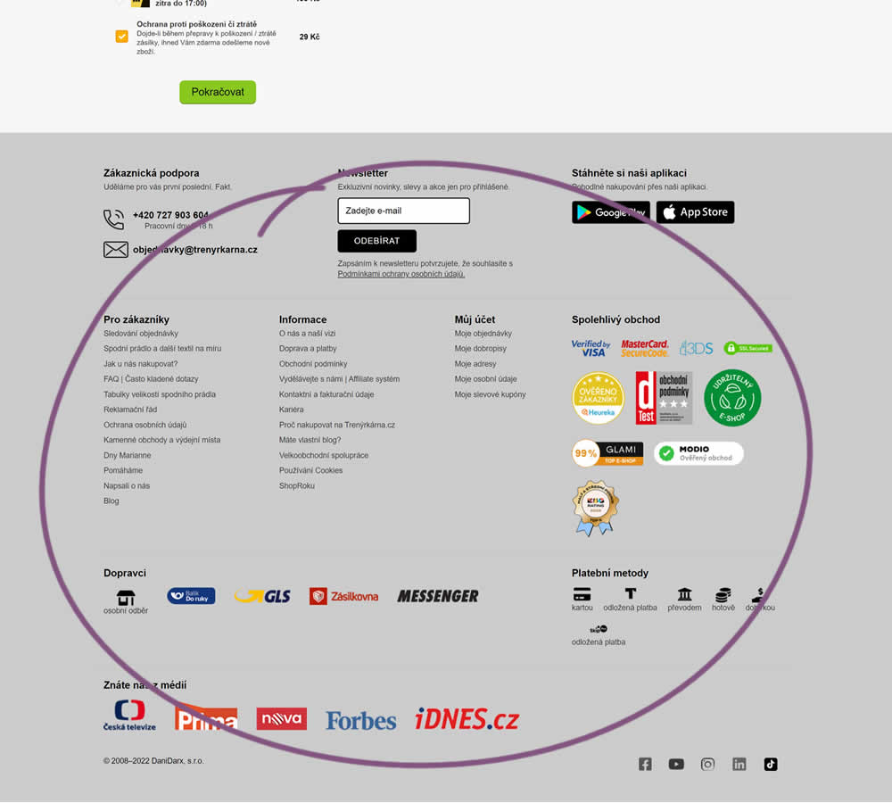
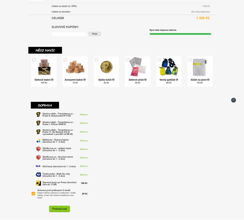
In this shopping cart experiment, a tall footer was completely removed. The footer contained elements such as: app download links, a newsletter signup, secondary web site links, trust symbols, social media icons and company contant information. Impact on sales was measured.
Which A Or B Actually Wins? Find Out Before You Test.
Members see every test result — the winners, the flat ones, and the losers — along with exact effects and sample sizes. Use it to estimate your tests and prioritize by probability, not gut feel. Start every experiment with the odds on your side.
Test #435 on
Volders.de
by  Daria Kurchinskaia
Oct 17, 2022
Desktop
Mobile
Checkout
X.X%
Sales
Daria Tested Pattern #9: Multiple Steps On Volders.de
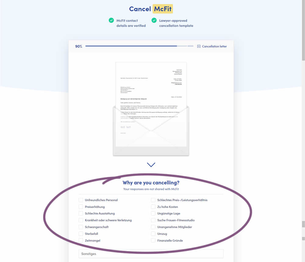
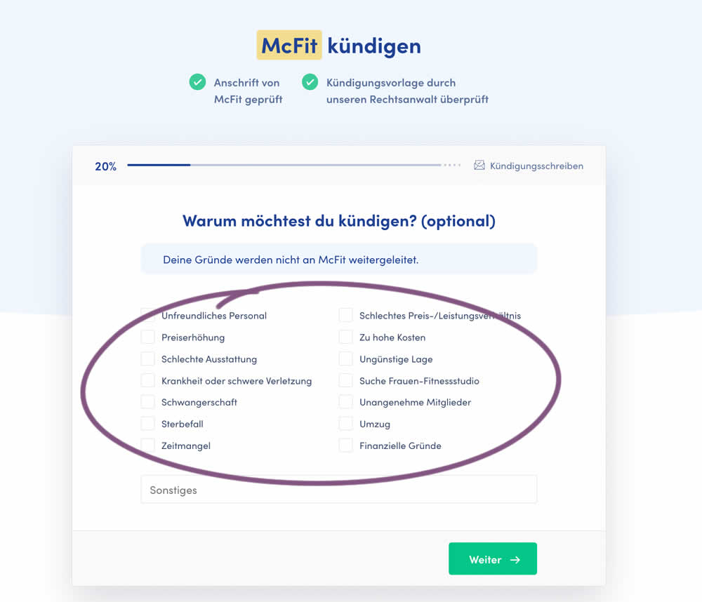
In this experiment, a question about a customer's reason for purchase was broken out into a separate step and moved earlier in the process. In the control, this question was asked in the final checkout step along with a plan selection (Step 4 of 4). In the variation, this question was shifted as a standalone first step (Step 1 of 5). Impact on completed purchases was measured (for a contract cancellation service in this case).
Test #433 on
Expertinstitute.com
by  Ardit Veliu
Sep 30, 2022
Desktop
Mobile
Signup
X.X%
Leads
Ardit Tested Pattern #20: Canned Response On Expertinstitute.com
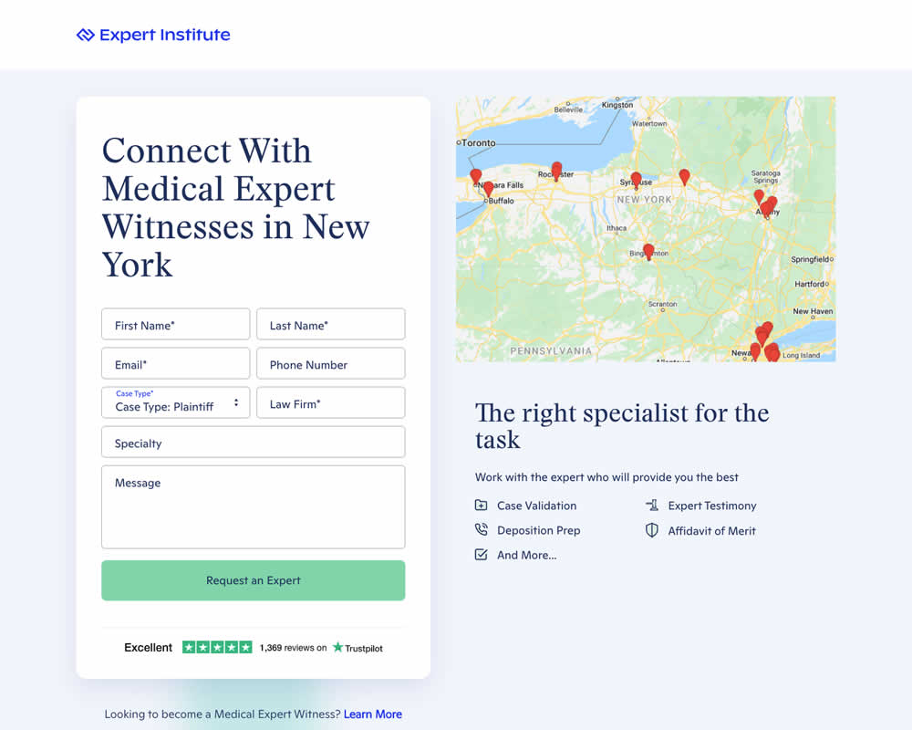
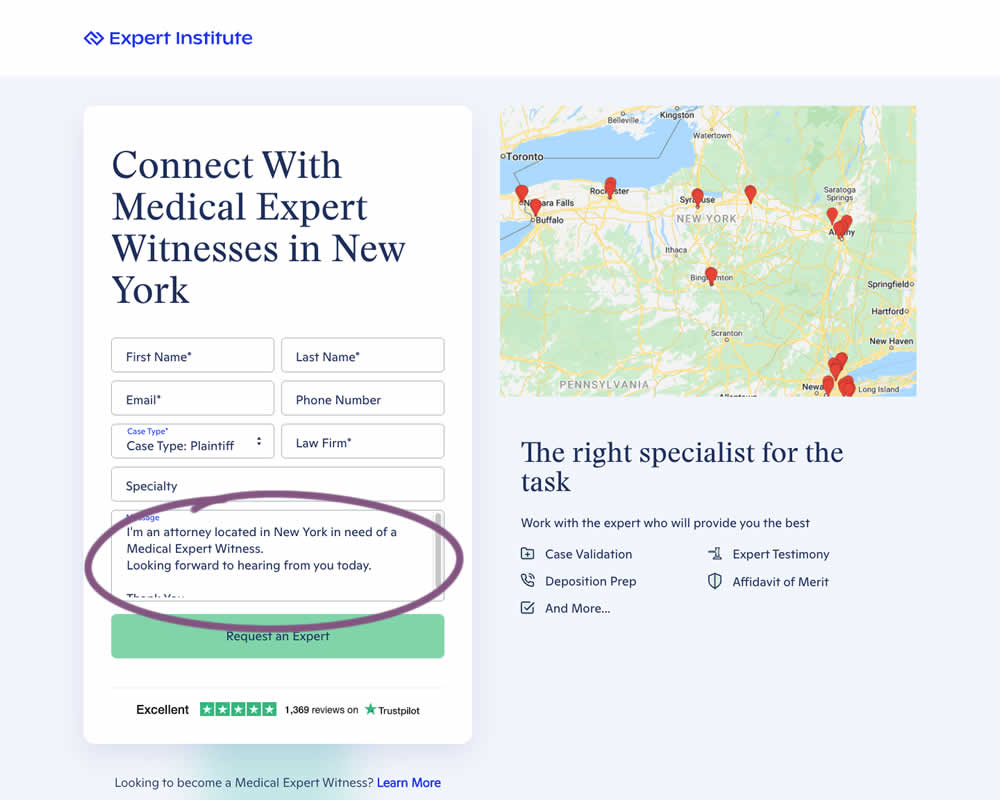
In this experiment a dynamic canned response was added to a lead form. The contents of the copy reflected a handful of user choices from other form field selections. Impact on leads / form submissions was measured.
Test #427 on
Designlab.com
by  Daniel Shapiro
Aug 10, 2022
Desktop
Mobile
Checkout
X.X%
Sales
Daniel Tested Pattern #28: Easiest Fields First On Designlab.com
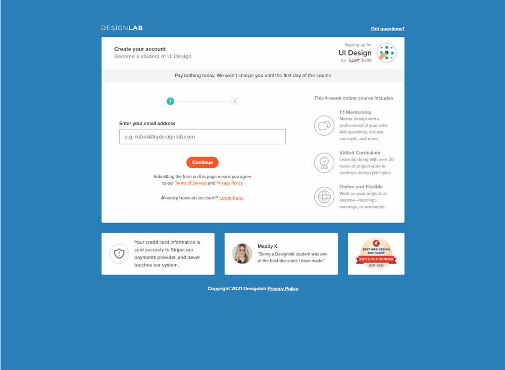
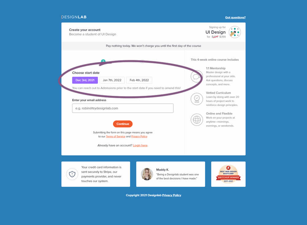
In this experiment, the course enrollment start date was moved from step 2 to step 1 of an enrollment / checkout flow. The test was run by Designlab - that offers design courses and education with a strong element of mentorship. Impact on progression to next step and completed transactions were measured.
Test #423 on
Expertinstitute.com
by  Ardit Veliu
Jul 26, 2022
Desktop
Mobile
Home & Landing
X.X%
Leads
Ardit Tested Pattern #110: Optional Field Labels On Expertinstitute.com
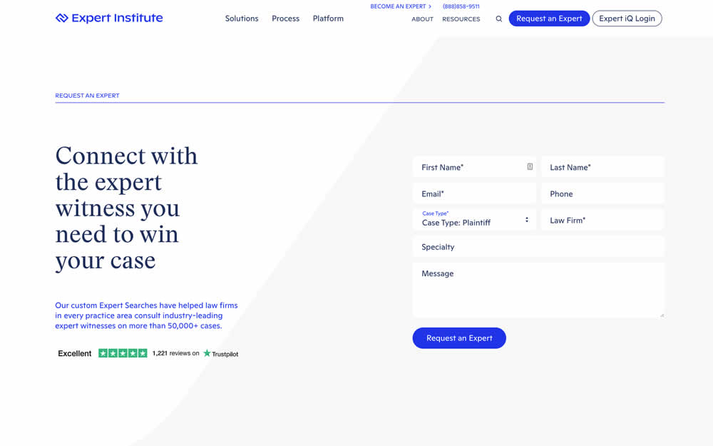
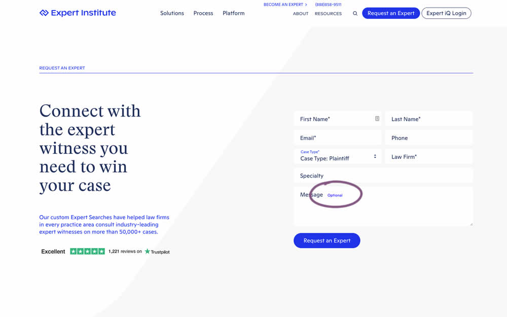
In this experiment, an "optional" label was shown near a message form field. Impact on overall leads was measured (requesting experts).
Test #422 on
Volders.de
by  Daria Kurchinskaia
Jul 22, 2022
Desktop
Mobile
Shopping Cart
X.X%
Sales
Daria Tested Pattern #3: Fewer Form Fields On Volders.de
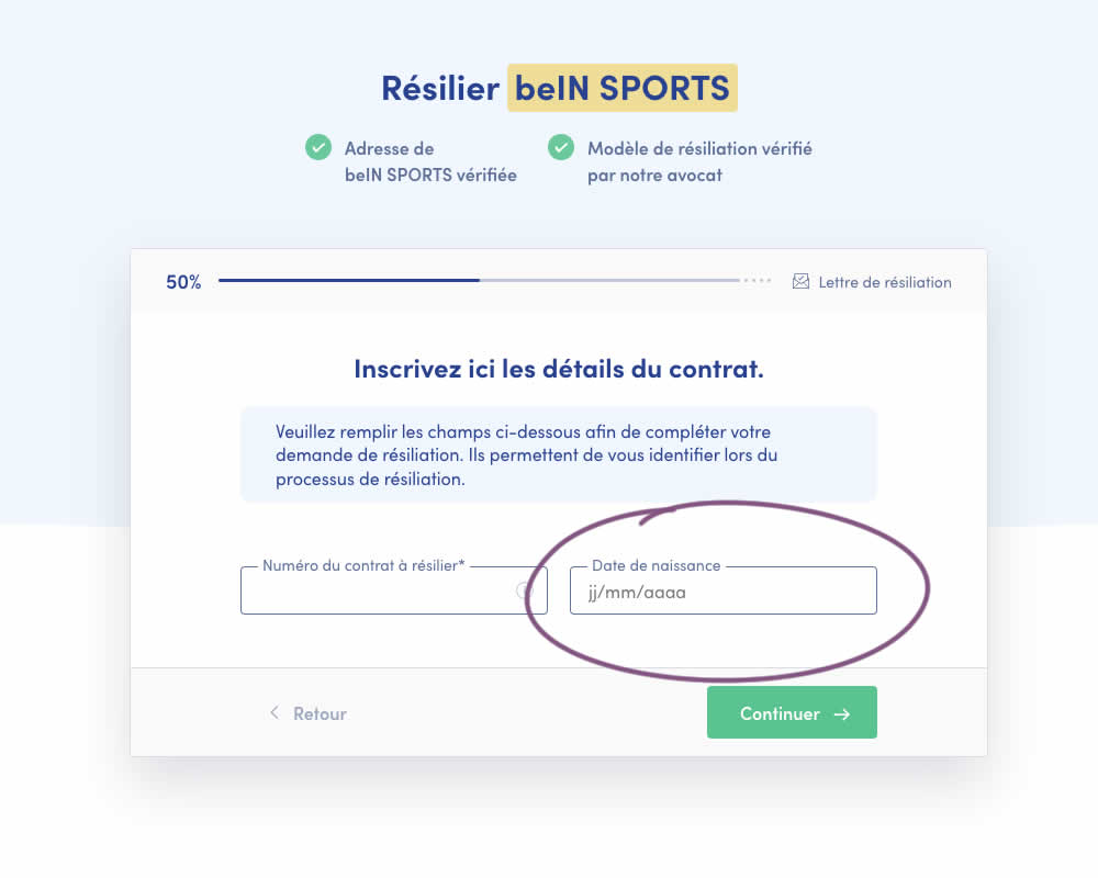
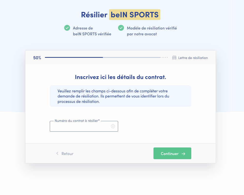
A birthdate field was removed during a signup process for a paid contract cancellation service. Impact on progression (next step) and sales (completed transactions) was measured.
Test #415 on
Learnwithhomer.com
by  Stanley Zuo
Jun 09, 2022
Mobile
Checkout
X.X%
Signups
Stanley Tested Pattern #3: Fewer Form Fields On Learnwithhomer.com
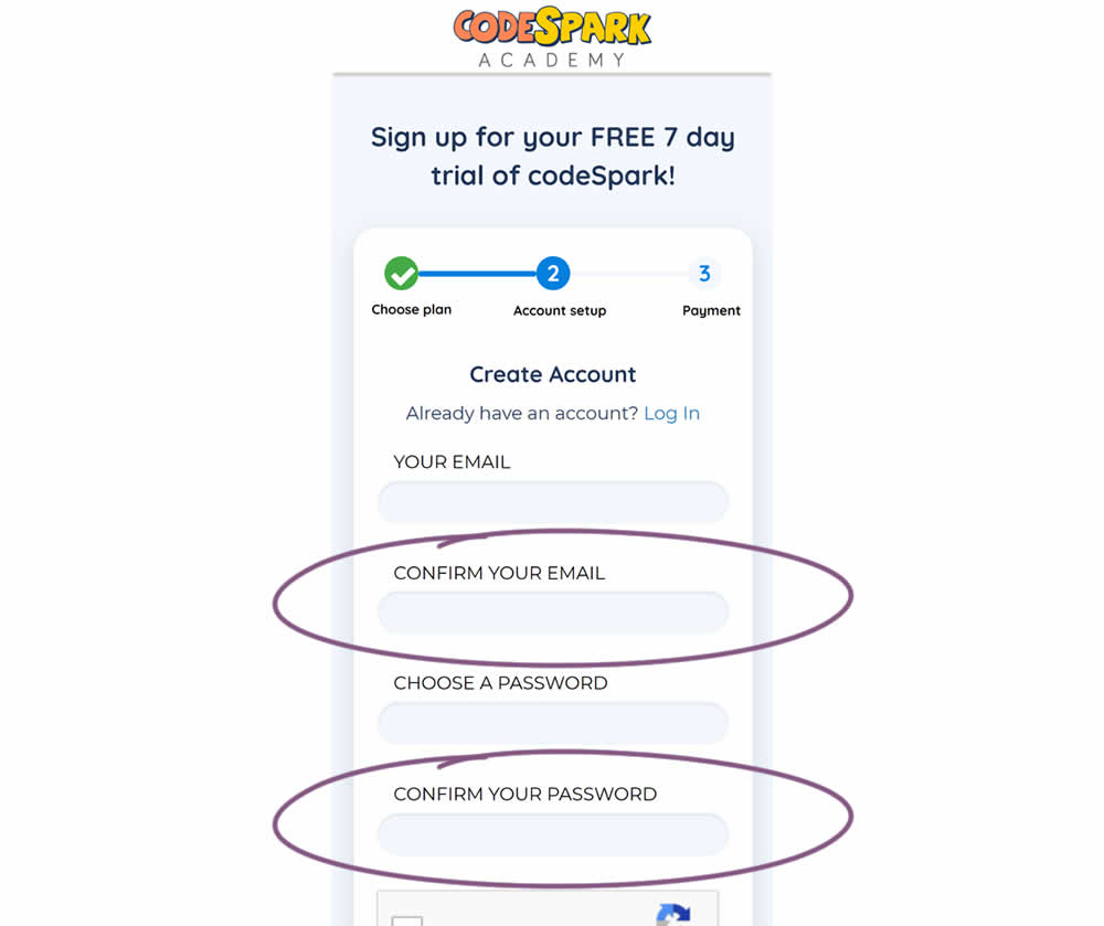
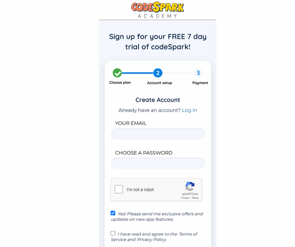
Do fewer confirmation form fields matter? In this experiment, redundant password and email confirmation fields were removed during a signup / checkout funnel. Impact on signups was measured.
Test #414 on
Volders.de
by  Frederik Fröhle
May 31, 2022
Desktop
Mobile
Checkout
X.X%
Sales
Frederik Tested Pattern #98: Auto Suggest On Volders.de
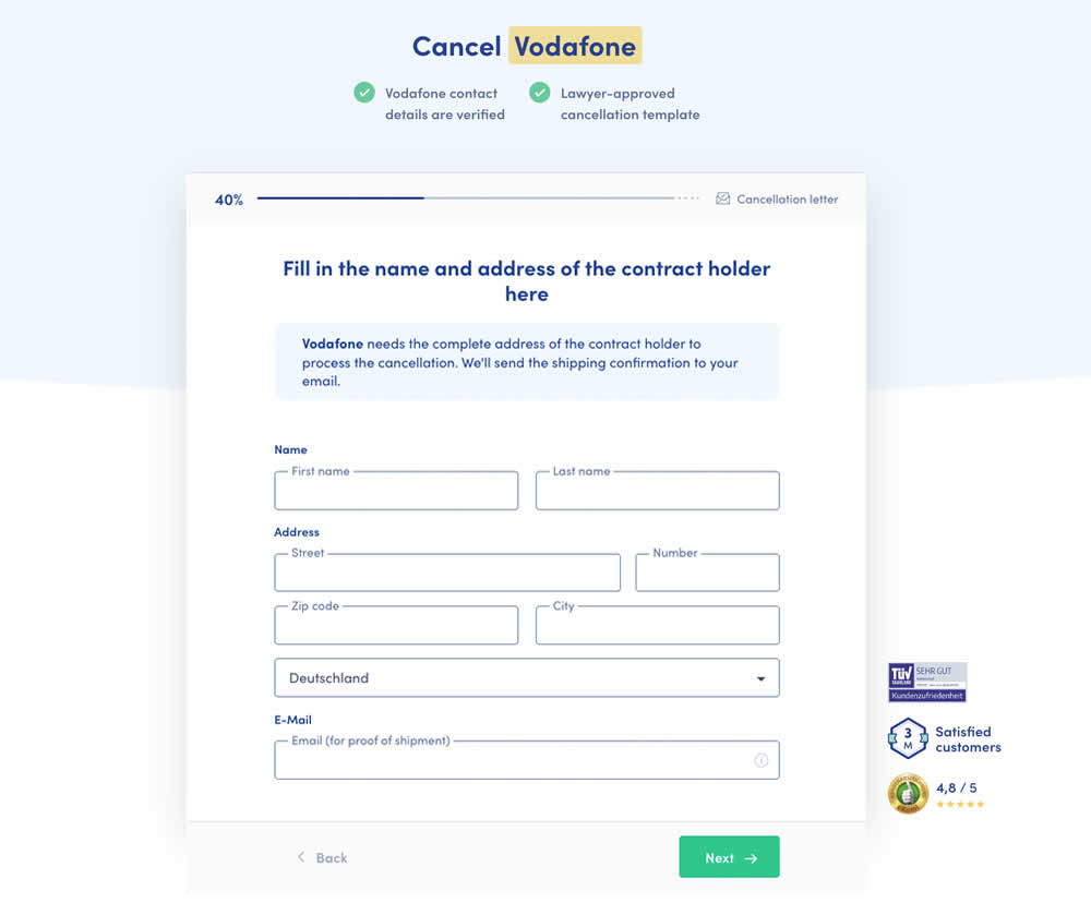
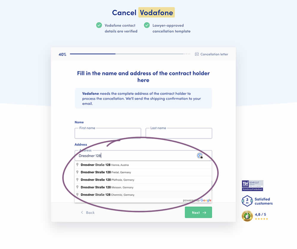
Does adding Google's address auto complete functionality to an address field help with higher form completions? This auto fill feature has been tested in the variation of a contract cancellation funnel. After selecting an auto completed address from a pulldown menu, the following fields were preselected: house number, zip code, city and country (potentially lowering friction?). Impact on successful form completions (contract cancellations) has been measured. Notice how the form also expanded progressively upon selecting the complete address in the variation.
Test #409 on
Expertinstitute.com
by  Ardit Veliu
Apr 30, 2022
Desktop
Mobile
Signup
X.X%
Leads
Ardit Tested Pattern #20: Canned Response On Expertinstitute.com
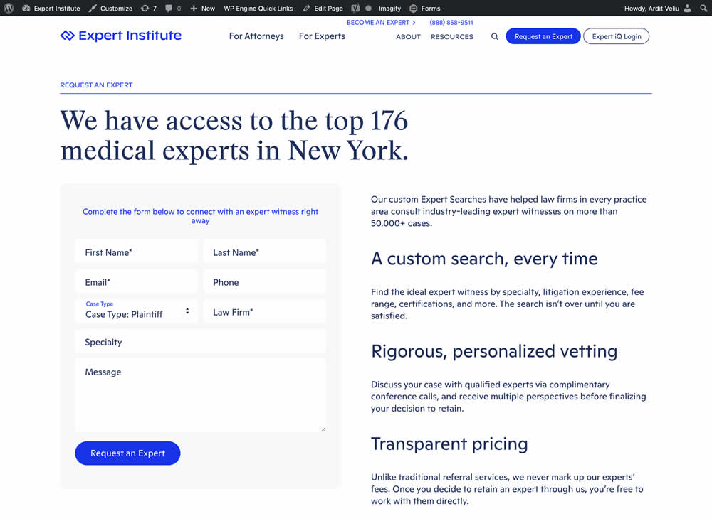
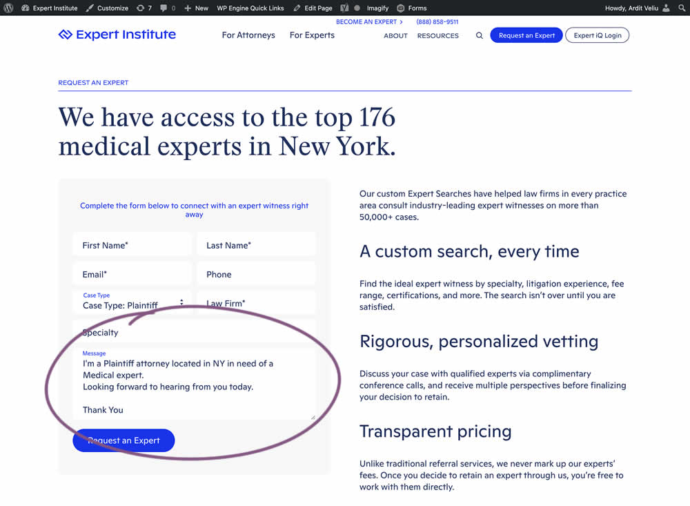
In this experiment, the copy of an input textarea on a lead form was used to summarize a user's choices. Instead of showing using a generic "Message" statement, the variation use the following formula: "I'm a [Lead Type] located in [State] looking for [Expert Type]. Looking forward to hearing from you today. Thank You." Impact of leads was measured.
Test #405 on
Learnwithhomer.com
by  Stanley Zuo
Apr 07, 2022
Mobile
Signup
X.X%
Sales
Stanley Tested Pattern #119: Unselected Or Selected Defaults On Learnwithhomer.com


In this experiment, the annual plan was preselected instead of starting off unselected in the control. Impact on two metrics was measured: any plan and annual plan purchases.
Test #399 on
by  Jakub Linowski
Feb 27, 2022
Desktop
Mobile
Checkout
X.X%
Progression
Jakub Tested Pattern #35: Floating Labels
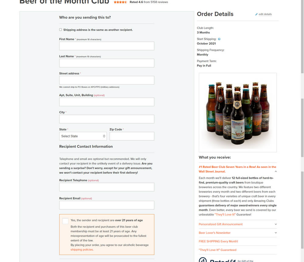
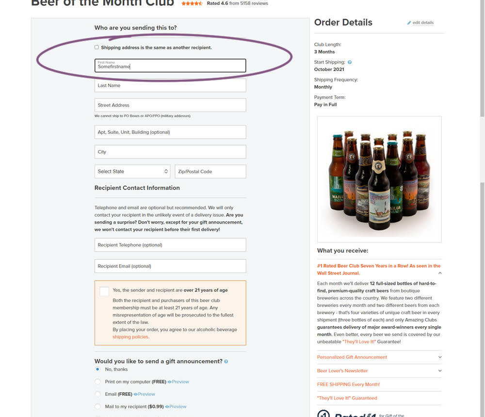
In this experiment, top-aligned field labels were tested against floating labels (with labels floating inside the form field itself).
Test #393 on
Snocks.com
by  Melina Hess
Jan 19, 2022
Mobile
Shopping Cart
X.X%
Sales
Melina Tested Pattern #1: Remove Coupon Fields On Snocks.com
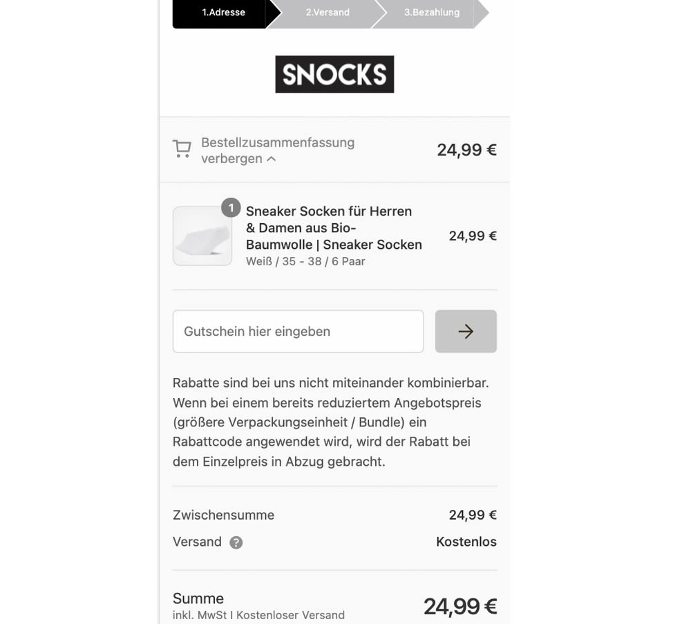
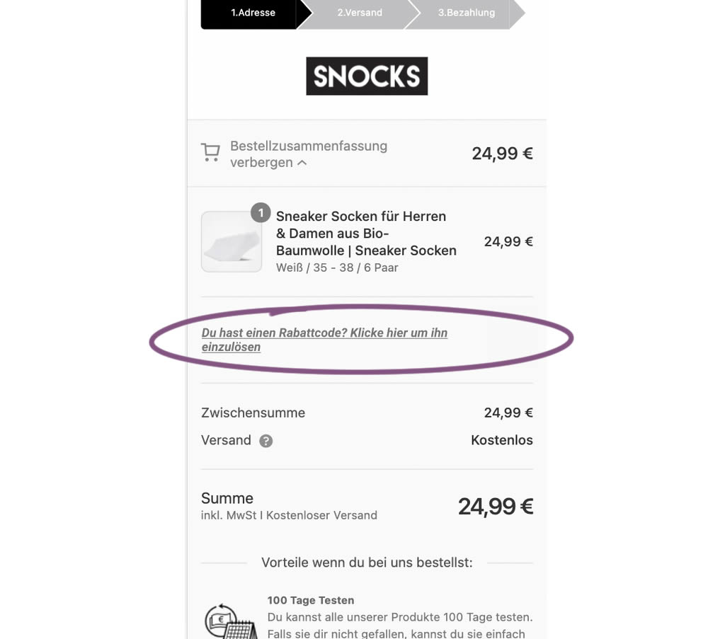
This experiment replaced a visible coupon field with a dynamic text link that would initially hide the form field. Only after clicking the text link would the coupon form field appear. The translation from German is "Do you have a coupon code? Click here to apply". Impact on completed transactions was measured.
Test #389 on
Svsound.com
by  Keenan Davis
Dec 16, 2021
Desktop
Mobile
Checkout
X.X%
Sales
Keenan Tested Pattern #1: Remove Coupon Fields On Svsound.com
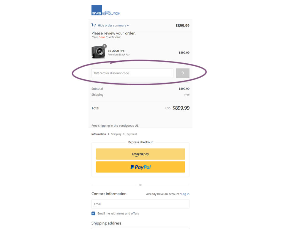
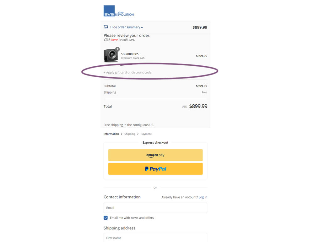
In this simple experiment, a highly visible coupon field was replaced with a less visible (but clickable) link in the variation. Clicking on the link would show the coupon field. Impact on sales and revenue was measured.
Test #383 on
by  Jakub Linowski
Nov 11, 2021
Desktop
Checkout
X.X%
Sales
Jakub Tested Pattern #123: Single Or Double Column Form Fields
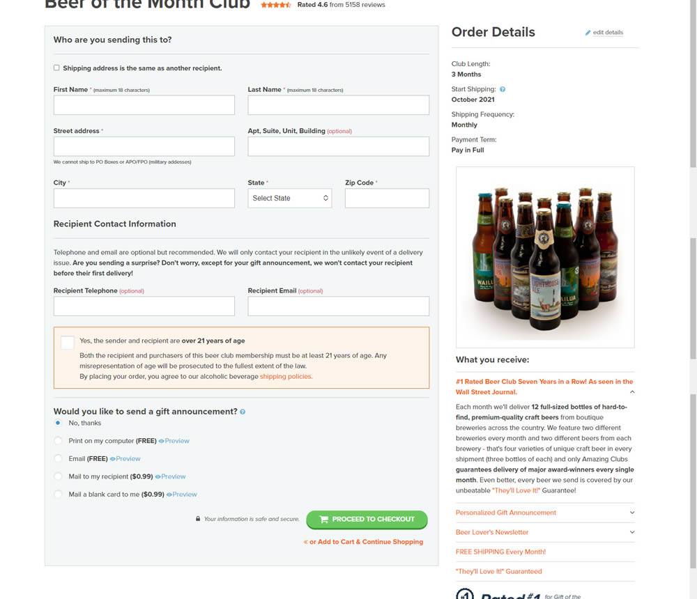

In this simple [inverted] experiment, the variation organized the form fields into a single column. The control had two columns of form fields.
Test #352 on
Us.flukecal.com
by  John Hickey
May 11, 2021
Desktop
Global
X.X%
Leads
John Tested Pattern #123: Single Or Double Column Form Fields On Us.flukecal.com
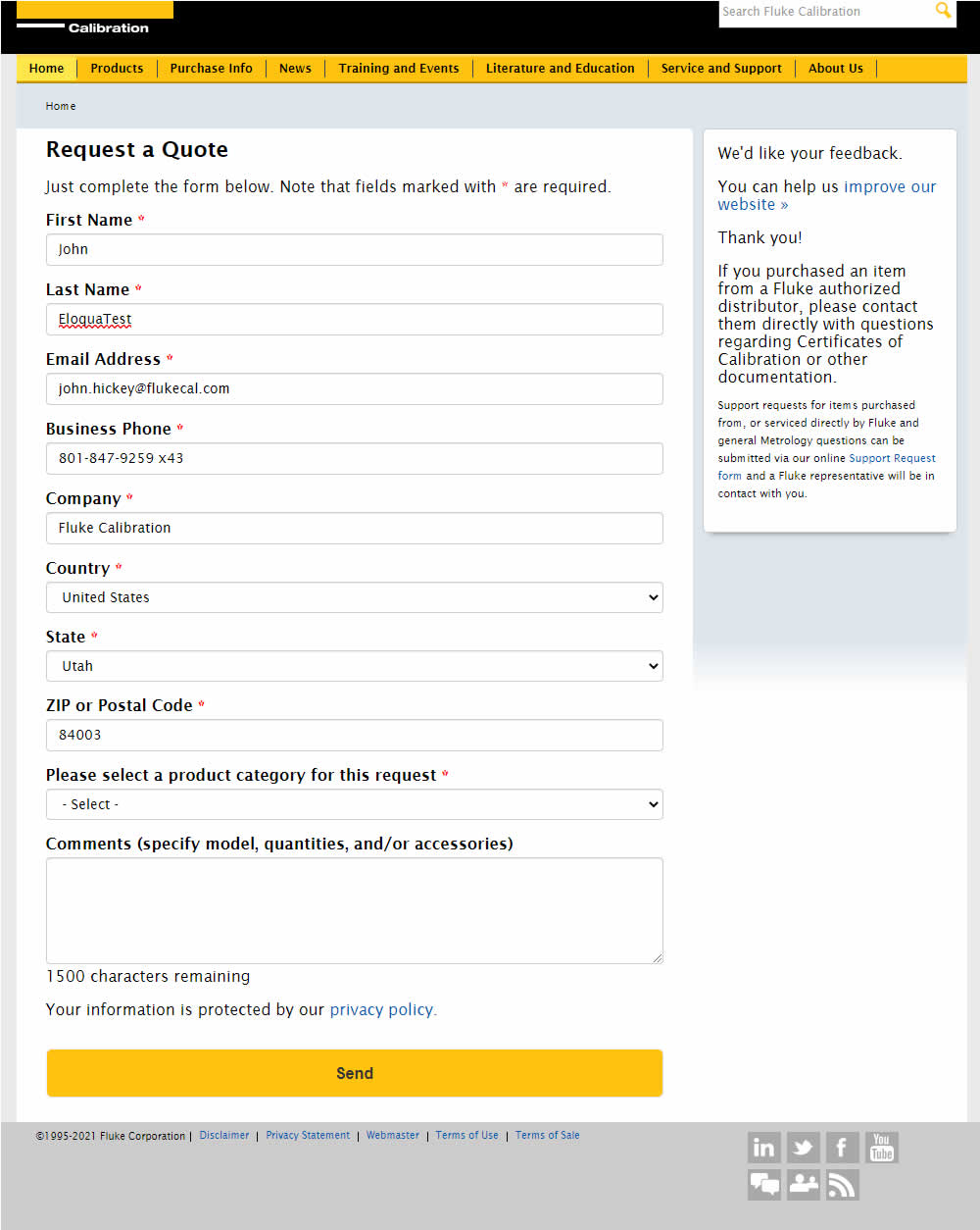
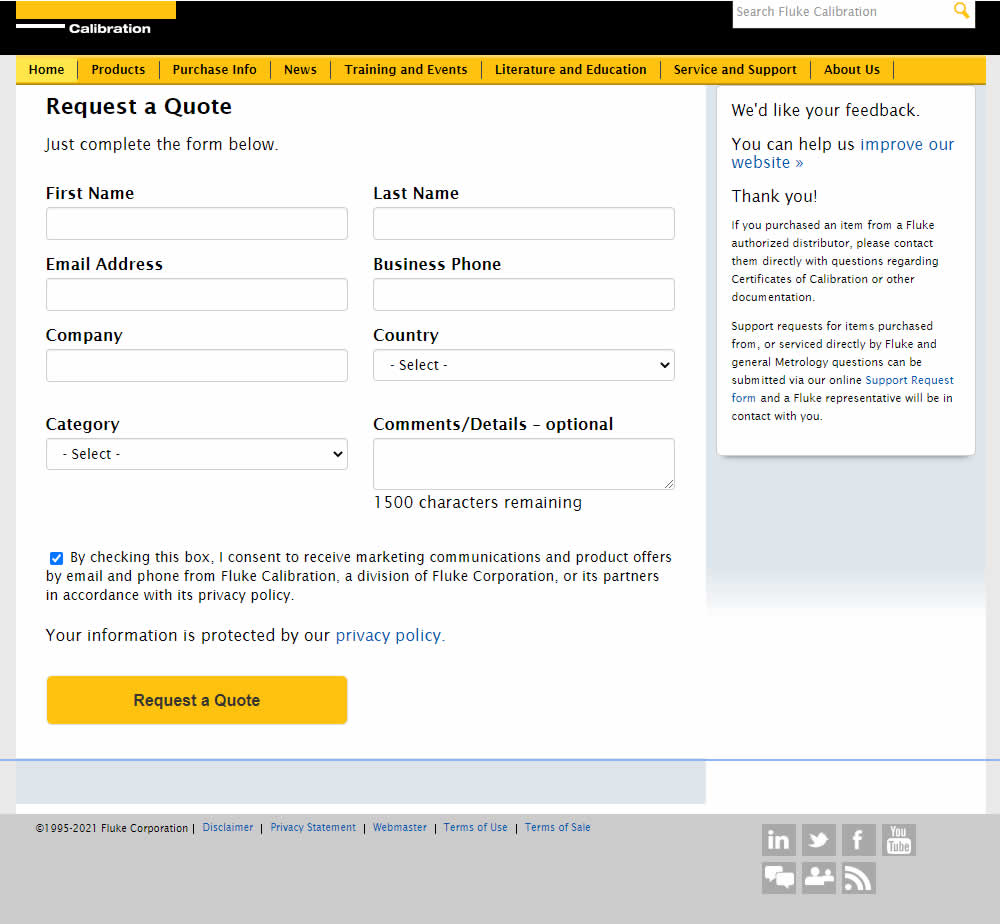
In this experiment, single column (longer) form fields were tested against a two column layout (more compact).
Test #351 on
Baremetrics.com
by  Brian Sierakowski
Apr 30, 2021
Desktop
Mobile
Home & Landing
X.X%
Signups
Brian Tested Pattern #11: Gradual Reassurance On Baremetrics.com
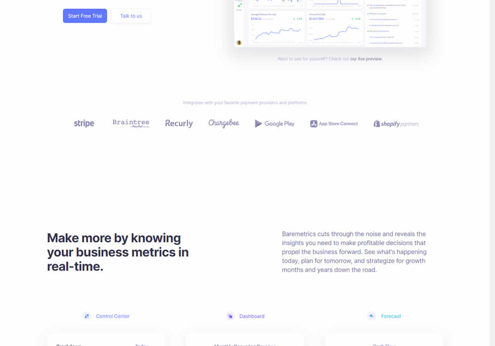
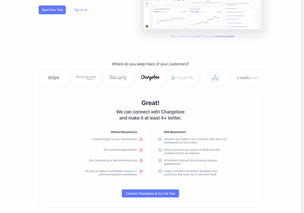
In this experiment, static integration logos were replaced with selectable ones that reassured users to signup. After clicking an integration logo, a comparison chart would appear showing how Baremetrics improves upon a selected payment processor, along with a call to signup. Impact on signups was measured.
Test #345 on
Getninjas.com.br
by  Rodolfo Lugli
Mar 29, 2021
Desktop
Home & Landing
X.X%
Leads
Rodolfo Tested Pattern #9: Multiple Steps On Getninjas.com.br
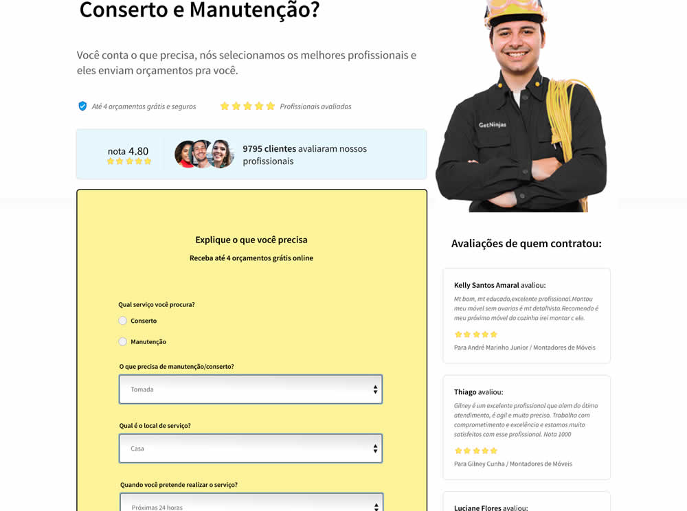

In this experiment, a single long form was broken into at least 3 steps.
Test #86 on
Vivareal.com.br
by  Rodrigo Maués
Feb 28, 2021
Mobile
Desktop
Product
X.X%
Leads
Rodrigo Tested Pattern #3: Fewer Form Fields On Vivareal.com.br
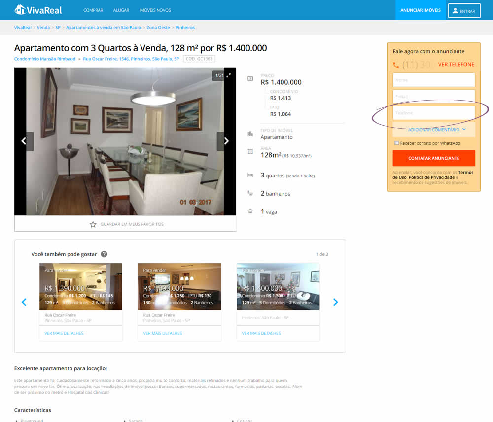
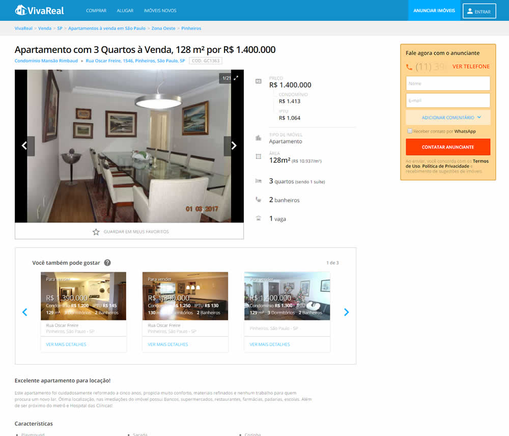
In this experiment, the telephone field was removed from a lead form on a property page. Impact on leads was measured.
Test #341 on
by  Alex James
Feb 25, 2021
Desktop
Mobile
Signup
X.X%
Signups
Alex Tested Pattern #35: Floating Labels
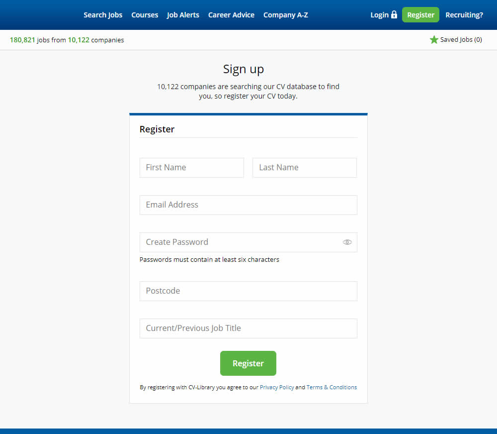
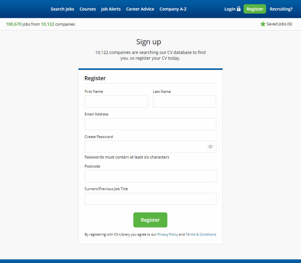
This experiment shows a comparison between floating-field labels vs top-aligned labels. Form labels first appeared inline and as users would begin typing, they floated to the top of the field. In the other version, fixed field labels were shown above the form fields at all times. Impact on signups was measured.
Test #313 on
Trydesignlab.com
by  Daniel Shapiro
Aug 19, 2020
Desktop
Mobile
Home & Landing
X.X%
Leads
Daniel Tested Pattern #11: Gradual Reassurance On Trydesignlab.com


In this experiment, instead of showing a single-focused lead form (for the UX Academy Program), users were asked to express a wider set of choices first (for the UX Academy or shortter set of skill-based courses). The experiment measured overall leads for both types of programs.