All Latest 620 A/B Tests
MOST RECENT TESTS
Test #617 on
by  Frazer Mawson
Oct 30, 2025
Mobile
Signup
X.X%
Sales
Frazer Tested Pattern #99: Progress Bar
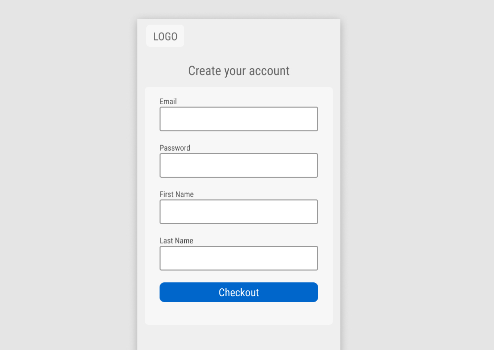
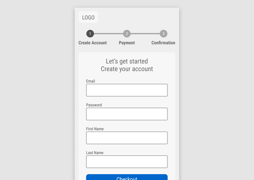
A progress bar was added to the top of a 3 step signup funnel. Impact on completed orders was measured.
Which A Or B Actually Wins? Find Out Before You Test.
Members see every test result — the winners, the flat ones, and the losers — along with exact effects and sample sizes. Use it to estimate your tests and prioritize by probability, not gut feel. Start every experiment with the odds on your side.
Test #615 on
Online.metro-cc.ru
by  Andrey Andreev
Oct 28, 2025
Mobile
Checkout
X.X%
Sales
Andrey Tested Pattern #64: Tunnel On Online.metro-cc.ru
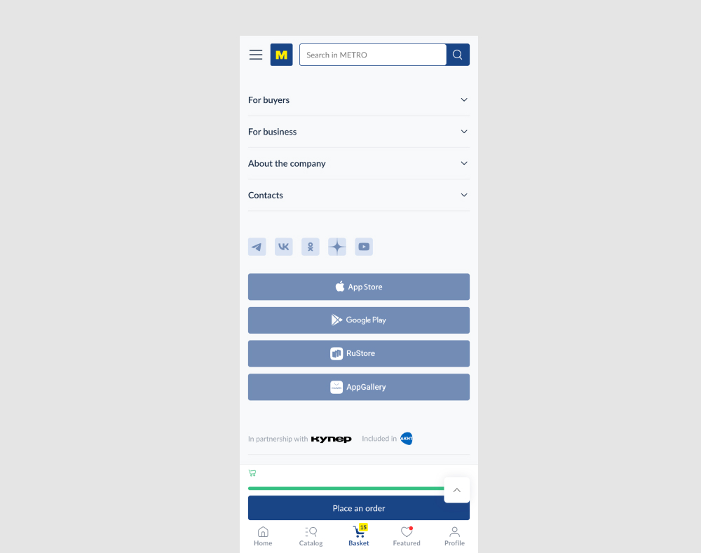
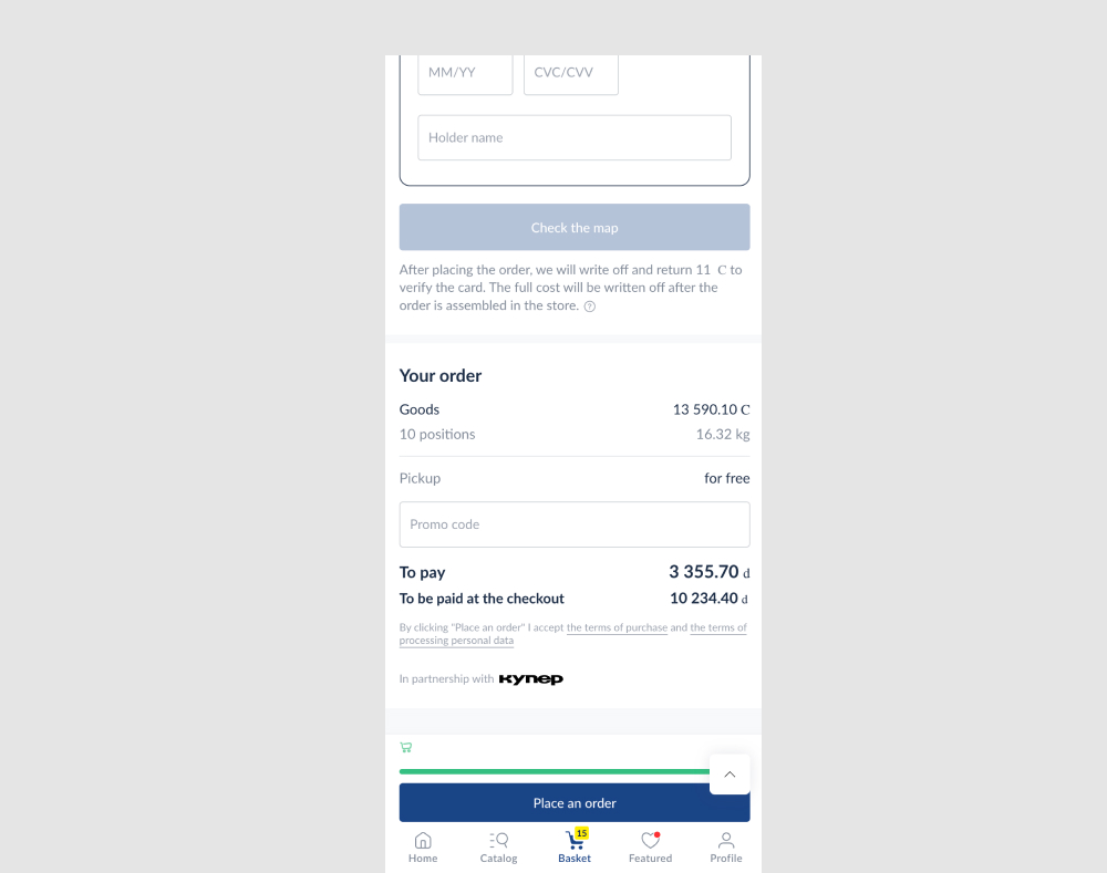
In this experiment, two sets of distractions were removed from the checkout put. First, the search bar was removed from the top of the screen. Second, a series of app links were also removed from the bottom of the screen near the footer. Impact on checkouts was measured.
Test #614 on
Kay.com
by  Craig Kistler
Oct 23, 2025
Mobile
Home & Landing
X.X%
Sales
Craig Tested Pattern #26: Cart Reminder And Recently Viewed On Kay.com
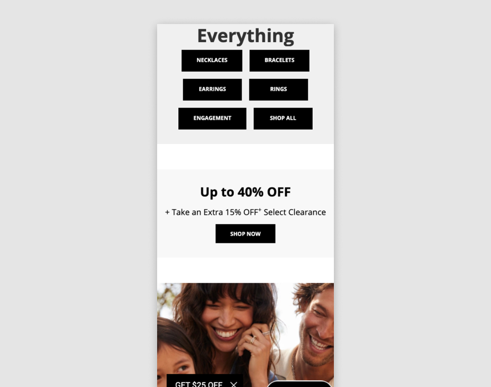
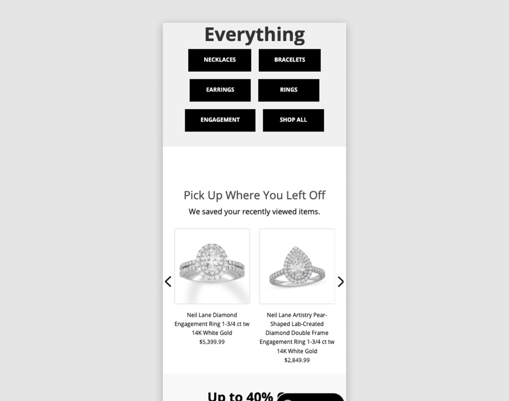
In this experiment, returning users to a homepage would be shown recently viewed items. Impact on adds to cart and sales was measured. The experiment was triggered to returning users.
Test #613 on
Online.metro-cc.ru
by  Andrey Andreev
Sep 30, 2025
Desktop
Home & Landing
X.X%
Sales
Andrey Tested Pattern #135: Product Categories On Online.metro-cc.ru
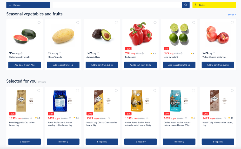
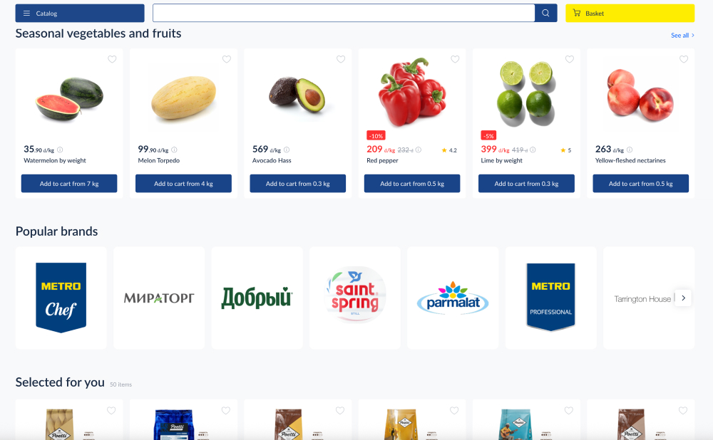
In this experiment, a series of brand logos with links to product listing pages were added - enabling another layer of search. Impact on products purchased was measured.
Test #612 on
by  Frazer Mawson
Sep 28, 2025
Mobile
Checkout
X.X%
Sales
Frazer Tested Pattern #99: Progress Bar
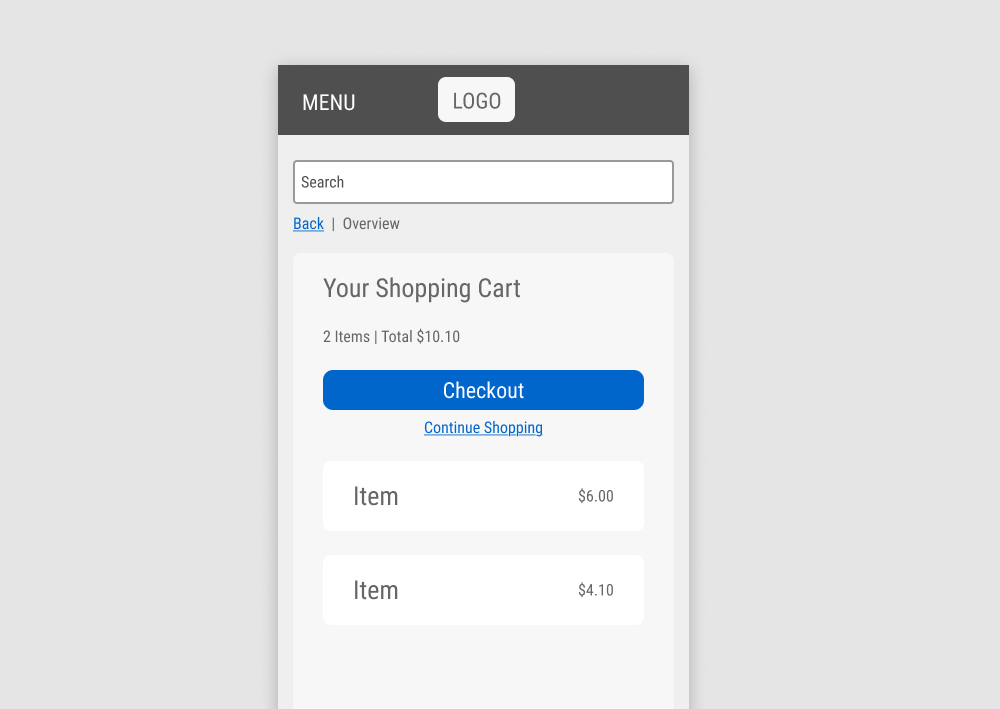
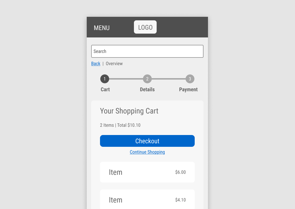
In this experiment, a 3 step progress bar was added at the top of an ecommerce checkout funnel. Impact on checkout progression and completed sales was measured.
Test #608 on
by  Frazer Mawson
Aug 28, 2025
Mobile
Signup
X.X%
Signups
Frazer Tested Pattern #99: Progress Bar
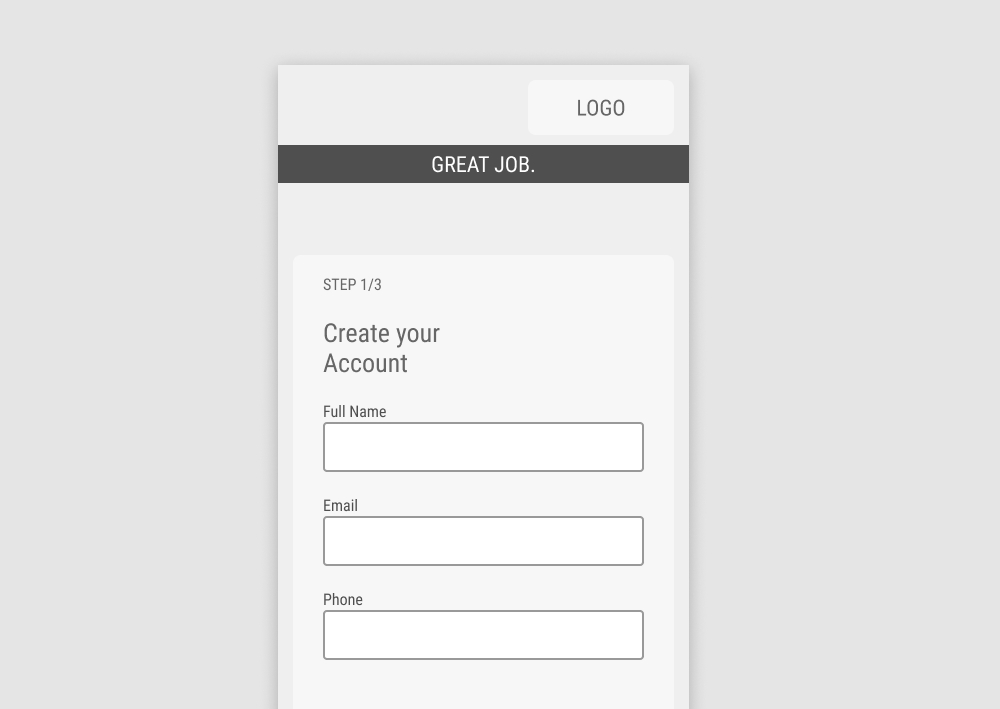
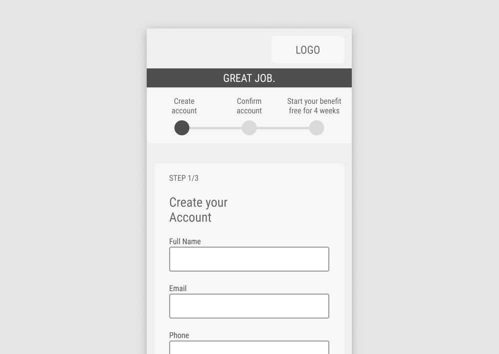
In this experiment, a 3 step progress bar was added at the top of a signup funnel. Impact on signups was measured.
Test #603 on
Kay.com
by  Craig Kistler
Jul 30, 2025
Desktop
Mobile
Product
X.X%
Sales
Craig Tested Pattern #55: Conversational Filters On Kay.com
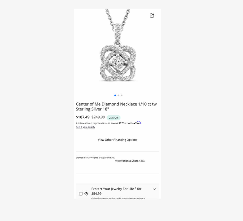
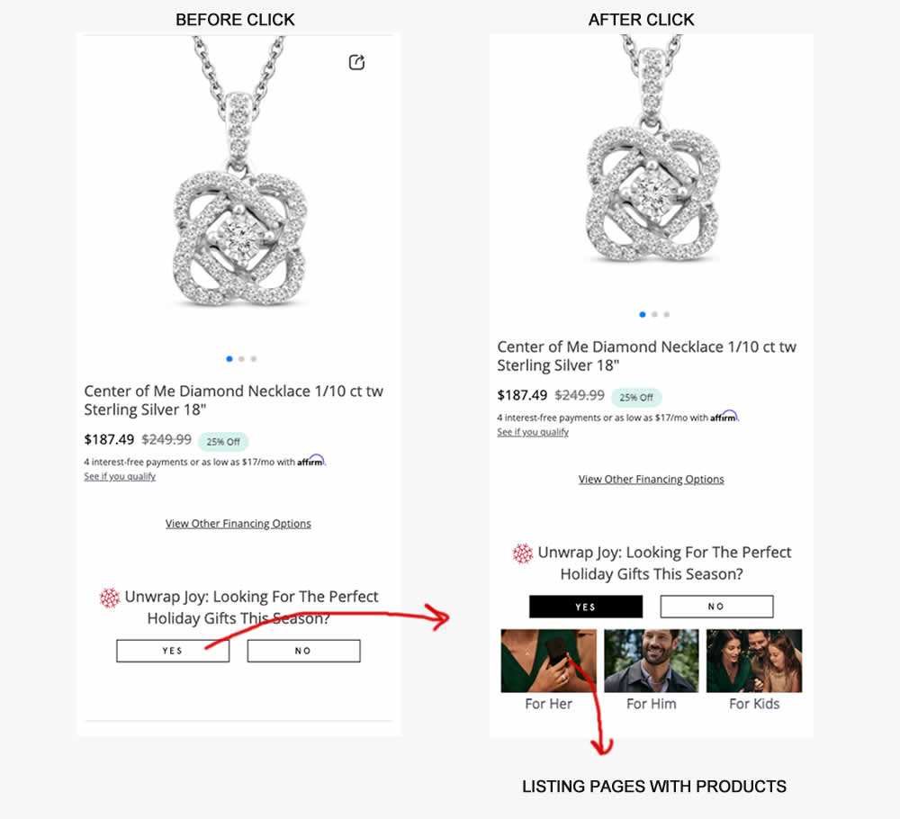
In this experiment, product pages (variant) asked users if they were interested to see holiday gifts with two buttons. Upon clicking "yes", the UI expanded to make another choice in order to see gifts for: Her, Him or Kids. Clicking any of these three would send users to dedicated listing pages with more product recommendations. Impact on sales was measured.
Test #598 on
by  Jakub Linowski
Jun 27, 2025
Desktop
Mobile
Product
X.X%
Sales
Jakub Tested Pattern #26: Cart Reminder And Recently Viewed
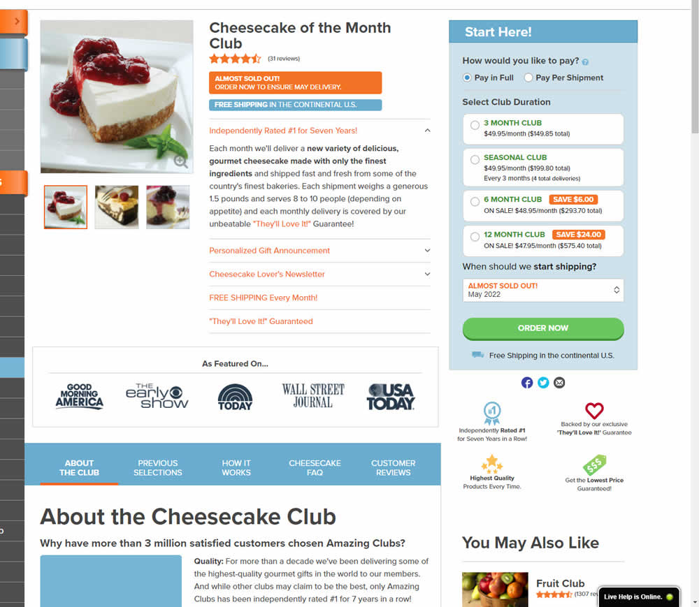
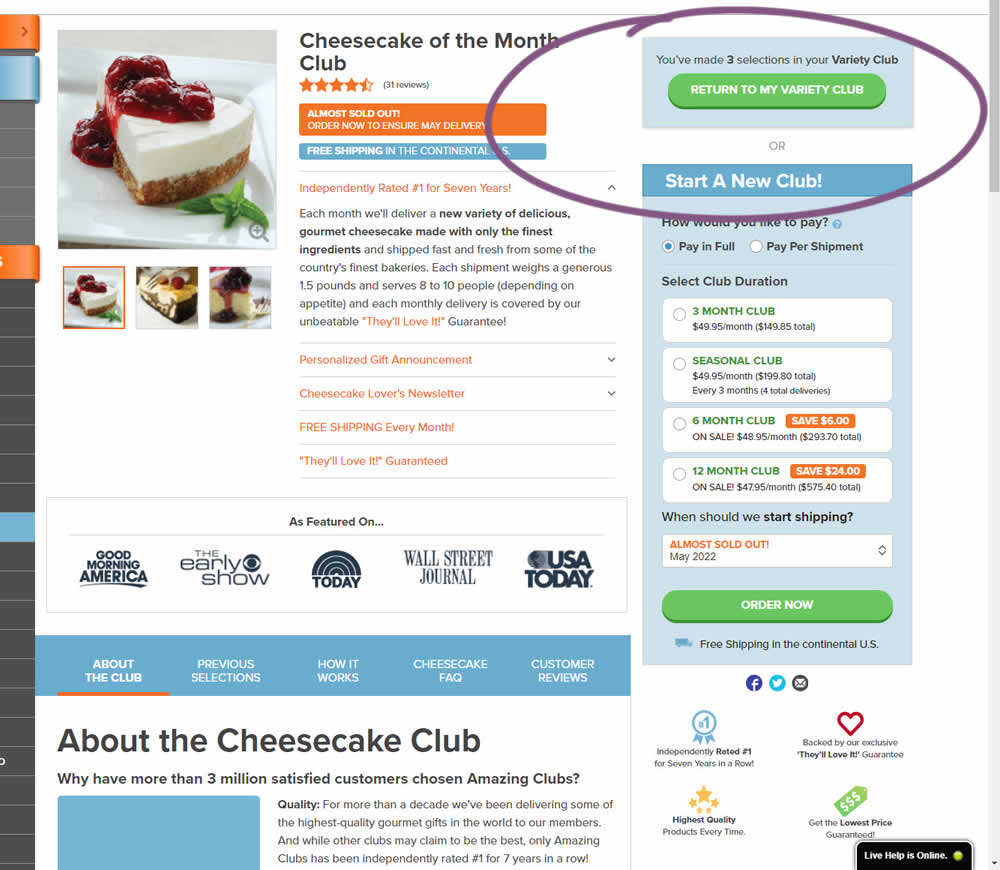
This experiment started when a user started a custom product build and visited any other product page. In the variation, a resume button appeared that would bring the customers back to their custom build. Impact on checkouts and sales was measured.
Test #599 on
Finn.com
by  Tim Karcher
Jun 27, 2025
Mobile
Product
X.X%
Leads
Tim Tested Pattern #10: Postponed Modal Forms On Finn.com
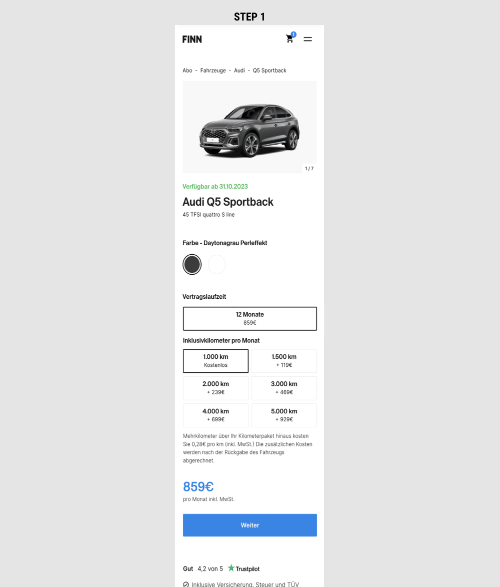
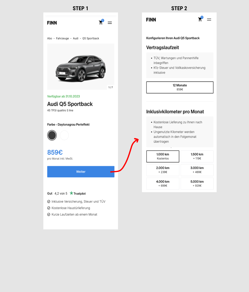
This is a heavily confounded multi-change experiment. In the variation, product choices on product detail pages were taken off and moved to a 2nd step (a new step). This also resulted in the price and primary button becoming more visible from an upward position shift. Impact on adds-to-cart and lead generation was measured.
Test #597 on
by  Frazer Mawson
Jun 26, 2025
Mobile
Product
X.X%
Sales
Frazer Tested Pattern #41: Sticky Call To Action
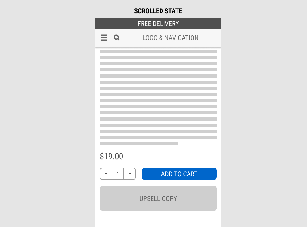
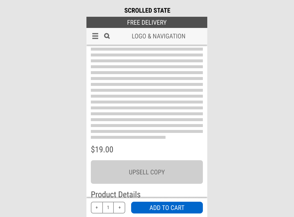
In this experiment, a fixed add-to-cart button along with the quantity selector was transformed into an always floating one. Impact on sales was measured. (Visitors are session based).
Test #589 on
by  Jakub Linowski
Apr 30, 2025
Desktop
Product
X.X%
Sales
Jakub Tested Pattern #68: Welcome Discount
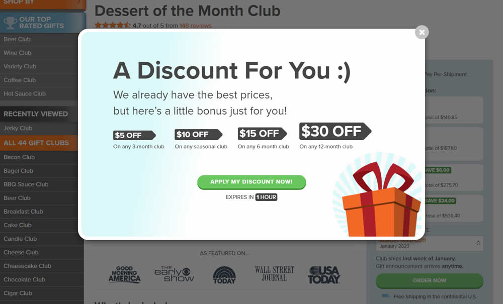
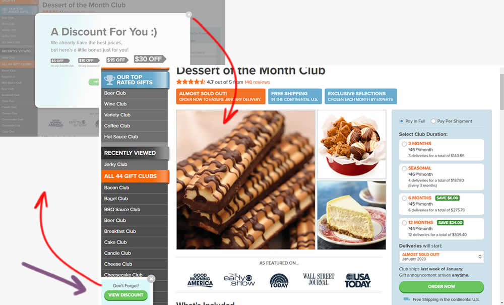
This experiment added one extra layer of persistence to an appearing welcome discount offer. In the variation, a welcome discount appeared on product pages after some inactivity behavior combined with a delay. In the variation, the only thing that was modified was the "collapse" behavior - basically creating a small floating micro modal in the bottom right. The micro modal allowed users to return to the larger modal or collaping it for good (with a second X collapse button). Impact on sales was measured.
Test #588 on
Hellostake.com
by  Louis Alston
Apr 28, 2025
Mobile
Global
X.X%
Sales
Louis Tested Pattern #26: Cart Reminder And Recently Viewed On Hellostake.com
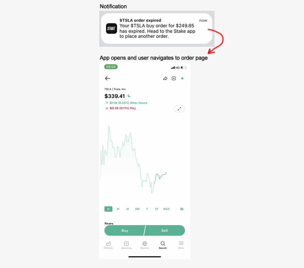
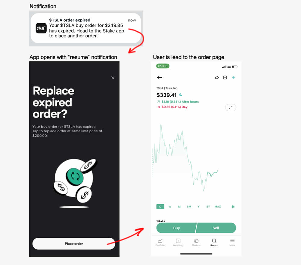
This experiment started right after users of a trading app received trade order expiry notification (for a security trading app). In the control, after clicking the notifications, users would have to navigate to the trade themselves. In the variation, 1) an additional step was added which informed what happened (an order was not place and expired) and 2) they were automatically send to the order page. Impact on orders placed was measured.
Test #585 on
Jared.com
by  Craig Kistler
Apr 10, 2025
Mobile
Desktop
Listing
X.X%
Sales
Craig Tested Pattern #137: Visible Filters On Jared.com
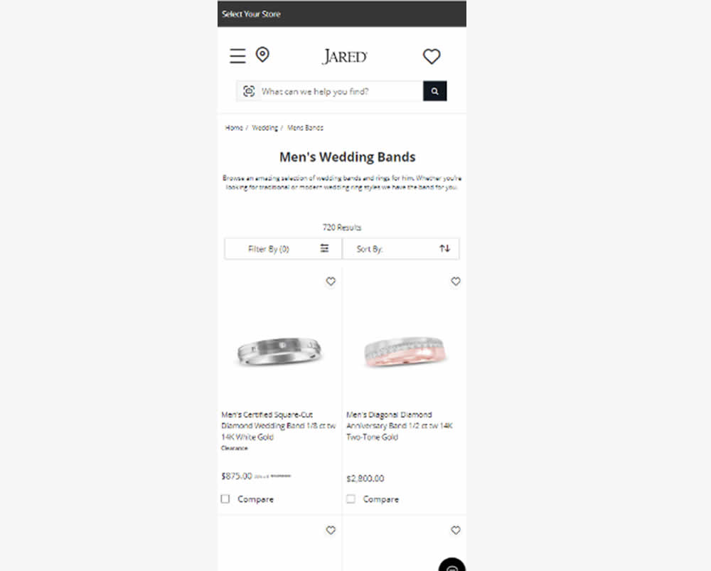
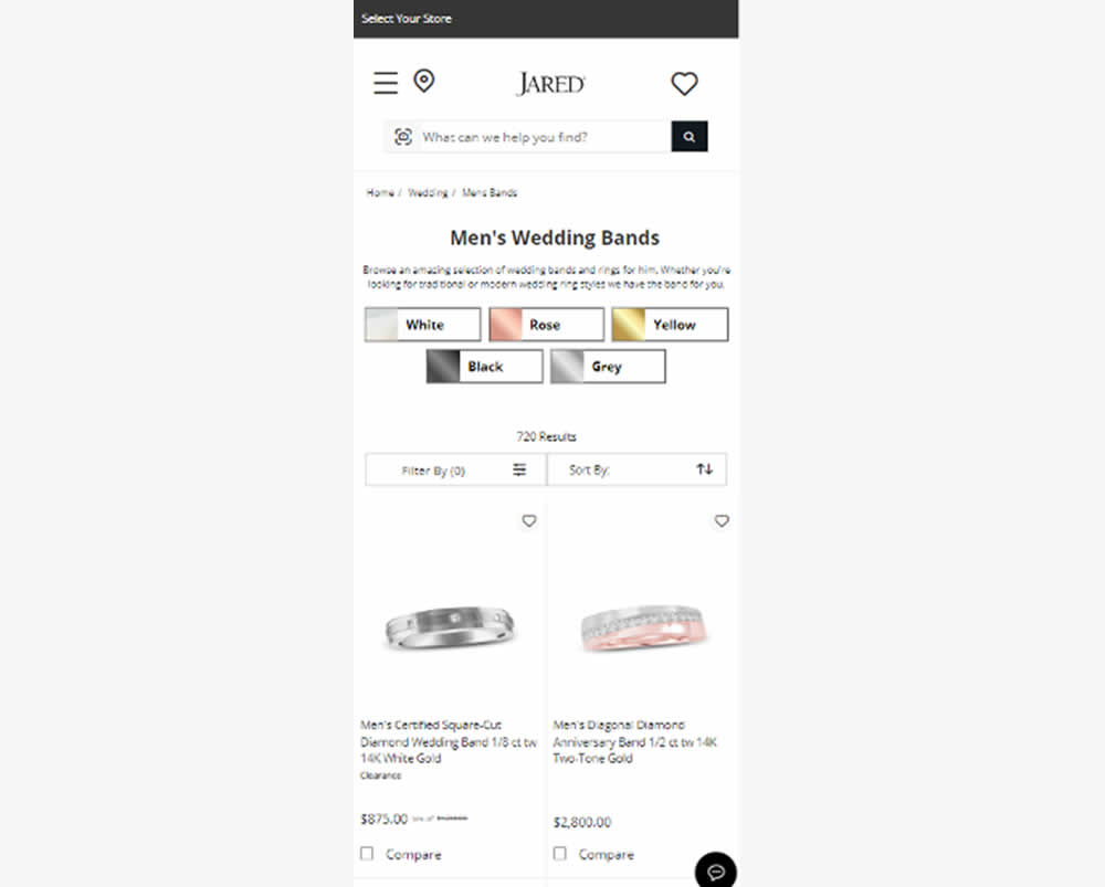
In this experiment, UI filters with metal color options were surfaced at the top of product listing pages (for Jared - an online jewelry retailer). Impact on filter usage, adds to cart and sales were measured.
Test #580 on
Finn.com
by  Tim Karcher
Mar 06, 2025
Mobile
Signup
X.X%
Signups
Tim Tested Pattern #91: Forced Action On Finn.com
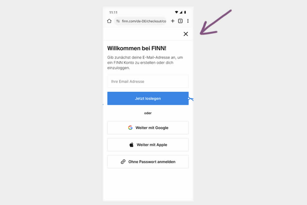
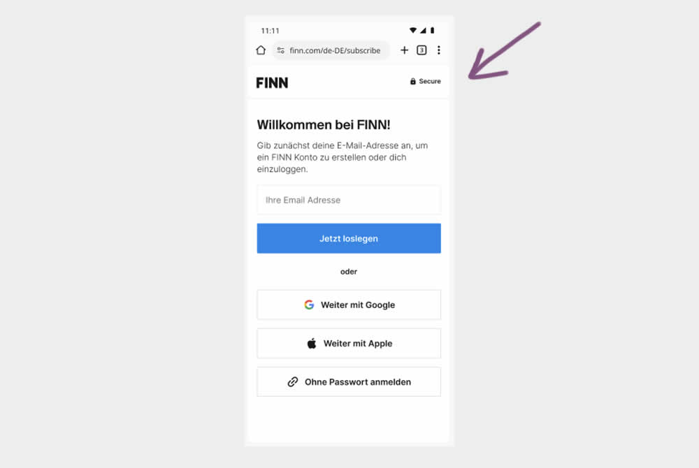
In this experiment, the control shows an (X) close option within a signup flow, whereas the variation had it removed. Clicking the close icon would collapse the signup modal and show the product page. Users were still able use the back and forward functionality.
(The test was inversed in order to fit the pattern). Impact on signups was measured.
Test #576 on
Finn.com
by  Tim Karcher
Feb 12, 2025
Mobile
Listing
X.X%
Leads
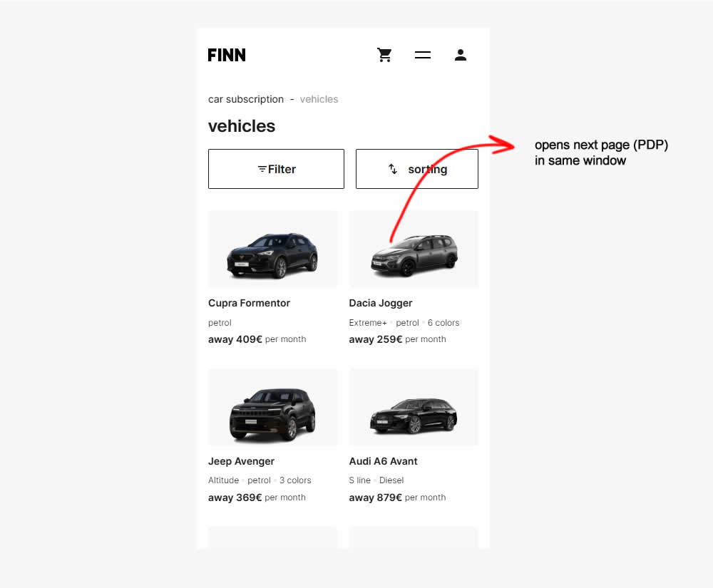
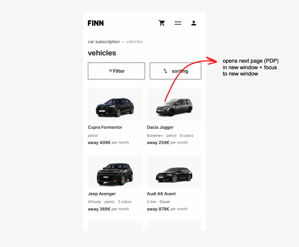
Tim Tested Pattern #34: Open In A New Tab On Finn.com
Test #575 on
Finn.com
by  Tim Karcher
Feb 12, 2025
Desktop
Listing
X.X%
Leads
Tim Tested Pattern #34: Open In A New Tab On Finn.com
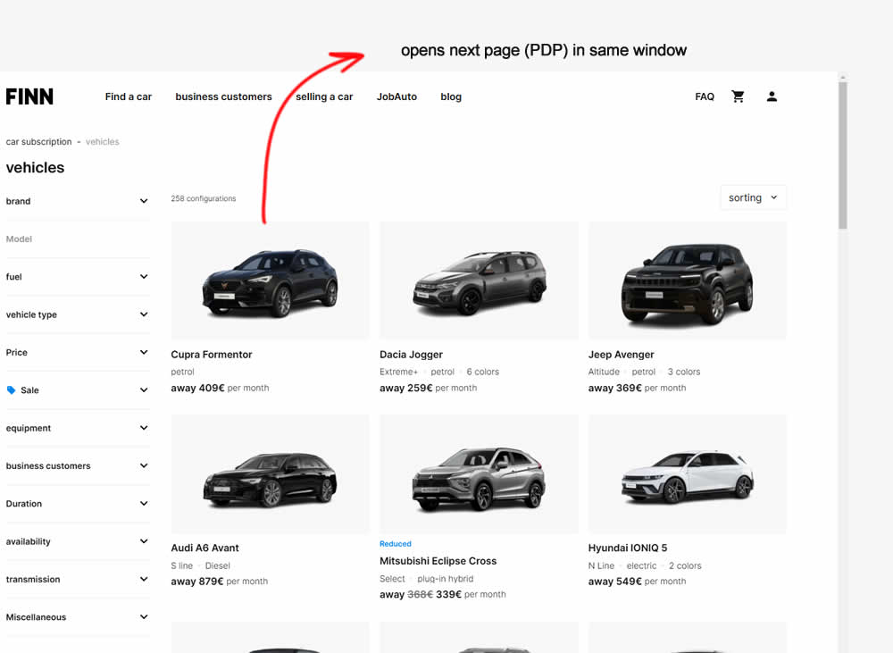
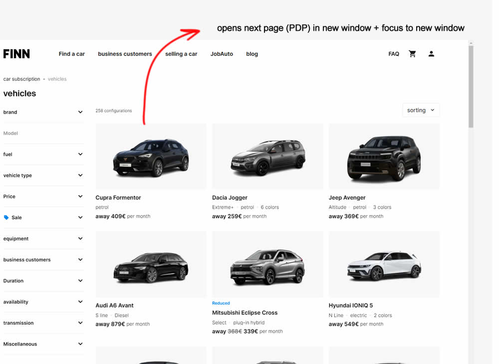
In this experiment, product listing were either opened in the same window (control) or opened in a new tab and focused on (variation). Impact on signups and sales was measured.
Test #574 on
Myer.com.au
by  Jay Kim
Jan 30, 2025
Mobile
Product
X.X%
Sales
Jay Tested Pattern #41: Sticky Call To Action On Myer.com.au
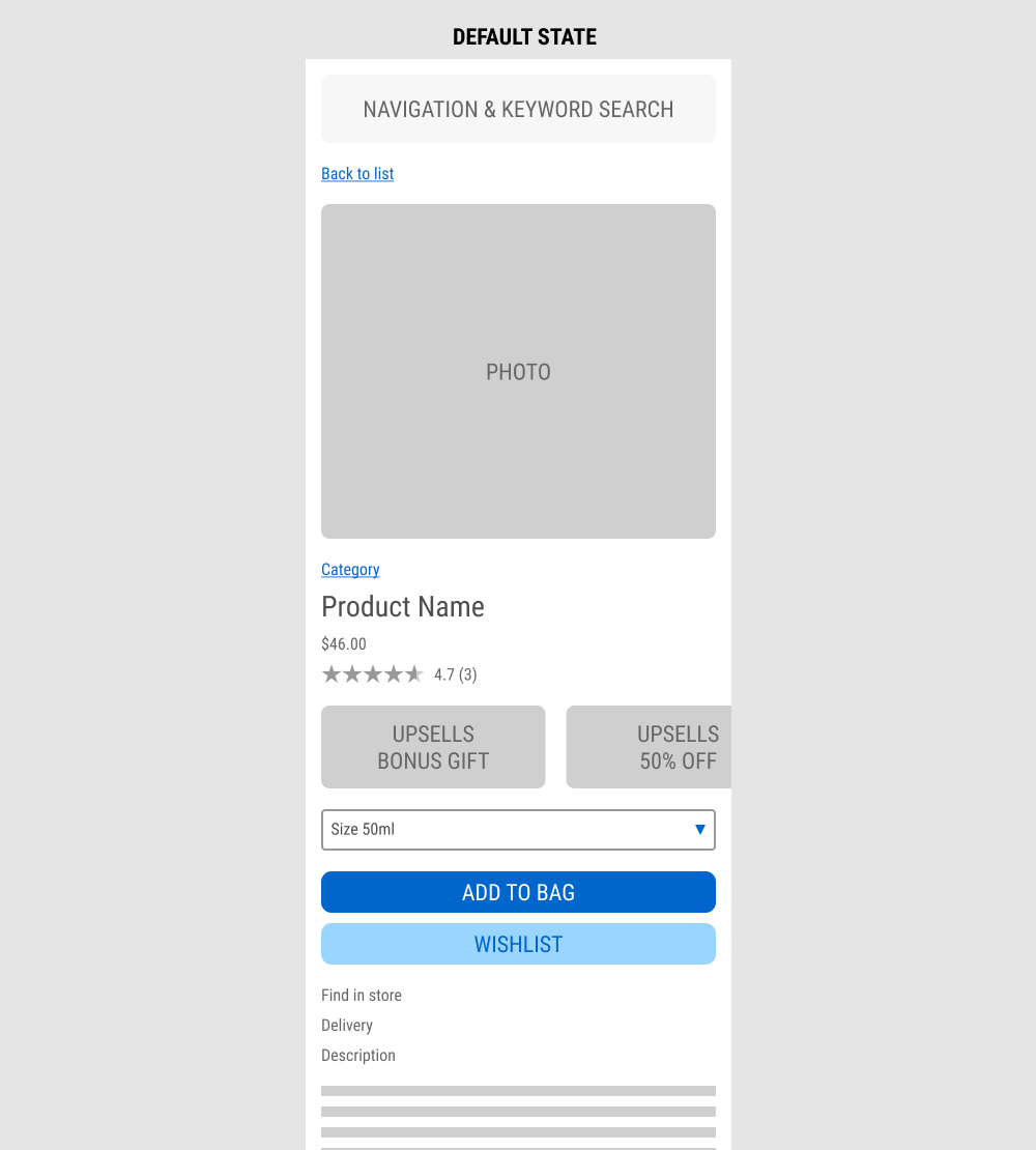
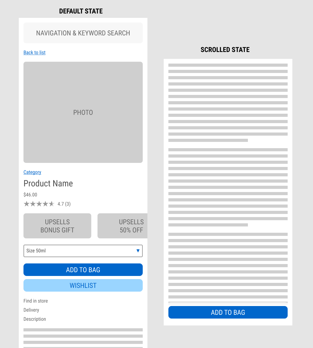
In this experiment published by Jay Kim, a sticky add to cart button was added on mobile product detail pages. It appeared after the scroll depth past the original add to cart button. Impact to adds to cart and completed sales was measured.
Test #572 on
by  Deborah O'Malley
Jan 27, 2025
Mobile
Product
X.X%
Progression
Deborah Tested Pattern #41: Sticky Call To Action


In this experiment from GuessTheTest.com, the control variation only showed the primary add-to-cart button further down on the page. The variation however turned the button into a floating one once users scrolled on the page. Impact on button clicks was measured.
Test #568 on
by  Jakub Linowski
Dec 22, 2024
X.X%
Sales
Jakub Tested Pattern #80: Persistent Filters
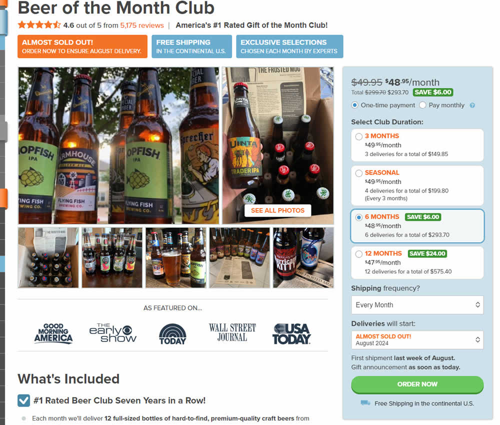
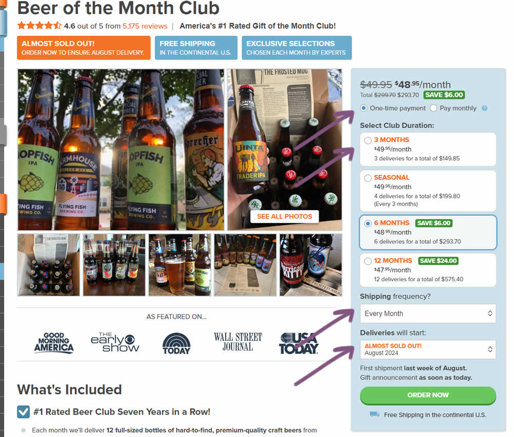
In this experiment, "persistence" of 4 product choices was added in the variation. When users made a product selection such as: duration, payment terms, starting month or shipping frequency, their choices were remembered and defaulted on next visits, reloads or when viewing other products. Impact on adds to cart and sales was measured.
Test #566 on
Banter.com
by  Craig Kistler
Dec 11, 2024
Desktop
Product
X.X%
Revenue
Craig Tested Pattern #66: Complementary Upsell On Banter.com
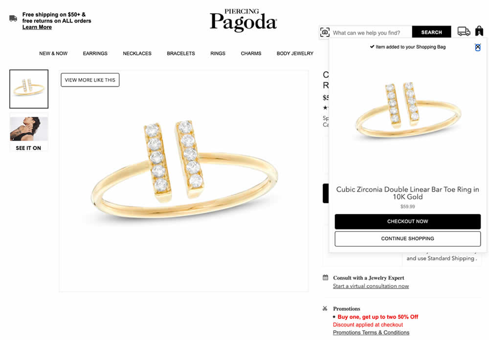
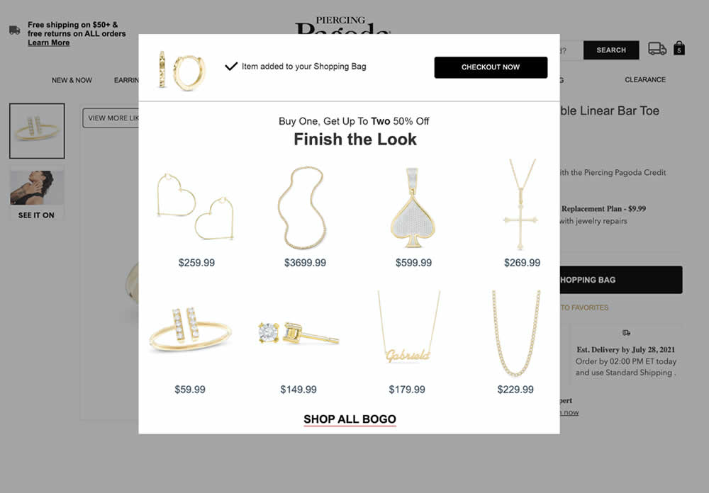
In this experiment, a modal based message was shown to encourage extra products being added as complementary upsells. In the control, the promotion text appeared at the bottom as red text ("Buy one, get up to two 50% Off"). Whereas in the variation, specific products were shown on the modal (post add-to-cart). Impact on adds-to-cart, sales and average revenue was measured.