All Latest 501 A/B Tests
Become a member to unlock the abiltiy to see the highest impact a/b tests. Being able to see the actual test results and sort by impact allows growth and experimentation teams to take action on the biggest gains first
MOST RECENT TESTS
Test #529 on
Jared.com
by
 Craig Kistler
Apr 29, 2024
Mobile
Desktop
Listing
Craig Kistler Tested Pattern #55: Conversational Filters In Test #529 On Jared.com
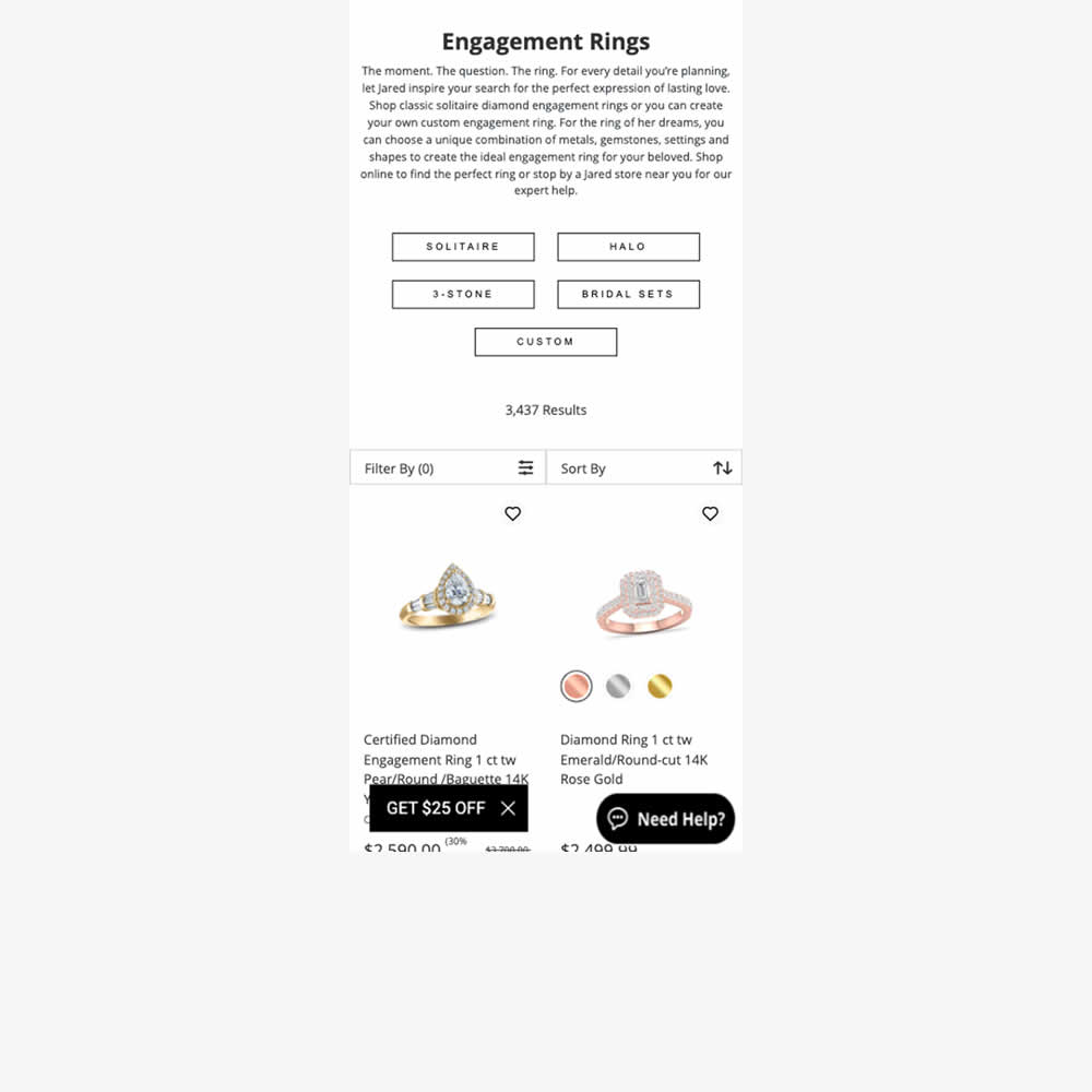
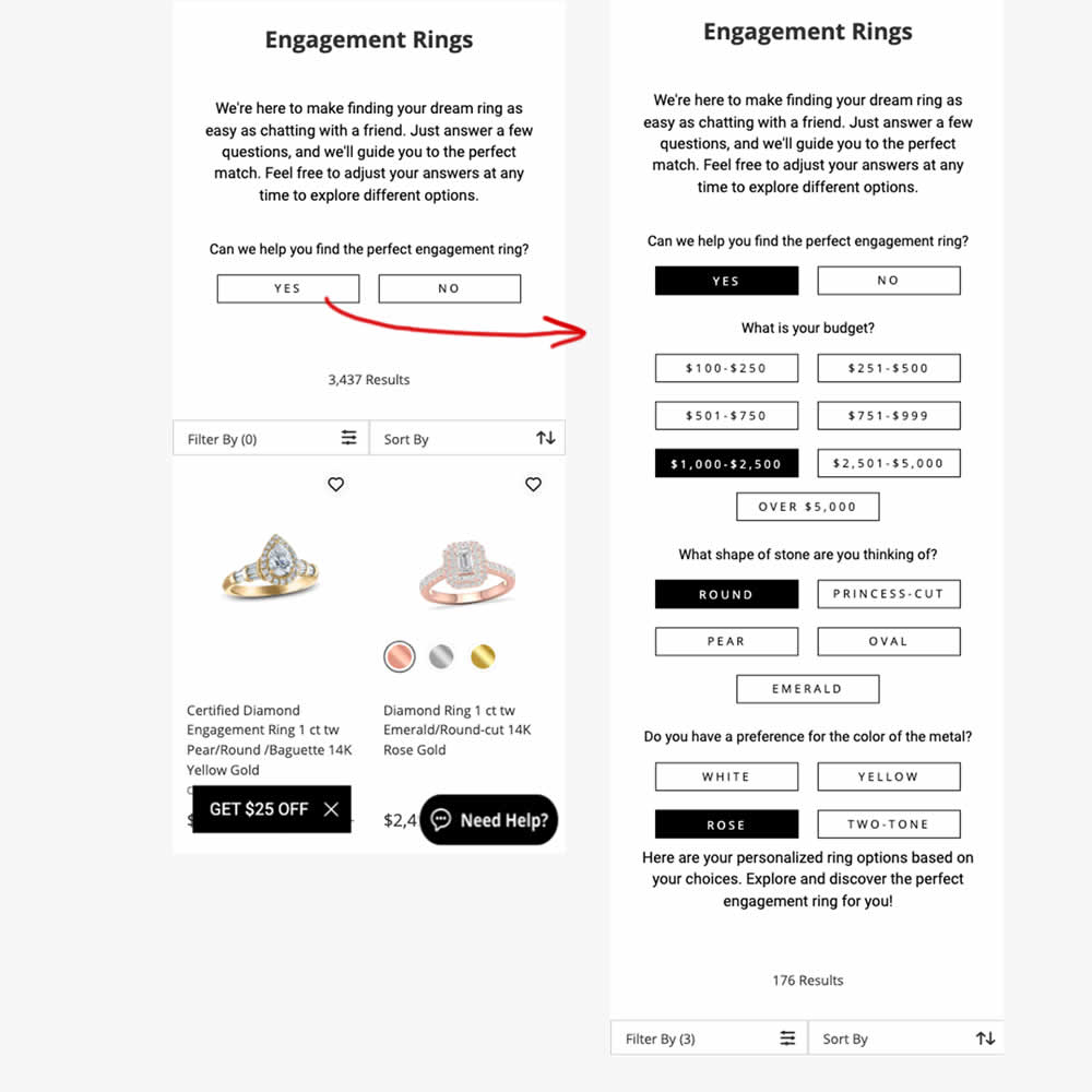
In this experiment, conversational filters were tested at the top of some listing pages. Instead of showing one set of product filters, customers were shown three sets of product questions. After selecting each answer, product results would narrow and update further down on the page. Impact on adds to cart and sales were measured.
Test #525 on
by
 Jakub Linowski
Mar 27, 2024
Desktop
Mobile
Product
Jakub Linowski Tested Pattern #119: Unselected Or Selected Defaults In Test #525
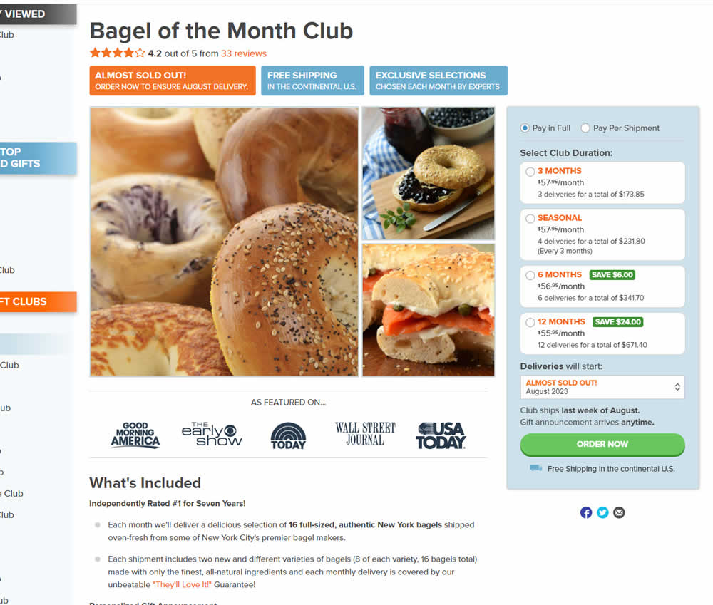
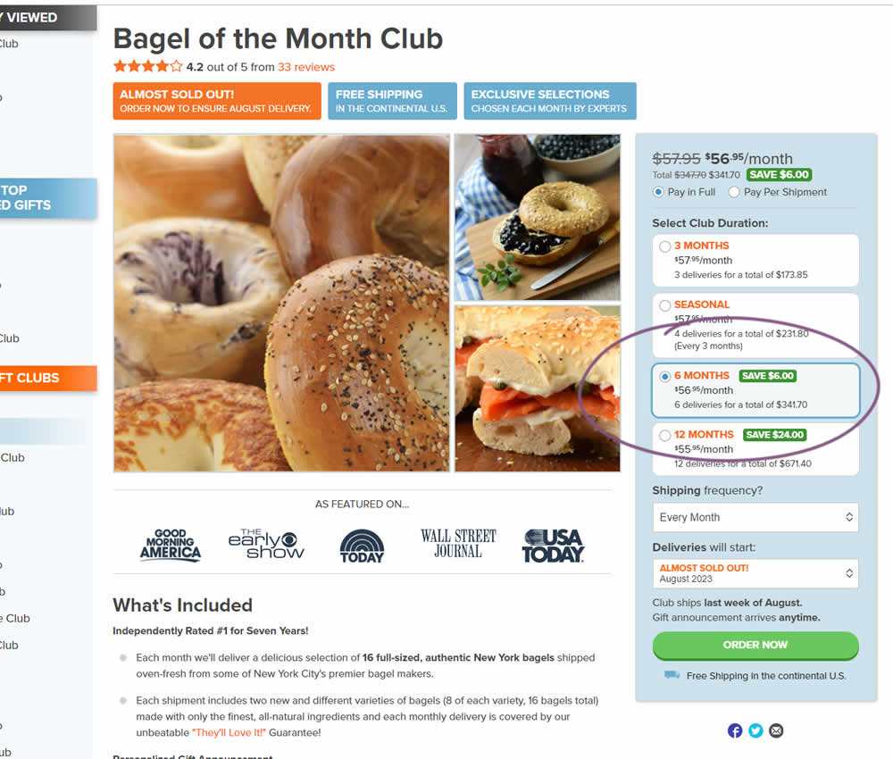
In this experiment, a club subscription duration was preselected to 6 in the variation. The control had no club durations preselected. As a result of preselecting a club duration, a more visible price also appeared at the top (sooner in the variation). Impact on sales was measured.
Test #524 on
Jared.com
by
 Craig Kistler
Mar 26, 2024
Mobile
Listing
Craig Kistler Tested Pattern #79: Single Or Multiple Triggers In Test #524 On Jared.com
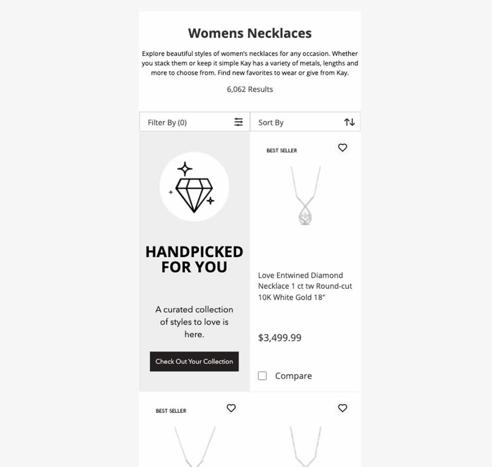
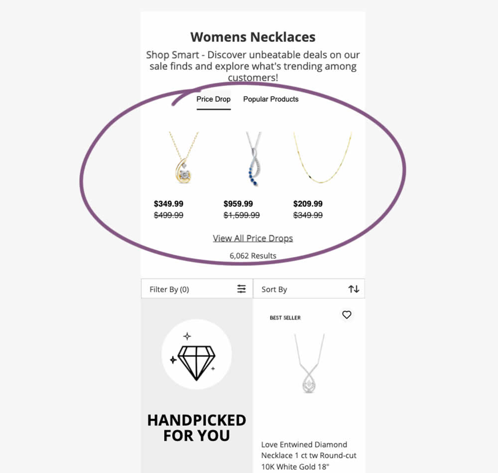
In this experiment, additional (discounted) products were shown at the top of category listing pages with a link to see more such products ("View All Price Drops"). Impact on overall sales was measured.
Test #521 on
Finn.com
by
 Maksim Meged
Mar 14, 2024
Mobile
Home & Landing
Maksim Meged Tested Pattern #26: Cart Reminder And Recently Viewed In Test #521 On Finn.com
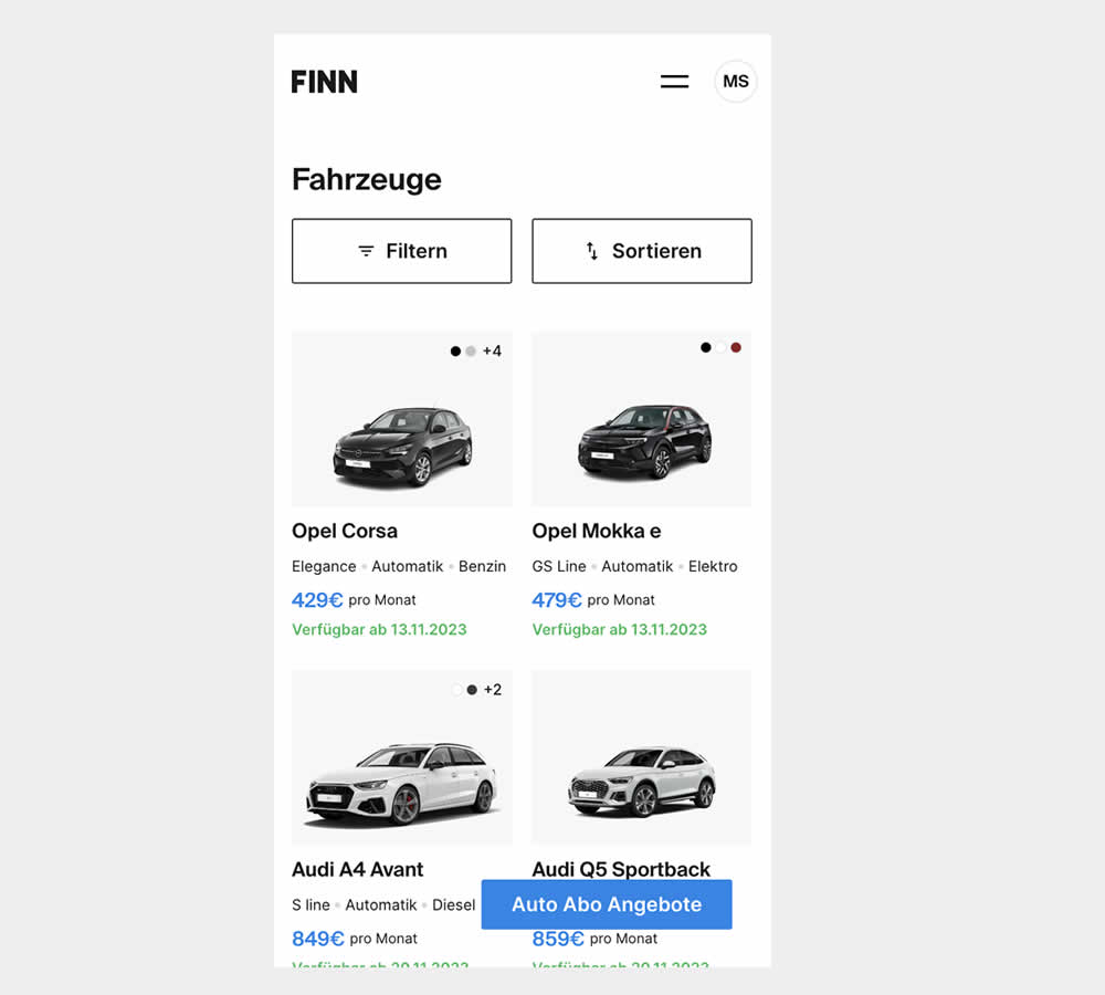
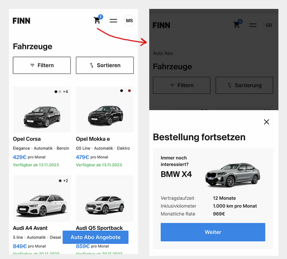
This experiment was triggered by a small segment of users who completed the first step of checkout funnel (submitted email, name, phone number), but dropped from checkout and returned to cars catalogue 7 or more minutes later.
In the control, users didn't see any cart icon nor function to resume their checkout flow.
In the variation however, users saw a filled shopping cart icon with resume functionality. Clicking on the icon would guide and redirect users to their latest abandoned stage of their checkout flow.
Test #520 on
Asics.com
by
 Andrey Prokhorov
Feb 29, 2024
Mobile
Product
Andrey Prokhorov Tested Pattern #51: Shortcut Buttons In Test #520 On Asics.com
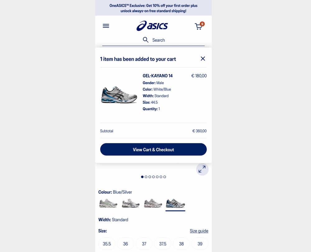
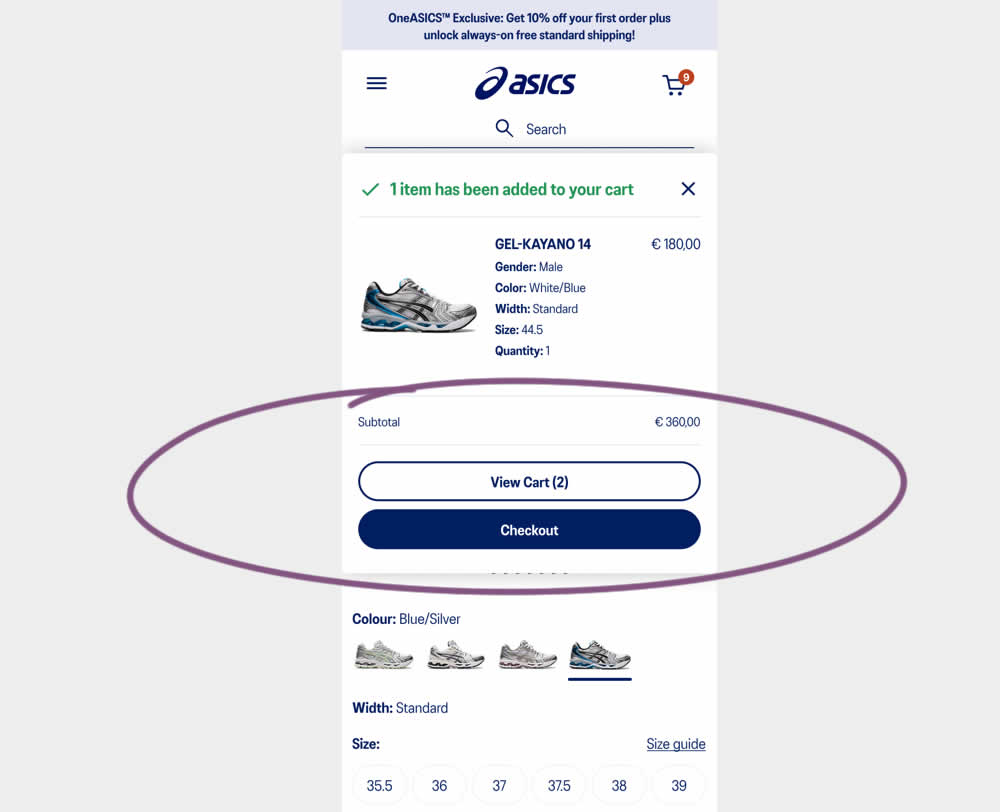
This experiment started when users would click add-to-cart on product detail pages. In both the control and variation, a modal would appear. In the control the modal contained a "View Cart and Checkout" button that lead users to the cart page. In the variation the modal showed separate "View Cart" and "Checkout" buttons. The a/b test variation also introduced a green confirmation message about the product being added to cart. Impact on transactions and revenue was measured.
Test #518 on
by
 Jakub Linowski
Feb 14, 2024
Mobile
Checkout
Jakub Linowski Tested Pattern #64: Tunnel In Test #518
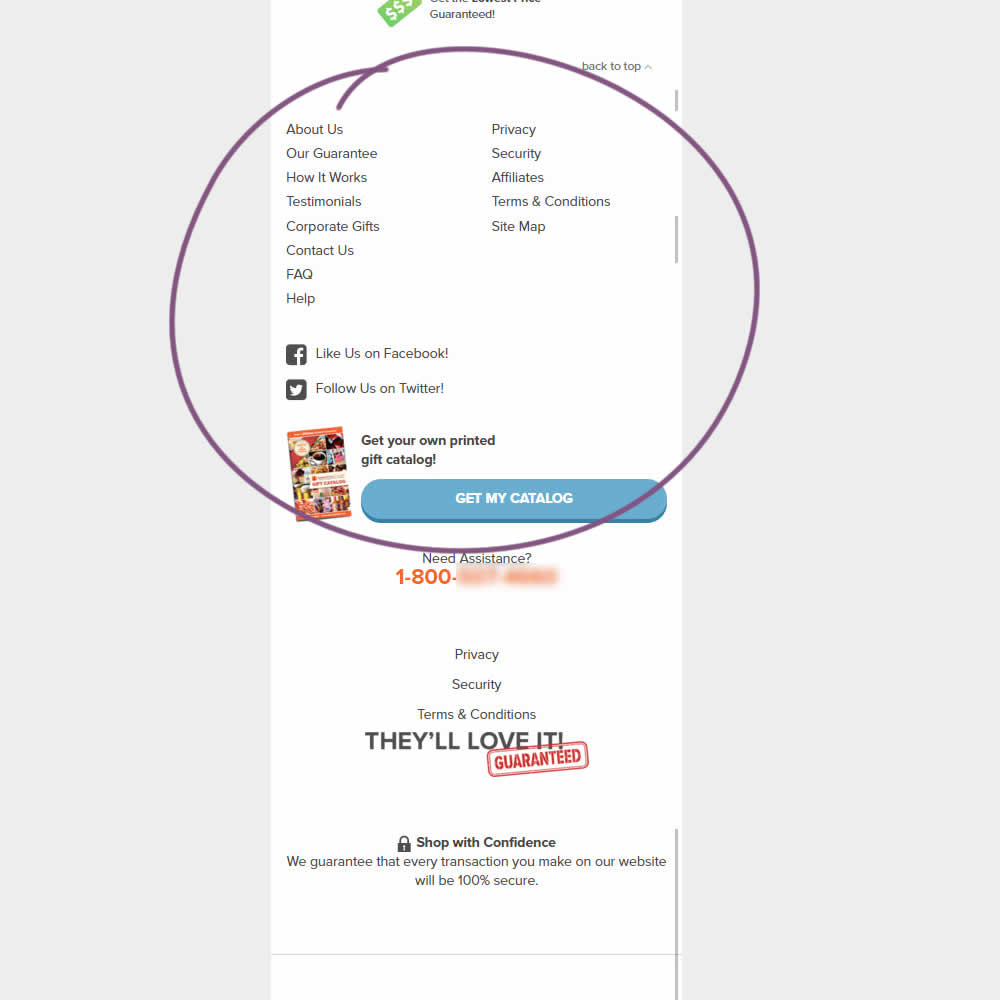
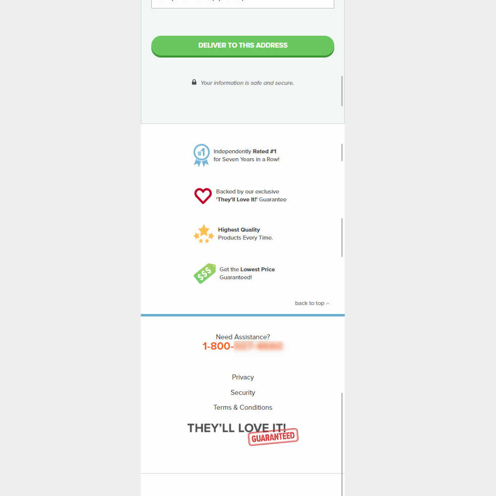
This was an experiment on the first checkout step where users would enter shipping information. The control had a longer footer with more additional sitewide links and a call to action to a newsletter. The variation removed these elements and kept the focus on the shipping information task. Impact on progression to next step and sales was measured.
Test #514 on
Backstage.com
by
 Stanley Zuo
Jan 24, 2024
Desktop
Listing
Stanley Zuo Tested Pattern #97: Bigger Form Fields In Test #514 On Backstage.com
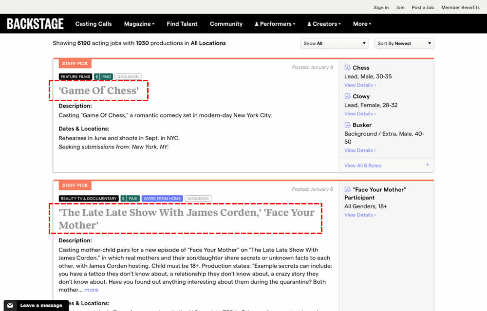
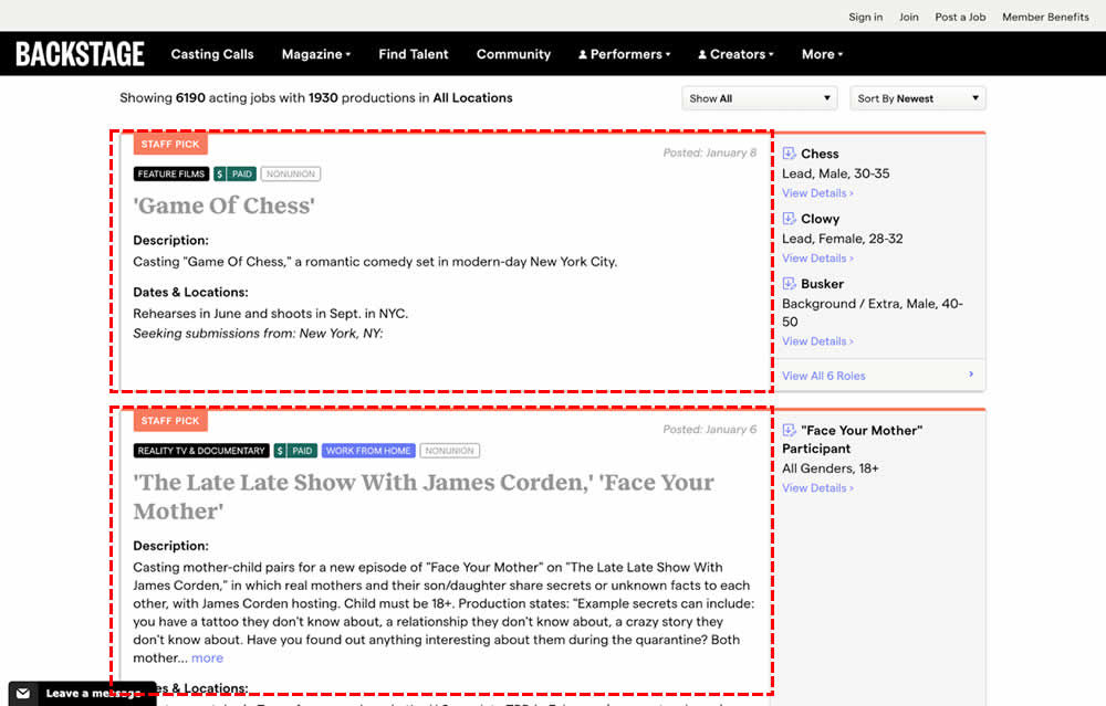
In this experiment, the click area of job listing tiles was expanded to the size of the full job tile. In the control, the click area was smaller - mostly only the job headline, along with additional "view more" links on the right hand column. Clicking the tile or headline would open up a new job details page in both control and variation. Impact on progression and membership sales was measured.
Test #510 on
Formelskin.de
by
 Alexander Krieger
Dec 21, 2023
Mobile
Home & Landing
Alexander Krieger Tested Pattern #26: Cart Reminder And Recently Viewed In Test #510 On Formelskin.de
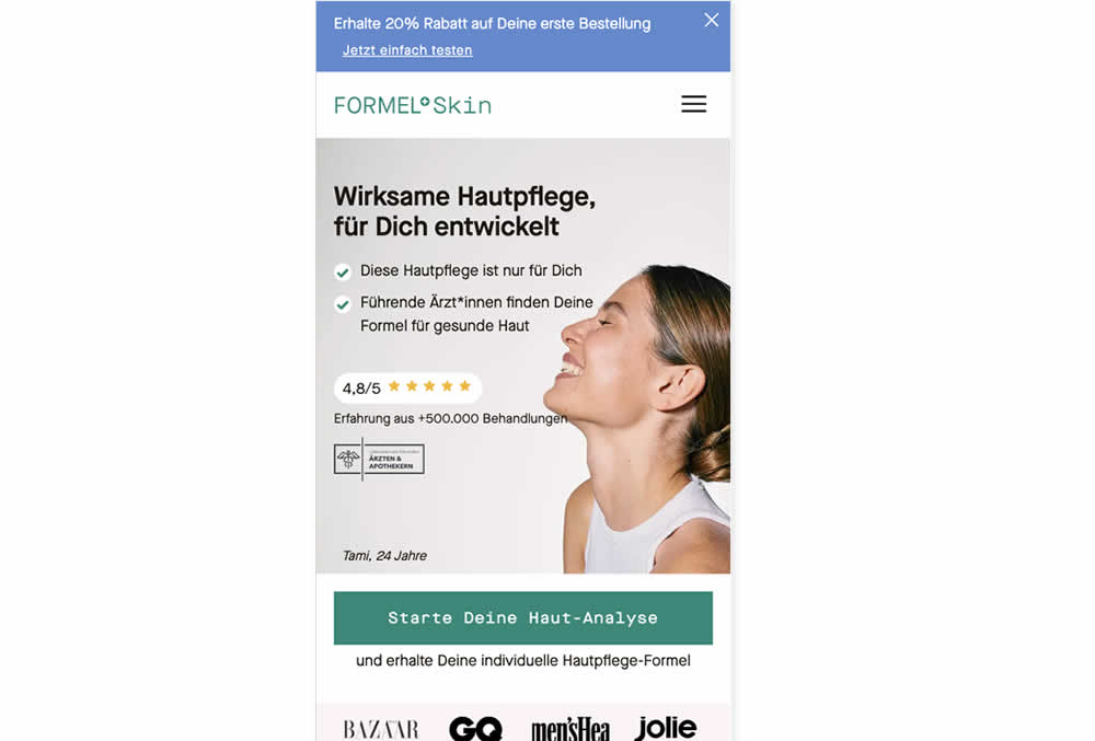
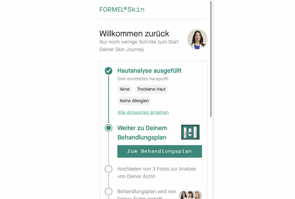
In this experiment, users that did not complete a purchase and came back to the homepage were shown two different experiences. In the control, users would see the homepage (essentially having to restart the purchase flow). Whereas, in the variation, users would be shown a "Welcome Back" summary view with the completed steps shown as completed and a quick resume button to the next incomplete step. Impact on completed sales was measured.
Test #508 on
Online.metro-cc.ru
by
 Andrey Andreev
Dec 15, 2023
Mobile
Product
Andrey Andreev Tested Pattern #93: Auto Next In Test #508 On Online.metro-cc.ru
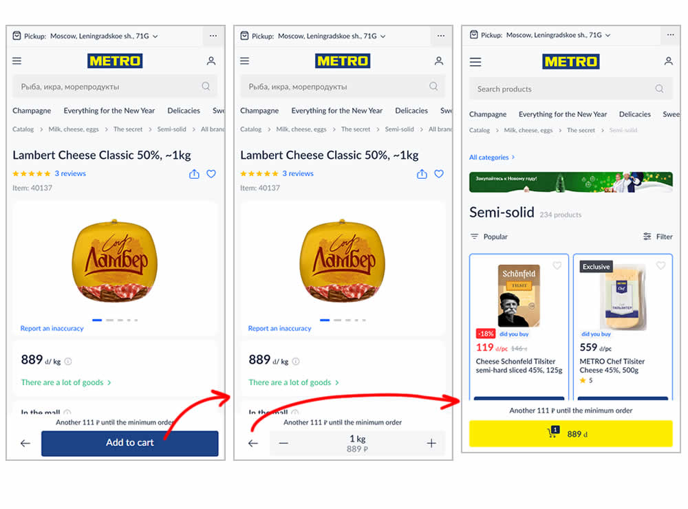
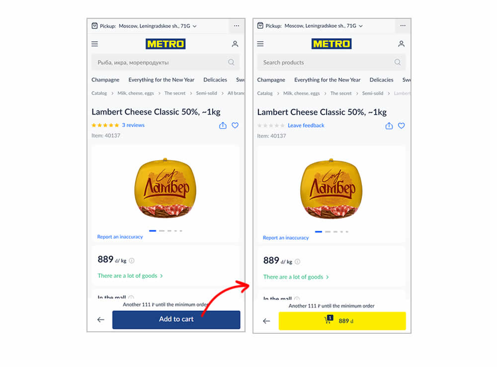
In this experiment, the variation transformed an add-to-cart button into a shopping cart one (making it a two step process). The control had an interaction where an add-to-cart button would become a quantity selection and then a shopping cart action (a three step process). In a way, the control kept users in a "dead-end" quantity selection middle state that required clicking the back button to continue the sale. Whereas the variation automatically moved users into the next step (closer towards being able to make a purchase). Impact on sales was measured.
Test #499 on
Shmoodyapp.com
by
 Michael McSweeney
Oct 20, 2023
Mobile
Signup
Michael McSweeney Tested Pattern #99: Progress Bar In Test #499 On Shmoodyapp.com
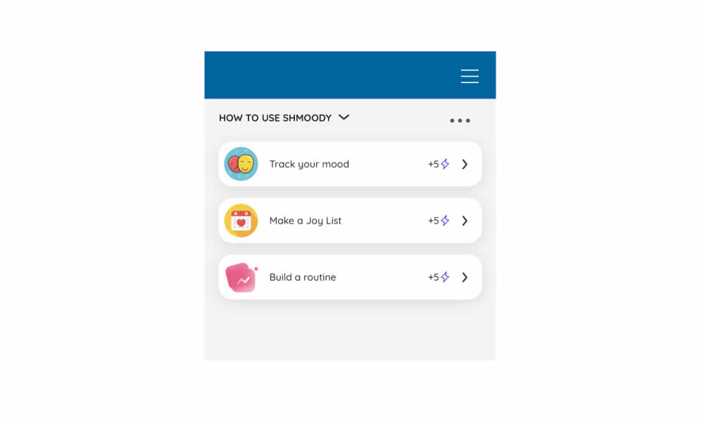
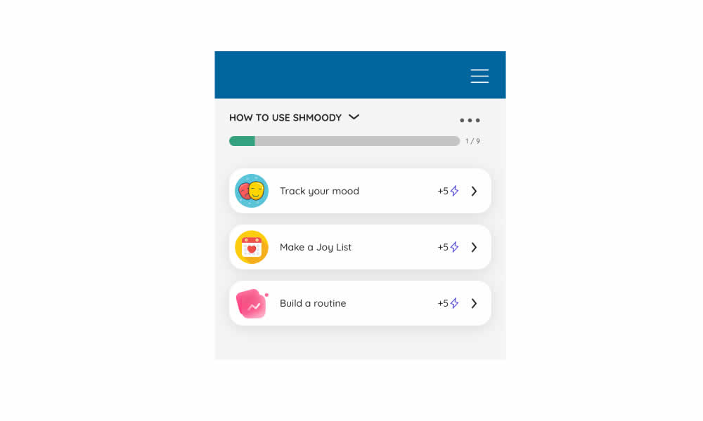
In this experiment, a progress bar was added to a signup flow of a mental health app. It appeared on numerous steps of a onboarding flow. Impact on signup completions and checkouts was measured.
Test #495 on
Formelskin.de
by
 Alexander Krieger
Sep 25, 2023
Mobile
Signup
Alexander Krieger Tested Pattern #9: Multiple Steps In Test #495 On Formelskin.de
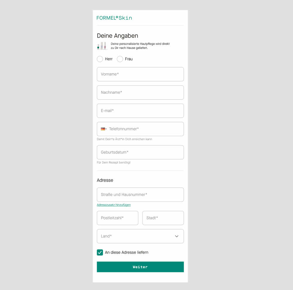
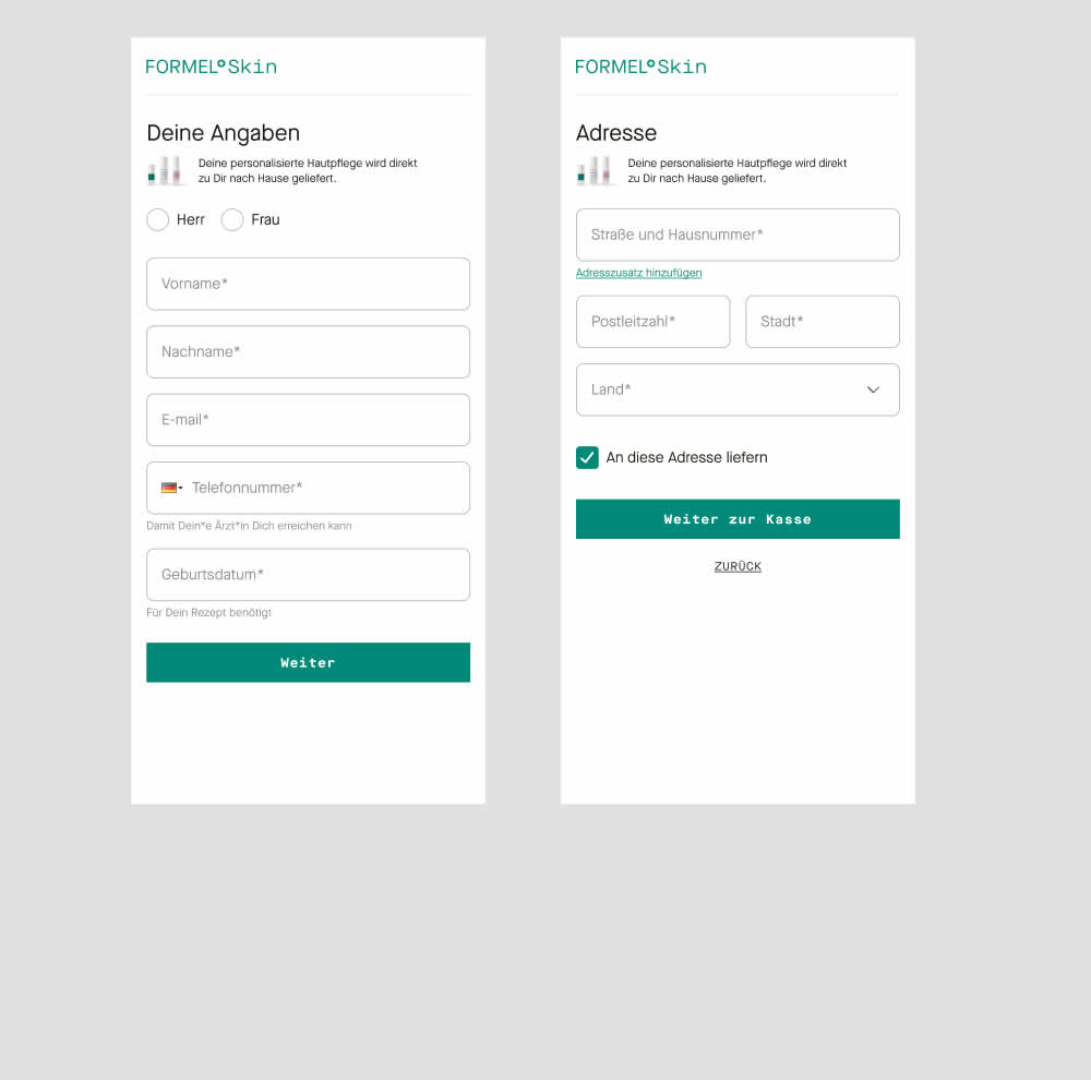
In this experiment two sections of a form on a single page (control) were broken out into 2 separate steps (variation). The two sections included personal details and shipping information. This step appeared after having received a product recommendation when filling out a questionnaire for a skin care product. Impact on next step progression and purchases was measured.
Test #490 on
by
 Jakub Linowski
Aug 17, 2023
Desktop
Mobile
Jakub Linowski Tested Pattern #9: Multiple Steps In Test #490
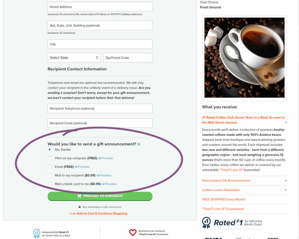
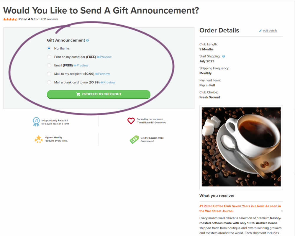
In this experiment, a section dedicated to choosing gift messages was taken out and separated into its own individial step. The change happened on the first step of a checkout flow and increased the flow by an additional step. Impact on checkouts and total sales was measured.
Test #460 on
Backstage.com
by
 Stanley Zuo
Mar 21, 2023
Mobile
Listing
Stanley Zuo Tested Pattern #41: Sticky Call To Action In Test #460 On Backstage.com
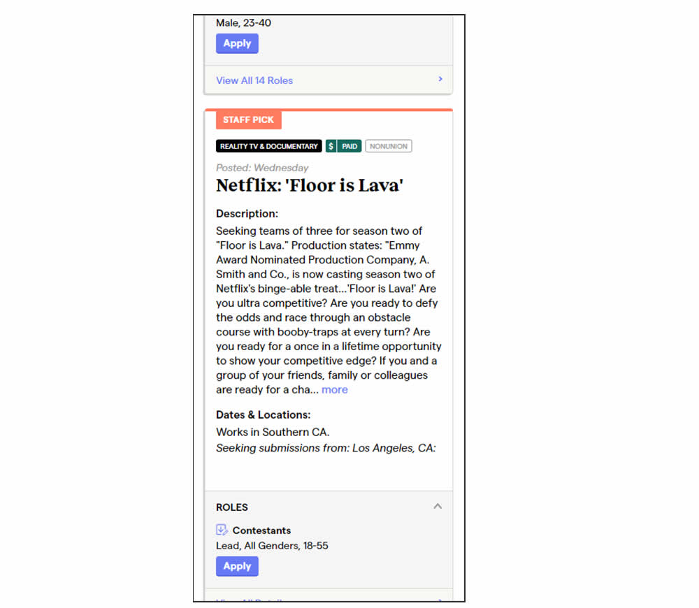
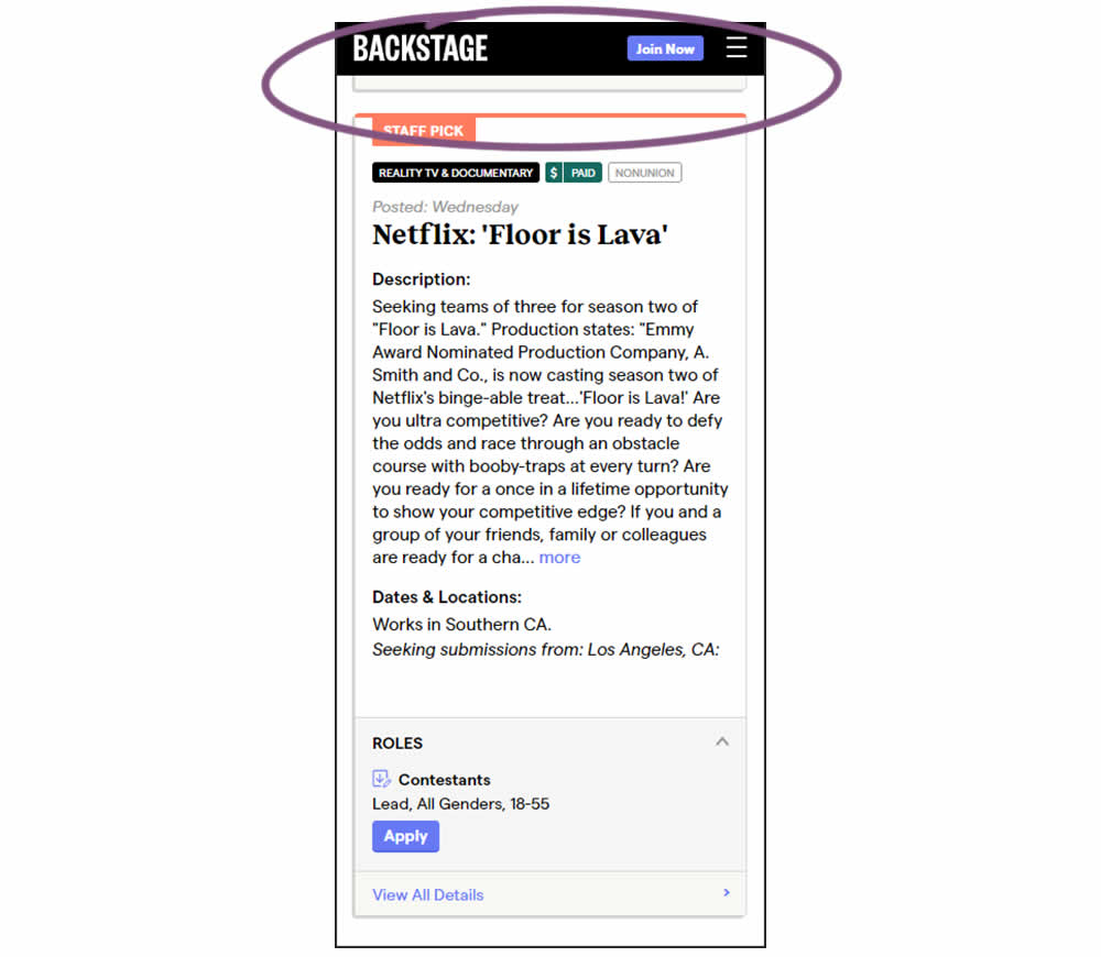
In this experiment, a floating top navigation was shown with a "Join" button. In the control, the navigation was only visible at the top of the page. Also keep in mind that signup starts were also triggered throughout multiple CTAs throughout the page and from particular job detail pages. The a/b test ran on a listing page of Backstage - a casting call job site. Impact on signups and checkouts was measured.
Test #457 on
by
 Jakub Linowski
Feb 26, 2023
Desktop
Mobile
Shopping Cart
Jakub Linowski Tested Pattern #64: Tunnel In Test #457
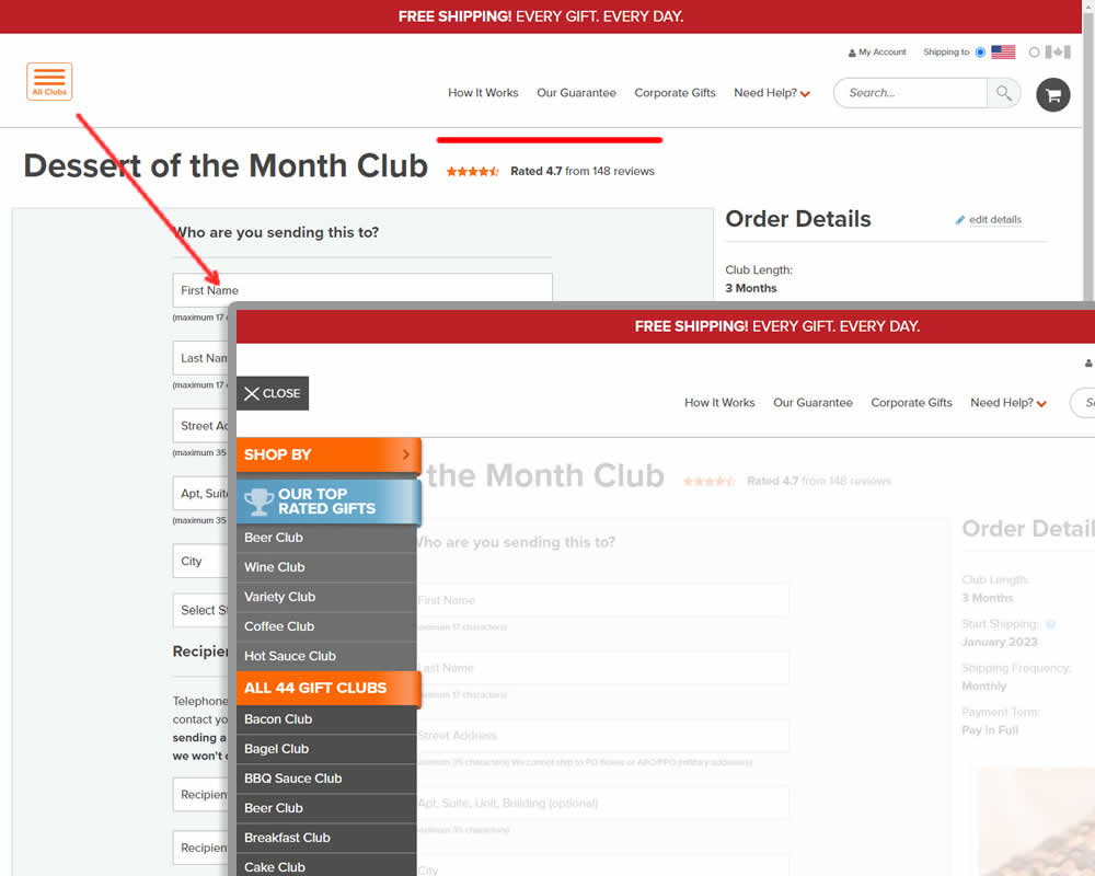
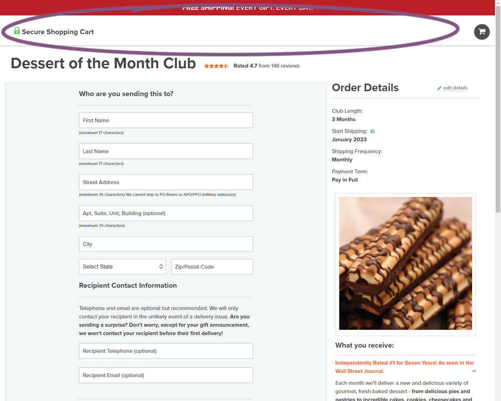
In this experiment, hamburger navigation with product links, was removed from the shopping / add to cart page. Tertiary links (How It Works, Guarantee details and support pages) were also removed, while a "Secure Checkout" message was brought into the header. This header version was already present on the next checkout page, and was copied over one step earlier. The idea was to keep customers within the checkout flow. Impact on sales was measured.
Test #456 on
Aboalarm.de
by
 Daria Kurchinskaia
Feb 23, 2023
Desktop
Mobile
Signup
Daria Kurchinskaia Tested Pattern #28: Easiest Fields First In Test #456 On Aboalarm.de
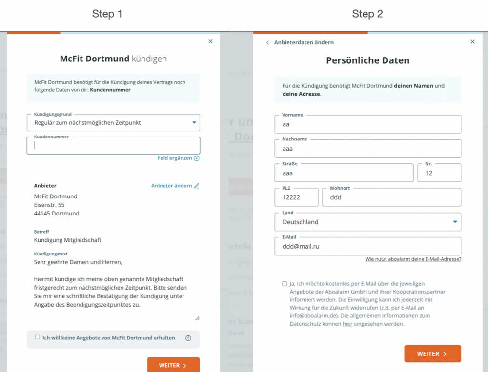
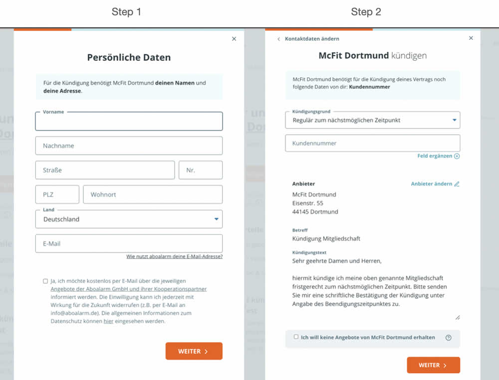
In this experiment, a more difficult step of a contract cancelation service flow was rearranged toward a later step. In the variation, the easier step (hypothetically) with personal details and address fields was placed as the first step. Whereas the step with contract or account numbers (hypothetically more difficult) were placed as the second step.
Test #453 on
by
 Jakub Linowski
Jan 31, 2023
Desktop
Mobile
Shopping Cart
Jakub Linowski Tested Pattern #64: Tunnel In Test #453
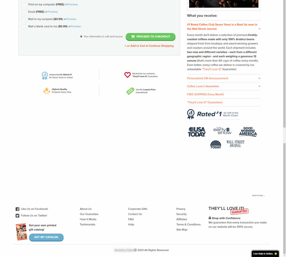
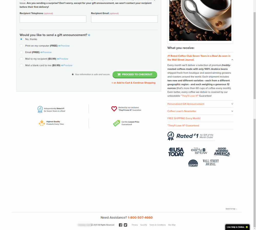
In this experiment, the footer was simplified with multiple elements being removed (catalog request, secondary links, and a guarantee). Additionally, a more prominent phone number was also displayed.
Test #450 on
Trenyrkarna.cz
by
 Ondřej Ilinčev
Jan 20, 2023
Desktop
Shopping Cart
Ondřej Ilinčev Tested Pattern #64: Tunnel In Test #450 On Trenyrkarna.cz
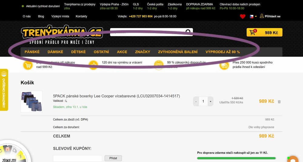
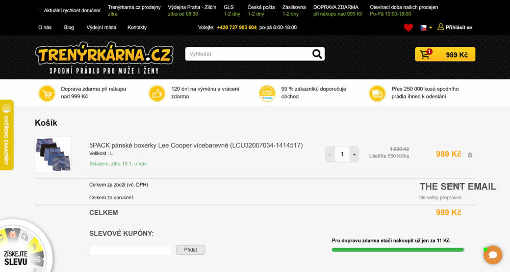
In this experiment, top category navigation (with fly out categories) was removed from the shopping cart of an online store. Impact on sale transactions was measured.
Test #444 on
by
 Melina Hess
Nov 30, 2022
Mobile
Product
Melina Hess Tested Pattern #41: Sticky Call To Action In Test #444
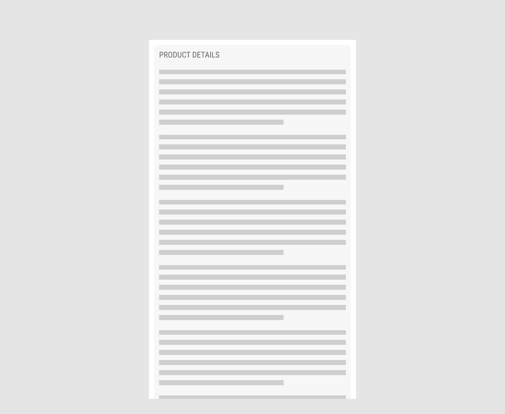
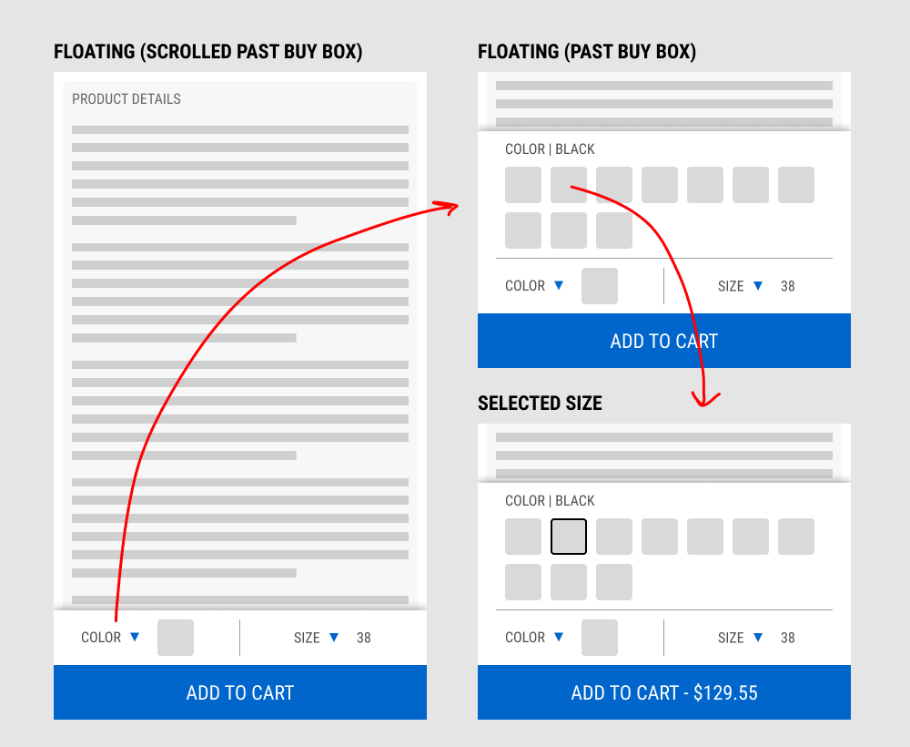
In this experiment, a floating add-to-cart with two product choices (color and size) were added on a product page. This appeared only after scrolling past the existing / embedded product selection buy box.
The floating add-to-cart widget had another layer of complexity in that it allowed customers to make a size and color selection with an expandable fly out. Making a selection would also append the total price to the add-to-cart button label.
Impact on total transactions was measured.
Test #441 on
by
 Melina Hess
Nov 23, 2022
Desktop
Mobile
Product
Melina Hess Tested Pattern #41: Sticky Call To Action In Test #441
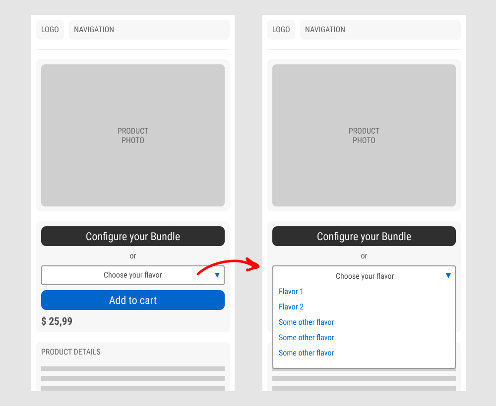
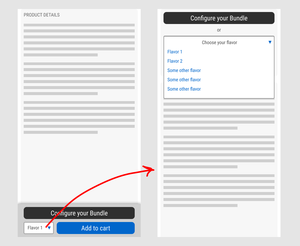
In this experiment, a floating sticky bar was added on product pages. The sticky elements only appeared after users scrolled beyond the fixed buy box area that is relatively high on the page (visible on the control screenshot). The sticky bar contained three elements: a button to configure up to three product choices, a flavor selection pulldown, and the add-to-cart button.
In the variation, when users clicked on the flavor pulldown three things happened. First, they were anchored back to the top of the buy box. Second, the floating sticky disappeared. And third, the flavors pulldown automatically expanded (overlapping the original primary add-to-cart button).
The control did not have any of the sticky behaviors.
Impact to total sales was measured.
Test #435 on
Volders.de
by
 Daria Kurchinskaia
Oct 17, 2022
Desktop
Mobile
Checkout
Daria Kurchinskaia Tested Pattern #9: Multiple Steps In Test #435 On Volders.de
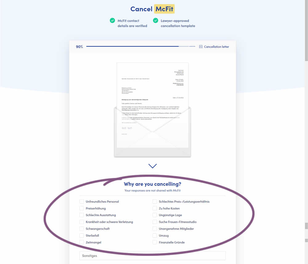
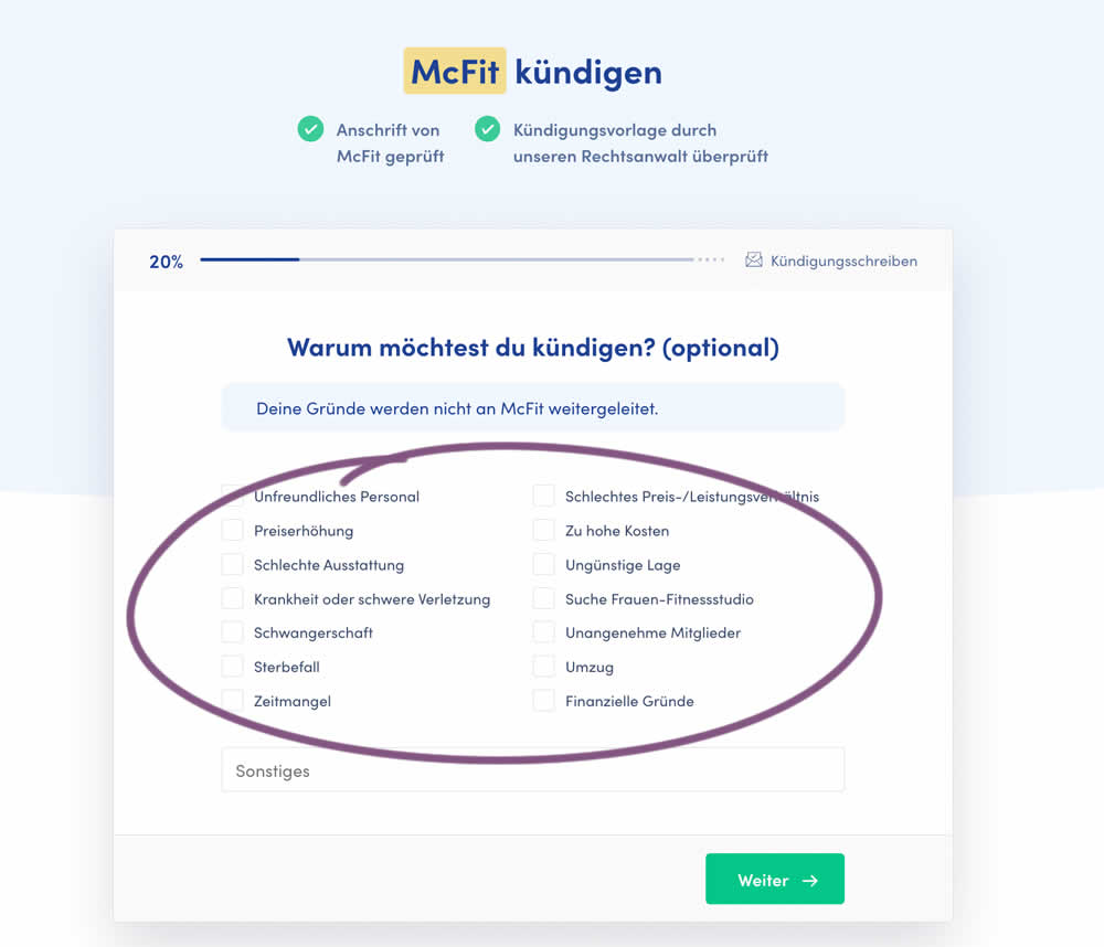
In this experiment, a question about a customer's reason for purchase was broken out into a separate step and moved earlier in the process. In the control, this question was asked in the final checkout step along with a plan selection (Step 4 of 4). In the variation, this question was shifted as a standalone first step (Step 1 of 5). Impact on completed purchases was measured (for a contract cancellation service in this case).