All Latest 620 A/B Tests
MOST RECENT TESTS
Test #647 on
by  Jakub Linowski
Apr 27, 2026
Mobile
Product
X.X%
Sales
Jakub Tested Pattern #79: Product Highlights
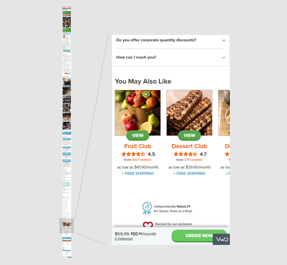
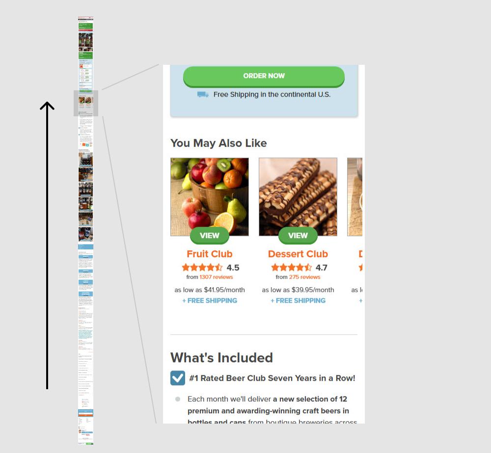
In this experiment, a set of 5 alternative product recommendations were moved from the very bottom of the page (control) to the top (variation). These "You May Also Like " recommendations were moved just above the existing product descriptions. Impact on adds to cart and sales was measured.
Which A Or B Actually Wins? Find Out Before You Test.
Members see every test result — the winners, the flat ones, and the losers — along with exact effects and sample sizes. Use it to estimate your tests and prioritize by probability, not gut feel. Start every experiment with the odds on your side.
Test #646 on
by  Jakub Linowski
Apr 25, 2026
Desktop
Product
X.X%
Sales
Jakub Tested Pattern #79: Product Highlights
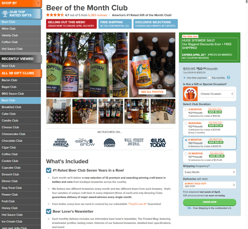
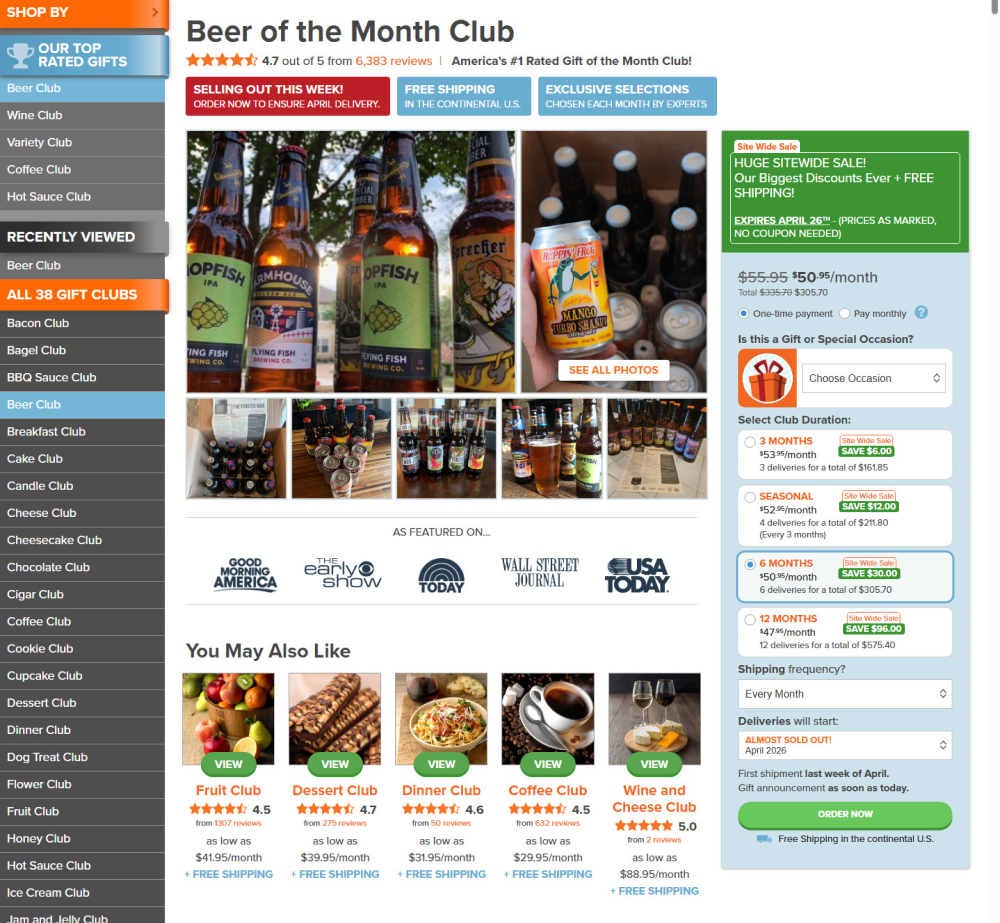
In this experiment, a set of 5 alternative product recommendations were moved from the very bottom of the page (control) to the top (variation). These "You May Also Like " recommendations were moved just above the existing product descriptions. Impact on adds to cart and sales was measured.
Test #613 on
Online.metro-cc.ru
by  Andrey Andreev
Sep 30, 2025
Desktop
Home & Landing
X.X%
Sales
Andrey Tested Pattern #135: Product Categories On Online.metro-cc.ru
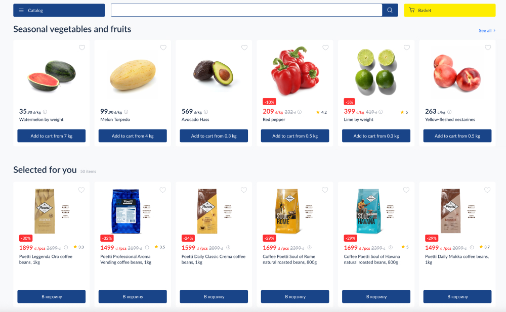
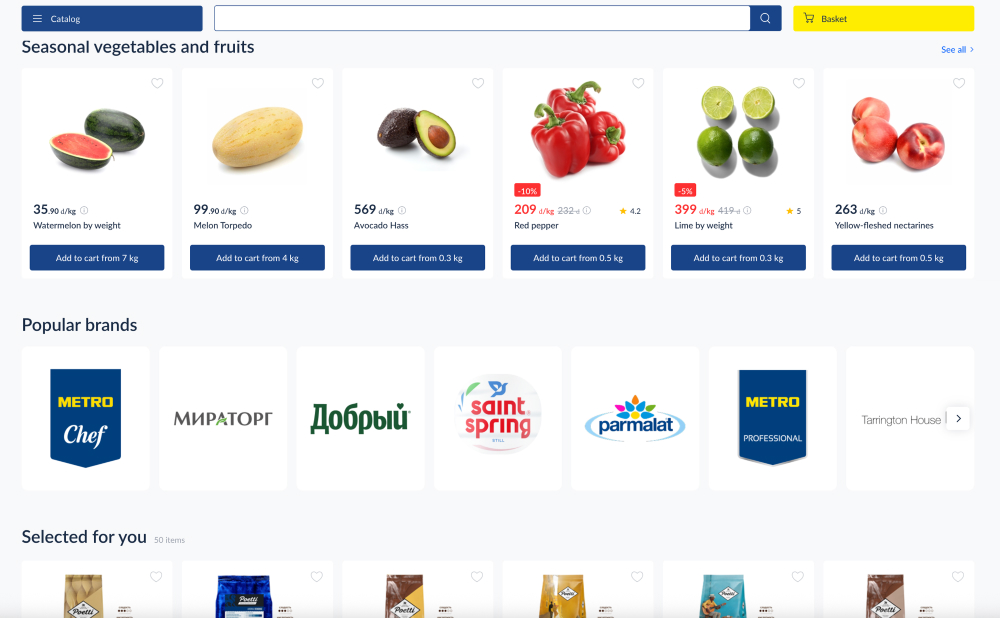
In this experiment, a series of brand logos with links to product listing pages were added - enabling another layer of search. Impact on products purchased was measured.
Test #601 on
Online.metro-cc.ru
by  Andrey Andreev
Jul 22, 2025
Desktop
Product
X.X%
Sales
Andrey Tested Pattern #45: Benefit Bar On Online.metro-cc.ru
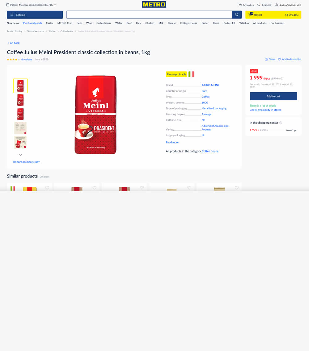
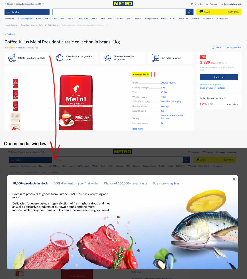
In this experiment, 4 selling points were added at the top of product details pages. Clicking on them would launch a modal with more details.
Test #586 on
by  Jakub Linowski
Apr 25, 2025
Mobile
Product
X.X%
Sales
Jakub Tested Pattern #48: Video Testimonials
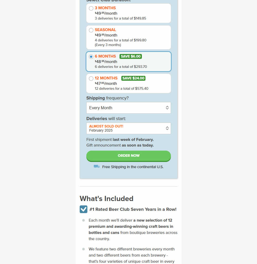
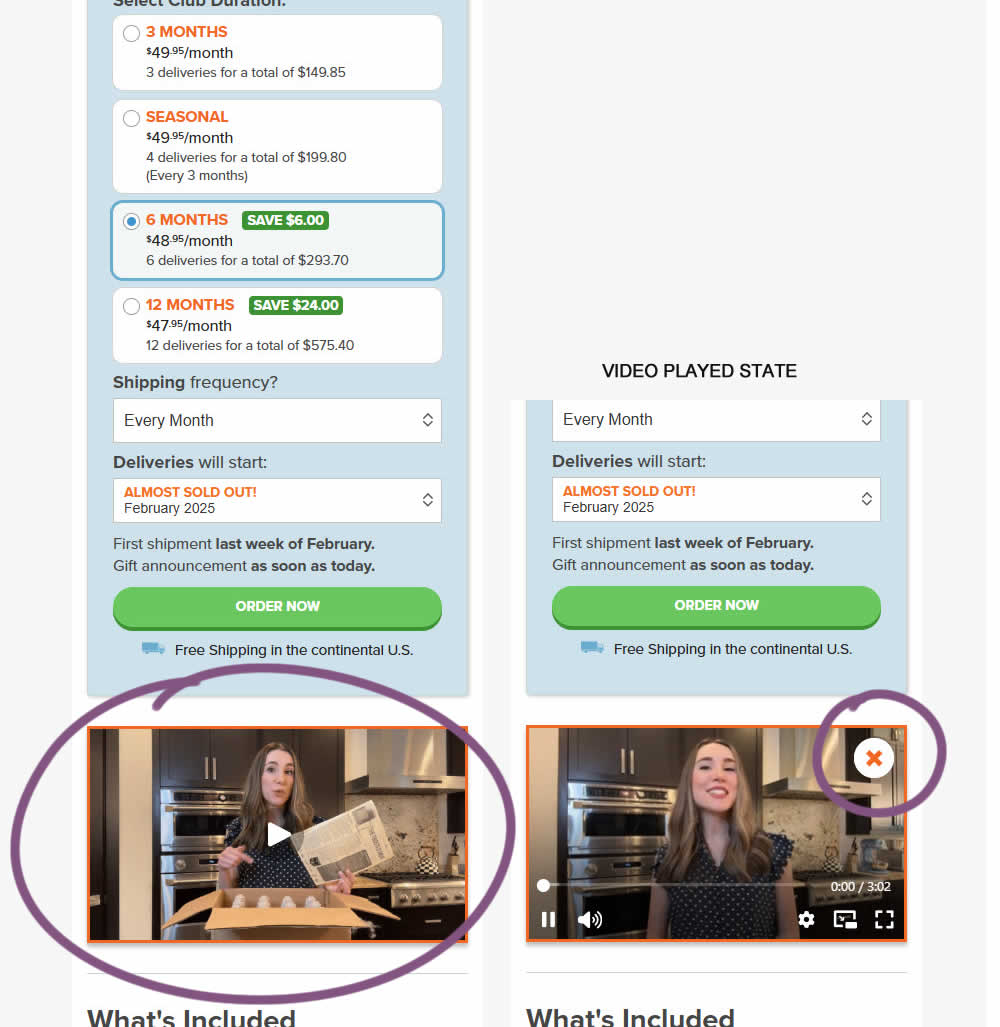
In this experiment, a video unboxing and product overview video was added on product pages (below the buy box). After pressing play, the video started playing with a visible "close" control to allow stopping of the video.
Impact on adds to cart and sales was measured.
Test #581 on
Asics.com
by  Andrey Prokhorov
Mar 21, 2025
Desktop
Product
X.X%
Sales
Andrey Tested Pattern #104: Carousel Vs Static Grid Images On Asics.com
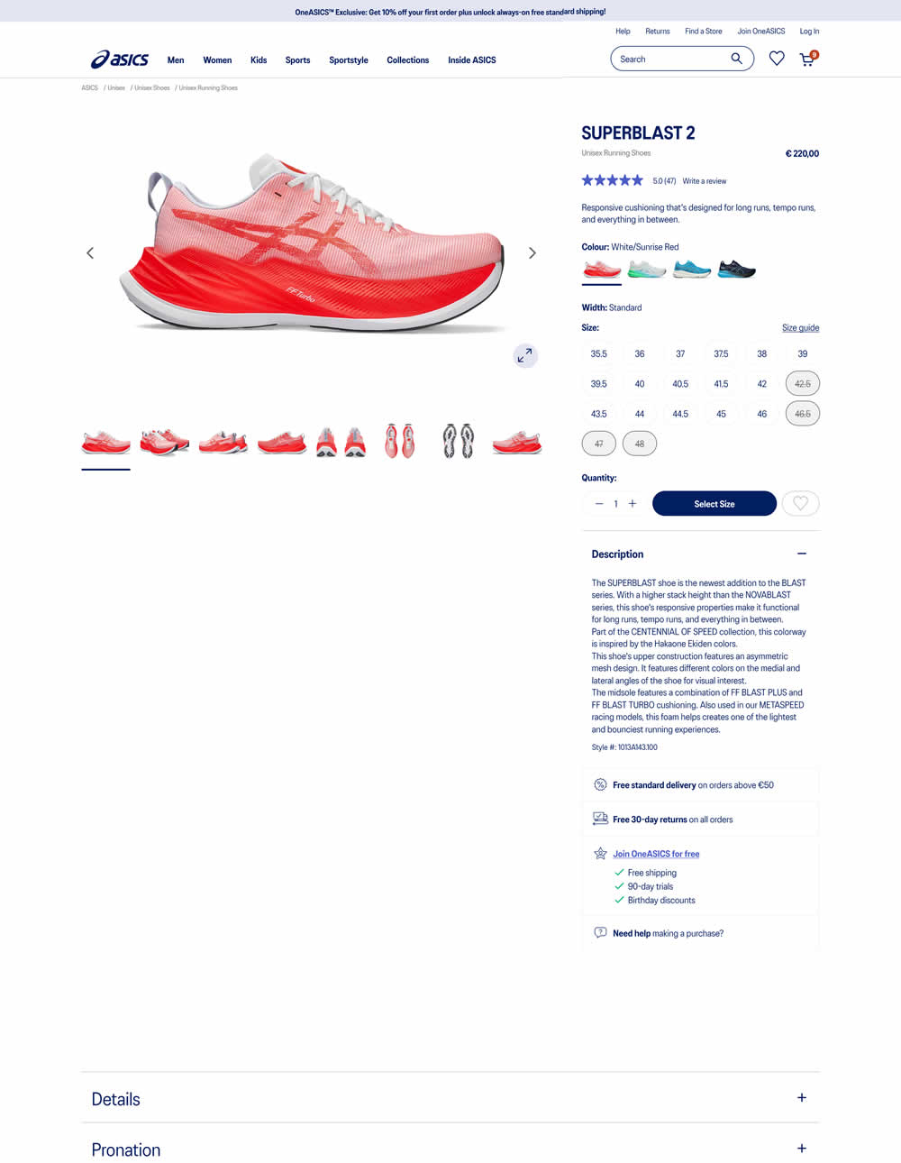
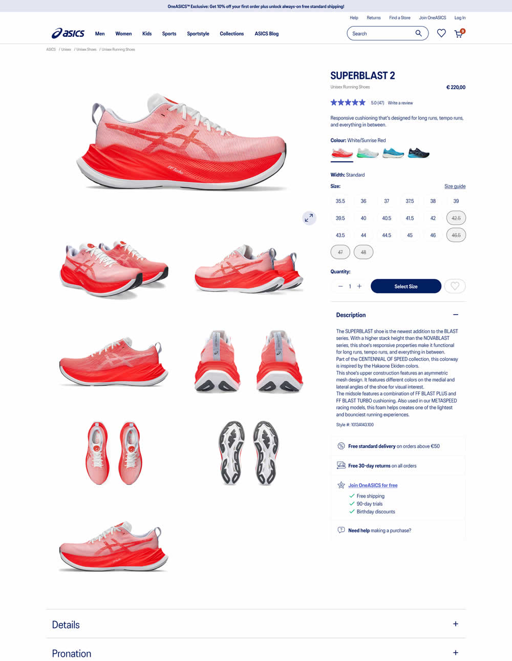
More product photos were exposed in the main column of the variation. Treatment used a collapsed gallery. Impact on ATC and sales was measured.
Test #578 on
by  Jakub Linowski
Feb 20, 2025
Mobile
Product
X.X%
Sales
Jakub Tested Pattern #48: Video Testimonials
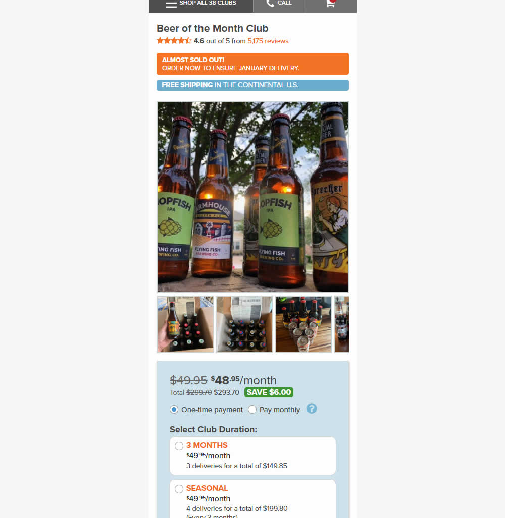
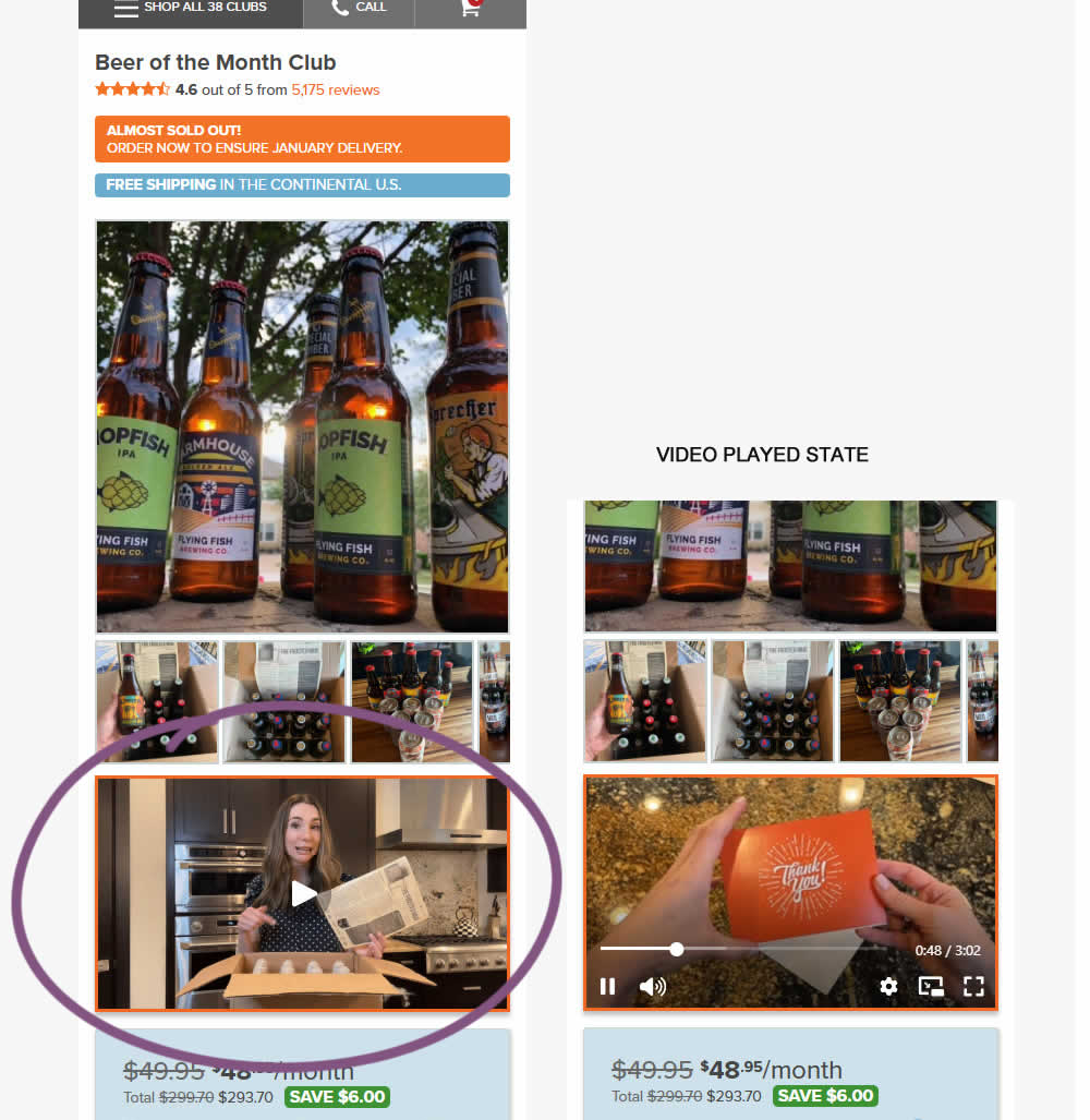
In this experiment, a video unboxing and product overview video was added on product pages. After pressing play, the video started playing with the controls only appearing for a short time before fading away.
Notice the confounding from pushing the buy box further down.
Impact on adds to cart and sales was measured.
Test #577 on
by  Jakub Linowski
Feb 19, 2025
Desktop
Product
X.X%
Sales
Jakub Tested Pattern #48: Video Testimonials
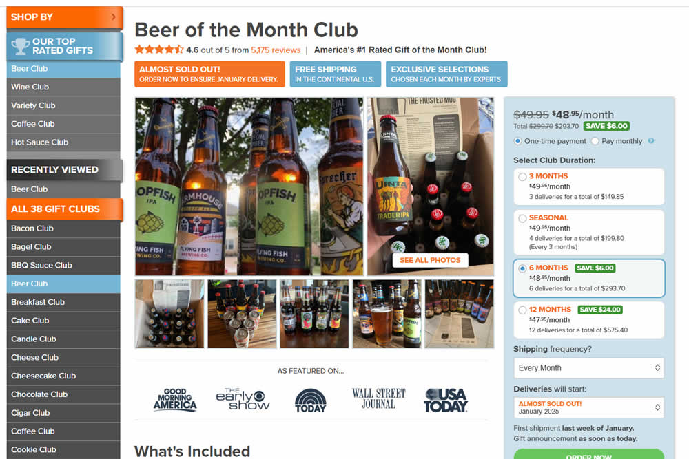
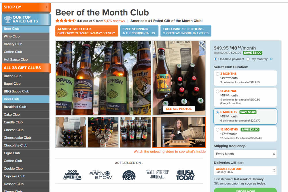
In this experiment, a video unboxing and product overview video was added on product pages. After pressing play, the video expanded to a full column width (taking over the middle column while replacing the 5 small square photo tiles and growing in height.) The video in its play state also contained a prominent (X) icon that allowed users to stop and revert to the original state.
Impact on adds to cart and sales was measured.
Test #571 on
by  Jakub Linowski
Jan 03, 2025
Desktop
Mobile
Product
X.X%
Sales
Jakub Tested Pattern #30: Authentic Photos
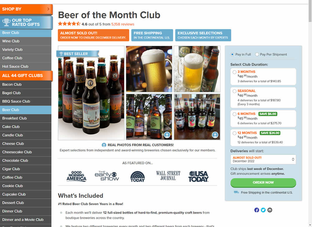
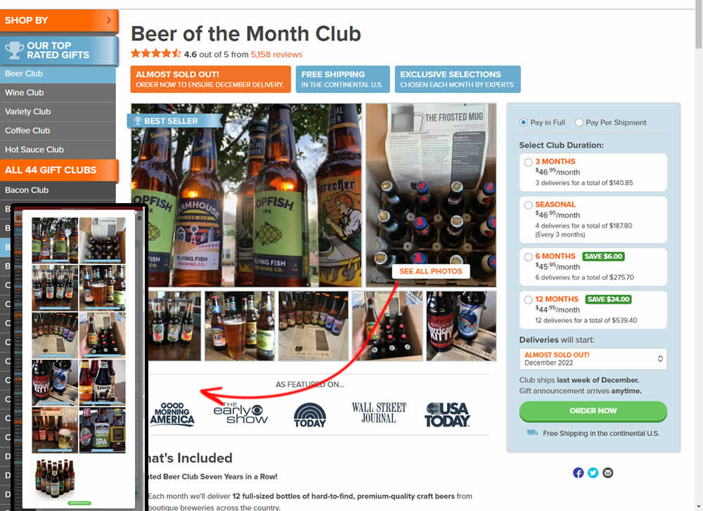
In this experiment, additional customer product photos were shown at the top of the product page. A "Show More Photos" button was also added which launched a modal with additional and larger images. Impact on sales was measured.
Test #567 on
Online.metro-cc.ru
by  Andrey Andreev
Dec 18, 2024
Mobile
Desktop
Home & Landing
X.X%
Sales
Andrey Tested Pattern #135: Product Categories On Online.metro-cc.ru
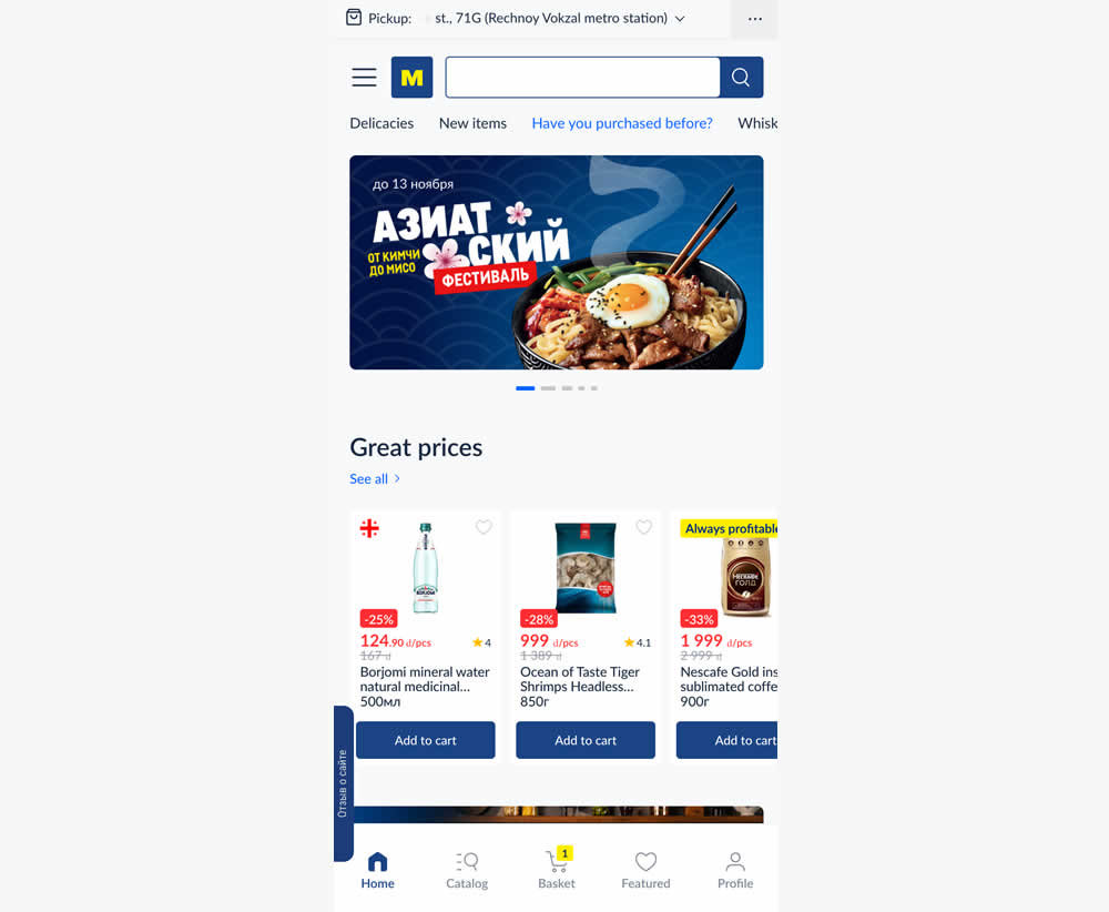
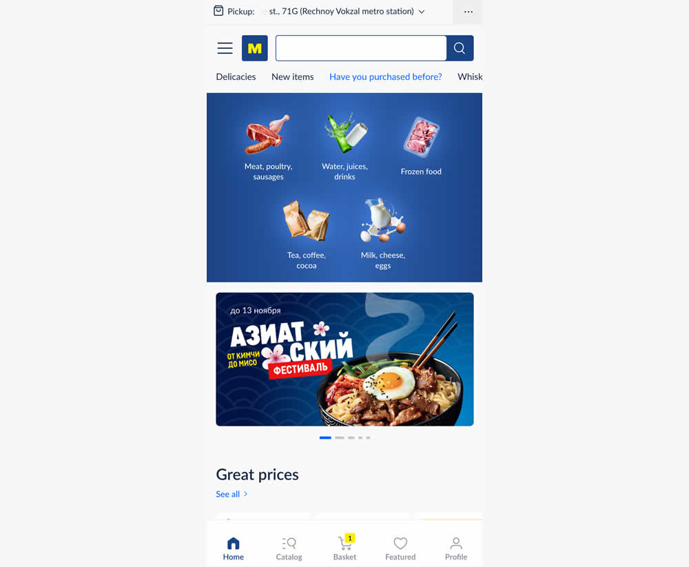
In this experiment, the variation added popular categories with links at the top of the homepage. This was done for all sets of user segments: new and returning. Impact on transactions was measured.
Test #561 on
Aboalarm.de
by  Katharina Lay
Nov 07, 2024
Desktop
Signup
X.X%
Sales
Katharina Tested Pattern #40: Blurred Product Background On Aboalarm.de
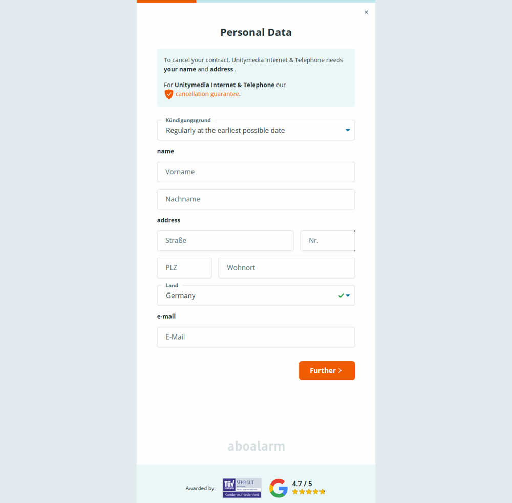
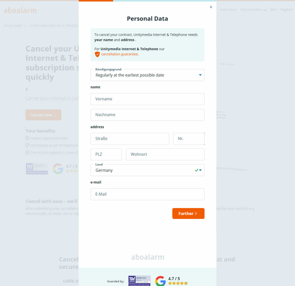
In this experiment, as a multi-step sign up funnel launched as a modal, there was a different treatment of the background. In the A version the background was a flat color, whereas in the B version the background used a transparent opacity to show through the landing page underneath. Impact on sign ups was measured.
Test #544 on
686.com
by  Adan Archila
Jul 25, 2024
Desktop
Product
X.X%
Sales
Adan Tested Pattern #104: Carousel Vs Static Grid Images On 686.com
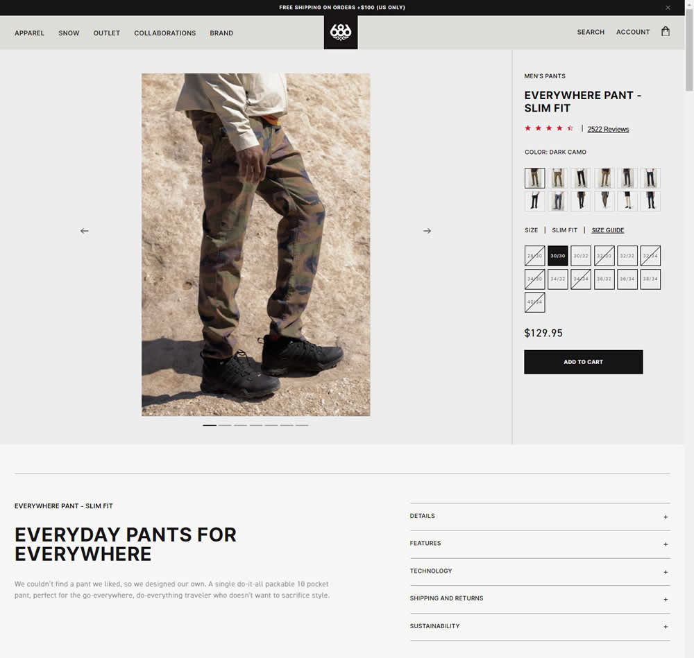
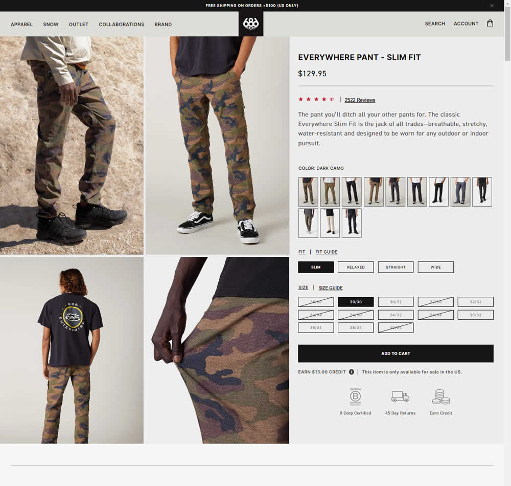
In this experiment, a single image carousel gallery was replaced with a grid gallery. In addition the variation also used: taller swatches; a wider size box, added fit (slim, relaxed, straight, wide) options; and used a wider Add to Cart CTA (full width of the column). Impact on sales was measured.
Test #535 on
686.com
by  Adan Archila
May 31, 2024
Desktop
Listing
X.X%
Sales
Adan Tested Pattern #120: Supporting Theme Images On 686.com
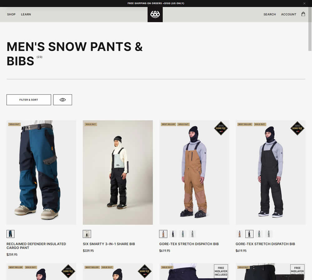
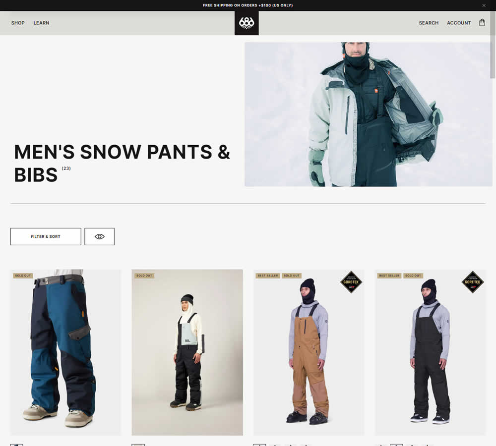
In this experiment, a static category theme image at the top of a listing page was tested against the same page but without the extra image. Impact on sales was measured.
Test #528 on
686.com
by  Adan Archila
Apr 26, 2024
Mobile
Listing
X.X%
Sales
Adan Tested Pattern #120: Supporting Theme Images On 686.com
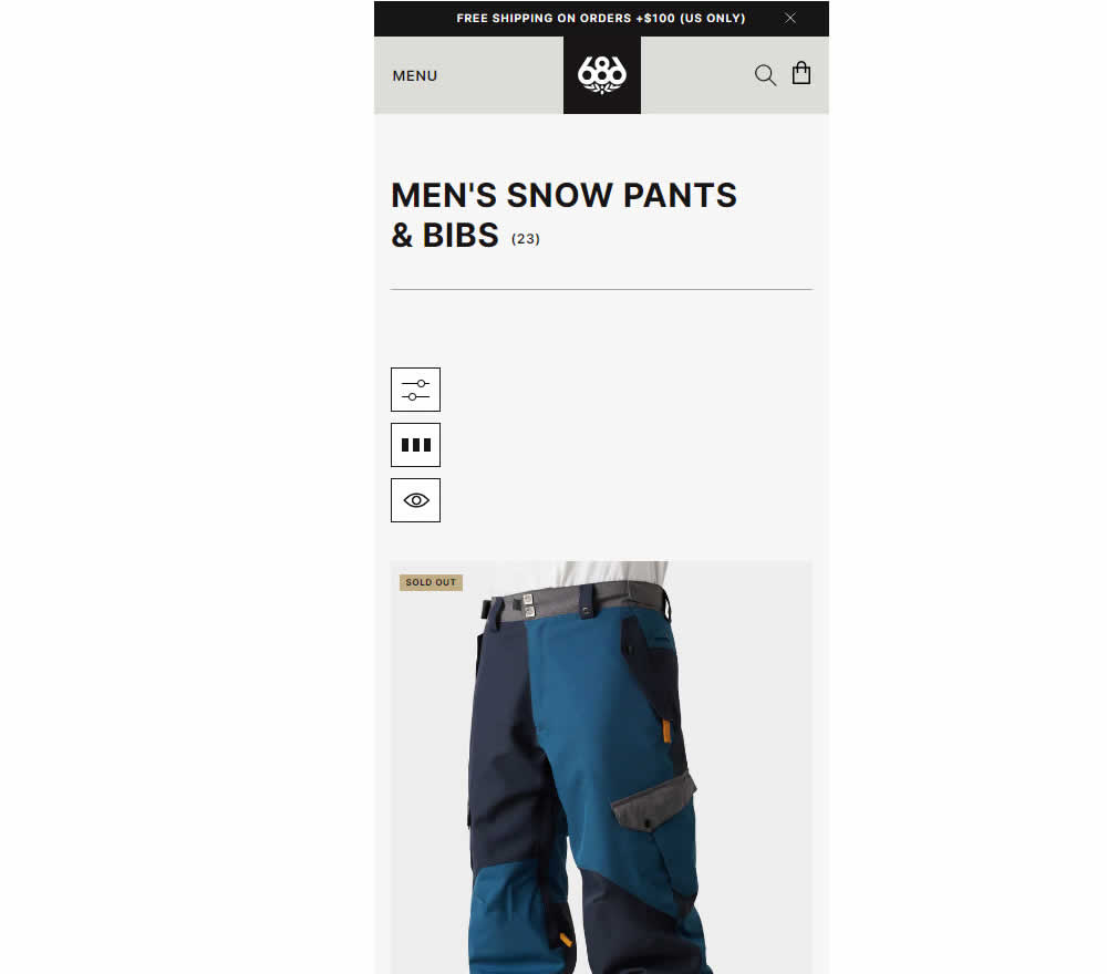
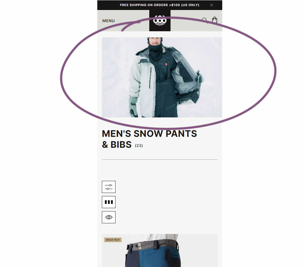
In this experiment, the effect of having additional static category themed images was tested on category listing pages. Impact on sales was measured.
Test #524 on
Jared.com
by  Craig Kistler
Mar 26, 2024
Mobile
Listing
X.X%
Revenue
Craig Tested Pattern #79: Product Highlights On Jared.com
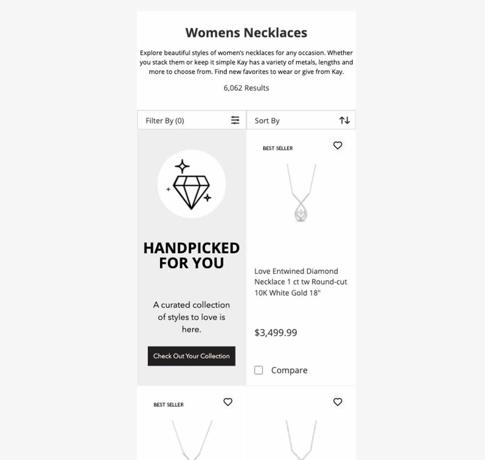
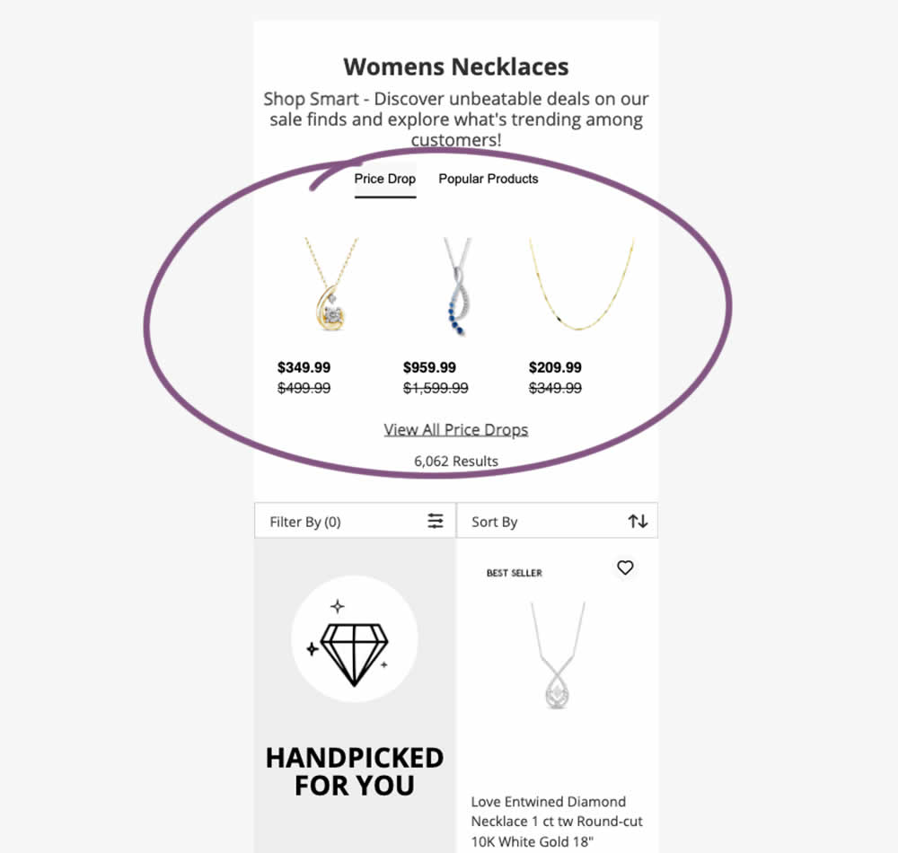
In this experiment, additional (discounted) products were shown at the top of category listing pages with a link to see more such products ("View All Price Drops"). Impact on overall sales was measured.
Test #523 on
Livefresh.de
by  Pascal Dietz
Mar 21, 2024
Mobile
Product
X.X%
Sales
Pascal Tested Pattern #131: Authority On Livefresh.de
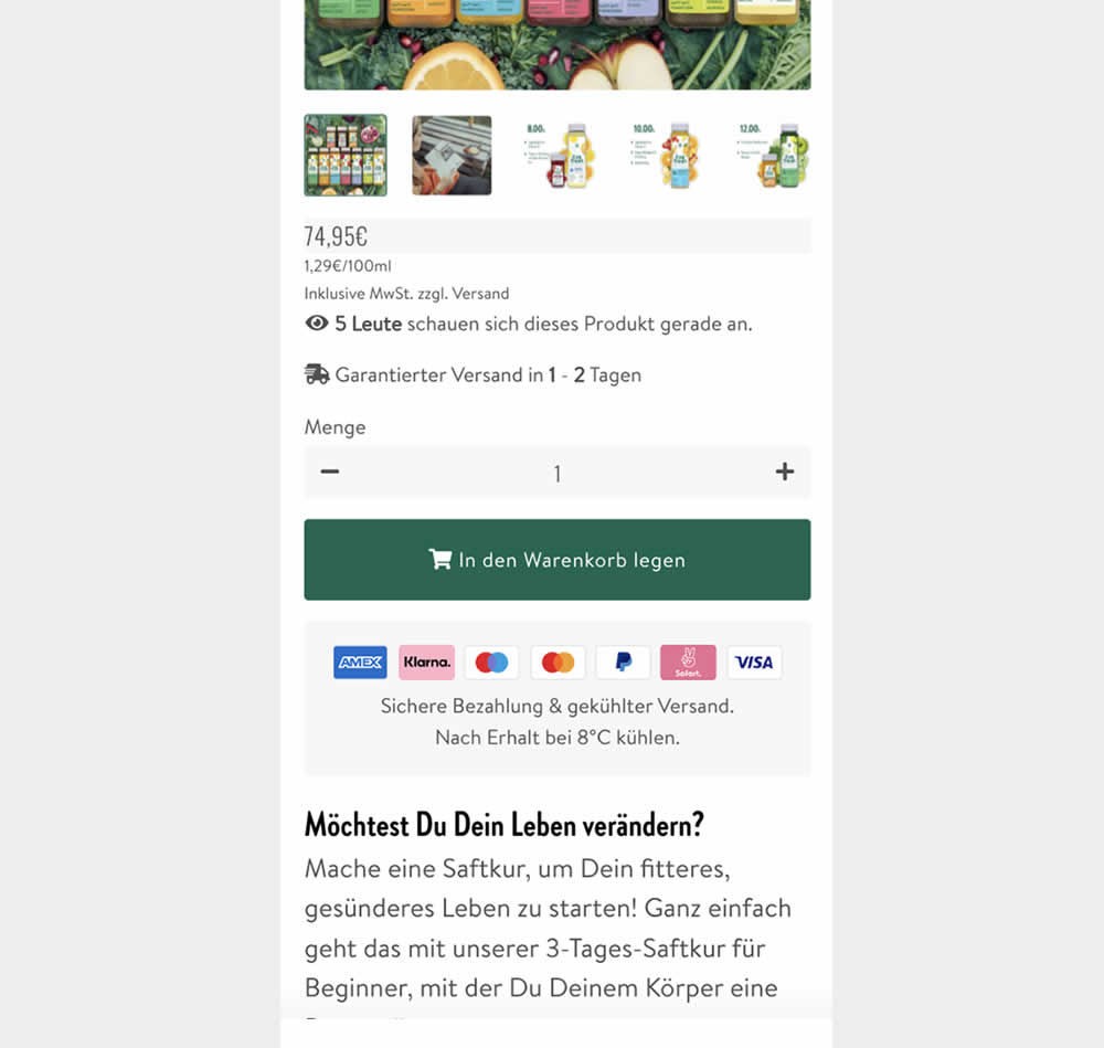
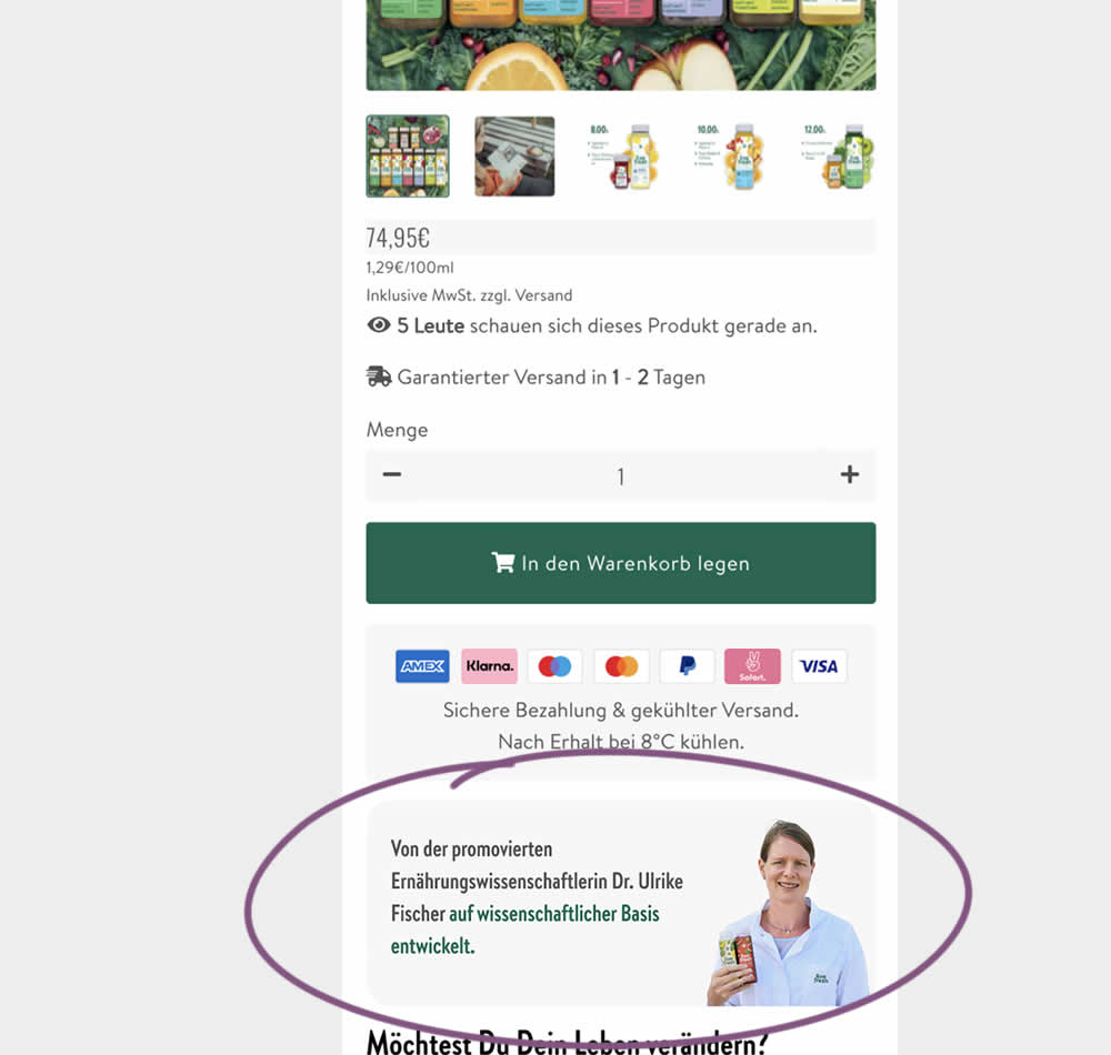
In this experiment, a photo of a doctor (who researched and created the a cleanising juice - the product) was appended after the add to cart button. The copy is translated as follows from "Von der promovierten Ernährungswissenschaftlerin Dr. Ulrike Fisher auf wissenschaftlicher Basis entwickelt." [German] -> "Developed by doctoral nutritionist Dr. Ulrike Fisher with a scientific basis." Impact on sales was measured.
Test #522 on
686.com
by  Adan Archila
Mar 18, 2024
Desktop
Listing
X.X%
Sales
Adan Tested Pattern #37: List Or Grid View On 686.com
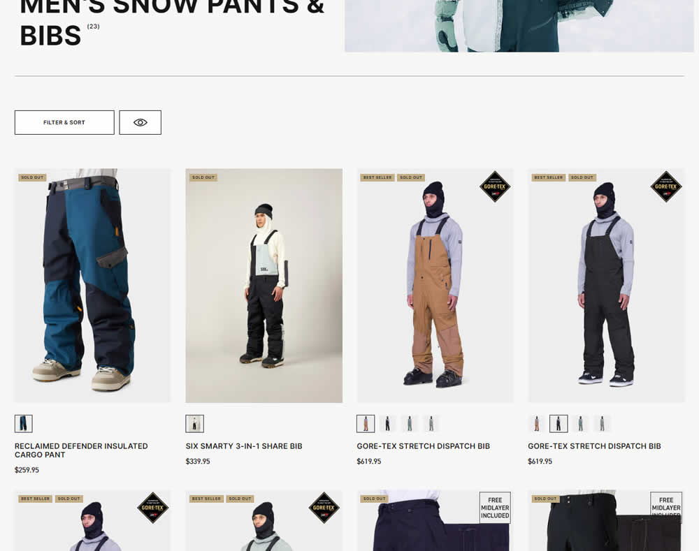
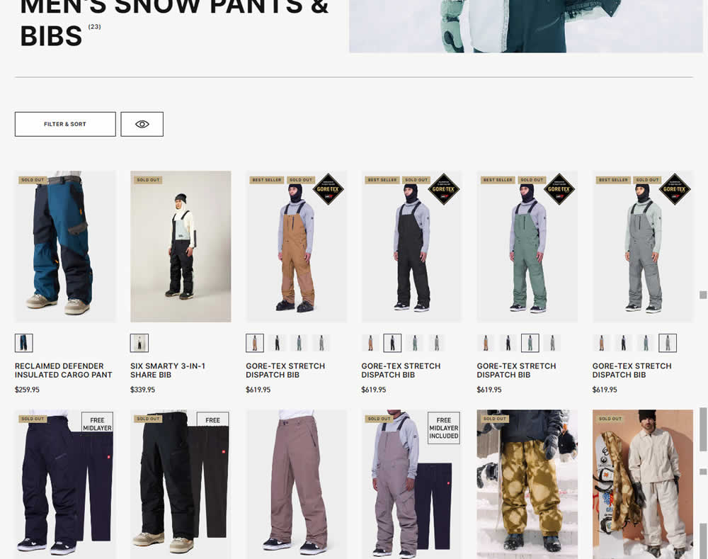
In this desktop experiment, 4 product tiles per page (control) were tested against 6. Impact on sales was measured.
Test #516 on
686.com
by  Adan Archila
Feb 05, 2024
Mobile
Listing
X.X%
Sales
Adan Tested Pattern #37: List Or Grid View On 686.com
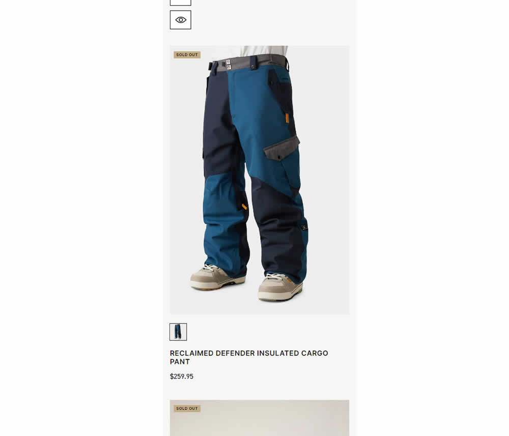
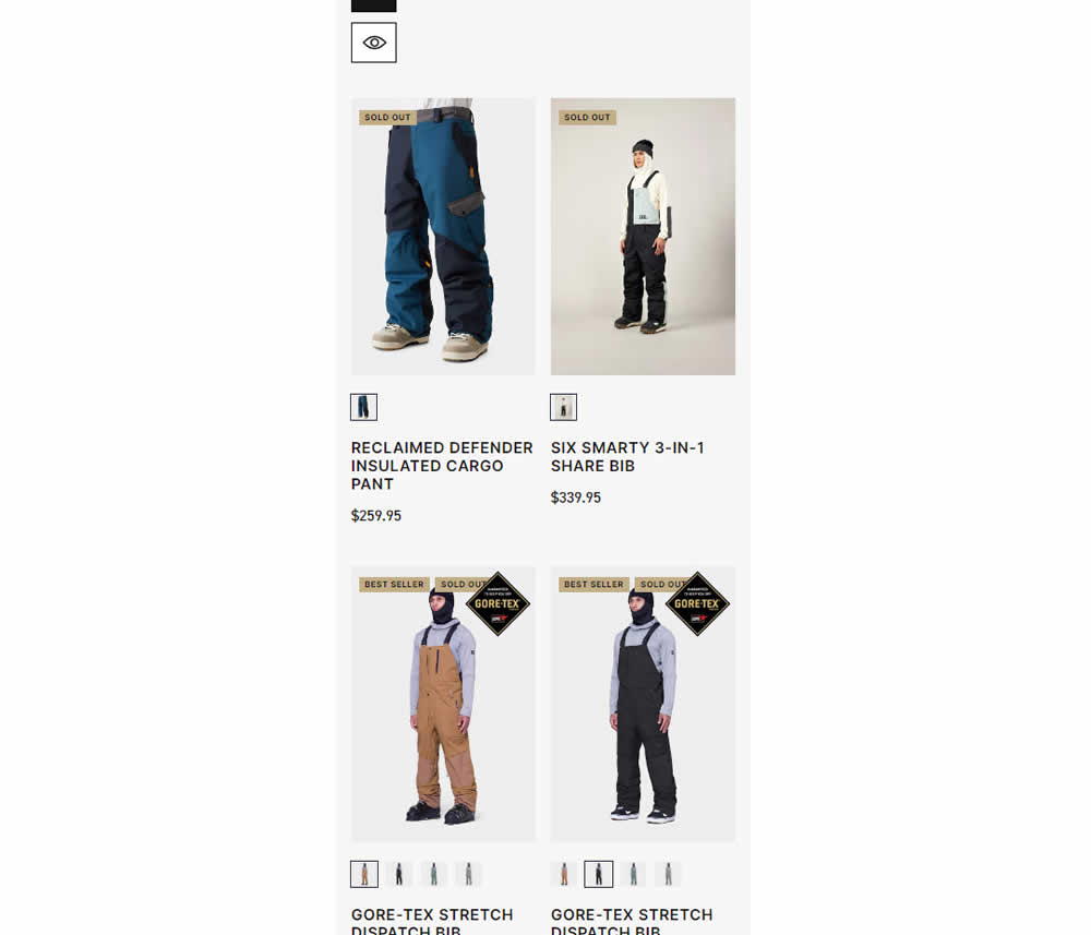
In this experiment, a one large product photo (control) was tested against a two-column layout with two smaller images (variation). Impact on sales was measured.
Test #511 on
Online.metro-cc.ru
by  Andrey Andreev
Jan 09, 2024
Desktop
Home & Landing
X.X%
Sales
Andrey Tested Pattern #79: Product Highlights On Online.metro-cc.ru
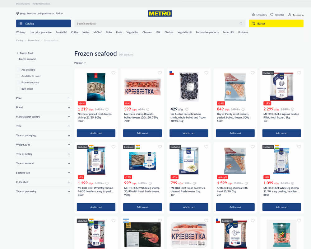
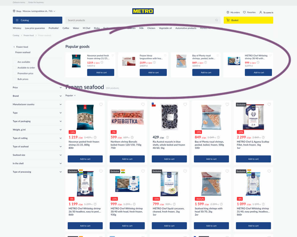
In this experiment, popular products were shown at the top of the homepage. Impact to sale was measured.
Test #505 on
Shmoodyapp.com
by  Michael McSweeney
Nov 28, 2023
Mobile
Signup
X.X%
Sales
Michael Tested Pattern #52: How It Works On Shmoodyapp.com
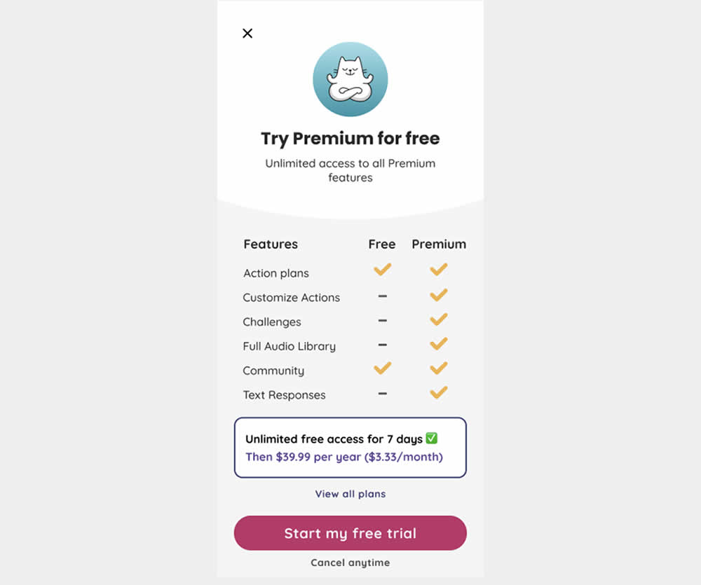
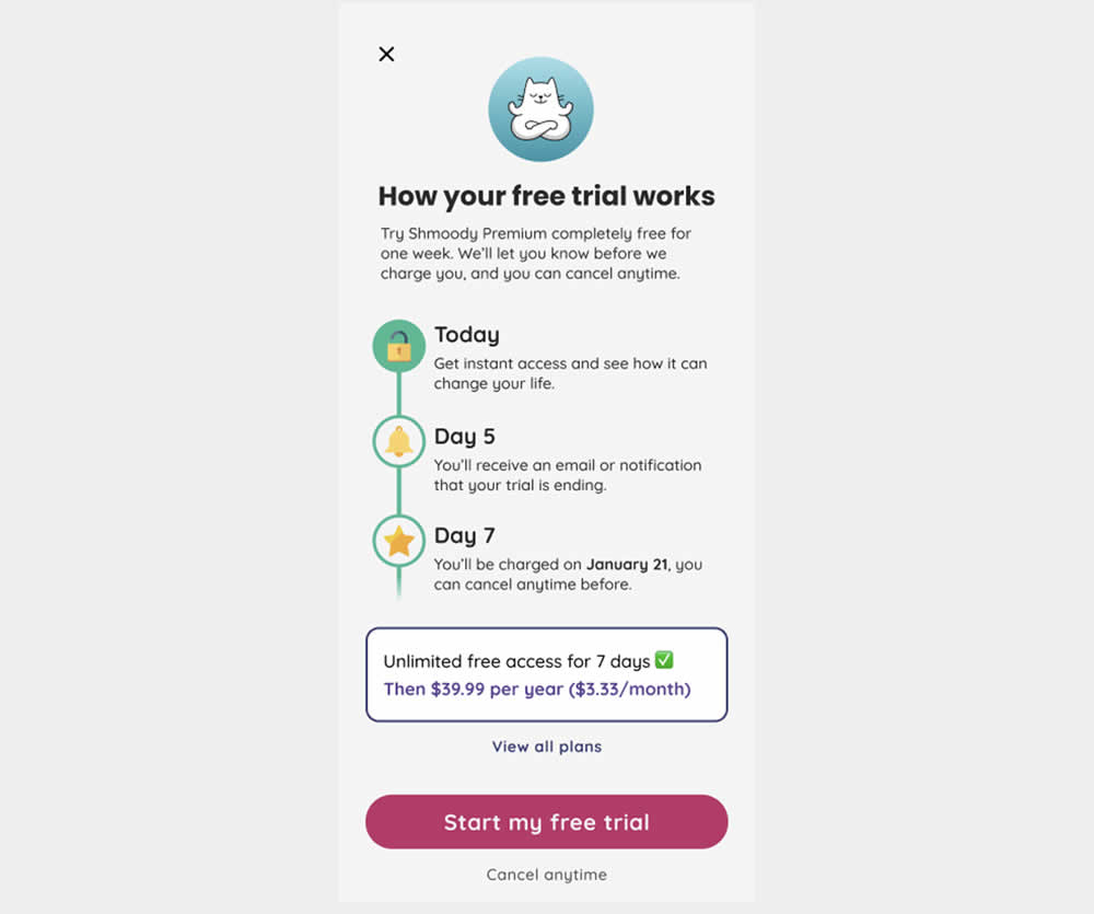
In this experiment, new paywall copy and messaging was used to encourage more users to signup and pay for access to a mental health app. The variation reinforced that users would be receiving a full featured application, with reminders about the upcoming billing. It reinforced that users will have a full week to decide and potentially cancel their application. Impact on lagging +7 day later transactions was measured.