All Latest 620 A/B Tests
MOST RECENT TESTS
Test #494 on
Online.Metro-cc.ru
by  Andrey Andreev
Sep 20, 2023
Desktop
Mobile
Home & Landing
X.X%
Sales
Andrey Tested Pattern #26: Cart Reminder And Recently Viewed On Online.Metro-cc.ru
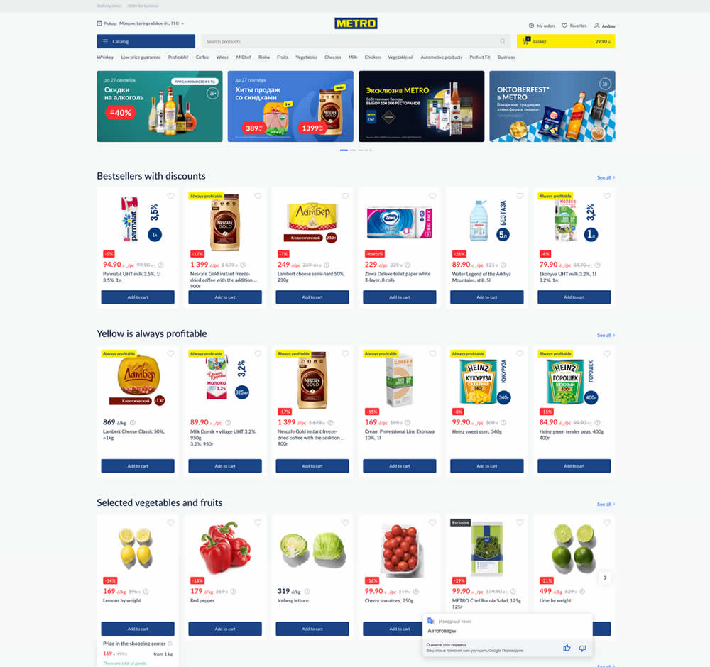
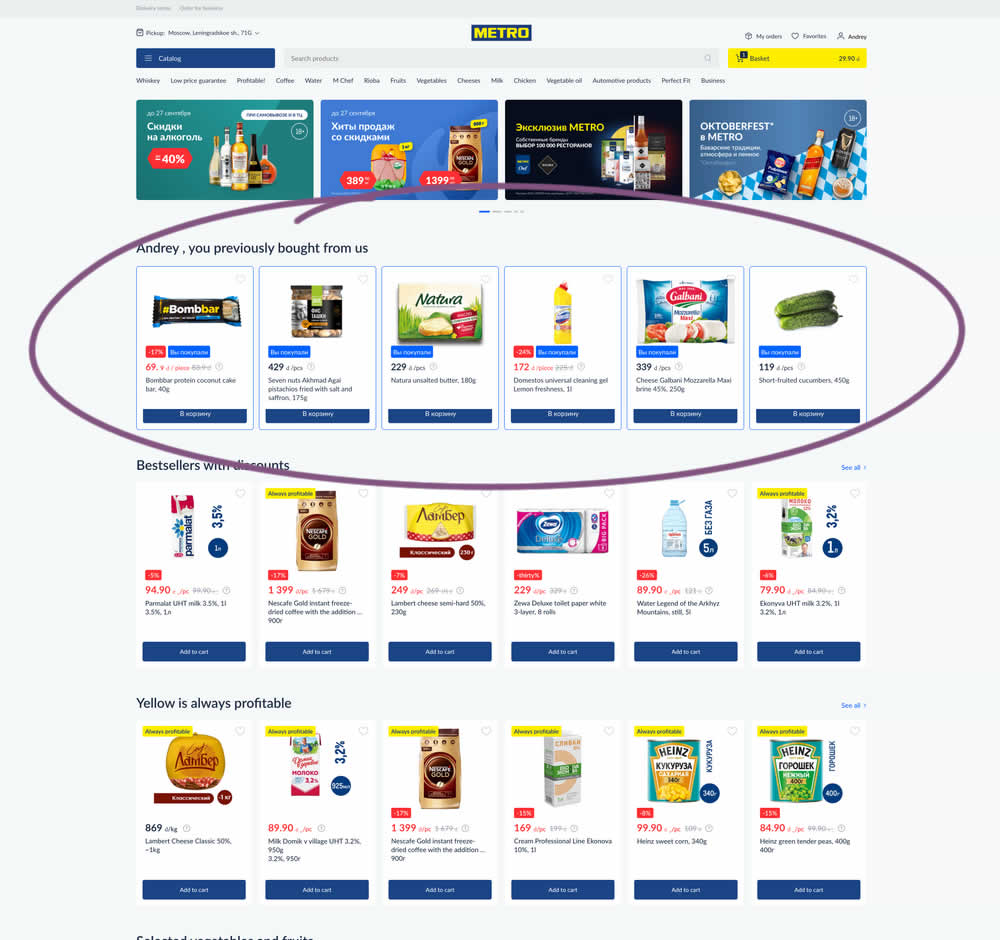
In this experiment, recently purchased products were appended at the top of the homepage. The test ran for loggedin users only. Impact on add-to-cart, sales and revenue was measured.
Which A Or B Actually Wins? Find Out Before You Test.
Members see every test result — the winners, the flat ones, and the losers — along with exact effects and sample sizes. Use it to estimate your tests and prioritize by probability, not gut feel. Start every experiment with the odds on your side.
Test #492 on
Formelskin.de
by  Alexander Krieger
Sep 15, 2023
Mobile
Signup
X.X%
Sales
Alexander Tested Pattern #131: Authority On Formelskin.de
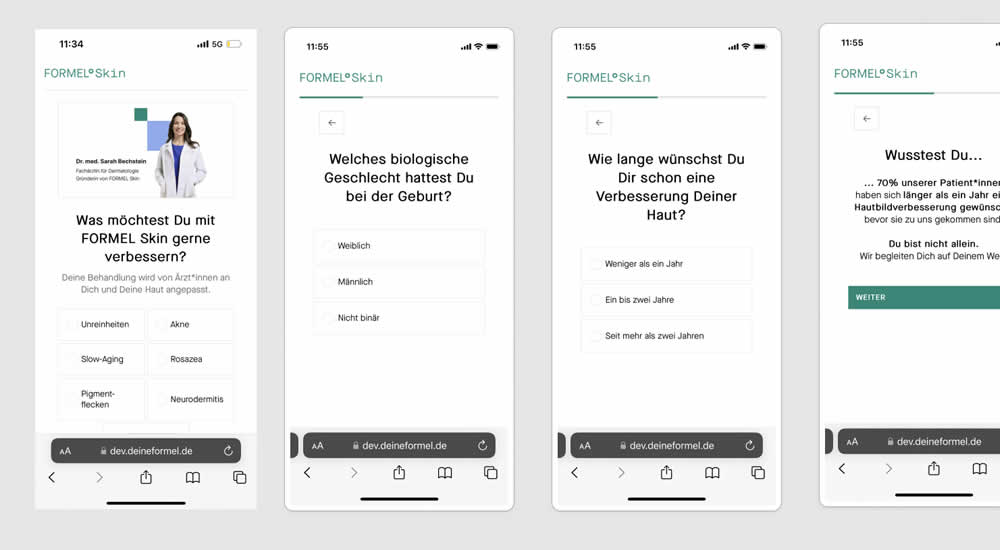
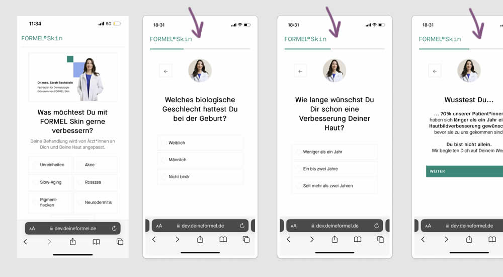
This experiment was a retest of a previously tested test 491. Simiarly, a photo of the real doctor behind a skin care product was shown throughout a signup / questionnaire flow in the variation.
Test #491 on
Formelskin.de
by  Alexander Krieger
Sep 08, 2023
Mobile
Signup
X.X%
Sales
Alexander Tested Pattern #131: Authority On Formelskin.de
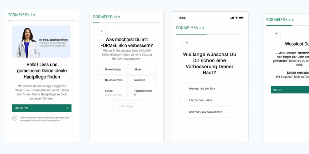
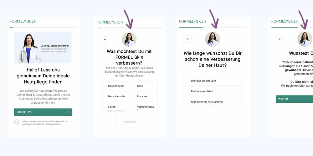
In this experiment, a photo of the real doctor behind a skin care product was shown throughout a signup / questionnaire flow. In the control version, the photo with introduction was only shown on the first screen. In the variation, the photo appeared on the first and all other screens - reinforcing expertise, authority and the idea of a consultation. Impact on signups and purchases was measured.
Test #485 on
Livefresh.de
by  Pascal Dietz
Jul 27, 2023
Mobile
Product
X.X%
Sales
Pascal Tested Pattern #131: Authority On Livefresh.de
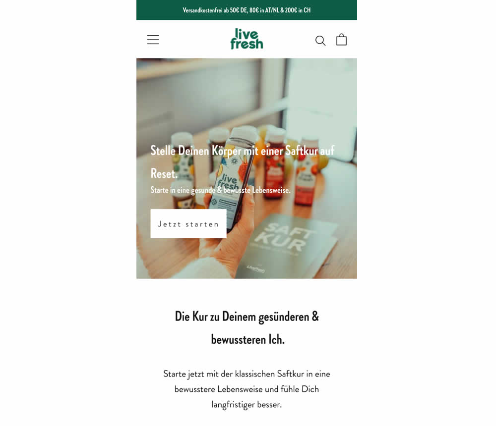
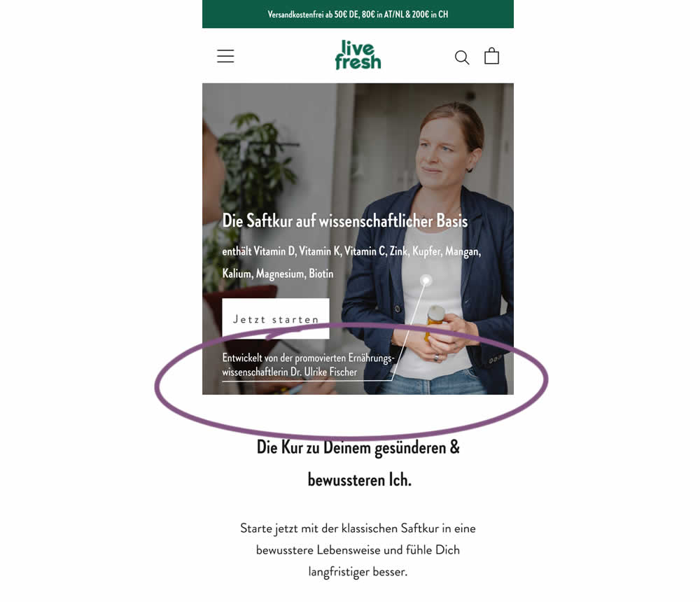
In this experiment a juice cleanse product (developed by Dr. Ulrike Fischer) was supported with statements and visuals to reinforce her as a doctor and an authority figure. The control only referenced the product itself. Google translations include:
A) Headline: "Reset your body with a juice cleanse"
B) Headline: "The juice cleanse with a scientific basis"
B) Listed out specific vitamins and supplements.
B) Added Subheadline: "Developed by Dr. Ulrike Fischer, who holds a doctorate in nutritional science"
Test #477 on
Snocks.com
by  Melina Hess
Jun 09, 2023
Mobile
Desktop
Product
X.X%
Sales
Melina Tested Pattern #95: Clickable Product Previews On Snocks.com
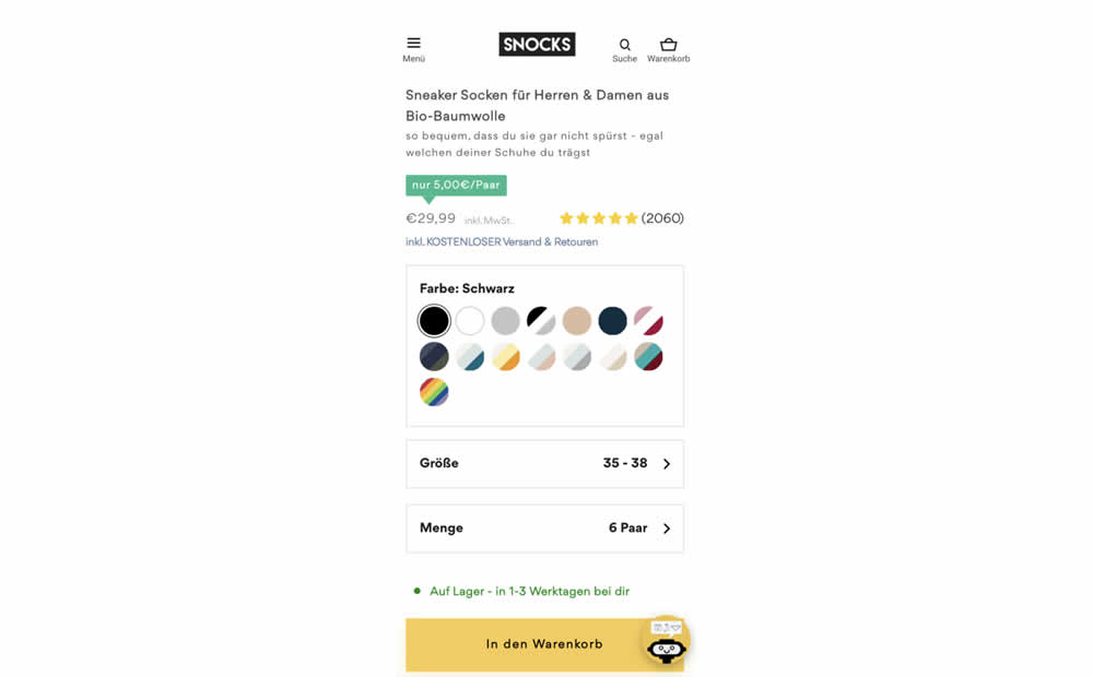
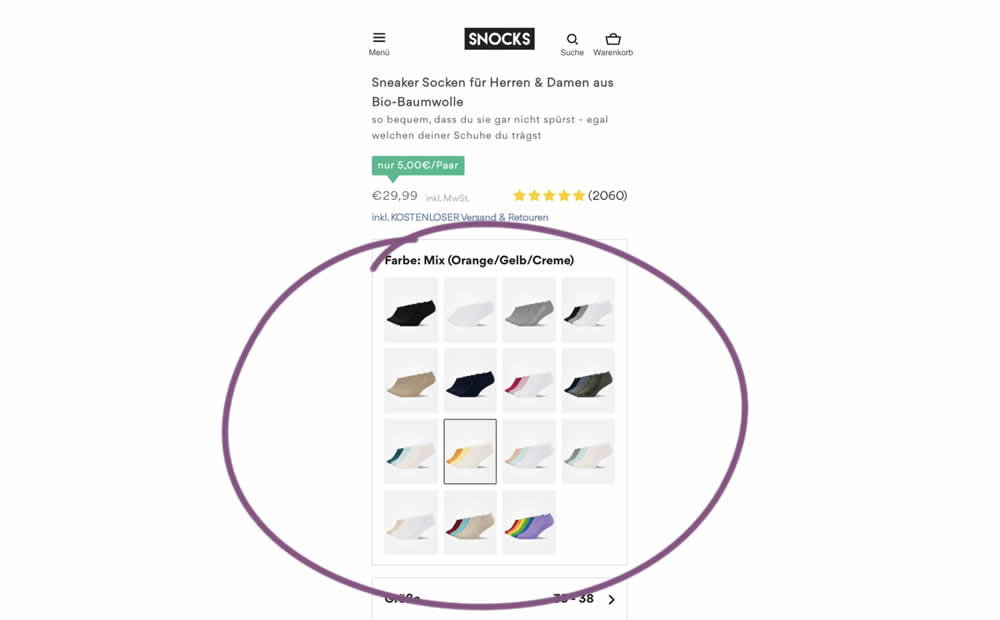
In this experiment, product color swatches were replaced with real product photos. Whereas the control showed the colors as more abstract circles. Impact on sales was measured.
Test #476 on
by  Devesh Khanal
Jun 08, 2023
Mobile
Product
X.X%
Sales
Devesh Tested Pattern #95: Clickable Product Previews
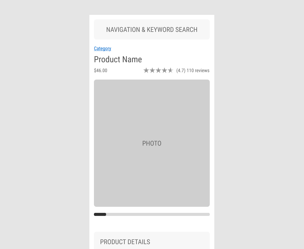
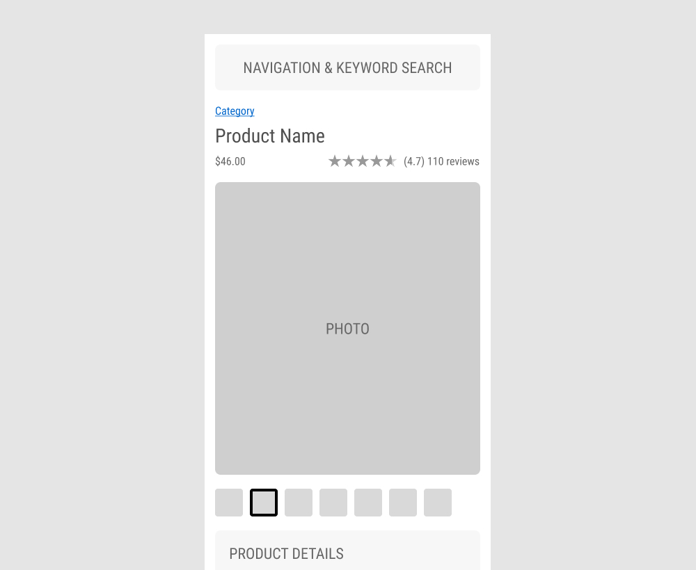
The GrowthRock team ran an experiment on one of their client's product detail pages. Instead of using a scrollbar (for mulitple images), clickable product photo thumbnails were used instead. Impact on sales was measured.
Test #475 on
Online.metro-cc.ru
by  Andrey Andreev
Jun 07, 2023
Desktop
Mobile
Listing
X.X%
Sales
Andrey Tested Pattern #36: Fewer Or More Results On Online.metro-cc.ru
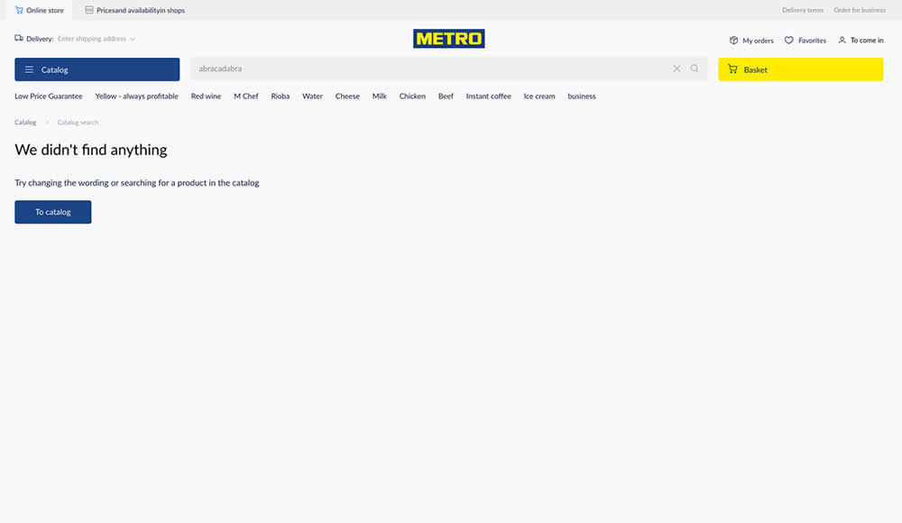
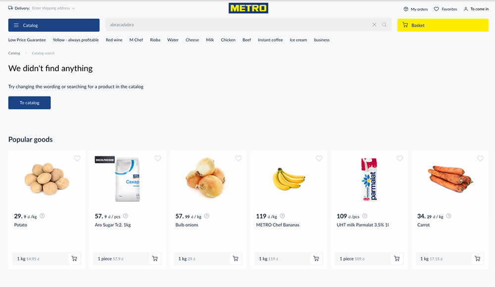
Are more (popular) product results better than none at all? In this experiment, popular products were shown during an empty search result. Impact on sales was measured.
Test #459 on
Snocks.com
by  Melina Hess
Feb 28, 2023
Desktop
Mobile
Listing
X.X%
Sales
Melina Tested Pattern #36: Fewer Or More Results On Snocks.com
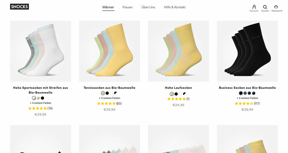
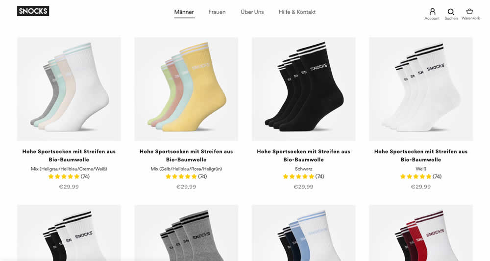
In this listing page experiment, color sets of the same product were tested against individual products with unique colors (with additional product tiles). Essentially, the A version here contained fewer product items (with color sets), while the B version contained more results and tiles (with grouped products). Impact on total sales was measured.
(The original control and variation was inverted, but was flipped to match the fewer or more results pattern).
Test #455 on
Expertinstitute.com
by  Ardit Veliu
Feb 16, 2023
Desktop
Mobile
Home & Landing
X.X%
Leads
Ardit Tested Pattern #117: Company Logos On Expertinstitute.com
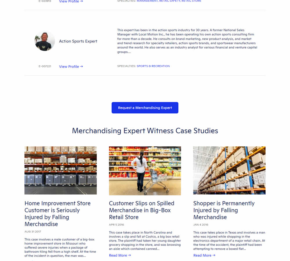

In this experiment, supporting university logos were appended near the primary call to action for additional credibility. These logos were placed around the middle of long landing pages on Expert Institute's web site (where experts for legal advice are searched). Impact on total leads was measured.
Test #451 on
Fluke.com
by  Marika Francisco
Jan 25, 2023
Desktop
Product
X.X%
Sales
Marika Tested Pattern #115: Pricing Comparison Table On Fluke.com
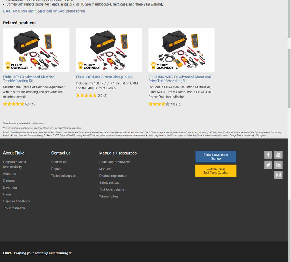
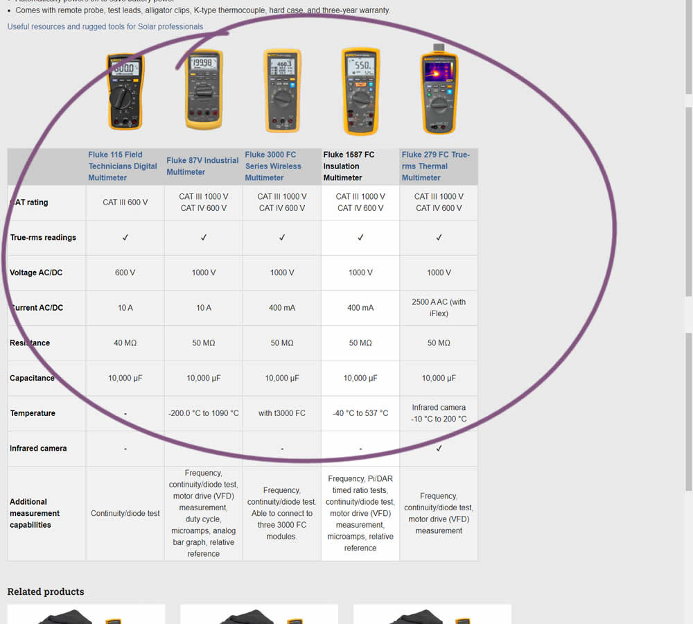
In this experiment, a product comparison table was added in the middle of a product detail page. The comparison table contained products from the same class or family of products. Clicking on the photo thumbnails also allowed customers to visit the specific detail page. Impact on adds to cart and transactions was measured.
Test #445 on
Phorest.com
by  Sorcha Mullis
Dec 14, 2022
Desktop
Mobile
Home & Landing
X.X%
Leads
Sorcha Tested Pattern #33: Example Situations On Phorest.com
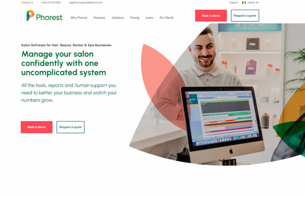
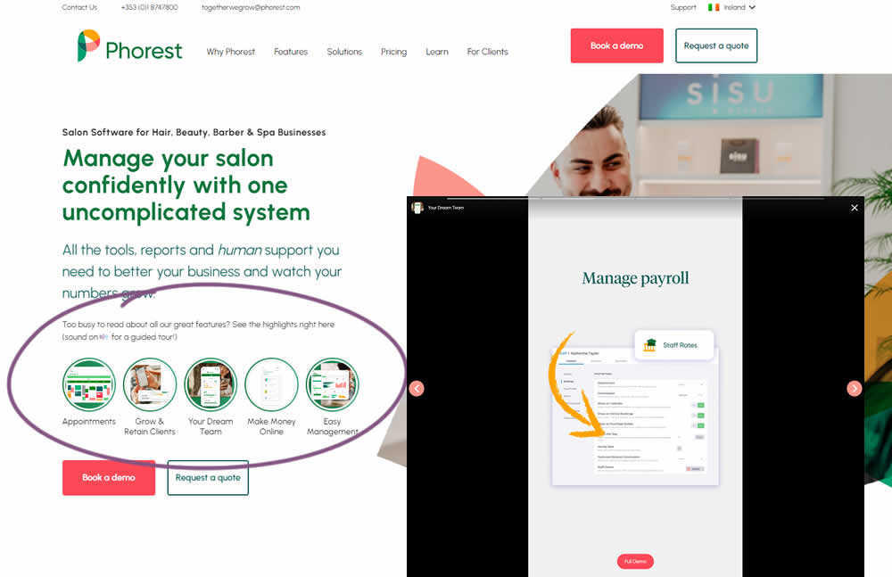
In this experiment, five clickable feature elements were surfaced on the homepage. Clicking on any of these 5 elements launched an Instastory-like short 10 second video in full screen. These videos explained the key features of the software being offered. Impact on lead generation was measured.
Test #439 on
Designlab.com
by  Daniel Shapiro
Oct 31, 2022
Desktop
Mobile
Home & Landing
X.X%
Sales
Daniel Tested Pattern #18: Single Or Alternative Buttons On Designlab.com

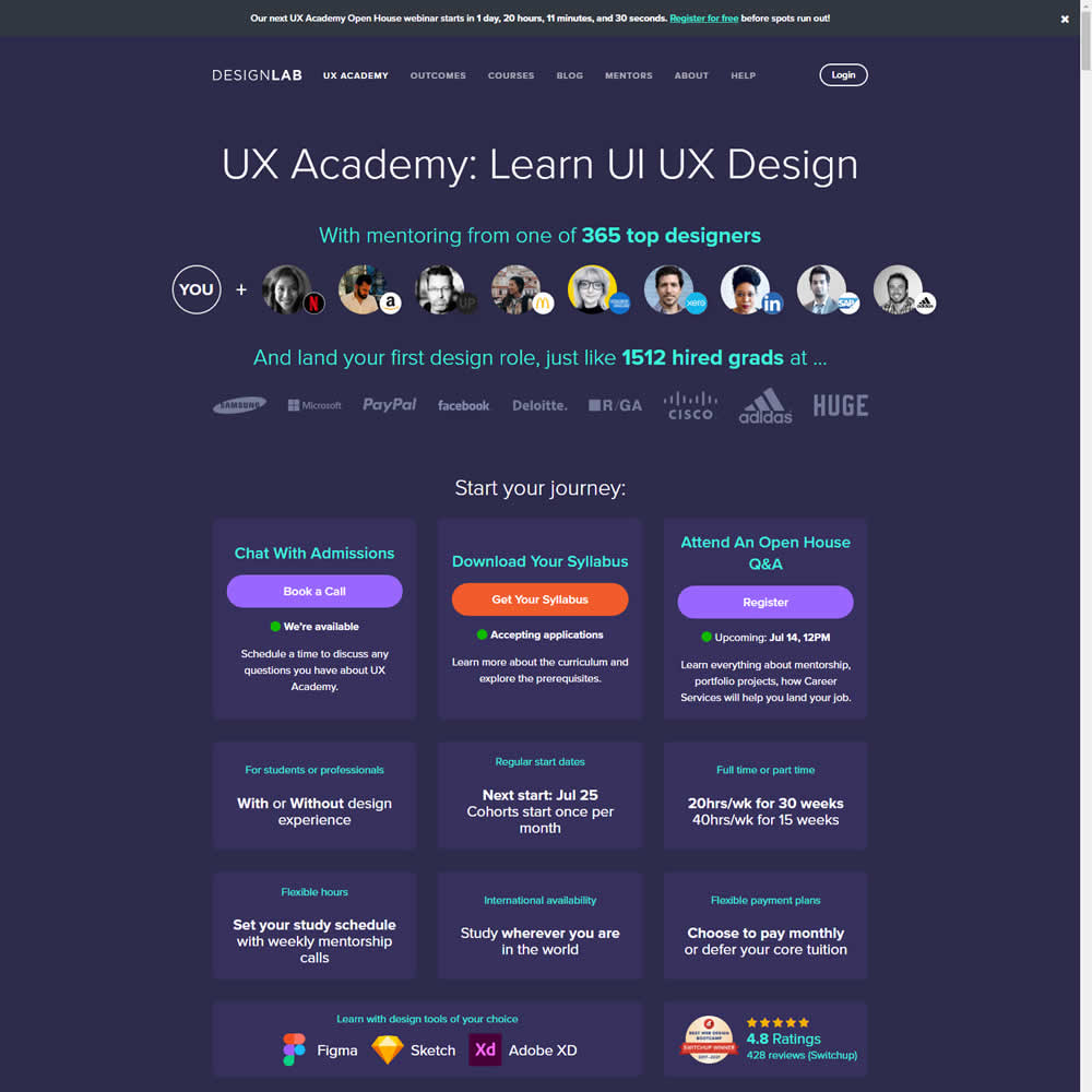
This was a larger leap experiment with numerous changes to the header part of a design program landing page. One of the key changes however was a shift from a single to multiple call to actions for lead generation. In the control, all potential leads would first funnel through a single syllabus download flow. In the variation, users were given three visible choices: download syllabus, webinar signup and/or book a live call with admissions. Impact on overall generated leads was measured, as well as paid enrollments.
Test #411 on
by  Ayat Shukairy
May 09, 2022
Desktop
Mobile
Product
X.X%
Sales
Ayat Tested Pattern #126: Bottom Or Left Thumbnails
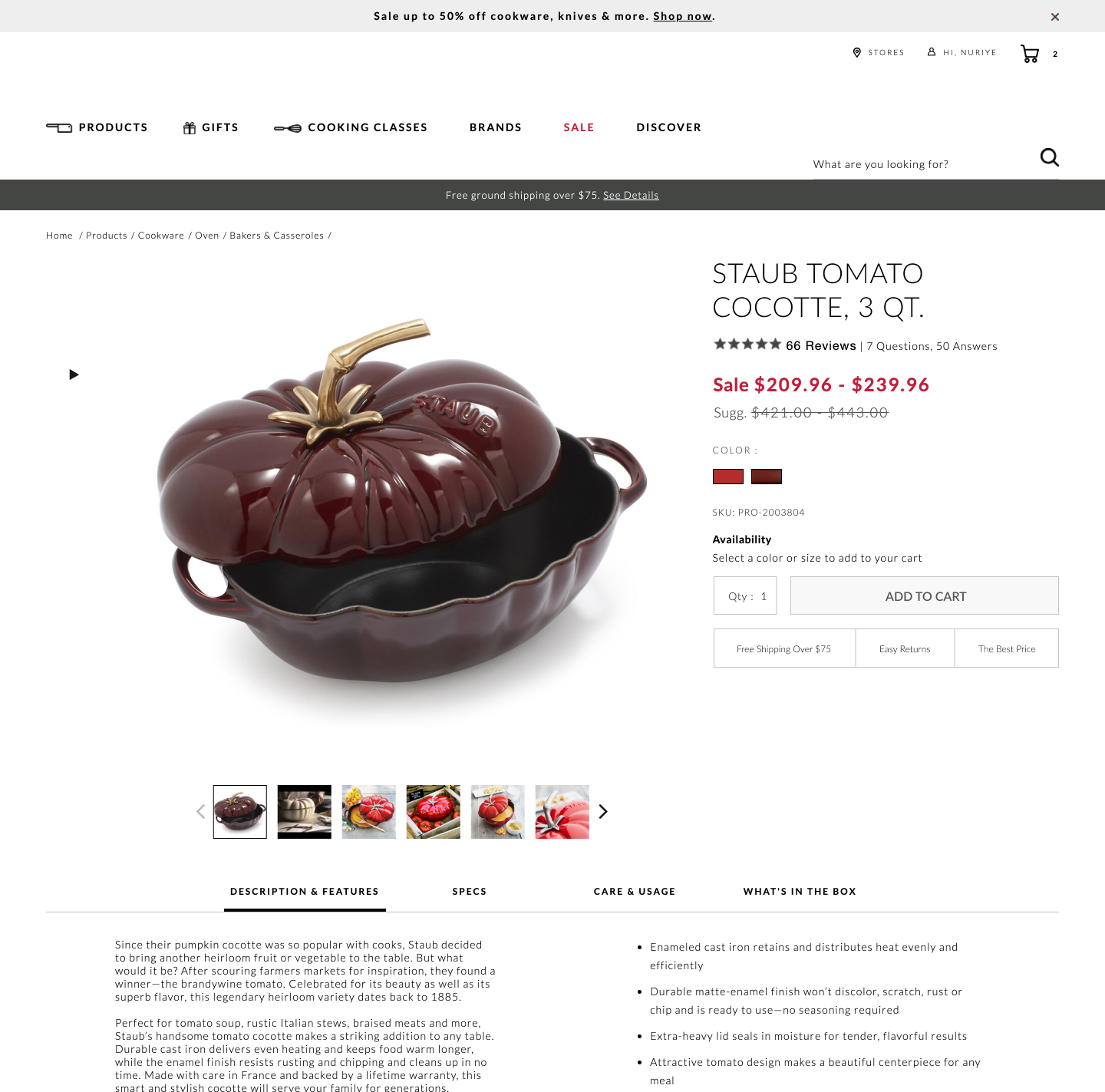
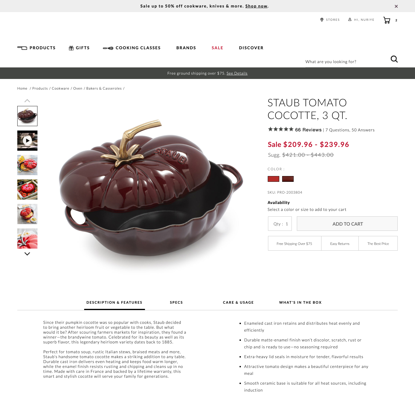
Bottom aligned thumbnails were shifted to the left side on a product image. Doing so, also shifted the product descriptions a little higher. Impact on adds-to-cart and total transactions was measured.
Test #402 on
Snocks.com
by  Melina Hess
Mar 25, 2022
Mobile
Product
X.X%
Sales
Melina Tested Pattern #103: Money Back Guarantee On Snocks.com
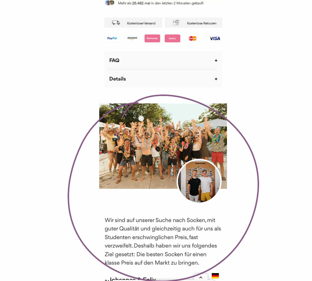
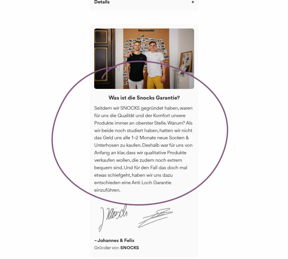
In this experiment on a product screen, a message about quality (from the founders) was reformatted to reinforce the "Anti Hole Guarantee" (in the context of socks). The founders were also made more prominent and their signature added as well. Interestingly, the actual guarantee copy (and its important detail about a 6 month product replacement) was present further down on both the control and variation.
The translation of the new copy (Google Translate) reads:
Since we founded SNOCKS, the quality and comfort of our products have always been our top priority. Why? When we both were still studying, we didn't have the money to buy new socks & underpants every 1-2 months. That's why it was clear to us from the start that we wanted to sell quality products that are also extremely comfortable. And just in case something goes wrong, we have decided to introduce an anti-hole guarantee.
Test #396 on
Depositphotos.com
by  Gleb Hodorovskiy
Feb 13, 2022
Desktop
Listing
X.X%
Revenue
Gleb Tested Pattern #124: Confirmed Selection On Depositphotos.com
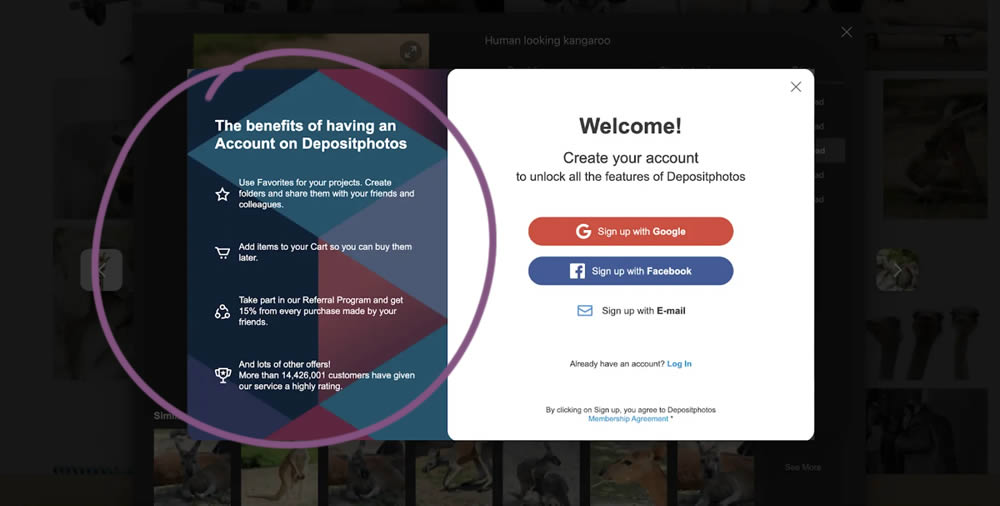
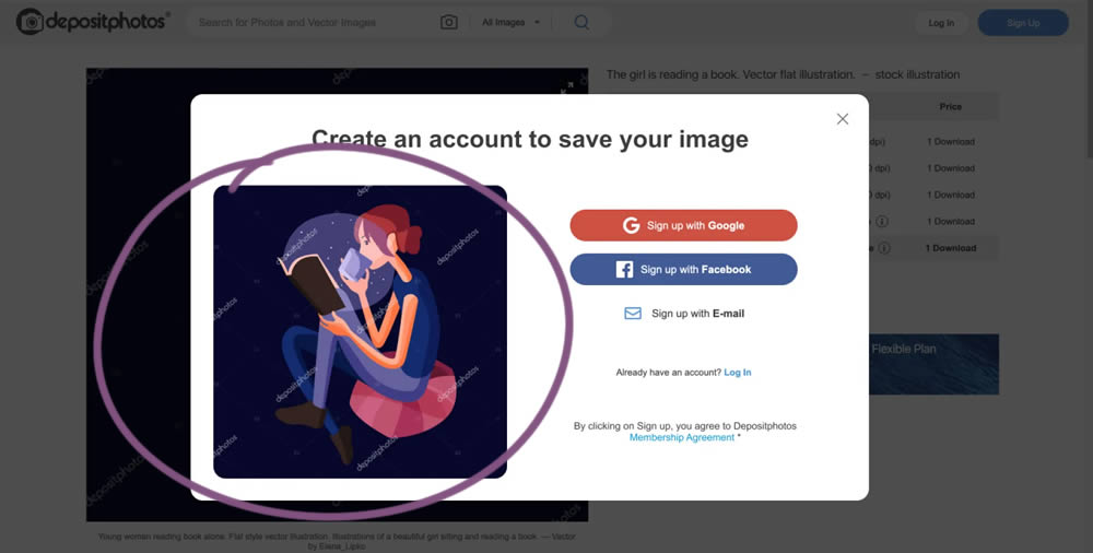
In this experiment from Conversionrate.store, the framing of the registration message was changed from a generic account creation one to a specific image selected by the user. The experiment started on a listing page of a stock photography / illustration site. The control showed a more generic message with benefits for signing up and making the purchase. Whereas the variation repeated the actual image that customers clicked on from listing pages - establishing continuity as well as providing a reason for signing up. Impact on sales was measured.
Test #122 on
Designlab.com
by  Daniel Shapiro
Jan 22, 2022
Desktop
Mobile
Product
X.X%
Leads
Daniel Tested Pattern #30: Authentic Photos On Designlab.com
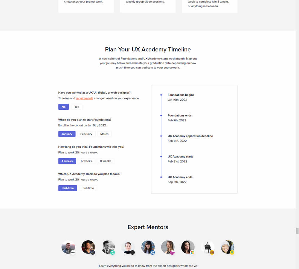
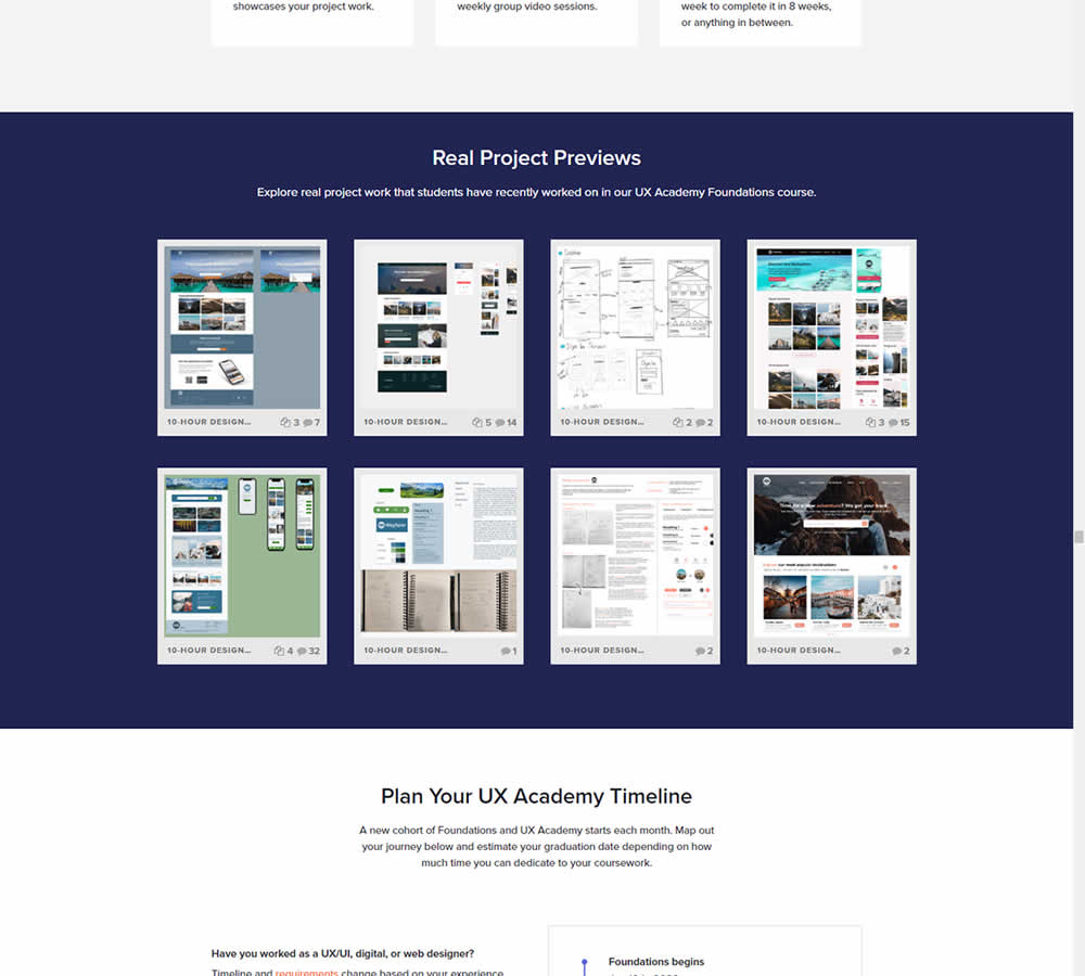
In this experiment for an online design course, the variation had an extra section with student work previews. The previews were not clickable but were added just below the fold. Impact on leads was measured by potential students requesting a syllabus through an online form throughout the long landing page.
Test #392 on
by  Jakub Linowski
Dec 31, 2021
Desktop
Mobile
Product
X.X%
Sales
Jakub Tested Pattern #122: Zigzag Layout
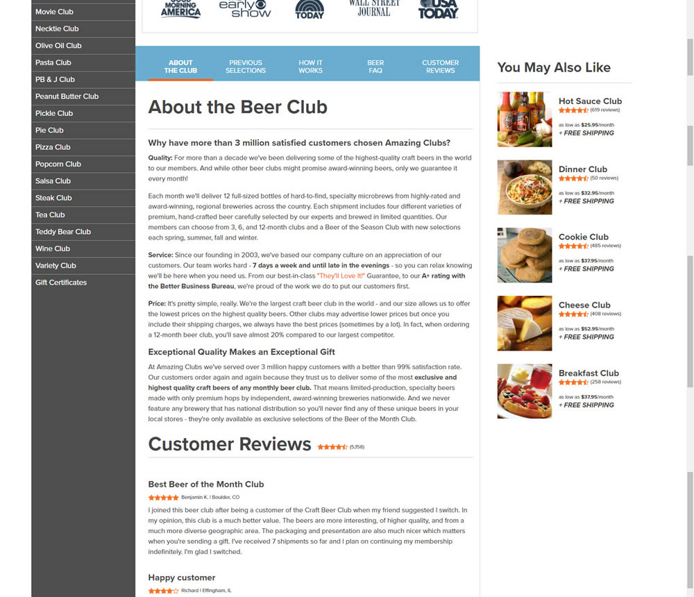
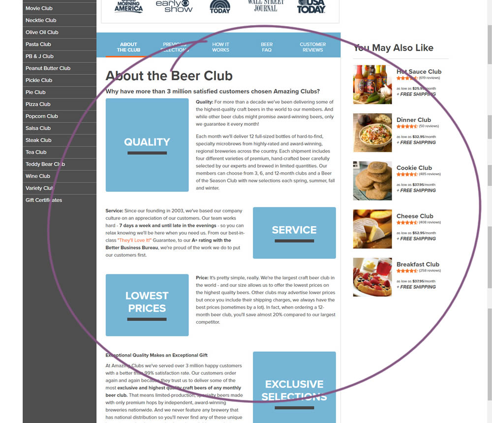
In this experiment, paragraph style copy was reorganized into a zig zag layout with key sections being reinforiced with copy-as-image statements. Impact on adds-to-cart and sales was measured.
Test #375 on
Backstage.com
by  Stanley Zuo
Sep 17, 2021
Mobile
Listing
X.X%
Sales
Stanley Tested Pattern #32: Condensed List On Backstage.com
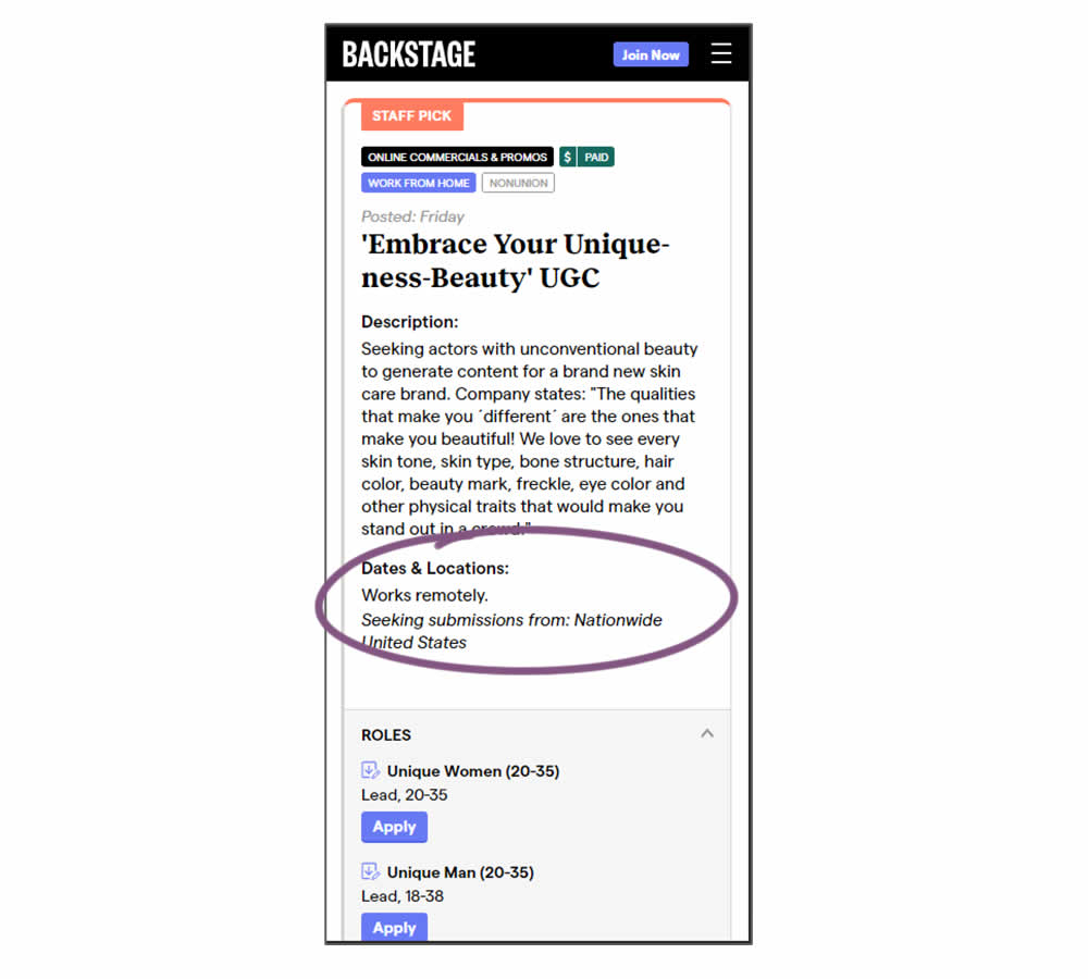
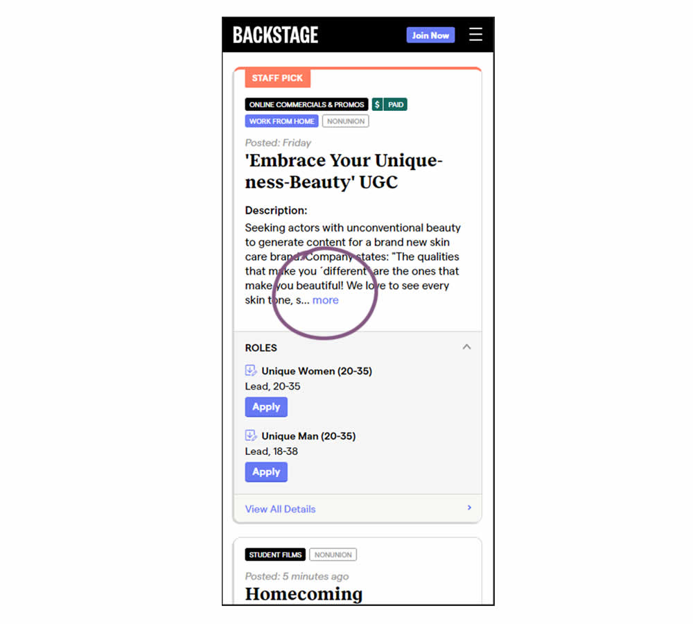
Similar to experiment 373, listing descriptions were shortened dynamically using exposable "more" links AND dates/location data was removed. This way, the variation showed shorter listings and therefore more listings per screens. Impact on listing clicks (progression) along with membership starts was measured.
Test #368 on
Mvideo.ru
by  Andrey Andreev
Aug 02, 2021
Desktop
Home & Landing
X.X%
Sales
Andrey Tested Pattern #135: Product Categories On Mvideo.ru
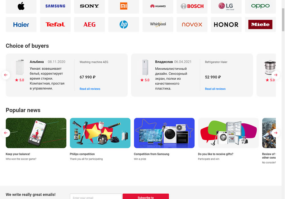
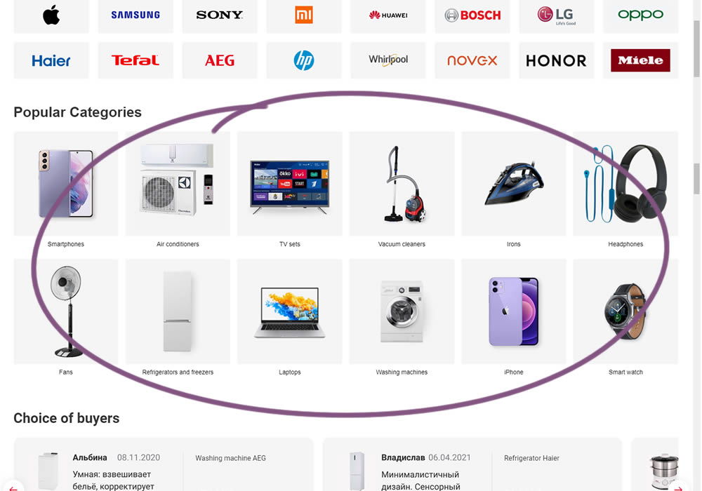
In this experiment, popular categories were added at the bottom of a long ecommerce homepage. Impact on total sales was measured.
Test #364 on
Lotuscrafts.eu
by  Samuel Hess
Jul 06, 2021
Desktop
Product
X.X%
Sales
Samuel Tested Pattern #122: Zigzag Layout On Lotuscrafts.eu
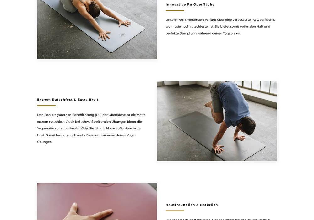
In this experiment, product descriptions or qualities were added using a zigzag layout pattern composed of photos and extra copy. This sections was appended between existing copy and testimonials. Some of the copy highlights included wording such as "innovative surface", "non-slip and wide", and "skin-friendly". Impact on adds-to-cart and sales was measured.