All Latest 620 A/B Tests
Test #99 on
Vivareal.com.br
by  Rodrigo Maués
Sep 23, 2020
Desktop
Mobile
Product
X.X%
Leads
Rodrigo Tested Pattern #24: Visible Availability On Vivareal.com.br
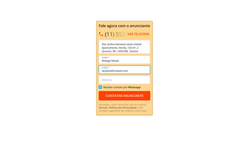
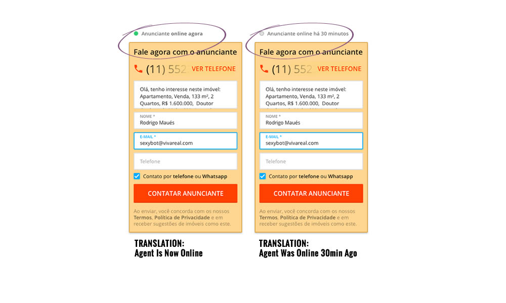
In this experiment, a lead form on a listing page showed whether an agent was recently online or not. The diplayed had two statuses: either indicating that someone is online now, or the most recent time they were online in minutes.
Which A Or B Actually Wins? Find Out Before You Test.
Members see every test result — the winners, the flat ones, and the losers — along with exact effects and sample sizes. Use it to estimate your tests and prioritize by probability, not gut feel. Start every experiment with the odds on your side.
Test #314 on
Zapimoveis.com.br
by  Vinicius Barros Peixoto
Aug 21, 2020
Desktop
Mobile
Product
X.X%
Leads
Vinicius Tested Pattern #43: Long Titles On Zapimoveis.com.br
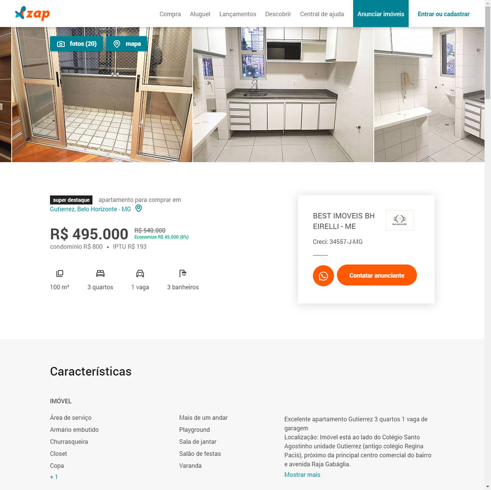
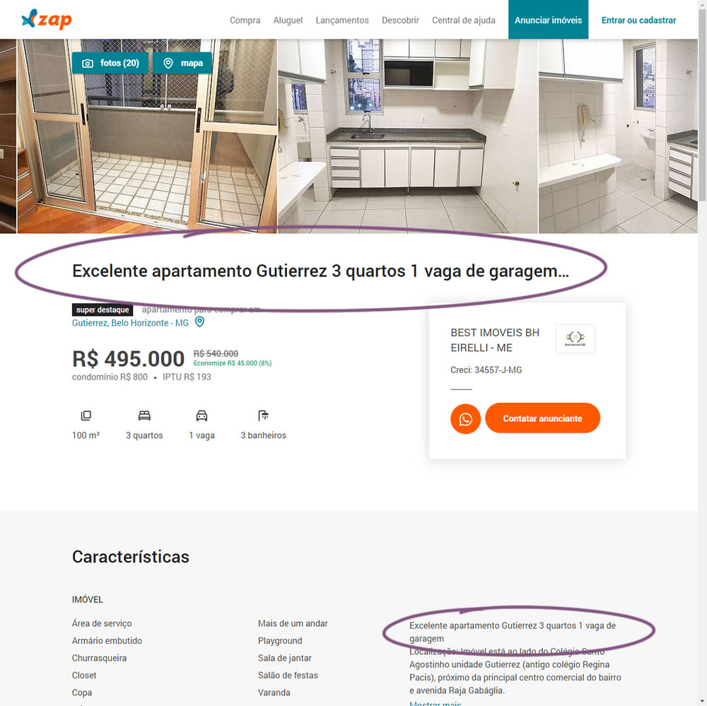
In this experiment, a dynamic page title was generated and added at the top of the screen. The first few words from a property description were used to dynamically generate these titles. The effect on leads was measured.
Test #313 on
Trydesignlab.com
by  Daniel Shapiro
Aug 19, 2020
Desktop
Mobile
Home & Landing
X.X%
Leads
Daniel Tested Pattern #11: Gradual Reassurance On Trydesignlab.com


In this experiment, instead of showing a single-focused lead form (for the UX Academy Program), users were asked to express a wider set of choices first (for the UX Academy or shortter set of skill-based courses). The experiment measured overall leads for both types of programs.
Test #303 on
Thomasnet.com
by  Julian Gaviria
Jun 26, 2020
Desktop
Mobile
Global
X.X%
Leads
Julian Tested Pattern #14: Exposed Menu Options On Thomasnet.com

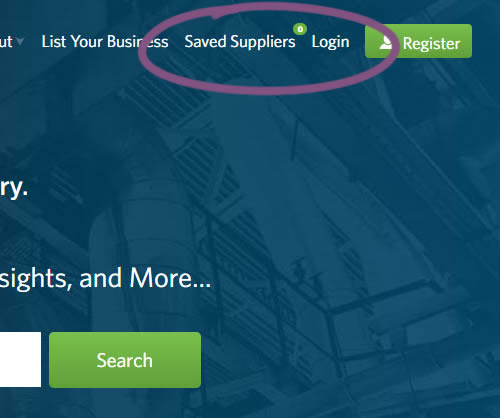
In this experiment variation, the saved suppliers feature was surfaced in the global navigation.It was already possible to save supplier companies from listing and specific company pages. This experiment aimed to increase the saving functions visibility and possibly increase more leads.
Test #301 on
Zapimoveis.com.br
by  Vinicius Barros Peixoto
May 31, 2020
Desktop
Mobile
Product
X.X%
Leads
Vinicius Tested Pattern #21: What It's Worth On Zapimoveis.com.br

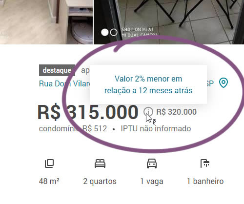
In this experiment, the B variation property prices were framed using higher and crossed out price points from 12 months ago - achieving a relative discount. A tooltip was also shown which explained the higher price point on hover. The example in the screenshot translates to "2% less compared to 12 months ago". This high-power experiment measured the number of leads that were generated on property (product) screens.
Test #298 on
Zapimoveis.com.br
by  Vinicius Barros Peixoto
May 14, 2020
Desktop
Mobile
Listing
X.X%
Leads
Vinicius Tested Pattern #36: Fewer Or More Results On Zapimoveis.com.br
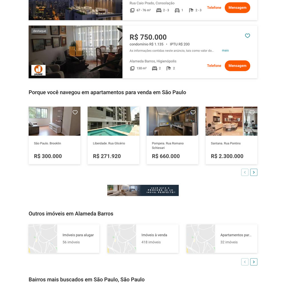
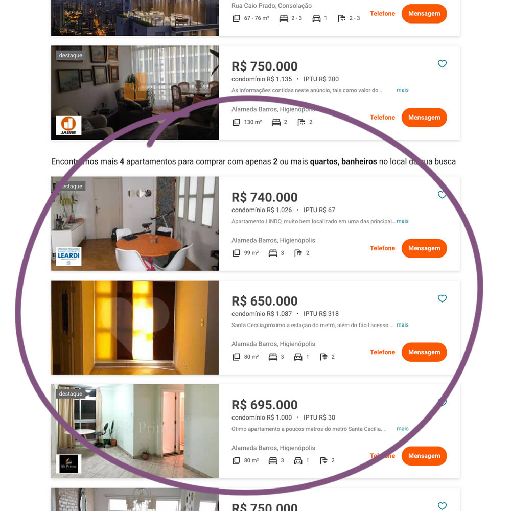
In this experiment on a listing page, the search was expanded to show more listings (variation B). Conditionally, if there were fewer than 36 results, set basic filters such as number bedrooms and bathrooms were expanded and appended to the results. Hence if someone chose 2 bedrooms and 2 bathrooms in variation A, they would only see listing with that filter. In variation B however they would first see the filtered results, and later they would also see results with 3 or more of each.
Test #284 on
Thomasnet.com
by  Julian Gaviria
Feb 19, 2020
Desktop
Mobile
Listing
X.X%
Leads
Julian Tested Pattern #78: Tags, Badges And Structured Information On Thomasnet.com
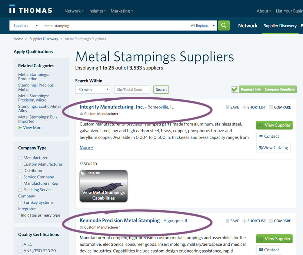
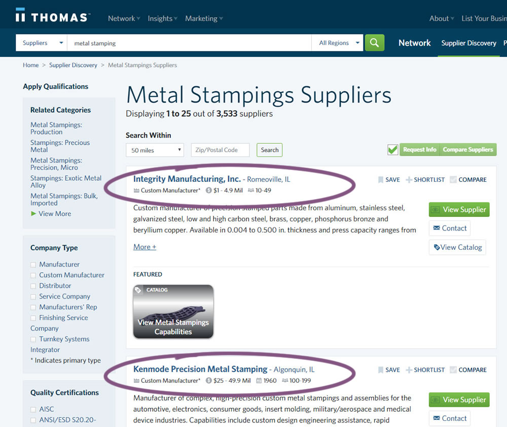
In this experiment, structured data tags were displayed on a listing page to help potential buyers make better decisions. The additional information about the listed companies included: annual revenue, employee count, and year of establishment.
Test #282 on
Thomasnet.com
by  Julian Gaviria
Feb 07, 2020
Desktop
Mobile
Listing
X.X%
Leads
Julian Tested Pattern #51: Shortcut Buttons On Thomasnet.com
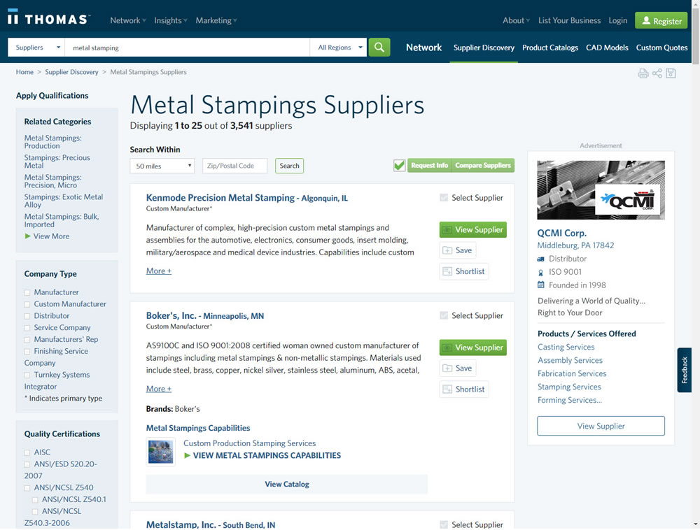
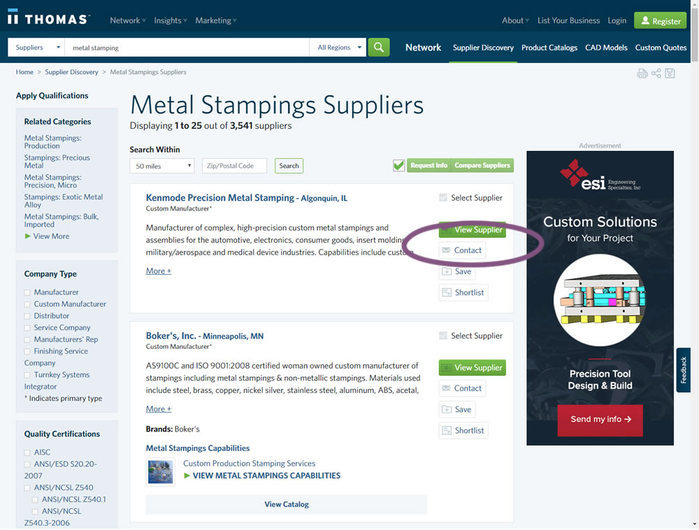
In this experiment, a contact button was added to a listing / search results page to make it faster to contact a company. This same button was also visible on the company detail page.
Test #262 on
Thomasnet.com
by  Julian Gaviria
Oct 03, 2019
Desktop
Mobile
Listing
X.X%
Leads
Julian Tested Pattern #32: Condensed List On Thomasnet.com
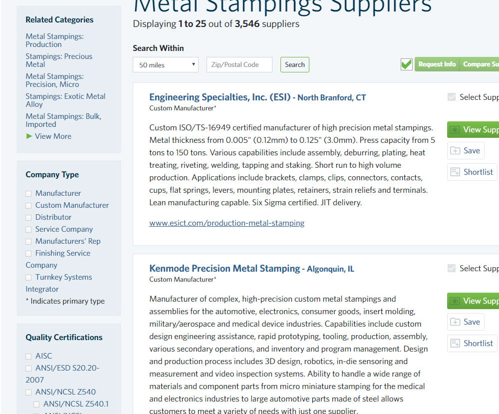
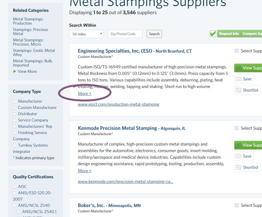
In this experiment, the B version condensed the company listings. This was done by showing less of the description and introducing a "more" and "less" dynamic links that would expand and collapse the description.
Test #249 on
Autoscout24.com
by  Optimizely
Jul 17, 2019
Desktop
Product
X.X%
Leads
Optimizely Tested Pattern #20: Canned Response On Autoscout24.com
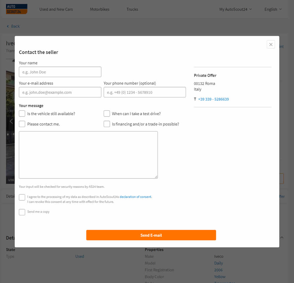
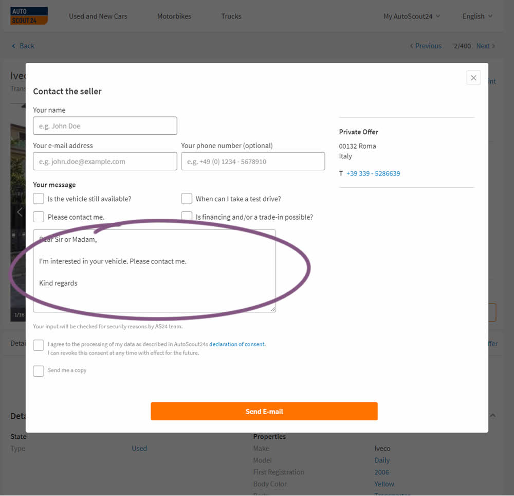
AutoScout24 is Europe’s largest online marketplace for new and used cars. As published by Optimizely, they tested a form pre-filled with text that read: ‘Hello. I am interested in your vehicle. Please contact me. Kind regards.’
Test #244 on
Mt.com
by  Vito Mediavilla
Jun 06, 2019
Desktop
Product
X.X%
Leads
Vito Tested Pattern #49: Above The Fold Call To Action On Mt.com

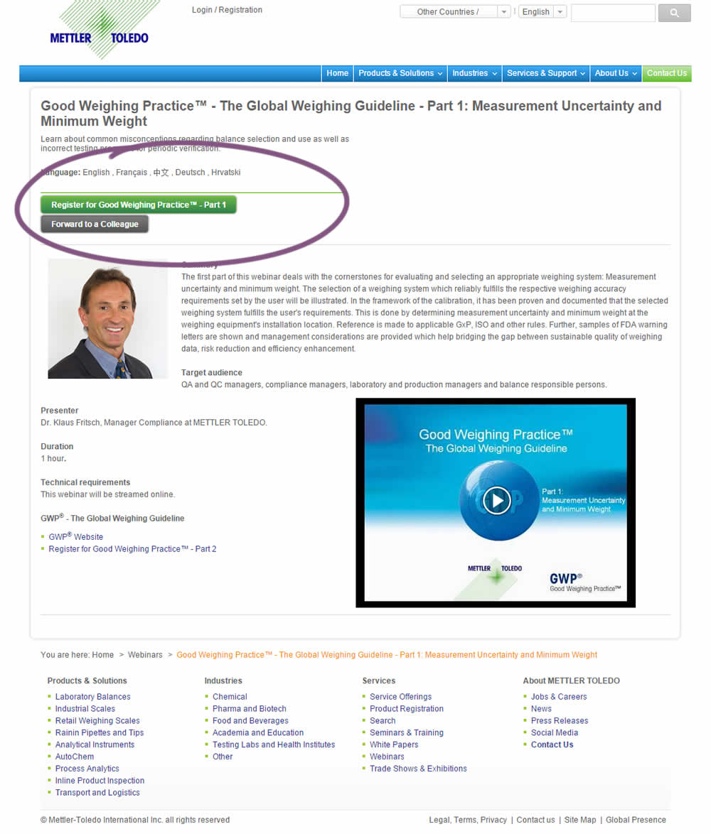
A product landing page with an image was tested against one without - raising the call to action above the fold.
Test #235 on
Thomasnet.com
by  Julian Gaviria
Apr 02, 2019
Desktop
Mobile
Home & Landing
X.X%
Leads
Julian Tested Pattern #102: Expanded Or Condensed Layout On Thomasnet.com
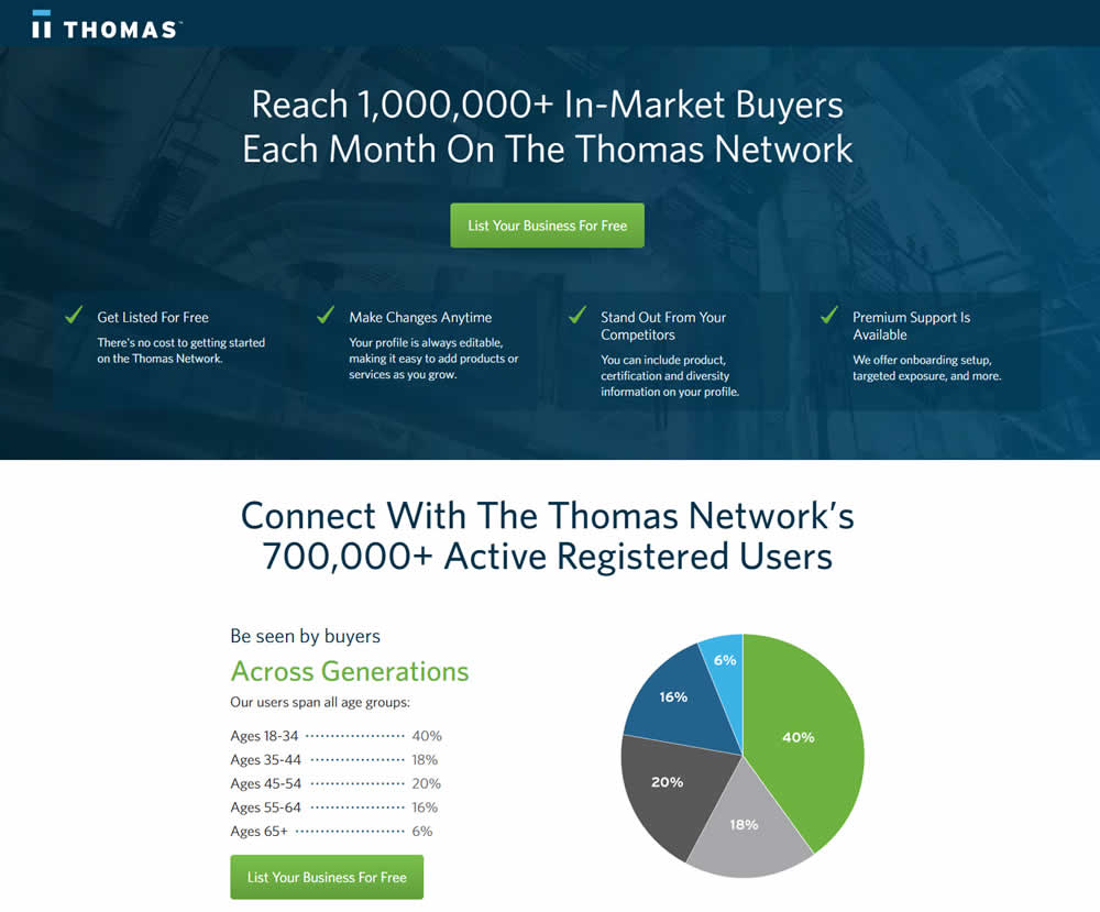
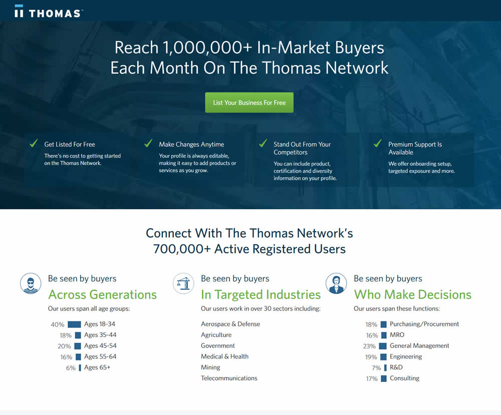
In this experiment, the layout was condensed from a taller to a shorter one.
Test #234 on
by  Alex James
Apr 01, 2019
Desktop
Listing
X.X%
Leads
Alex Tested Pattern #101: Search Keyword Highlighting


In this experiment, a different style for keyword highlighting was used.
Test #231 on
Glass.net
by  Mark Freedle
Mar 14, 2019
Desktop
Mobile
Signup
X.X%
Leads
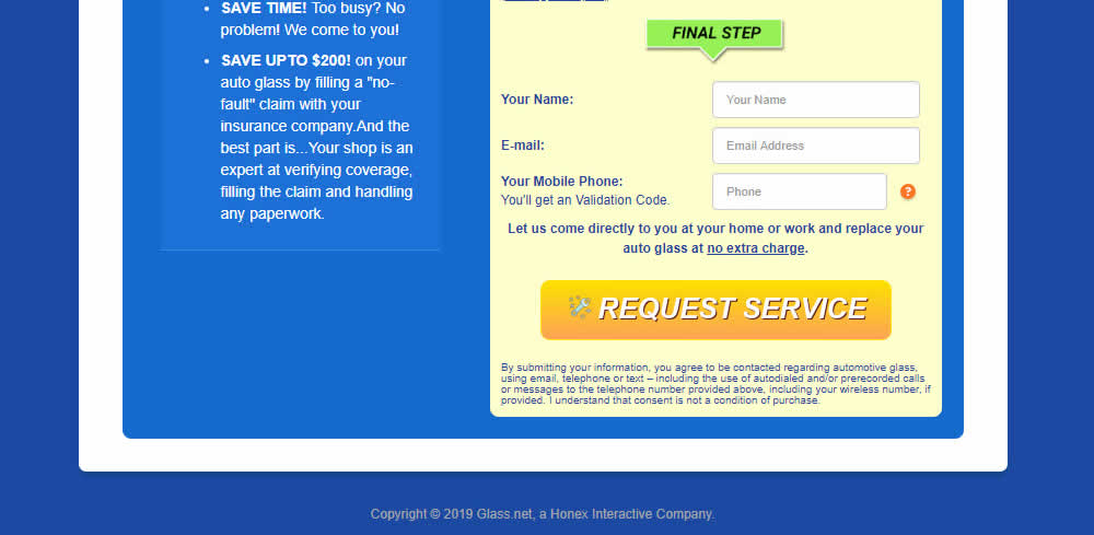
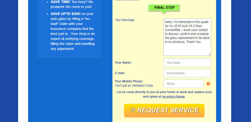
Mark Tested Pattern #20: Canned Response On Glass.net
Test #227 on
Volders.de
by  Alexander Krieger
Mar 04, 2019
Desktop
Signup
X.X%
Leads
Alexander Tested Pattern #99: Progress Bar On Volders.de

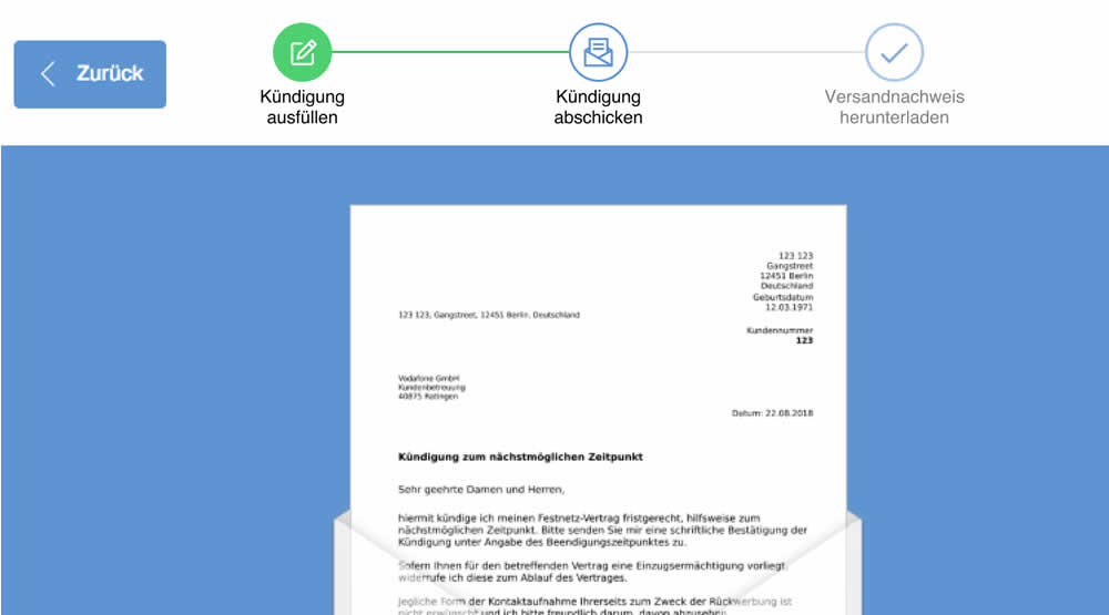
In this experiment, a simple progress bar was added to a 2nd step of contract cancellation funnel. The progress bar used separate styles to show which steps were completed, what the current step was, as well as the future step.
Translation of the 3 steps from German are as follows:
- Fill out the termination
- Send termination
- Proof of termination
Test #222 on
Thomasnet.com
by  Julian Gaviria
Feb 01, 2019
Desktop
Listing
X.X%
Leads
Julian Tested Pattern #7: Social Counts On Thomasnet.com

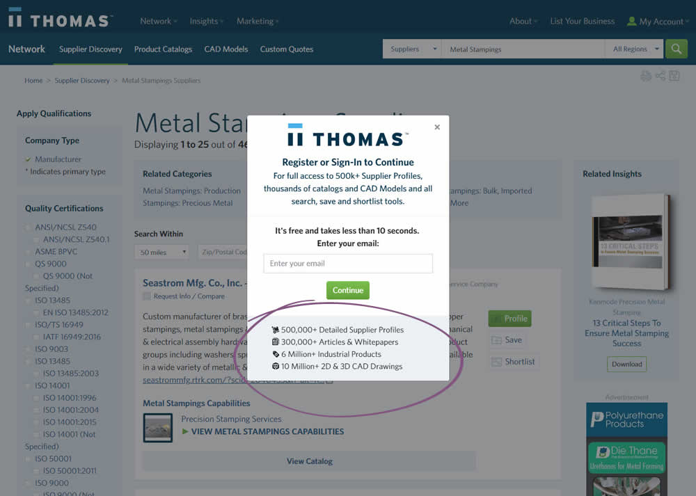
In this variation, a number of social proof references were added to a signup modal.
Test #223 on
Volders.de
by  Alexander Krieger
Feb 01, 2019
Desktop
Mobile
Signup
X.X%
Leads
Alexander Tested Pattern #12: Payment First On Volders.de
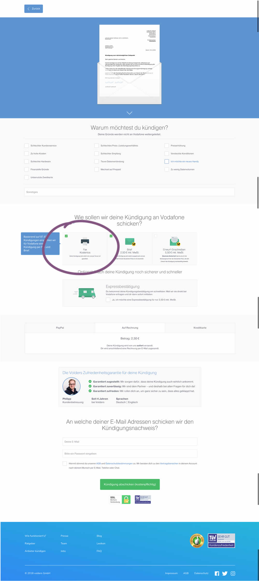
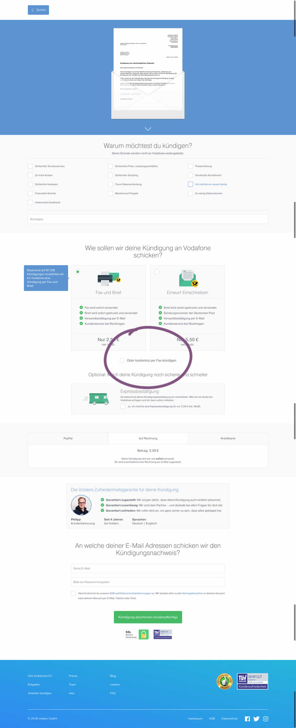
This test deprioritized the free option (kostenlos) of cancelling a contract. It did so by placing it under the paid options as small text link / radio option.
Test #220 on
by  Alex James
Jan 18, 2019
Desktop
Listing
X.X%
Leads
Alex Tested Pattern #34: Open In A New Tab
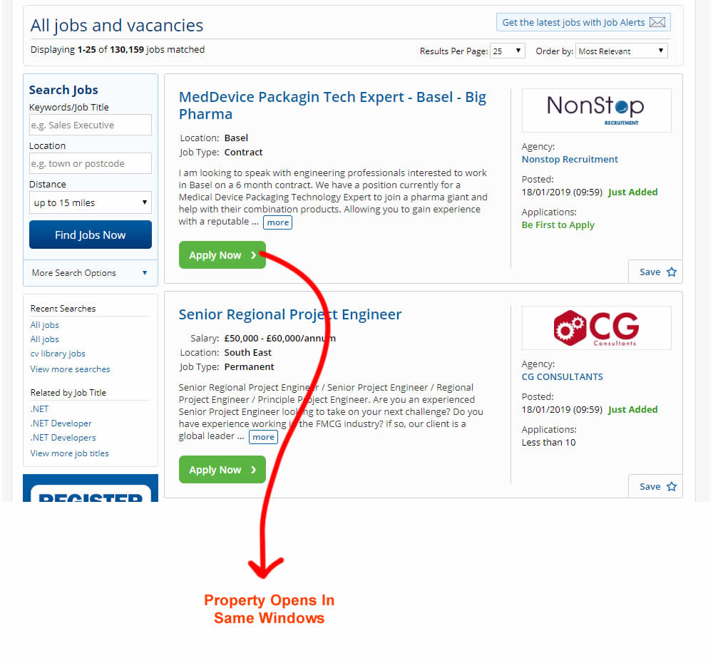
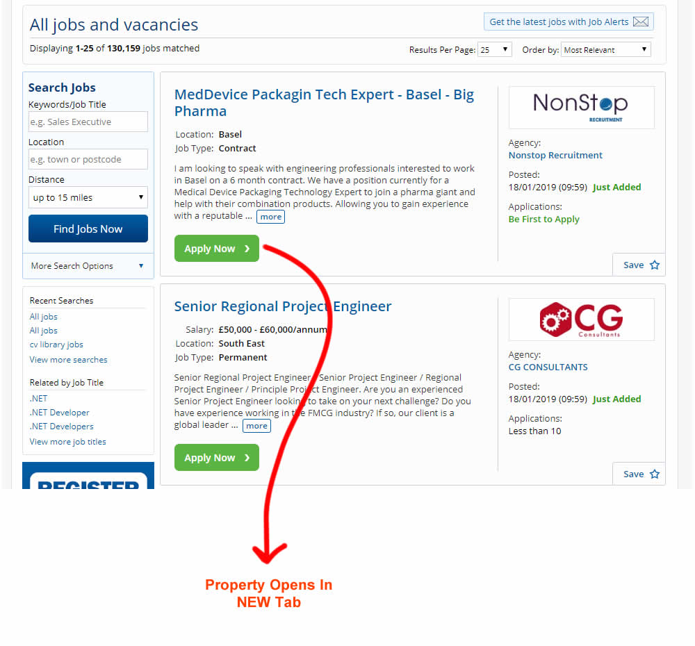
This experiment measured the effect of opening new listing (job applications) in a new tab, against opening them in the same window. The experiment A-B was inversed to match the pattern (in reality, the original already opened the tabs in a new window).
Test #219 on
Mt.com
by  Vito Mediavilla
Jan 14, 2019
Desktop
Mobile
Home & Landing
X.X%
Leads
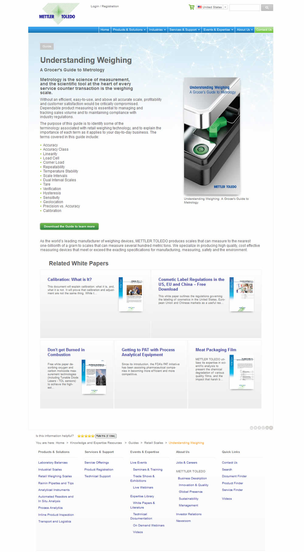
Vito Tested Pattern #95: Clickable Product Previews On Mt.com
Test #215 on
Vivareal.com.br
by  Vinicius Barros Peixoto
Dec 21, 2018
Mobile
Listing
X.X%
Leads
Vinicius Tested Pattern #92: Already Viewed Label On Vivareal.com.br


The idea of this test was to add a "Viewed" label on a listing page to indicate listings which have already been viewed by users.