All Latest 617 A/B Tests
Test #423 on
Expertinstitute.com
by  Ardit Veliu
Jul 26, 2022
Desktop
Mobile
Home & Landing
X.X%
Leads
Ardit Tested Pattern #110: Optional Field Labels On Expertinstitute.com
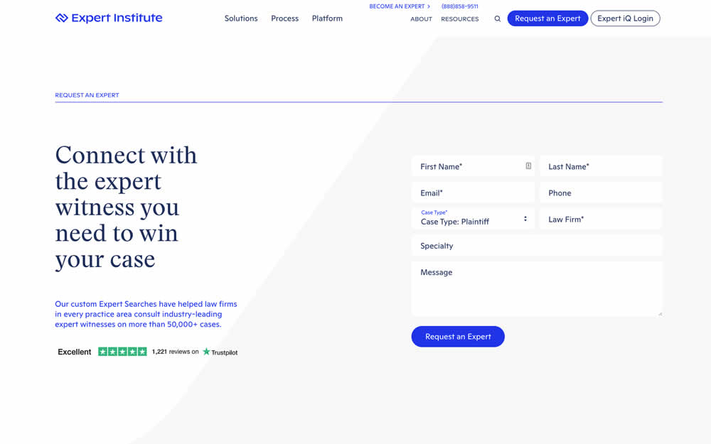
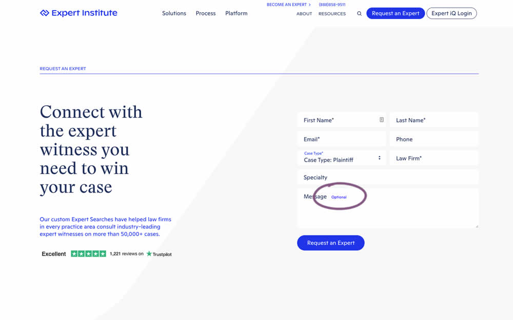
In this experiment, an "optional" label was shown near a message form field. Impact on overall leads was measured (requesting experts).
Which A Or B Actually Wins? Find Out Before You Test.
Members see every test result — the winners, the flat ones, and the losers — along with exact effects and sample sizes. Use it to estimate your tests and prioritize by probability, not gut feel. Start every experiment with the odds on your side.
Test #420 on
Designlab.com
by  Daniel Shapiro
Jul 12, 2022
Desktop
Mobile
Product
X.X%
Leads
Daniel Tested Pattern #115: Pricing Comparison Table On Designlab.com
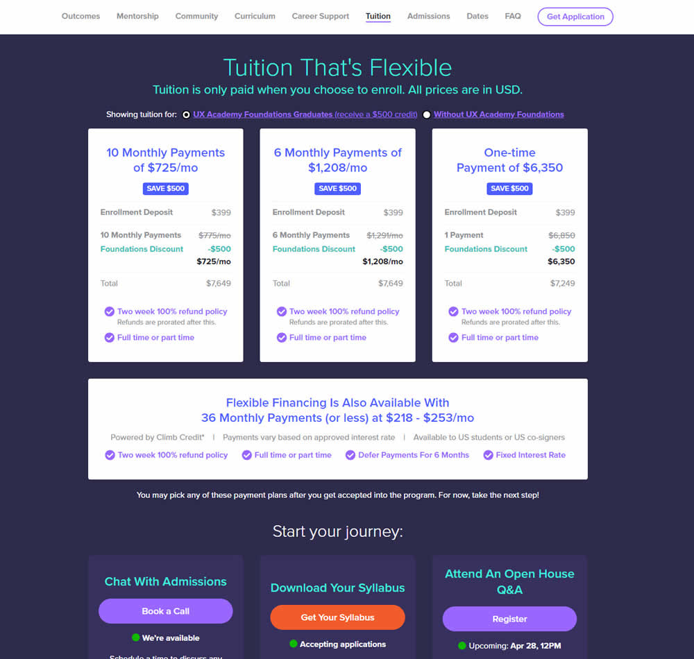
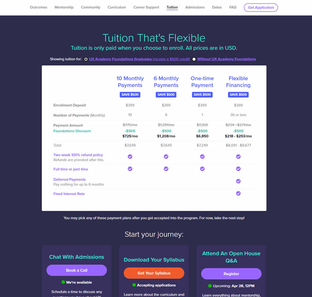
In this experiment, pricing plans were laid out horizontally for easier comparison. In the variation, most of the plan benefits, features and differences were also referenced using a single lable that was left-aligned. The idea was to make the variables aligned and therefore more comparable.
This pricing table appeared at the bottom of a long design program landing page. Impact on leads and applications was measured.
Test #416 on
Designlab.com
by  Daniel Shapiro
Jun 20, 2022
Desktop
Mobile
Product
X.X%
Leads
Daniel Tested Pattern #105: Lead Magnets On Designlab.com


In this experiment, copy was added which communicated that students signing up for a course would receive extra design resources (the lead magnet). This was added in multiple states of the course page. Impact on lead generation and enrollment was measured.
Test #409 on
Expertinstitute.com
by  Ardit Veliu
Apr 30, 2022
Desktop
Mobile
Signup
X.X%
Leads
Ardit Tested Pattern #20: Canned Response On Expertinstitute.com
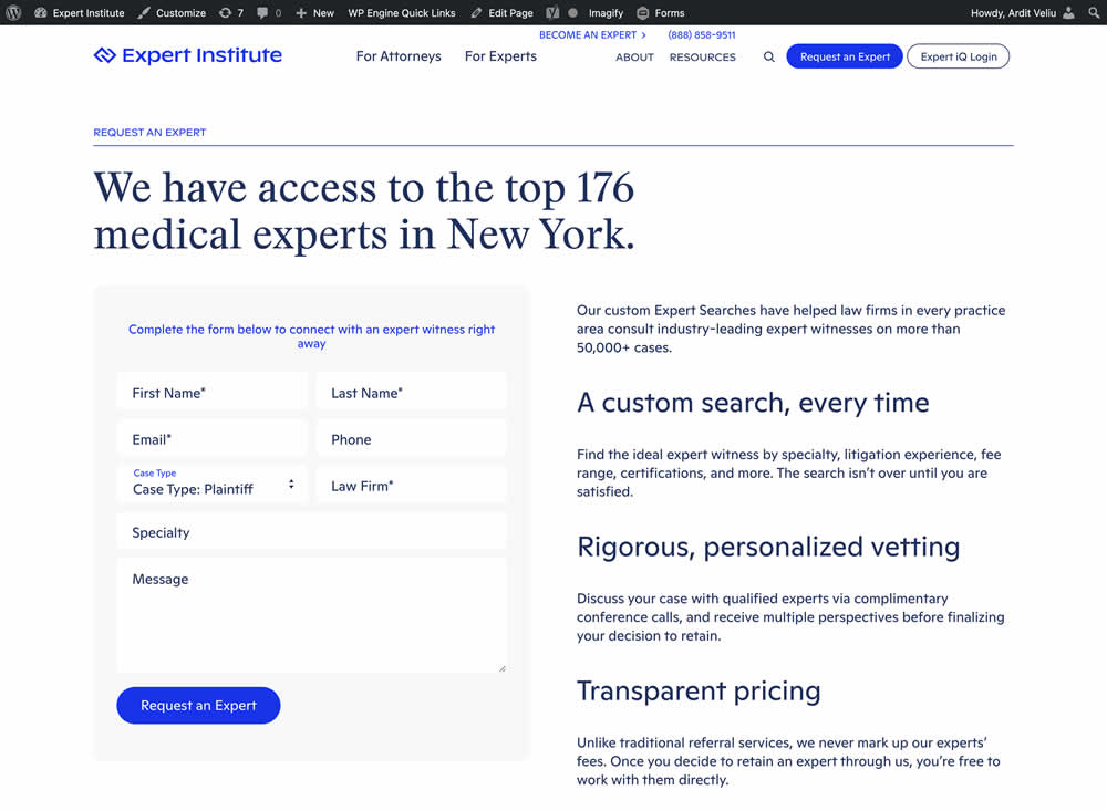
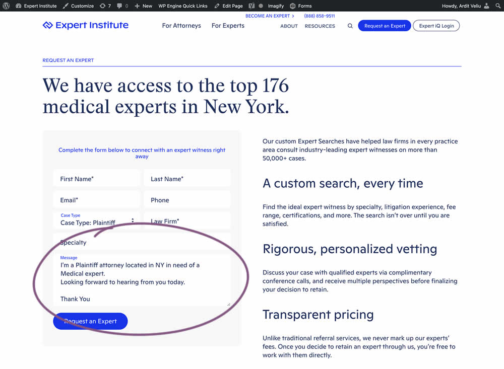
In this experiment, the copy of an input textarea on a lead form was used to summarize a user's choices. Instead of showing using a generic "Message" statement, the variation use the following formula: "I'm a [Lead Type] located in [State] looking for [Expert Type]. Looking forward to hearing from you today. Thank You." Impact of leads was measured.
Test #404 on
Expertinstitute.com
by  Ardit Veliu
Mar 31, 2022
Desktop
Mobile
Signup
X.X%
Leads
Ardit Tested Pattern #97: Bigger Form Fields On Expertinstitute.com


In this experiment, the button width was extended to the full width of the form above. Impact on leads was measured.
Test #122 on
Designlab.com
by  Daniel Shapiro
Jan 22, 2022
Desktop
Mobile
Product
X.X%
Leads
Daniel Tested Pattern #30: Authentic Photos On Designlab.com

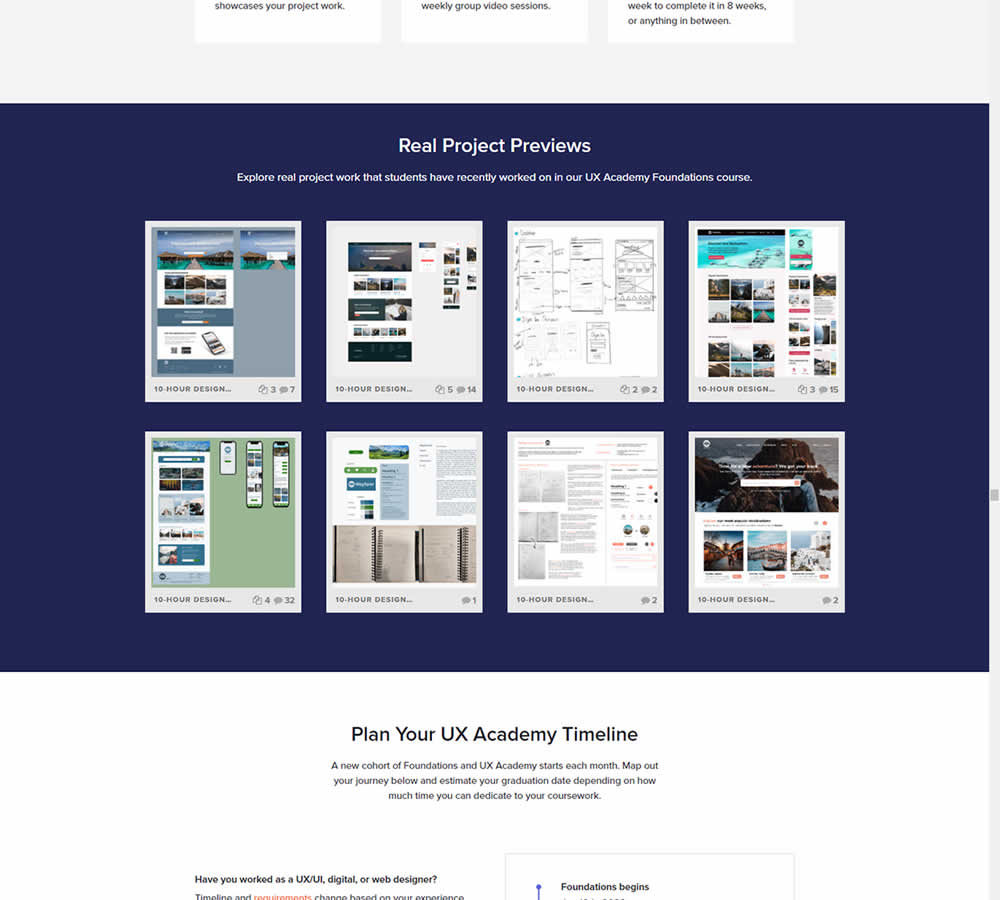
In this experiment for an online design course, the variation had an extra section with student work previews. The previews were not clickable but were added just below the fold. Impact on leads was measured by potential students requesting a syllabus through an online form throughout the long landing page.
Test #381 on
Expertinstitute.com
by  Ardit Veliu
Oct 30, 2021
Desktop
Mobile
Home & Landing
X.X%
Leads
Ardit Tested Pattern #49: Above The Fold Call To Action On Expertinstitute.com


In this experiment, an extra button to a signup lead form was placed above the fold. In the control, the same button appeared further down on the page.
Test #380 on
Getninjas.com.br
by  Rodolfo Lugli
Oct 27, 2021
Desktop
Mobile
Home & Landing
X.X%
Leads
Rodolfo Tested Pattern #21: What It's Worth On Getninjas.com.br


In this experimemt, the average $ gain from a performed service category was shown on a landing page. Impact on leads was measured (people who would be signing up to offer a particular service).
Test #374 on
Expertinstitute.com
by  Ardit Veliu
Sep 15, 2021
Desktop
Mobile
Home & Landing
X.X%
Leads
Ardit Tested Pattern #9: Multiple Steps On Expertinstitute.com
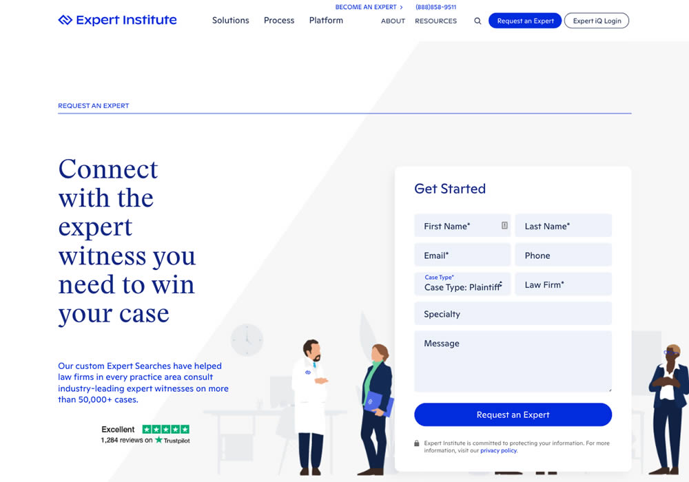

In this experiment, a lead form with numerous fields shown all at once, was broken down into 3 steps. The first step only asked for a Specialty choice that expanded into a list of options. Impact on full form completions was measured.
Test #369 on
Getninjas.com.br
by  Rodolfo Lugli
Aug 05, 2021
Desktop
Mobile
Home & Landing
X.X%
Leads
Rodolfo Tested Pattern #7: Social Counts On Getninjas.com.br
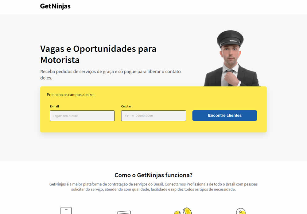
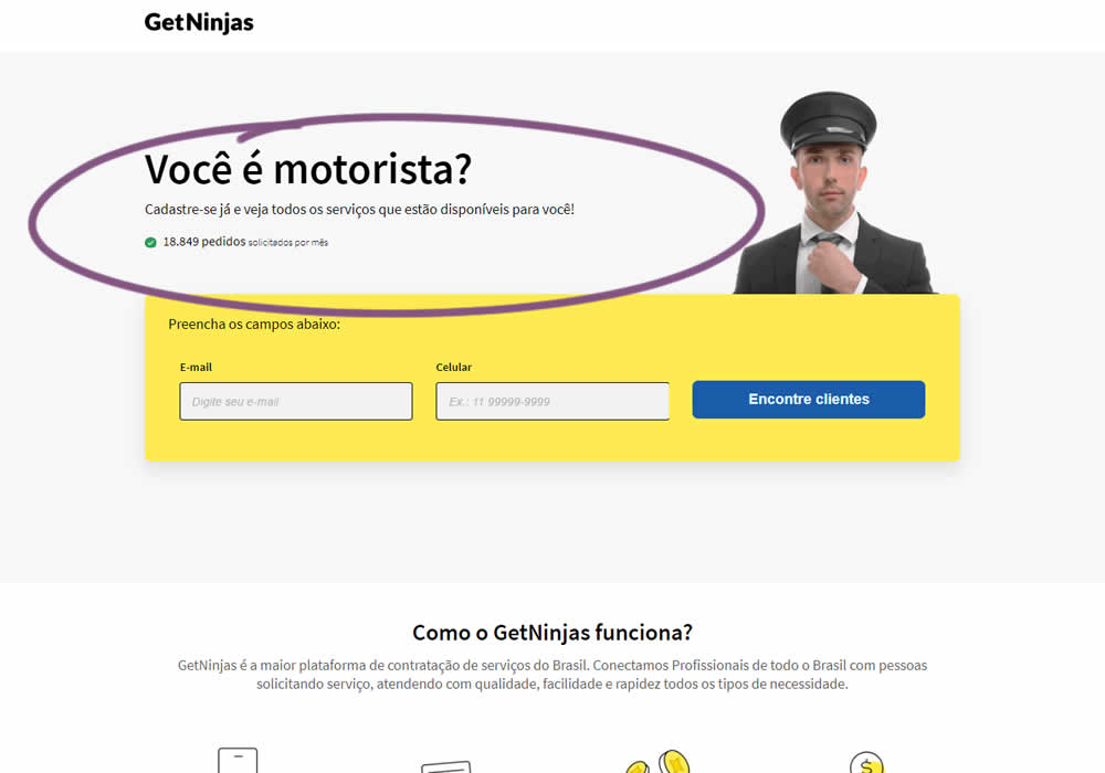
In this experimemt, the number of service requests per month were shown that people can expect after signing up in a given category. Impact on leads was measured (people who would be signing up to offer a particular service).
Test #362 on
Vivareal.com.br
by  Vinicius Barros Peixoto
Jun 23, 2021
Desktop
Mobile
Product
X.X%
Leads
Vinicius Tested Pattern #7: Social Counts On Vivareal.com.br
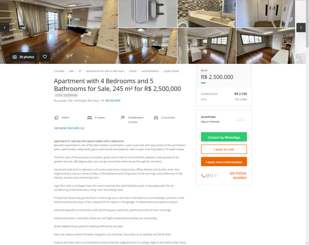
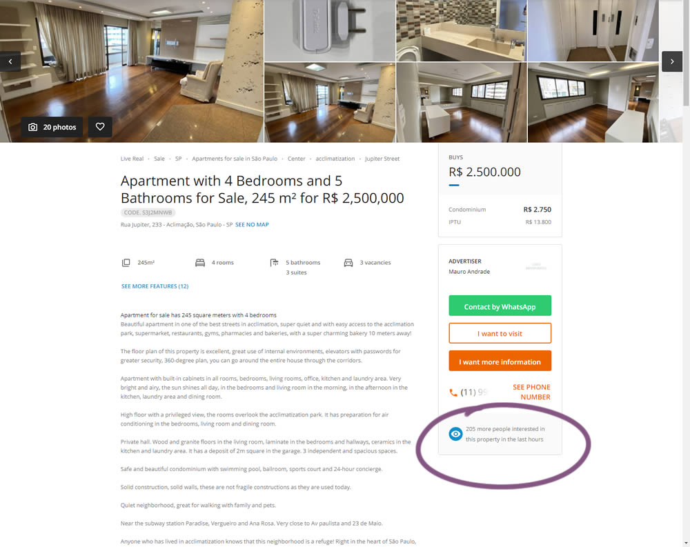
In this experiment, the number of recent property views was displayed under the call to action. Impact on overall lead generation was measured. (Translated using Google from Brazilian Portuguese.)
Test #352 on
Us.flukecal.com
by  John Hickey
May 11, 2021
Desktop
Global
X.X%
Leads
John Tested Pattern #123: Single Or Double Column Form Fields On Us.flukecal.com
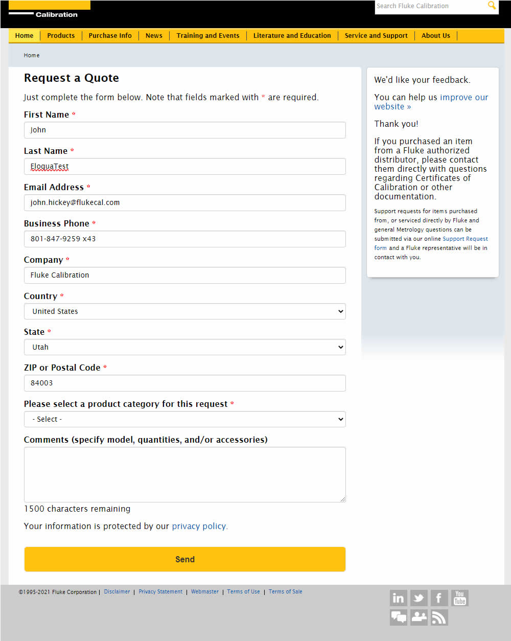
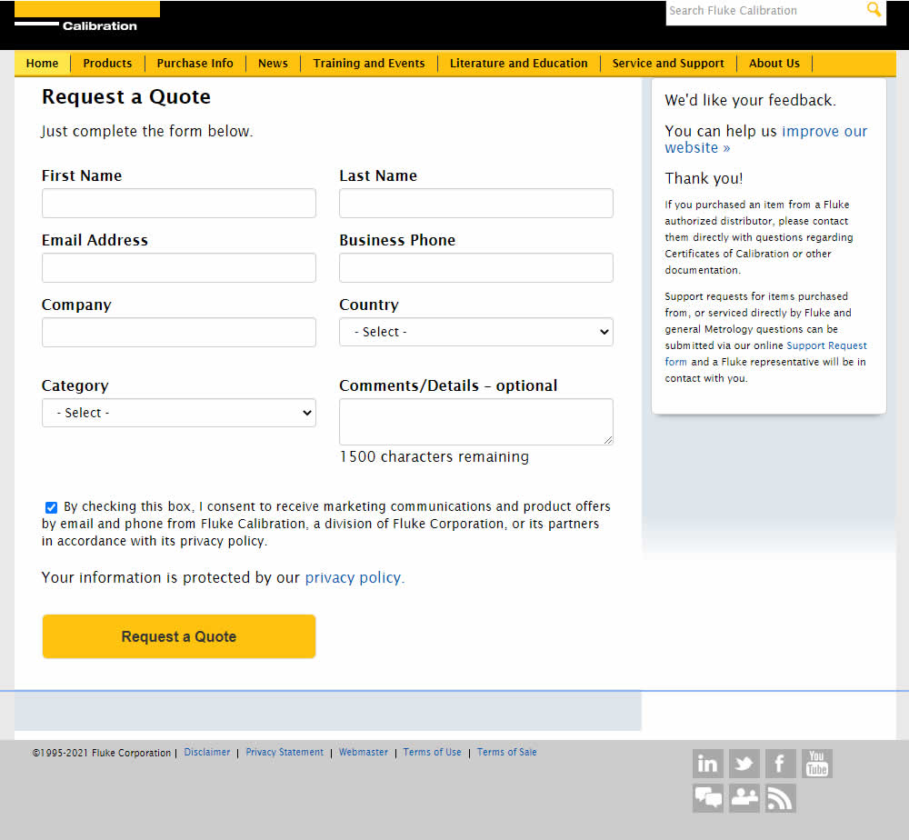
In this experiment, single column (longer) form fields were tested against a two column layout (more compact).
Test #350 on
Expertinstitute.com
by  Ardit Veliu
Apr 29, 2021
Desktop
Content
X.X%
Leads
Ardit Tested Pattern #16: Welcome Mat - Partial On Expertinstitute.com


In this experiment, a lead generating section with a call to action (welcome mat) was appended at the top of article pages. Impact on lead generation was measured.
Test #104 on
3dhubs.com
by  Rob Draaijer
Mar 31, 2021
Desktop
Listing
X.X%
Leads
Rob Tested Pattern #15: Bulleted Reassurances On 3dhubs.com
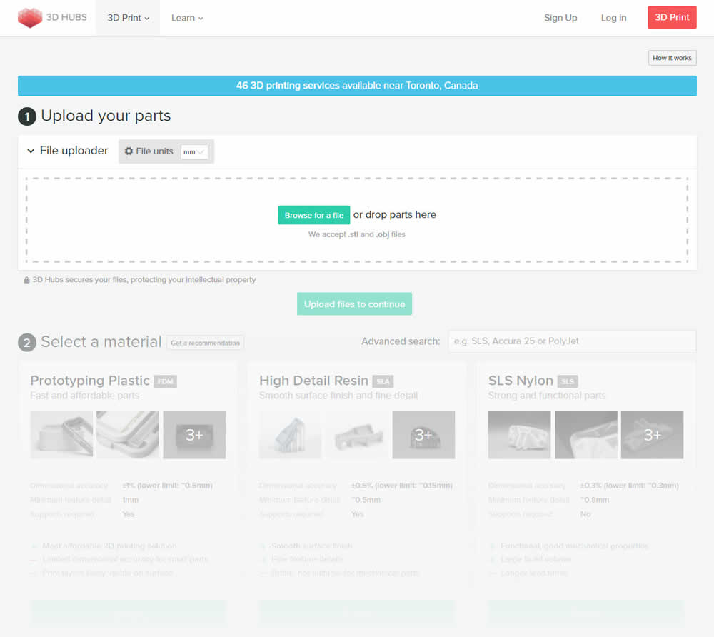
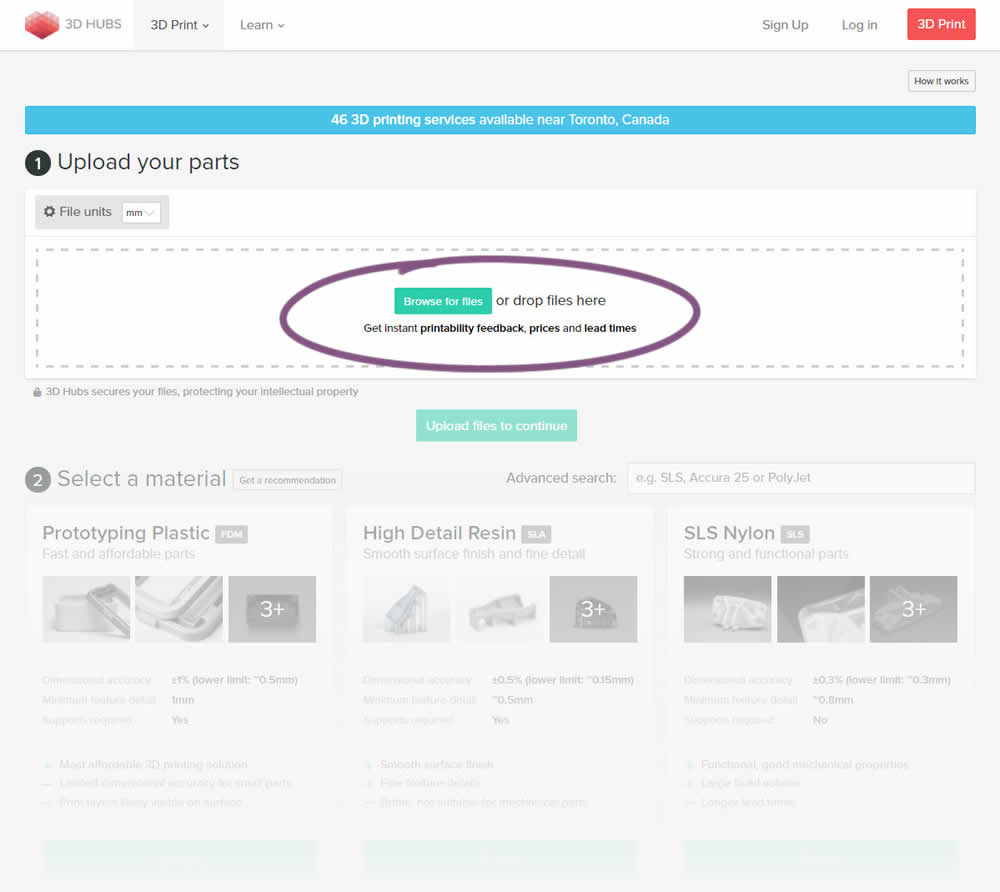
This experiment attempted to increase the number of leads on a lead-funnel. As the first step, users were being asked to upload a file. The control showed the file types that were allowed, whereas the variation changed the copy to show a number of benefits for taking that action. The text-based benefits included the: receiving feedback, prices and lead times.
Test #345 on
Getninjas.com.br
by  Rodolfo Lugli
Mar 29, 2021
Desktop
Home & Landing
X.X%
Leads
Rodolfo Tested Pattern #9: Multiple Steps On Getninjas.com.br
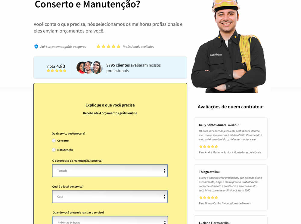
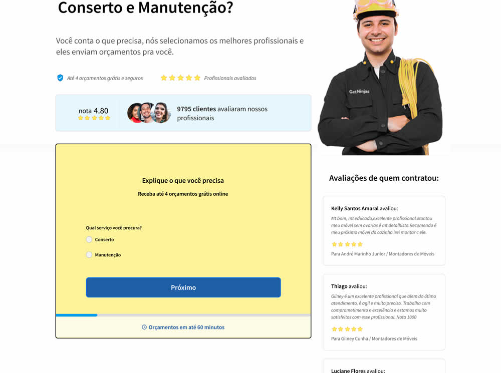
In this experiment, a single long form was broken into at least 3 steps.
Test #86 on
Vivareal.com.br
by  Rodrigo Maués
Feb 28, 2021
Mobile
Desktop
Product
X.X%
Leads
Rodrigo Tested Pattern #3: Fewer Form Fields On Vivareal.com.br
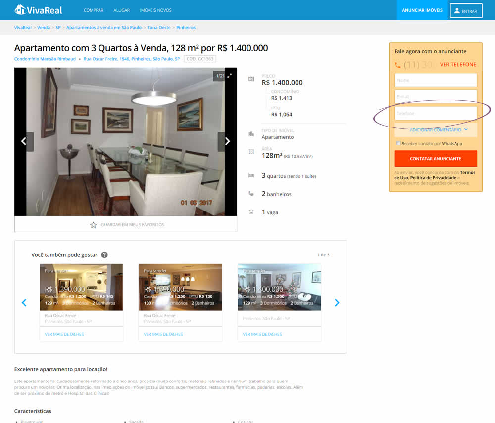
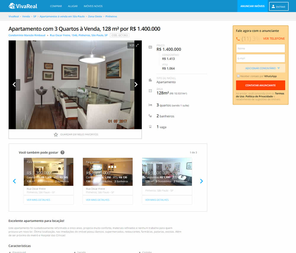
In this experiment, the telephone field was removed from a lead form on a property page. Impact on leads was measured.
Test #339 on
Expertinstitute.com
by  Ardit Veliu
Feb 23, 2021
Desktop
Home & Landing
X.X%
Leads
Ardit Tested Pattern #33: Example Situations On Expertinstitute.com

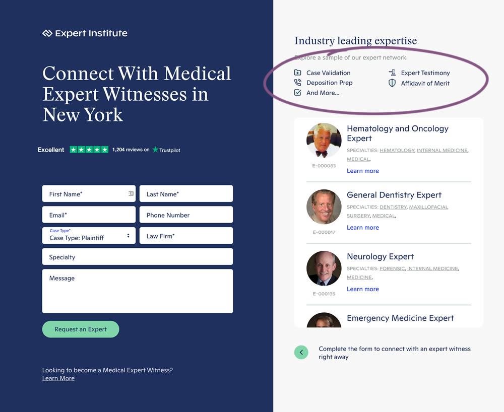
In this experiment, a number of use cases examples were added to illustrate the situations in which experts could help.
Test #333 on
Expertinstitute.com
by  Ardit Veliu
Dec 31, 2020
Desktop
Mobile
Home & Landing
X.X%
Leads
Ardit Tested Pattern #11: Gradual Reassurance On Expertinstitute.com


In this experiment, the variation broke up a lead form into two parts. In the first step users were asked for their state followed by a standard contact form on a second step. All of the states were shown as selectable options. In the control version, the landing page only showed a button which lead to the full form. The experiment measured impact on lead form submissions.
Test #10 on
Tradegecko.com
by  Syed AtiF Husain
Nov 30, 2020
Desktop
Home & Landing
X.X%
Leads
Syed AtiF Tested Pattern #10: Postponed Modal Forms On Tradegecko.com


In this experiment, 3 form fields were removed (postponed to a next step) from the homepage leaving only a "Start Trail" button. When users clicked on the "Start A Free 14 Day Trial" button, in both the control and variation they've seen the same next registration page with all of the fields. The registration page repeated the same fields with their corresponding values, as well as asked for a password as an extra field. The experiment measured successful leads.
Test #98 on
3dhubs.com
by  Rob Draaijer
Nov 30, 2020
Desktop
Mobile
Listing
X.X%
Leads
Rob Tested Pattern #24: Visible Availability On 3dhubs.com

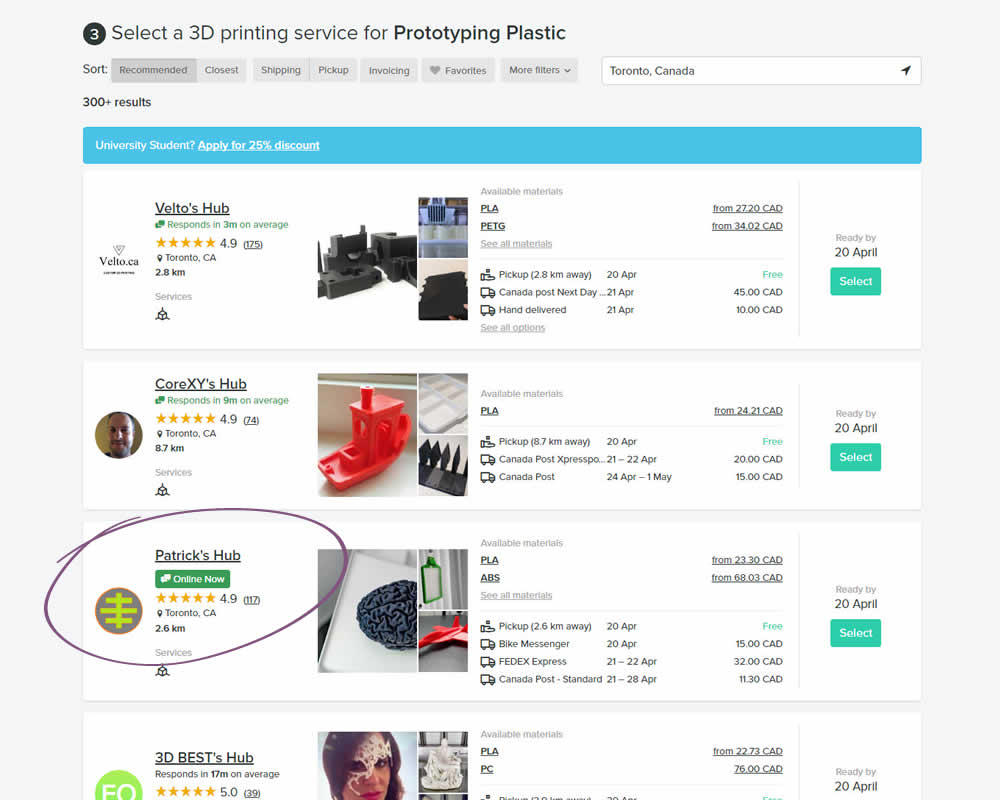
In this experiment, the variation showed a listing's owner online status as a badge, instead of showing their average "response time". More specifically, an "Online Now" badge was shown beside individual listings of a 3D printing marketplace site. The experiment measured completed quote / lead requests (a few steps further).