All Latest 620 A/B Tests
Test #643 on
Backstage.com
by  Stanley Zuo
Mar 28, 2026
Desktop
Mobile
Home & Landing
X.X%
Signups
Stanley Tested Pattern #135: Product Categories On Backstage.com

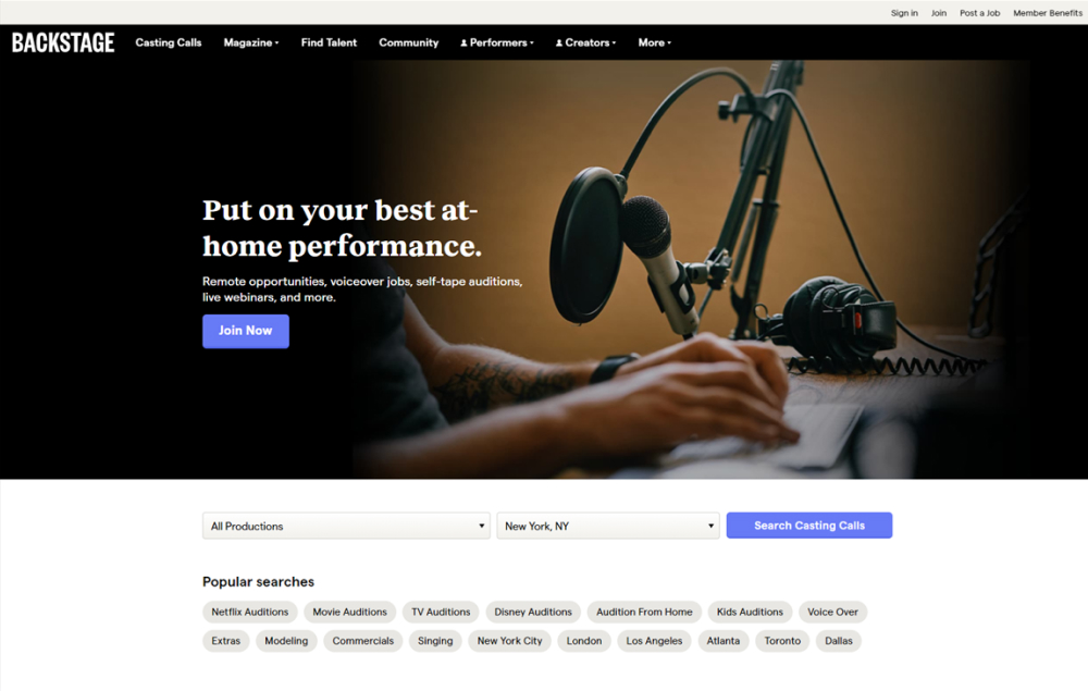
In this experiment, more popular search categories (pills) were shown on the homepage based on analyzed search volume. Impact on searches and email subscriptions were measured.
Which A Or B Actually Wins? Find Out Before You Test.
Members see every test result — the winners, the flat ones, and the losers — along with exact effects and sample sizes. Use it to estimate your tests and prioritize by probability, not gut feel. Start every experiment with the odds on your side.
Test #608 on
by  Frazer Mawson
Aug 28, 2025
Mobile
Signup
X.X%
Signups
Frazer Tested Pattern #99: Progress Bar
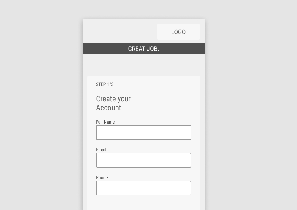
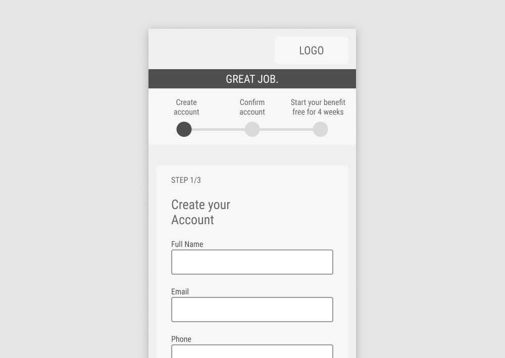
In this experiment, a 3 step progress bar was added at the top of a signup funnel. Impact on signups was measured.
Test #607 on
Backstage.com
by  Stanley Zuo
Aug 26, 2025
Mobile
Listing
X.X%
Signups
Stanley Tested Pattern #51: Shortcut Buttons On Backstage.com


In this experiment, additional "apply" buttons were shown on listing tiles which lead users one step further in the application process. These buttons were also shown with multiple role details. Impact on progression and job application starts was measured.
Test #580 on
Finn.com
by  Tim Karcher
Mar 06, 2025
Mobile
Signup
X.X%
Signups
Tim Tested Pattern #91: Forced Action On Finn.com
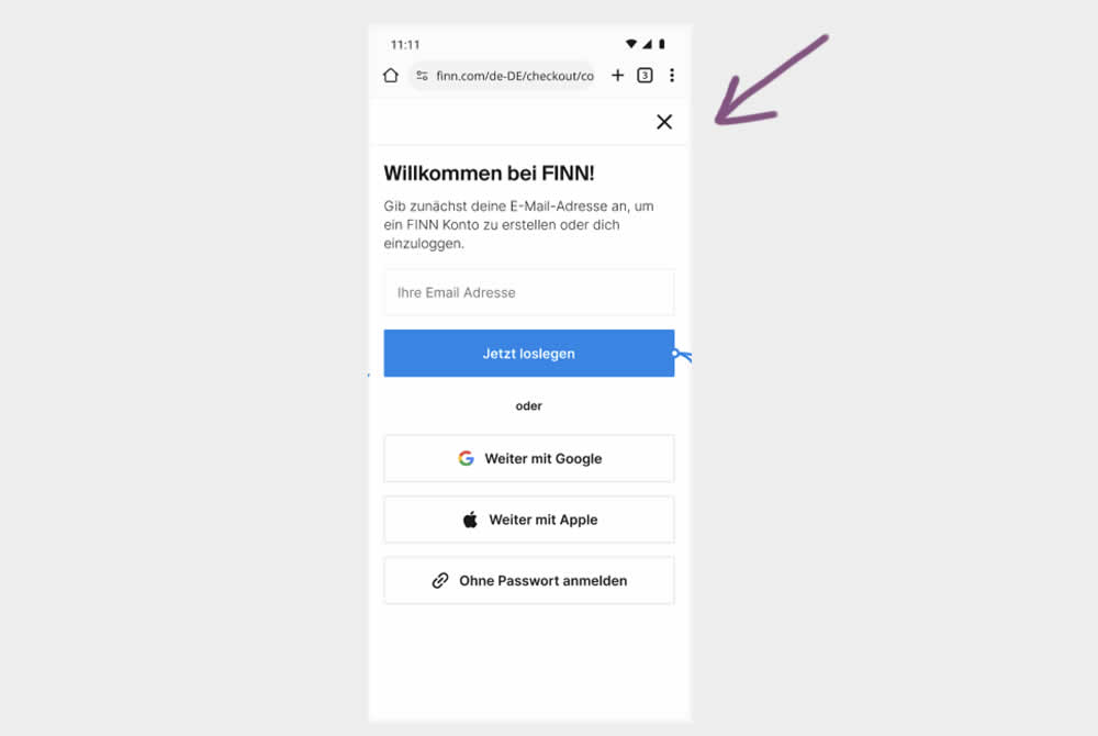
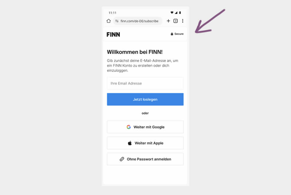
In this experiment, the control shows an (X) close option within a signup flow, whereas the variation had it removed. Clicking the close icon would collapse the signup modal and show the product page. Users were still able use the back and forward functionality.
(The test was inversed in order to fit the pattern). Impact on signups was measured.
Test #564 on
Hellostake.com
by  Louis Alston
Nov 26, 2024
Desktop
Mobile
Home & Landing
X.X%
Signups
Louis Tested Pattern #114: Less Or More Visible Prices On Hellostake.com
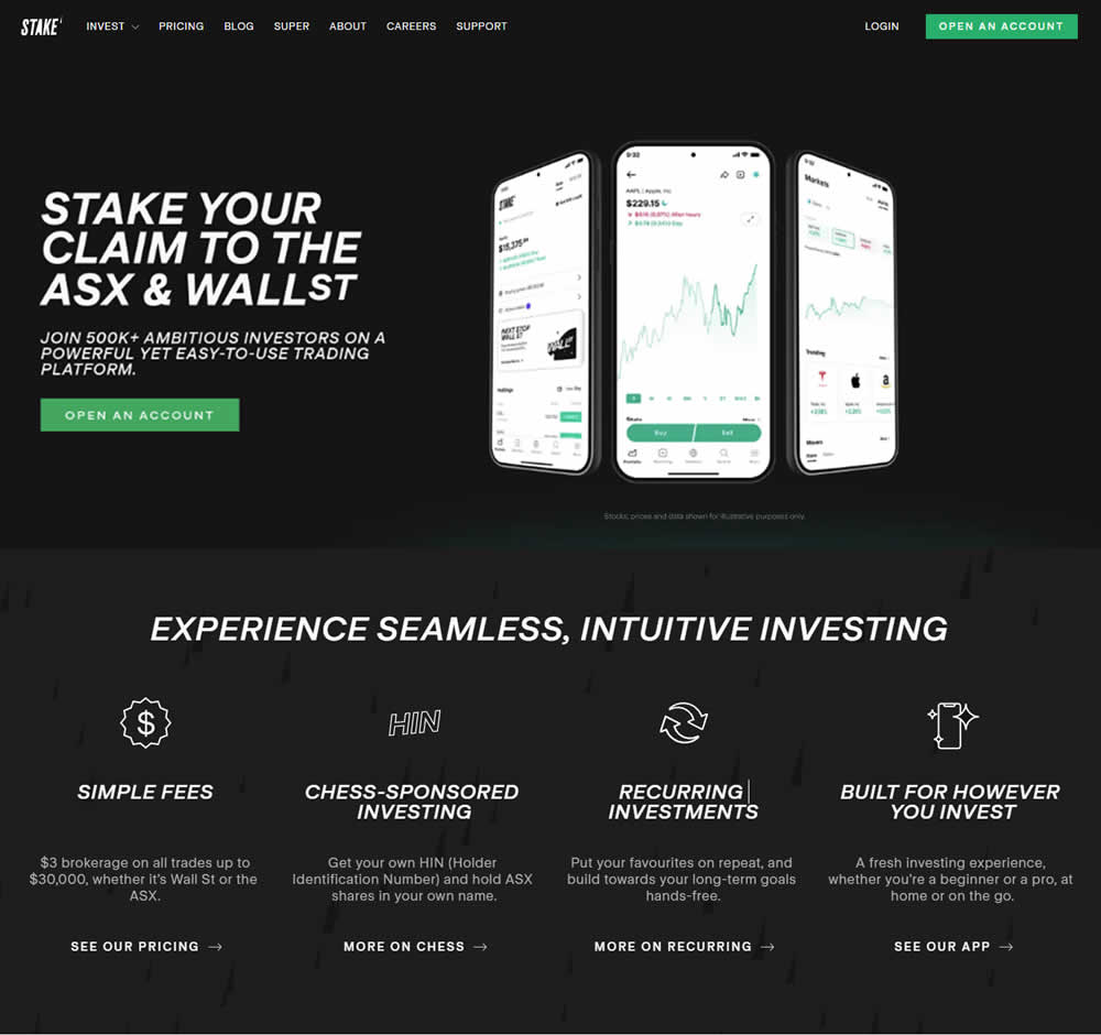
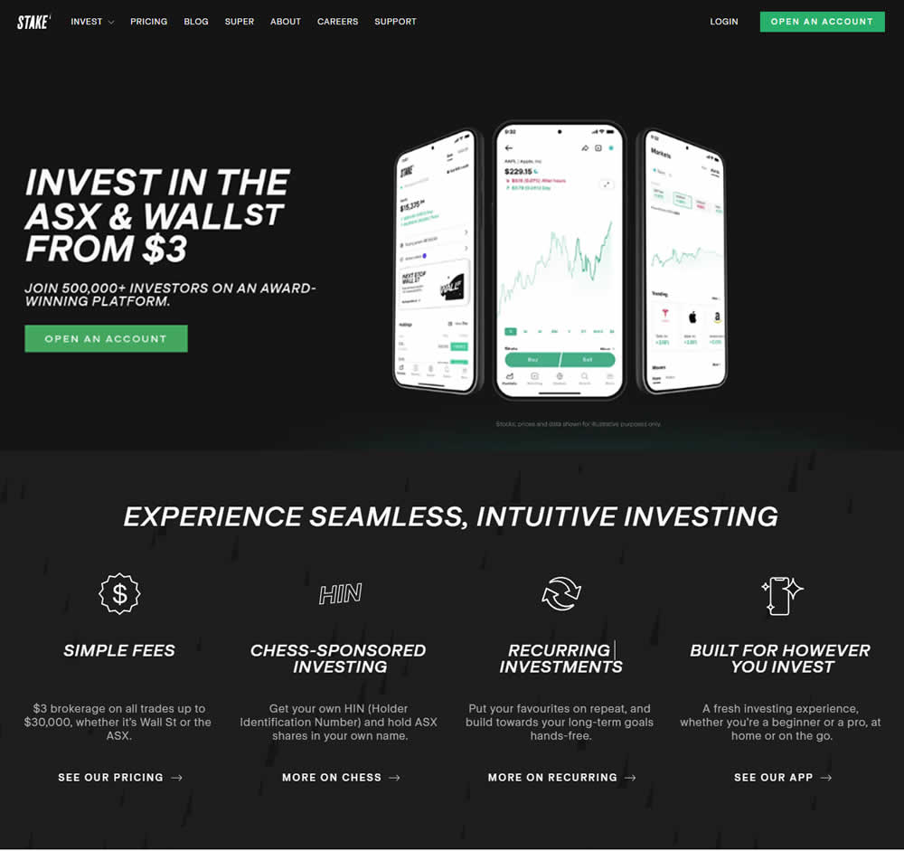
In this a/b test, the headline was changed to reflect pricing information (informing that trades are starting at $3). Impact on progression and signups was measured.
Test #560 on
Finn.com
by  Daria Kurchinskaia
Oct 22, 2024
Mobile
Desktop
Checkout
X.X%
Signups
Daria Tested Pattern #46: Pay Later On Finn.com
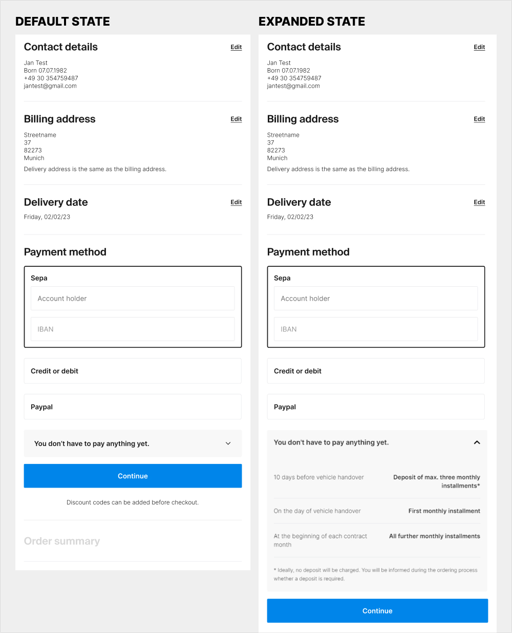
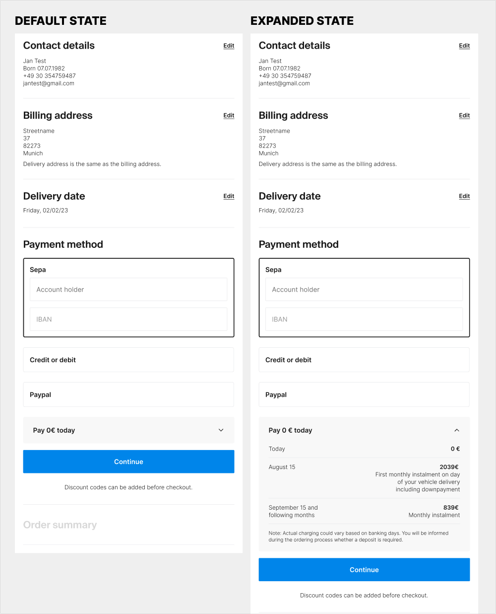
The idea of this experiment was at least two fold. 1) the variation attempted to clarify that there is no payment today with the copy "Pay 0€ today" on the collapsed state of the payment amount. 2) clarify the payment terms with exact dates and amounts for future payments.
Test #546 on
Finn.com
by  Maksim Meged
Aug 01, 2024
Desktop
Signup
X.X%
Signups
Maksim Tested Pattern #129: Right Or Left Aligned Forms On Finn.com
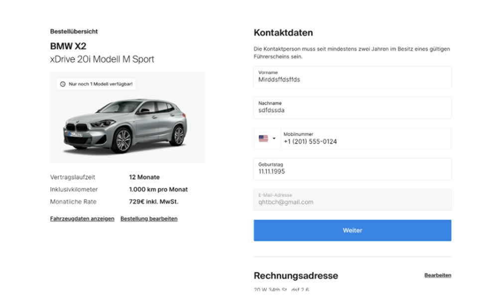
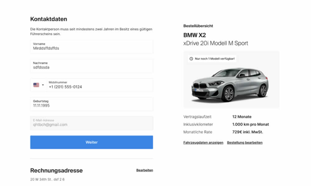
In this signup flow experiment, form fields on the right hand side (control) were shifted to the left column (variation). Impact on account creations and checkouts was measured.
Test #532 on
Finn.com
by  Maksim Meged
May 10, 2024
Mobile
Listing
X.X%
Signups
Maksim Tested Pattern #76: Infinite Scrolling Or Pagination On Finn.com


In this experiment, infinite scrolling was a/b tested against a paginated one.
Test #530 on
by  Stanley Zuo
Apr 30, 2024
Desktop
Mobile
X.X%
Signups
Stanley Tested Pattern #28: Easiest Fields First On
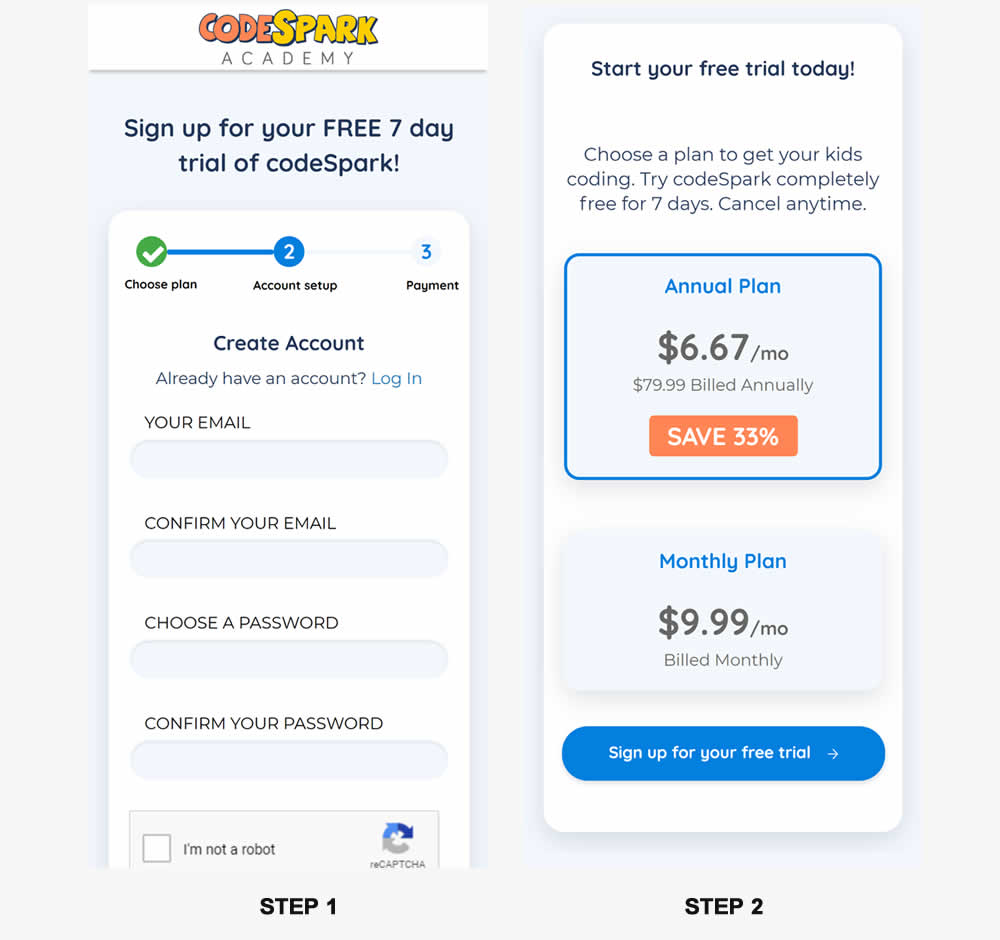
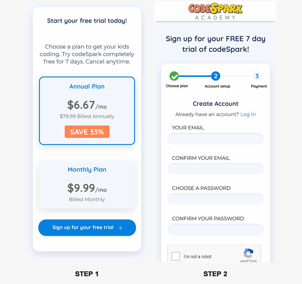
In this experiment, the order of two signup pages was tested: plan selection vs account creation. Here we have the account creation step first in the control and the the plan selection step first in the variation. (I flipped these around to match the pattern). Impact on signups was measured.
Test #492 on
Formelskin.de
by  Alexander Krieger
Sep 15, 2023
Mobile
Signup
X.X%
Signups
Alexander Tested Pattern #131: Authority On Formelskin.de
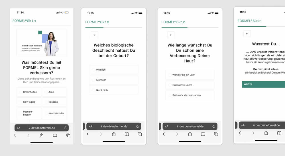
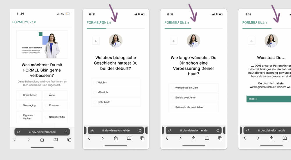
This experiment was a retest of a previously tested test 491. Simiarly, a photo of the real doctor behind a skin care product was shown throughout a signup / questionnaire flow in the variation.
Test #491 on
Formelskin.de
by  Alexander Krieger
Sep 08, 2023
Mobile
Signup
X.X%
Signups
Alexander Tested Pattern #131: Authority On Formelskin.de
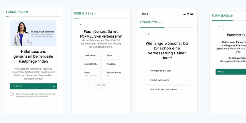
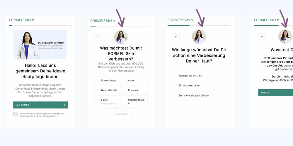
In this experiment, a photo of the real doctor behind a skin care product was shown throughout a signup / questionnaire flow. In the control version, the photo with introduction was only shown on the first screen. In the variation, the photo appeared on the first and all other screens - reinforcing expertise, authority and the idea of a consultation. Impact on signups and purchases was measured.
Test #487 on
Learnwithhomer.com
by  Stanley Zuo
Aug 10, 2023
Mobile
Pricing
X.X%
Signups
Stanley Tested Pattern #78: Tags, Badges And Structured Information On Learnwithhomer.com
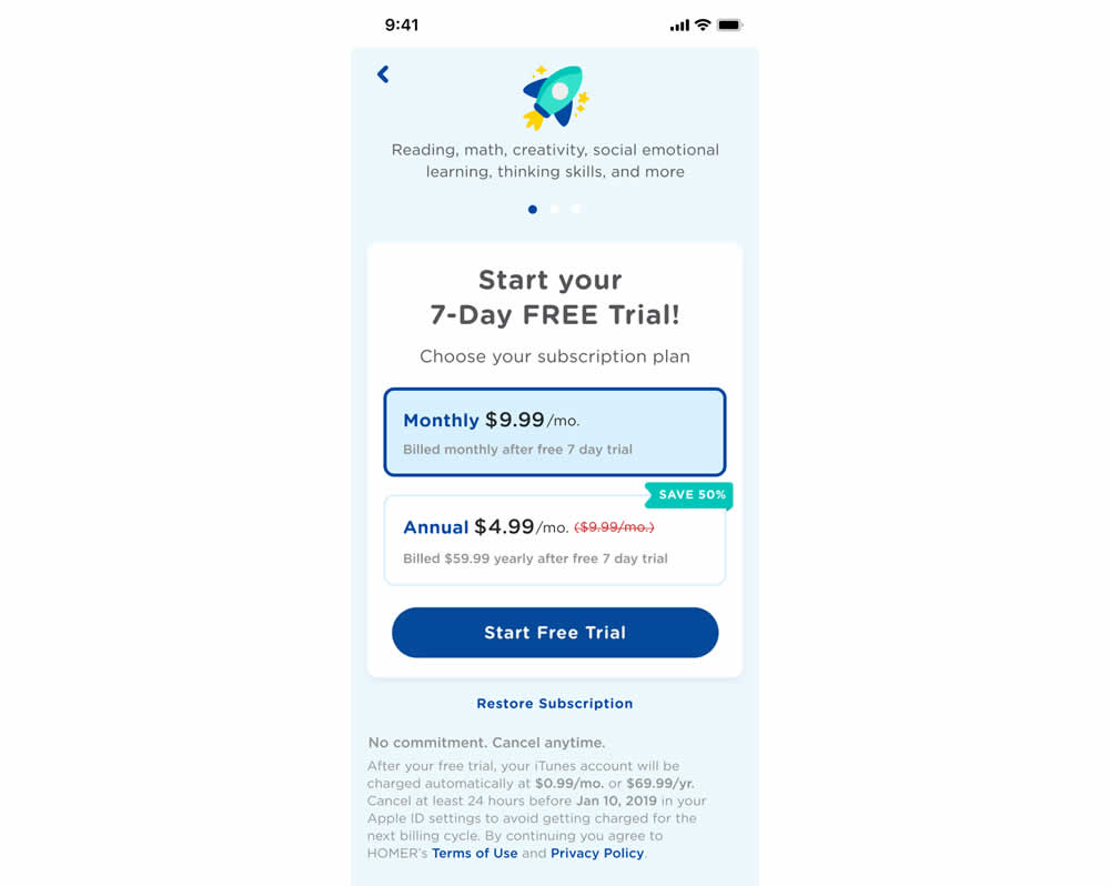
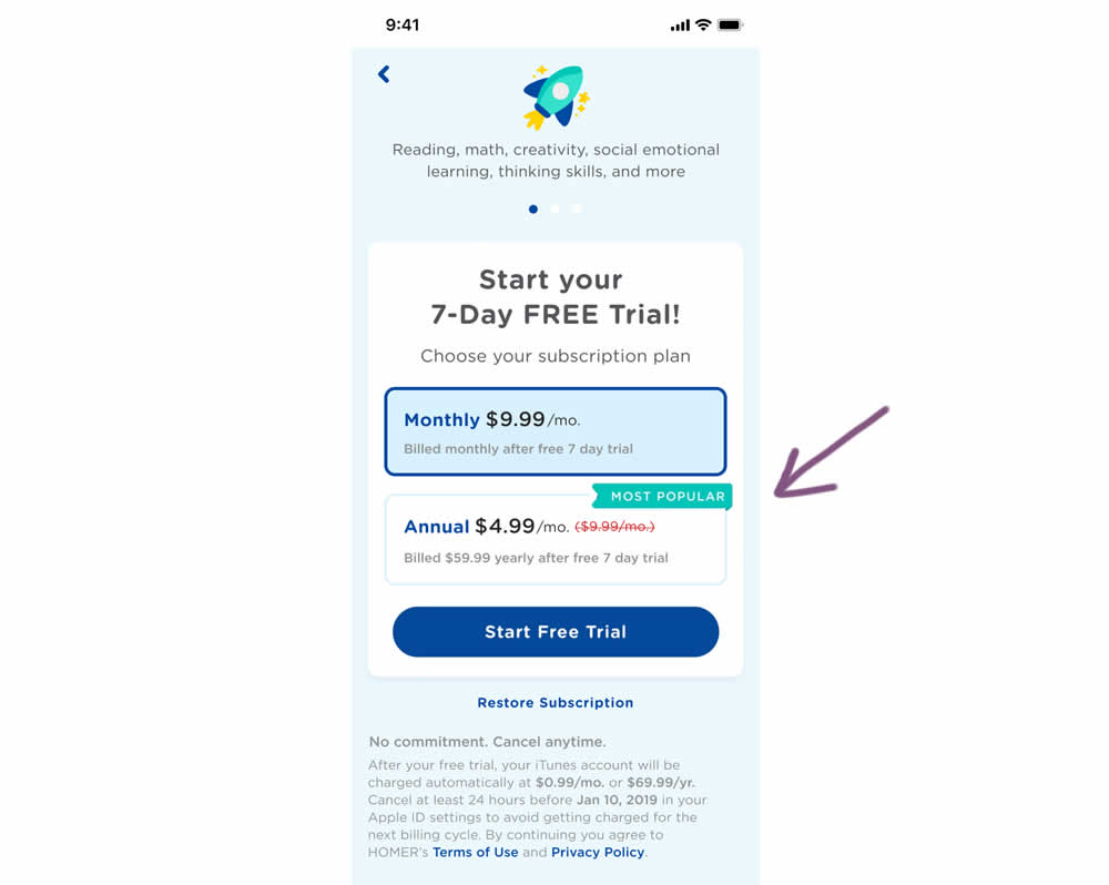
In this experiment, a "save 50%" badge was replaced with a "most popular" one with the intent of encouraging more users to select the higher priced plan. Impact on total and annual trial starts was measured.
Test #474 on
Rollbar.com
by  Mike Smith
May 27, 2023
Desktop
Mobile
Home & Landing
X.X%
Signups
Mike Tested Pattern #4: Testimonials On Rollbar.com
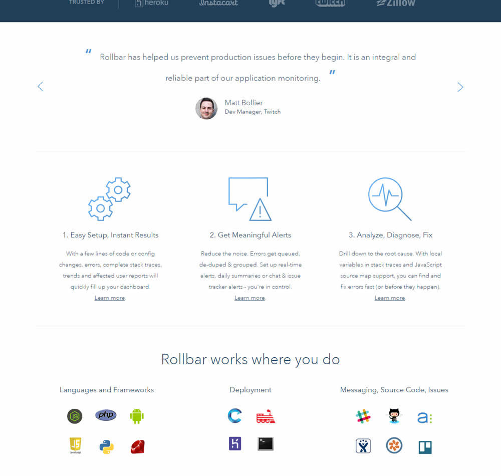
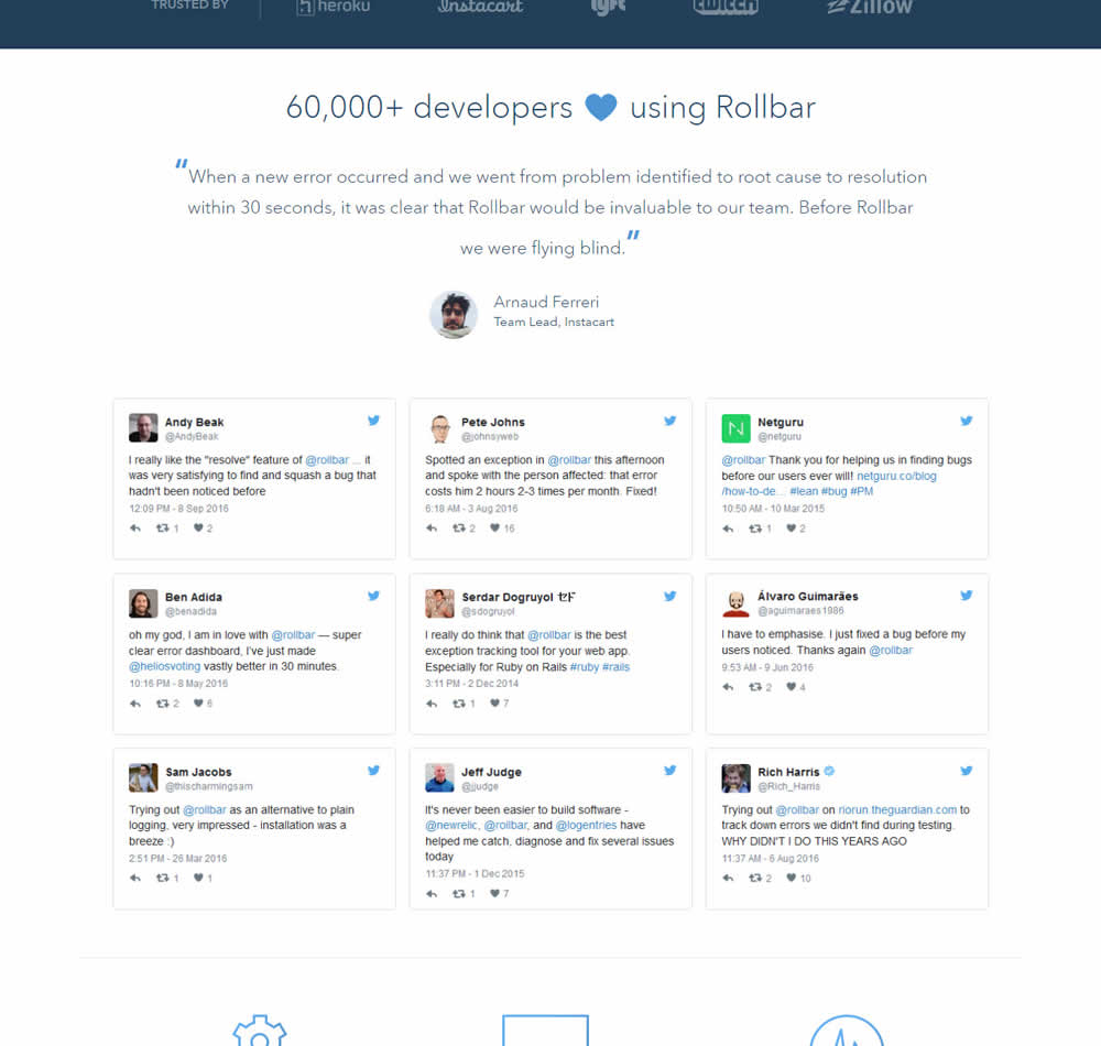
In this experiment, 9 Twitter card style testimonials were appended onto the homepage of Rollbar. These were image / screenshots recreations without links to the actual tweets.
Test #460 on
Backstage.com
by  Stanley Zuo
Mar 21, 2023
Mobile
Listing
X.X%
Signups
Stanley Tested Pattern #41: Sticky Call To Action On Backstage.com
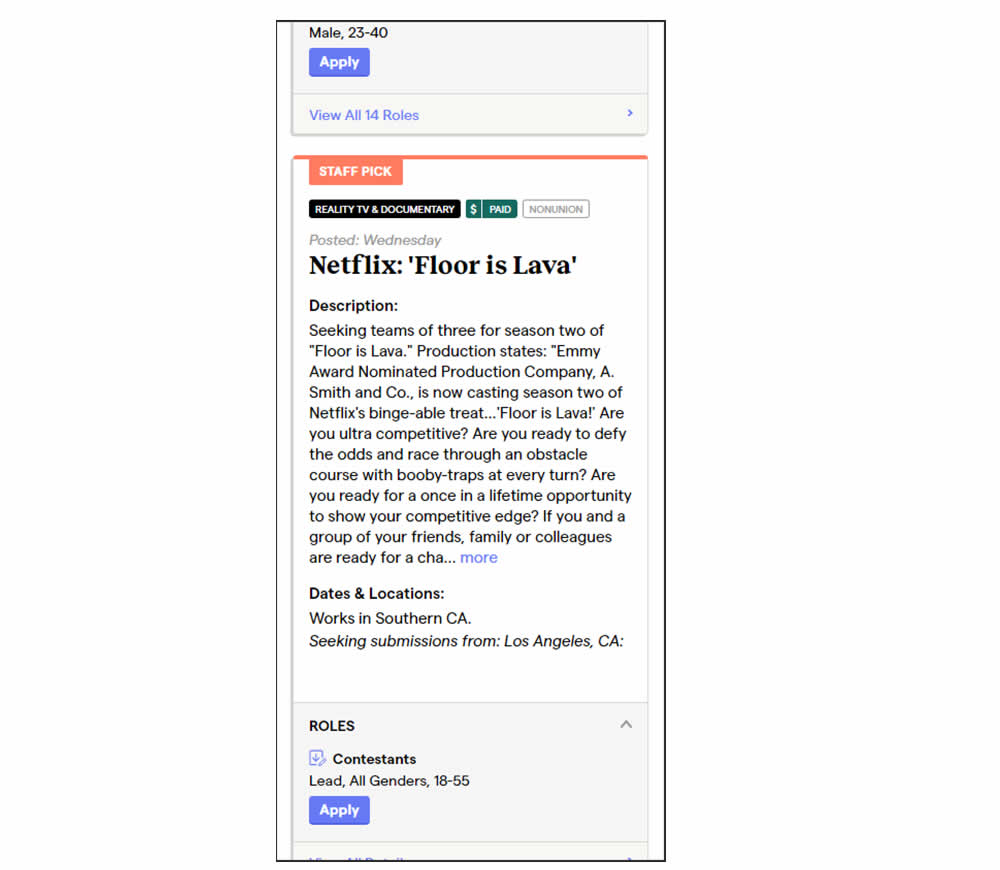
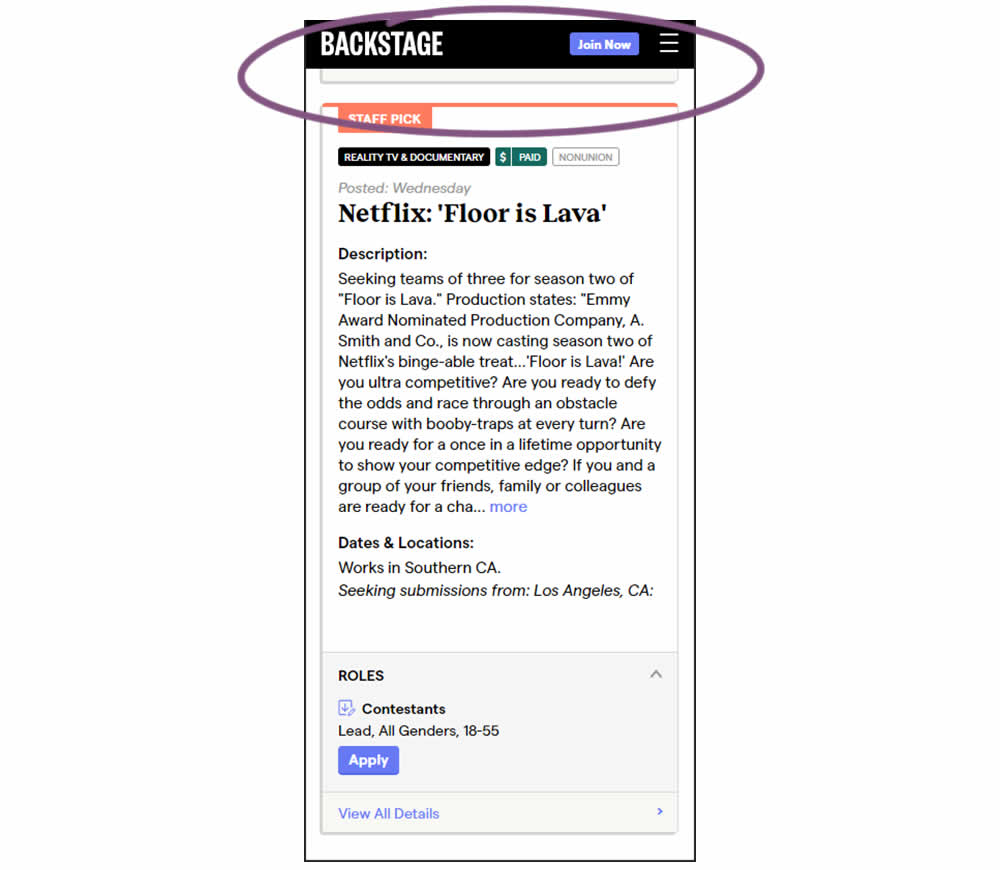
In this experiment, a floating top navigation was shown with a "Join" button. In the control, the navigation was only visible at the top of the page. Also keep in mind that signup starts were also triggered throughout multiple CTAs throughout the page and from particular job detail pages. The a/b test ran on a listing page of Backstage - a casting call job site. Impact on signups and checkouts was measured.
Test #440 on
Formelskin.de
by  Alexander Krieger
Nov 17, 2022
Mobile
Signup
X.X%
Signups
Alexander Tested Pattern #49: Above The Fold Call To Action On Formelskin.de
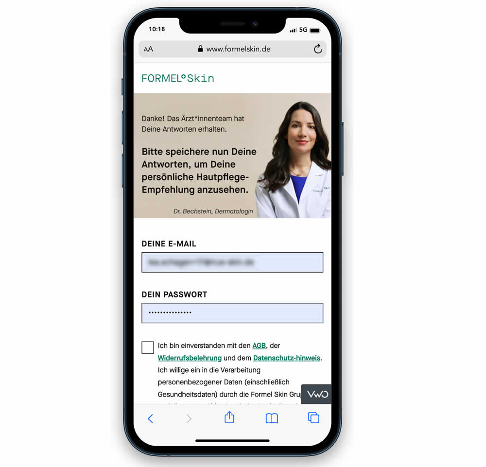
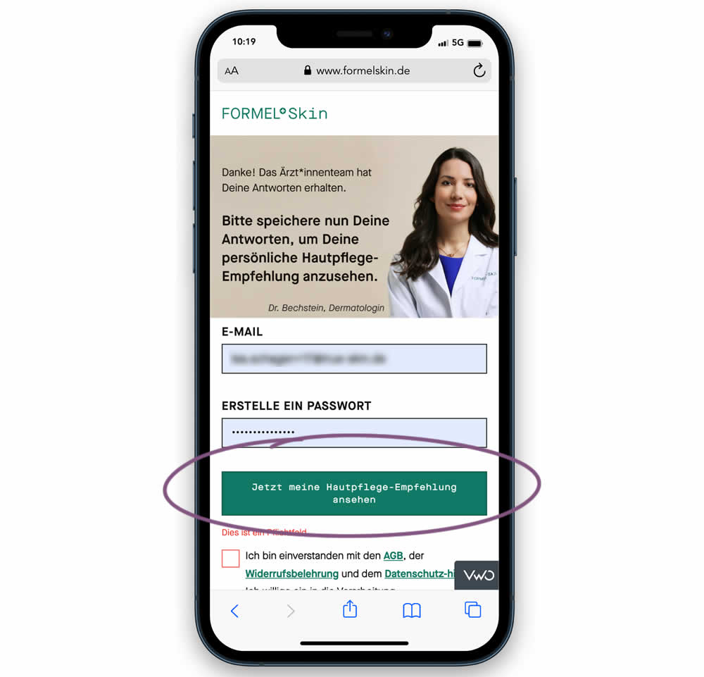
In this experiment, the call to action or button was raised above the legal text to be visible right away without scrolling. Additionally a error message was added for users that did not activate the checkbox to remind them that this is mandatory. Impact on signups and eventual follow-through to purchases (3 steps later) was measured.
Test #434 on
Learnwithhomer.com
by  Stanley Zuo
Sep 30, 2022
Mobile
Signup
X.X%
Signups
Stanley Tested Pattern #66: Complementary Upsell On Learnwithhomer.com
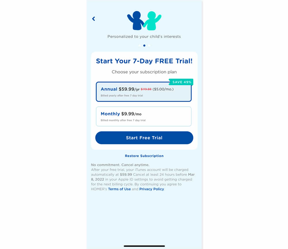
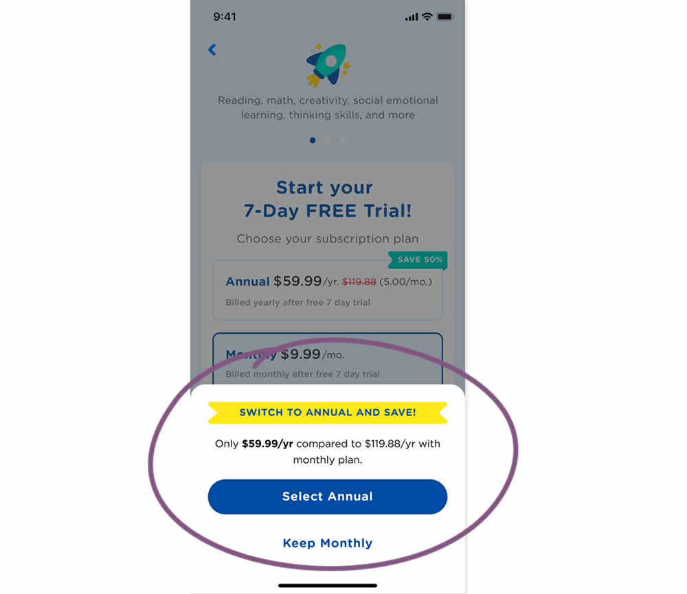
In this experiment, an upsell modal appeared during a signup funnel. In the variation, if users did not select a monthly plan, they were nudged to an annual one. Impact on overall and annual signups was measured.
Test #420 on
Designlab.com
by  Daniel Shapiro
Jul 12, 2022
Desktop
Mobile
Product
X.X%
Signups
Daniel Tested Pattern #115: Pricing Comparison Table On Designlab.com
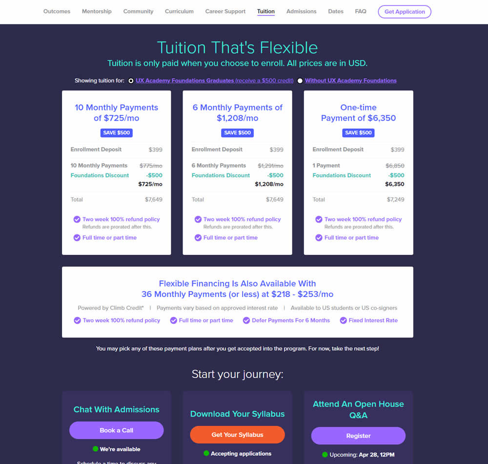
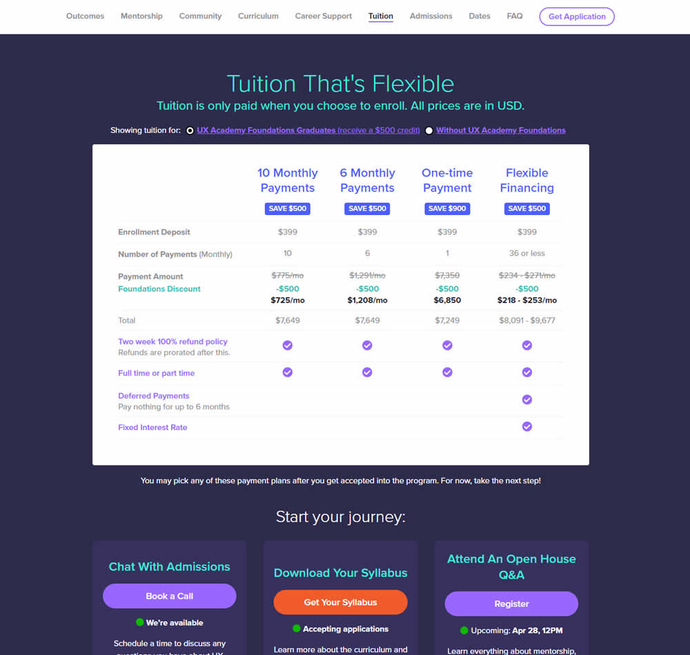
In this experiment, pricing plans were laid out horizontally for easier comparison. In the variation, most of the plan benefits, features and differences were also referenced using a single lable that was left-aligned. The idea was to make the variables aligned and therefore more comparable.
This pricing table appeared at the bottom of a long design program landing page. Impact on leads and applications was measured.
Test #417 on
Cxl.com
by  Ognjen Bošković
Jun 27, 2022
Desktop
Mobile
Signup
X.X%
Signups
Ognjen Tested Pattern #127: Vague Or Specific Benefits On Cxl.com
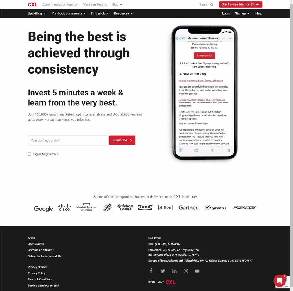
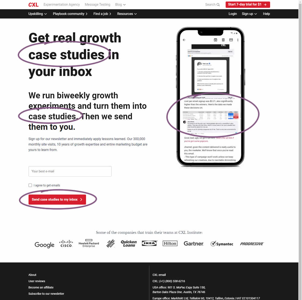
CXL ran an interesting experiment that (1) added more specificity on a newsletter subscription page as well as (2) reinforced it consistently. Most visibly, an abstract or vague headline statement (control) was changed to a benefit oriented one - hinting that subscribers will eventually receive valuable case studies. This message was further reinforced with supporting copy that explained where these case studies are obtained from along with the frequency of the delivery. This same message was also reinforced with an image of actual case studies. The call to action button was also adjusted to mimic the benefit.
Impact on newsletter signups was measured.
Test #415 on
Learnwithhomer.com
by  Stanley Zuo
Jun 09, 2022
Mobile
Checkout
X.X%
Signups
Stanley Tested Pattern #3: Fewer Form Fields On Learnwithhomer.com
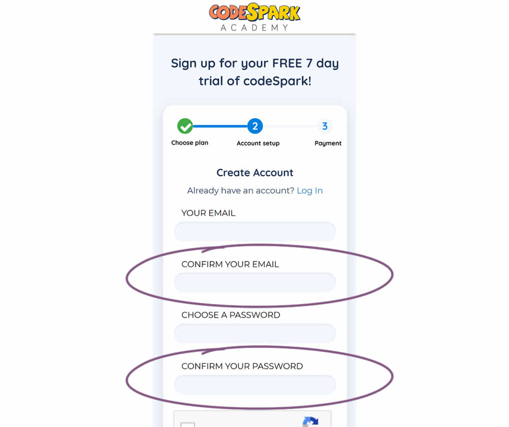
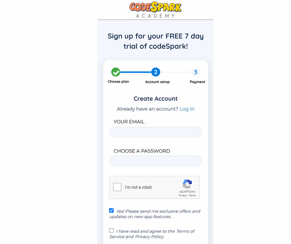
Do fewer confirmation form fields matter? In this experiment, redundant password and email confirmation fields were removed during a signup / checkout funnel. Impact on signups was measured.
Test #401 on
Learnwithhomer.com
by  Stanley Zuo
Mar 11, 2022
Desktop
Home & Landing
X.X%
Signups
Stanley Tested Pattern #58: Full Height False Bottom On Learnwithhomer.com

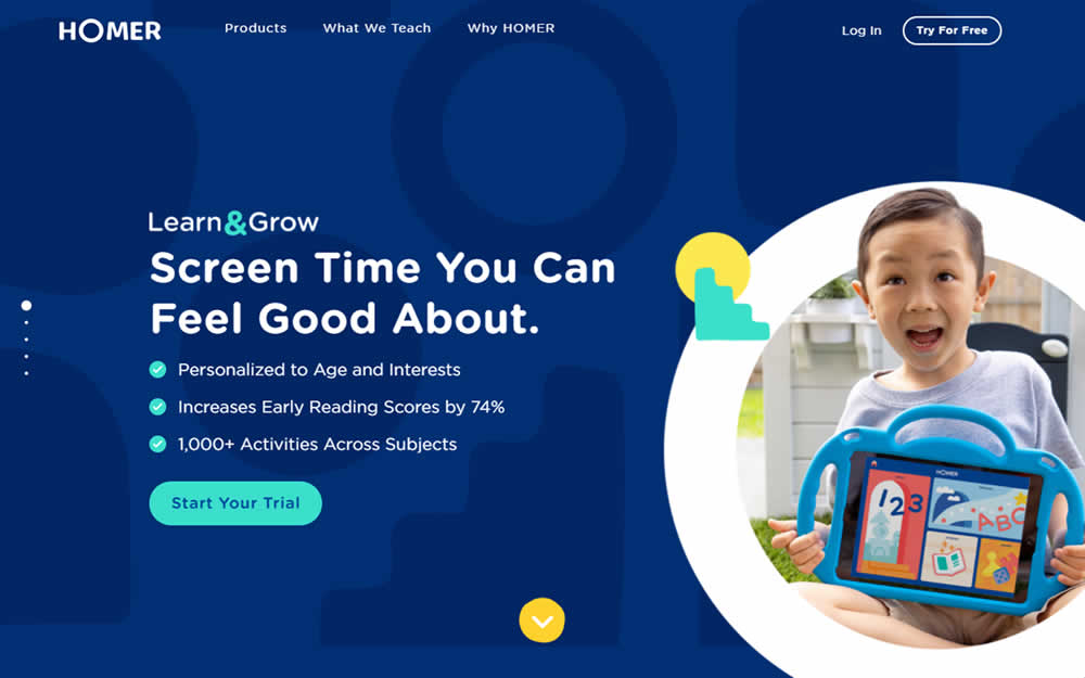
Here the experiment contained a layout change. Standard content components with varied heights were tested against sections with false bottoms. That is the conntent blocks in the variation took up 100% height of the viewport. This change was also applied throughout the rest of the content blocks. Impact on overall signup rates was measured.