All Latest 620 A/B Tests
Test #288 on
Kenhub.com
by  Niels Hapke
Mar 05, 2020
Desktop
Mobile
Home & Landing
X.X%
Signups
Niels Tested Pattern #117: Company Logos On Kenhub.com


In this experiment, customer logos (of universities attended by students using Kenhub) were placed on a homepage. The experiment tested for the effect on registration visits, and premium subscription starts.
Which A Or B Actually Wins? Find Out Before You Test.
Members see every test result — the winners, the flat ones, and the losers — along with exact effects and sample sizes. Use it to estimate your tests and prioritize by probability, not gut feel. Start every experiment with the odds on your side.
Test #276 on
Umbraco.com
by  Lars Skjold Iversen
Dec 31, 2019
Desktop
Mobile
Home & Landing
X.X%
Signups
Lars Tested Pattern #111: Field Explanations On Umbraco.com
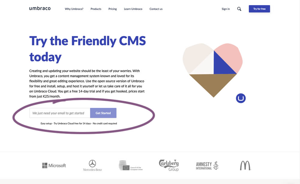
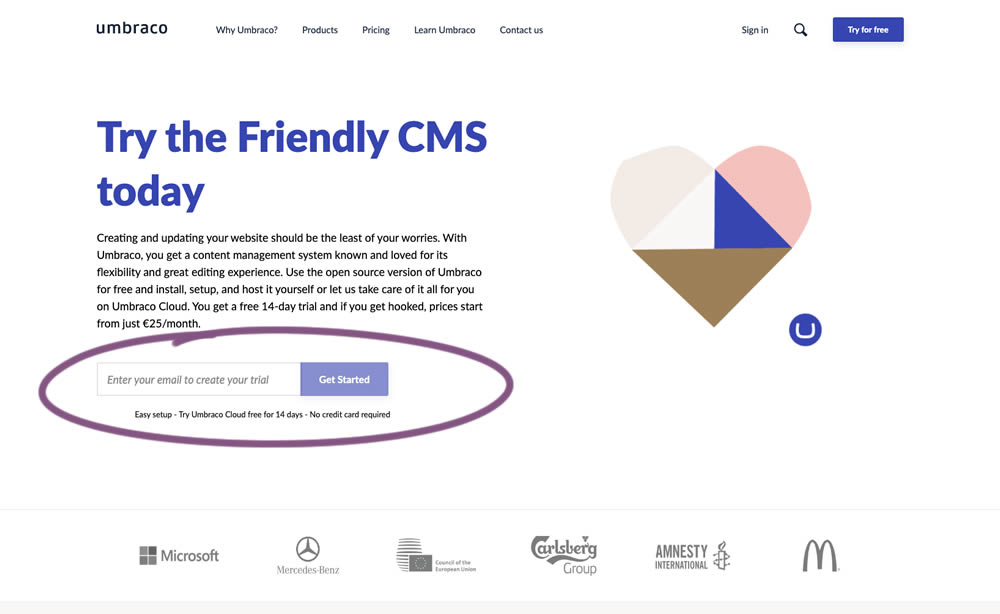
In this experiment, the idea was to move away from copy that was focusing on the needs of the company ("we need your email") towards copy that hinted at a customer benefit ("create your trial").
Test #273 on
Elevate App
by  Jesse Germinario
Dec 19, 2019
Mobile
Signup
X.X%
Signups
Jesse Tested Pattern #9: Multiple Steps
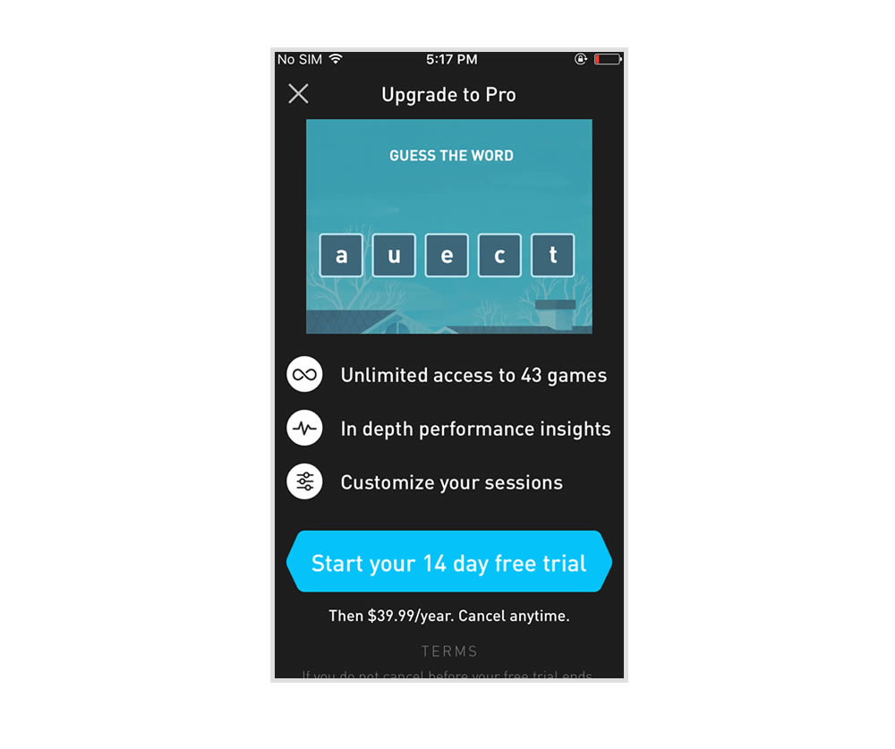
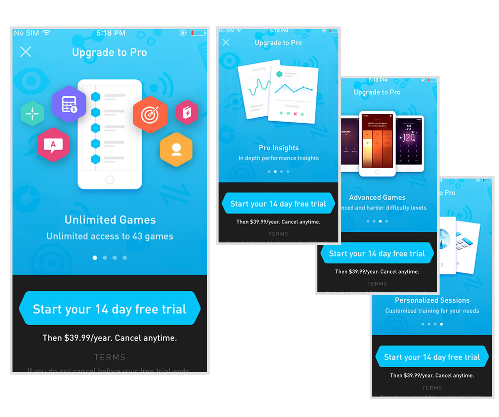
This experiment tests the impact of a different paywall screen on iOS. The current control paywall screen for 100% of iOS users was the animated pro screen. In this screen, users see an animation that gives shows glimpses of several Elevate games in action, as well as a bulleted list of key selling points for Pro. The proposed change (variant B) features a swipeable carousel of pages where each page has an image and some accompanying text explaining a different benefit of subscribing to Pro. The hypothesis is that we can lift conversion by showing users the alternate swiping paywall screen.
Test #271 on
Analytics-toolkit.co...
by  Georgi Z. Georgiev
Nov 24, 2019
Desktop
Mobile
Signup
X.X%
Signups
Georgi Tested Pattern #4: Testimonials On Analytics-toolkit.co...
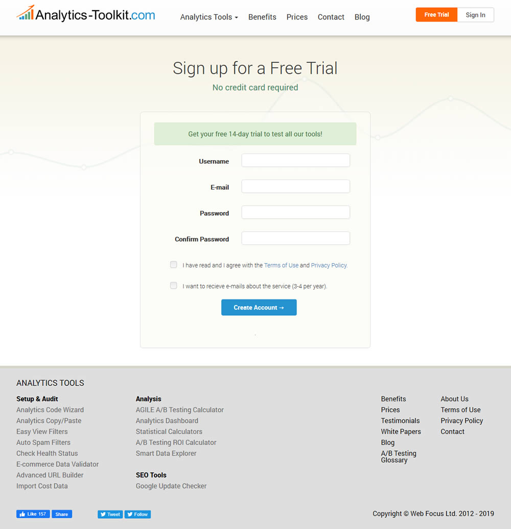
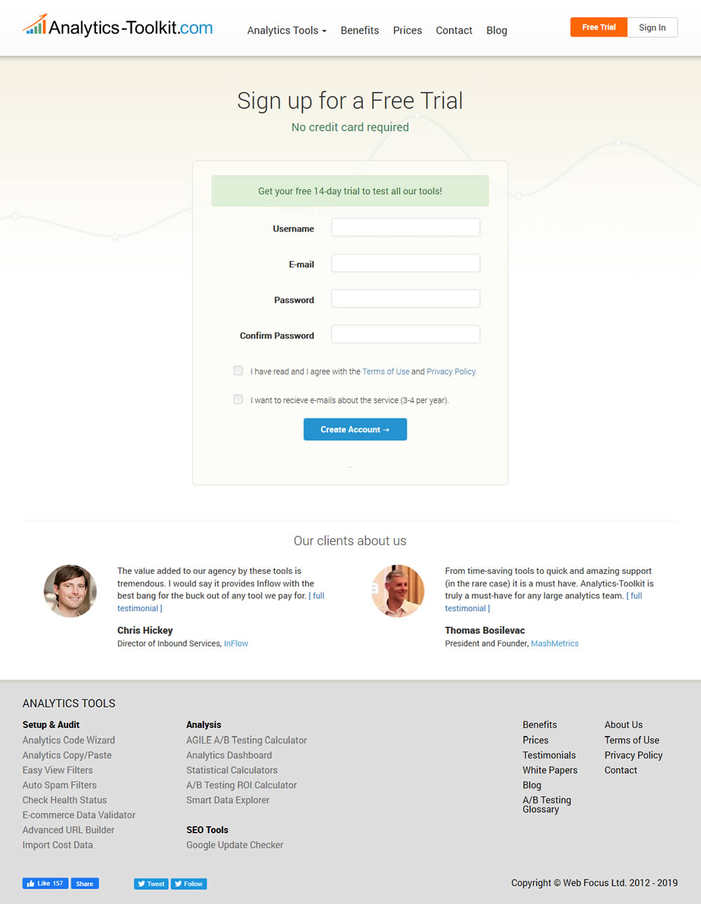
In this experiment, the test variant showed 2 testimonials on the user registration / free trial registration page at Analytics-Toolkit.com
Test #269 on
Thomasnet.com
by  Julian Gaviria
Nov 15, 2019
Desktop
Home & Landing
X.X%
Signups
Julian Tested Pattern #14: Exposed Menu Options On Thomasnet.com


In this experiment, the variation exposed 6 of the options from the pulldown menu as tabs.
Test #263 on
Goodui.org
by  Jakub Linowski
Oct 04, 2019
Desktop
Mobile
Home & Landing
X.X%
Signups
Jakub Tested Pattern #22: Empowering Headline On Goodui.org
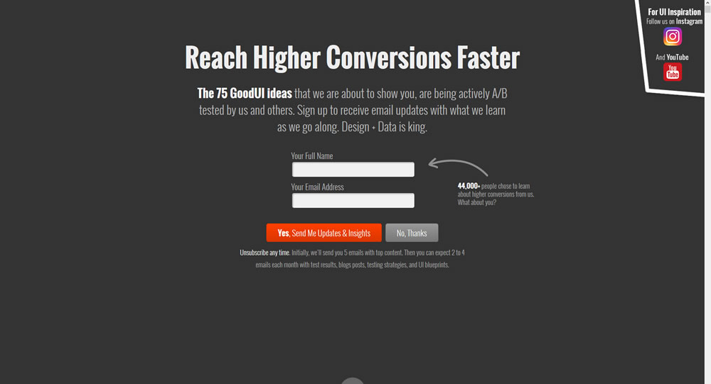
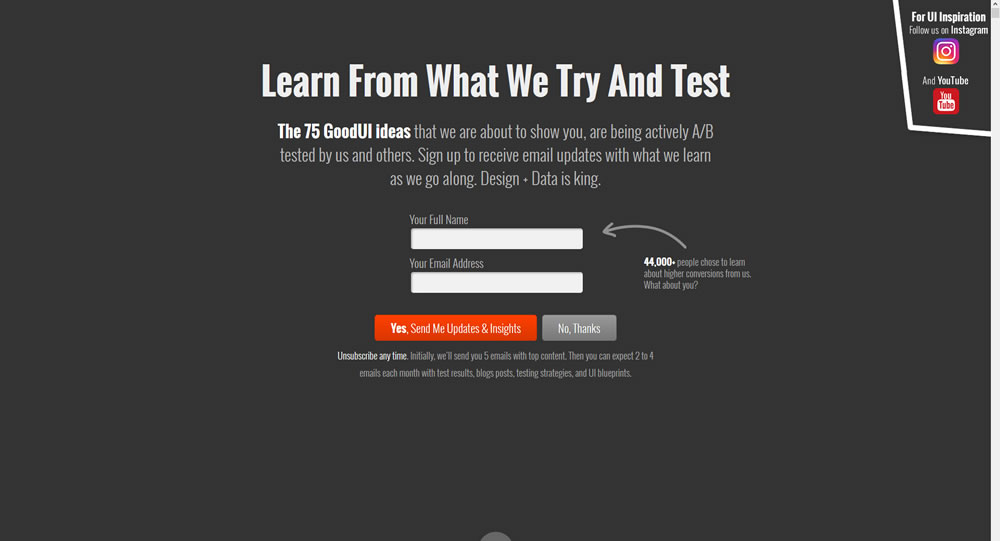
In this experiment a different headline was tested. "Reach Higher Conversions Faster" vs. "Learn From What We Try And Test".
Test #105 on
Inktweb.nl
by  Martijn Oud
Sep 23, 2019
Desktop
Mobile
Signup
X.X%
Signups
Martijn Tested Pattern #111: Field Explanations On Inktweb.nl
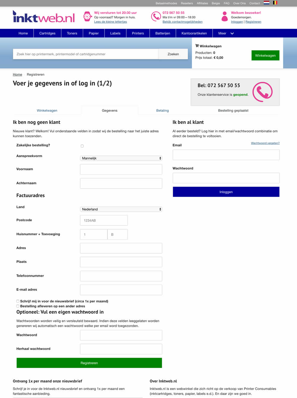
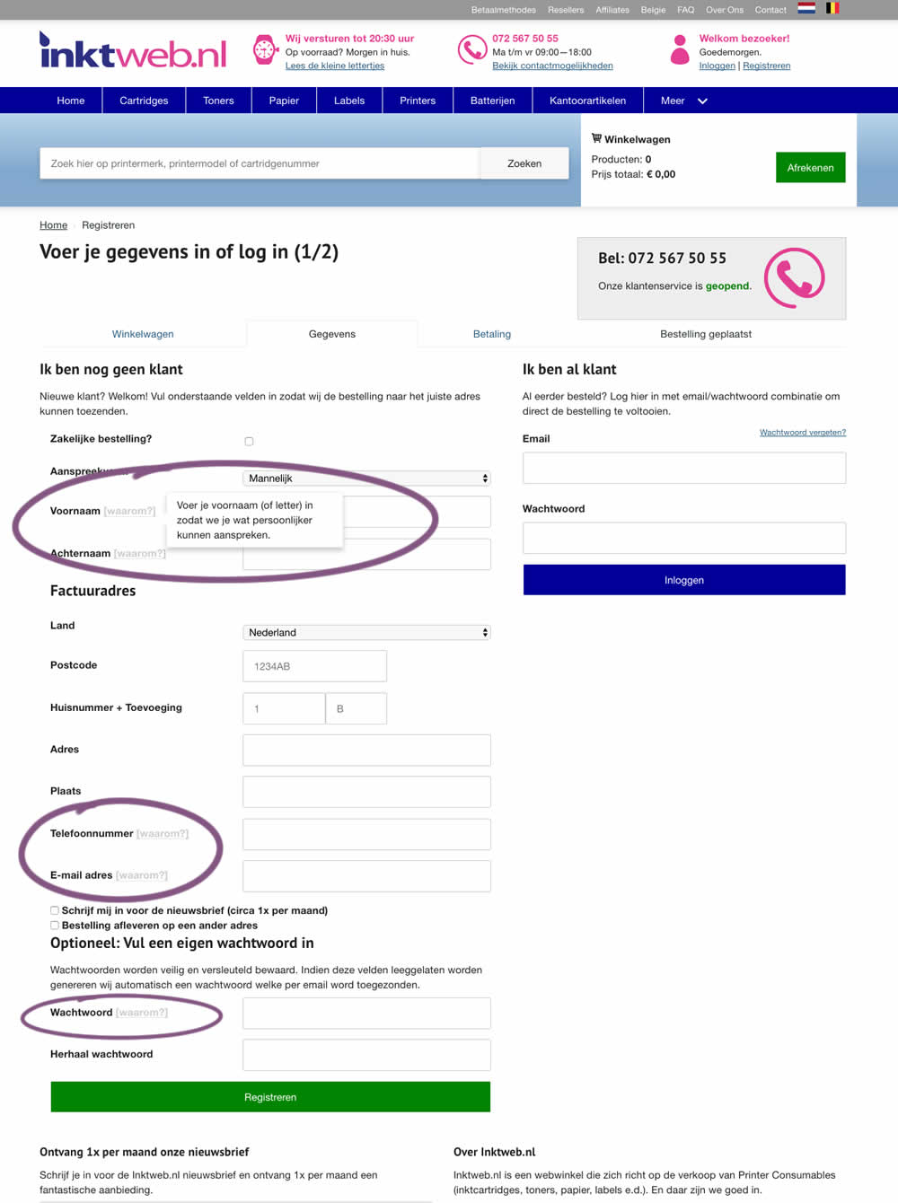
In this experiment, onhover tooltip explanations were added to selected fields (Firstname, Lastname, Phone, Email and Password). One translation example of the Firstname tooltip was the following "Enter your first name (or letter) so that we can address you in a more personal way".
Test #258 on
Thomasnet.com
by  Julian Gaviria
Sep 12, 2019
Desktop
Mobile
Signup
X.X%
Signups
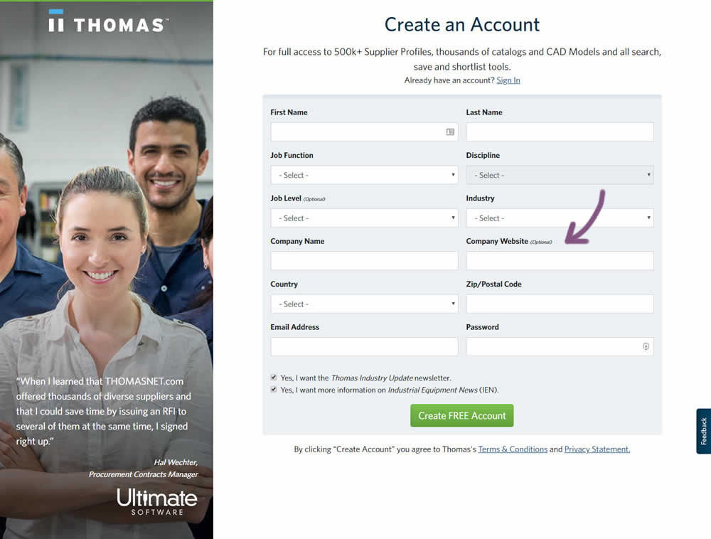
Julian Tested Pattern #110: Optional Field Labels On Thomasnet.com

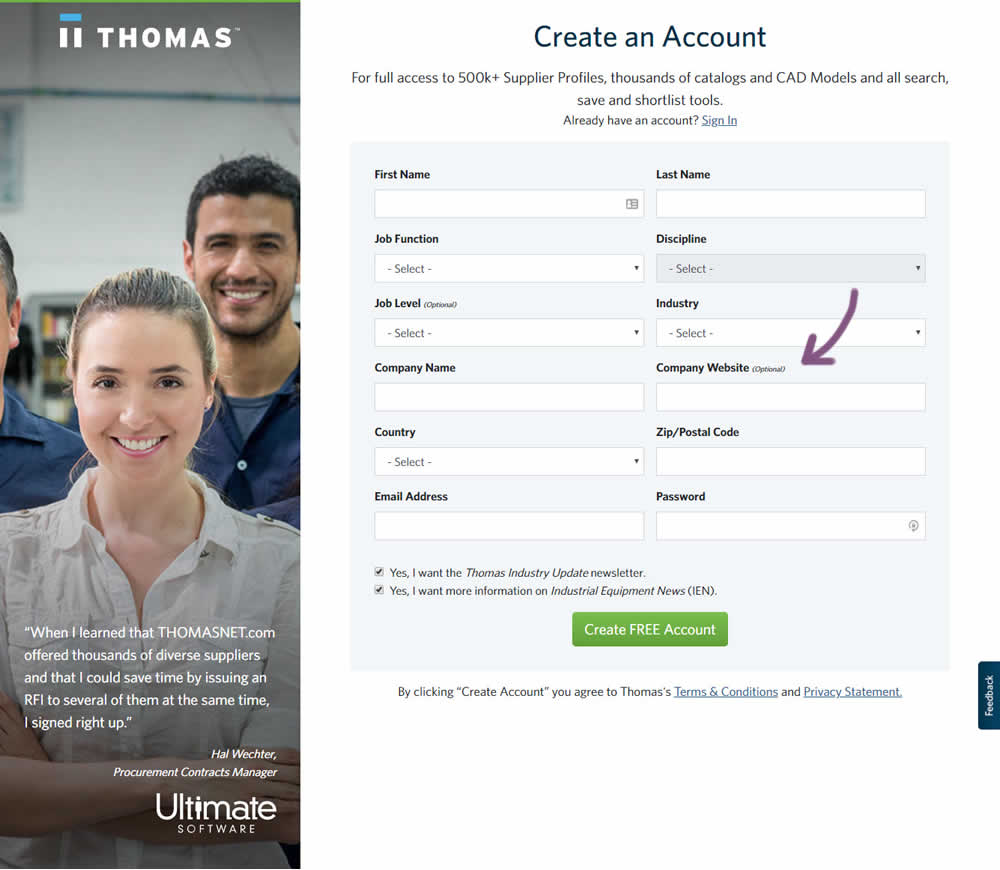
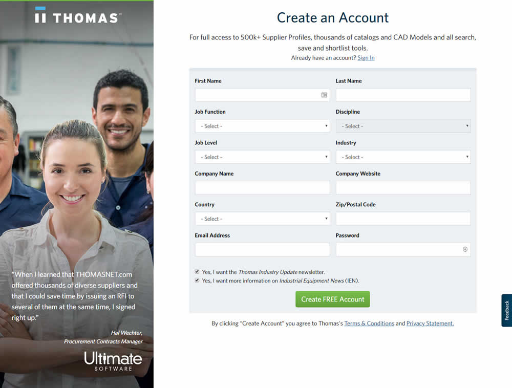
In this variation an optional field label was added.
Test #259 on
Thomasnet.com
by  Julian Gaviria
Sep 12, 2019
Desktop
Mobile
Signup
X.X%
Signups
Julian Tested Pattern #110: Optional Field Labels On Thomasnet.com
Test #257 on
Thomasnet.com
by  Julian Gaviria
Sep 09, 2019
Desktop
Mobile
Signup
X.X%
Signups
Julian Tested Pattern #109: Required Field Labels On Thomasnet.com


In this followup experiment, field labels without and with a marked asterisk were tested.
Test #256 on
by  Alex James
Aug 23, 2019
Desktop
Mobile
Signup
X.X%
Signups
Alex Tested Pattern #109: Required Field Labels
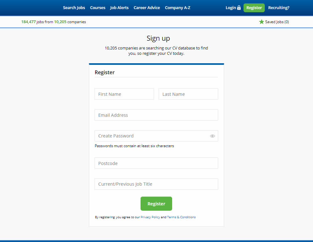
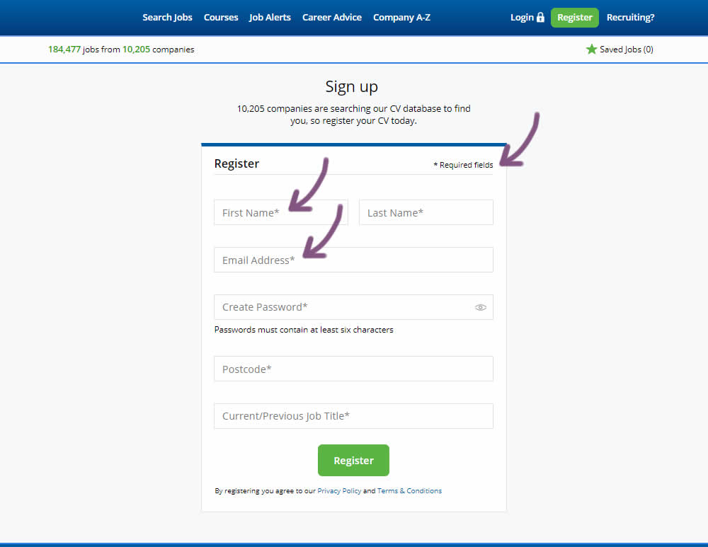
The original had no fields marked as required. The variant had all fields marked as required with an asterisk (and a reference note).
Test #255 on
Thomasnet.com
by  Julian Gaviria
Aug 22, 2019
Desktop
Mobile
Signup
X.X%
Signups
Julian Tested Pattern #109: Required Field Labels On Thomasnet.com
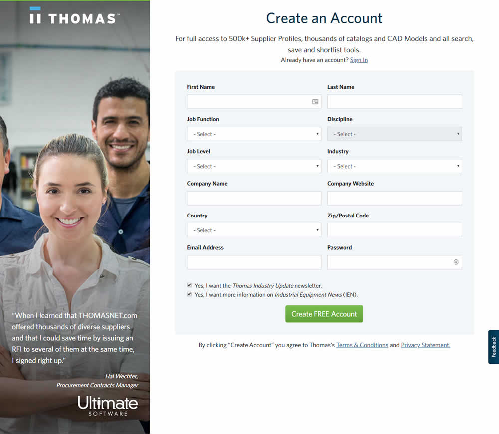

In this experiment, field labels without and with a marked asterisk were tested.
Test #250 on
Volders.de
by  Alexander Krieger
Jul 25, 2019
Desktop
Mobile
Signup
X.X%
Signups
Alexander Tested Pattern #106: Back Buttons On Volders.de
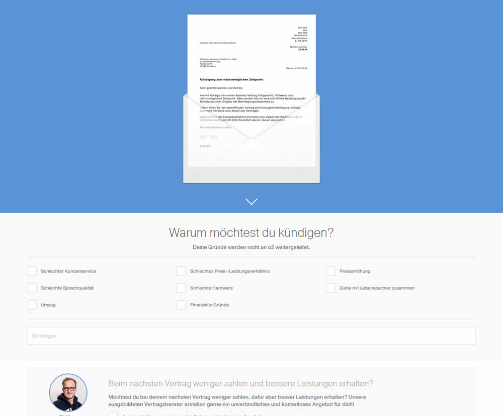
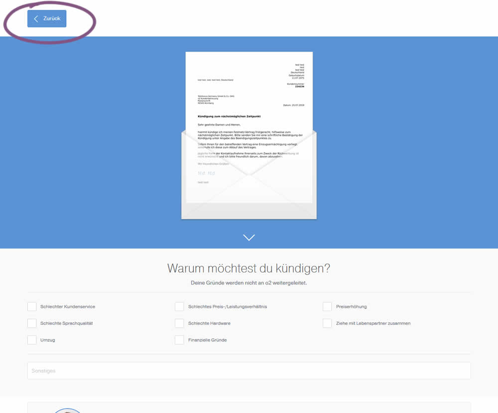
In this experiment, a version without a back button was tested against a one where it was positioned in the upper left corner. This test occured on a second step of a contract cancellation service.
Test #251 on
Goodui.org
by  Jakub Linowski
Jul 25, 2019
Desktop
Mobile
Content
X.X%
Signups
Jakub Tested Pattern #57: Maybe Later On Goodui.org
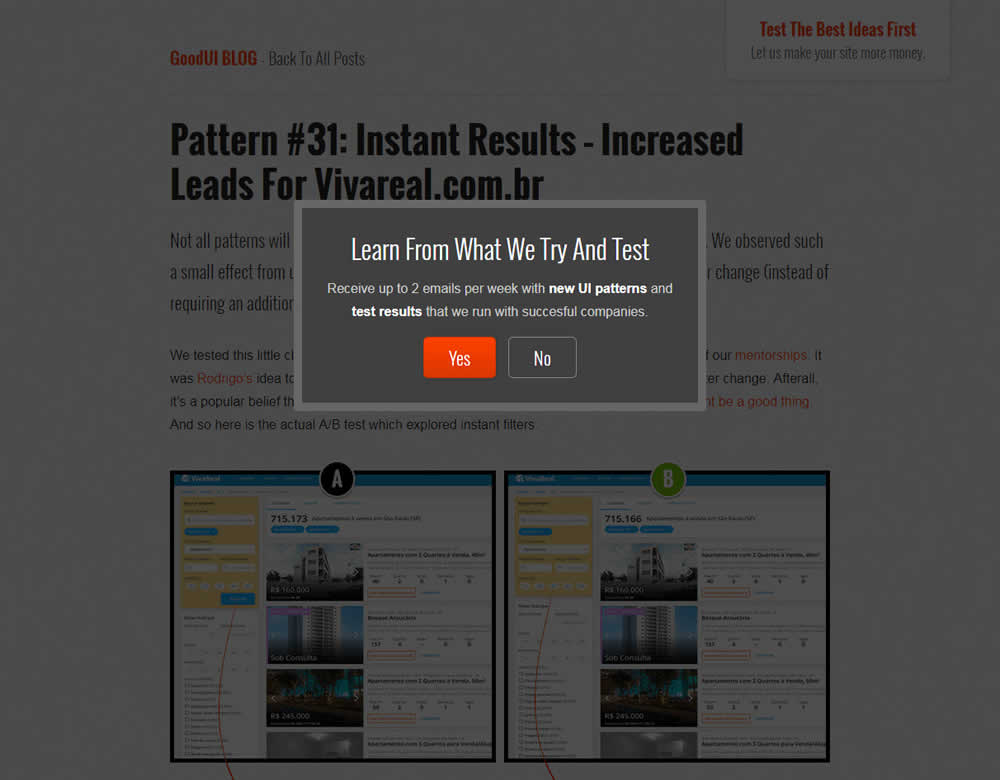

In this experiment, we tested a standard modal (with 2 choices) against a "Maybe Later" one (with 3 choices). One of the choices in the variant allowed users to postpone their decision with a "maybe" which would enable a floating bar at the bottom of the screen. Clicking on any of the "Yes" options would send people to the bottom of the screen with an email signup form. Increasing signup was our primary measure. Both modals also appeared instantly after a page load.
Test #39 on
Over-blog.com
by  Tael Pinault
Jul 02, 2019
Desktop
Signup
X.X%
Signups
Tael Tested Pattern #83: Progressive Fields On Over-blog.com
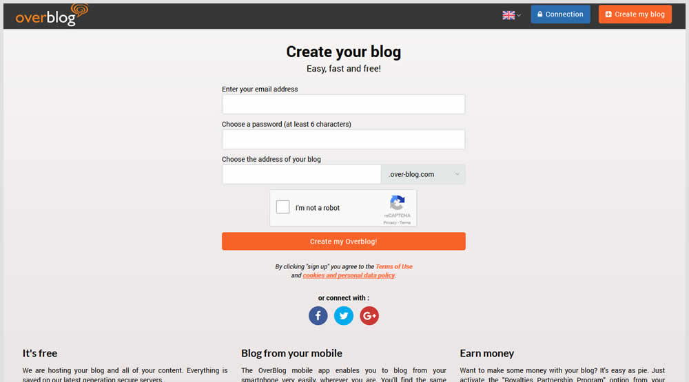
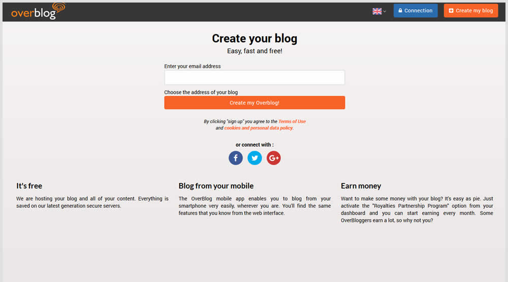
This test explored a progressive disclosure interaction in variation B. When a user started typing text into the first field, two more fields expanded into view.
Test #247 on
Thomasnet.com
by  Julian Gaviria
Jun 13, 2019
Desktop
Mobile
Content
X.X%
Signups
Julian Tested Pattern #41: Sticky Call To Action On Thomasnet.com
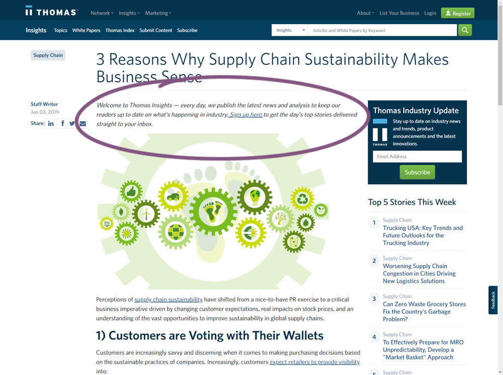
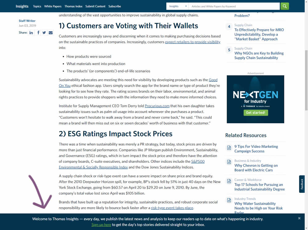
In this experiment, the same message (with a link) for signing up to a newsletter was shown in two distinct ways. The control (A) showed the signup message as inline one that preceded the content of the article at the very top. The variant showed the same signup message as a scroll-delayed sticky interaction at the bottom of the screen. The background color of the B variant was also inverted to match the style of the footer.
Test #245 on
Kenhub.com
by  Niels Hapke
Jun 11, 2019
Desktop
Signup
X.X%
Signups
Niels Tested Pattern #19: Benefit Testimonials On Kenhub.com
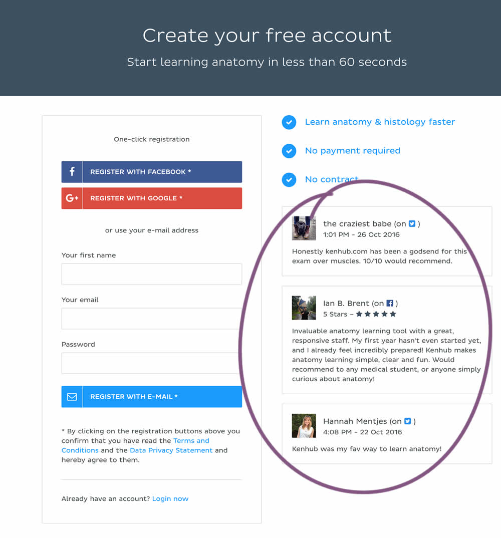
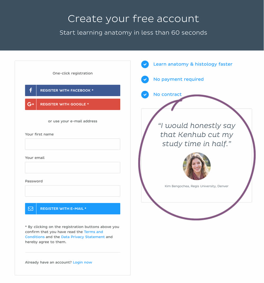
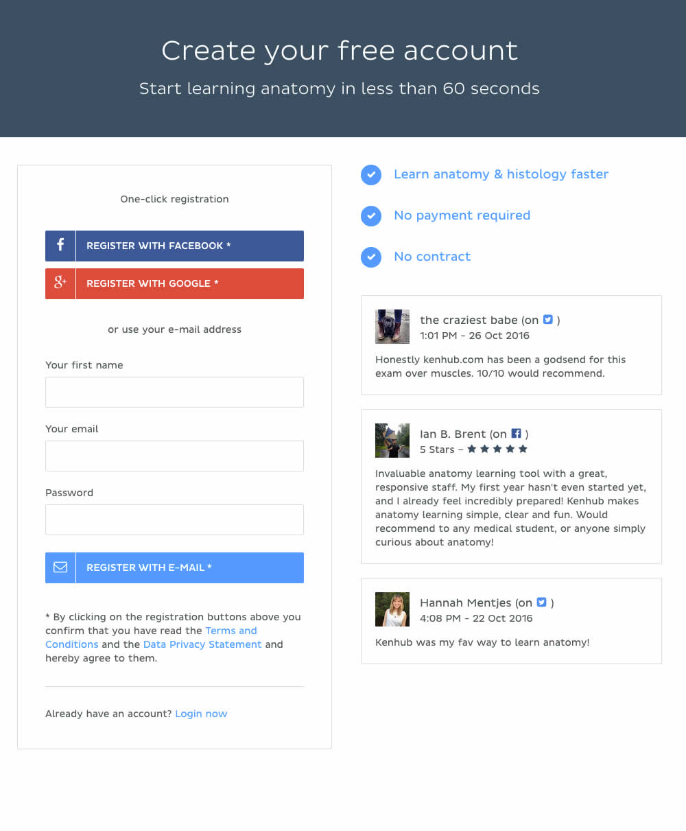
In this experiment a more elaborate and authentic testimonial was used instead of three more generic ones from social media sites.
Test #242 on
by  Alex James
May 27, 2019
Desktop
Mobile
Signup
X.X%
Signups
Alex Tested Pattern #7: Social Counts
Test #241 on
Kenhub.com
by  Niels Hapke
May 24, 2019
Desktop
Mobile
Signup
X.X%
Signups
Niels Tested Pattern #105: Lead Magnets On Kenhub.com
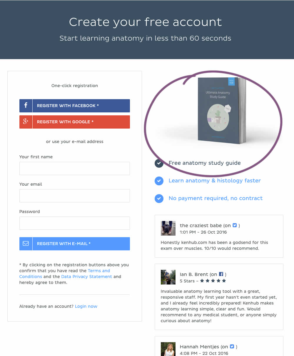
In this experiment, a free study guide ebook was promoted on a registration page.
Test #236 on
by  Alex James
Apr 04, 2019
Desktop
Signup
X.X%
Signups
Alex Tested Pattern #9: Multiple Steps
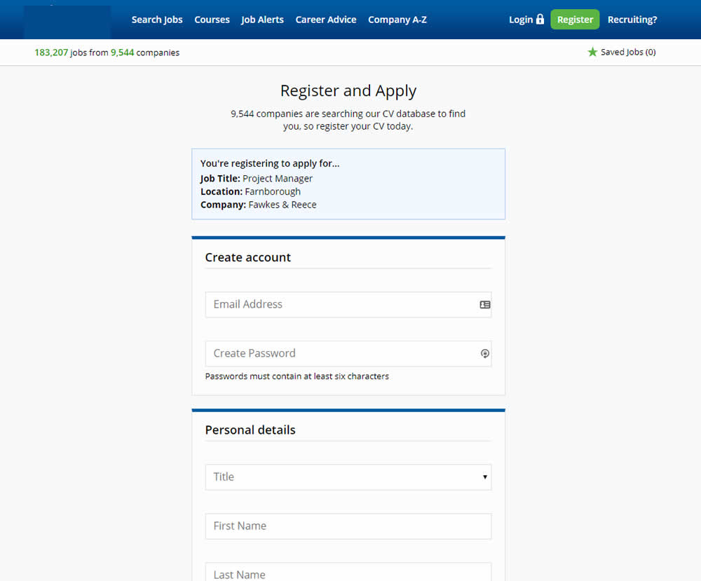
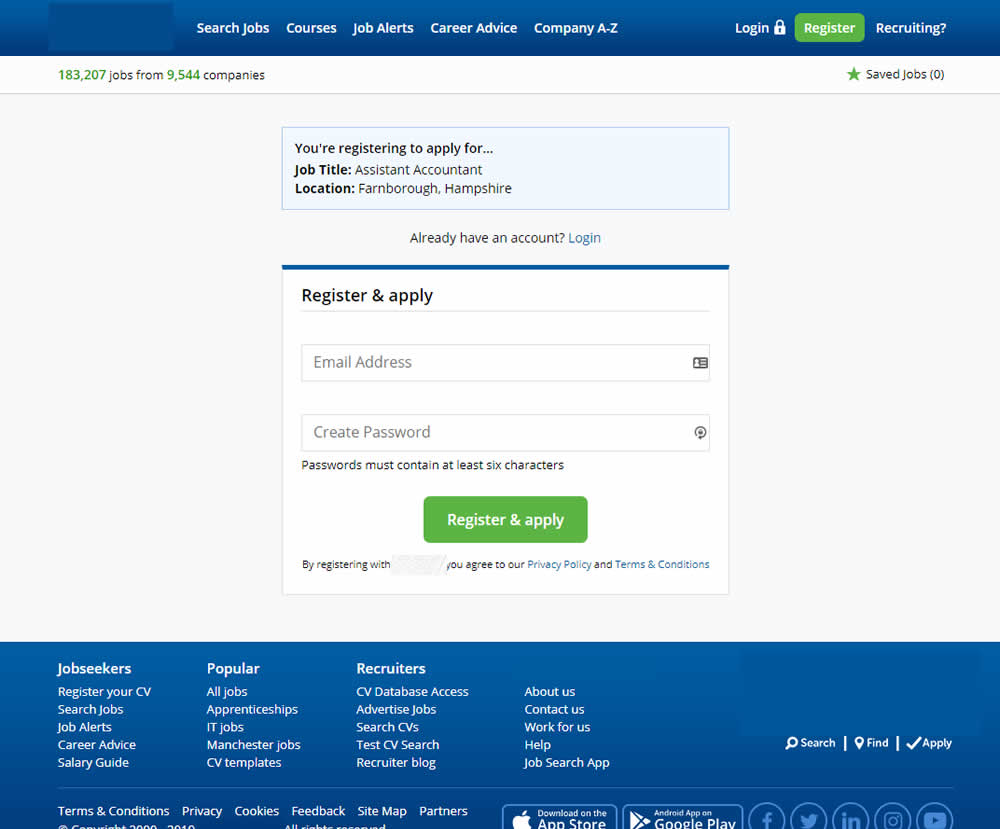
In this experiment a single screen signup process was broken into 2 separate steps: account creation & details.