All Latest 620 A/B Tests
Test #396 on
Depositphotos.com
by  Gleb Hodorovskiy
Feb 13, 2022
Desktop
Listing
X.X%
Signups
Gleb Tested Pattern #124: Confirmed Selection On Depositphotos.com
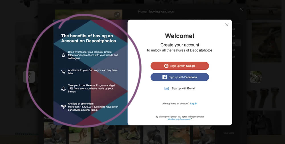
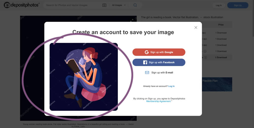
In this experiment from Conversionrate.store, the framing of the registration message was changed from a generic account creation one to a specific image selected by the user. The experiment started on a listing page of a stock photography / illustration site. The control showed a more generic message with benefits for signing up and making the purchase. Whereas the variation repeated the actual image that customers clicked on from listing pages - establishing continuity as well as providing a reason for signing up. Impact on sales was measured.
Which A Or B Actually Wins? Find Out Before You Test.
Members see every test result — the winners, the flat ones, and the losers — along with exact effects and sample sizes. Use it to estimate your tests and prioritize by probability, not gut feel. Start every experiment with the odds on your side.
Test #391 on
Backstage.com
by  Stanley Zuo
Dec 30, 2021
Desktop
Mobile
Listing
X.X%
Signups
Stanley Tested Pattern #82: Onboarding Callouts On Backstage.com
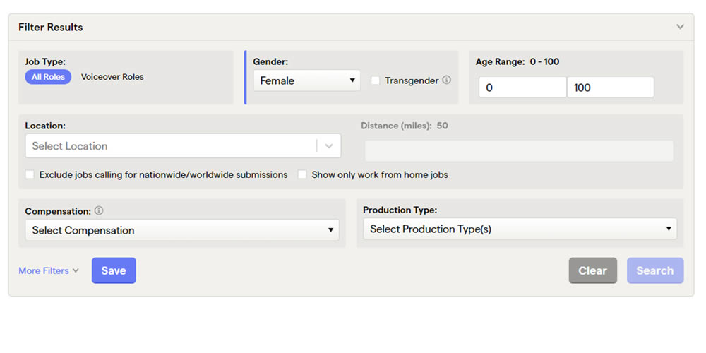
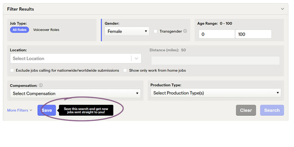
This experiment added a small nudge or callout to encourage more signups. Attention was directed towards the save function, which lead to the signup flow for anyone not signed it. Impact on signups was measured.
Test #357 on
Baremetrics.com
by  Brian Sierakowski
Jun 02, 2021
Desktop
Mobile
Pricing
X.X%
Signups
Brian Tested Pattern #113: More Or Fewer Plans On Baremetrics.com
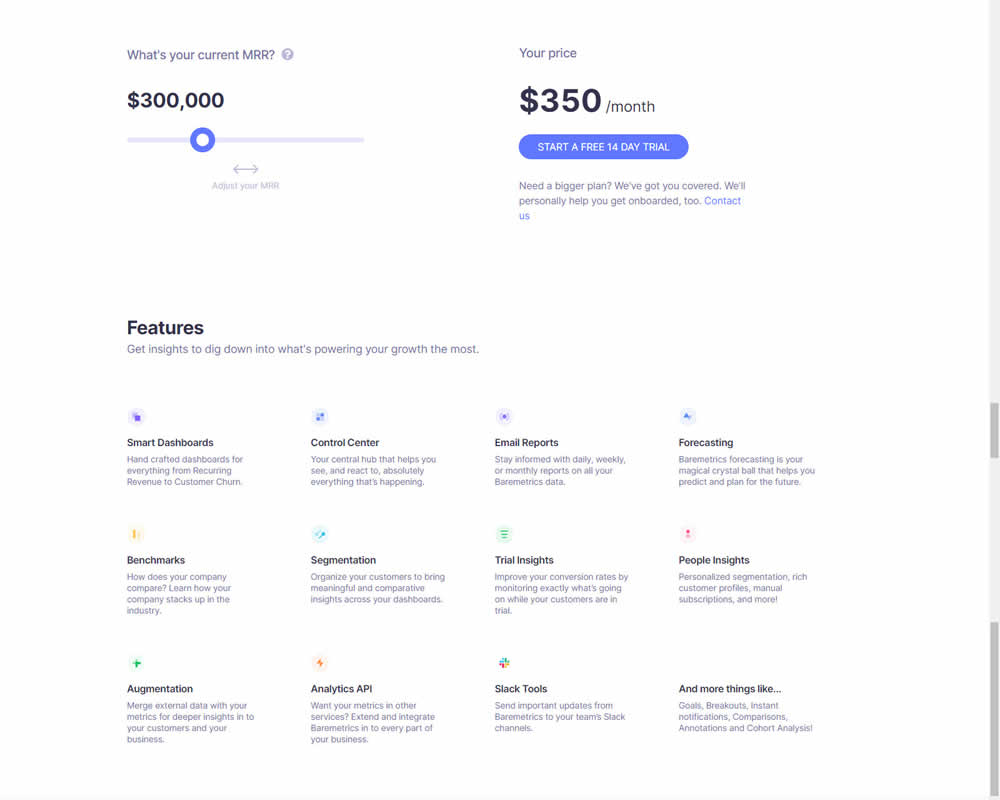
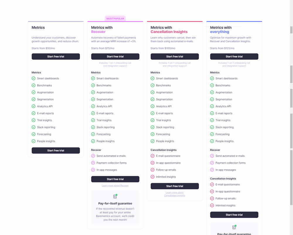
In this experiment, a single focus signup was transformed into a pricing comparison table. Impact on signups was measured.
Test #353 on
Backstage.com
by  Stanley Zuo
May 12, 2021
Desktop
Product
X.X%
Signups
Stanley Tested Pattern #13: Centered Forms & Buttons On Backstage.com
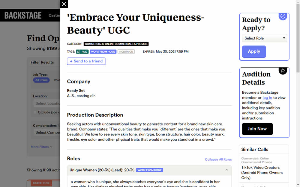
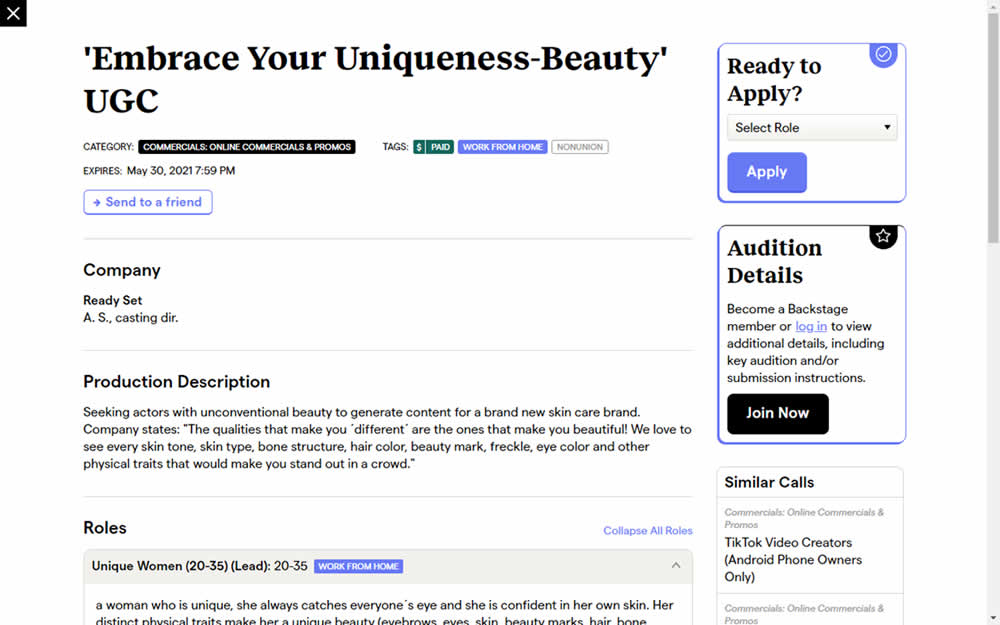
This experiment challanged a right aligned detail page. After clicking a result of a job role on a listing page, an overlay would appear on the right with the details. The variation used a full width screen instead - effectively centering the page.
Test #351 on
Baremetrics.com
by  Brian Sierakowski
Apr 30, 2021
Desktop
Mobile
Home & Landing
X.X%
Signups
Brian Tested Pattern #11: Gradual Reassurance On Baremetrics.com
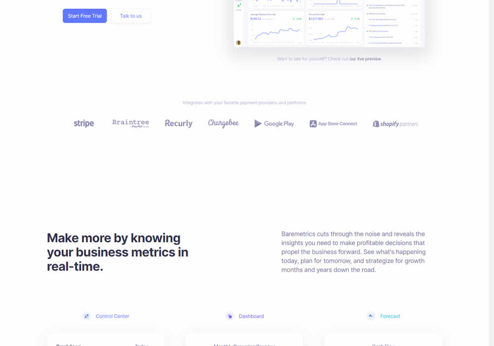
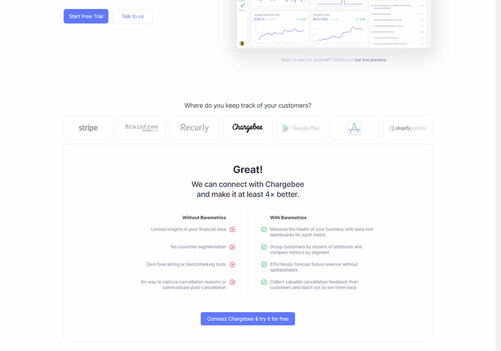
In this experiment, static integration logos were replaced with selectable ones that reassured users to signup. After clicking an integration logo, a comparison chart would appear showing how Baremetrics improves upon a selected payment processor, along with a call to signup. Impact on signups was measured.
Test #342 on
Backstage.com
by  Stanley Zuo
Feb 28, 2021
Desktop
Mobile
Listing
X.X%
Signups
Stanley Tested Pattern #25: Nagging Results On Backstage.com

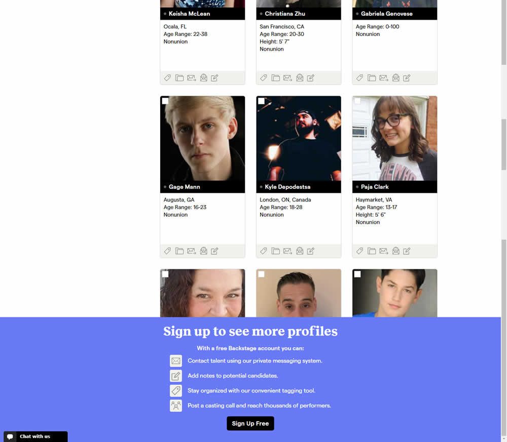
In this experiment, a registration wall was added on a listing page of casting call profiles. The registration wall appeared after the first 9 listings or so and encouraged users to sign up. Impact on registrations was measured, along with an engagement metric of "posting a job".
Test #341 on
by  Alex James
Feb 25, 2021
Desktop
Mobile
Signup
X.X%
Signups
Alex Tested Pattern #35: Floating Labels
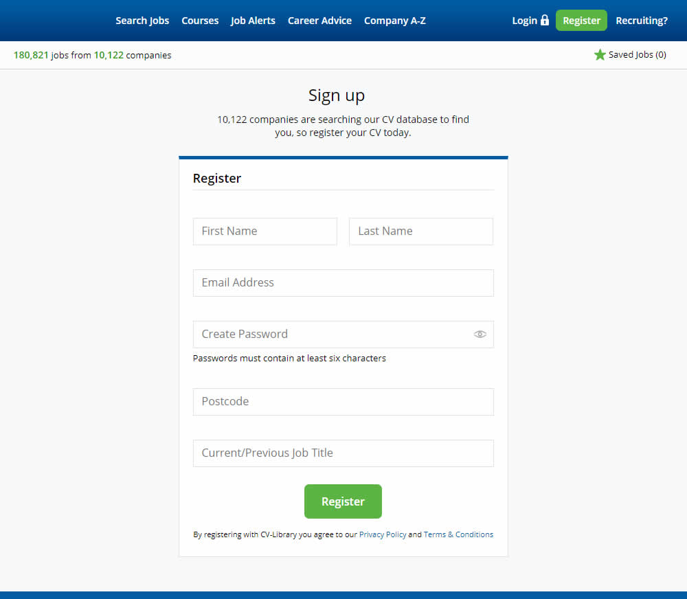
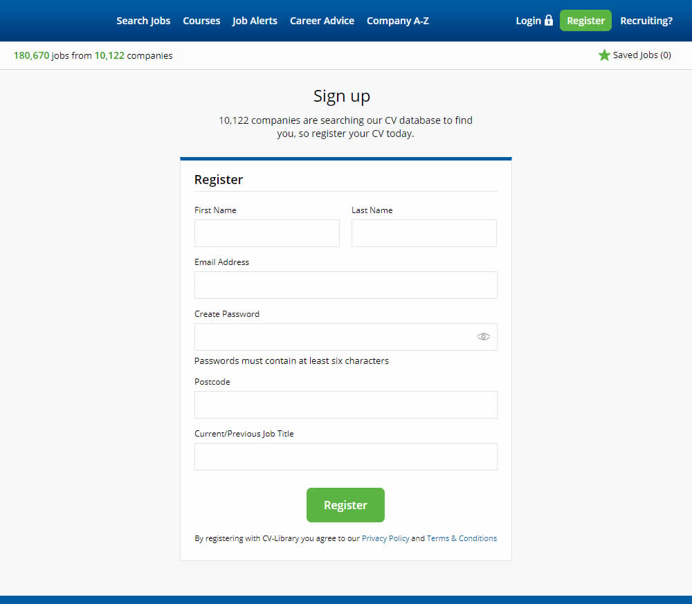
This experiment shows a comparison between floating-field labels vs top-aligned labels. Form labels first appeared inline and as users would begin typing, they floated to the top of the field. In the other version, fixed field labels were shown above the form fields at all times. Impact on signups was measured.
Test #338 on
Umbraco.com
by  Lars Skjold Iversen
Jan 29, 2021
Desktop
Mobile
Home & Landing
X.X%
Signups
Lars Tested Pattern #63: Trust Seals On Umbraco.com
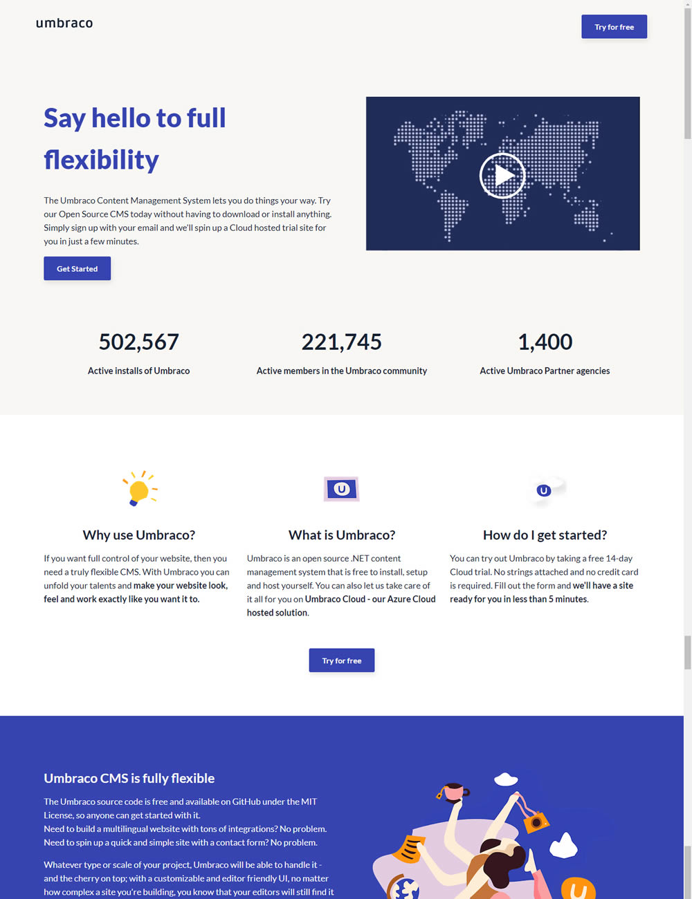
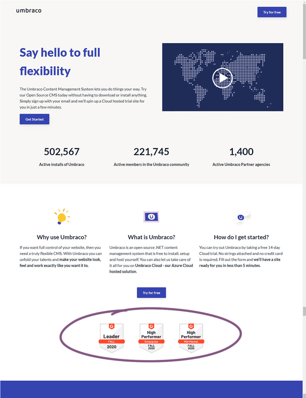
In this experiment, the variation added three G2 badges or awards. The intent was to measure the impact of this change on signups for Umbraco.
Test #330 on
Backstage.com
by  Stanley Zuo
Dec 29, 2020
Desktop
Content
X.X%
Signups
Stanley Tested Pattern #116: Links Or Buttons On Backstage.com
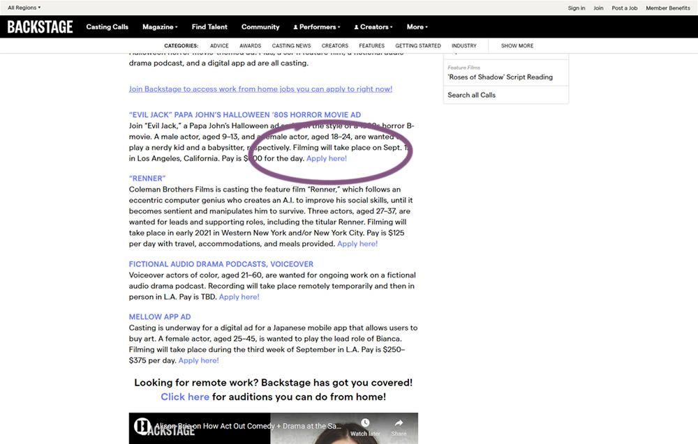
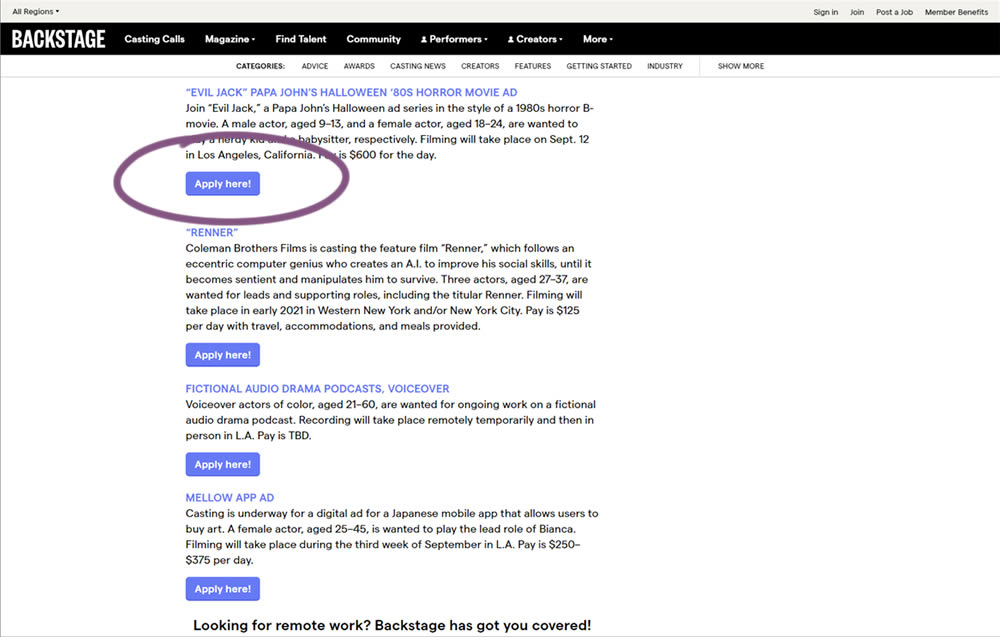
In this simple experiment on a content page, links were turned into more prominent buttons. The experiment measured clicks and signups.
Test #328 on
Umbraco.com
by  Lars Skjold Iversen
Dec 21, 2020
Desktop
Mobile
Home & Landing
X.X%
Signups
Lars Tested Pattern #60: Repeated Bottom Call To Action On Umbraco.com
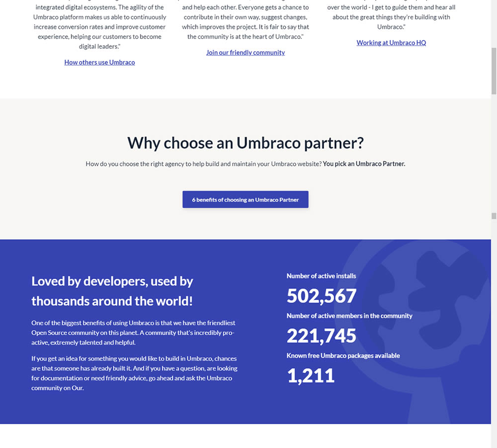
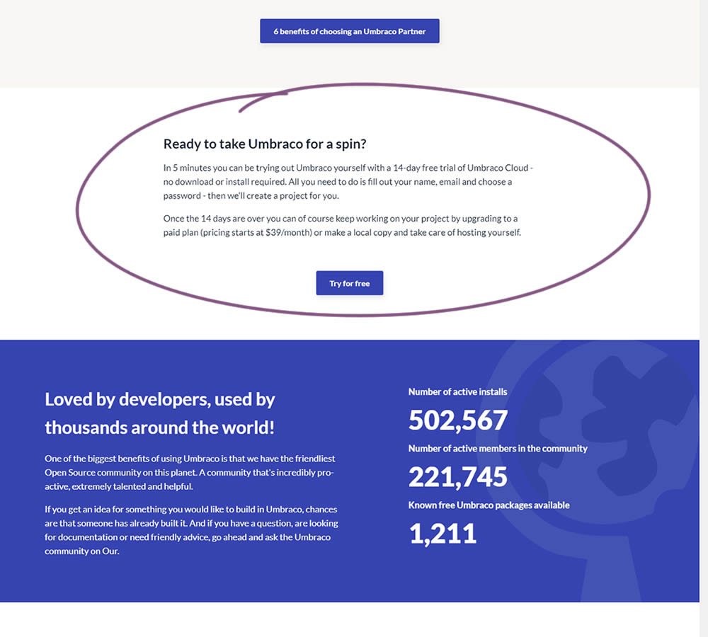
In this experiment, a trial signup section was added at the bottom of Umbraco's long homepage (CMS business). The experiment measured the impact on trial signups.
Test #327 on
Backstage.com
by  Stanley Zuo
Nov 26, 2020
Desktop
Signup
X.X%
Signups
Stanley Tested Pattern #120: Supporting Theme Images On Backstage.com
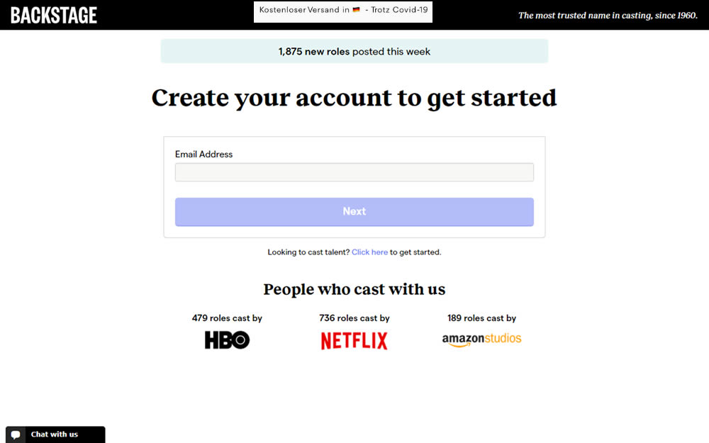
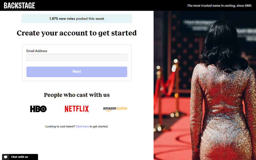
In this experiment, an aspirational photo was shown on the right side panel - reinforcing the theme of casting calls. The experiment measured progression to the next step and completed signups.
Test #323 on
Backstage.com
by  Stanley Zuo
Oct 29, 2020
Mobile
Signup
X.X%
Signups
Stanley Tested Pattern #117: Company Logos On Backstage.com
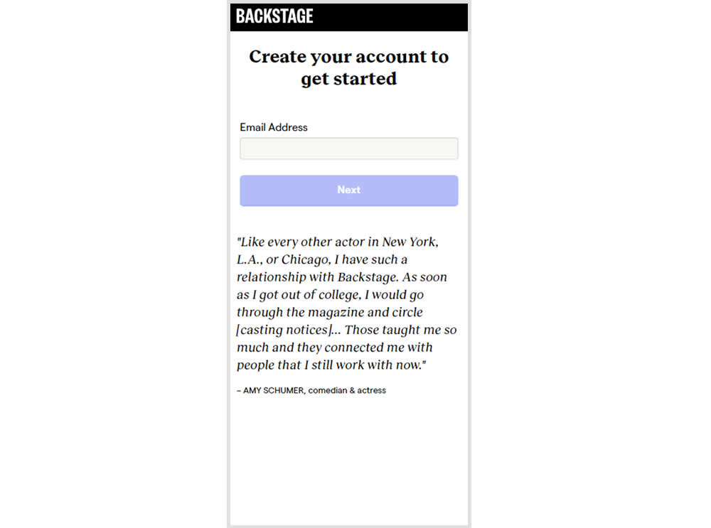
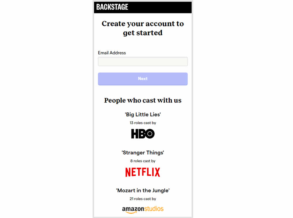
In this experiment, the variation replaced a text testimonial with high-profile production companies that have cast with Backstage. The logos were shown during the signup and checkout flow.
Test #322 on
Thomasnet.com
by  Kyle Phillips
Oct 27, 2020
Desktop
Mobile
Product
X.X%
Signups
Kyle Tested Pattern #82: Onboarding Callouts On Thomasnet.com
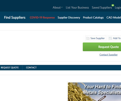
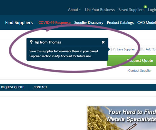
This experiment variation prompted users to save (bookmark) a company profile on a company detail page. Clicking on the save feature while logged out, would prompt a registration modal. Hence the save feature acted as an extra reason to signup. The number of people engaging or interacting with the feature was measured, as well as registrations.
Test #318 on
Thomasnet.com
by  Kyle Phillips
Sep 29, 2020
Desktop
Mobile
Content
X.X%
Signups
Kyle Tested Pattern #60: Repeated Bottom Call To Action On Thomasnet.com
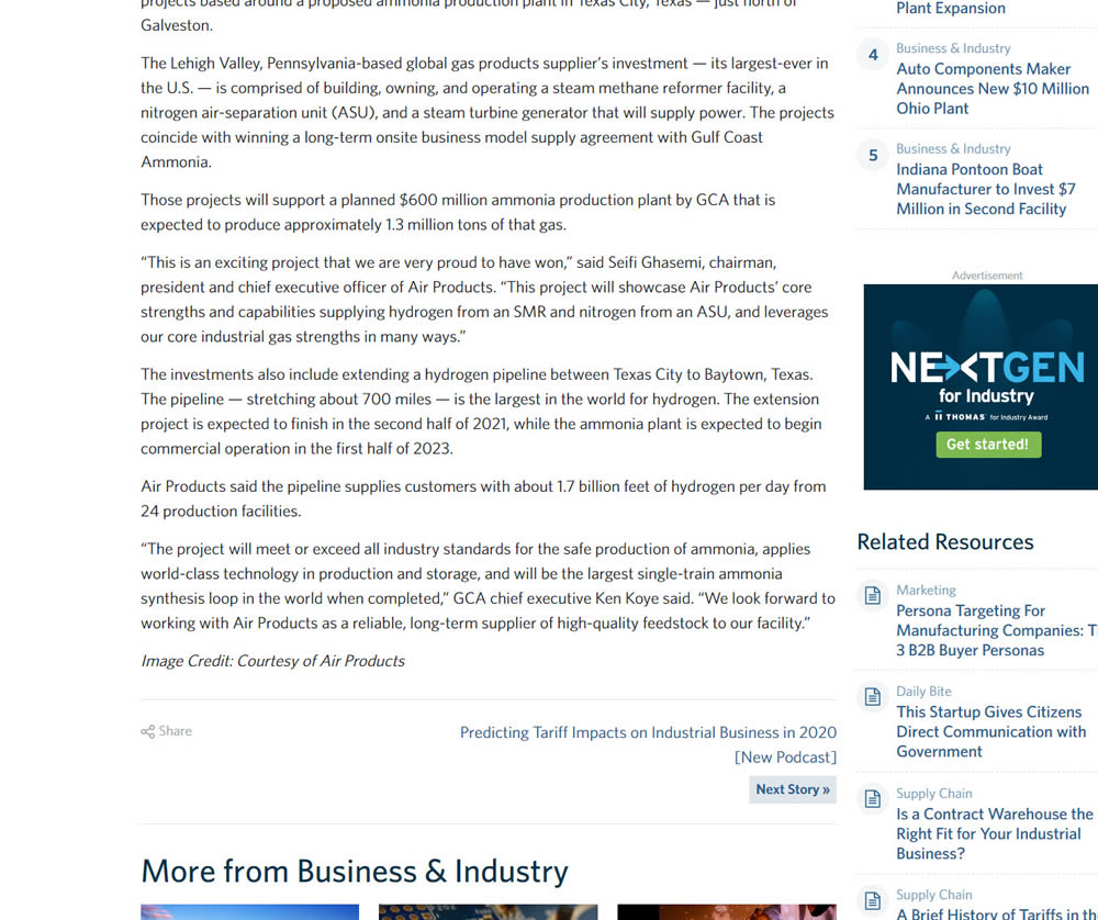
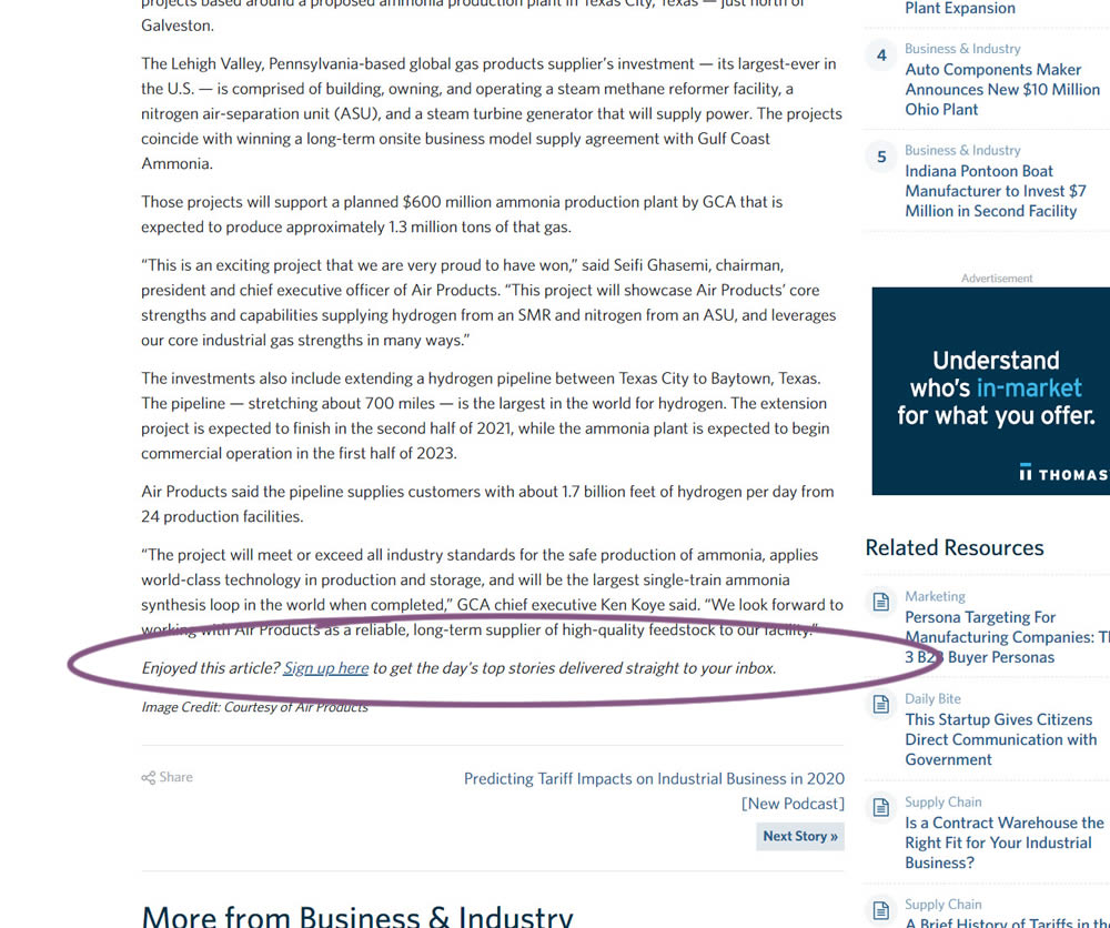
In this experiment, a simple link to a newsletter signup landing page was added at the bottom of an article. The newsletter landing page then encouraged users to provide their email address for future article updates.
Test #316 on
Trydesignlab.com
by  Daniel Shapiro
Sep 24, 2020
Desktop
Mobile
Home & Landing
X.X%
Signups
Daniel Tested Pattern #22: Empowering Headline On Trydesignlab.com


In this experiment, the headline was changed to focus more on the end-goal of the UX Academy program - that of landing your first UI/UX role.
Test #315 on
Backstage.com
by  Stanley Zuo
Aug 22, 2020
Mobile
Signup
X.X%
Signups
Stanley Tested Pattern #7: Social Counts On Backstage.com
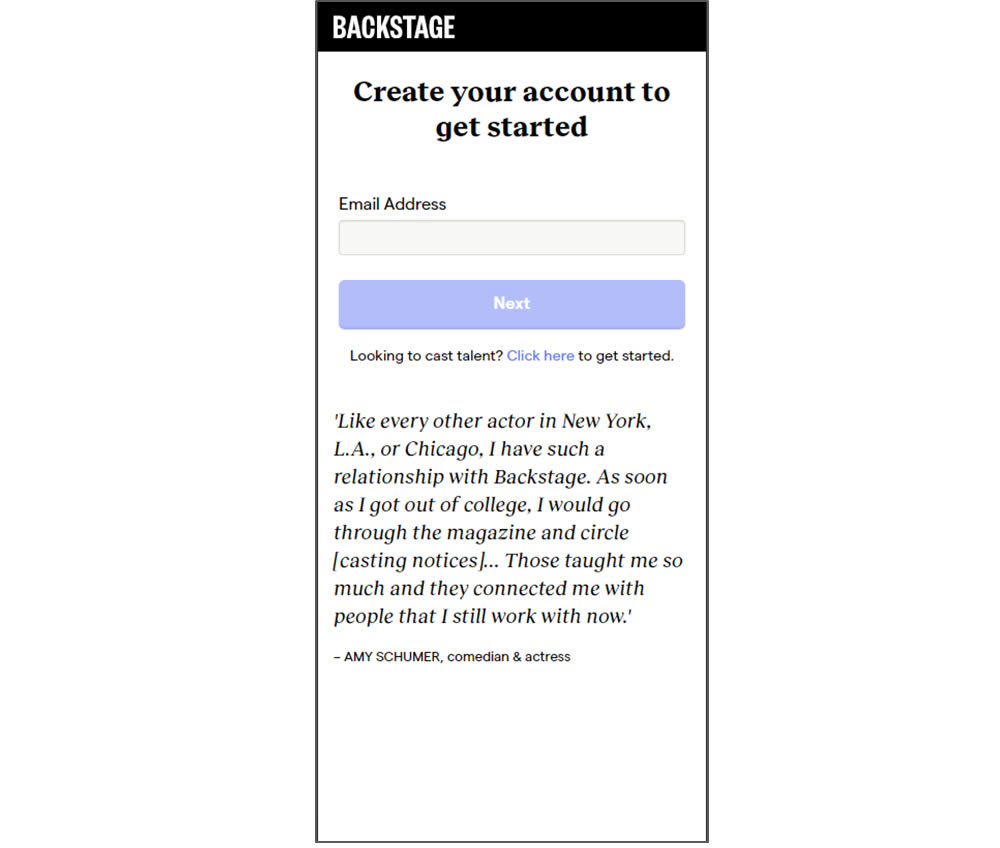
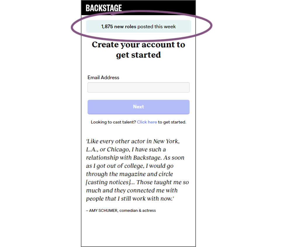
In this experiment, a dynamic number of job postings was displayed during the signup process - reinforcing the value of signing up for membership access.
Test #308 on
Umbraco.com
by  Lars Skjold Iversen
Jul 23, 2020
Desktop
Home & Landing
X.X%
Signups
Lars Tested Pattern #4: Testimonials On Umbraco.com
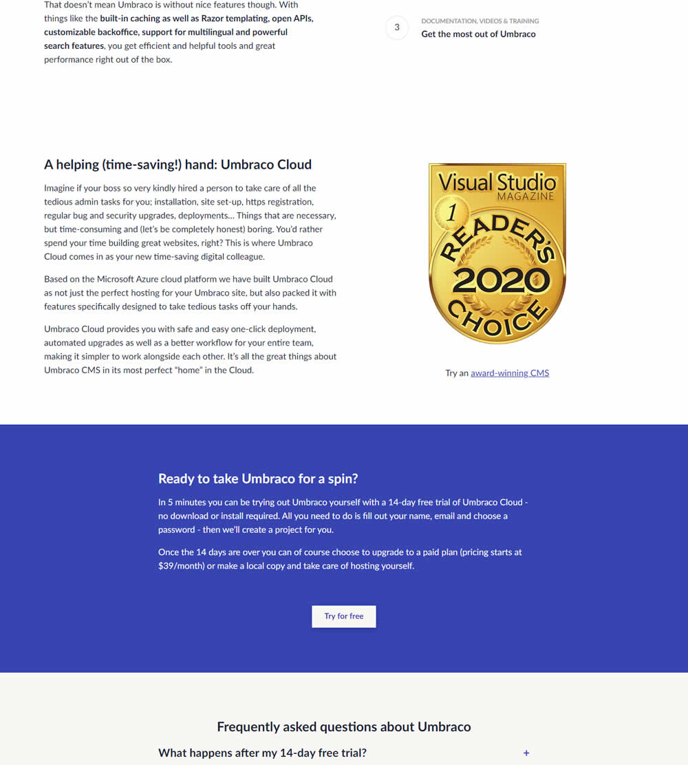
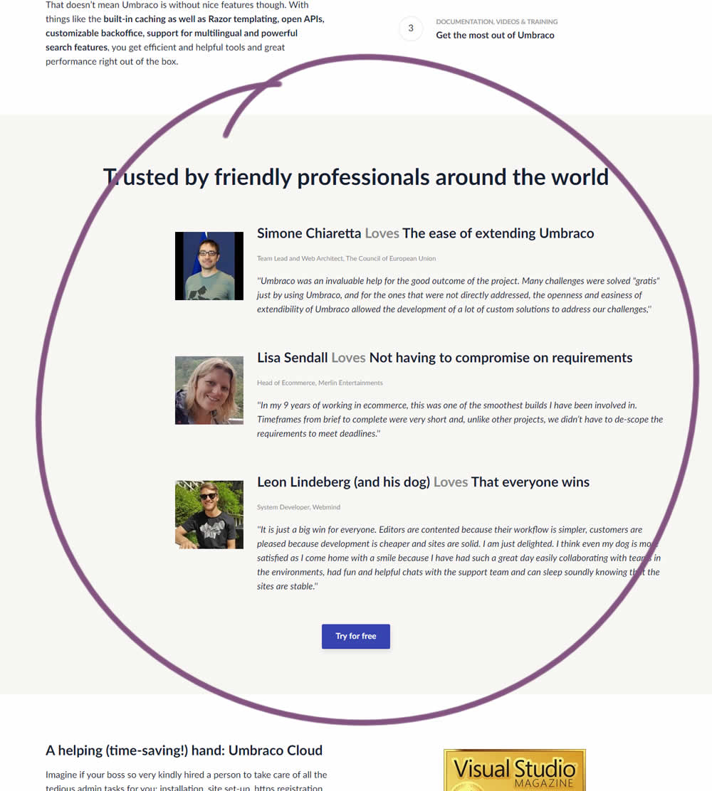
In this experiment, three testimonials were added mid way though on a CMS landing page. At the end of the customer testimonials an additional trial signup button was also added - which was also the primary metric.
Test #304 on
Backstage.com
by  Stanley Zuo
Jun 29, 2020
Mobile
Product
X.X%
Signups
Stanley Tested Pattern #97: Bigger Form Fields On Backstage.com
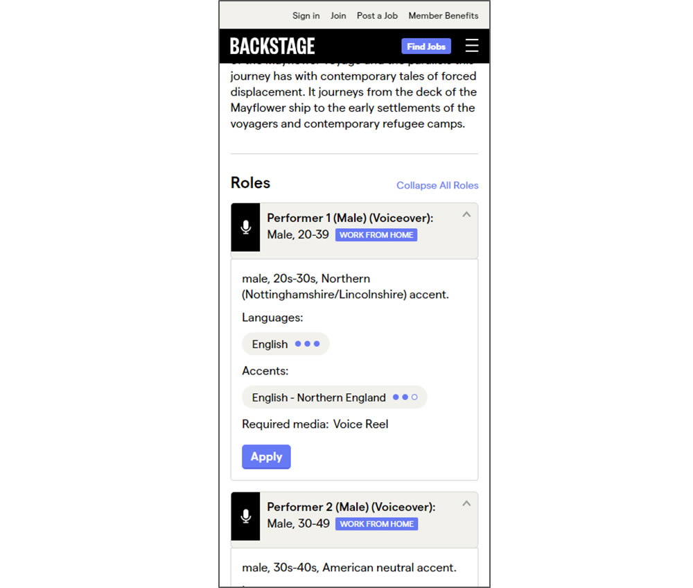
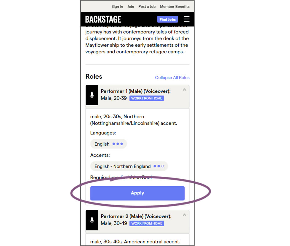
In this experiment, larger "Apply" buttons were shown on a casting detail page. The application funnel would take users through a series of steps leading to a paid membership subscription. The experiment measured initial progression and account signups (email signups).
Test #295 on
Thomasnet.com
by  Julian Gaviria
Apr 29, 2020
Desktop
Mobile
Content
X.X%
Signups
Julian Tested Pattern #25: Nagging Results On Thomasnet.com
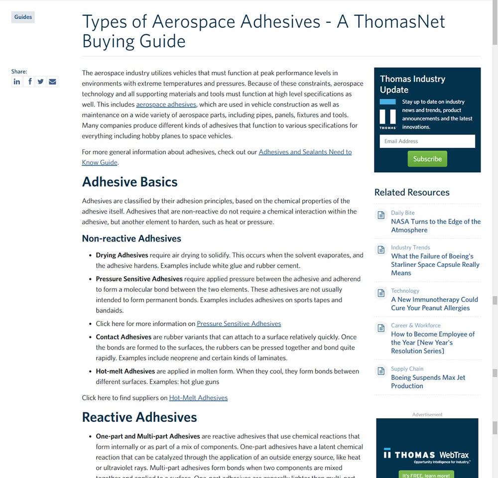
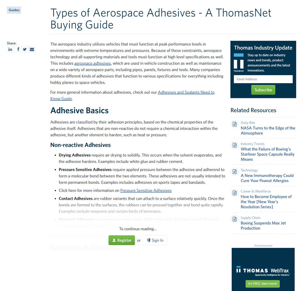
In this experiment, blog article pages were hidden behind a registration wall - requing a signup to access. The registration wall would appear after the first paragraph using gradual opacity to cover the rest of the article. We have published the effects of this change on registrations (signups) and on engagement (users viewing other more important company detail pages).
Test #291 on
Elevate App
by  Jesse Germinario
Mar 30, 2020
Mobile
Signup
X.X%
Signups
Jesse Tested Pattern #91: Forced Action
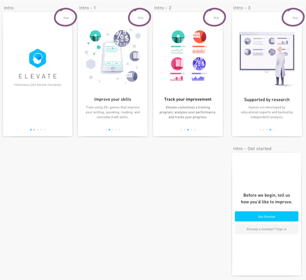
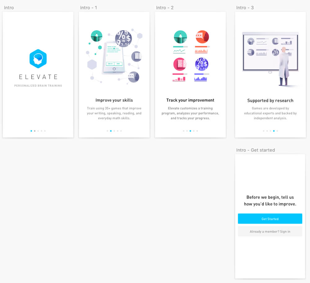
This experiment was ran on the initial onboarding screens of the Elevate App - right after installing and launching the app for the first time. The change was the removal of subtle "skip" links that fast tracked users to the signup/login screen (Get Started). Hence in the variation, all users had to scroll through the 4 introductory messages before being asked to create an account.