All Latest 615 A/B Tests
Become a member to unlock the abiltiy to see the highest impact a/b tests. Being able to see the actual test results and sort by impact allows growth and experimentation teams to take action on the biggest gains first
MOST RECENT TESTS
Test #308 on
Umbraco.com
by  Lars Skjold Iversen
Jul 23, 2020
Desktop
Home & Landing
Lars Tested Pattern #4: Testimonials On Umbraco.com
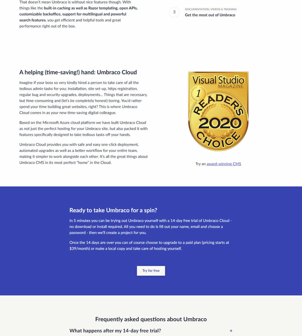
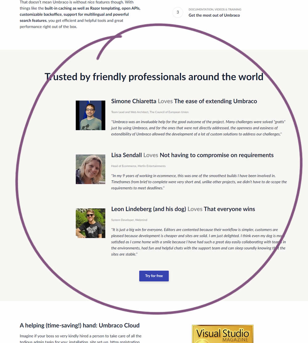
In this experiment, three testimonials were added mid way though on a CMS landing page. At the end of the customer testimonials an additional trial signup button was also added - which was also the primary metric.
Test #307 on
Volders.de
by Michal Fiech
Jul 17, 2020
Desktop
Thank You
Michal Tested Pattern #77: Filled Or Ghost Buttons On Volders.de
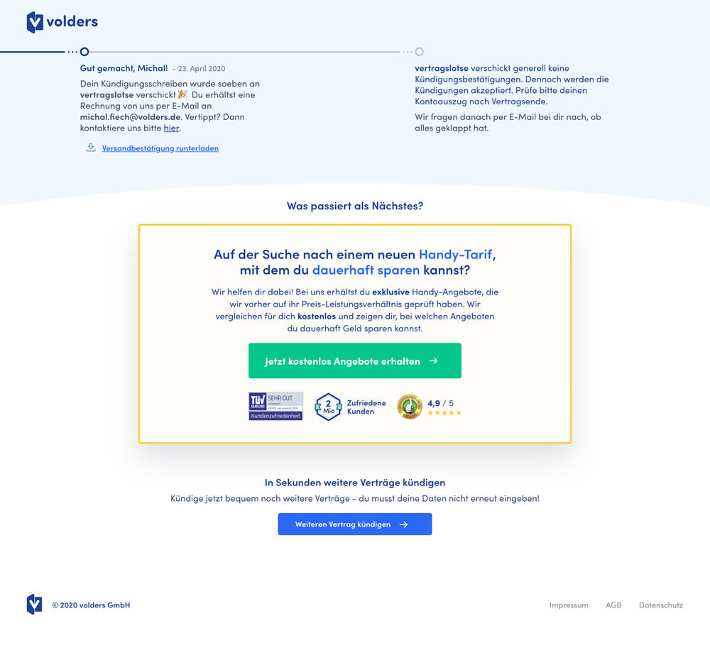
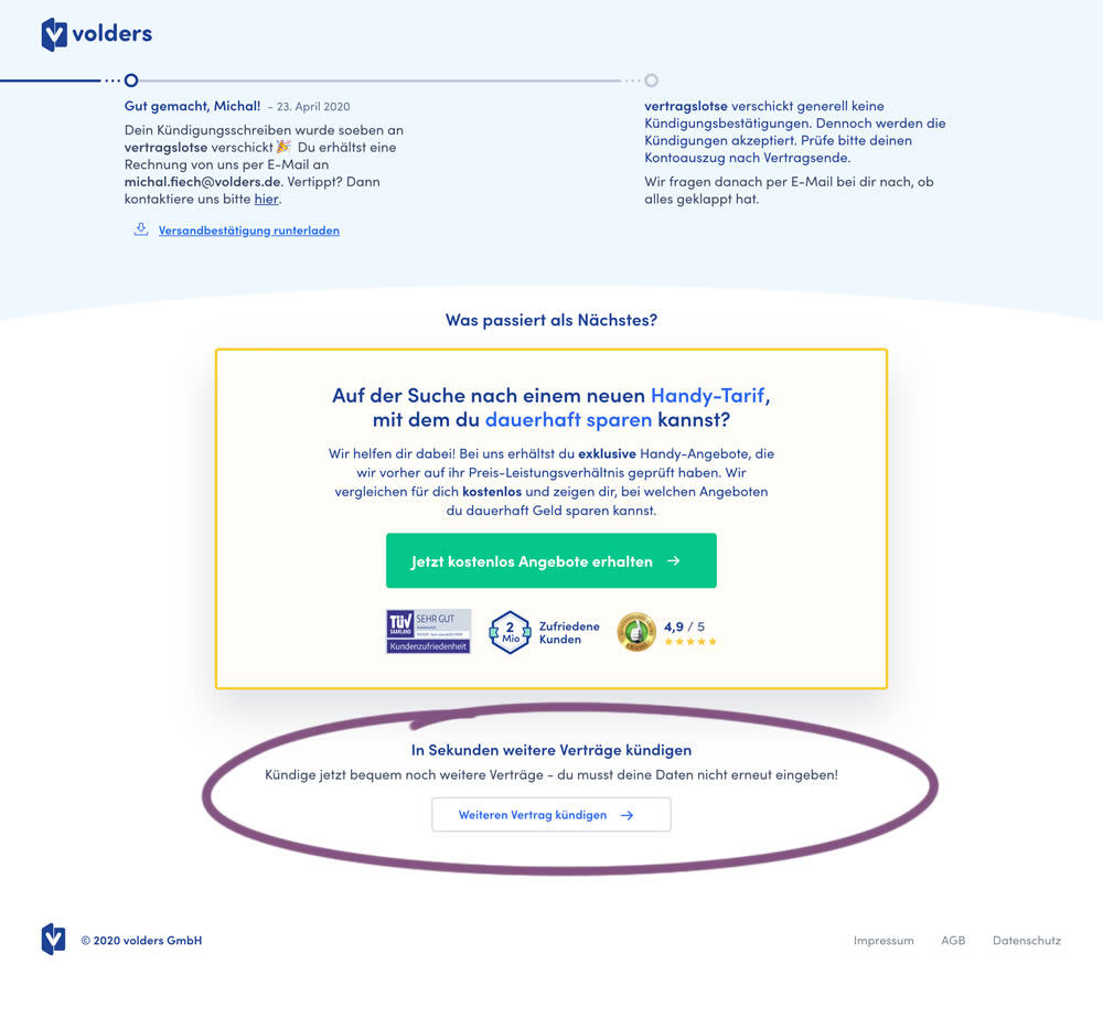
This experiment measured a shallow click goal on a button that would encourage to repeated the action that was just completed (in this case a contract cancellation). In the control version (A) a thank-you screen shows a filled button style, and the variant (B) there was a ghost button. As a note, I also flipped the A-B in this experiment for the purpose of matching it to our ghost button pattern, which means that Volders in fact was starting out with a ghost button to begin with.
Test #306 on
Backstage.com
by  Stanley Zuo
Jul 09, 2020
Desktop
Mobile
Pricing
Stanley Tested Pattern #69: Autodiscounting On Backstage.com
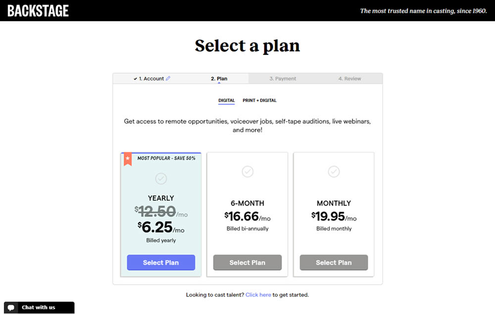
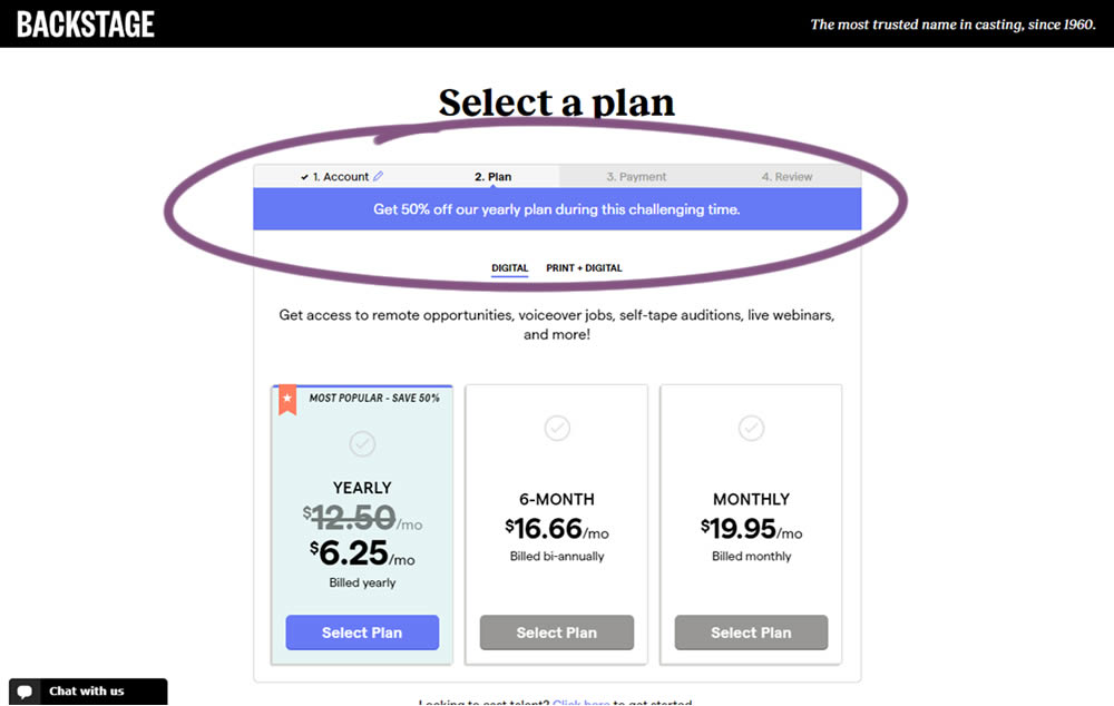
In this experiment, the only change was an added message at the top of the pricing screen, clarifying that there is an active discount on a yearly plan. The discount was already communicated with a strike-through price on the control version as well. The variation simply emphasized this aggressively.
Test #305 on
Volders.de
by Michal Fiech
Jun 30, 2020
Mobile
Desktop
Home & Landing
Michal Tested Pattern #94: Visible Search On Volders.de
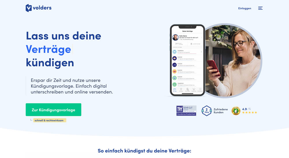
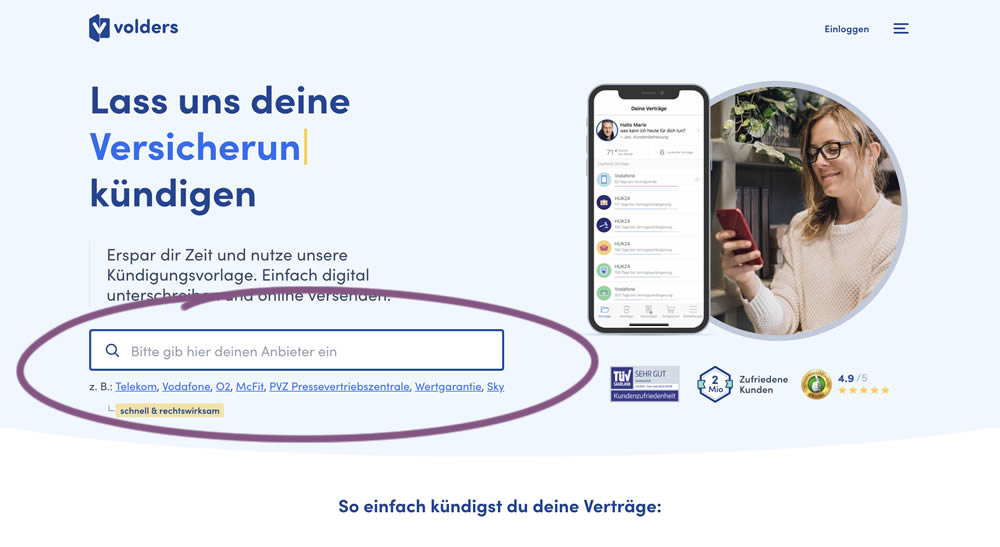
In this experiment, a search input field (to look for companies) along with most popular links (also company names) were displayed on the homepage of a leading contract cancellation service. The control (A) version instead had a button that sent users to a next page where the same selection could be made - only later. The measurable success criteria were the number of paid cancellations - a few steps down the funnel.
Test #304 on
Backstage.com
by  Stanley Zuo
Jun 29, 2020
Mobile
Product
Stanley Tested Pattern #97: Bigger Form Fields On Backstage.com
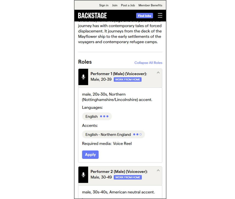
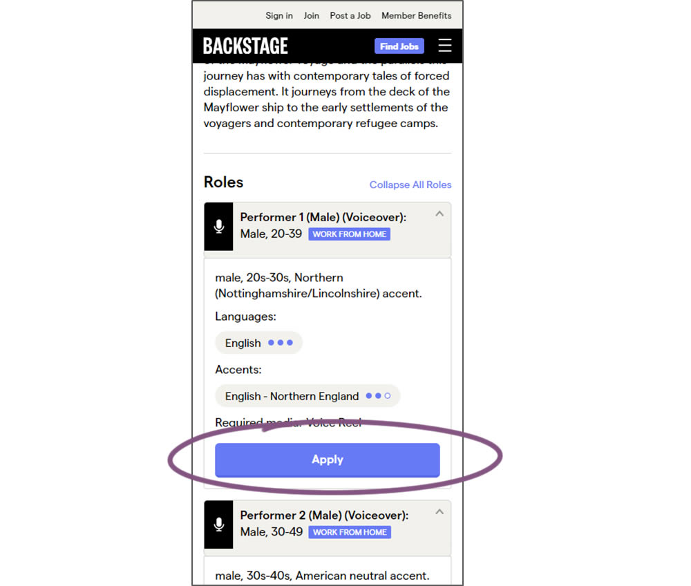
In this experiment, larger "Apply" buttons were shown on a casting detail page. The application funnel would take users through a series of steps leading to a paid membership subscription. The experiment measured initial progression and account signups (email signups).
Test #300 on
Volders.de
by Michal Fiech
May 25, 2020
Desktop
Mobile
Signup
Michal Tested Pattern #3: Fewer Form Fields On Volders.de
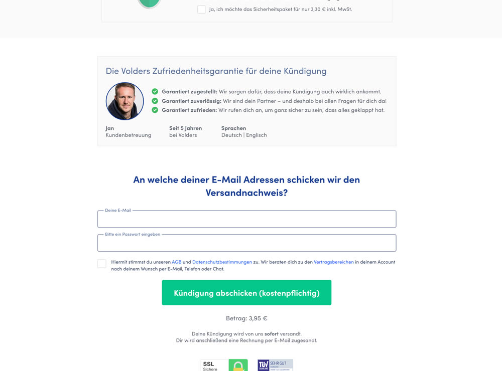
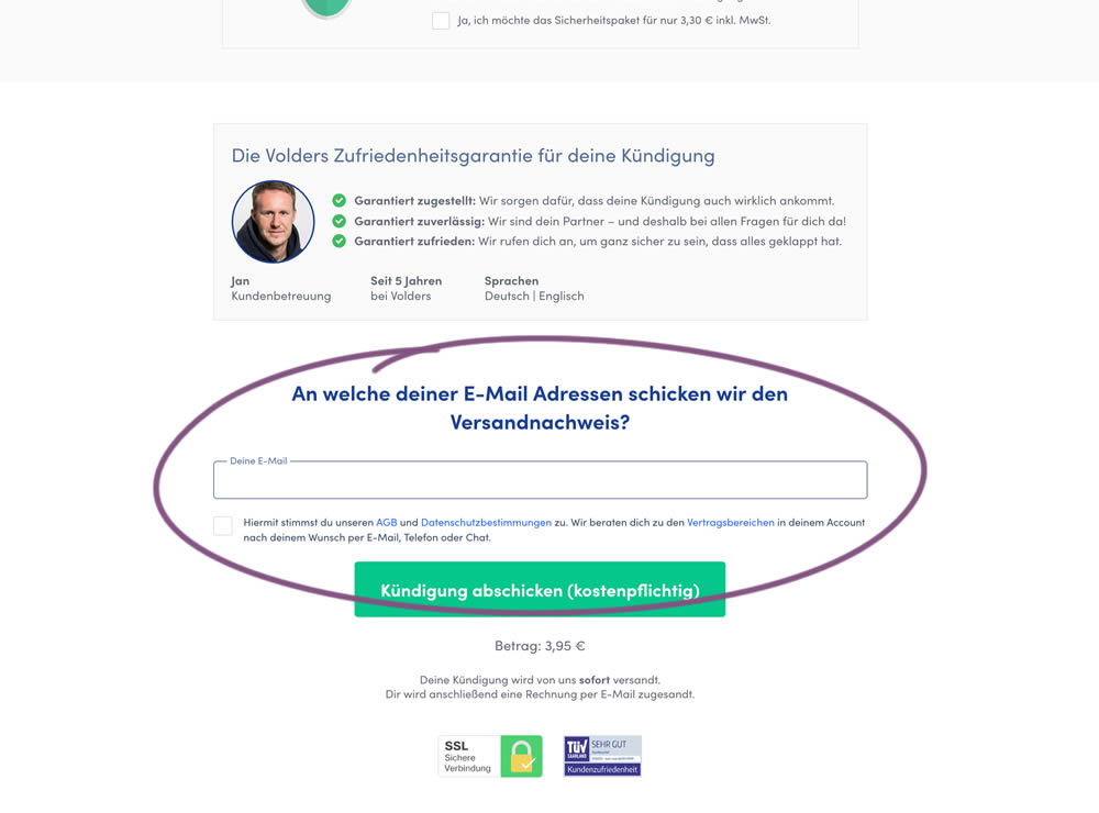
In this experiment, a password field was removed on a contract cancellation form (Volders).
In the control version, users were required to enter their email address and a password. If the email address was associated with an existing account, then the password was used to authenticate the user (and validated). When users entered a new email address, then the password field was used to create a new account.
In the variation, the password field was removed, as the authentication happened after the conversion itself using other backend mechanisms.
Test #299 on
Backstage.com
by  Stanley Zuo
May 22, 2020
Desktop
Mobile
Listing
Stanley Tested Pattern #60: Repeated Bottom Call To Action On Backstage.com
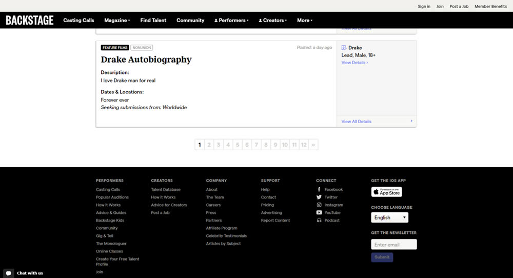
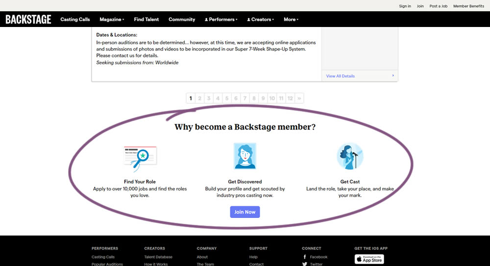
In this experiment, at the bottom of a search results screen, a membership join button was added along with 3 encouraging reasons. The experiment measured membership funnel starts, as well as paid membership transactions (sales).
Test #297 on
Trydesignlab.com
by  Daniel Shapiro
May 04, 2020
Desktop
Home & Landing
Daniel Tested Pattern #41: Sticky Call To Action On Trydesignlab.com

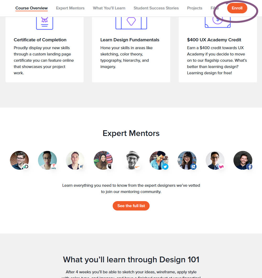
In this experiment, a sticky "Enroll" button was shown on a course landing page. The button lead to a payment funnel to allow enrolling/paying for a course. The exeperiment measured inital progression into this funnel as well as the deeper completed sales metric.
Test #296 on
Backstage.com
by  Stanley Zuo
Apr 30, 2020
Mobile
Content
Stanley Tested Pattern #23: Inline Link Nudge On Backstage.com
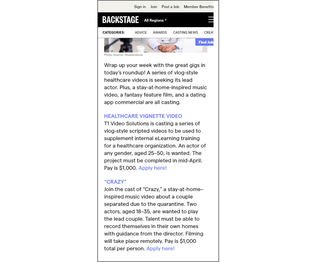
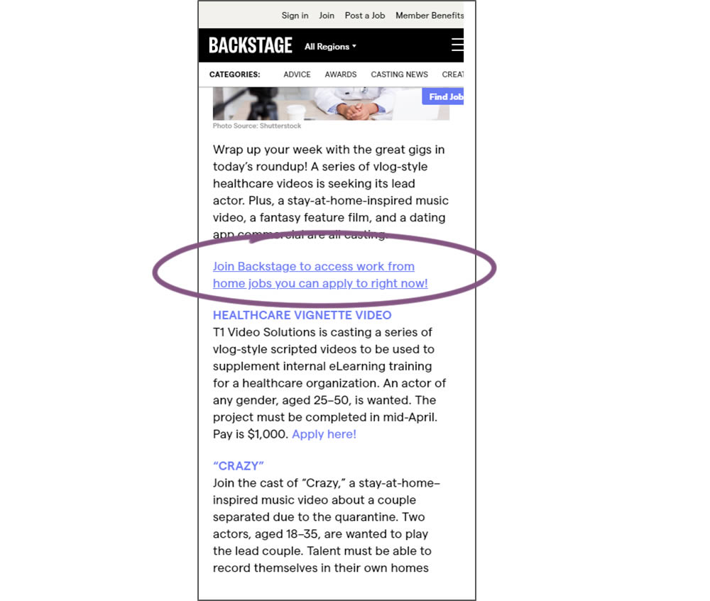
In this simple experiment, a text link to a join page was injected on an article page. The hypothesis was that more users would signup as a result of this subtle trigger.
Test #294 on
Umbraco.com
by  Lars Skjold Iversen
Apr 23, 2020
Desktop
Pricing
Lars Tested Pattern #115: Pricing Comparison Table On Umbraco.com
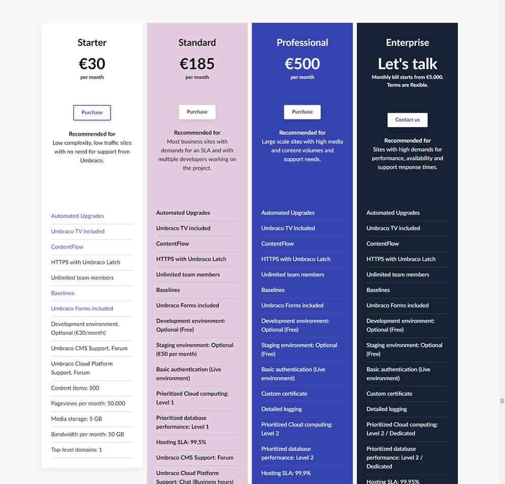
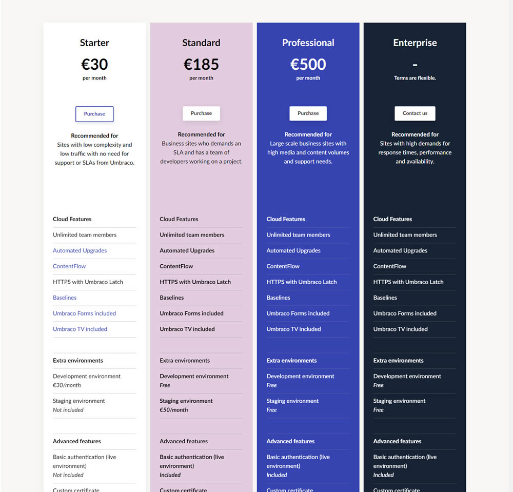
In this experiment, plan properties on a pricing page were horizontally aligned (for easier comparison). More so, labels and values were also broken on separate lines.
Test #293 on
Backstage.com
by  Stanley Zuo
Apr 14, 2020
Desktop
Mobile
Product
Stanley Tested Pattern #114: Less Or More Visible Prices On Backstage.com
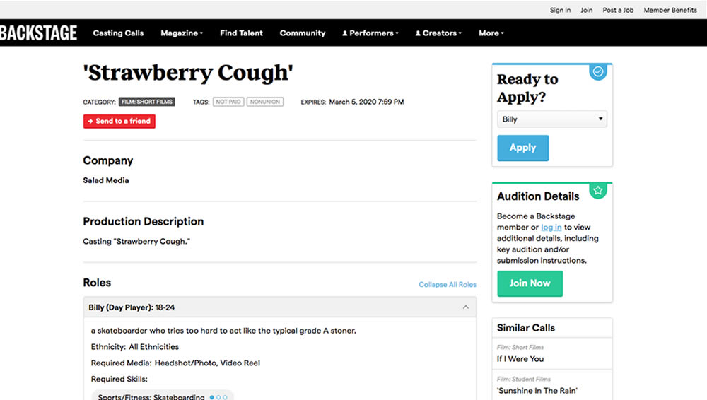
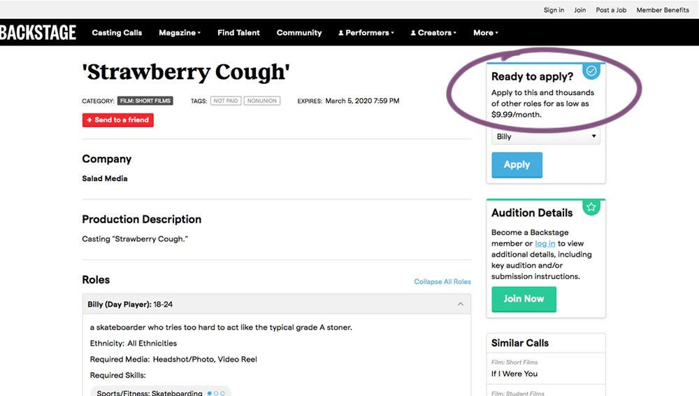
In this experiment on a casting call site, pricing information was shown beside the application button. This change shows the effect of setting a price expectation and being more clear that the application process is not free.
Test #292 on
Backstage.com
by  Stanley Zuo
Apr 13, 2020
Desktop
Mobile
Listing
Stanley Tested Pattern #24: Visible Availability On Backstage.com
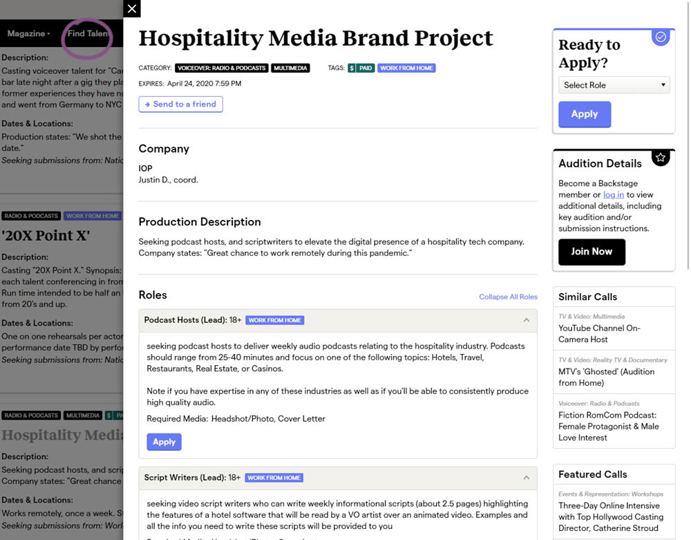
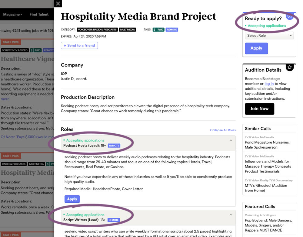
The core hypothesis of this experiment was that by showing clear availability (in green text) beside each casting call, more users would apply and become premium members. The experiment reports on two metrics: application starts (the first progression metric), and premium membership sales (measured a few steps further in the funnel).
Test #288 on
Kenhub.com
by  Niels Hapke
Mar 05, 2020
Desktop
Mobile
Home & Landing
Niels Tested Pattern #117: Company Logos On Kenhub.com
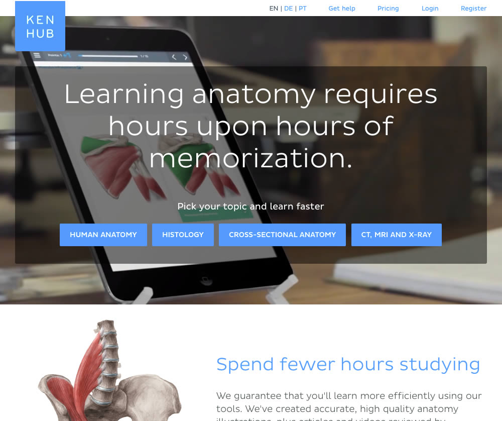
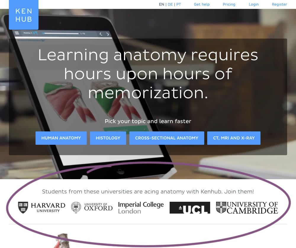
In this experiment, customer logos (of universities attended by students using Kenhub) were placed on a homepage. The experiment tested for the effect on registration visits, and premium subscription starts.
Test #287 on
Goodui.org
by  Jakub Linowski
Mar 04, 2020
Desktop
Mobile
Pricing
Jakub Tested Pattern #117: Company Logos On Goodui.org
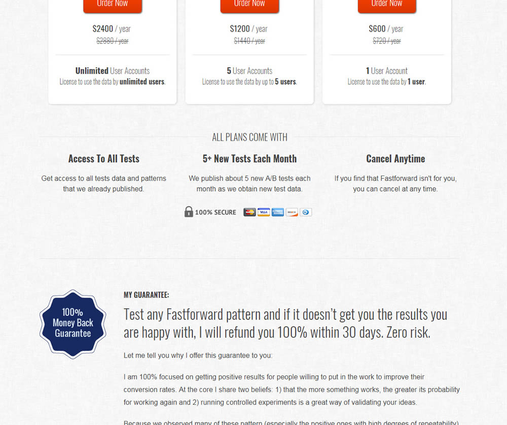
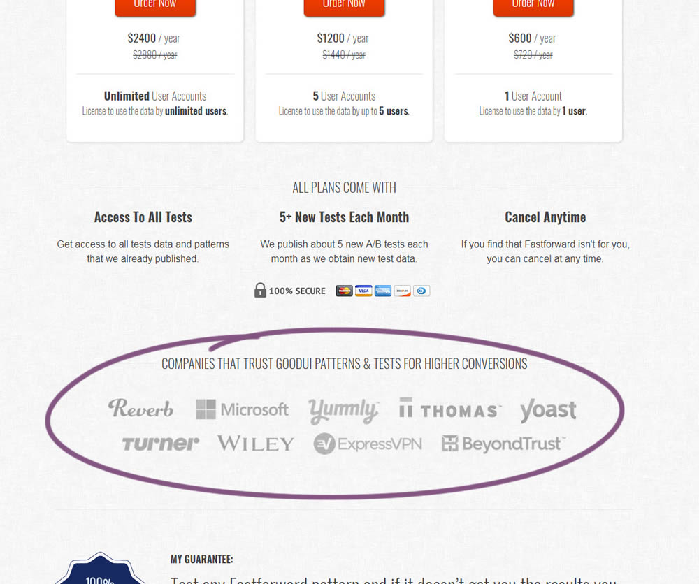
In this experiment, a handful of customers and contributors from GoodUI were added on a pricing page to test the effect on sales.
Test #286 on
Volders.de
by  Alexander Krieger
Feb 28, 2020
Desktop
Mobile
Home & Landing
Alexander Tested Pattern #9: Multiple Steps On Volders.de
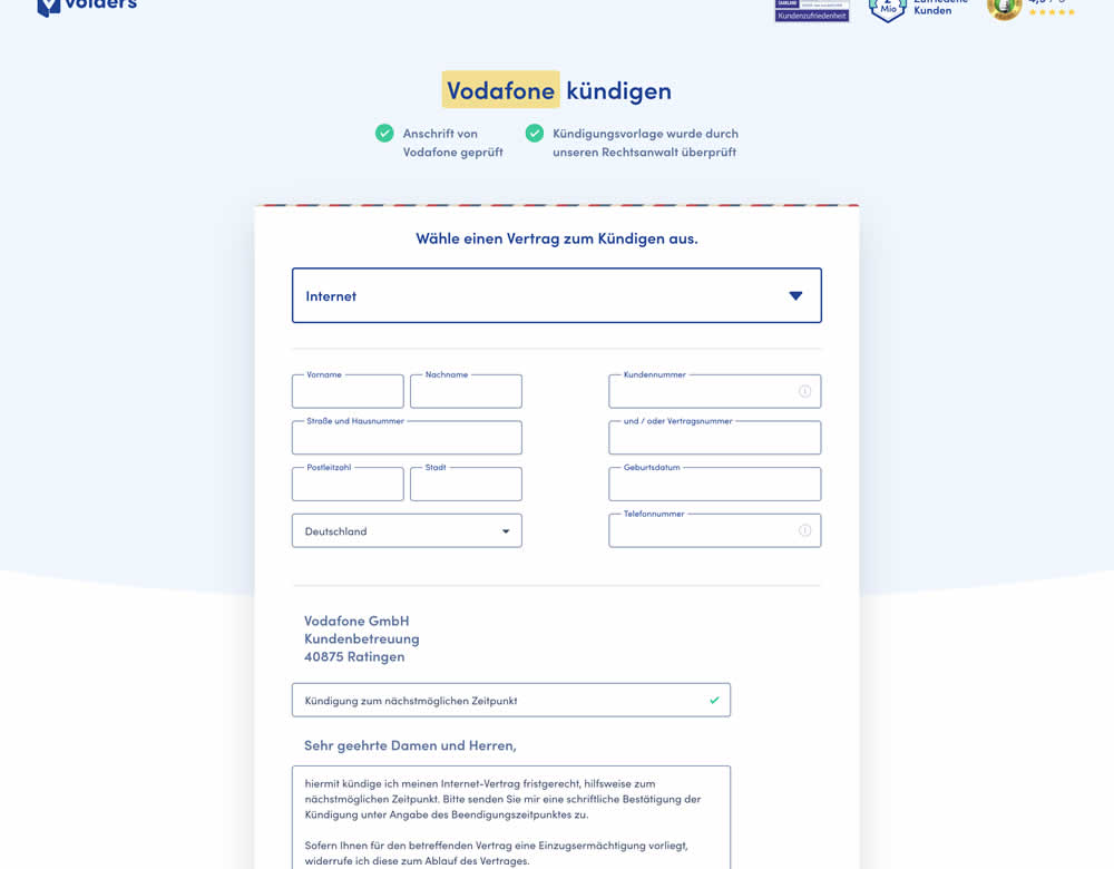
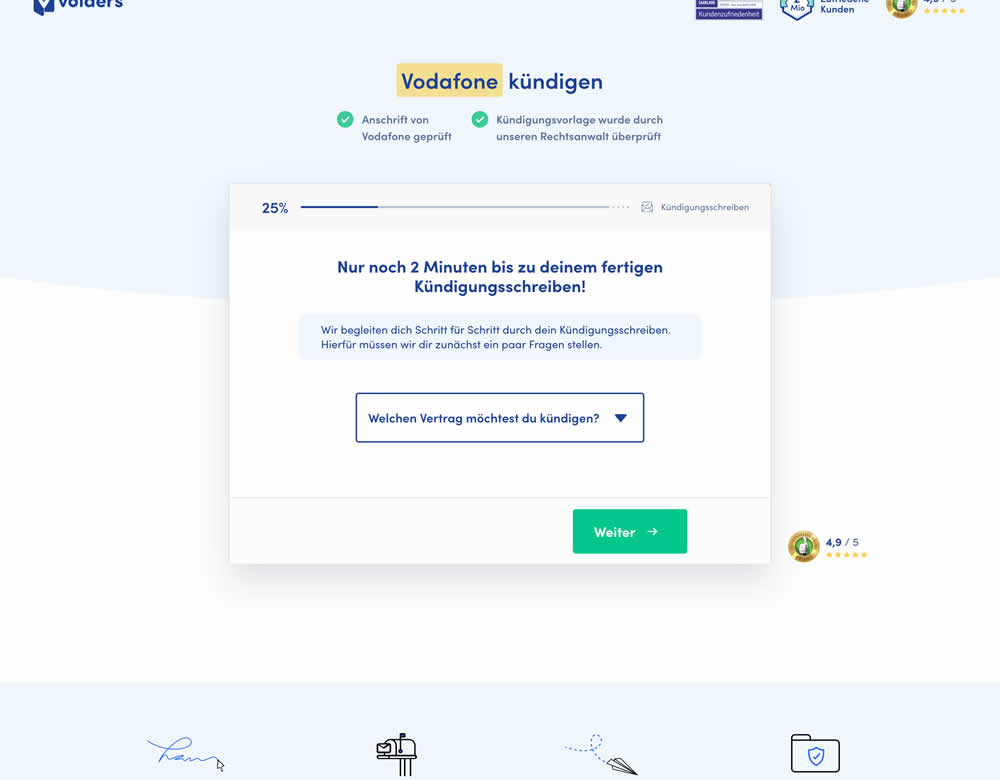
In this experiment, a long contract cancellation landing page (control) was broken down into 4 steps with 1 final summary step (variation).
Test #285 on
Ibood.com
by  Lukas Jorissen
Feb 27, 2020
Desktop
Product
Lukas Tested Pattern #7: Social Counts On Ibood.com
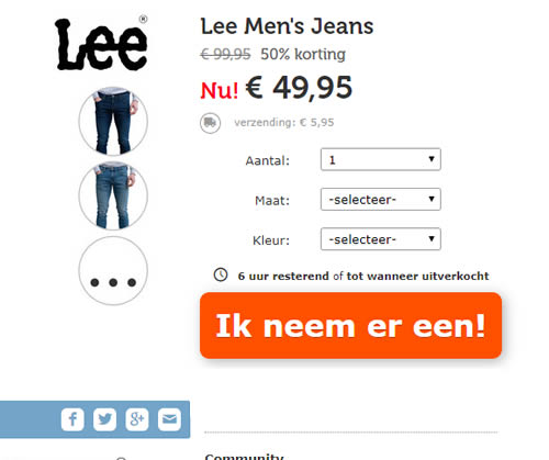
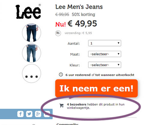
In this experiment, realtime social proof information has been added below an add-to-cart button. The variation shows how many users that have viewed, or placed a product into their basket. Translated to "4 visitors have this product in their shopping cart."
Test #284 on
Thomasnet.com
by  Julian Gaviria
Feb 19, 2020
Desktop
Mobile
Listing
Julian Tested Pattern #78: Tags, Badges And Structured Information On Thomasnet.com
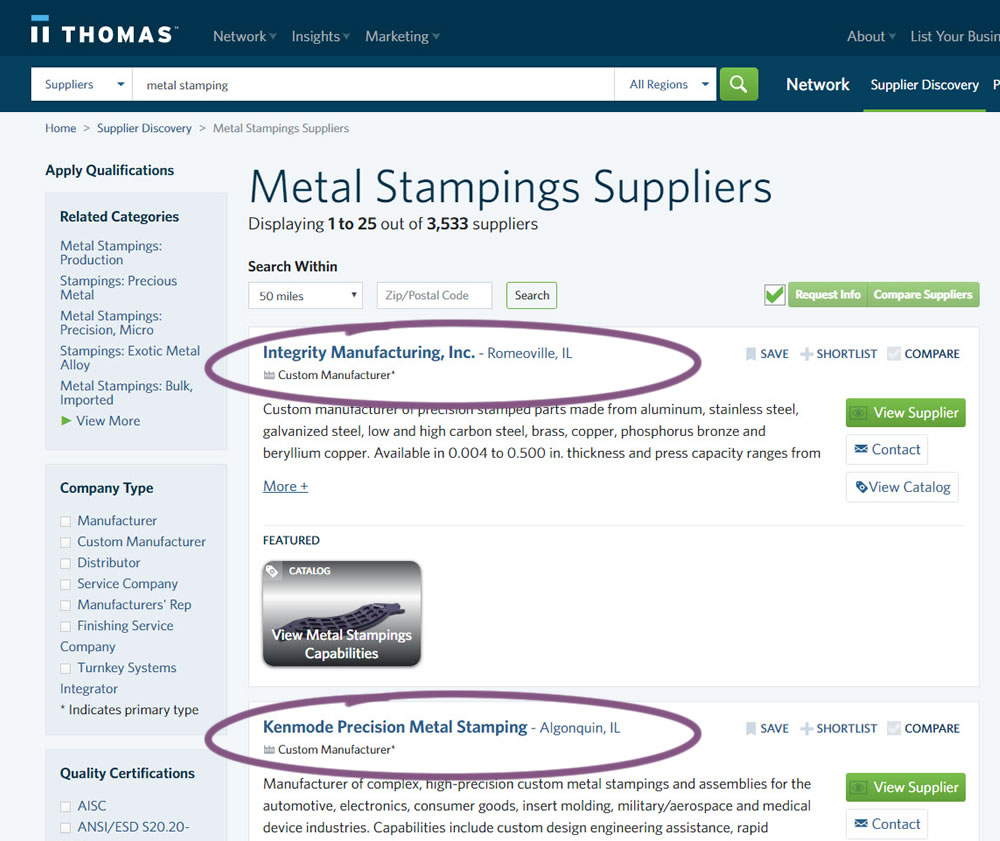
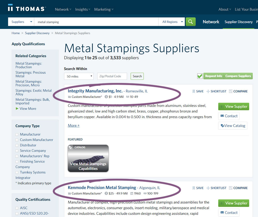
In this experiment, structured data tags were displayed on a listing page to help potential buyers make better decisions. The additional information about the listed companies included: annual revenue, employee count, and year of establishment.
Test #282 on
Thomasnet.com
by  Julian Gaviria
Feb 07, 2020
Desktop
Mobile
Listing
Julian Tested Pattern #51: Shortcut Buttons On Thomasnet.com
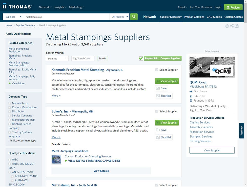
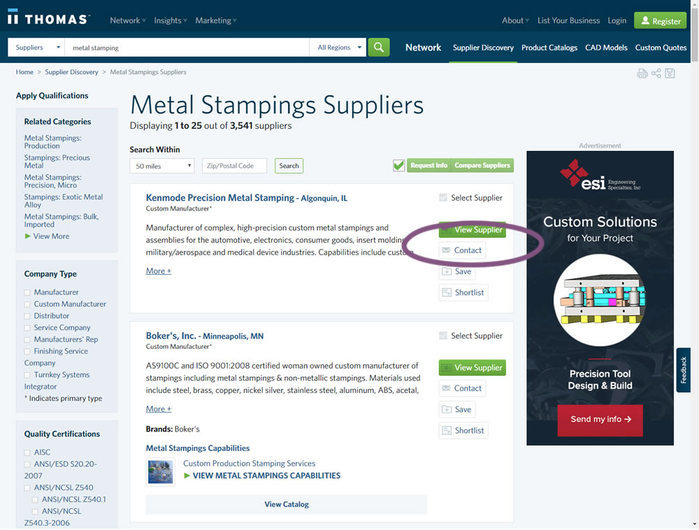
In this experiment, a contact button was added to a listing / search results page to make it faster to contact a company. This same button was also visible on the company detail page.
Test #281 on
Backstage.com
by  Stanley Zuo
Jan 31, 2020
Desktop
Listing
Stanley Tested Pattern #116: Links Or Buttons On Backstage.com
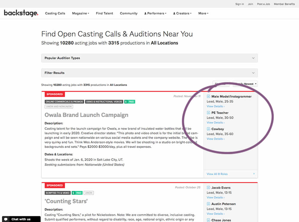
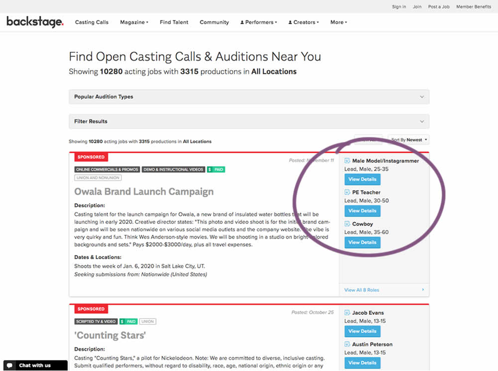
In this experiment, multiple view detail links for a listing tile were turned into higher contrast buttons.
Test #280 on
Volders.de
by  Alexander Krieger
Jan 24, 2020
Desktop
Mobile
Signup
Alexander Tested Pattern #3: Fewer Form Fields On Volders.de
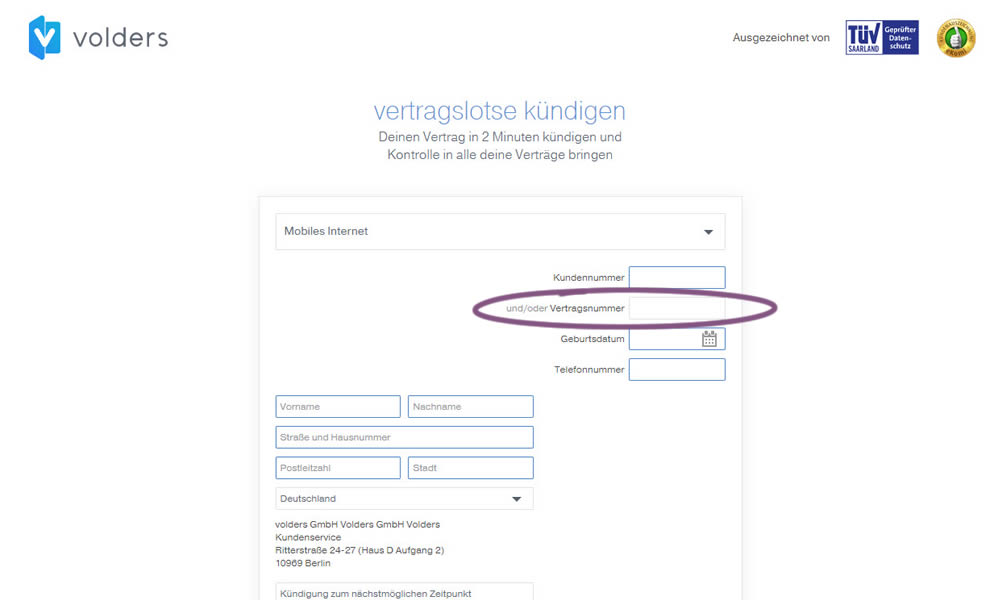
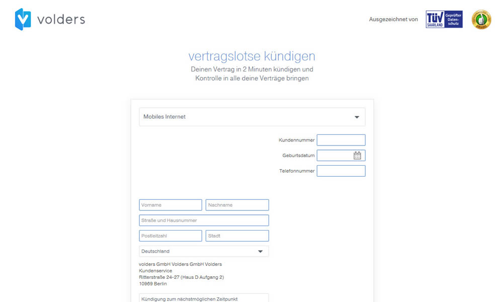
In this experiment on a contract cancellation funnel, one field was removed - a secondary contract ID. The control and variation both had a primary "customer ID" with which to identify and cancel someone's contract with.