All Latest 516 A/B Tests
Become a member to unlock the abiltiy to see the highest impact a/b tests. Being able to see the actual test results and sort by impact allows growth and experimentation teams to take action on the biggest gains first
MOST RECENT TESTS
Test #538 on
Volders.de
by
 Daria Kurchinskaia
Jun 20, 2024
Desktop
Mobile
Checkout
Daria Kurchinskaia Tested Pattern #77: Filled Or Ghost Buttons In Test #538 On Volders.de
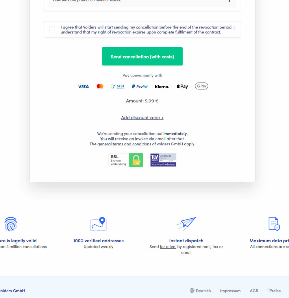
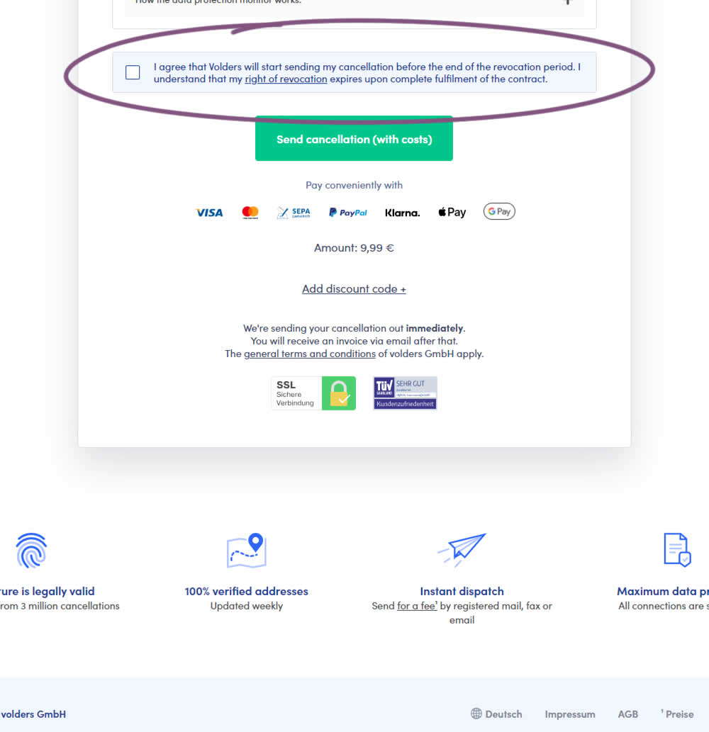
In this experiment, a less visible (ghost button style) legal confirmation box, was tested against a more visible one (filled state with higher contrast). Impact on error rates (from submitting an incomplete form) and sales was measured.
Test #536 on
by
 Jakub Linowski
Jun 14, 2024
Desktop
Mobile
Checkout
Jakub Linowski Tested Pattern #28: Easiest Fields First In Test #536
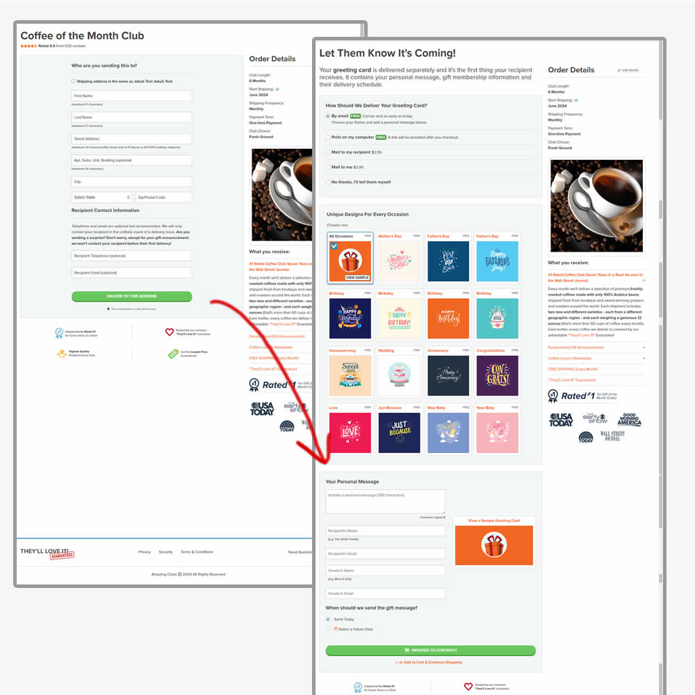

In this experiment, the order of the checkout flow was rearranged. In the control the first step of the checkout flow started with the shipping information step, followed by greeting card selection. In the variation this was rearranged (hypothesis was that the greeting card step was easier). Impact on sales was measured.
Test #531 on
Aboalarm.de
by
 Katharina Lay
May 03, 2024
Desktop
Mobile
Checkout
Katharina Lay Tested Pattern #128: Standard Or Superscript Price Format In Test #531 On Aboalarm.de
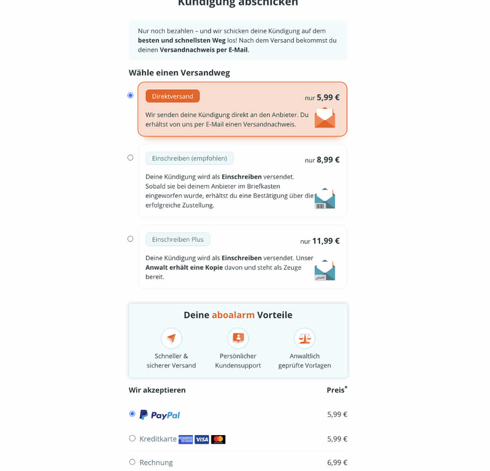
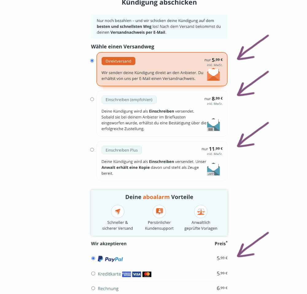
In this experiment, the font of the euro cents amount was made smaller. Additional copy was also added underneath the price reinforcing that tax was already included in the price. Impact on transactions was measured.
Test #519 on
Volders.de
by
 Katharina Lay
Feb 23, 2024
Desktop
Mobile
Checkout
Katharina Lay Tested Pattern #134: Optional or Confident Recommendation In Test #519 On Volders.de
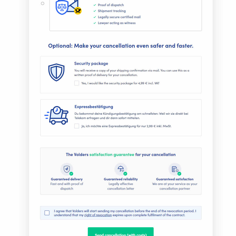
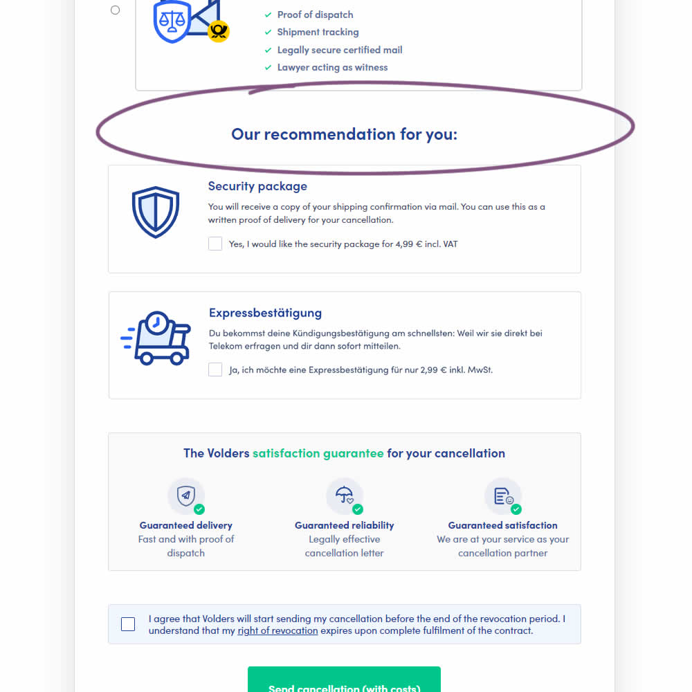
In this experiment, copy around an upsell was changed from using "optional" to "our recommendation for you". The idea was to recommend two upsells with more confidence. Impact on the two upsells (secure, and express) as well as overall transactions was measured.
Test #518 on
by
 Jakub Linowski
Feb 14, 2024
Mobile
Checkout
Jakub Linowski Tested Pattern #64: Tunnel In Test #518
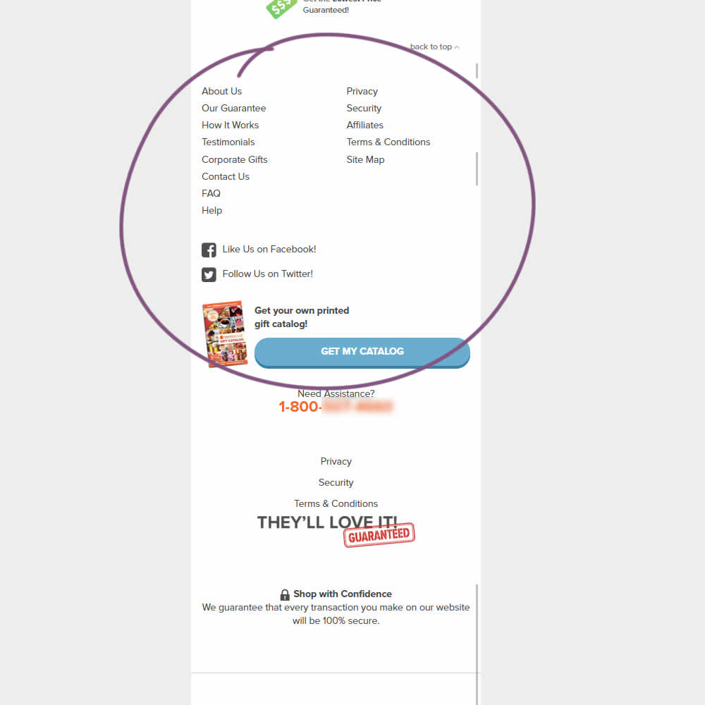
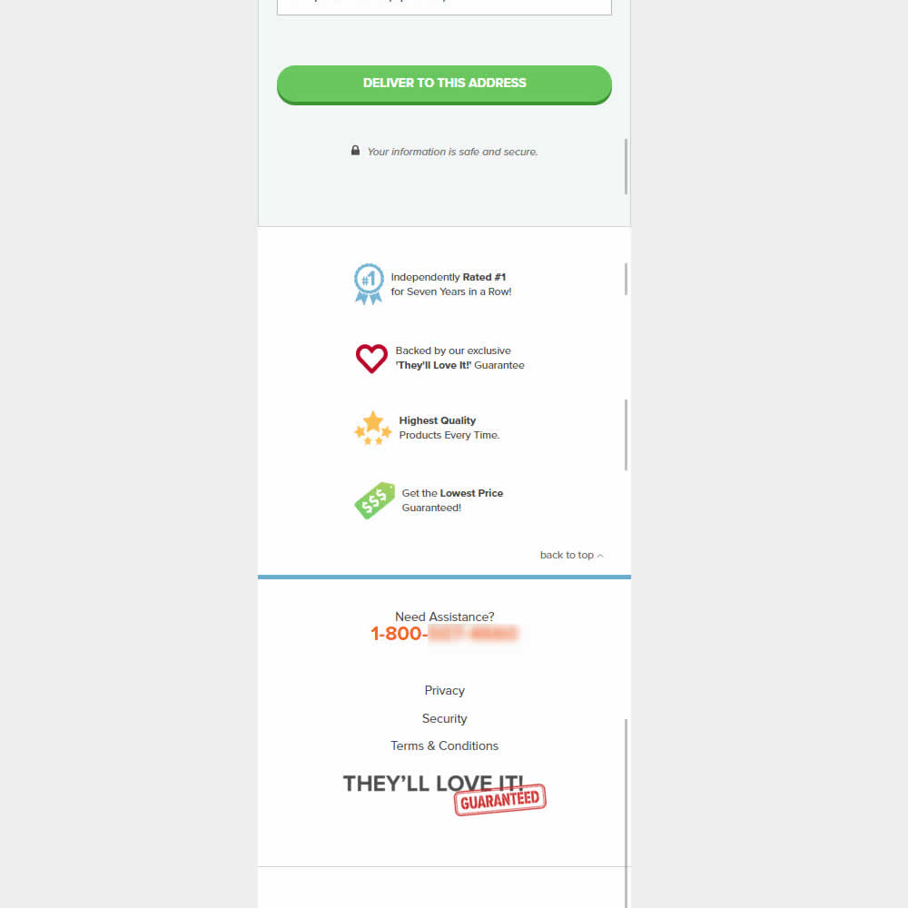
This was an experiment on the first checkout step where users would enter shipping information. The control had a longer footer with more additional sitewide links and a call to action to a newsletter. The variation removed these elements and kept the focus on the shipping information task. Impact on progression to next step and sales was measured.
Test #517 on
Aboalarm.de
by
 Daria Kurchinskaia
Feb 12, 2024
Desktop
Checkout
Daria Kurchinskaia Tested Pattern #78: Tags, Badges And Structured Information In Test #517 On Aboalarm.de
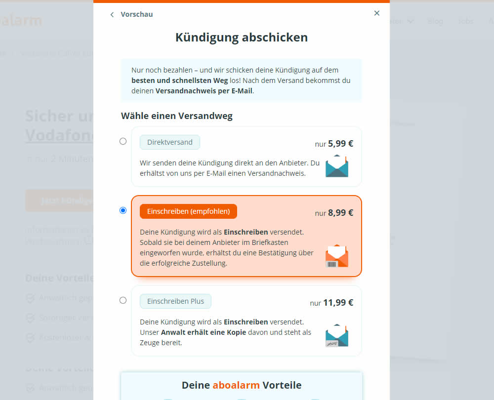
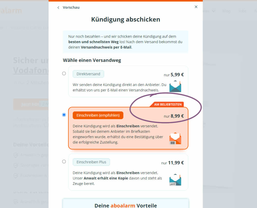
In this experiment, a "most popular" badge ("am beliebsten") was appended to the middle plan of a contract cancellation service. Impact on overall purchases and revenue was measured.
Test #483 on
Menufy.com
by
 Aleksandr Elesev
Jul 17, 2023
Desktop
Checkout
Aleksandr Elesev Tested Pattern #124: Confirmed Selection In Test #483 On Menufy.com
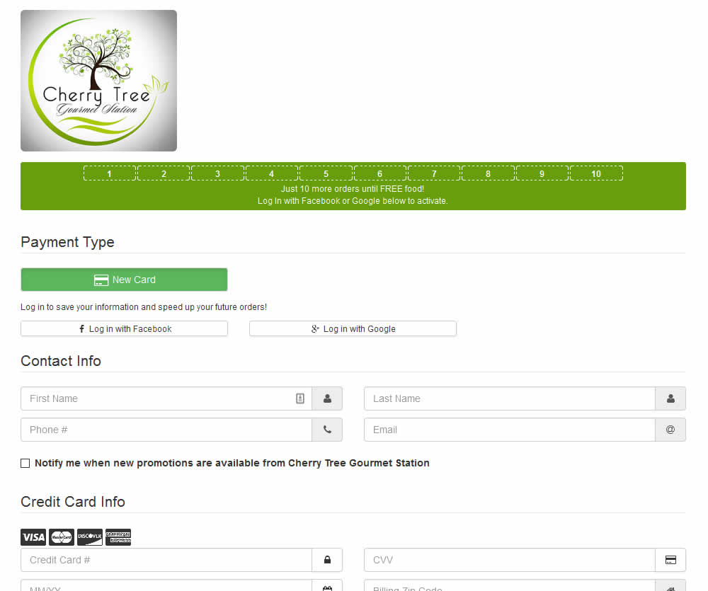
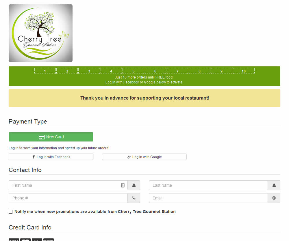
In this experiment, a thanking confirmation message was appended at the top of the checkout screen of a local food delivery service. Impact on completed transactions was measured.
Test #481 on
Backstage.com
by
 Stanley Zuo
Jul 14, 2023
Desktop
Mobile
Checkout
Stanley Zuo Tested Pattern #15: Bulleted Reassurances In Test #481 On Backstage.com
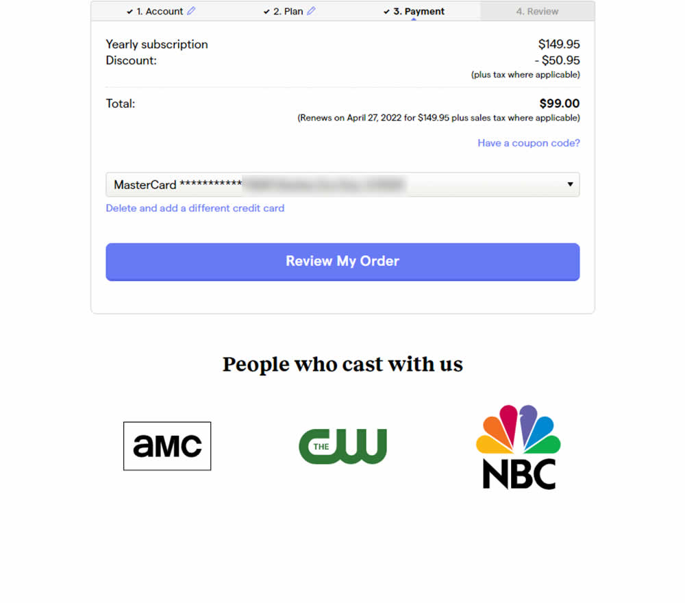
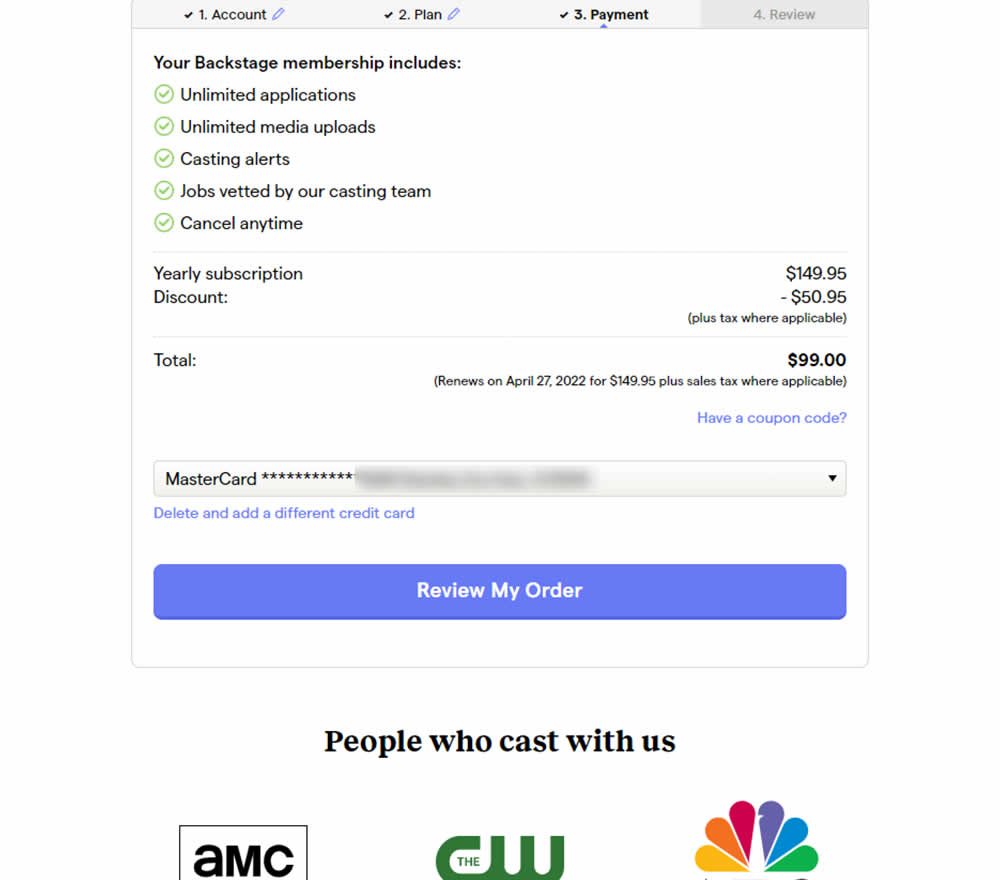
In this experiment, selling points and benefits of a subscription were placed as bullets at the top of a checkout page. The benefits highlighted things such as: unlimited applications, access to vetted jobs and the ability to cancel anytime. Impact on sales was measured.
Test #482 on
by
 Jakub Linowski
Jul 13, 2023
Desktop
Mobile
Checkout
Jakub Linowski Tested Pattern #124: Confirmed Selection In Test #482
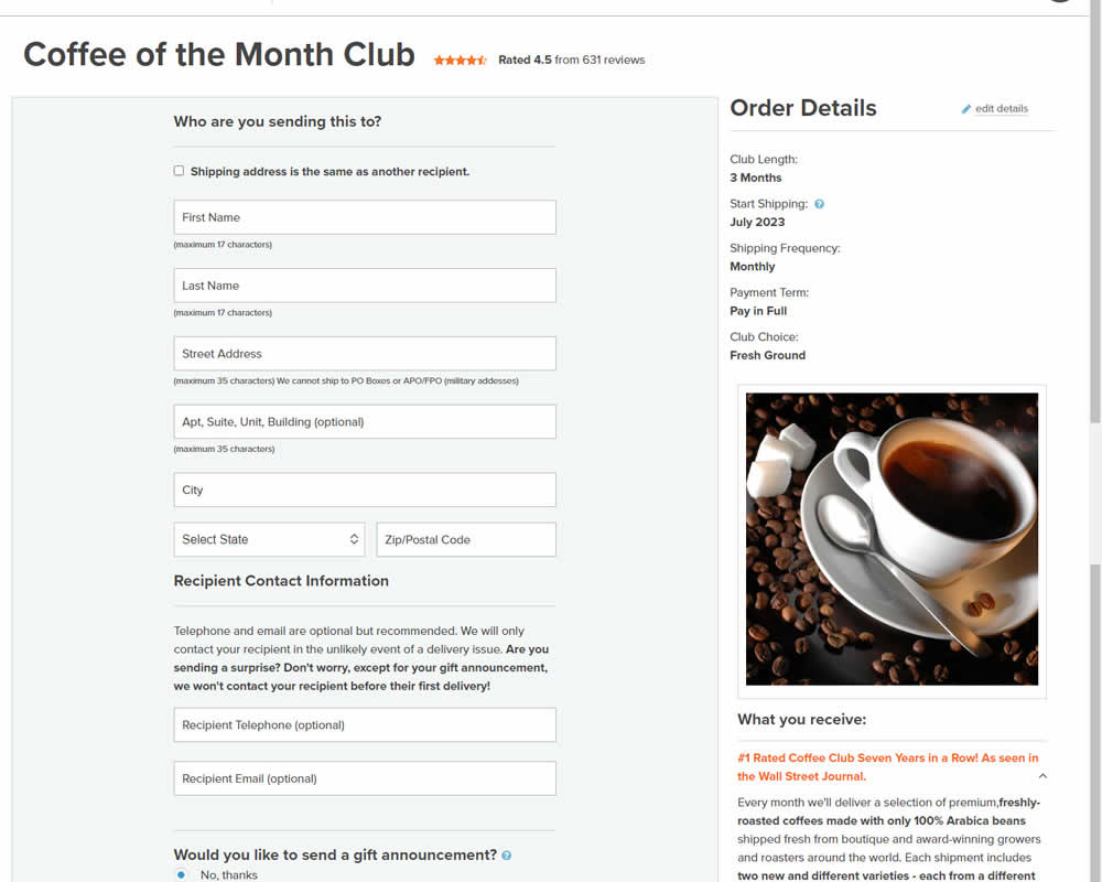
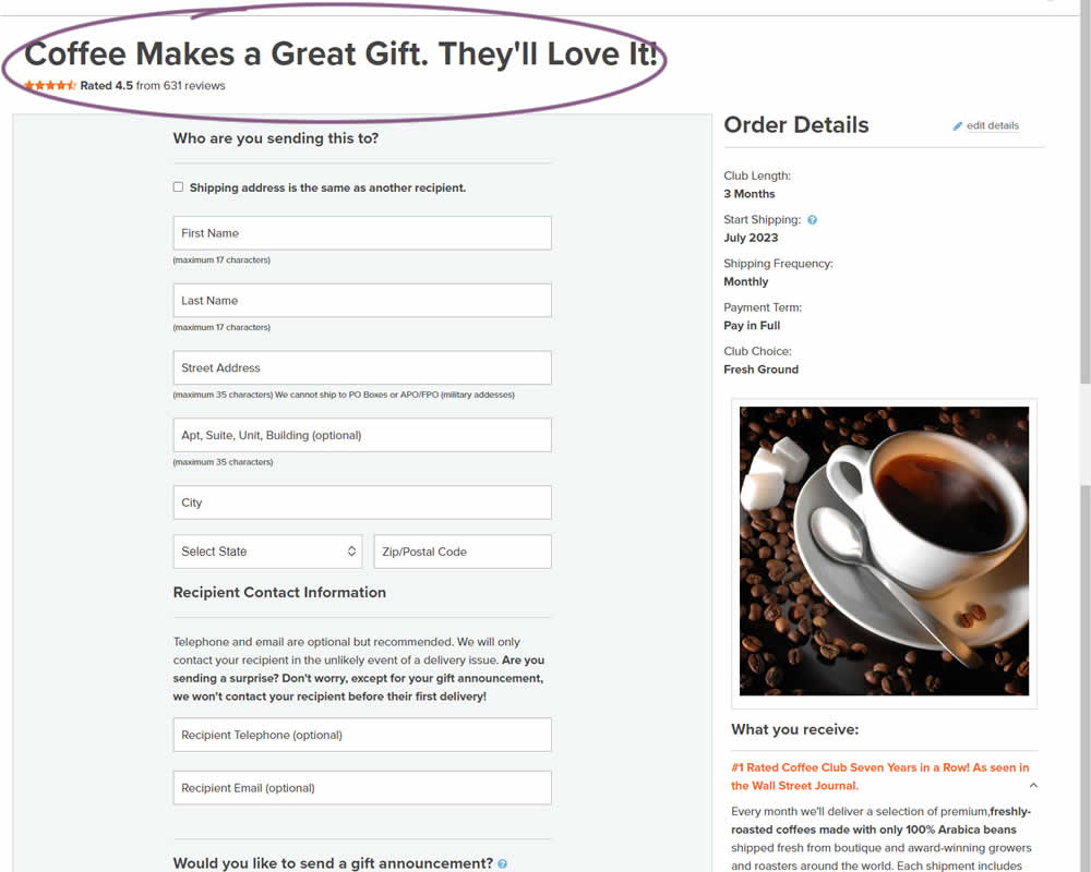
In this experiment, the choice of adding a product to cart was confirmed with a further positive message in the header of the next step (on the add to cart page). Once users left the product detail page, instead of simply stating the product name, the title was rephrased as "Product [X] Makes a Great Gift. They'll Love It!". I view this as a higher "intensity" experiment, given that the add-to-cart page was in some way already confirming the choice. Impact on sales was measured.
Test #479 on
Aboalarm.de
by
 Daria Kurchinskaia
Jun 15, 2023
Desktop
Mobile
Checkout
Daria Kurchinskaia Tested Pattern #15: Bulleted Reassurances In Test #479 On Aboalarm.de
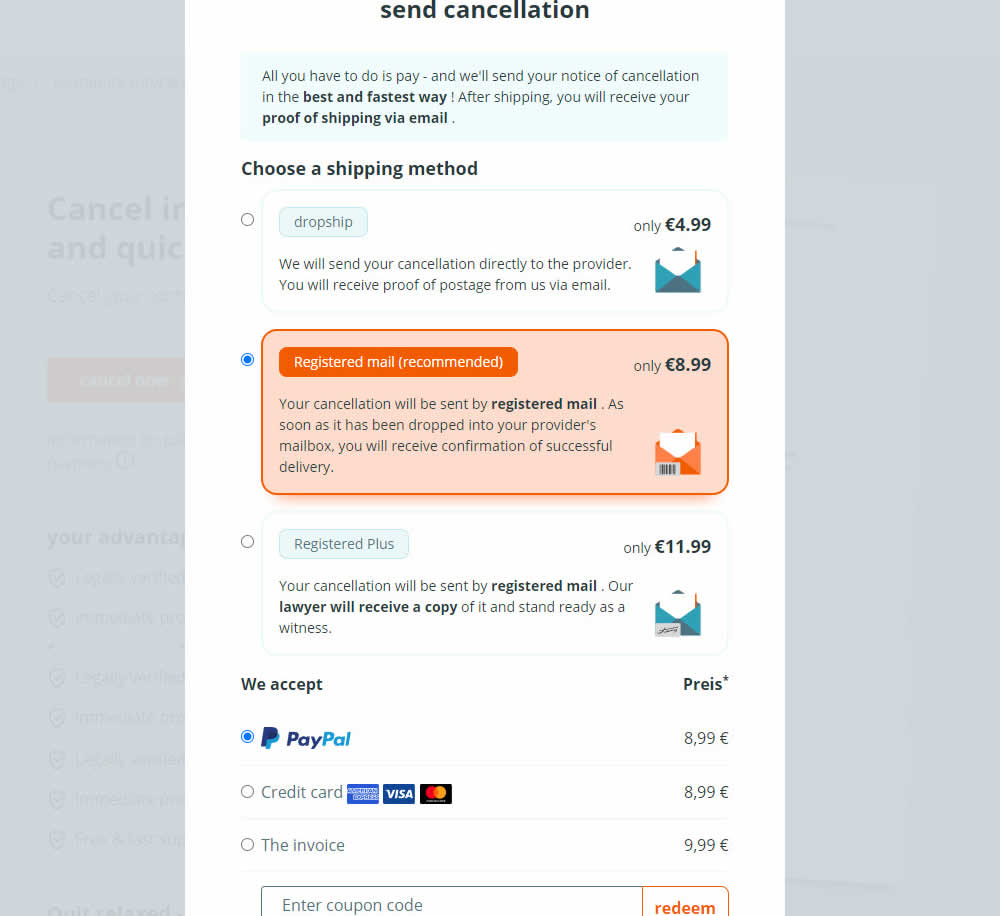
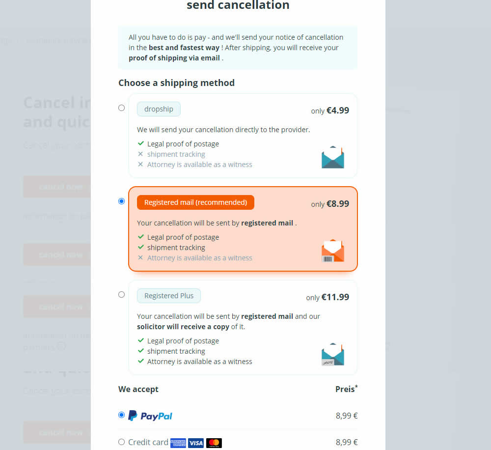
In this experiment, a list of benefits were shown for each of the 3 plans on the last step of a contract cancelation service. Benefit items not included in the lower plans were also shown with grayed out styles (and an "x"). Clearly the higher paid plan had all the benefits listed. Impact on transactions was measured.
Test #480 on
Aboalarm.de
by
 Daria Kurchinskaia
Jun 15, 2023
Desktop
Mobile
Checkout
Daria Kurchinskaia Tested Pattern #15: Bulleted Reassurances In Test #480 On Aboalarm.de

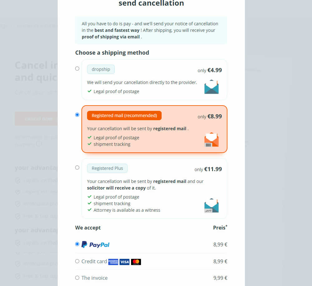
In this experiment, a list of benefits were shown for each of the 3 plans on the last step of a contract cancelation service. The lowest plan only had one benefit, whereas the highest plan had 3. Impact on transactions was measured.
Test #463 on
Volders.de
by
 Daria Kurchinskaia
Mar 25, 2023
Desktop
Checkout
Daria Kurchinskaia Tested Pattern #115: Pricing Comparison Table In Test #463 On Volders.de
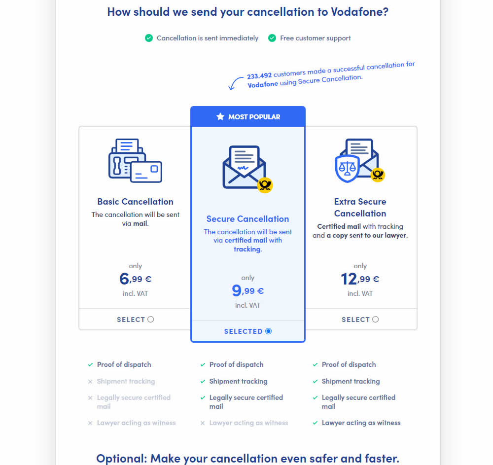
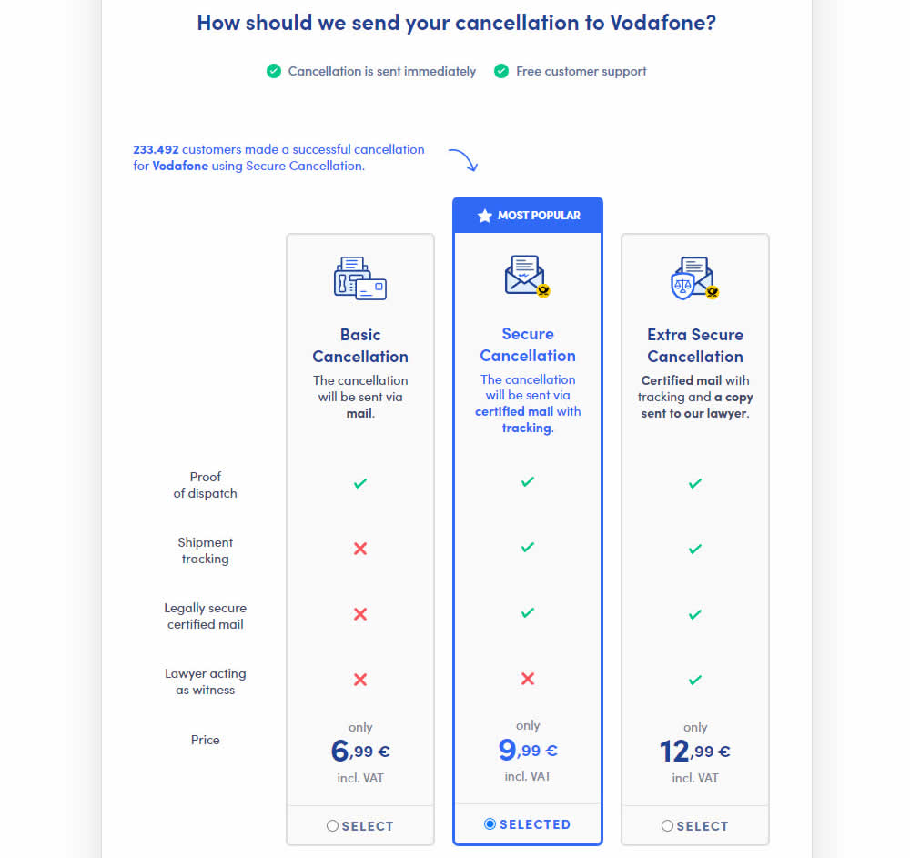
This experiment explored a pricing layout that enabled more feature comparisons. It also conveyed more clearly which features were missing between plans. The test has been inspired by this Netflix experiment. Impact on sales was measured.
Test #458 on
Volders.de
by
 Daria Kurchinskaia
Feb 27, 2023
Desktop
Mobile
Checkout
Daria Kurchinskaia Tested Pattern #103: Money Back Guarantee In Test #458 On Volders.de
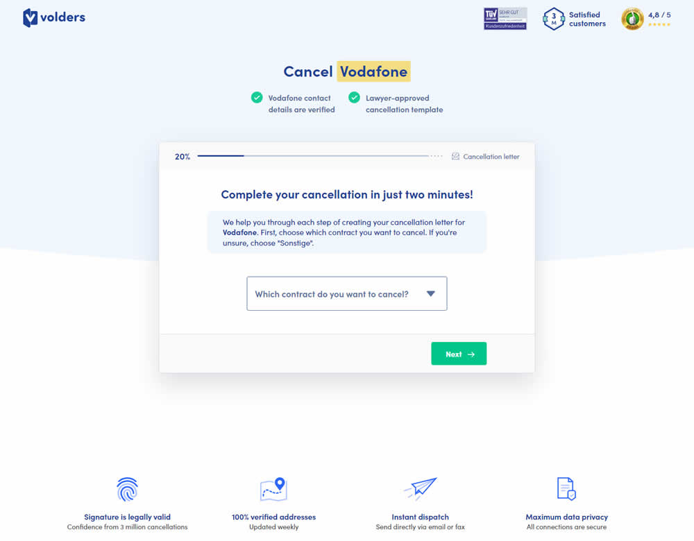
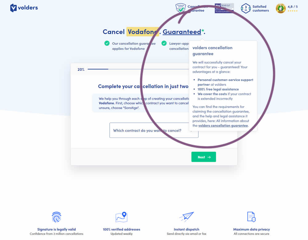
In this experiment, a cancelation guarantee was added believing it would make users feel safer while canceling their contracts with Volders (the paid service being offered). The variation appended a Guarantee in the headline as a hyperlink with an explanatory tooltip shown on hover. This variation change was added to multiple screens throughout the checkout flow (a 5 step process).
Test #452 on
Volders.de
by
 Daria Kurchinskaia
Jan 30, 2023
Desktop
Mobile
Checkout
Daria Kurchinskaia Tested Pattern #62: Urgent Next Day Delivery In Test #452 On Volders.de
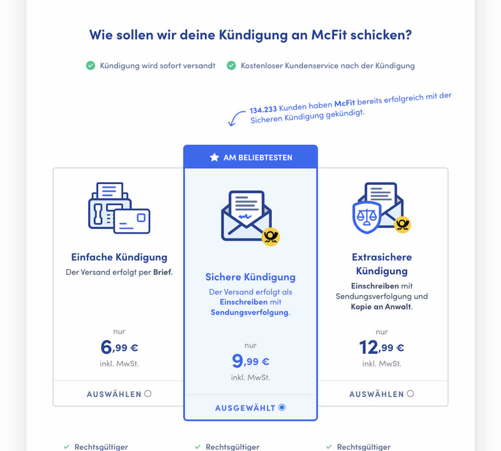
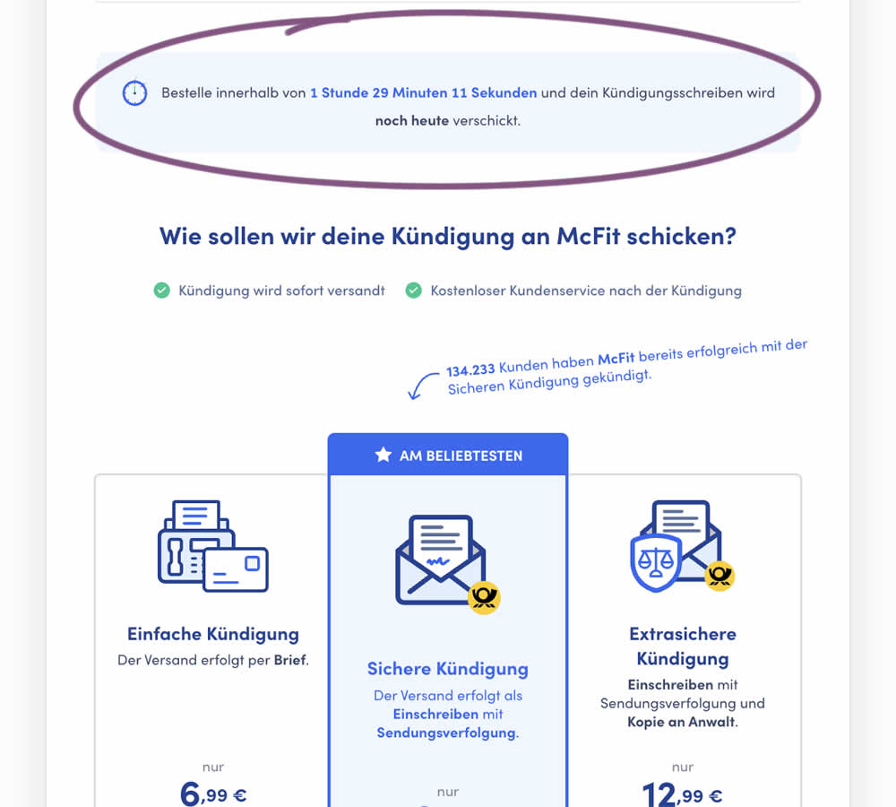
In this experiment, a count down timer was added near the top of a checkout page. The timer was only shown before 1pm and clarified that the serivce (contract cancellation) will be initiated on the same day if users act before a cut off time. Impact on completed payments was measured.
Test #435 on
Volders.de
by
 Daria Kurchinskaia
Oct 17, 2022
Desktop
Mobile
Checkout
Daria Kurchinskaia Tested Pattern #9: Multiple Steps In Test #435 On Volders.de
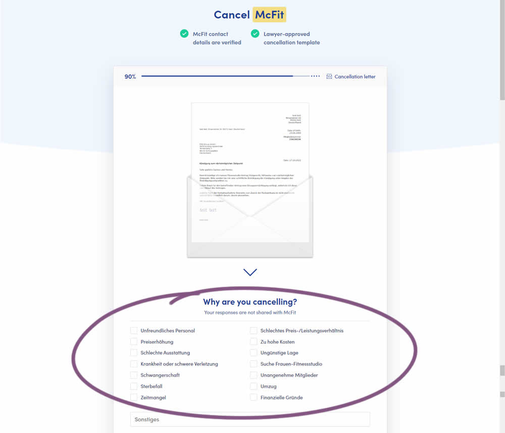
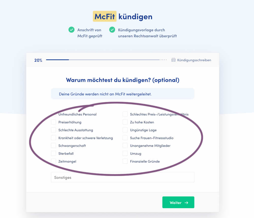
In this experiment, a question about a customer's reason for purchase was broken out into a separate step and moved earlier in the process. In the control, this question was asked in the final checkout step along with a plan selection (Step 4 of 4). In the variation, this question was shifted as a standalone first step (Step 1 of 5). Impact on completed purchases was measured (for a contract cancellation service in this case).
Test #427 on
Designlab.com
by
 Daniel Shapiro
Aug 10, 2022
Desktop
Mobile
Checkout
Daniel Shapiro Tested Pattern #28: Easiest Fields First In Test #427 On Designlab.com
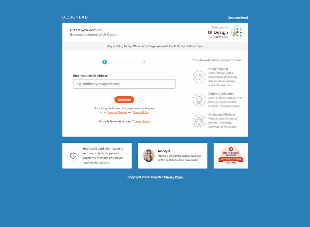
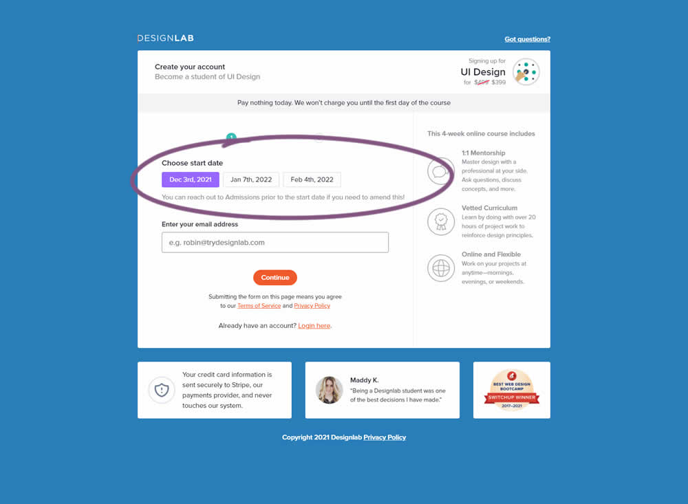
In this experiment, the course enrollment start date was moved from step 2 to step 1 of an enrollment / checkout flow. The test was run by Designlab - that offers design courses and education with a strong element of mentorship. Impact on progression to next step and completed transactions were measured.
Test #415 on
Learnwithhomer.com
by
 Stanley Zuo
Jun 09, 2022
Mobile
Checkout
Stanley Zuo Tested Pattern #3: Fewer Form Fields In Test #415 On Learnwithhomer.com
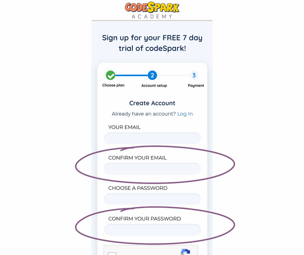
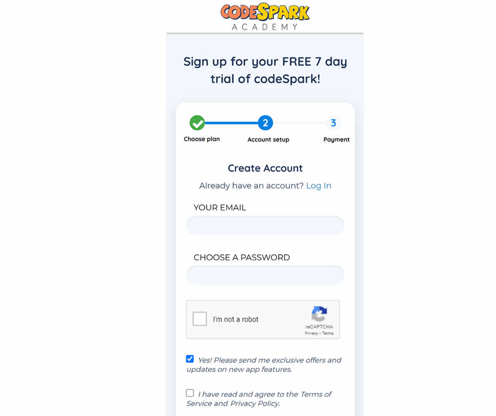
Do fewer confirmation form fields matter? In this experiment, redundant password and email confirmation fields were removed during a signup / checkout funnel. Impact on signups was measured.
Test #414 on
Volders.de
by
 Frederik Fröhle
May 31, 2022
Desktop
Mobile
Checkout
Frederik Fröhle Tested Pattern #98: Auto Suggest In Test #414 On Volders.de
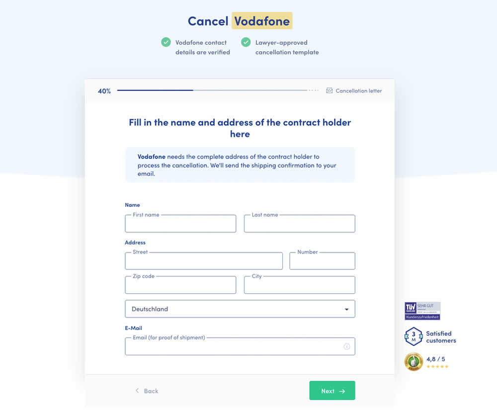
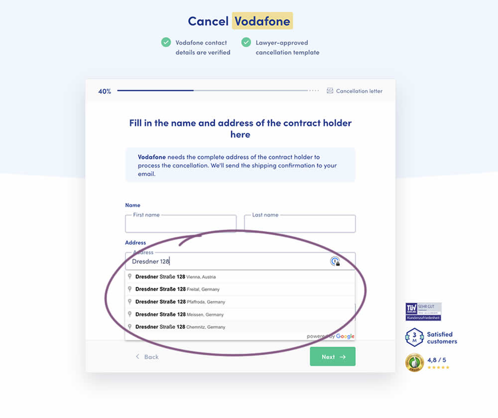
Does adding Google's address auto complete functionality to an address field help with higher form completions? This auto fill feature has been tested in the variation of a contract cancellation funnel. After selecting an auto completed address from a pulldown menu, the following fields were preselected: house number, zip code, city and country (potentially lowering friction?). Impact on successful form completions (contract cancellations) has been measured. Notice how the form also expanded progressively upon selecting the complete address in the variation.
Test #412 on
Volders.de
by
 Frederik Fröhle
May 16, 2022
Desktop
Mobile
Checkout
Frederik Fröhle Tested Pattern #15: Bulleted Reassurances In Test #412 On Volders.de
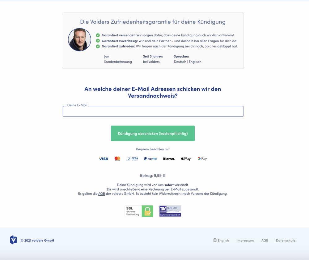
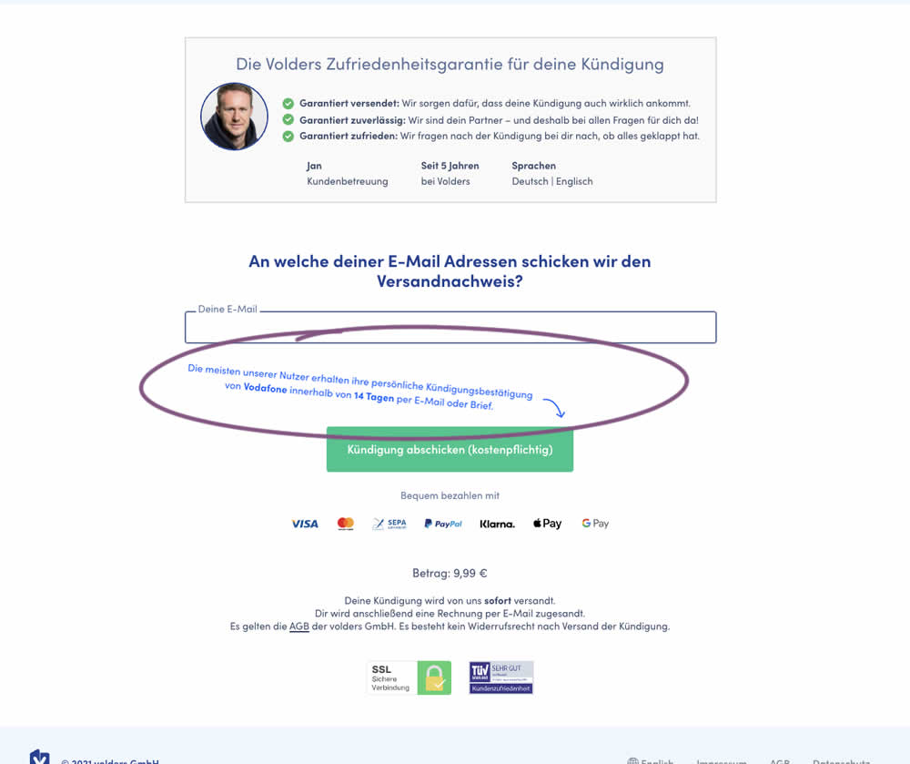
The Volders experimentation team assumed that adding information about how long it might take to get a cancellation confirmation near a CTA Button would result in higher cancellation requests (the paid service being offered).
The variation contained additional copy translated from German to: "Most of our users receive their cancellation confirmation from <vendor> within 14 days by email or letter."
Test #403 on
by
 Jakub Linowski
Mar 29, 2022
Desktop
Mobile
Checkout
Jakub Linowski Tested Pattern #42: Countdown Timer In Test #403
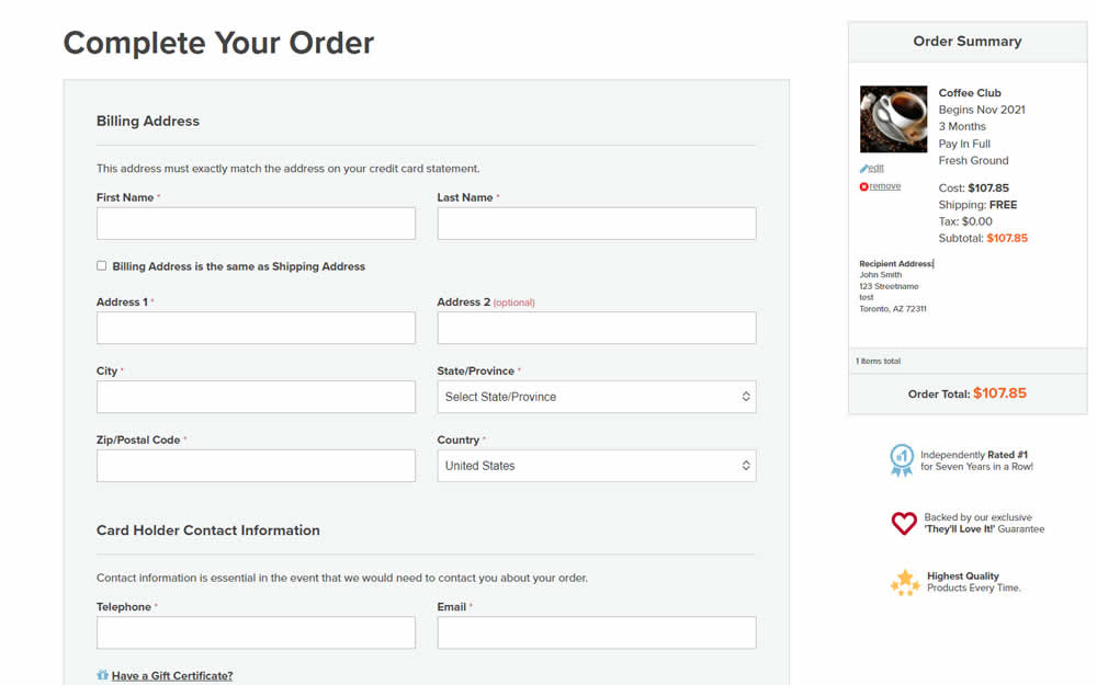
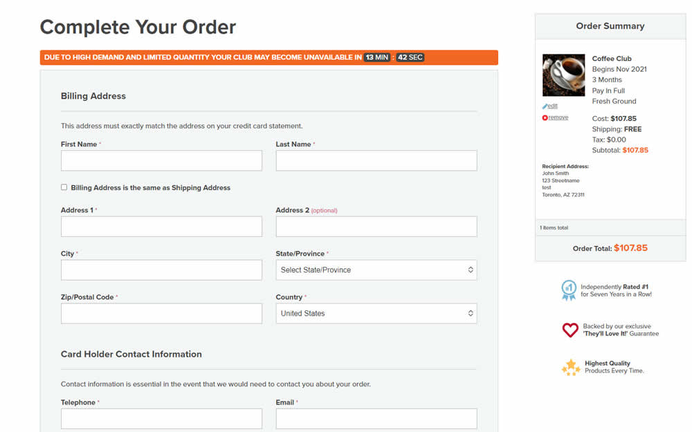
In this experiment, an urgency related message with a dynamic countdown timer was added on the final checkout screen. Impact on sales was measured.