Airbnb Switched To A Bigger Button After Running This Design Experiment
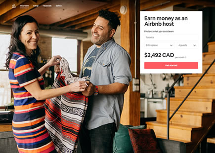
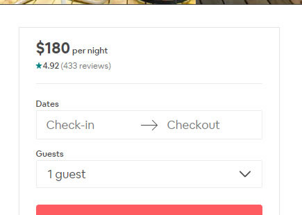
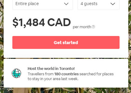
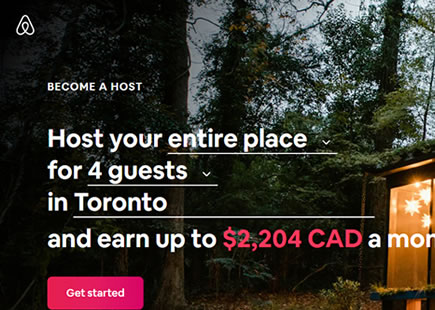
Here is a perfectly simple optimization of a "Get started" button on Airbnb's host signup landing page. Airbnb ran an experiment of a smaller vs larger button size. I know because I managed to capture two diverse screenshots with the same date stamp. :) More so, a few months later Airbnb rolled out the later button to 100% of their traffic - hinting at a successful experiment outcome.
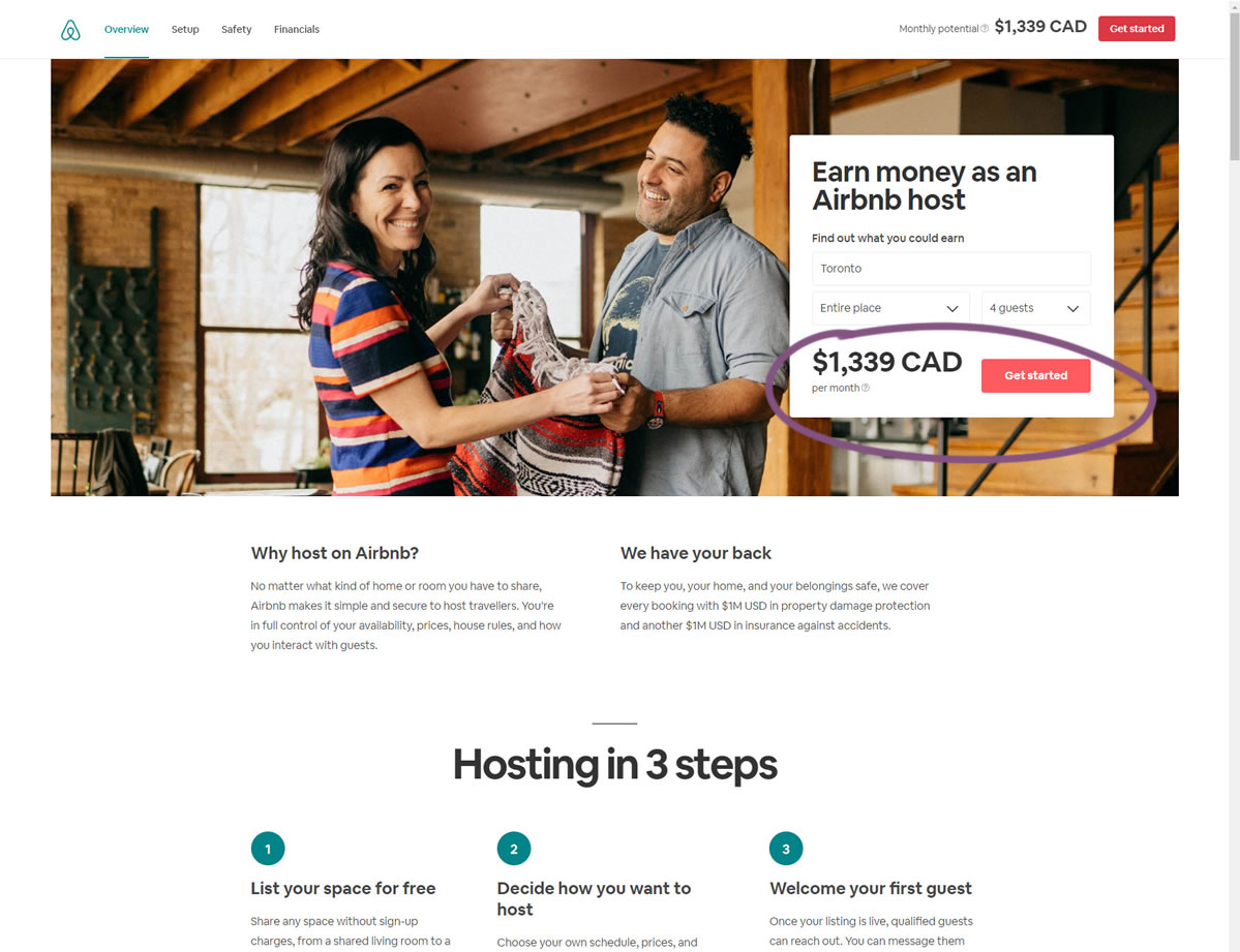
B - Mar 12, 2019 Screenshot
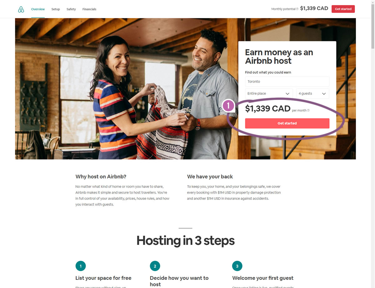
Highlighted UI Changes From This Leak
-
Larger Buttons
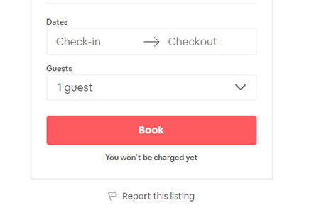
The distinct change in this experiment was clearly the increased button size visible in variant B. If you look more closely however, you'll also notice that due to the limited width of the container, the button was also moved to the next line. This slightly extended the height of the container and pushed the content a little further down. Nevertheless I find this as perfect evidence in favor of the Bigger Form & Buttons pattern.
0.5 Repeatability has been assigned to Pattern #97: Bigger Form Fields as evidence that it's getting better
Repeatability is a net count of evidence for or against a pattern. It’s how we can predict which patterns are better than others. :)
Comments
Rusty Lions 6 years ago ↑0↓0
Nice Article!
Thanks for sharing your experience with us.
Reply