All Latest 620 A/B Tests
Test #640 on
Obs.no
by  Joachim Furuseth
Mar 24, 2026
Desktop
Checkout
X.X%
Sales
Joachim Tested Pattern #1: Remove Coupon Fields On Obs.no
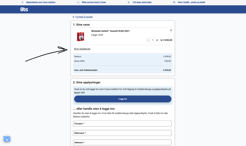
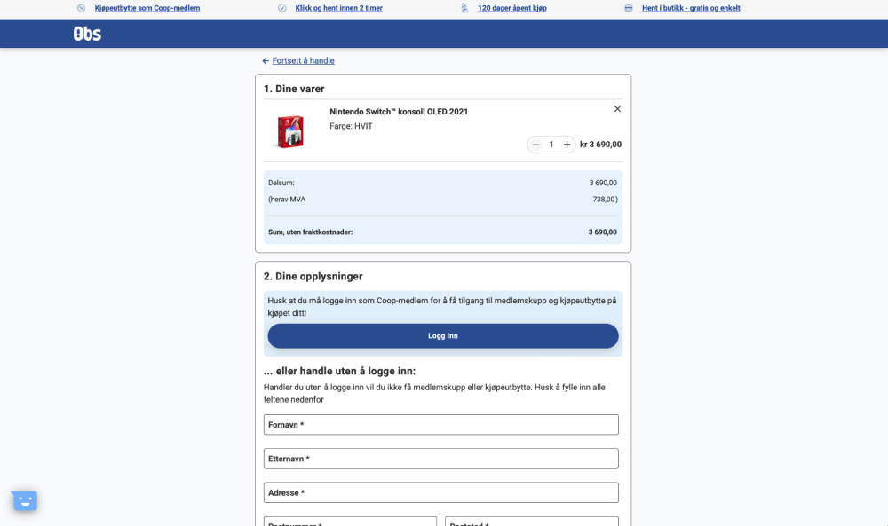
The control had a clickable link "Use discount code" which would reveal an input field for a coupon code. The variation removed this link and input field. Impact on purchases was measured. (Desktop only)
Which A Or B Actually Wins? Find Out Before You Test.
Members see every test result — the winners, the flat ones, and the losers — along with exact effects and sample sizes. Use it to estimate your tests and prioritize by probability, not gut feel. Start every experiment with the odds on your side.
Test #639 on
Obs.no
by  Joachim Furuseth
Mar 23, 2026
Mobile
Checkout
X.X%
Sales
Joachim Tested Pattern #1: Remove Coupon Fields On Obs.no
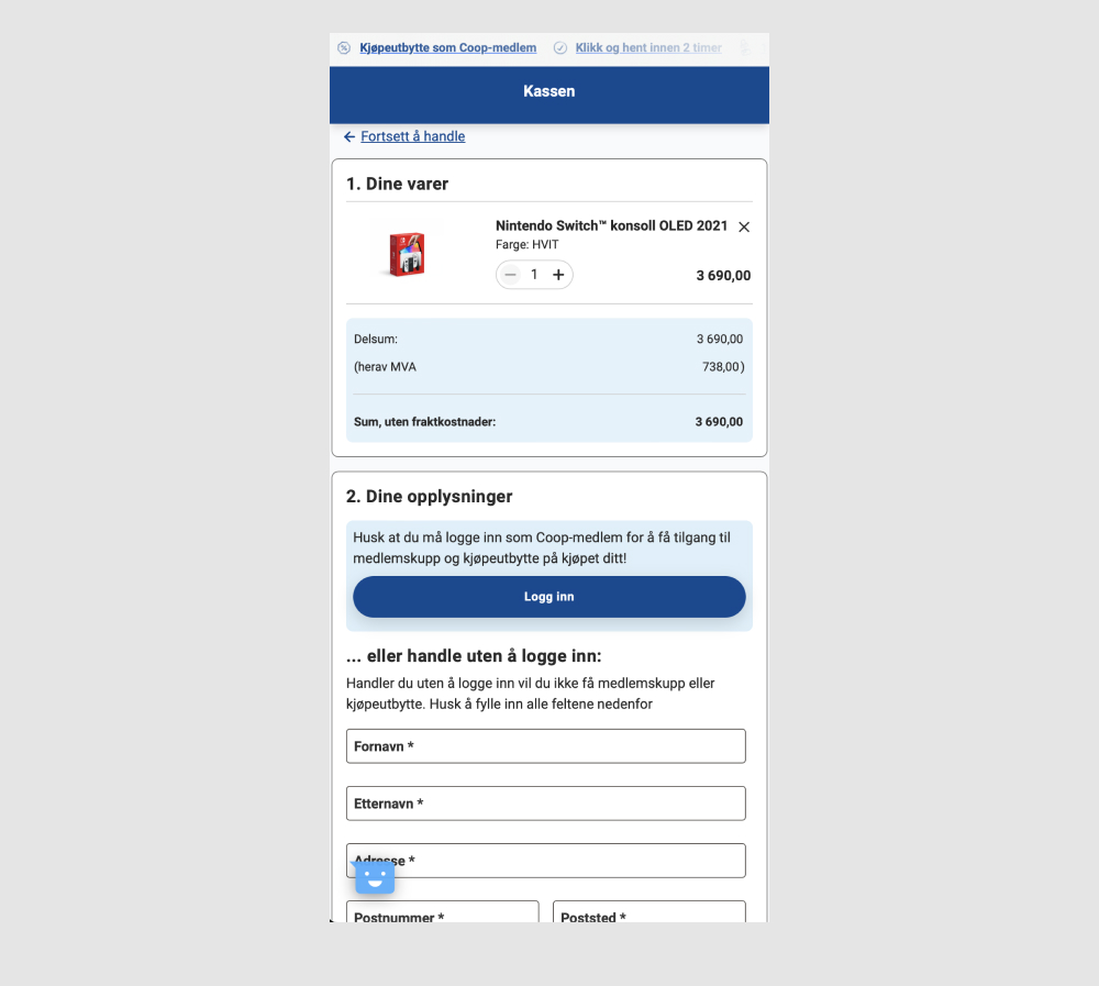
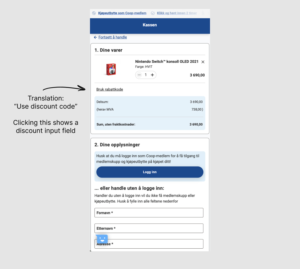
The control had a clickable link "Use discount code" which would reveal an input field for a coupon code. The variation removed this link and input field. Impact on purchases was measured. (Mobile only)
Test #634 on
Obsbygg.no
by  Joachim Furuseth
Feb 18, 2026
Mobile
Checkout
X.X%
Sales
Joachim Tested Pattern #1: Remove Coupon Fields On Obsbygg.no
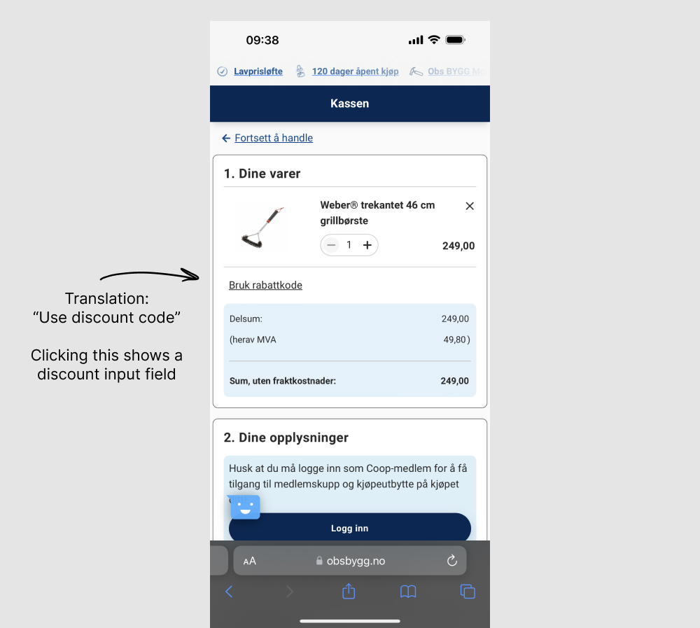
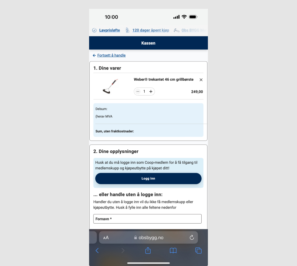
The control had a clickable link "Use discount code" which would reveal an input field for a coupon code. The variation removed this link and input field. Impact on purchases was measured. (Mobile only)
Test #635 on
Obsbygg.no
by  Joachim Furuseth
Feb 18, 2026
Desktop
Checkout
X.X%
Sales
Joachim Tested Pattern #1: Remove Coupon Fields On Obsbygg.no
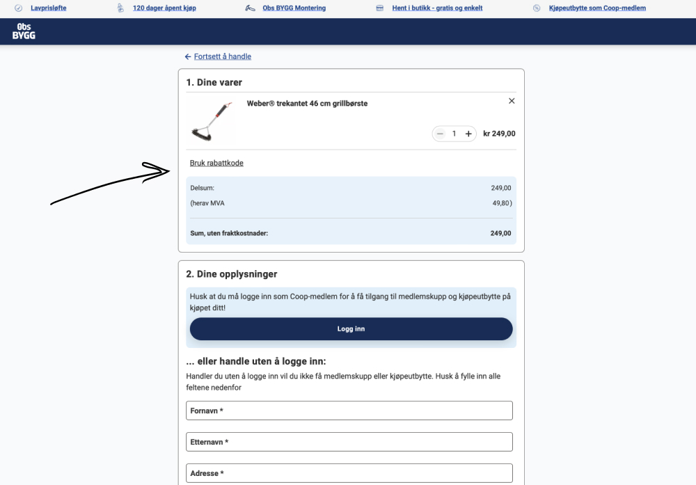
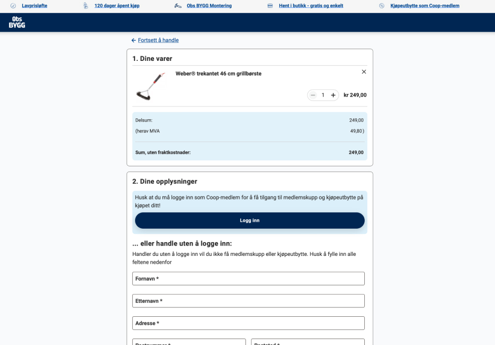
The control had a clickable link "Use discount code" which would reveal an input field for a coupon code. The variation removed this link and input field. Impact on purchases was measured. (Desktop only)
Test #615 on
Online.metro-cc.ru
by  Andrey Andreev
Oct 28, 2025
Mobile
Checkout
X.X%
Sales
Andrey Tested Pattern #64: Tunnel On Online.metro-cc.ru
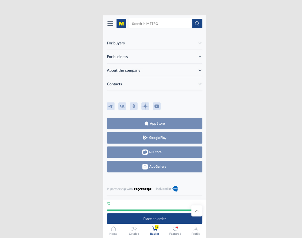
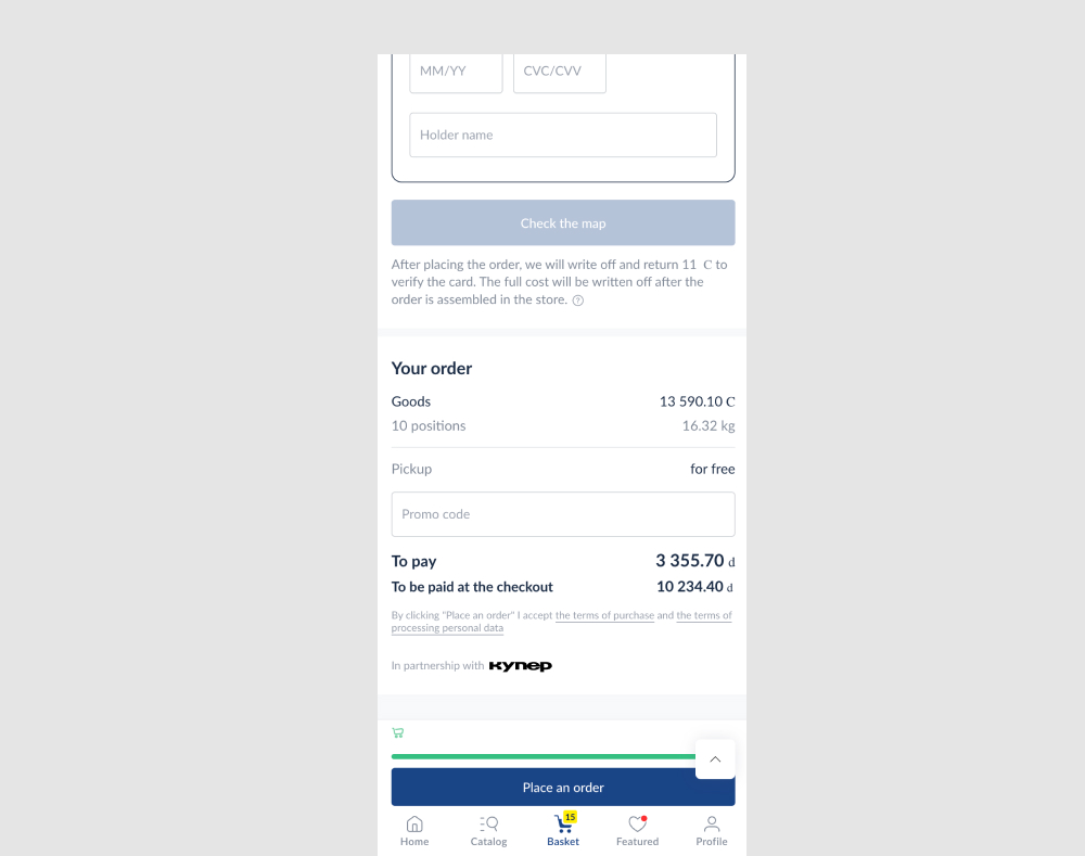
In this experiment, two sets of distractions were removed from the checkout put. First, the search bar was removed from the top of the screen. Second, a series of app links were also removed from the bottom of the screen near the footer. Impact on checkouts was measured.
Test #518 on
by  Jakub Linowski
Feb 14, 2024
Mobile
Checkout
X.X%
Sales
Jakub Tested Pattern #64: Tunnel
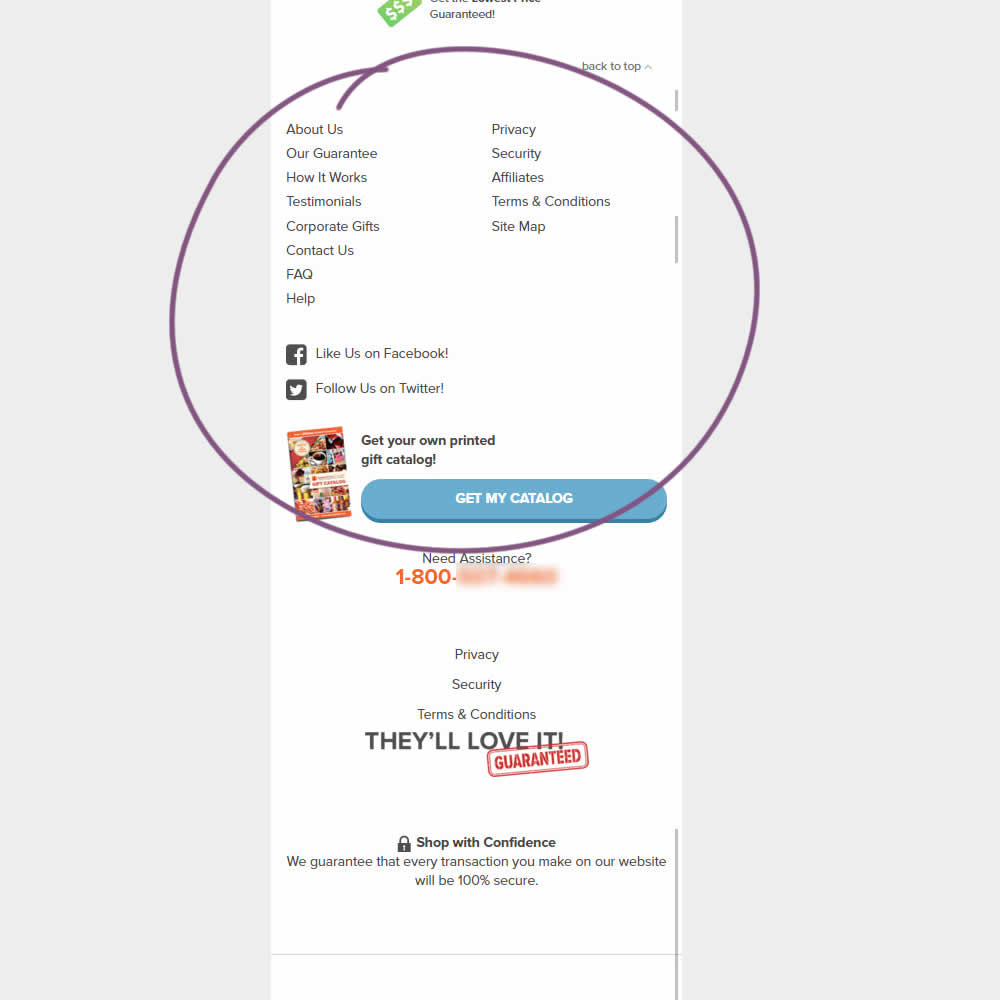
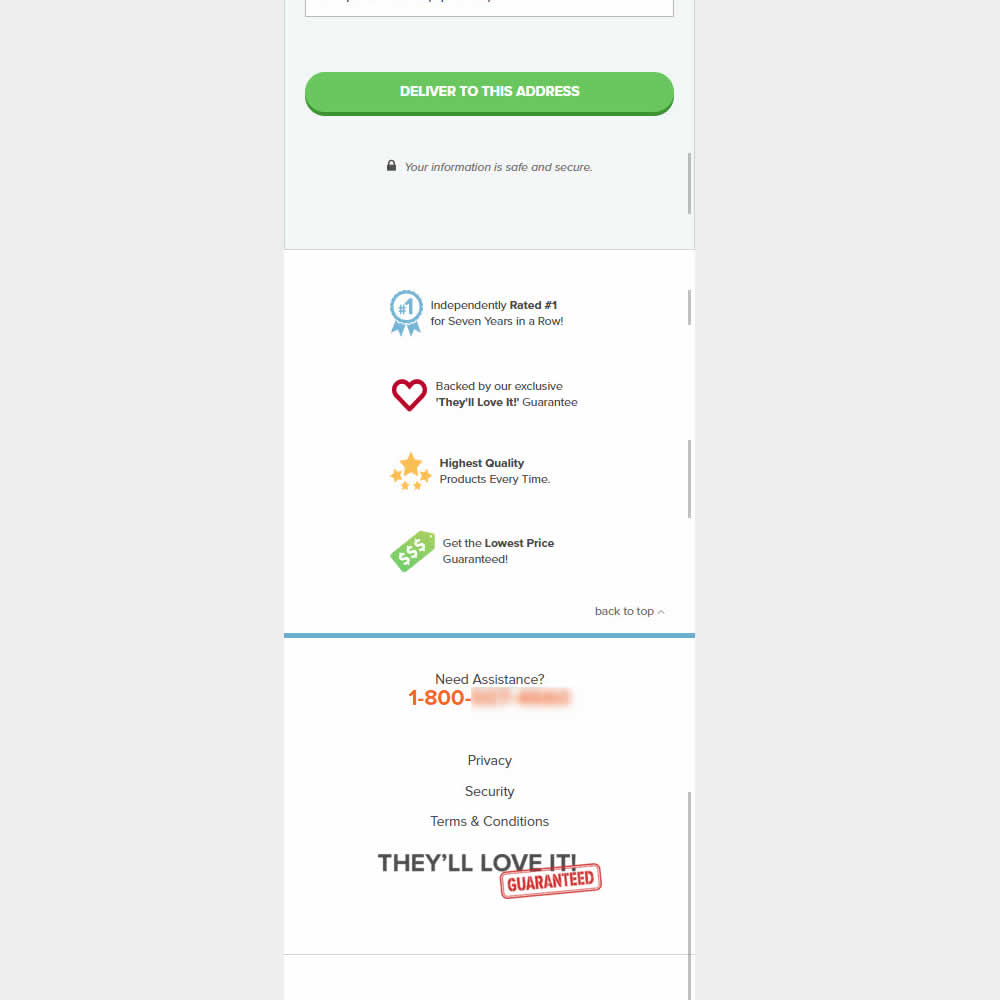
This was an experiment on the first checkout step where users would enter shipping information. The control had a longer footer with more additional sitewide links and a call to action to a newsletter. The variation removed these elements and kept the focus on the shipping information task. Impact on progression to next step and sales was measured.
Test #504 on
Volders.de
by Michal Fiech
Nov 17, 2023
Desktop
Mobile
Pricing
X.X%
Revenue
Michal Tested Pattern #113: More Or Fewer Plans On Volders.de
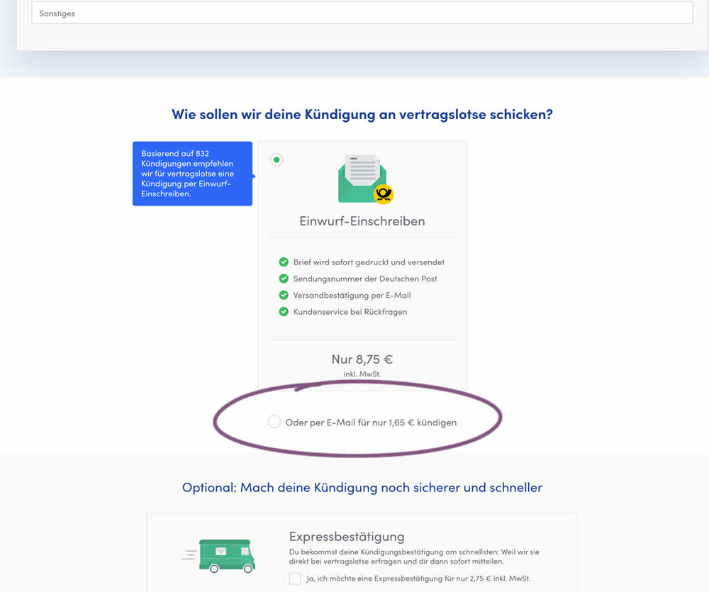
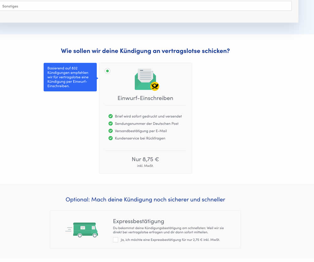
In this experiment, the cheapest pricing plan was removed from a set of 2 options. This only left the most expensive pricing plan as the option. Impact on sales and revenue was measured.
Test #470 on
Formelskin.de
by  Alexander Krieger
May 12, 2023
Mobile
Signup
X.X%
Sales
Alexander Tested Pattern #3: Fewer Form Fields On Formelskin.de
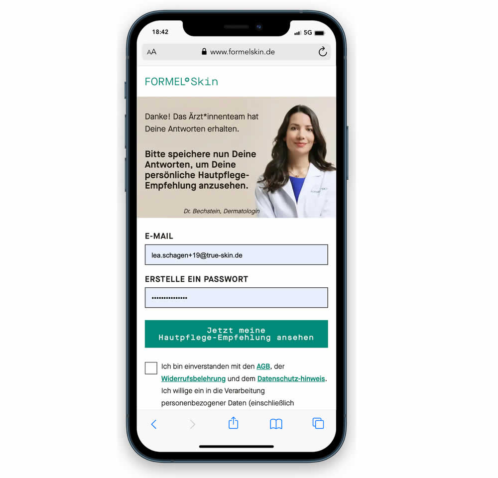
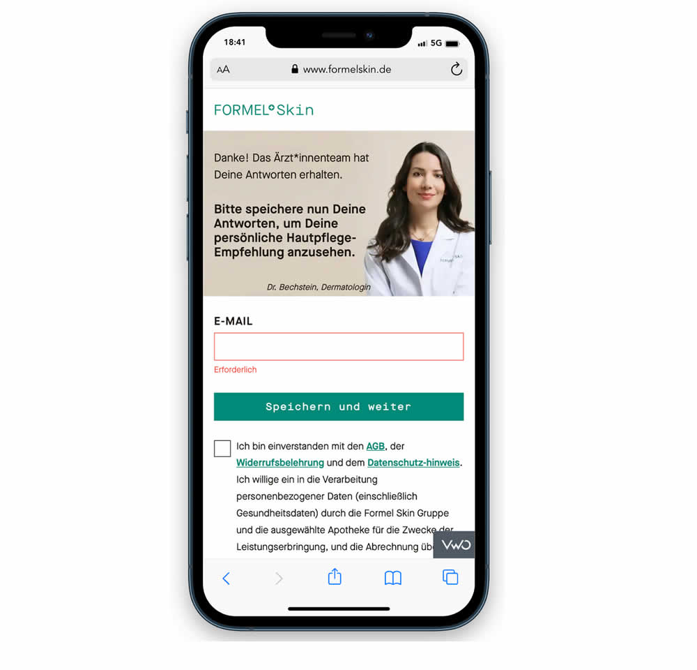
In this experiment, a password field was removed from a signup / account creation step. Instead of asking for a password, users received an email with an auto-generated password. This experiment ran on mobile and impact on sales (post-signup) was measured.
Test #457 on
by  Jakub Linowski
Feb 26, 2023
Desktop
Mobile
Shopping Cart
X.X%
Sales
Jakub Tested Pattern #64: Tunnel
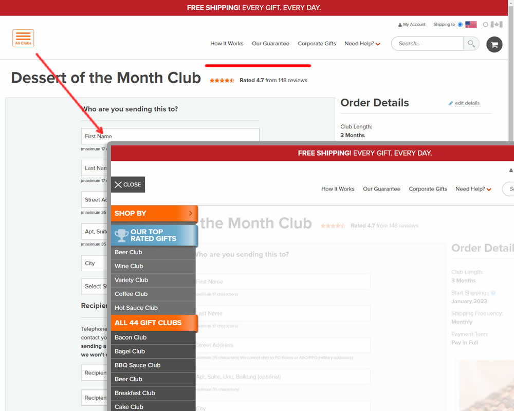
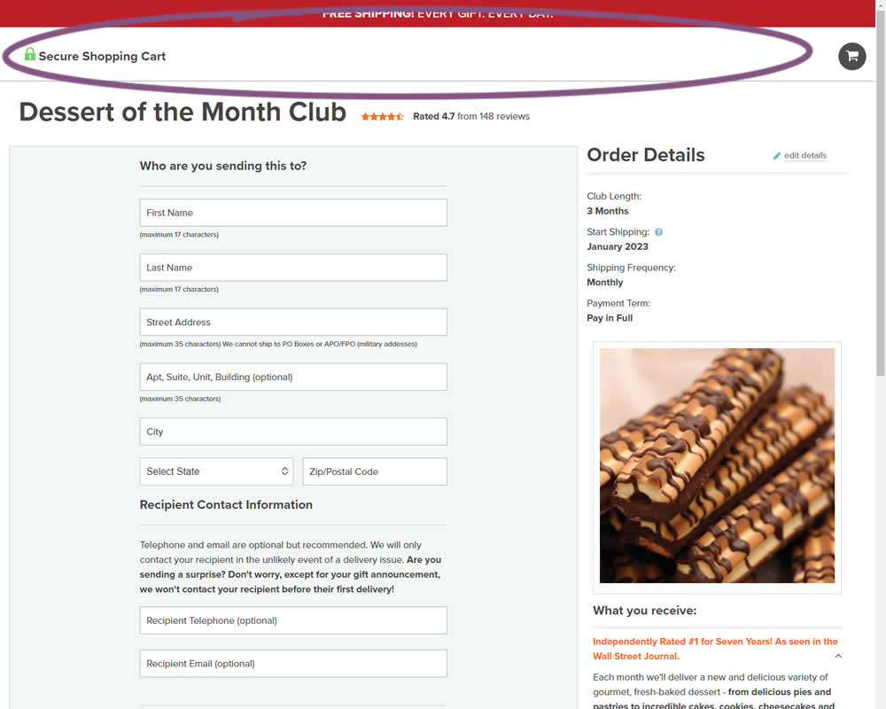
In this experiment, hamburger navigation with product links, was removed from the shopping / add to cart page. Tertiary links (How It Works, Guarantee details and support pages) were also removed, while a "Secure Checkout" message was brought into the header. This header version was already present on the next checkout page, and was copied over one step earlier. The idea was to keep customers within the checkout flow. Impact on sales was measured.
Test #453 on
by  Jakub Linowski
Jan 31, 2023
Desktop
Mobile
Shopping Cart
X.X%
Sales
Jakub Tested Pattern #64: Tunnel
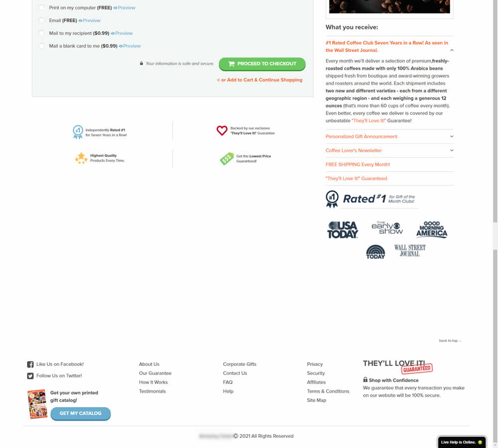
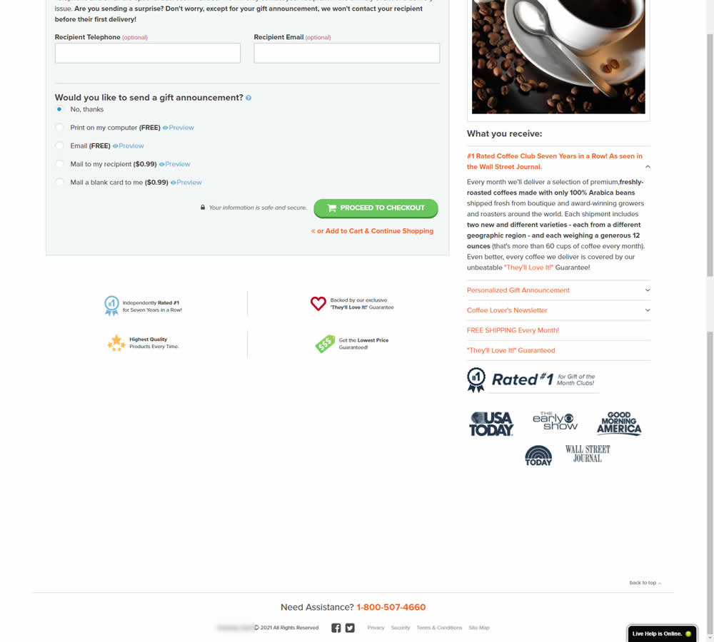
In this experiment, the footer was simplified with multiple elements being removed (catalog request, secondary links, and a guarantee). Additionally, a more prominent phone number was also displayed.
Test #454 on
Trenyrkarna.cz
by  Ondřej Ilinčev
Jan 31, 2023
Desktop
Mobile
Shopping Cart
X.X%
Sales
Ondřej Tested Pattern #64: Tunnel On Trenyrkarna.cz
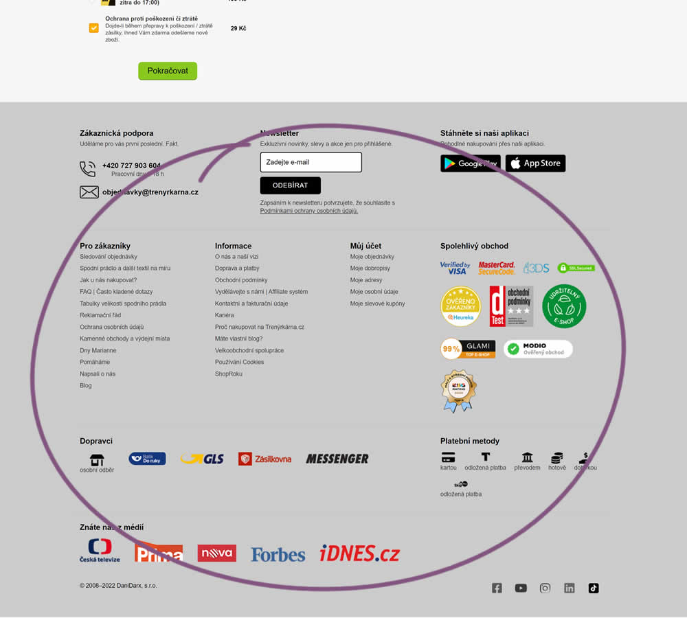
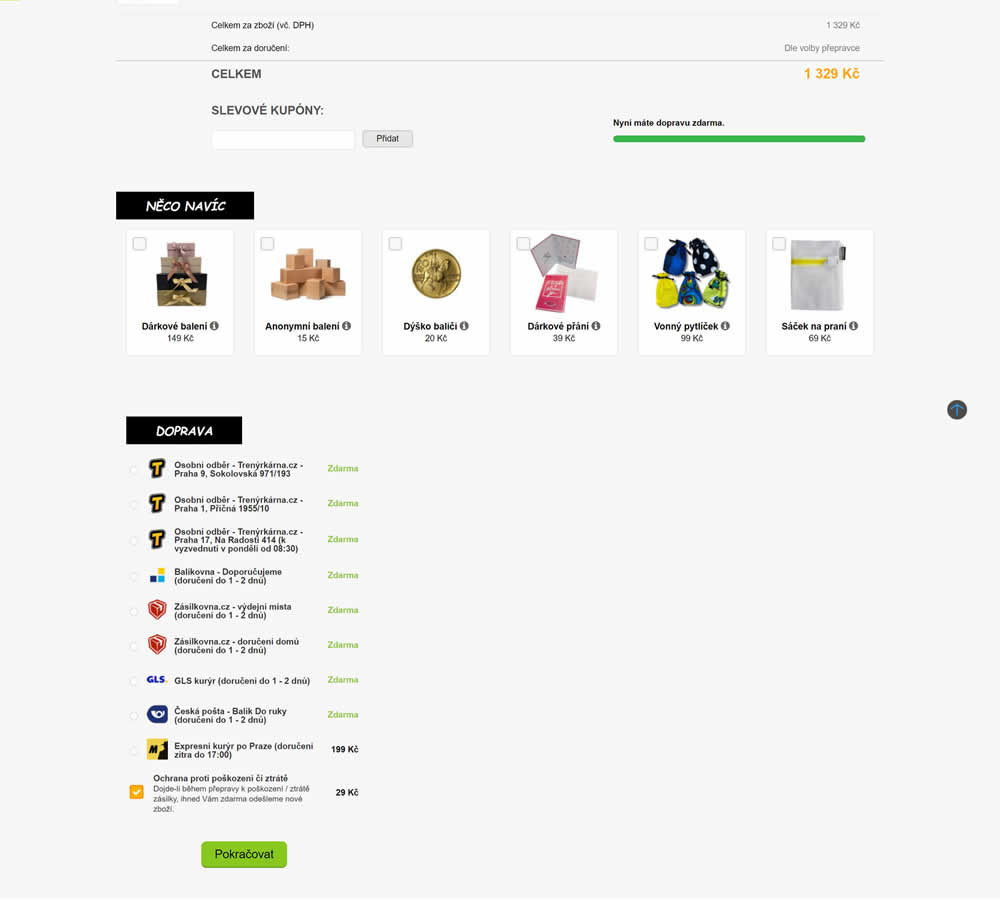
In this shopping cart experiment, a tall footer was completely removed. The footer contained elements such as: app download links, a newsletter signup, secondary web site links, trust symbols, social media icons and company contant information. Impact on sales was measured.
Test #450 on
Trenyrkarna.cz
by  Ondřej Ilinčev
Jan 20, 2023
Desktop
Shopping Cart
X.X%
Sales
Ondřej Tested Pattern #64: Tunnel On Trenyrkarna.cz
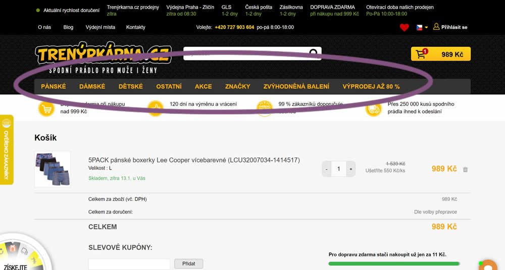
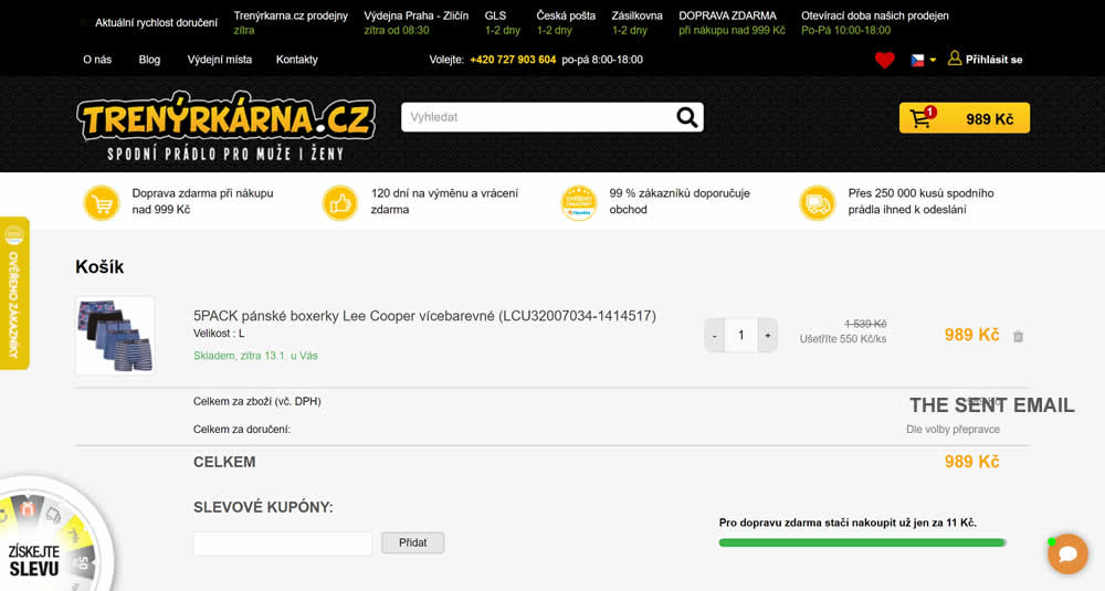
In this experiment, top category navigation (with fly out categories) was removed from the shopping cart of an online store. Impact on sale transactions was measured.
Test #422 on
Volders.de
by  Daria Kurchinskaia
Jul 22, 2022
Desktop
Mobile
Shopping Cart
X.X%
Sales
Daria Tested Pattern #3: Fewer Form Fields On Volders.de
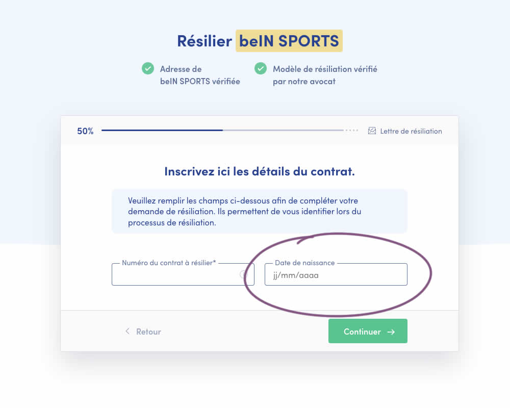
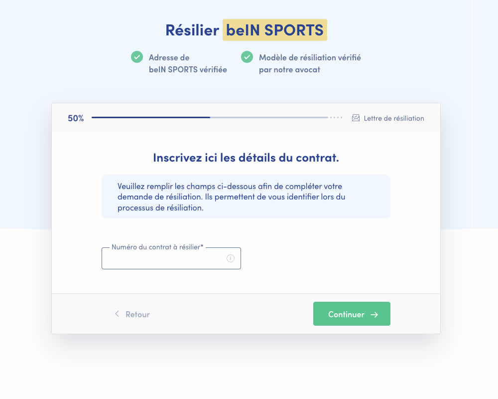
A birthdate field was removed during a signup process for a paid contract cancellation service. Impact on progression (next step) and sales (completed transactions) was measured.
Test #415 on
Learnwithhomer.com
by  Stanley Zuo
Jun 09, 2022
Mobile
Checkout
X.X%
Signups
Stanley Tested Pattern #3: Fewer Form Fields On Learnwithhomer.com
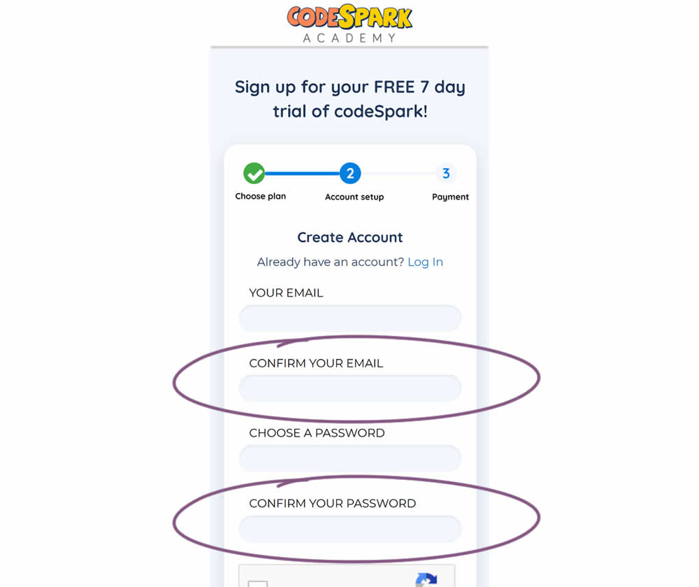
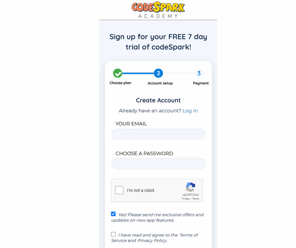
Do fewer confirmation form fields matter? In this experiment, redundant password and email confirmation fields were removed during a signup / checkout funnel. Impact on signups was measured.
Test #78 on
Mvideo.ru
by  Andrey Andreev
May 06, 2021
Desktop
Mobile
Listing
X.X%
Sales
Andrey Tested Pattern #90: Out Of Stock Or In Stock Products On Mvideo.ru
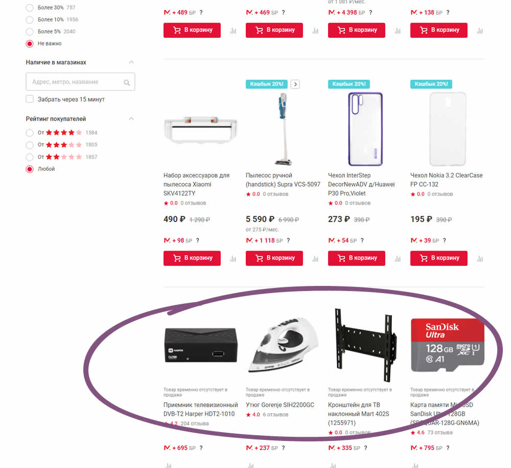
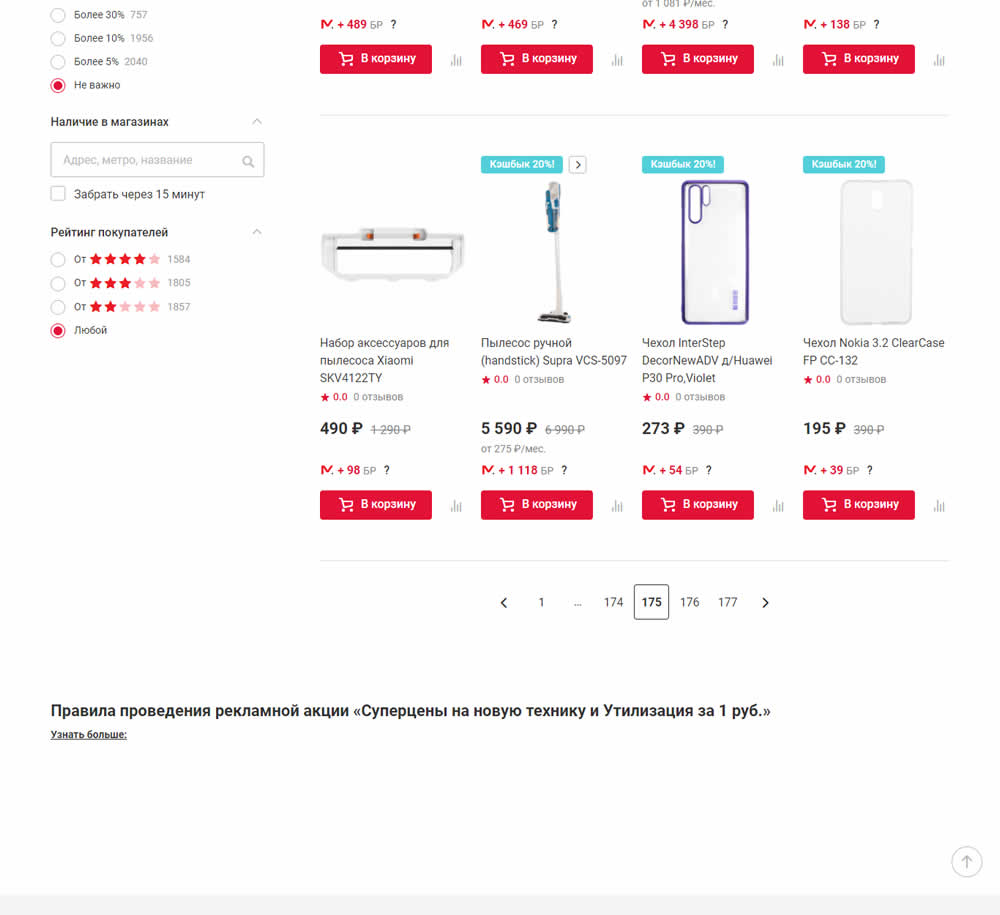
In this experiment, products which were out of stock were removed from listing pages and replaced with in stock ones (not visible in the screenshot).
Test #86 on
Vivareal.com.br
by  Rodrigo Maués
Feb 28, 2021
Mobile
Desktop
Product
X.X%
Leads
Rodrigo Tested Pattern #3: Fewer Form Fields On Vivareal.com.br
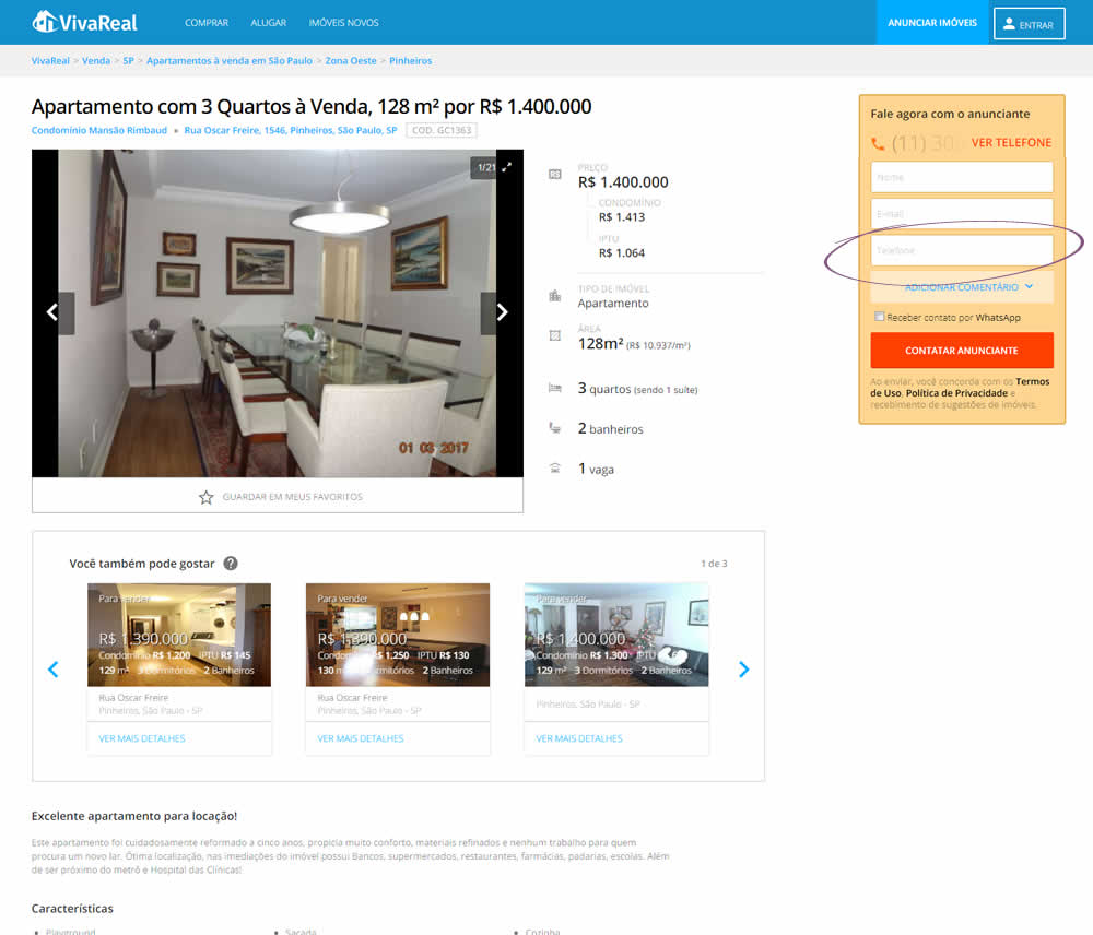
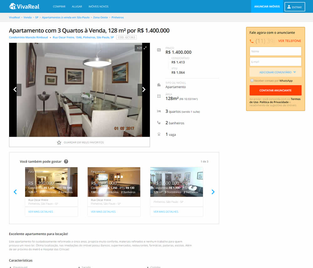
In this experiment, the telephone field was removed from a lead form on a property page. Impact on leads was measured.
Test #335 on
by  Jakub Linowski
Jan 27, 2021
Desktop
Mobile
Home & Landing
X.X%
Sales
Jakub Tested Pattern #32: Condensed List
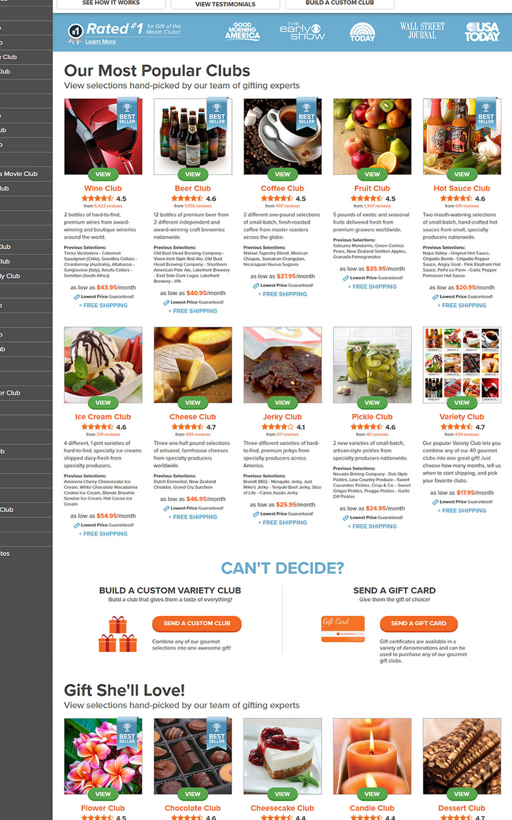
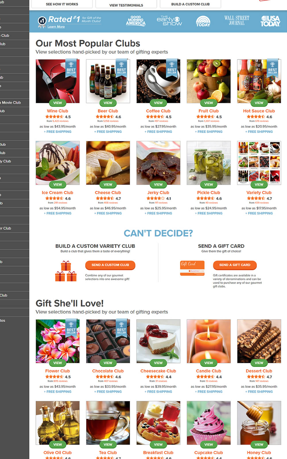
The variation here has more condensed product tiles being shown on a homepage. Two pieces of information were removed: product descriptions and past selections. Impact on product page visits and total sales was measured.
Test #10 on
Tradegecko.com
by  Syed AtiF Husain
Nov 30, 2020
Desktop
Home & Landing
X.X%
Leads
Syed AtiF Tested Pattern #10: Postponed Modal Forms On Tradegecko.com


In this experiment, 3 form fields were removed (postponed to a next step) from the homepage leaving only a "Start Trail" button. When users clicked on the "Start A Free 14 Day Trial" button, in both the control and variation they've seen the same next registration page with all of the fields. The registration page repeated the same fields with their corresponding values, as well as asked for a password as an extra field. The experiment measured successful leads.
Test #300 on
Volders.de
by Michal Fiech
May 25, 2020
Desktop
Mobile
Signup
X.X%
Progression
Michal Tested Pattern #3: Fewer Form Fields On Volders.de
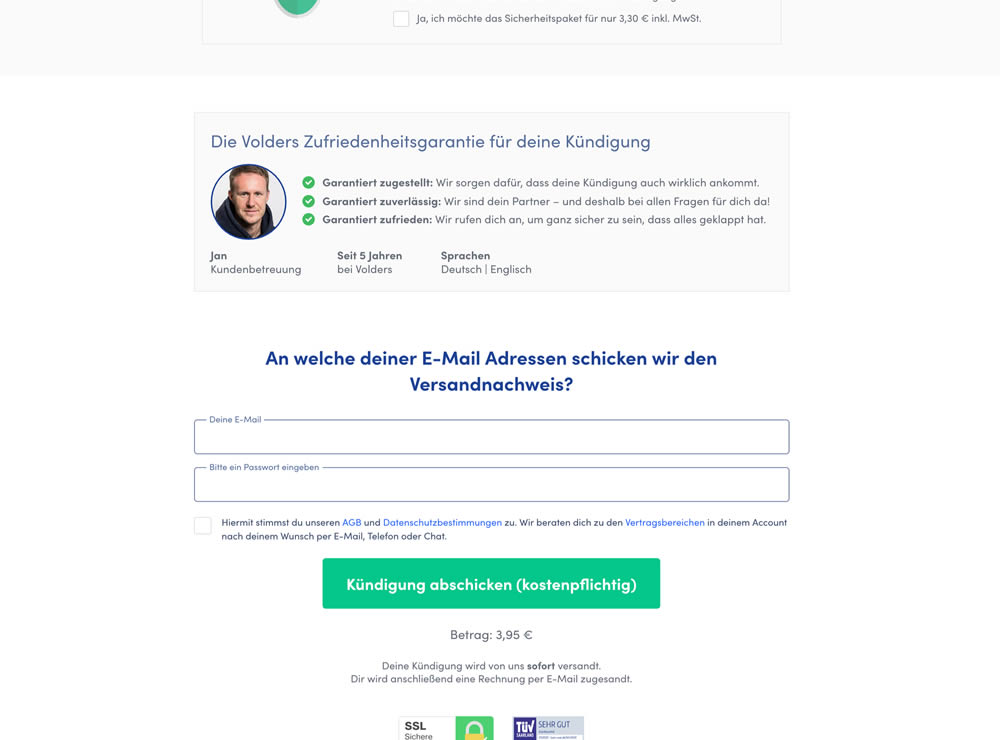
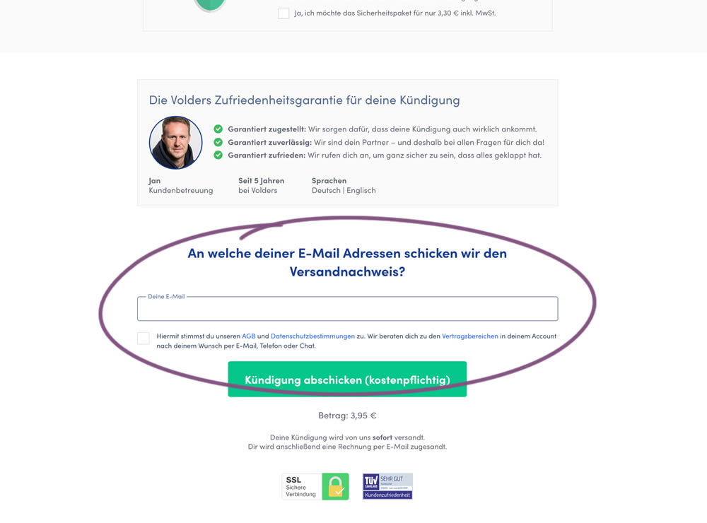
In this experiment, a password field was removed on a contract cancellation form (Volders).
In the control version, users were required to enter their email address and a password. If the email address was associated with an existing account, then the password was used to authenticate the user (and validated). When users entered a new email address, then the password field was used to create a new account.
In the variation, the password field was removed, as the authentication happened after the conversion itself using other backend mechanisms.
Test #291 on
Elevate App
by  Jesse Germinario
Mar 30, 2020
Mobile
Signup
X.X%
Signups
Jesse Tested Pattern #91: Forced Action
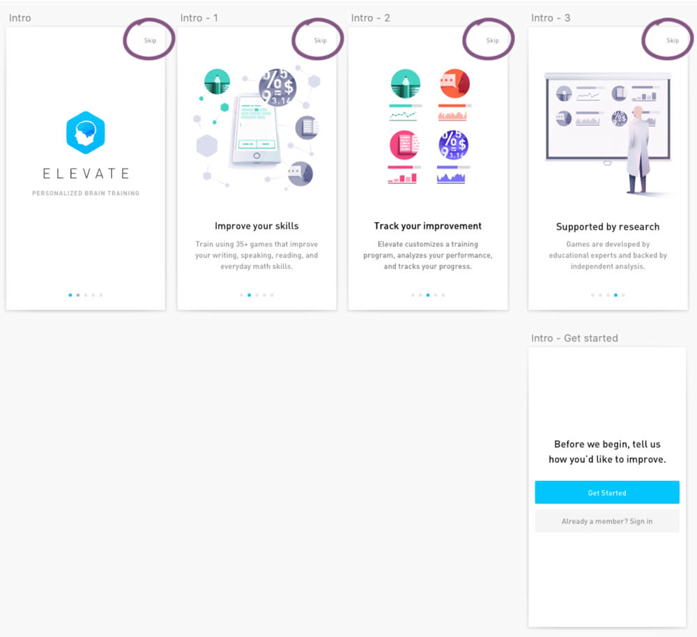
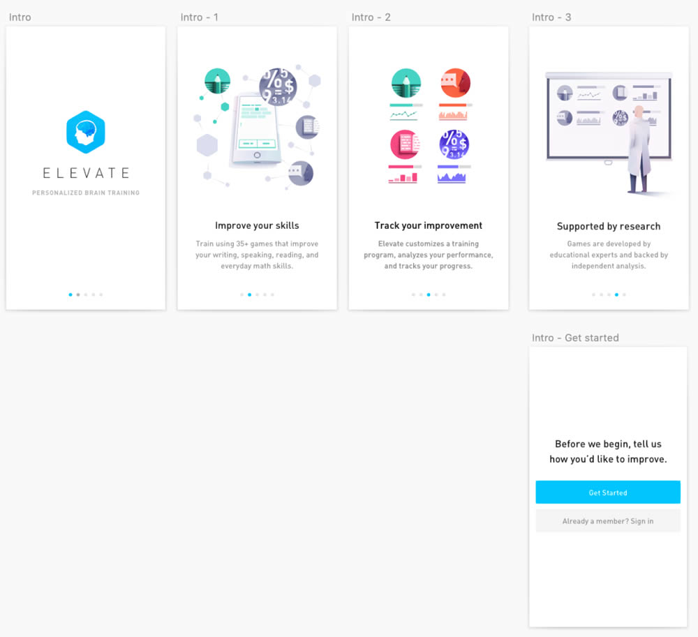
This experiment was ran on the initial onboarding screens of the Elevate App - right after installing and launching the app for the first time. The change was the removal of subtle "skip" links that fast tracked users to the signup/login screen (Get Started). Hence in the variation, all users had to scroll through the 4 introductory messages before being asked to create an account.