All Latest 562 A/B Tests
Become a member to unlock the abiltiy to see the highest impact a/b tests. Being able to see the actual test results and sort by impact allows growth and experimentation teams to take action on the biggest gains first
MOST RECENT TESTS
Test #250 on
Volders.de
by
 Alexander Krieger
Jul 25, 2019
Desktop
Mobile
Signup
Alexander Krieger Tested Pattern #106: Back Buttons In Test #250 On Volders.de
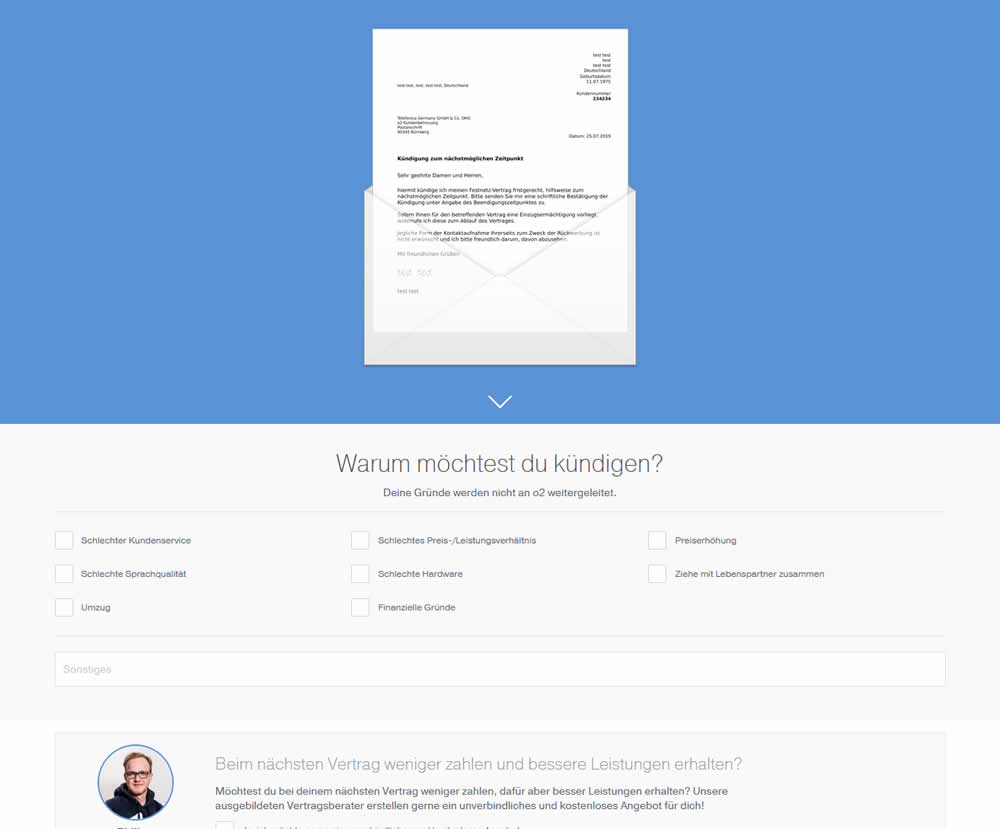
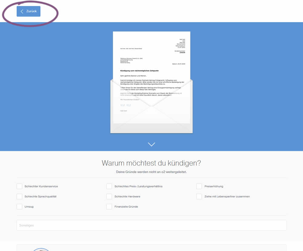
In this experiment, a version without a back button was tested against a one where it was positioned in the upper left corner. This test occured on a second step of a contract cancellation service.
Test #251 on
Goodui.org
by
 Jakub Linowski
Jul 25, 2019
Desktop
Mobile
Content
Jakub Linowski Tested Pattern #57: Maybe Later In Test #251 On Goodui.org
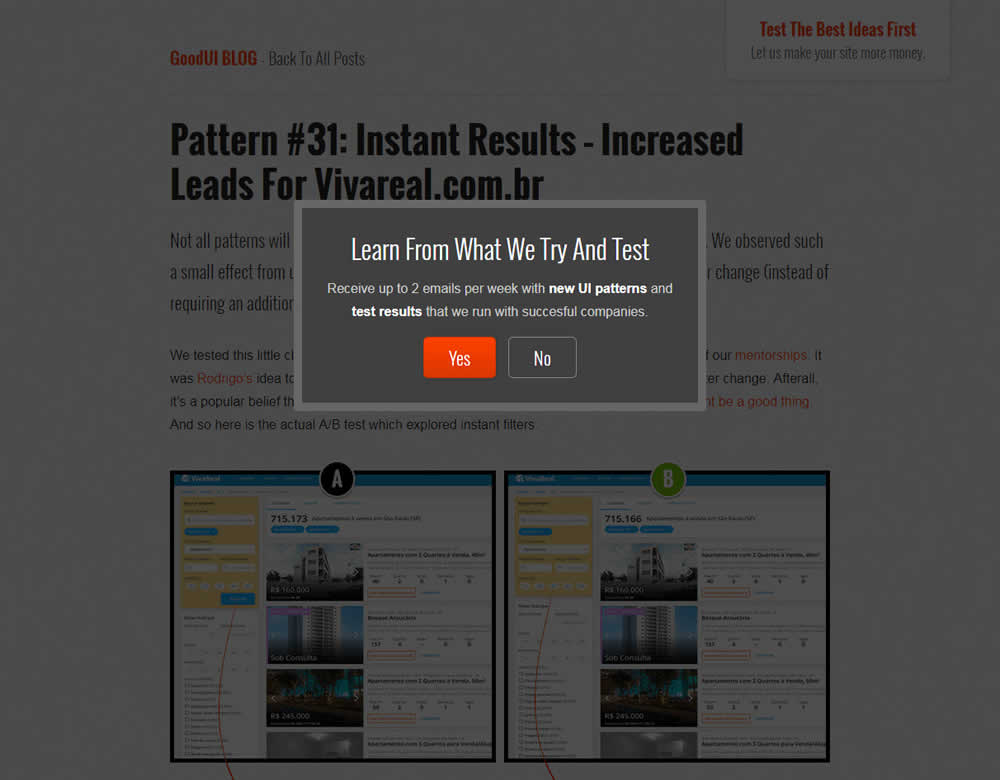

In this experiment, we tested a standard modal (with 2 choices) against a "Maybe Later" one (with 3 choices). One of the choices in the variant allowed users to postpone their decision with a "maybe" which would enable a floating bar at the bottom of the screen. Clicking on any of the "Yes" options would send people to the bottom of the screen with an email signup form. Increasing signup was our primary measure. Both modals also appeared instantly after a page load.
Test #247 on
Thomasnet.com
by
 Julian Gaviria
Jun 13, 2019
Desktop
Mobile
Content
Julian Gaviria Tested Pattern #41: Sticky Call To Action In Test #247 On Thomasnet.com
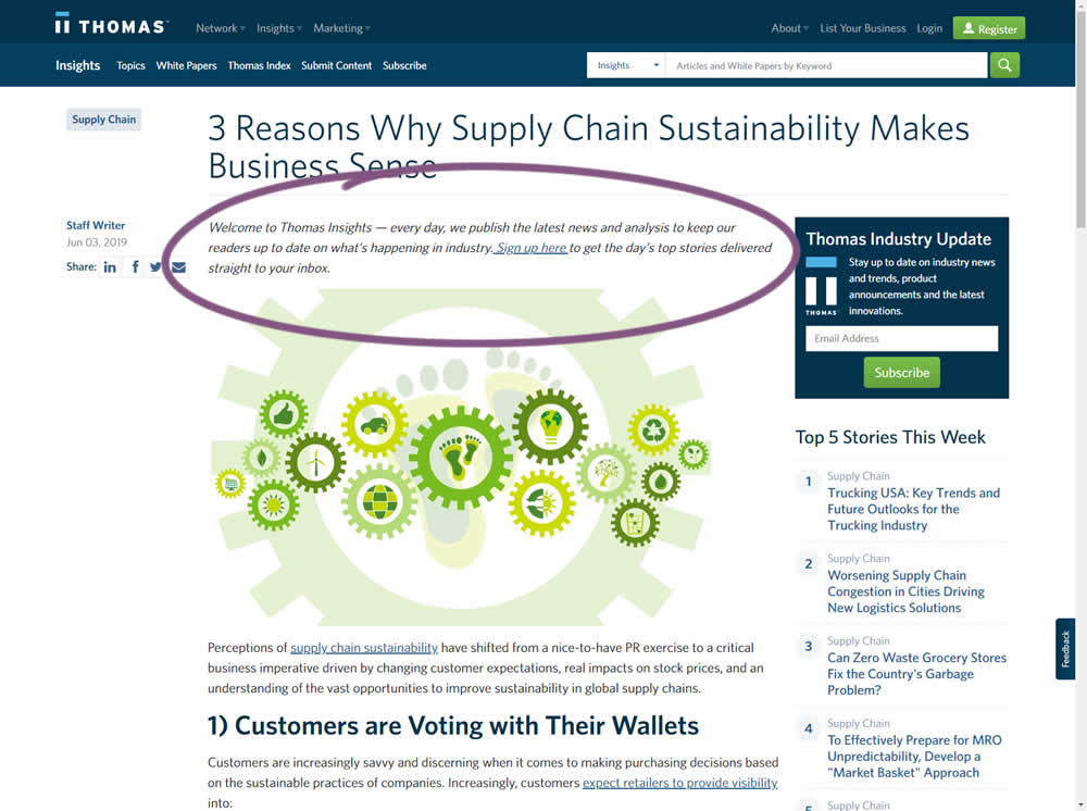
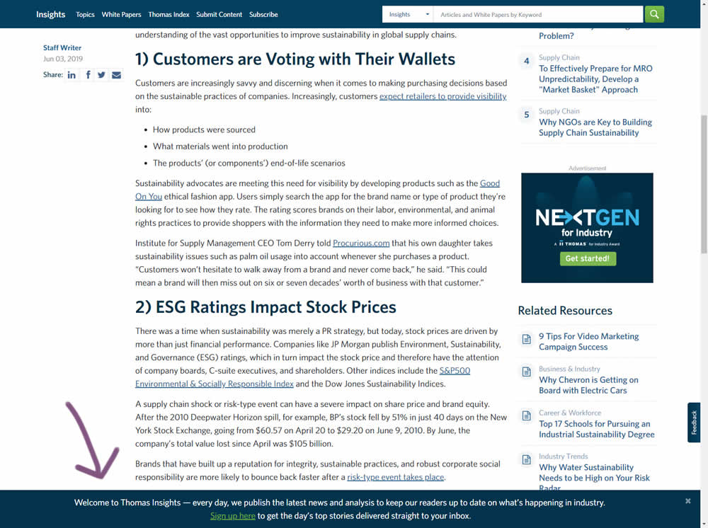
In this experiment, the same message (with a link) for signing up to a newsletter was shown in two distinct ways. The control (A) showed the signup message as inline one that preceded the content of the article at the very top. The variant showed the same signup message as a scroll-delayed sticky interaction at the bottom of the screen. The background color of the B variant was also inverted to match the style of the footer.
Test #246 on
Thomasnet.com
by
 Julian Gaviria
Jun 12, 2019
Desktop
Mobile
Home & Landing
Julian Gaviria Tested Pattern #88: Action Button In Test #246 On Thomasnet.com
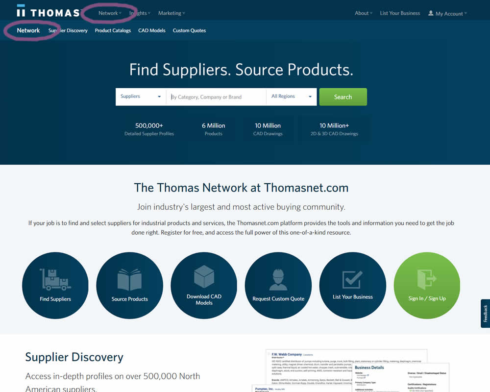
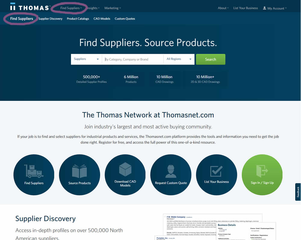
In this experiment, the navigation label was changed from "Network" to "Find Suppliers". The idea was to make use of an action label with a clearer benefit.
Test #243 on
Goodui.org
by
 Jakub Linowski
Jun 05, 2019
Desktop
Mobile
Home & Landing
Jakub Linowski Tested Pattern #77: Filled Or Ghost Buttons In Test #243 On Goodui.org
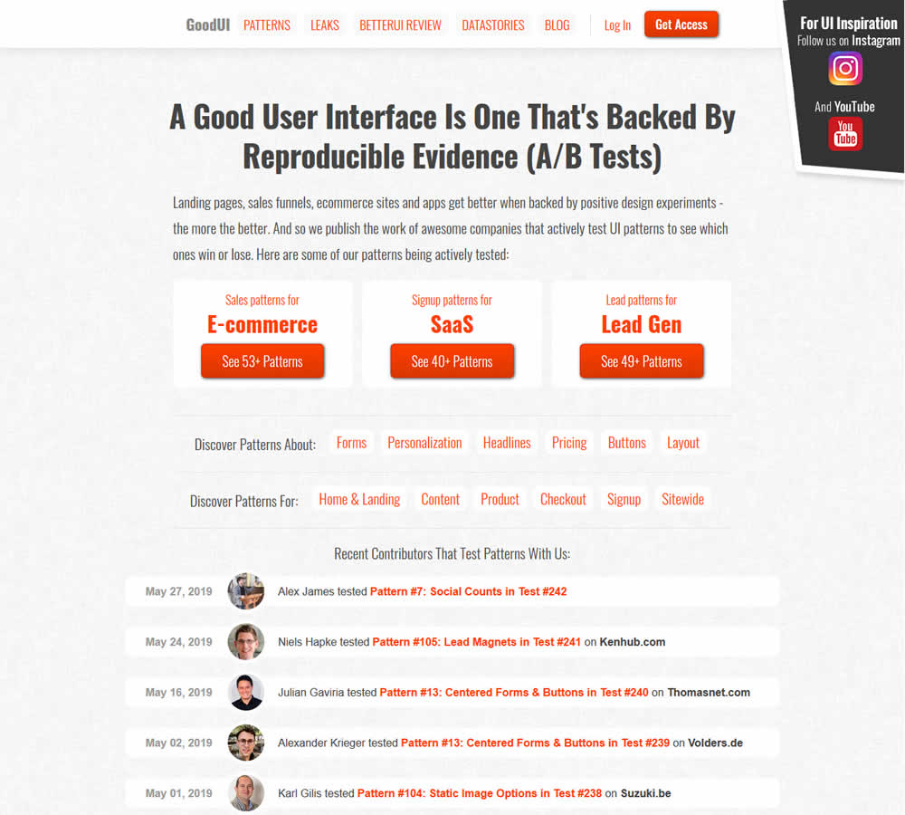
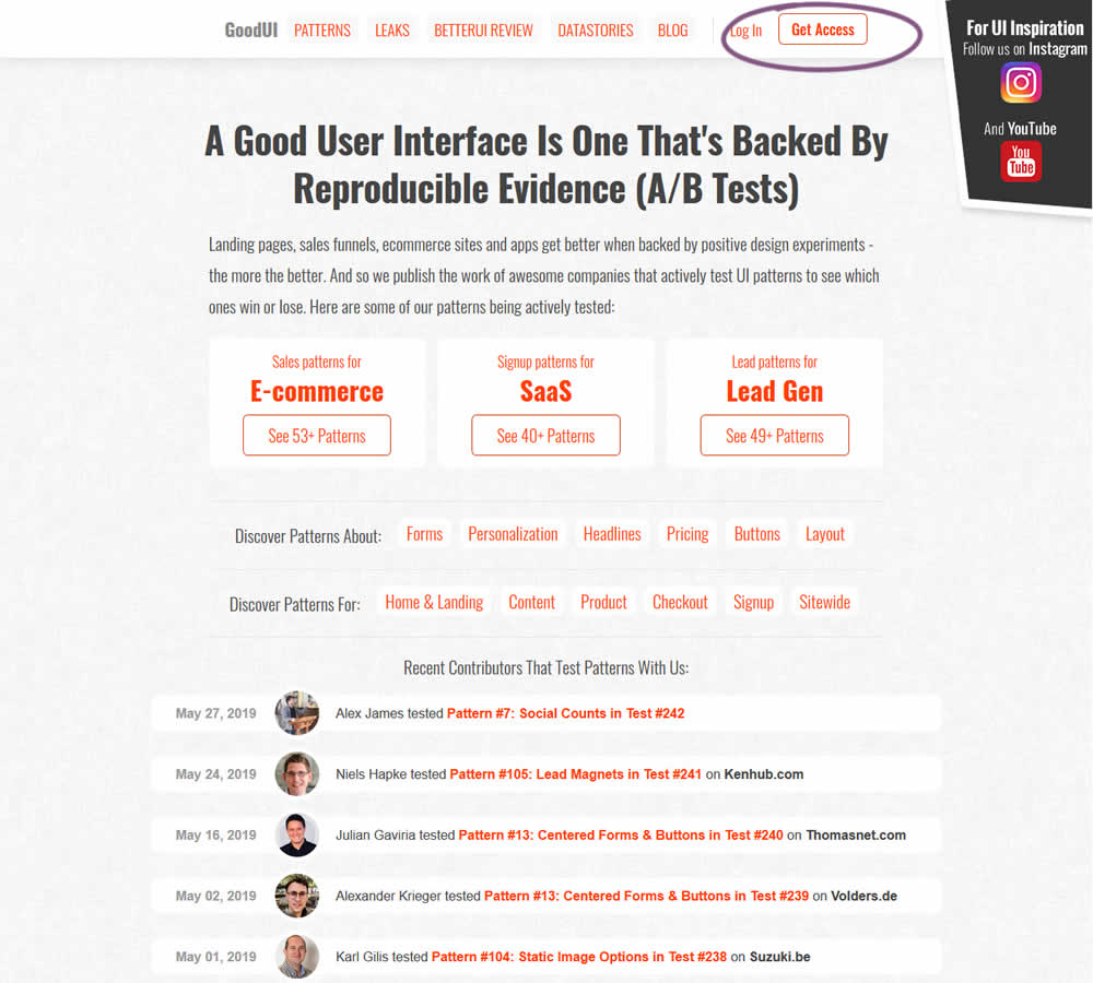
In this experiment, full red background buttons were changed to ghost buttons (red outline and transparent fill)
Test #242 on
by
 Alex James
May 27, 2019
Desktop
Mobile
Signup
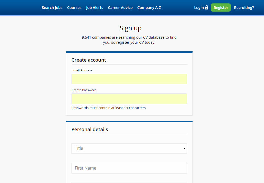
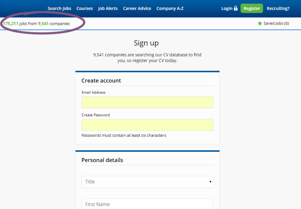
Alex James Tested Pattern #7: Social Counts In Test #242
Test #241 on
Kenhub.com
by
 Niels Hapke
May 24, 2019
Desktop
Mobile
Signup
Niels Hapke Tested Pattern #105: Lead Magnets In Test #241 On Kenhub.com
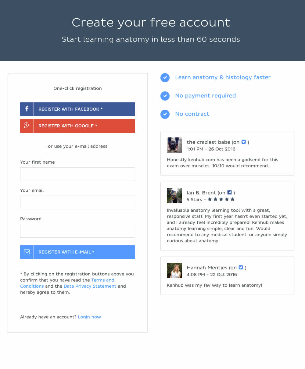
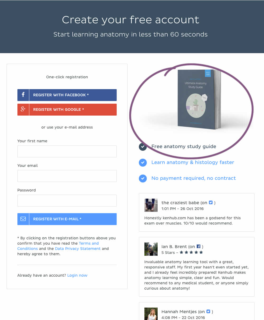
In this experiment, a free study guide ebook was promoted on a registration page.
Test #237 on
Goodui.org
by
 Jakub Linowski
Apr 29, 2019
Desktop
Mobile
Listing
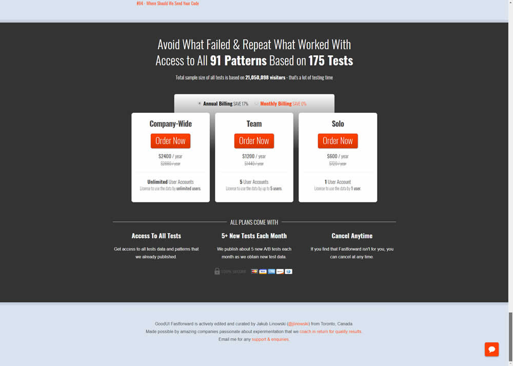
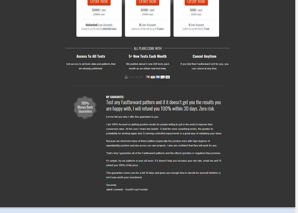
Jakub Linowski Tested Pattern #103: Money Back Guarantee In Test #237 On Goodui.org
Test #235 on
Thomasnet.com
by
 Julian Gaviria
Apr 02, 2019
Desktop
Mobile
Home & Landing
Julian Gaviria Tested Pattern #102: Expanded Or Condensed Layout In Test #235 On Thomasnet.com
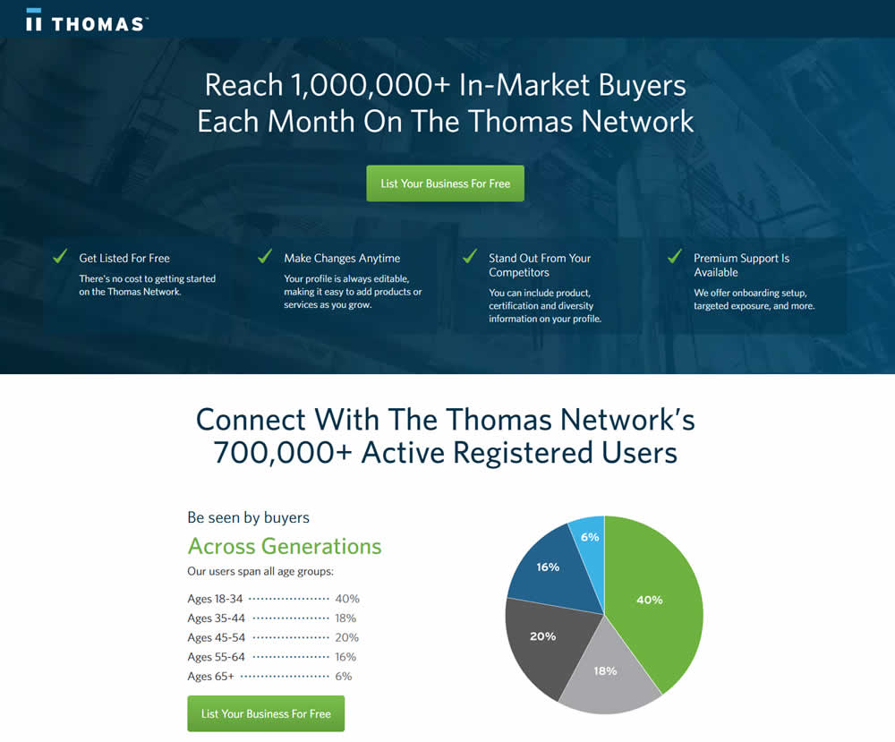
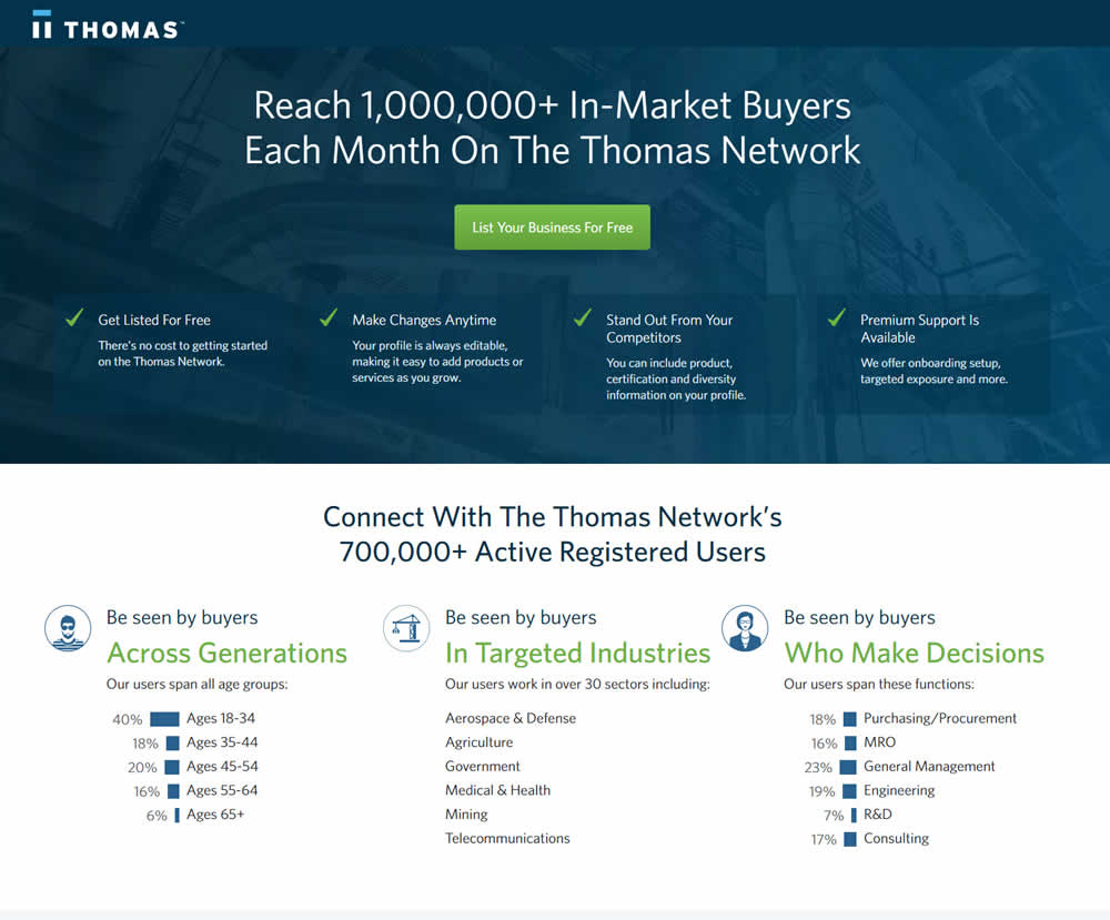
In this experiment, the layout was condensed from a taller to a shorter one.
Test #232 on
Yoast.com
by
 Sjardo Janssen
Mar 15, 2019
Desktop
Mobile
Checkout
Sjardo Janssen Tested Pattern #6: Customer Star Ratings In Test #232 On Yoast.com
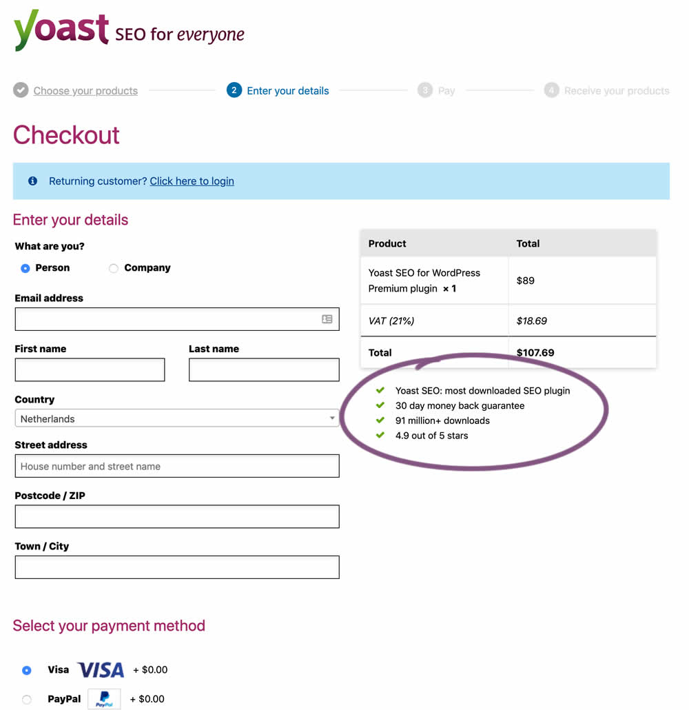
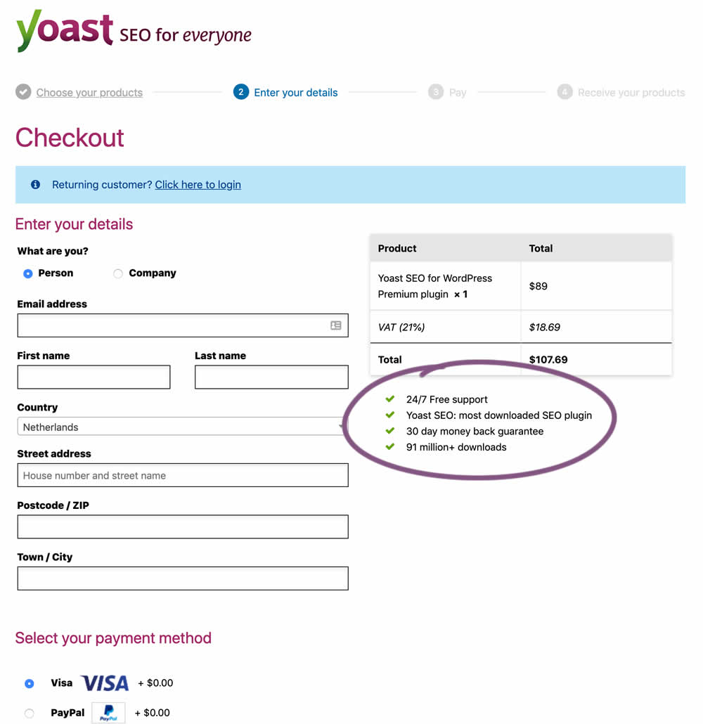
In this experiment, the Yoast team replaced one of the bulleted reassurances on their checkout page ("4.9 out of 5 stars" vs "24/7 Free support"). Raising the question - is free support or high reviews valued more? - Thanks Sjardo & Meike for sharing!
Test #231 on
Glass.net
by
 Mark Freedle
Mar 14, 2019
Desktop
Mobile
Signup
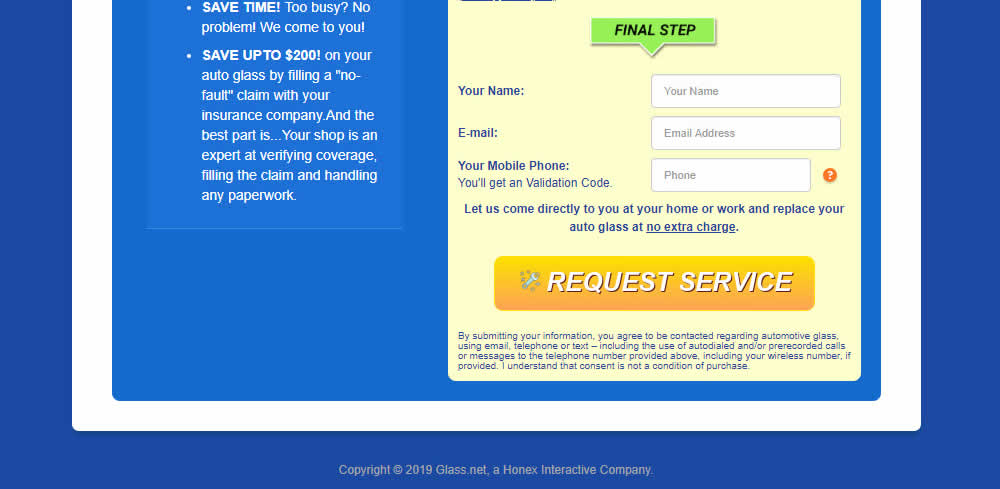
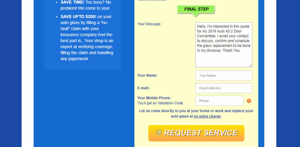
Mark Freedle Tested Pattern #20: Canned Response In Test #231 On Glass.net
Test #230 on
Goodui.org
by
 Jakub Linowski
Mar 09, 2019
Desktop
Mobile
Listing
Jakub Linowski Tested Pattern #56: Hover Button In Test #230 On Goodui.org
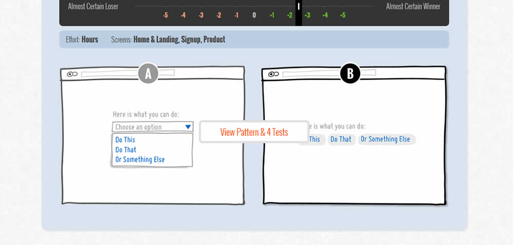
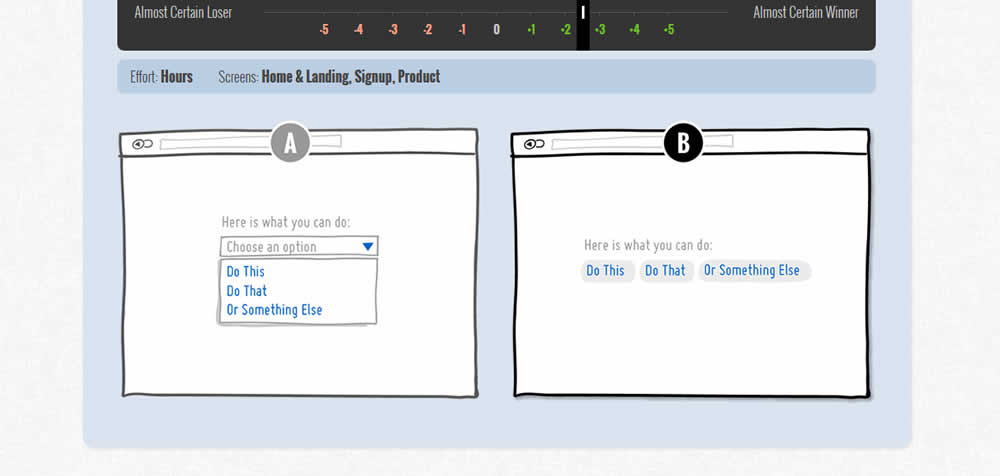
In this test we tested onhover buttons (variant) versus more traditional always exposed and visible ones.
Test #229 on
by
 Jakub Linowski
Mar 08, 2019
Desktop
Mobile
Checkout
Jakub Linowski Tested Pattern #99: Progress Bar In Test #229

Test #228 on
by
 Jakub Linowski
Mar 05, 2019
Desktop
Mobile
Checkout
Jakub Linowski Tested Pattern #99: Progress Bar In Test #228

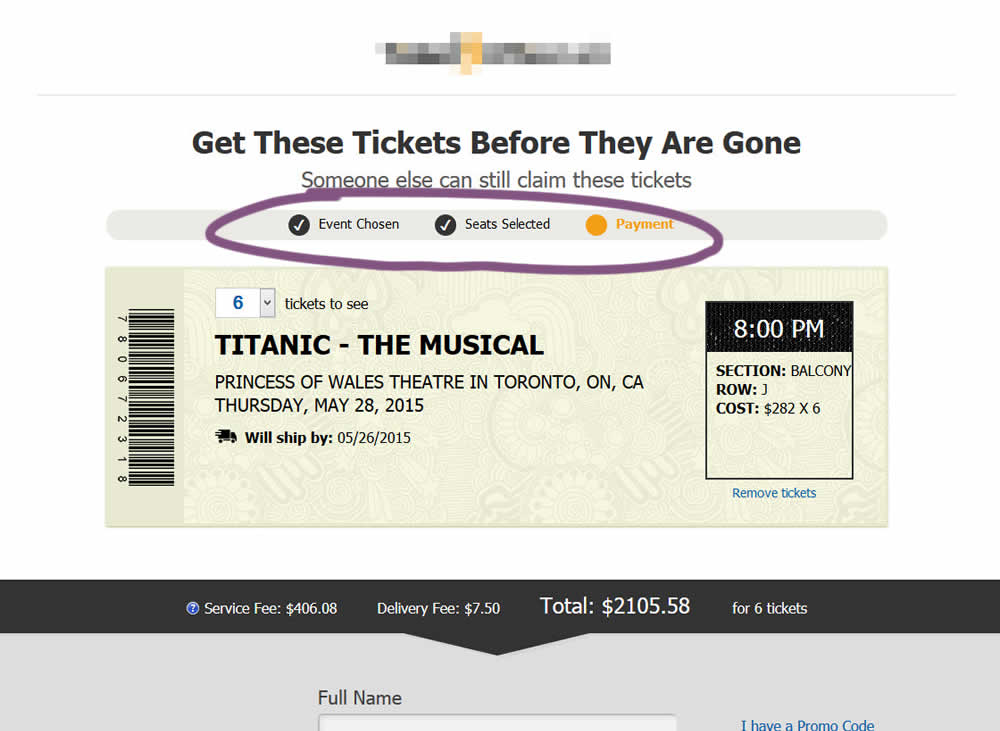
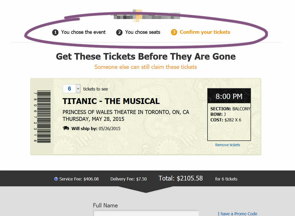
The variation added a progress bar to one of the checkout steps for a ticket ordering site.
Test #223 on
Volders.de
by
 Alexander Krieger
Feb 01, 2019
Desktop
Mobile
Signup
Alexander Krieger Tested Pattern #12: Payment First In Test #223 On Volders.de
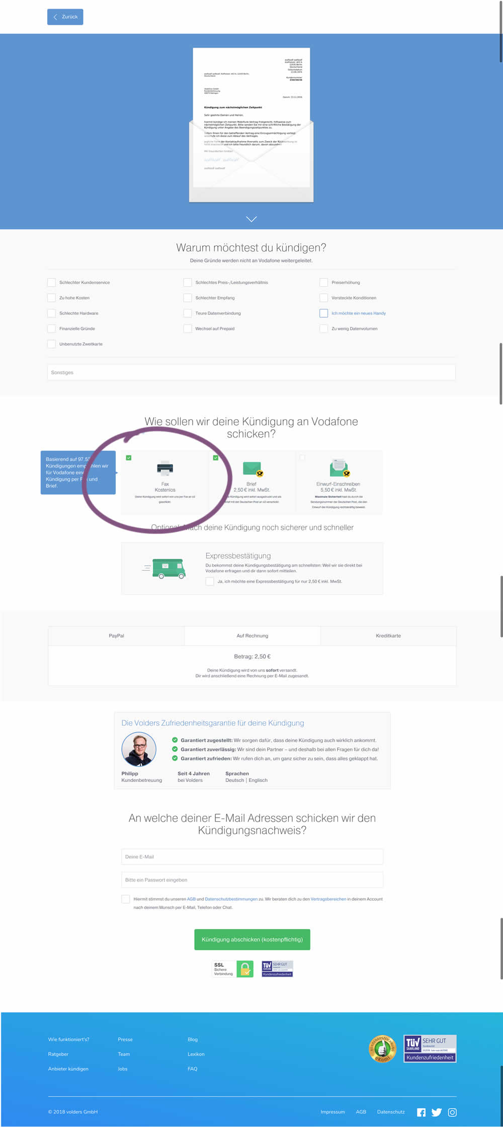
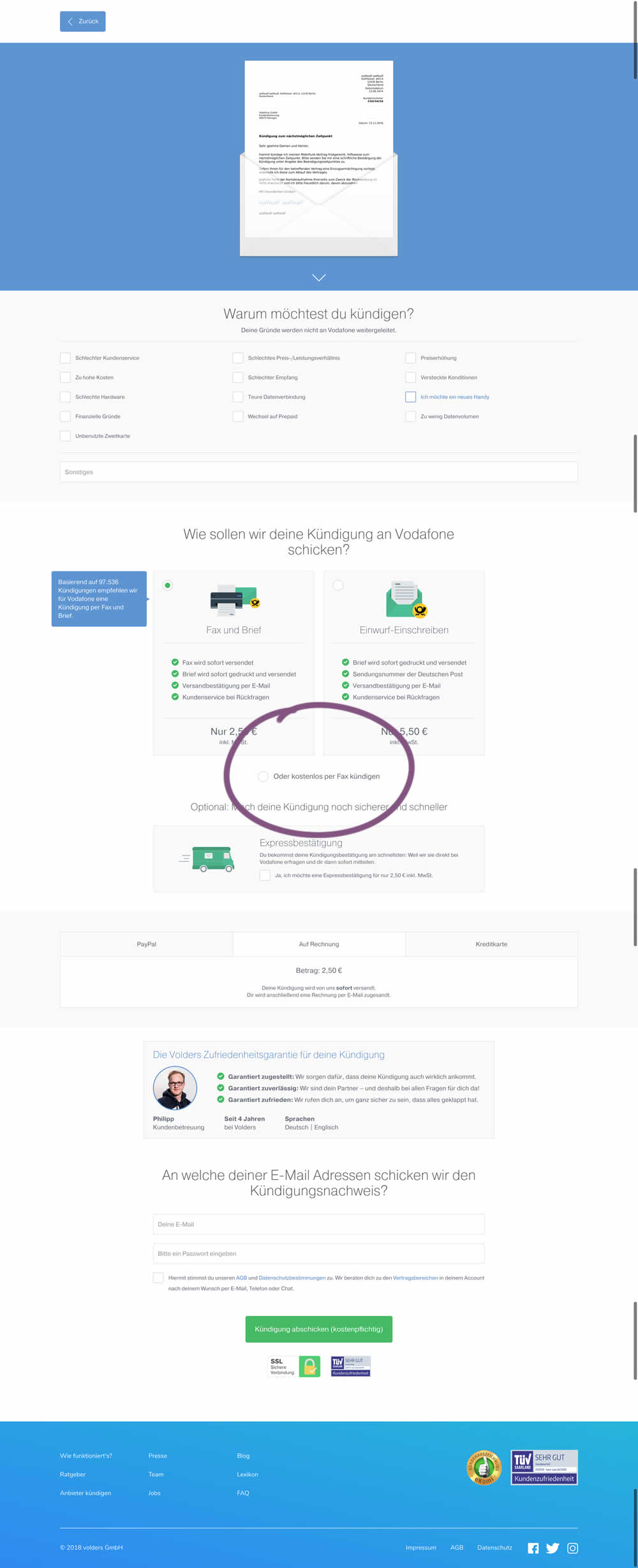
This test deprioritized the free option (kostenlos) of cancelling a contract. It did so by placing it under the paid options as small text link / radio option.
Test #218 on
Yummly.com
by
 Kimberly Cheung
Jan 14, 2019
Desktop
Mobile
Home & Landing
Kimberly Cheung Tested Pattern #94: Visible Search In Test #218 On Yummly.com
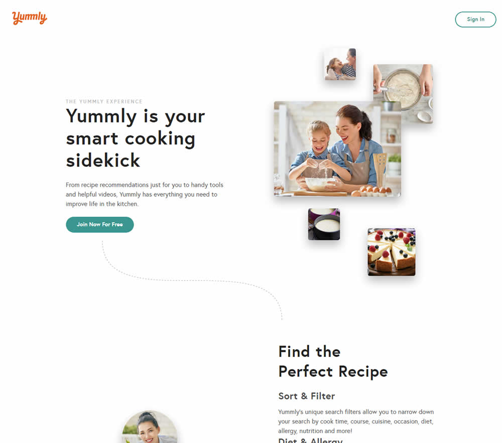
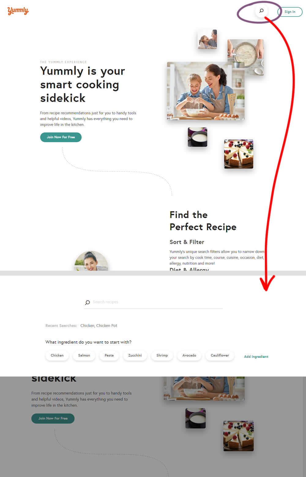
Hypothesis: Anonymous users can't use global search while on the home promo page. We believe that if we show a global search bar to anonymous users, it presents a higher converting funnel (guided search) and will increase our sign-up rates significantly.
Control (A): Logged out users don't see global search bar.
Variant (B): Logged out users see global search bar. After searching for a keyword, the signup funnel starts with a more personalized reason to continue the signup process.
Test #219 on
Mt.com
by
 Vito Mediavilla
Jan 14, 2019
Desktop
Mobile
Home & Landing
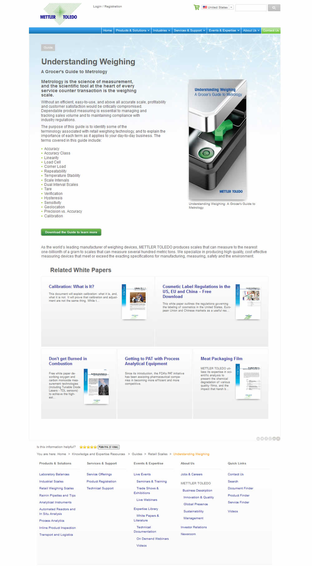
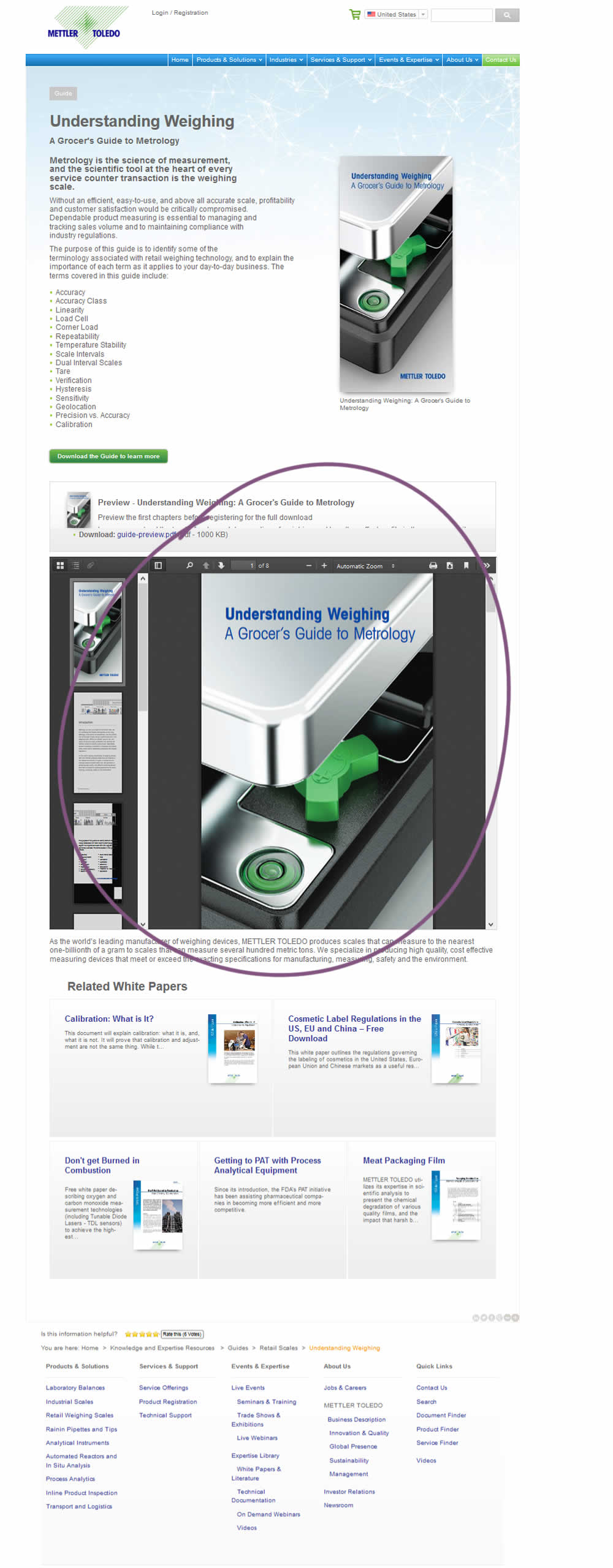
Vito Mediavilla Tested Pattern #95: Clickable Product Previews In Test #219 On Mt.com
Test #217 on
Thomasnet.com
by
 Julian Gaviria
Jan 03, 2019
Desktop
Mobile
Home & Landing
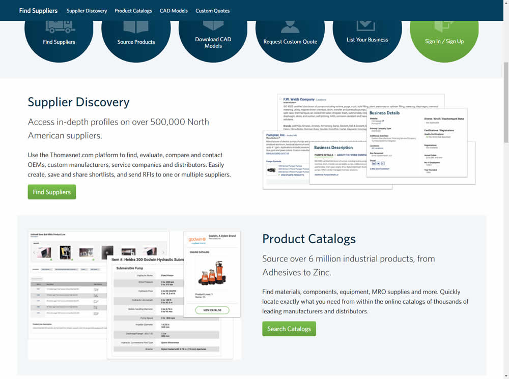
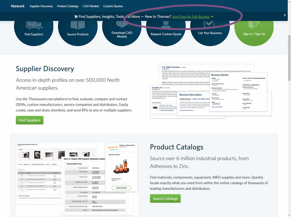
Julian Gaviria Tested Pattern #41: Sticky Call To Action In Test #217 On Thomasnet.com
Test #215 on
Vivareal.com.br
by
 Vinicius Barros Peixoto
Dec 21, 2018
Mobile
Listing
Vinicius Barros Peixoto Tested Pattern #92: Already Viewed Label In Test #215 On Vivareal.com.br


The idea of this test was to add a "Viewed" label on a listing page to indicate listings which have already been viewed by users.
Test #214 on
Yummly.com
by
 Marcos Ciarrocchi
Dec 07, 2018
Mobile
Signup
Marcos Ciarrocchi Tested Pattern #91: Forced Action In Test #214 On Yummly.com
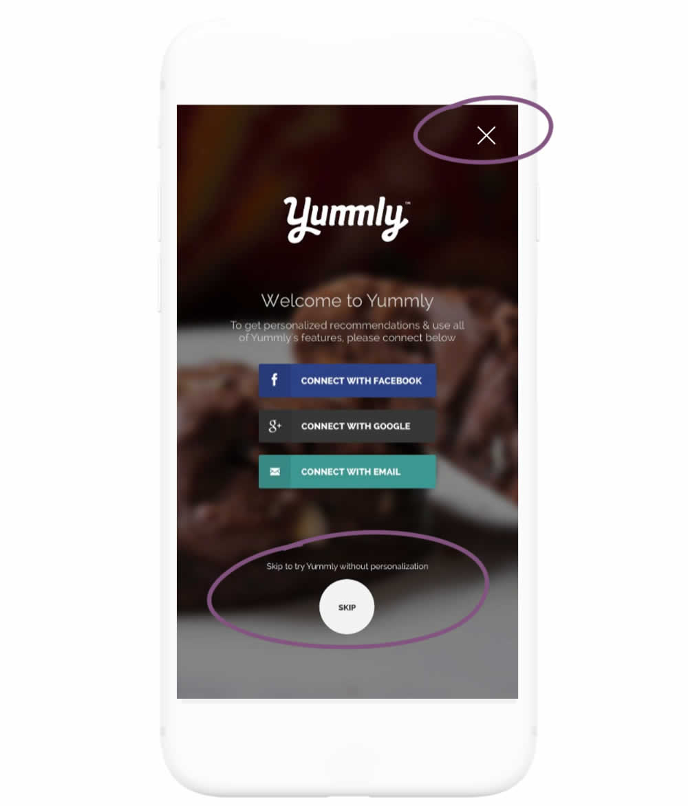
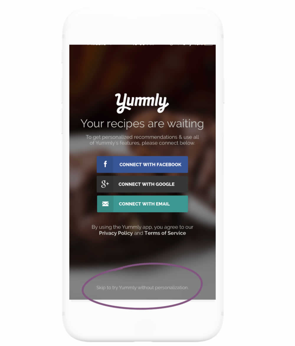
In this experiment, the highly prominent "skip" button was replaced with a less prominent text link. The copy of the skip text link also clarified the consequence of the action - losing out on personalization benefits. More so, the habitual top-right cancel icon was also removed.