All Latest 620 A/B Tests
MOST RECENT TESTS
Test #145 on
Normanrecords.com
by  Nathon Raine
Jan 18, 2018
Desktop
Checkout
X.X%
Sales
Nathon Tested Pattern #1: Remove Coupon Fields On Normanrecords.com
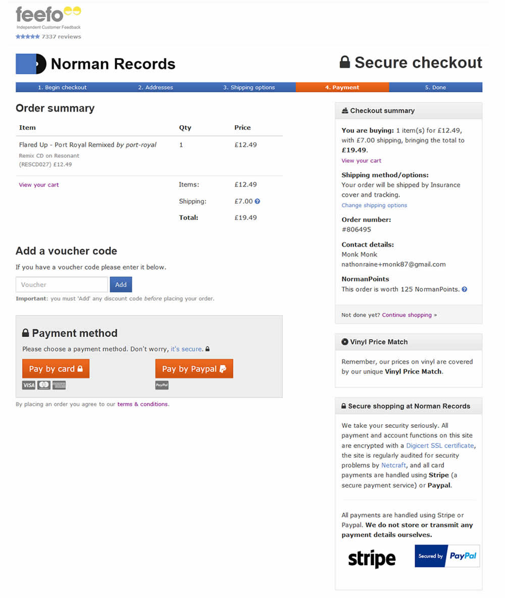
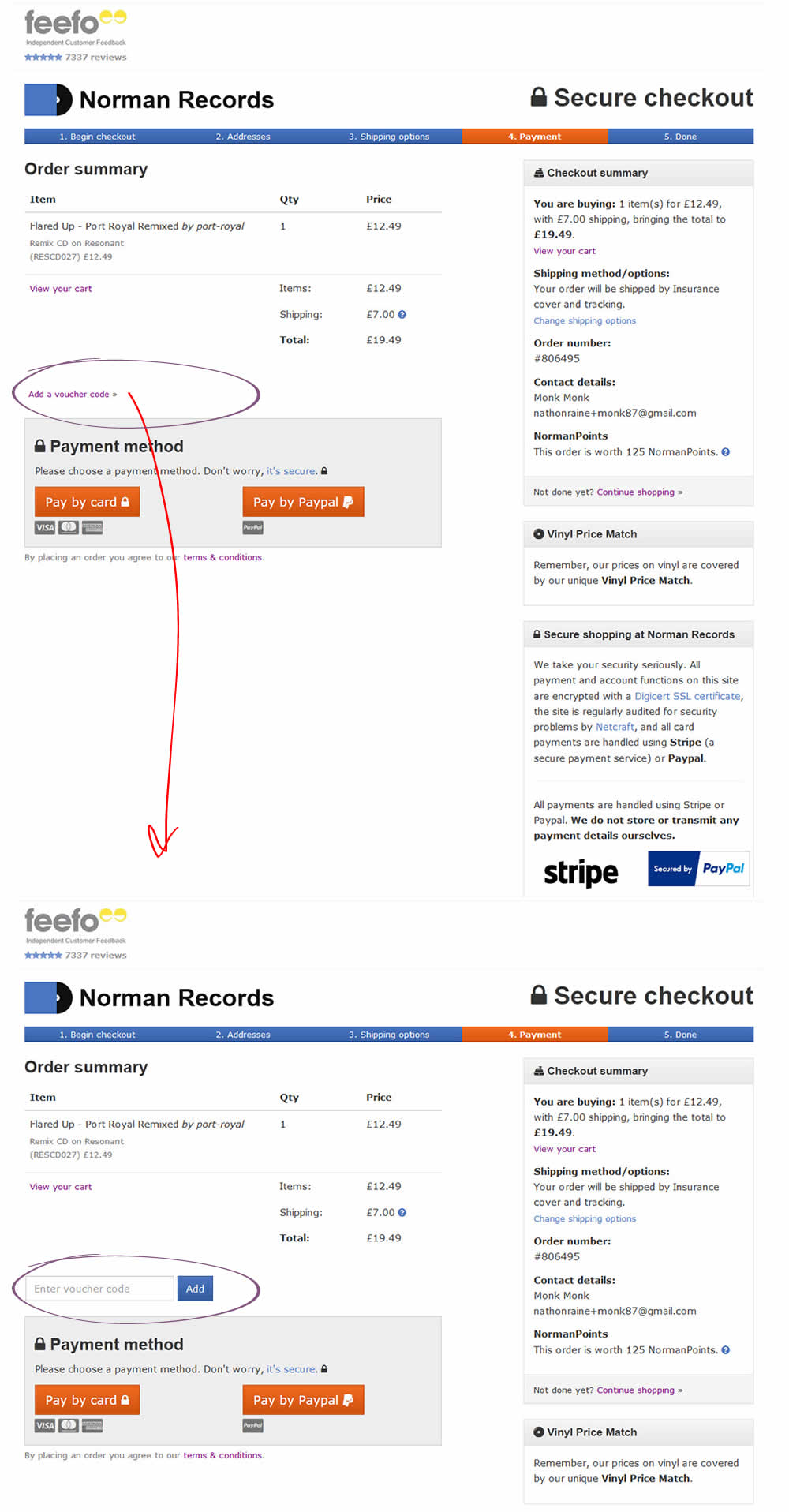
In this test the coupon field was replaced with a small link that would bring the field back if needed. This is a more suble approach than just completely removing the coupon field. It still allows for the use of coupon fields by those customers which are truly searching for a way to enter their aquired codes.
Which A Or B Actually Wins? Find Out Before You Test.
Members see every test result — the winners, the flat ones, and the losers — along with exact effects and sample sizes. Use it to estimate your tests and prioritize by probability, not gut feel. Start every experiment with the odds on your side.
Test #143 on
Vivareal.com.br
by  Rodrigo Maués
Jan 14, 2018
Desktop
Listing
X.X%
Leads
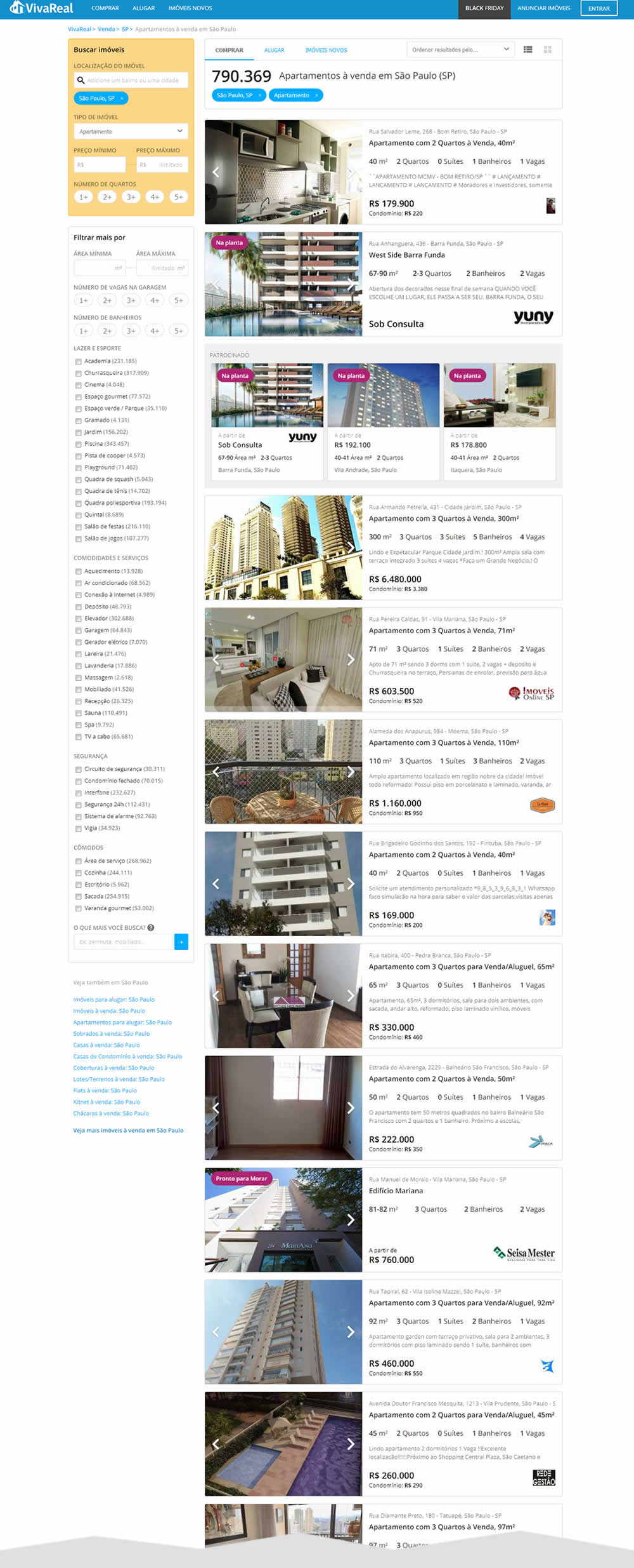
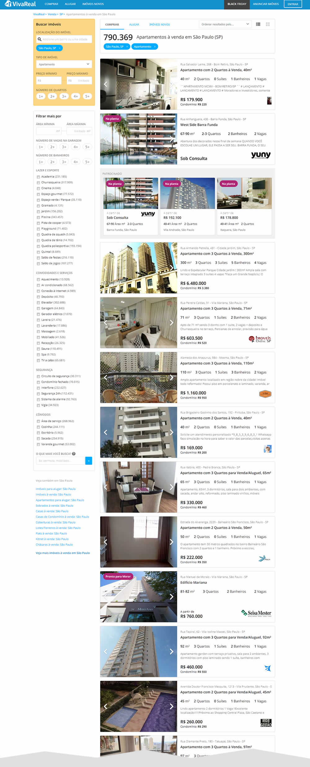
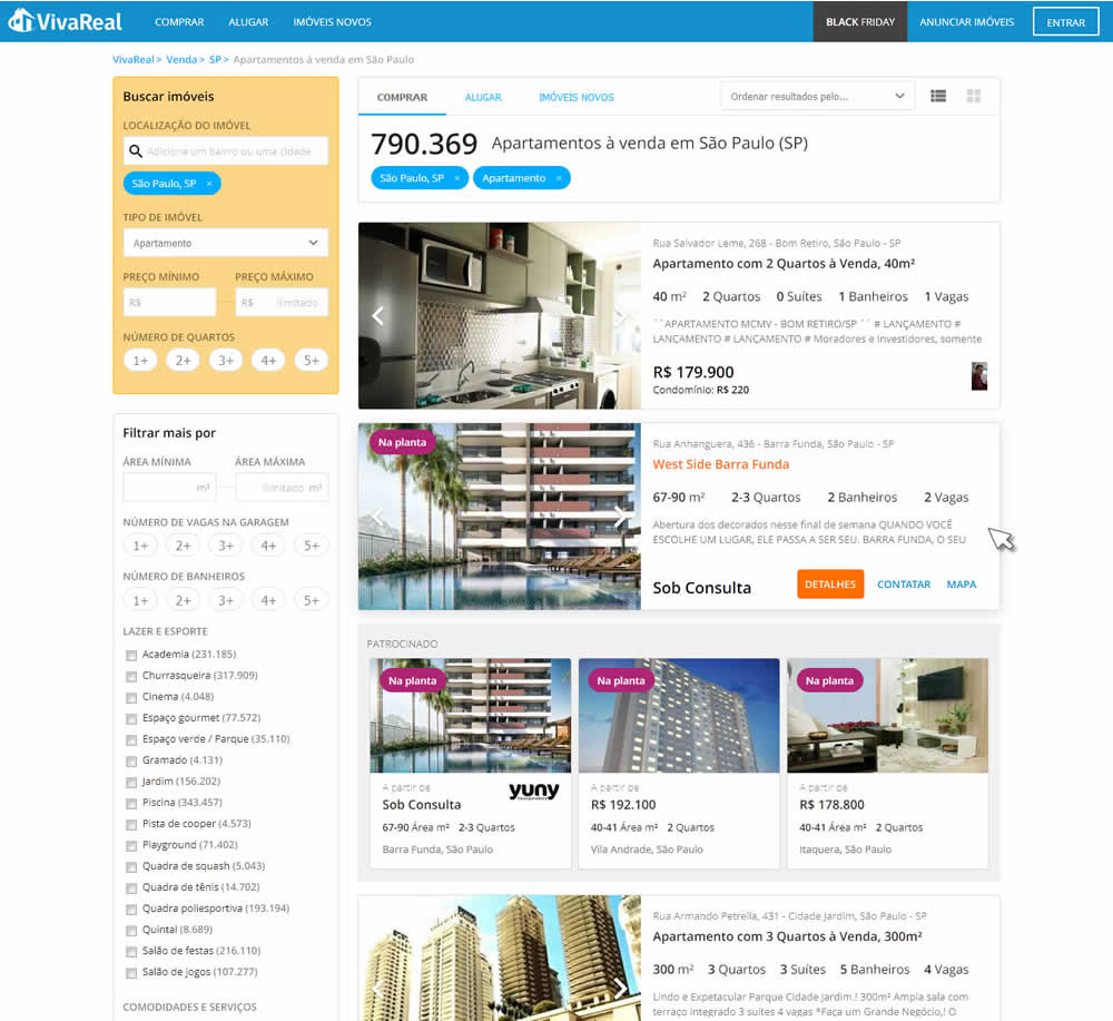
Rodrigo Tested Pattern #56: Hover Button On Vivareal.com.br

Test #144 on
Examine.com
by  Martin Wong
Jan 14, 2018
Desktop
Mobile
Product
X.X%
Sales
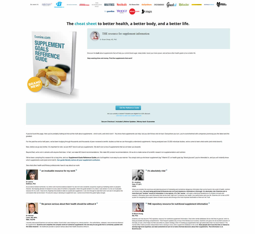
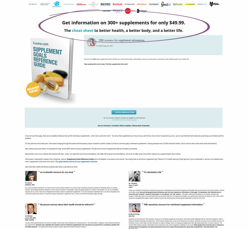
Martin Tested Pattern #27: More For Less Headline On Examine.com
Test #142 on
Streamlineicons.com
by  Vincent Le moign
Jan 13, 2018
Desktop
Product
X.X%
Progression
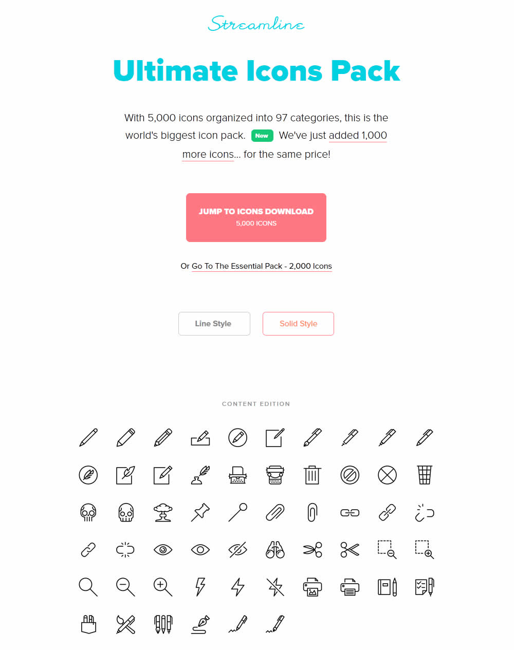
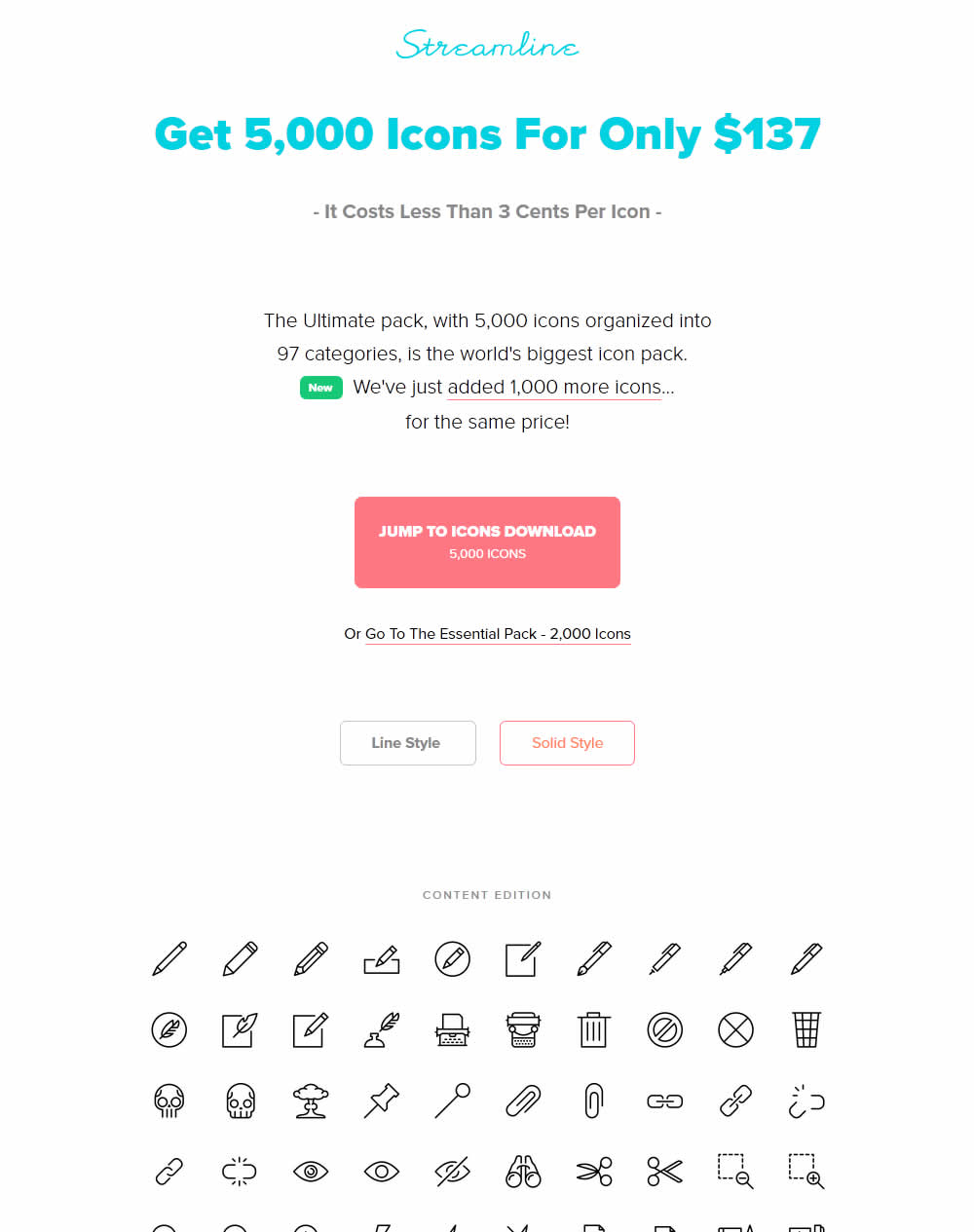
Vincent Tested Pattern #27: More For Less Headline On Streamlineicons.com
Test #140 on
Akademiafotografii.p...
by Grzegorz Jancewicz
Jan 05, 2018
Desktop
Mobile
Product
X.X%
Leads
Grzegorz Tested Pattern #46: Pay Later On Akademiafotografii.p...
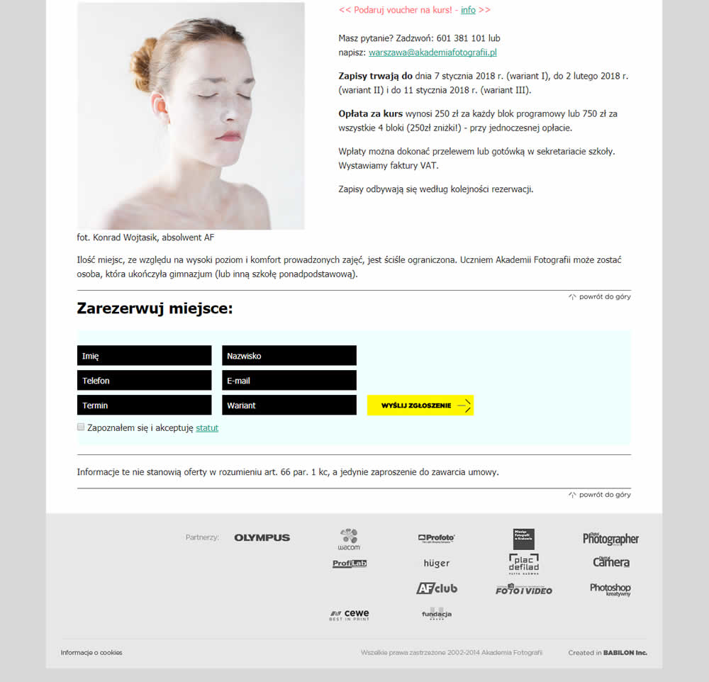
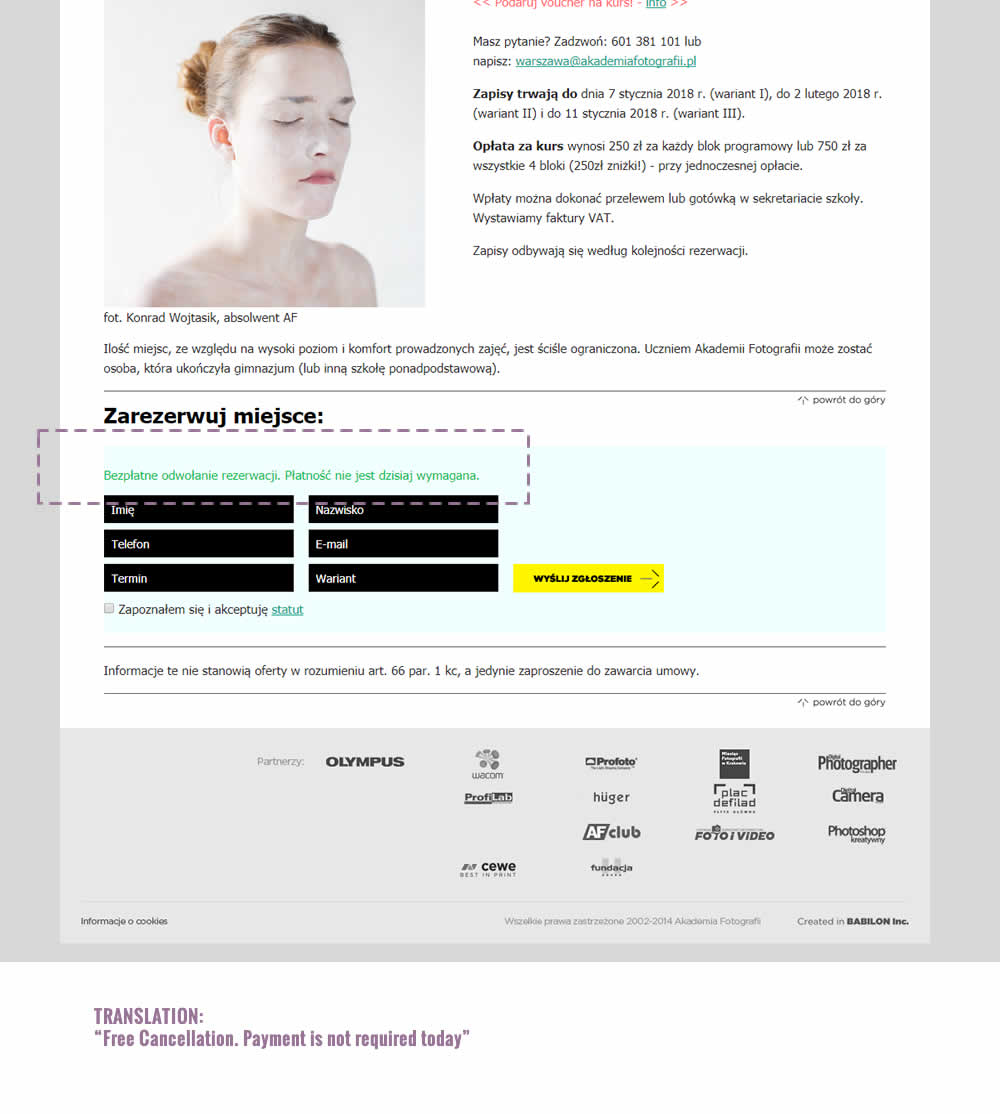
The test was run on multiple course pages. The screenshot contains the cropped bottom part of a long screen with an exposed signup form. The variation introduced additional text above the form which states: "Free Cancellation. Payment is not required today".
Test #141 on
Trydesignlab.com
by  Daniel Shapiro
Jan 05, 2018
Desktop
Mobile
Product
X.X%
Leads
Daniel Tested Pattern #49: Above The Fold Call To Action On Trydesignlab.com


The variation introduced a call to action at the top of the screen that linked to a form deep down on a long course page.
Test #139 on
Examine.com
by  Martin Wong
Jan 04, 2018
Desktop
Pricing
X.X%
Sales
Martin Tested Pattern #51: Shortcut Buttons On Examine.com
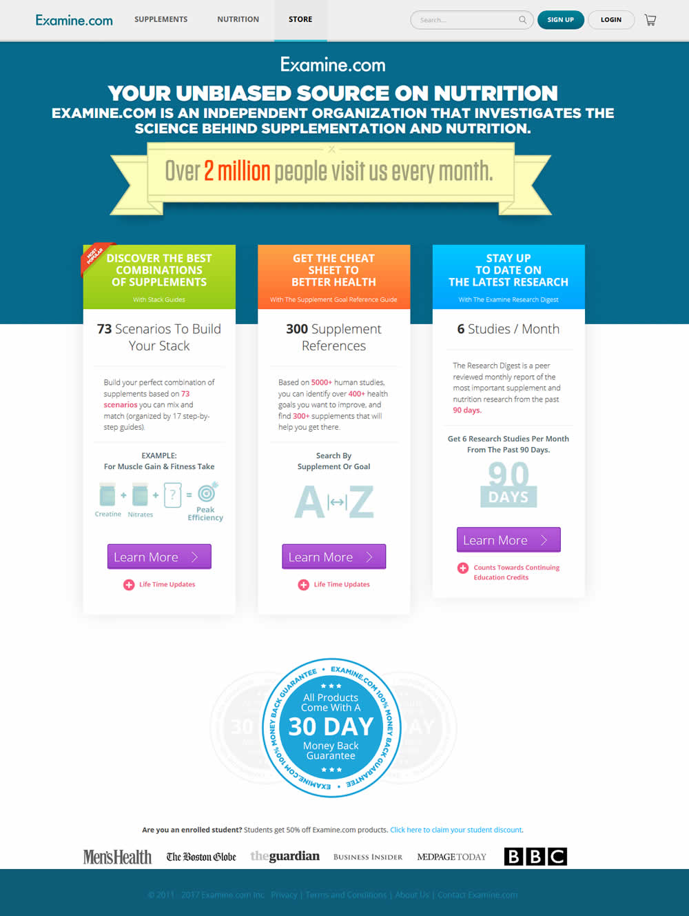
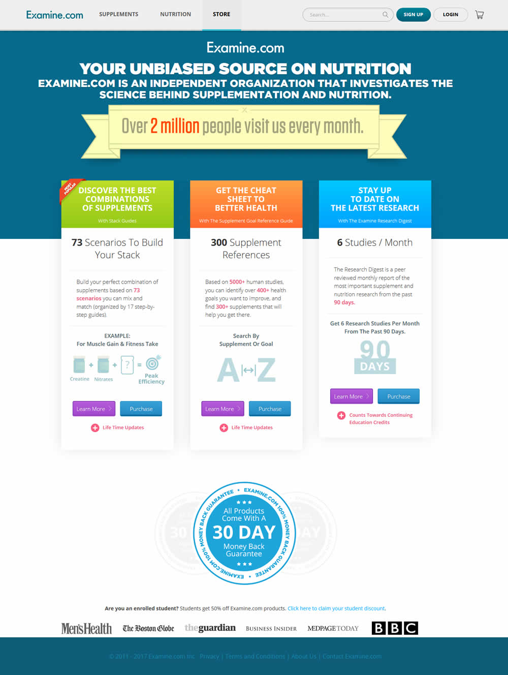
In this test an additional "Purchase" button was shown along side a "Learn More" button. The "Purchase" button went straight to checkout, whereas the "Learn More" button went to a product overview page.
Test #137 on
Trydesignlab.com
by  Daniel Shapiro
Dec 22, 2017
Desktop
Mobile
Checkout
X.X%
Sales
Daniel Tested Pattern #46: Pay Later On Trydesignlab.com
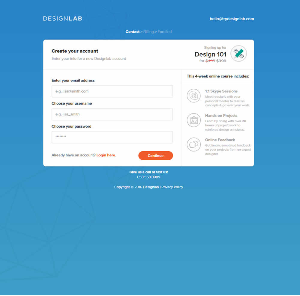
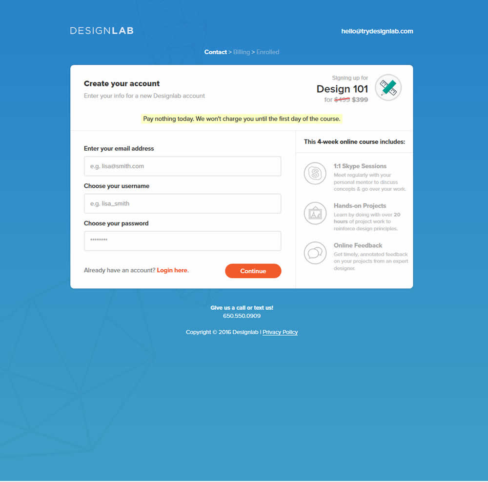
This test was run on a 3 step checkout process. The first screen was asking for contact information, and the second screen asked for credit card details. The change was shown on both first two steps as shown on the image below.
Test #138 on
Trydesignlab.com
by  Daniel Shapiro
Dec 22, 2017
Desktop
Mobile
Checkout
X.X%
Sales
Daniel Tested Pattern #42: Countdown Timer On Trydesignlab.com
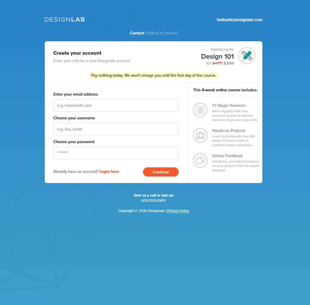
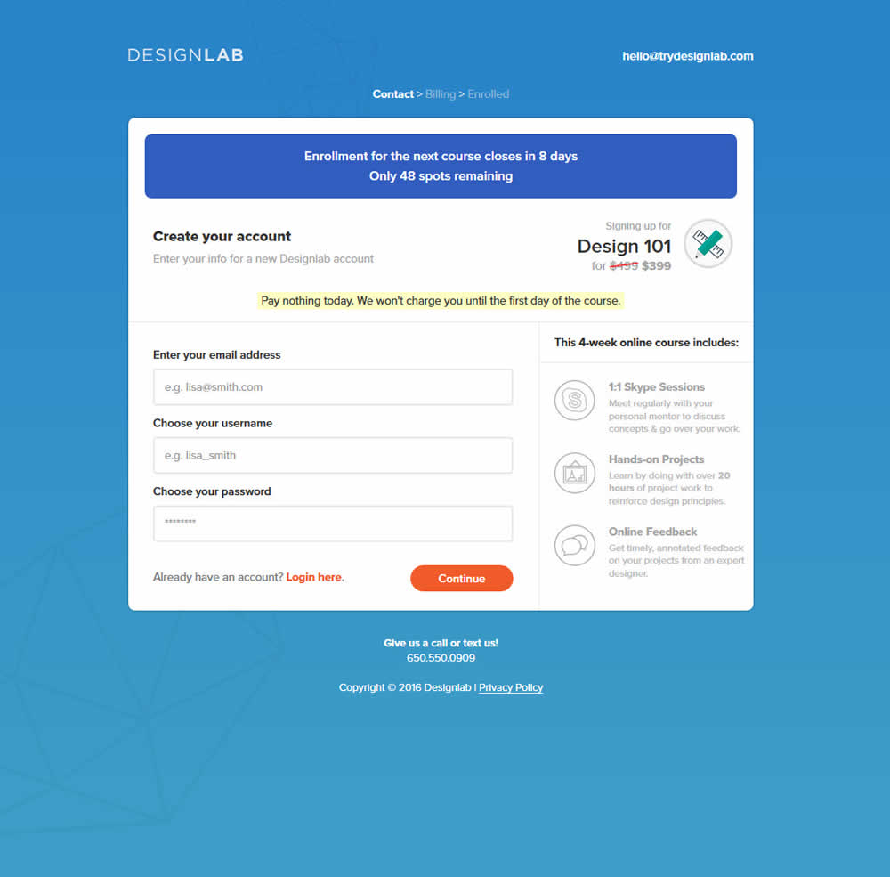
This test was run on a 3 step checkout process. The first screen was asking for contact information, and the second screen asked for credit card details. The change was shown on both first two steps as shown on the image below.
Test #135 on
Akademiafotografii.p...
by Grzegorz Jancewicz
Dec 18, 2017
Desktop
Home & Landing
X.X%
Leads
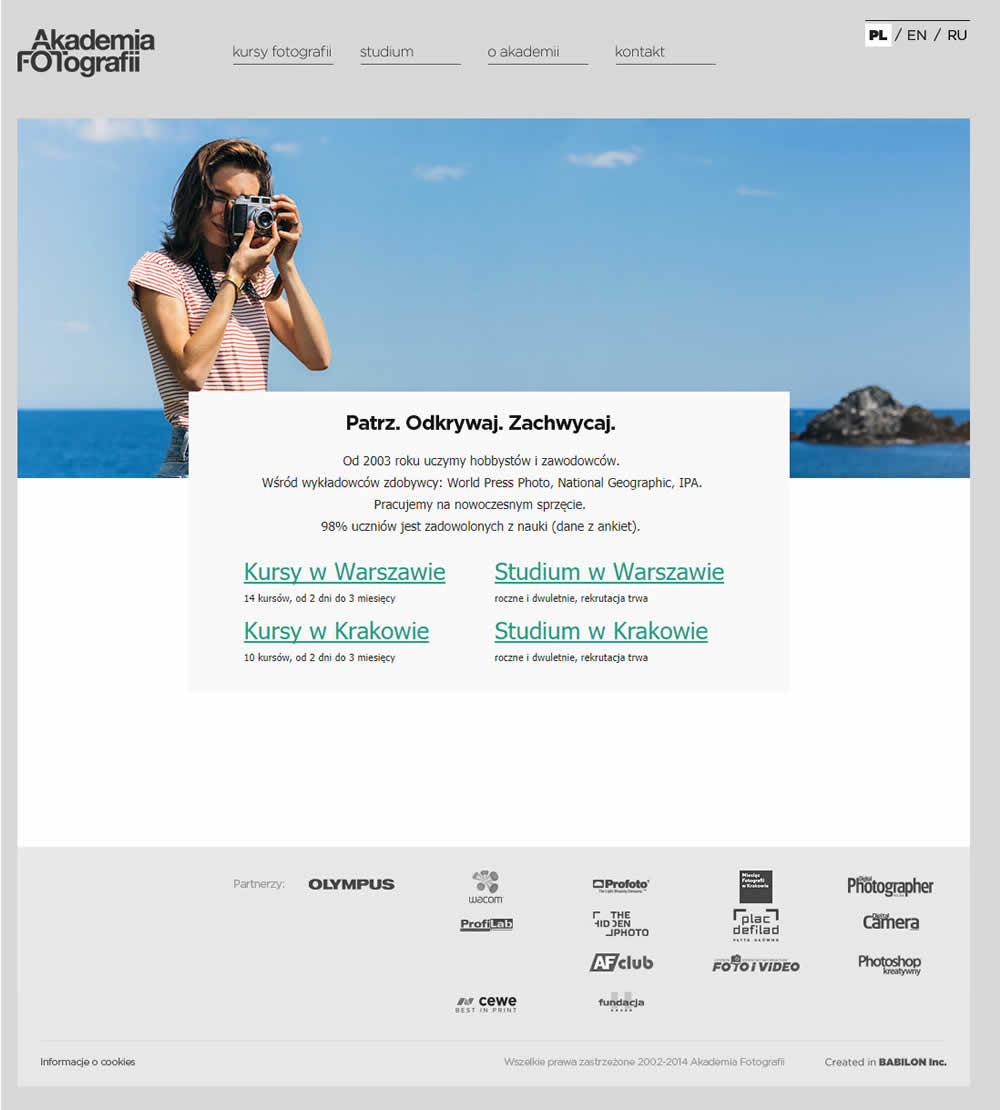
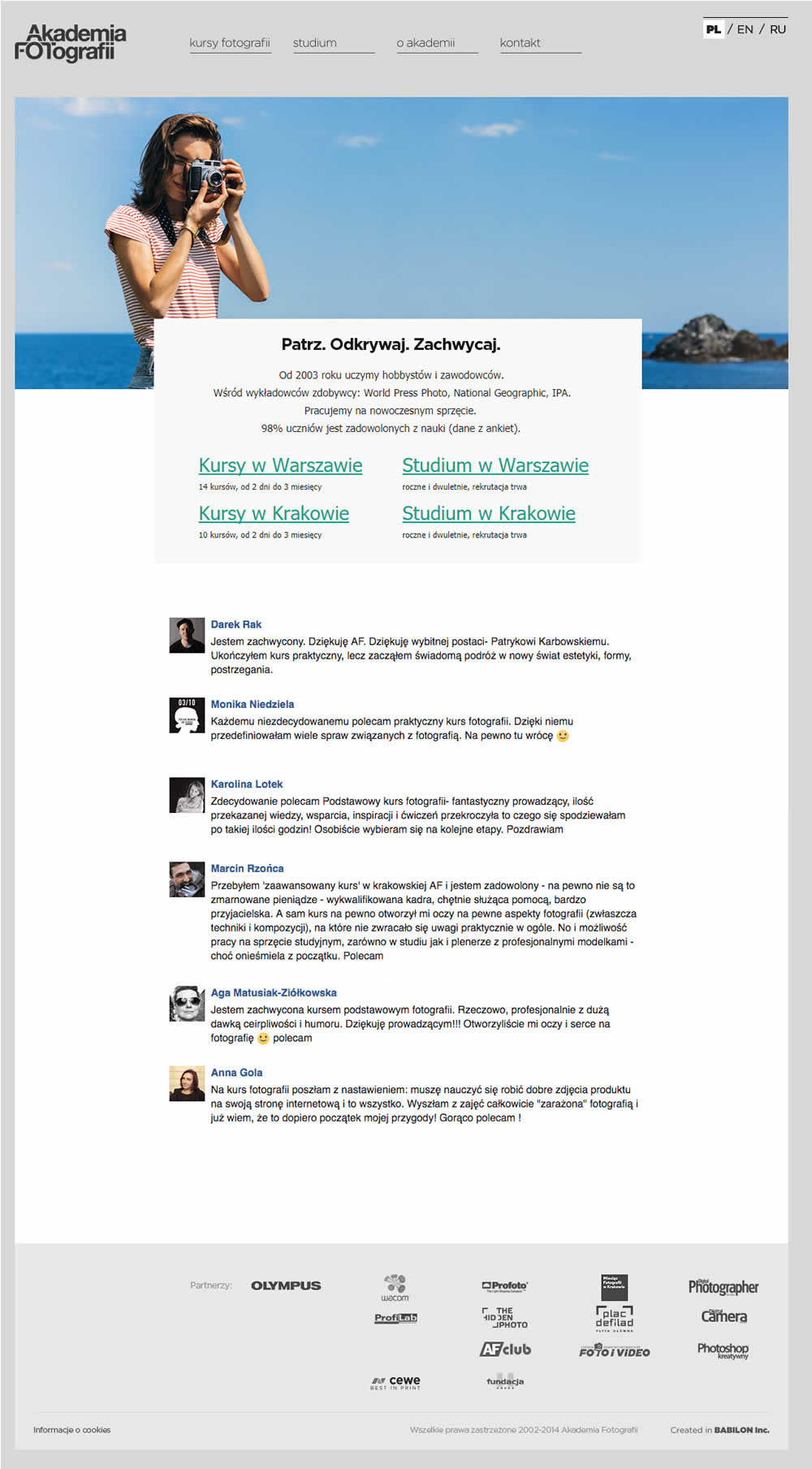
Grzegorz Tested Pattern #4: Testimonials On Akademiafotografii.p...
Test #136 on
Missetam.nl
by  Marlies Wilms Floet
Dec 18, 2017
Desktop
Product
X.X%
Sales
Marlies Wilms Tested Pattern #42: Countdown Timer On Missetam.nl
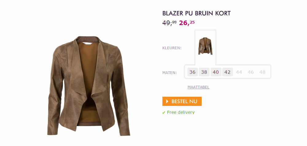
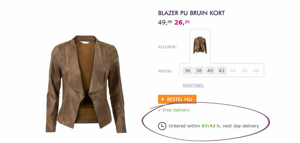
De Nieuwe Zaak (a Dutch ecommerce agency) tested a countdown timer on an ecommerce site. The variation showed how many hours and minutes were left in order to be eligible for next day delivery. The variation beat the control which did not have this element of urgency.
Test #134 on
Kenhub.com
by  Niels Hapke
Dec 14, 2017
Desktop
Product
X.X%
Sales
Niels Tested Pattern #41: Sticky Call To Action On Kenhub.com
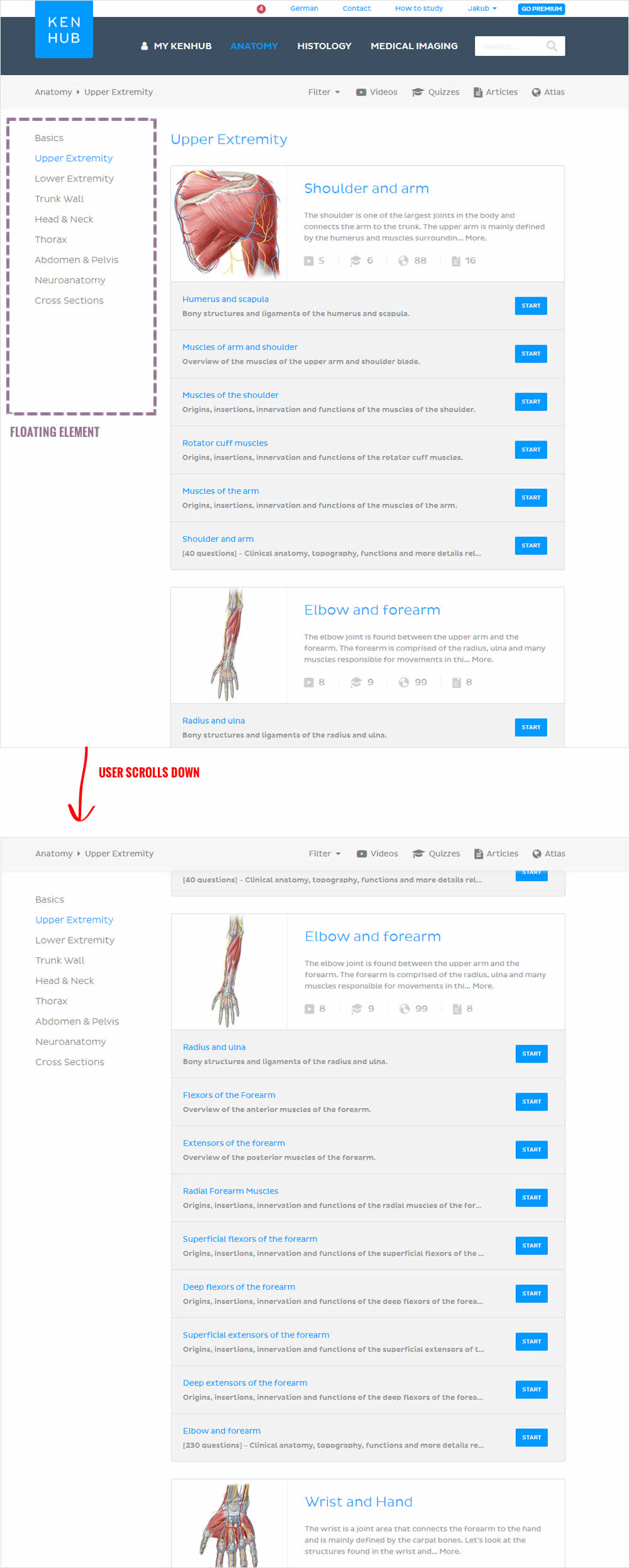
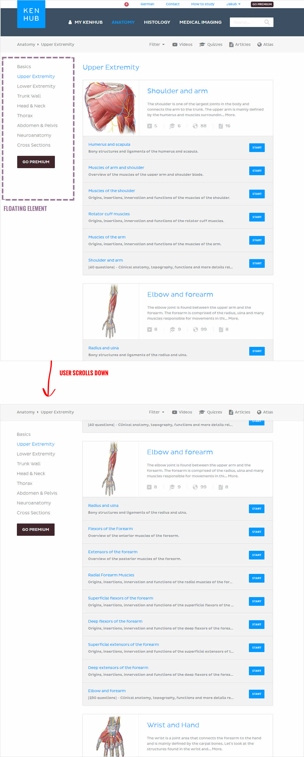
In this beautiful test, the key change was the introduction of a larger call to action linking to a premium / upgrade screen. The call to action was placed on the left sidebar which was floating. This is a great example of providing visibility to important elements by making them persistent.
Test #133 on
Bing.com
by  Ronny Kohavi
Dec 13, 2017
Desktop
Mobile
Listing
X.X%
Revenue
Ronny Tested Pattern #43: Long Titles On Bing.com
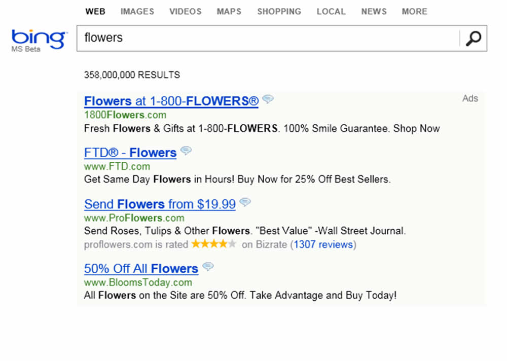
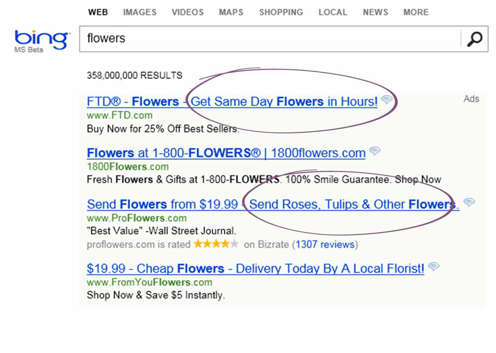
In 2012 a Microsoft employee working on Bing had an idea about changing the way the search engine displayed ad headlines. Developing it wouldn’t require much effort—just a few days of an engineer’s time—but it was one of hundreds of ideas proposed, and the program managers deemed it a low priority. So it languished for more than six months, until an engineer, who saw that the cost of writing the code for it would be small, launched a simple online controlled experiment—an A/B test—to assess its impact. Within hours the new headline variation was producing abnormally high revenue, triggering a “too good to be true” alert.
HBR, September–October 2017 Issue, https://hbr.org/2017/09/the-surprising-power-of-online-experiments
Note: This experiment was a solid success and replicated multiple times over a period of months. It worked at Bing and had a profound influence. The only reason why we atributed a 0.25 point (a "Maybe") was because we don't have the exact sample size and conversion data.
Test #131 on
Kenhub.com
by  Niels Hapke
Dec 11, 2017
Desktop
Home & Landing
X.X%
Signups
Niels Tested Pattern #11: Gradual Reassurance On Kenhub.com


Test #130 on
Kenhub.com
by  Niels Hapke
Dec 07, 2017
Desktop
Pricing
X.X%
Revenue
Niels Tested Pattern #17: Least Or Most Expensive First On Kenhub.com
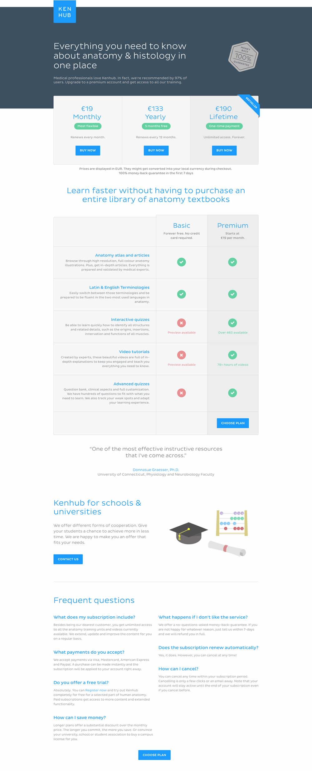
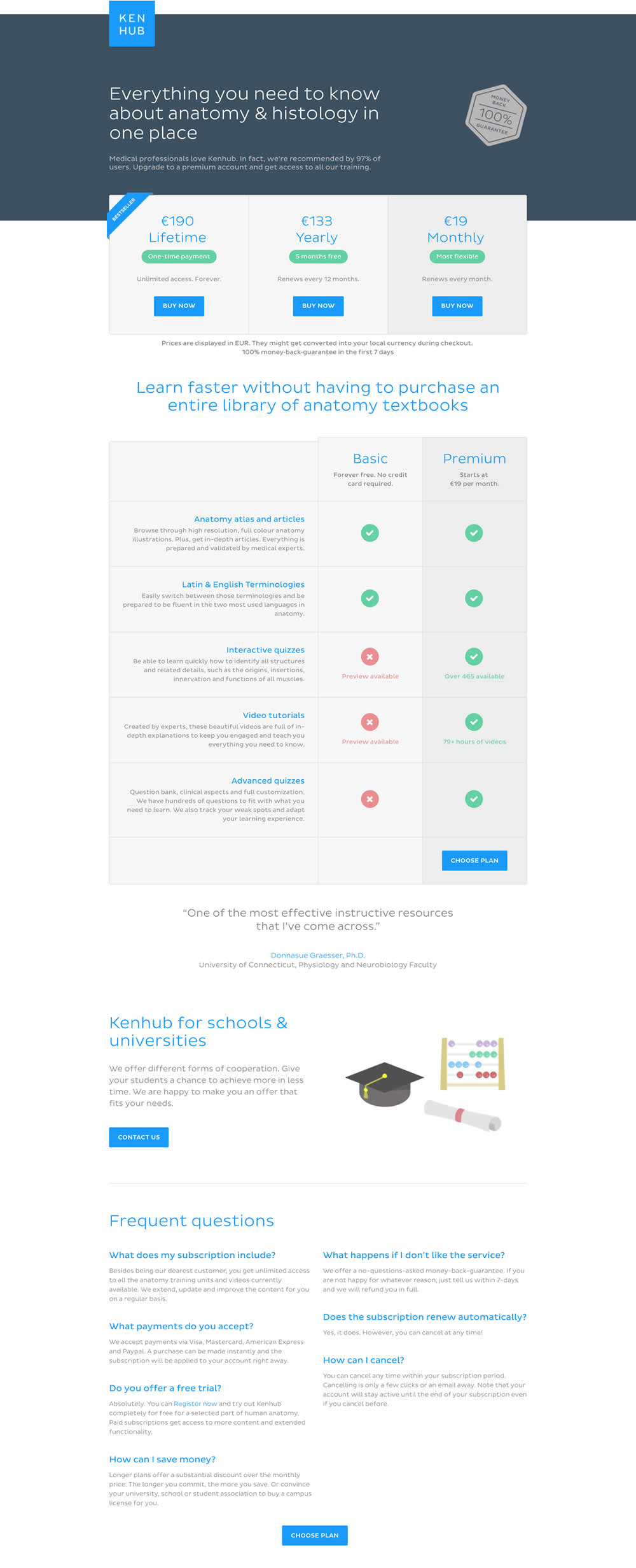
In this experiment, the plans were sorted by the most expensive first, left to right (variation).
Test #128 on
Acousticalsurfaces.c...
by Nina Bayatti
Dec 02, 2017
Desktop
Signup
X.X%
Leads
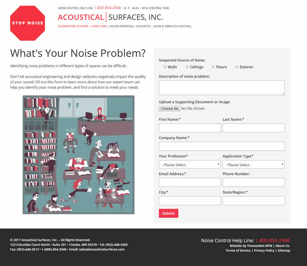
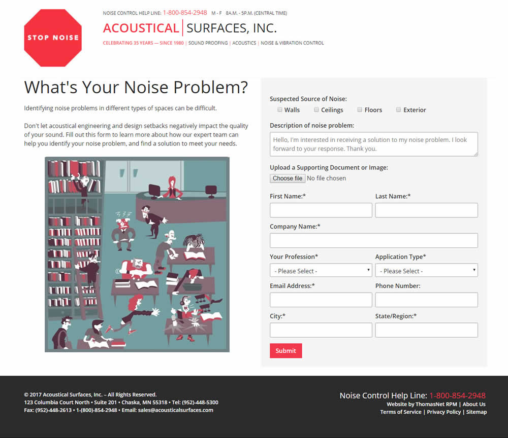
Nina Tested Pattern #20: Canned Response On Acousticalsurfaces.c...
Test #127 on
Glass.net
by  Mark Freedle
Nov 23, 2017
Desktop
Mobile
Listing
X.X%
Leads
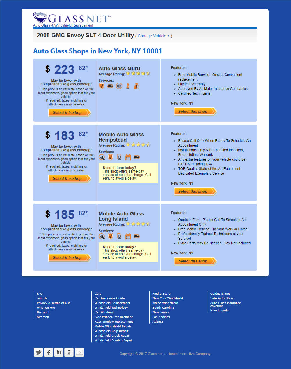
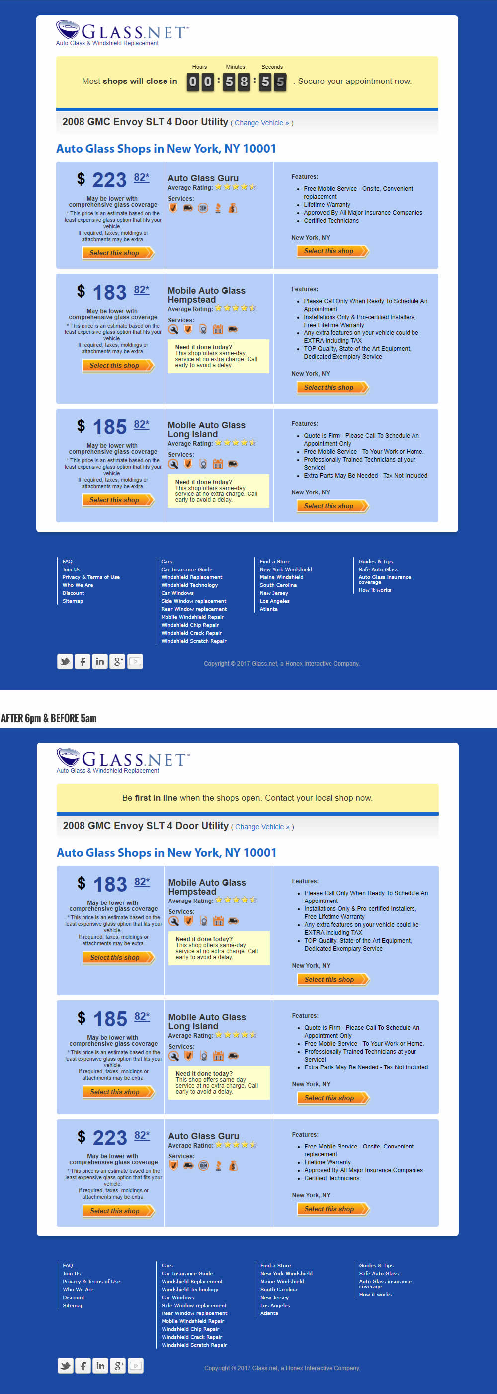
Mark Tested Pattern #42: Countdown Timer On Glass.net
Test #126 on
Rollbar.com
by  Mike Smith
Nov 22, 2017
Desktop
Signup
X.X%
Signups
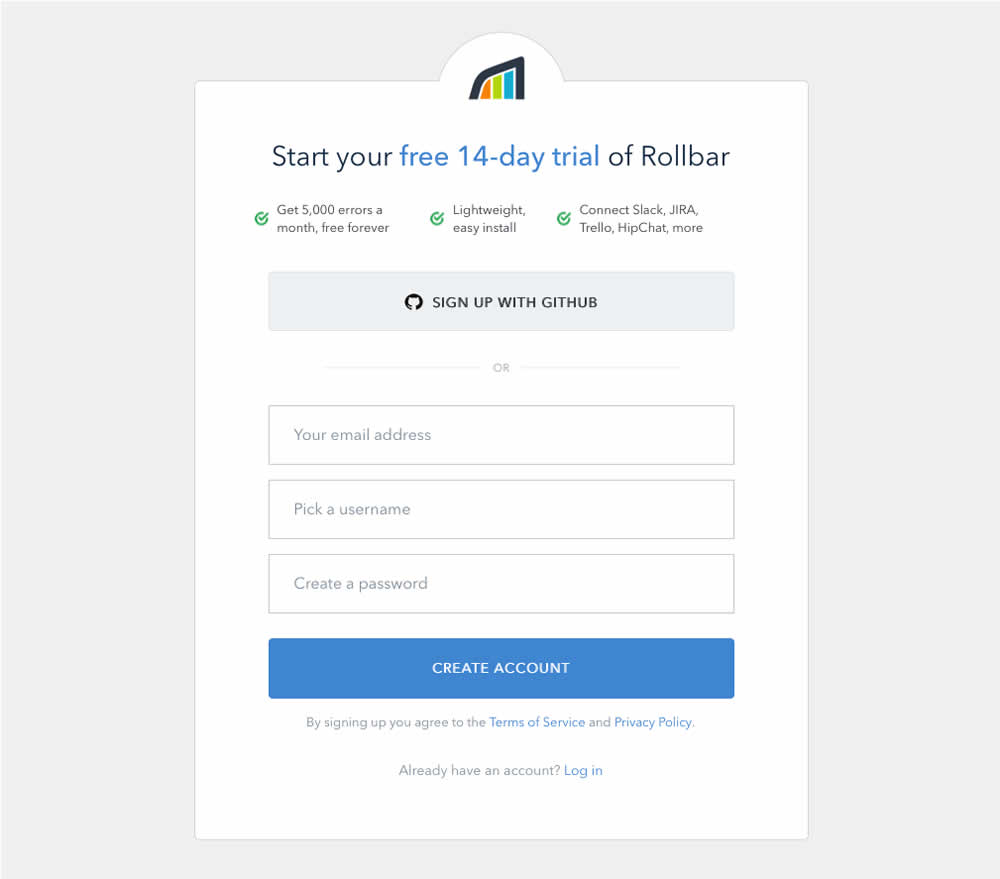
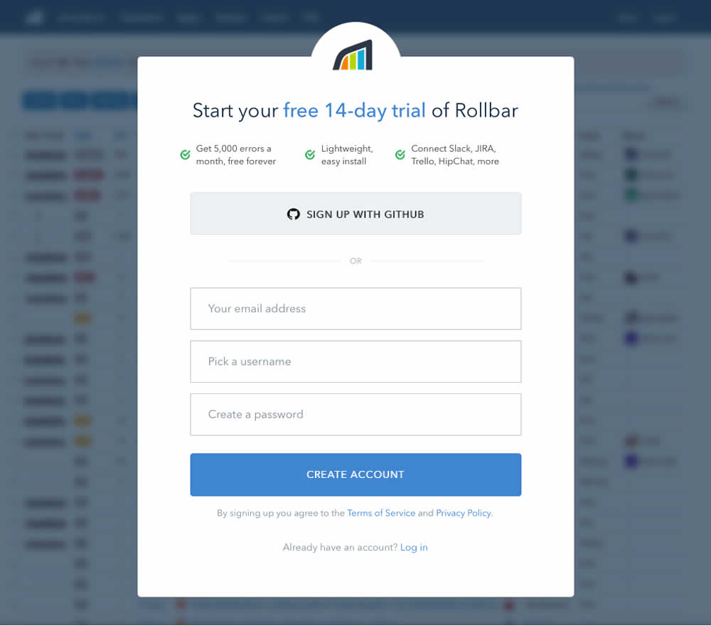
Mike Tested Pattern #40: Blurred Product Background On Rollbar.com
Test #125 on
Vivareal.com.br
by  Rodrigo Maués
Nov 13, 2017
Desktop
Product
X.X%
Leads
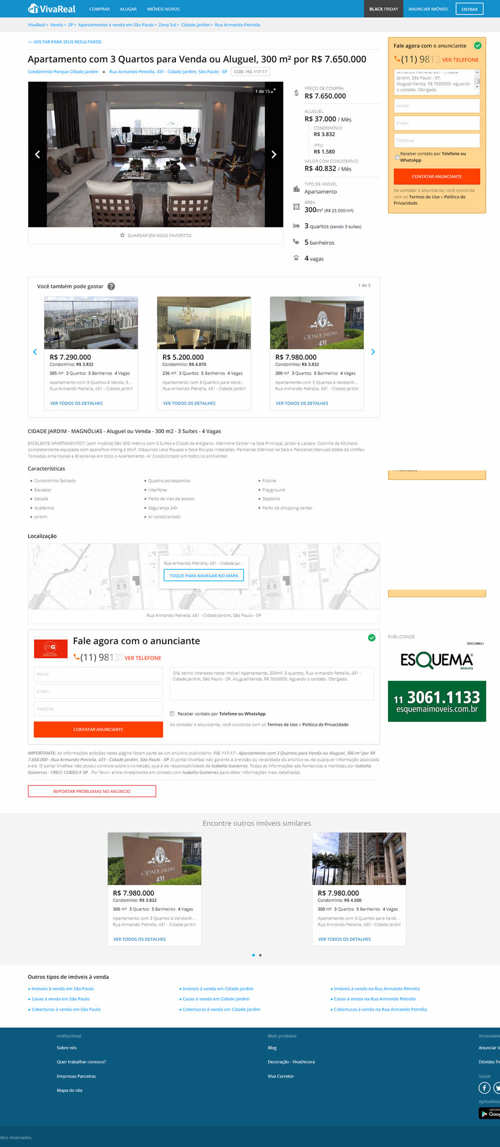
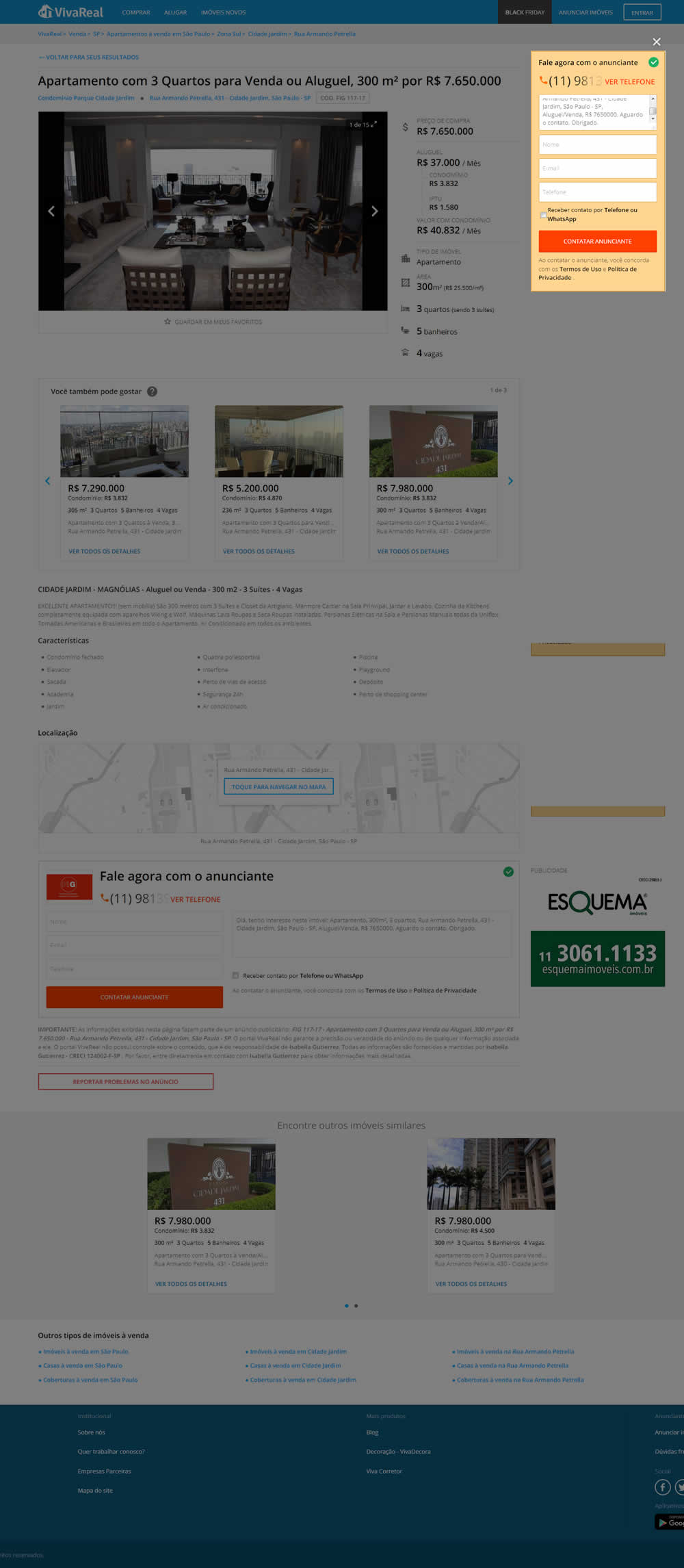
Rodrigo Tested Pattern #38: Faded Background Form On Vivareal.com.br
Test #119 on
Vivareal.com.br
by  Rodrigo Maués
Nov 01, 2017
Desktop
Listing
X.X%
Leads
Rodrigo Tested Pattern #36: Fewer Or More Results On Vivareal.com.br
