All Latest 620 A/B Tests
MOST RECENT TESTS
Test #189 on
Yummly.com
by  Kimberly Cheung
Jul 23, 2018
Desktop
Mobile
Signup
X.X%
Signups
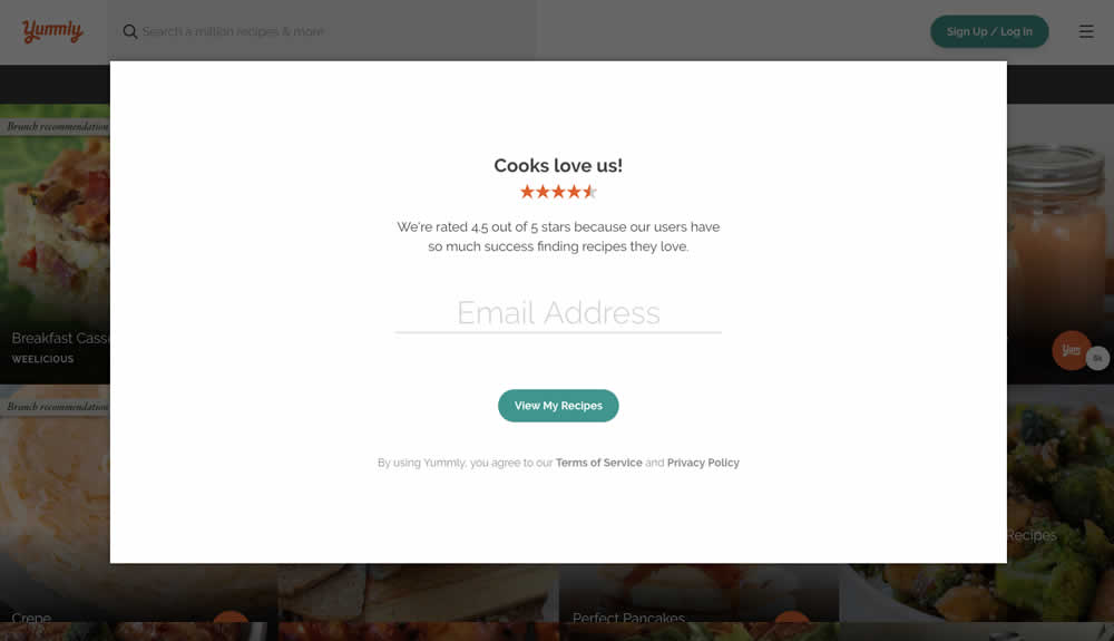
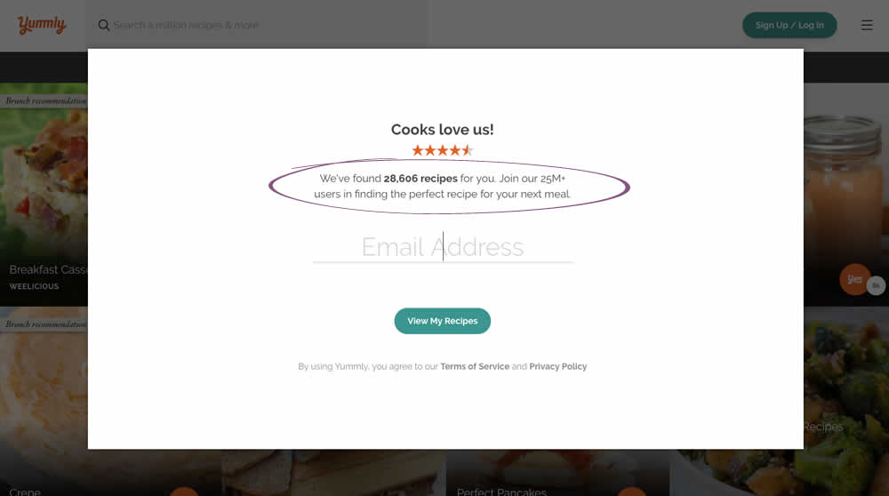
Kimberly Tested Pattern #7: Social Counts On Yummly.com
Which A Or B Actually Wins? Find Out Before You Test.
Members see every test result — the winners, the flat ones, and the losers — along with exact effects and sample sizes. Use it to estimate your tests and prioritize by probability, not gut feel. Start every experiment with the odds on your side.
Test #188 on
Thomasnet.com
by  Julian Gaviria
Jul 11, 2018
Desktop
Mobile
Home & Landing
X.X%
Progression
Julian Tested Pattern #4: Testimonials On Thomasnet.com
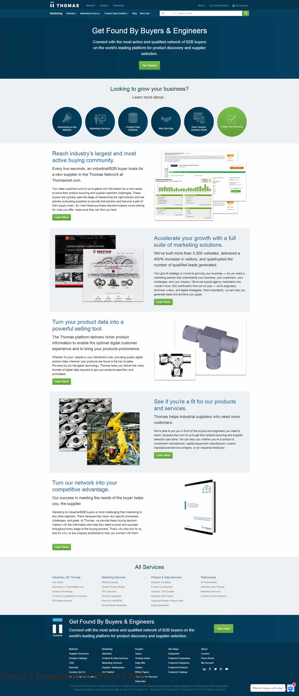
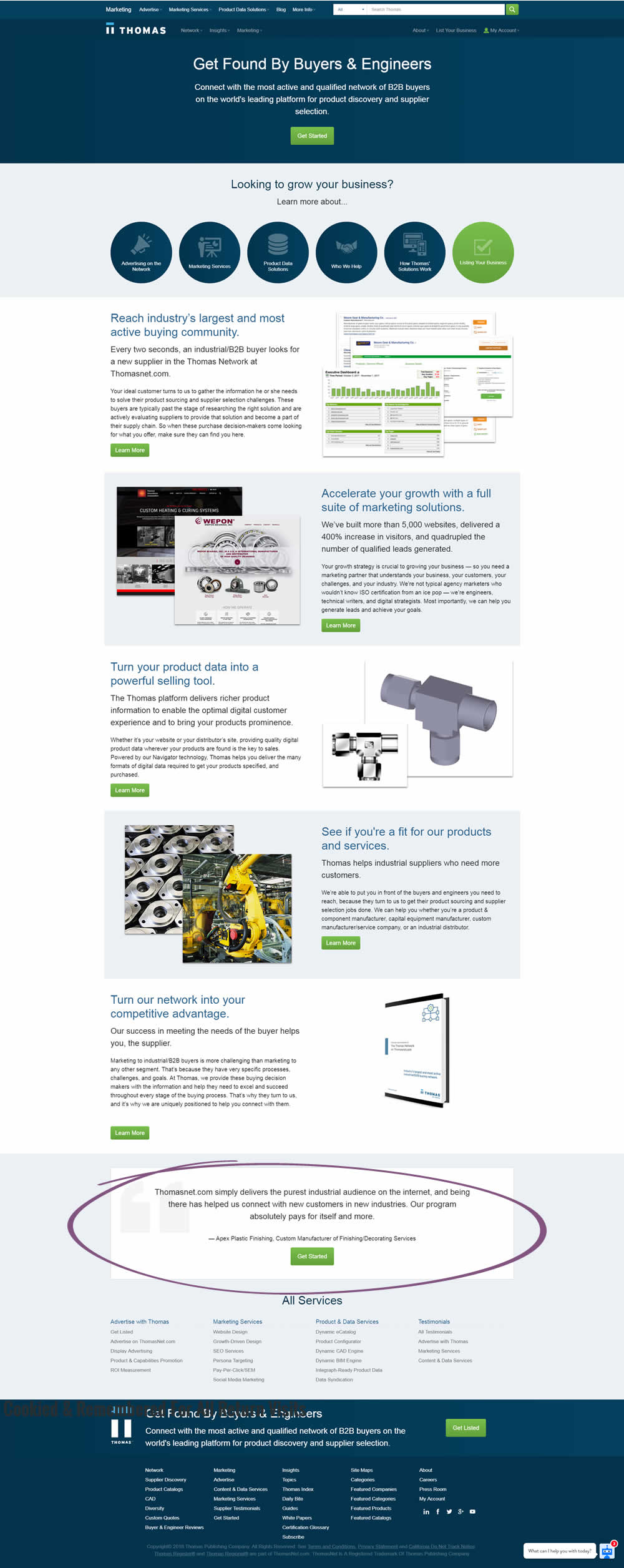
In this experiment, a testimonial with a repeated call to action was placed at the bottom of a landing page.
Test #187 on
Trydesignlab.com
by  Will Anderson
Jul 09, 2018
Desktop
Mobile
Product
X.X%
Sales
Will Tested Pattern #71: Personalized Next Step On Trydesignlab.com


In this experiment, a lead form (with a syllabus) would transform into the next application step of "enrolling" after being submitted. More so, this surfacing of the next enrollment step was personalized and shown for users that also returned to the web site in future visits.
Test #184 on
Bomgar.com
by  Lee Elkins
Jun 25, 2018
Desktop
Mobile
Home & Landing
X.X%
Signups
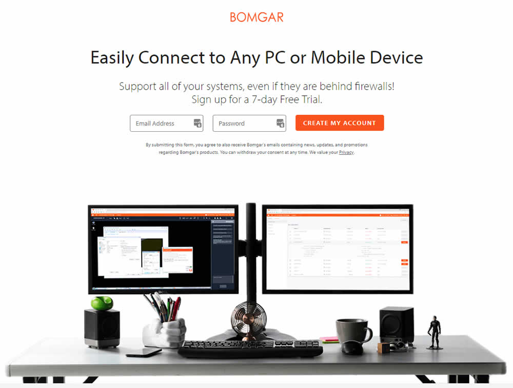
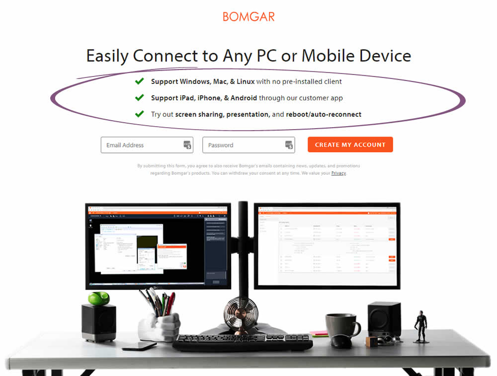
Lee Tested Pattern #15: Bulleted Reassurances On Bomgar.com
Test #183 on
Trydesignlab.com
by  Daniel Shapiro
Jun 19, 2018
Desktop
Mobile
Product
X.X%
Signups
Daniel Tested Pattern #46: Pay Later On Trydesignlab.com


Test #182 on
Yummly.com
by  Marcos Ciarrocchi
Jun 12, 2018
Desktop
Listing
X.X%
Engagement
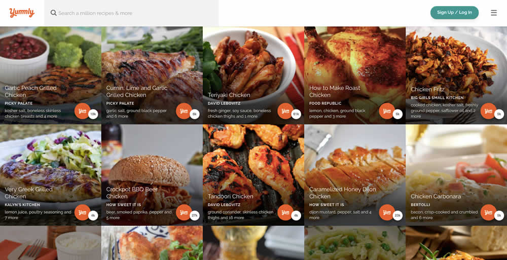
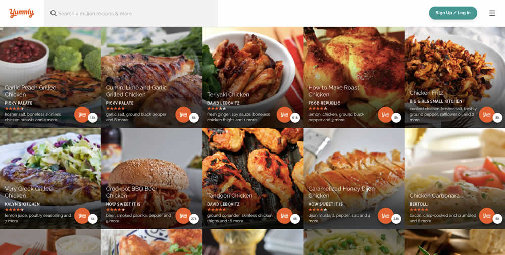
Marcos Tested Pattern #6: Customer Star Ratings On Yummly.com
Test #181 on
Yummly.com
by  Kimberly Cheung
Jun 04, 2018
Desktop
Mobile
Signup
X.X%
Signups
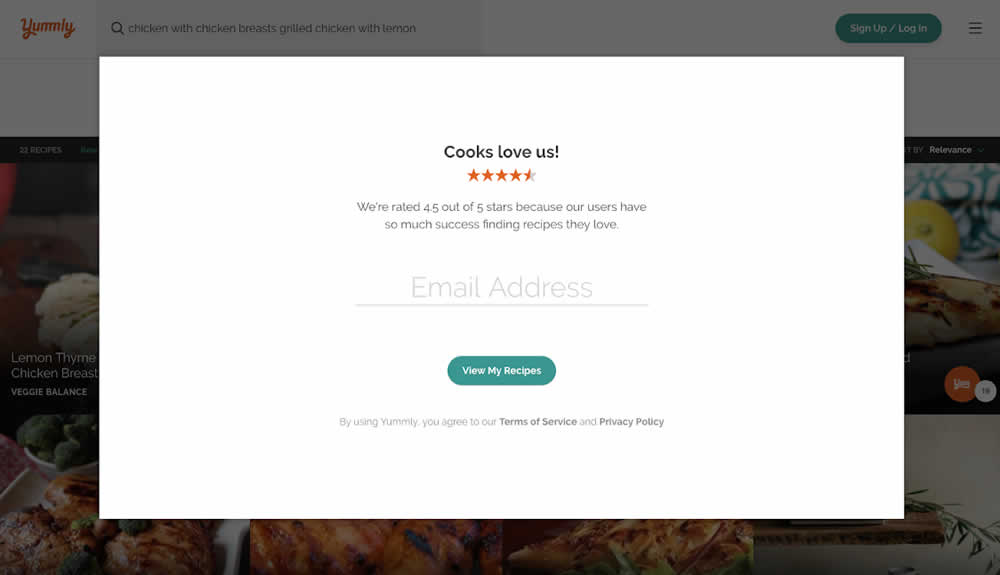
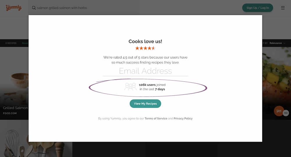
Kimberly Tested Pattern #7: Social Counts On Yummly.com
Test #179 on
Yummly.com
by  Marcos Ciarrocchi
May 18, 2018
Desktop
Listing
X.X%
Signups
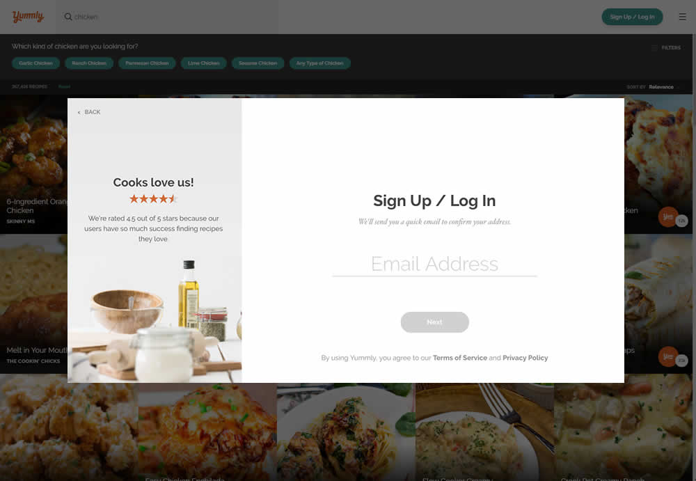
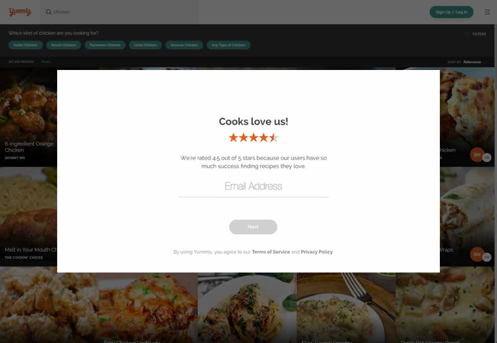
Marcos Tested Pattern #13: Centered Forms & Buttons On Yummly.com
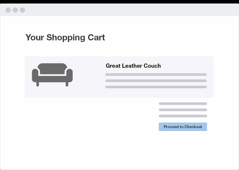
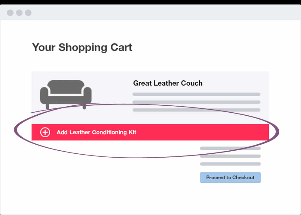
Test #177 on
by  Devesh Khanal
May 17, 2018
Desktop
Shopping Cart
X.X%
Revenue
Devesh Tested Pattern #66: Complementary Upsell
Test #178 on
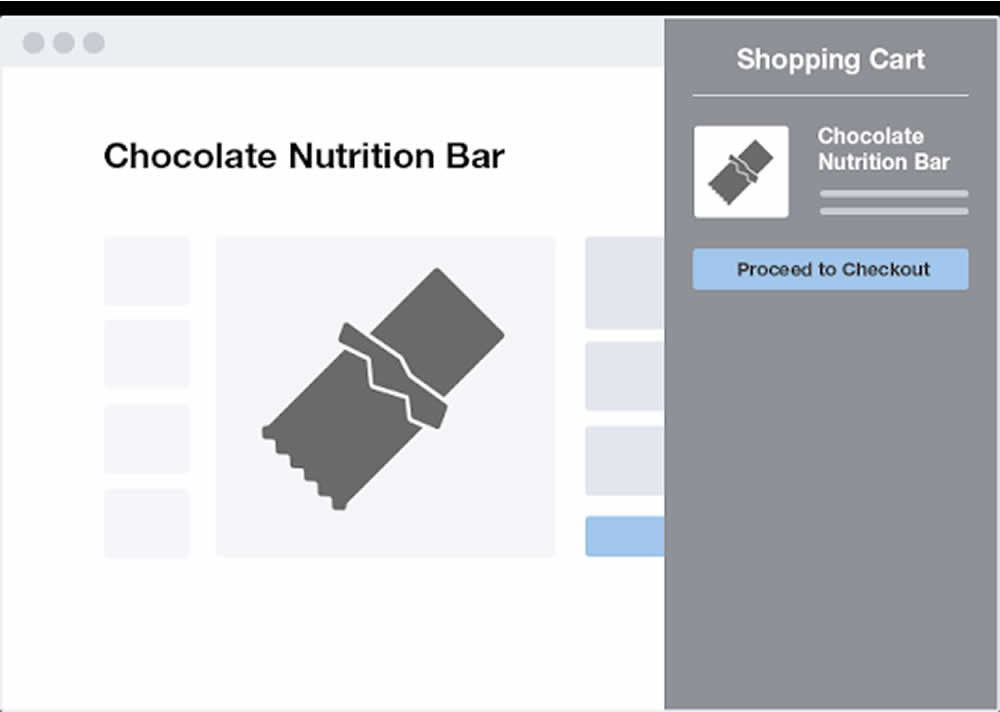
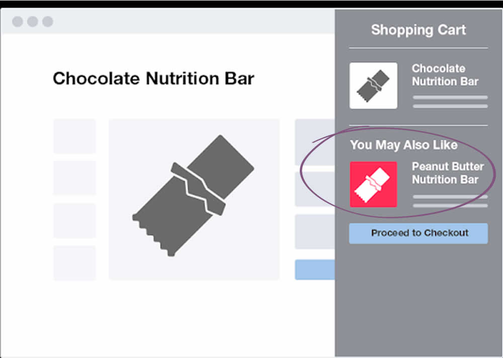
by  Devesh Khanal
May 17, 2018
Desktop
Product
X.X%
Sales
Devesh Tested Pattern #66: Complementary Upsell
Test #176 on
Kenhub.com
by  Niels Hapke
May 16, 2018
Desktop
Mobile
Checkout
X.X%
Sales
Niels Tested Pattern #4: Testimonials On Kenhub.com
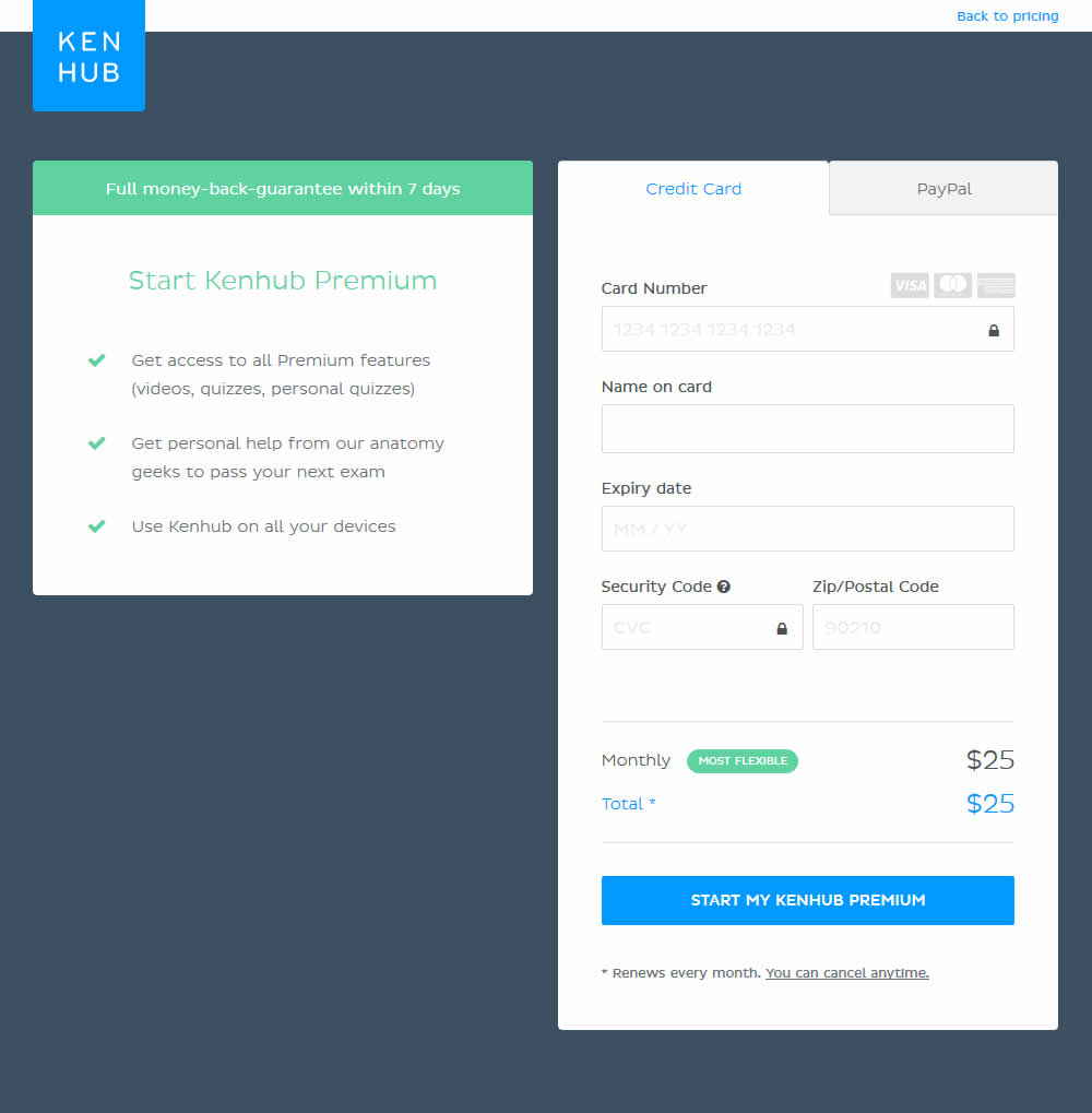
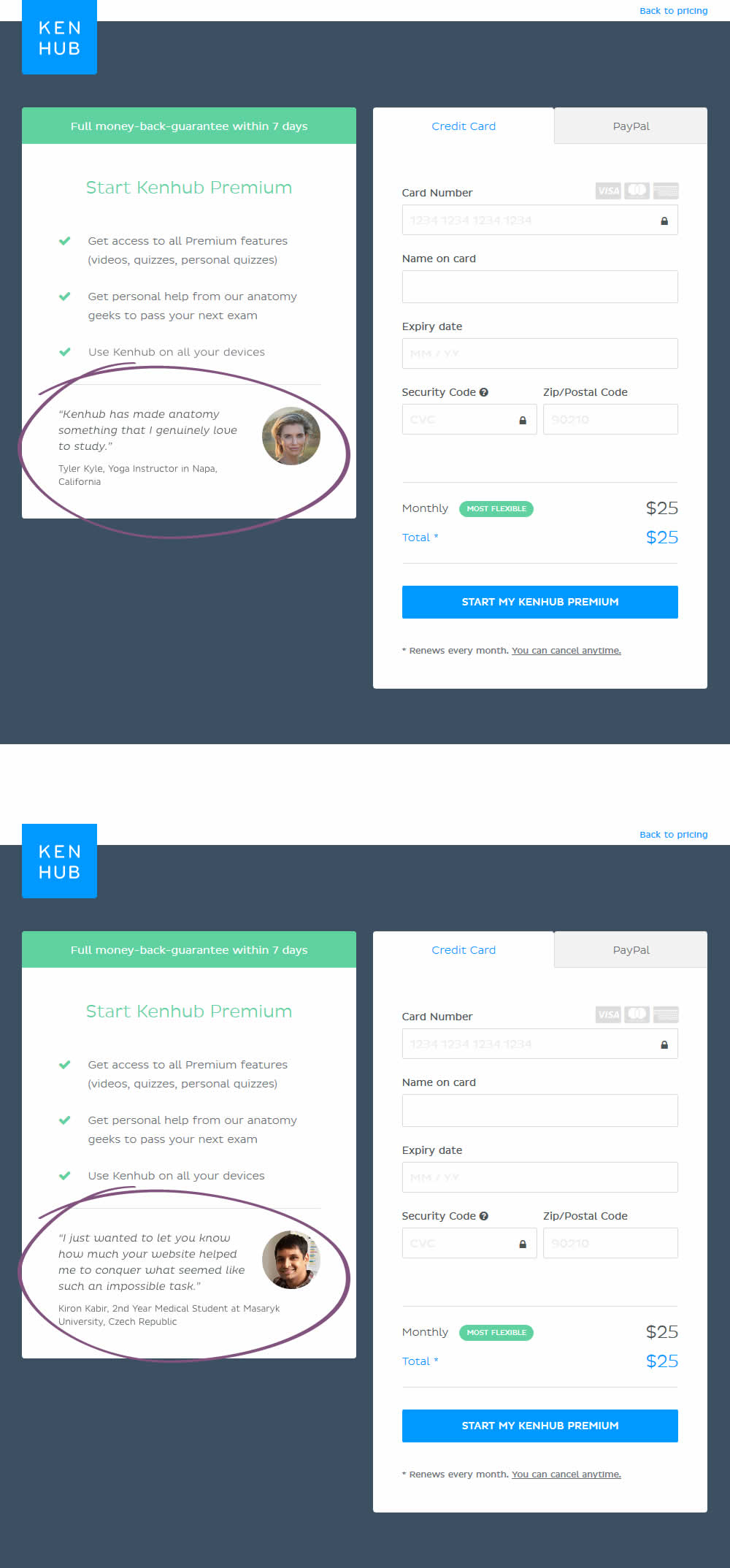
In this experiment, testimonials were added on a checkout screen.
Test #175 on
Thomasnet.com
by  Julian Gaviria
May 14, 2018
Desktop
Mobile
Content
X.X%
Leads
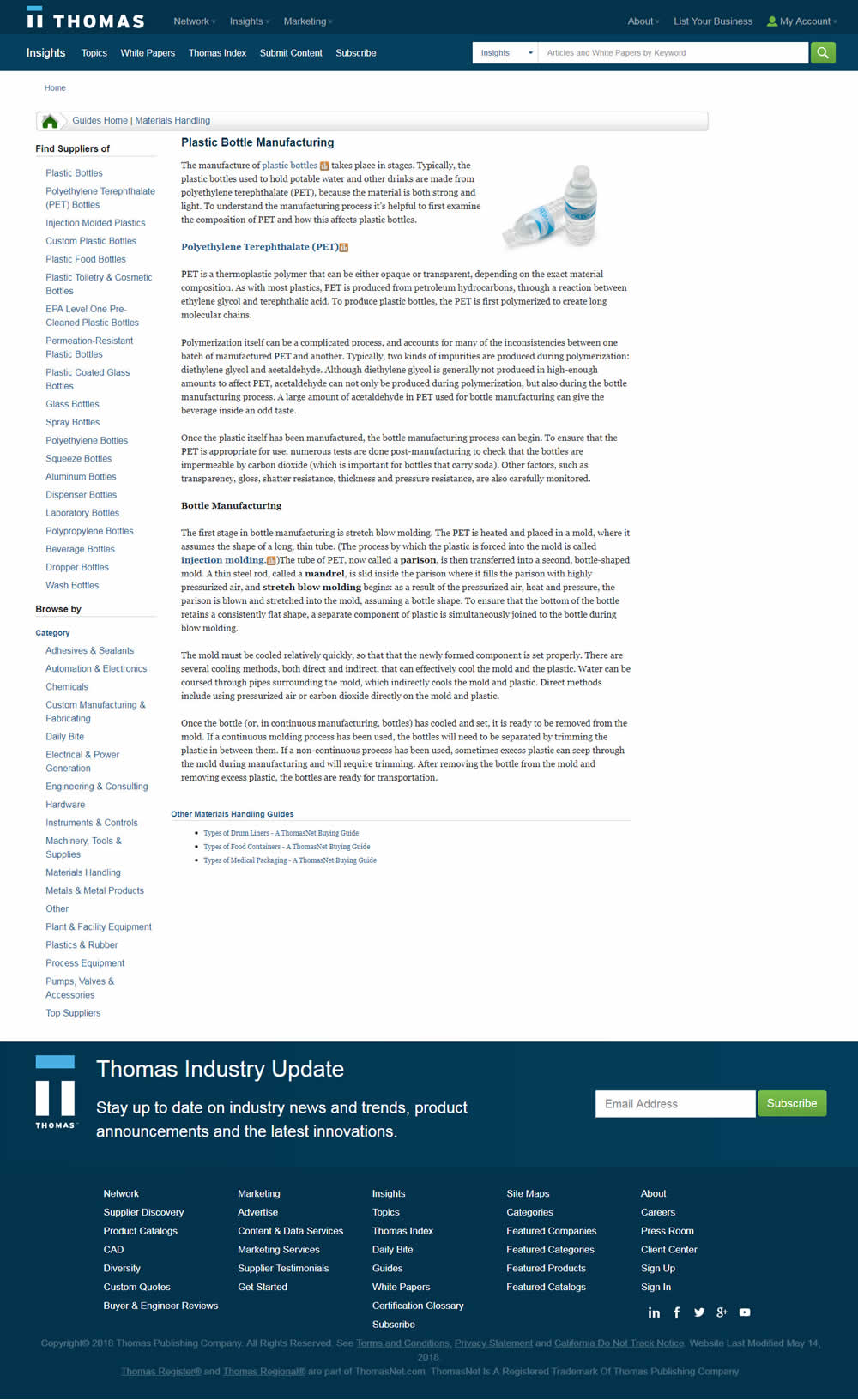
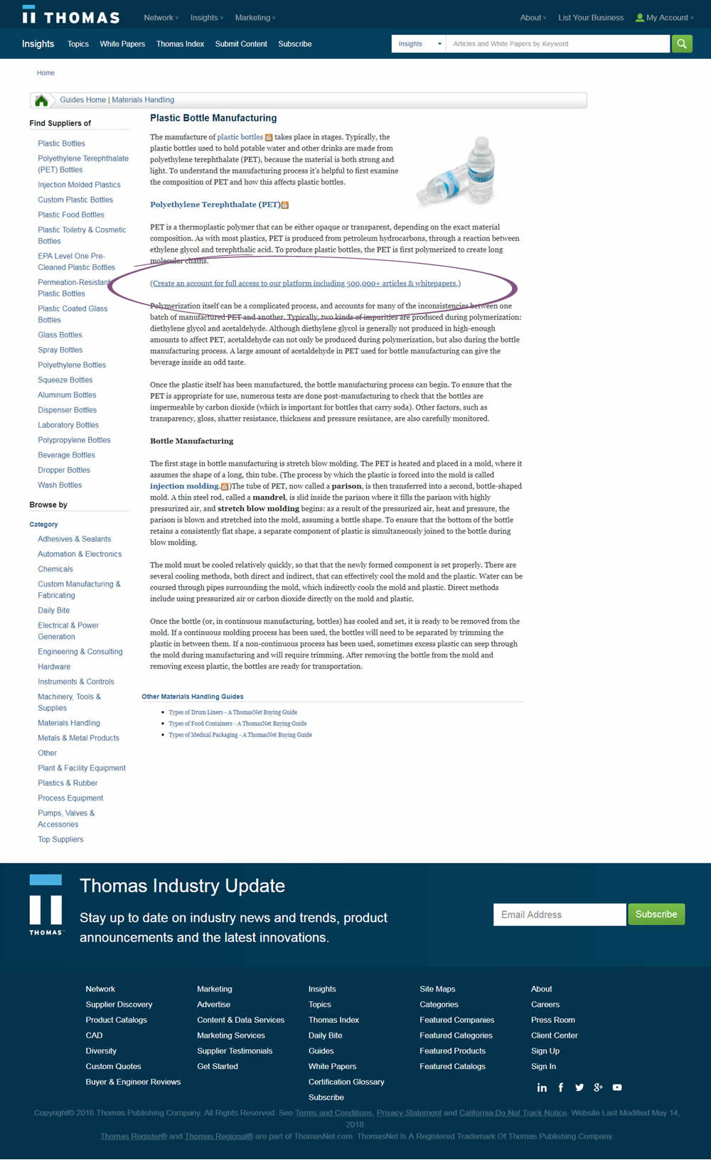
Julian Tested Pattern #23: Inline Link Nudge On Thomasnet.com
Test #174 on
Examine.com
by  Martin Wong
May 13, 2018
Desktop
Mobile
Checkout
X.X%
Sales
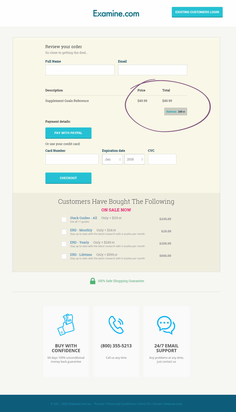
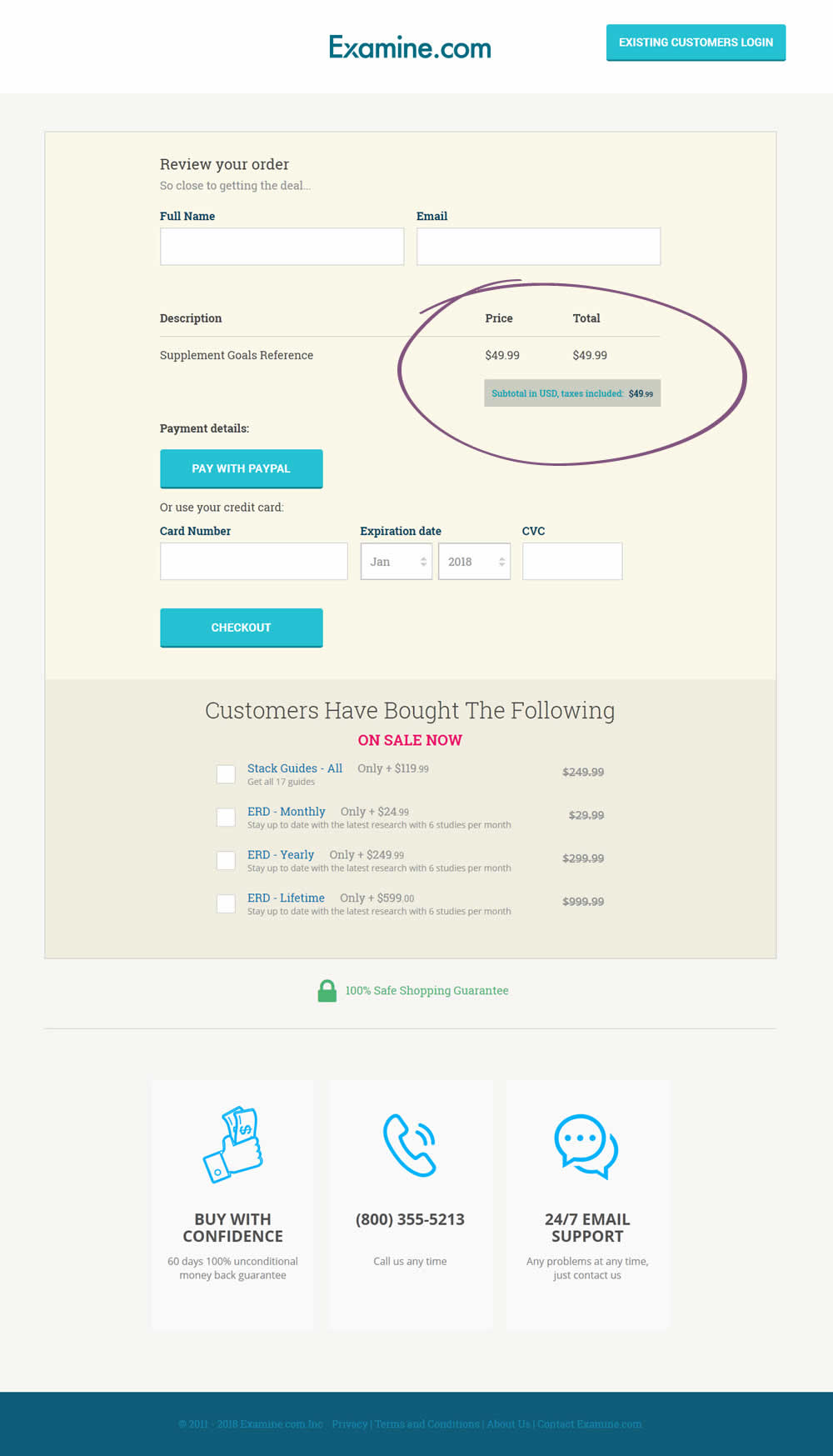
Martin Tested Pattern #67: Currency & Taxes On Examine.com
Test #172 on
Trydesignlab.com
by  Daniel Shapiro
May 08, 2018
Desktop
Mobile
Product
X.X%
Leads
Daniel Tested Pattern #11: Gradual Reassurance On Trydesignlab.com


Test #173 on
Rollbar.com
by  Mike Smith
May 08, 2018
Desktop
Mobile
Home & Landing
X.X%
Engagement
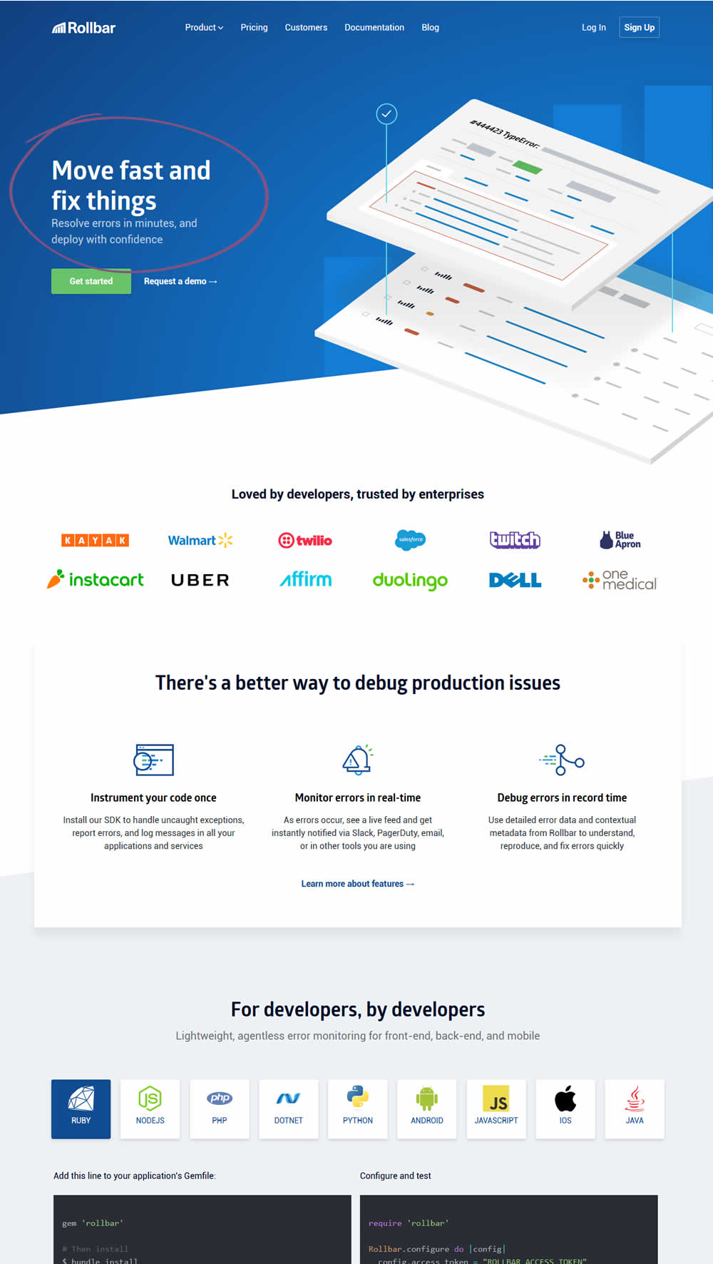
Mike Tested Pattern #22: Empowering Headline On Rollbar.com

Test #171 on
Sjvc.edu
by Phillip Barnes
Apr 27, 2018
Desktop
Mobile
Signup
X.X%
Leads
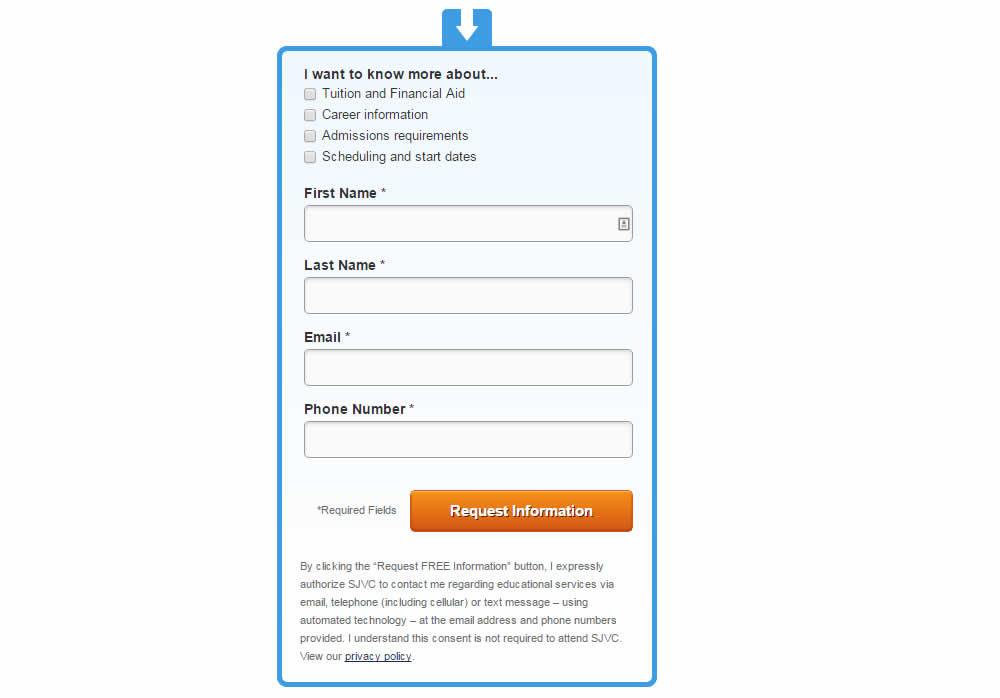
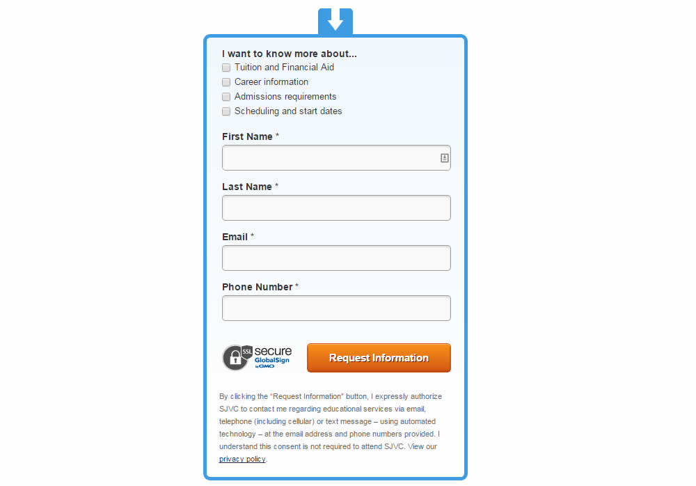
Phillip Tested Pattern #63: Trust Seals On Sjvc.edu
Test #169 on
Mt.com
by  Vito Mediavilla
Apr 24, 2018
Desktop
Listing
X.X%
Leads
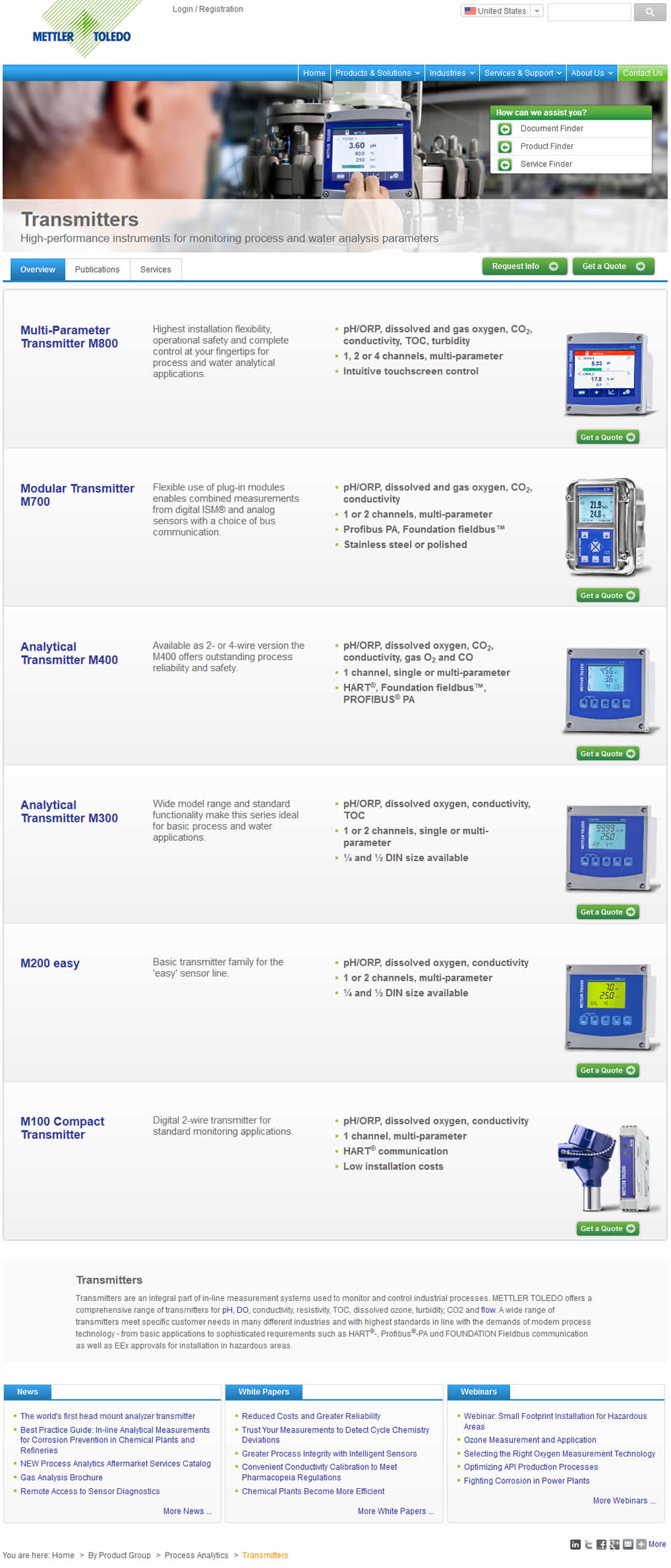
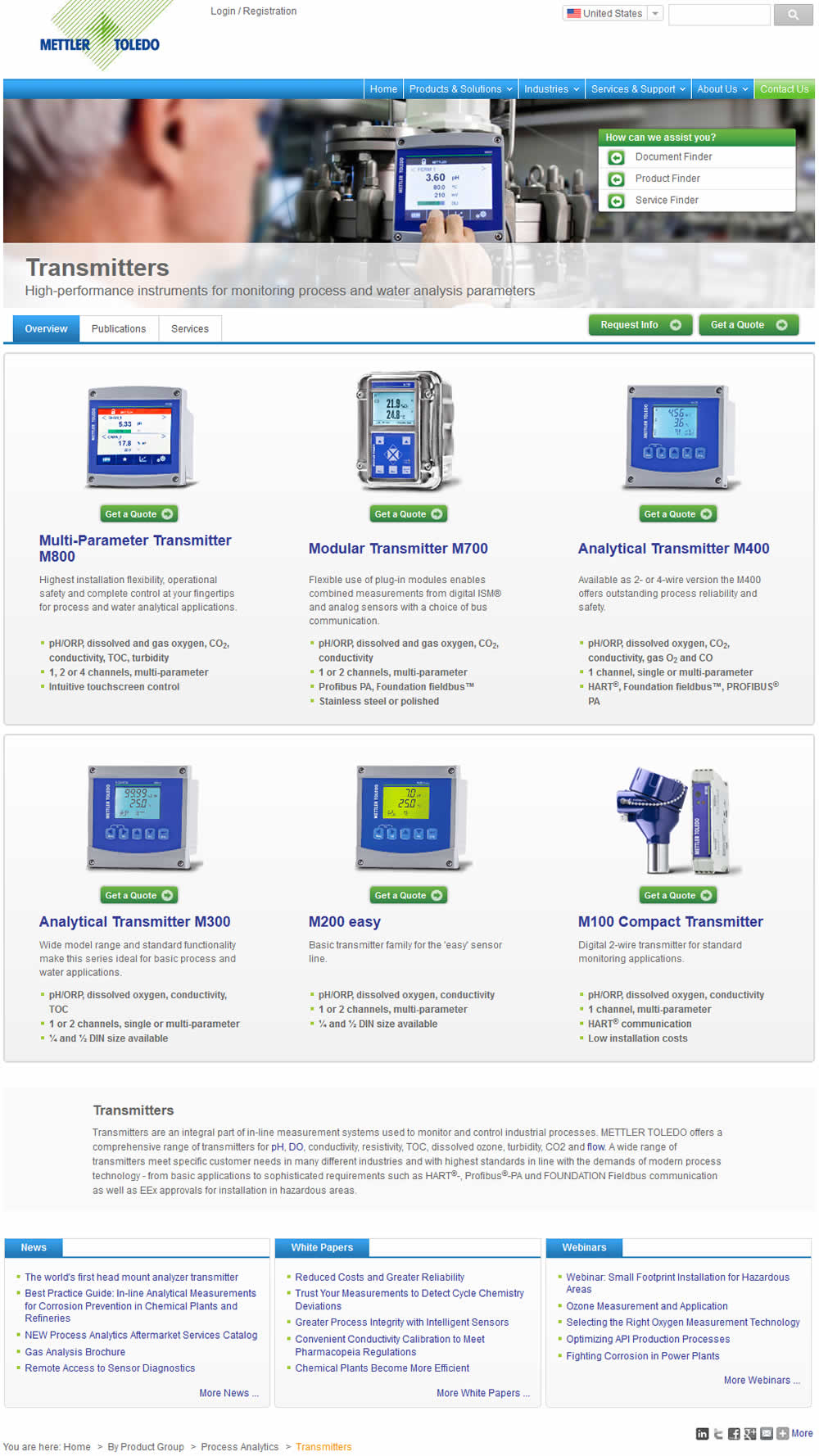
Vito Tested Pattern #37: List Or Grid View On Mt.com
Test #170 on
Goodui.org
by  Jakub Linowski
Apr 24, 2018
Desktop
Mobile
Home & Landing
X.X%
Sales
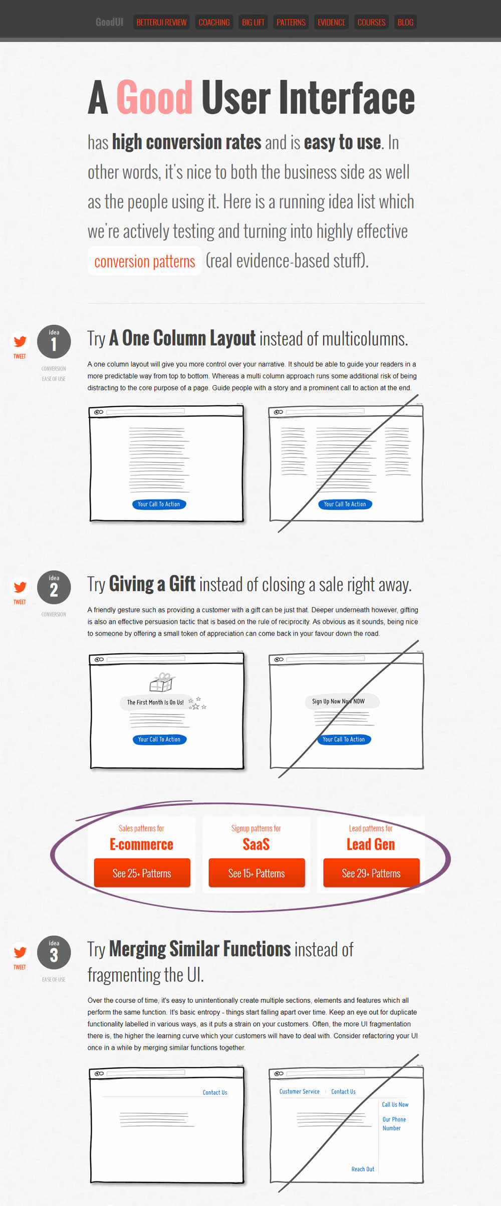
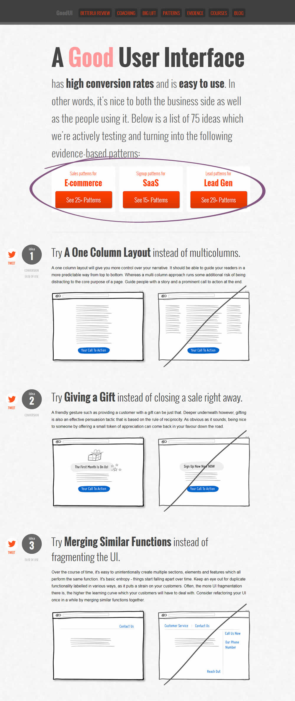
Jakub Tested Pattern #49: Above The Fold Call To Action On Goodui.org
Test #168 on
Akademiafotografii.p...
by Grzegorz Jancewicz
Apr 23, 2018
Desktop
Listing
X.X%
Leads
Grzegorz Tested Pattern #45: Benefit Bar On Akademiafotografii.p...


Test #167 on
Lovehoney.co.uk
by  Matthew Curry
Apr 10, 2018
Desktop
Product
X.X%
Sales
Matthew Tested Pattern #69: Autodiscounting On Lovehoney.co.uk
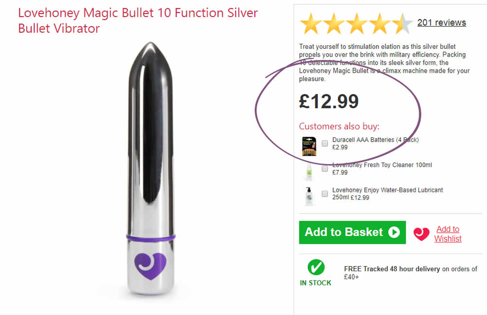
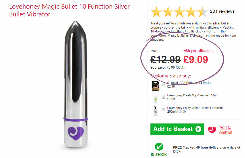
The idea is that, if the customer has an active discount code for that session (either by landing on a particular page, or entering a code somewhere), instead of just showing the discount in the basket, we show it further (earlier) up the funnel and automatically discount on the product page.
The effectiveness of this depends on the discount level, I've tested it at 30% and 50%.
With a 50% Discount:
Add to Cart rate +33%
Sales rate + 24%
With a 30% Discount:
Add to Cart rate +11.6%
Sales rate + 10.2%